
Have you ever needed an icon for your website, but you couldn't quite find the right one? Or perhaps you wanted to have a simple diagram, but didn't want to learn a whole new library just for that?
Well, good news – you can do all that and more without ever leaving your favorite code editor or using any third party tools or libraries.
Since HTML5, we can include the code of an SVG image inside an HTML document. We don’t even need to use the image tag that refers to a separate file. We can inline the code of an image right inside the HTML. We can do this because SVGs have a very similar syntax to HTML.
This opens up a lot of cool options. Suddenly we can access parts of an image from JavaScript or set the style from CSS. We can animate parts of an image from JavaScript or make it interactive. Or we can turn things around and generate graphics from code.
For more complicated images, you will still use a designer tool. But the next time you need a simple icon, a diagram, or animation, maybe you can code it yourself.
So how do SVGs look like under the surface? In this tutorial, we go through the source code of a few SVGs to cover the foundations.
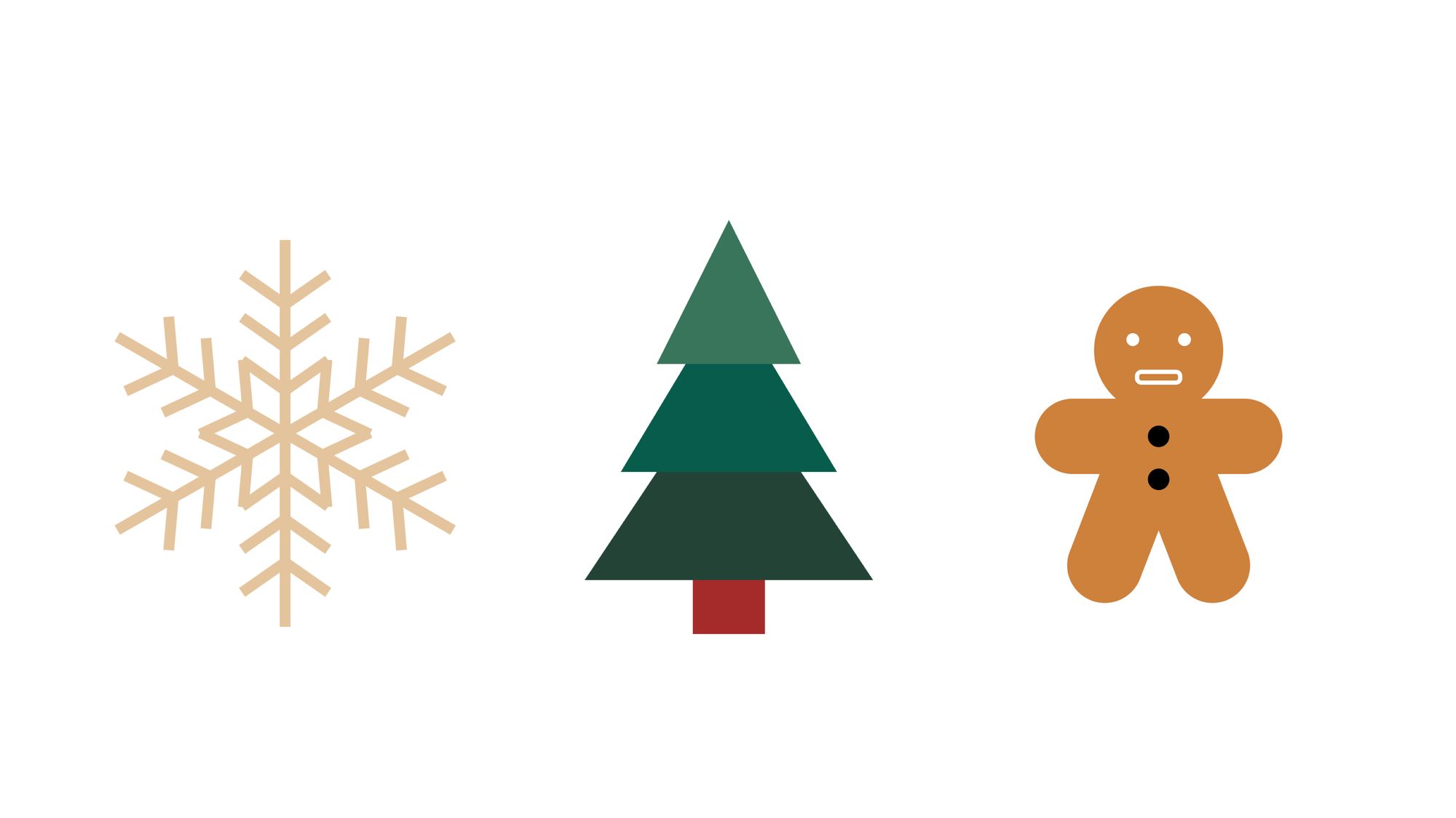
The following examples are from svg-tutorial.com. You can also watch this article as a video with even more fun examples.
The SVG tag
First, we have to talk about the svg tag itself. This tag contains the image elements and defines the frame of our image. It sets the inner size and the outer size of the image.
The width and height property define how much space the image takes up in the browser. There’s often a viewBox property as well. This defines a coordinate system for the elements inside the image. These two can be confusing because they both define a size.
You can think of the width and height of an SVG as an external size and the viewBox as an internal size.
The size defined by width and height is how the rest of HTML thinks of the image and how big it appears in the browser. The size defined by viewBox is how the image elements think of the image when they position themselves inside of it.
In the next example we have three SVGs that have the very same content. A circle element with the same center coordinate and same radius. They appear quite different, though.
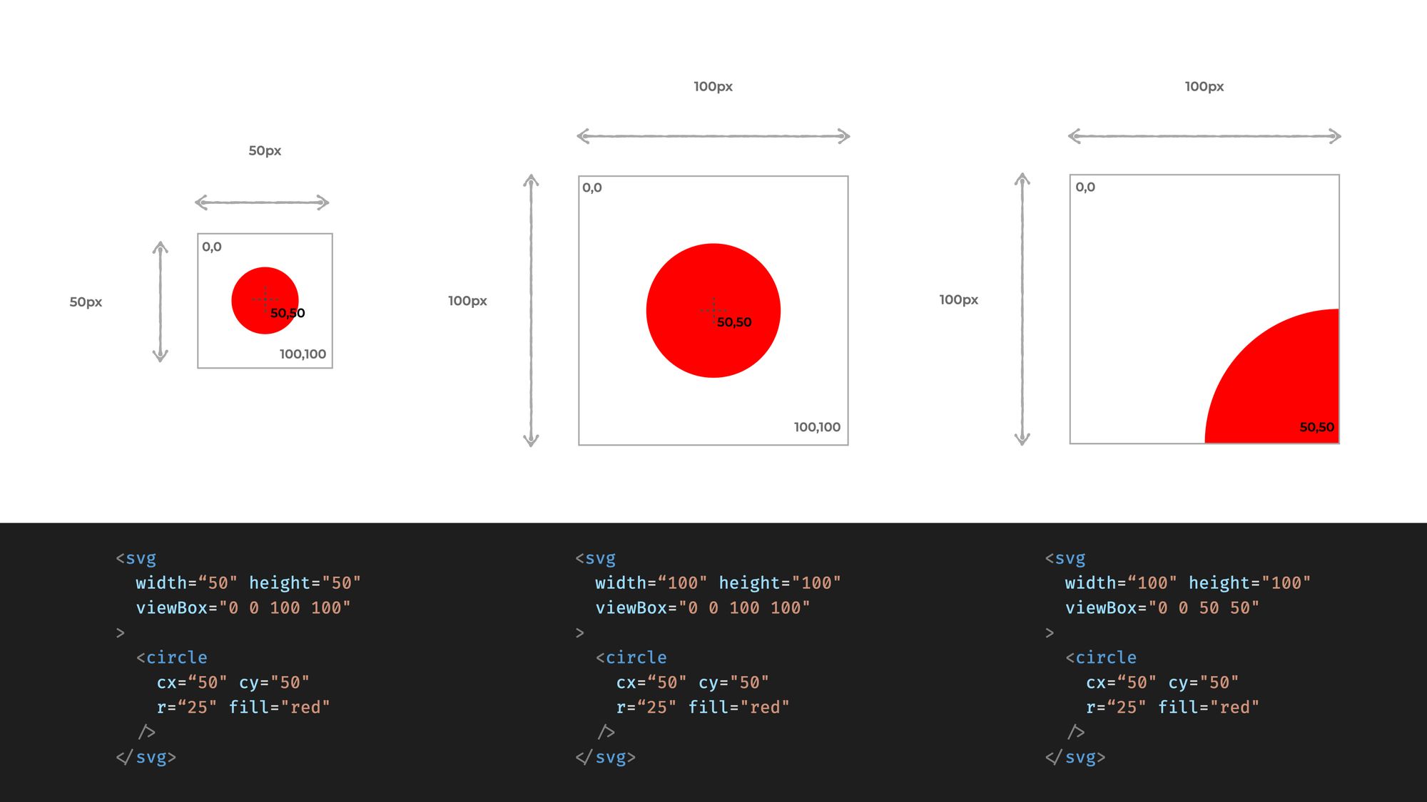 The very same circle can appear different based on the size of the image and the
 viewBox property
At the example in the middle, the size defined by width and height matches the one defined by the viewbox. In the first example we see what happens if the width and height are smaller. The image simply shrinks down as all the coordinates and sizes defined within the image still align to the viewbox.
In the last example we see what happens if the viewbox is focusing on only part of the image. Things appear bigger in this case, but the actual size of the image is still defined by the width and height property.
The viewBox also defines the center of the coordinate system in which the image items place themselves.
The first two numbers define which coordinate should be at the top left corner of the image. Coordinates grow to the right and downwards. In this article, we will center the coordinate systems. The 0,0 coordinate will always be in the middle of the image.
One note before we start: while we can inline SVG images in an HTML file, that doesn’t mean we can freely combine any SVG tag with any HTML tag.
The SVG tag represents the frame of the image and every SVG element has to come within an SVG tag. The same is true in the opposite direction. HTML tags can’t be within an SVG tag, so we can’t have a div or a header tag inside an SVG. But don’t worry, there are similar tags available.
How to Make a Christmas Ornament with SVG
Let’s start with a simple Christmas tree ornament. Here we'll only use simple shapes. A rectangle, and two circles.
We'll position and style these elements with attributes. For the circle, we define the center position and for the rectangle, we define the top left corner. These positions are always related to the coordinate system defined by the viewBox.
 Christmas Ornament made out of circles and a rectangle. On the right you can see the coordinates we use in this example.
<html>
  <svg width="200" height="200" viewBox="-100 -100 200 200”>
    <circle cx="0" cy="20" r="70" fill="#D1495B" />

    <circle
      cx="0"
      cy="-75"
      r="12"
      fill="none"
      stroke="#F79257"
      stroke-width="2"
    />

    <rect x="-17.5" y="-65" width="35" height="20" fill="#F79257" />
  </svg>
</html>
Remember, we moved the center of the coordinate system to the middle of the image and the X-axis grows to the right and the Y-axis grows towards the bottom.
We also have presentational attributes that style our shapes. Unlike in HTML, we do not use background-color to set a color for a shape but we use the fill attribute.
And to set a border for a shape we use stroke and stroke-width. Note how we use the circle element both to draw a ring and a ball with different attributes.
How to Build a Christmas Tree with SVG
Let’s move on to a Christmas tree. We can’t always use basic shapes to assemble our image. A polygon is the simplest way to draw a freeform shape. Here we set a list of points that are connected with straight lines.
 Christmas Tree made out of polygons and a rectangle
<html>
  <svg width="200" height="200" viewBox="-100 -100 200 200">
    <polygon points="0,0 80,120 -80,120" fill="#234236" />
    <polygon points="0,-40 60,60 -60,60" fill="#0C5C4C" />
    <polygon points="0,-80 40,0 -40,0" fill="#38755B" />
    <rect x="-20" y="120" width="40" height="30" fill="brown" />
  </svg>
</html>
You might be wondering how we know before starting to code where our coordinates should be.
To be honest, this requires a bit of imagination. You can start with pen and paper and draw a draft first to get an estimate. Or you can just make a guess then adjust your values until it looks good.
How to Make a Gingerbread Figure with SVG
Let’s move on with a gingerbread figure. Since our SVG is living inside an HTML file now, we can assign CSS classes to each tag and move some attributes to CSS.
We can only move the presentation attributes, though. Position attributes and attributes that define the shape still have to stay in the HTML. But we can move colors, stroke, and font attributes to CSS.
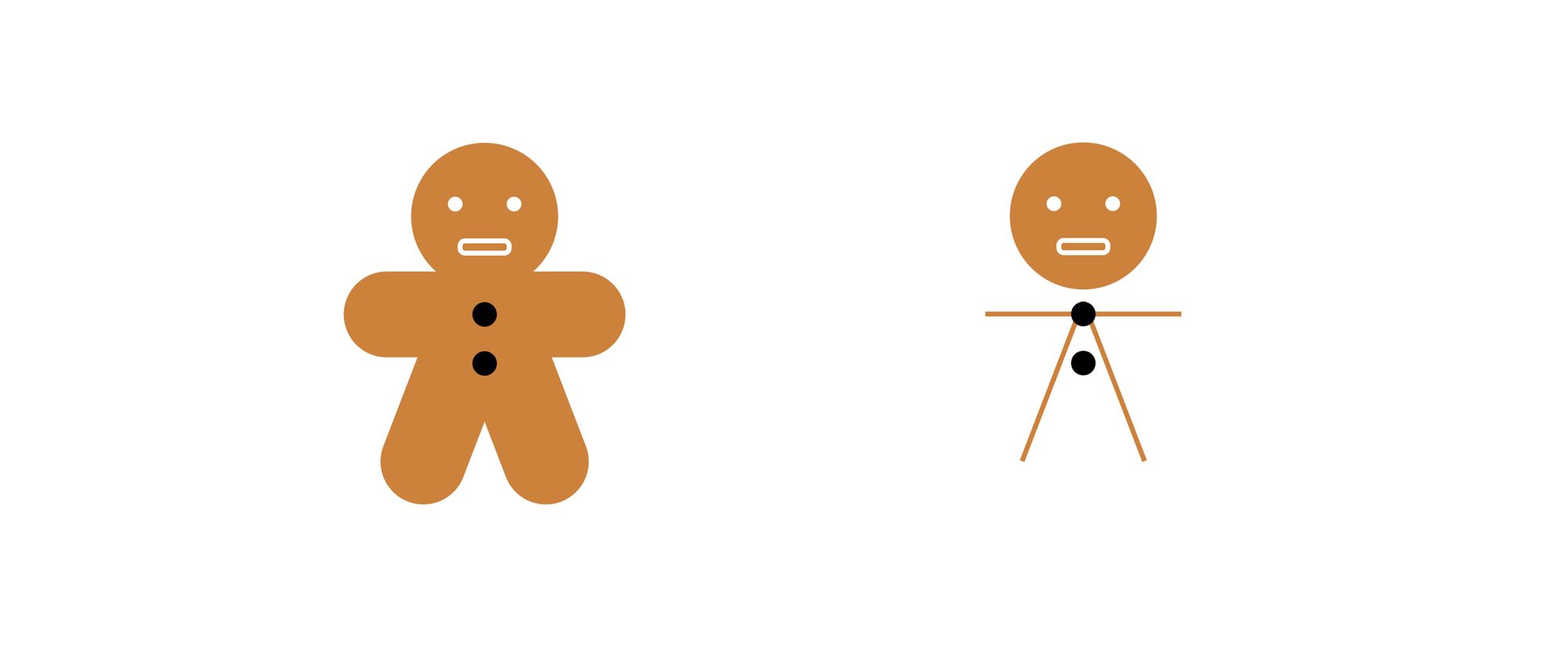 Gingerbread figure example. On the right you can see how would it look if the
 stroke-width were one
<svg class="gingerbread" width="200" height="200" viewBox="-100 -100 200 200">
  <circle class="body" cx="0" cy="-50" r="30" />

  <circle class="eye" cx="-12" cy="-55" r="3" />
  <circle class="eye" cx="12" cy="-55" r="3" />
  <rect class="mouth" x="-10" y="-40" width="20" height="5" rx="2" />

  <line class="limb" x1="-40" y1="-10" x2="40" y2="-10" />
  <line class="limb" x1="-25" y1="50" x2="0" y2="-15" />
  <line class="limb" x1="25" y1="50" x2="0" y2="-15" />

  <circle class="button" cx="0" cy="-10" r="5" />
  <circle class="button" cx="0" cy="10" r="5" />
</svg>
.gingerbread .body {
  fill: #cd803d;
}

.gingerbread .eye {
  fill: white;
}

.gingerbread .mouth {
  fill: none;
  stroke: white;
  stroke-width: 2px;
}

.gingerbread .limb {
  stroke: #cd803d;
  stroke-width: 35px;
  stroke-linecap: round;
}
We already saw the fill and some of the stroke properties, but here’s another one – the stroke-linecap. This can make our line cap round.
Note that the legs and the arms are simple lines here. If we remove the line cap and set a smaller stroke-width, then we can see that these are simple lines. But by setting a thick stroke width and a round line cap we can shape legs and arms for our figure.
Also note the rx property at the rectangle defining the mouth. This will make the edges round. You can think of it as border-radius if you like.
How to Make a Star with SVG
Let’s move on to a star. A star is a simple shape, so we can define it as a bunch of polygons and set each point individually. But then we would need to know each coordinate.
Instead of that, we can just define one wing as a group, then repeat it five times with a rotation to get the star's shape. We use the transform attribute to set a rotation.
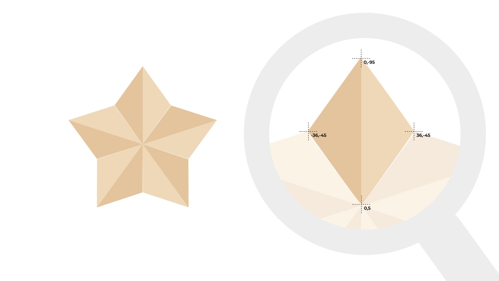 Star shape made out of transformed polygons. On the right we can see the coordianates of one arm of the star
<svg width="200" height="200" viewBox="-100 -100 200 200">
  <g transform="translate(0 5)">
    <g>
      <polygon points="0,0 36,-50 0,-100" fill="#EDD8B7" />
      <polygon points="0,0 -36,-50 0,-100" fill="#E5C39C" />
    </g>
    <g transform="rotate(72)">
      <polygon points="0,0 36,-50 0,-100" fill="#EDD8B7" />
      <polygon points="0,0 -36,-50 0,-100" fill="#E5C39C" />
    </g>
    <g transform="rotate(-72)">
      <polygon points="0,0 36,-50 0,-100" fill="#EDD8B7" />
      <polygon points="0,0 -36,-50 0,-100" fill="#E5C39C" />
    </g>
    <g transform="rotate(144)">
      <polygon points="0,0 36,-50 0,-100" fill="#EDD8B7" />
      <polygon points="0,0 -36,-50 0,-100" fill="#E5C39C" />
    </g>
    <g transform="rotate(-144)">
      <polygon points="0,0 36,-50 0,-100" fill="#EDD8B7" />
      <polygon points="0,0 -36,-50 0,-100" fill="#E5C39C" />
    </g>
  </g>
</svg>
In this example, each wing consists of two polygons. They need to be rotated the same way, so we can group them with a g tag and rotate them together.
You can think of the g tag as the div tag in HTML. On its own, it does not represent anything. But it can contain other elements and attributes defined on the group tag apply to its children.
Groups can be embedded. With the outer group we translate the whole star downwards by 5 units.
How to Make a Snowflake with SVG
Grouping elements is a nice trick, but we had to repeat the same code for each wing five times.
Instead of repeating the same code over and over again, we can also create a definition for a shape and reuse it by id. Here we define a branch of a snowflake then use it six times with different rotations.
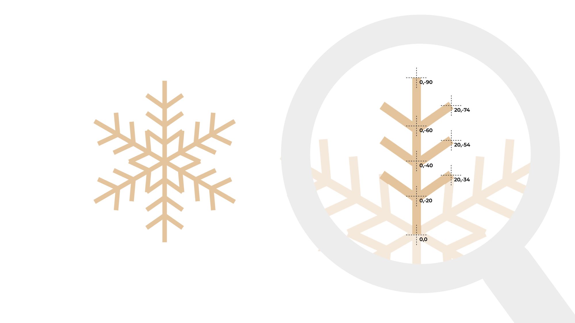 Snowflake made out of reused image elements. On the right we can see the coordainates use for an arm
<svg width="200" height="200" viewBox="-100 -100 200 200">
  <defs>
    <path
      id="branch"
      d="
        M 0 0 L 0 -90
        M 0 -20 L 20 -34
        M 0 -20 L -20 -34
        M 0 -40 L 20 -54
        M 0 -40 L -20 -54
        M 0 -60 L 20 -74
        M 0 -60 L -20 -74"
      stroke="#E5C39C"
      stroke-width="5"
    />
  </defs>

  <use href="#branch" />
  <use href="#branch" transform="rotate(60)" />
  <use href="#branch" transform="rotate(120)" />
  <use href="#branch" transform="rotate(180)" />
  <use href="#branch" transform="rotate(240)" />
  <use href="#branch" transform="rotate(300)" />
</svg>
The branch is defined as a path. The path is the most powerful SVG tag. We can define pretty much anything with paths, and if you open any SVG file, you will see mostly paths.
The shape of the path is defined by the d attribute. Here we define several drawing commands. A command always starts with a letter defining the command type and ends with a coordinate.
Here we only have the two most simple commands, move to (M) and line to (L). The move to command moves the cursor to a point without drawing a line and the line to command draws a straight line from the previous point.
A command always continues the previous command, so when we draw a line we only define the endpoint. The starting point will be the previous command’s endpoint.
This path is a bit unusual because there are several move to commands in it to draw the main branch and each side branch with the same path.
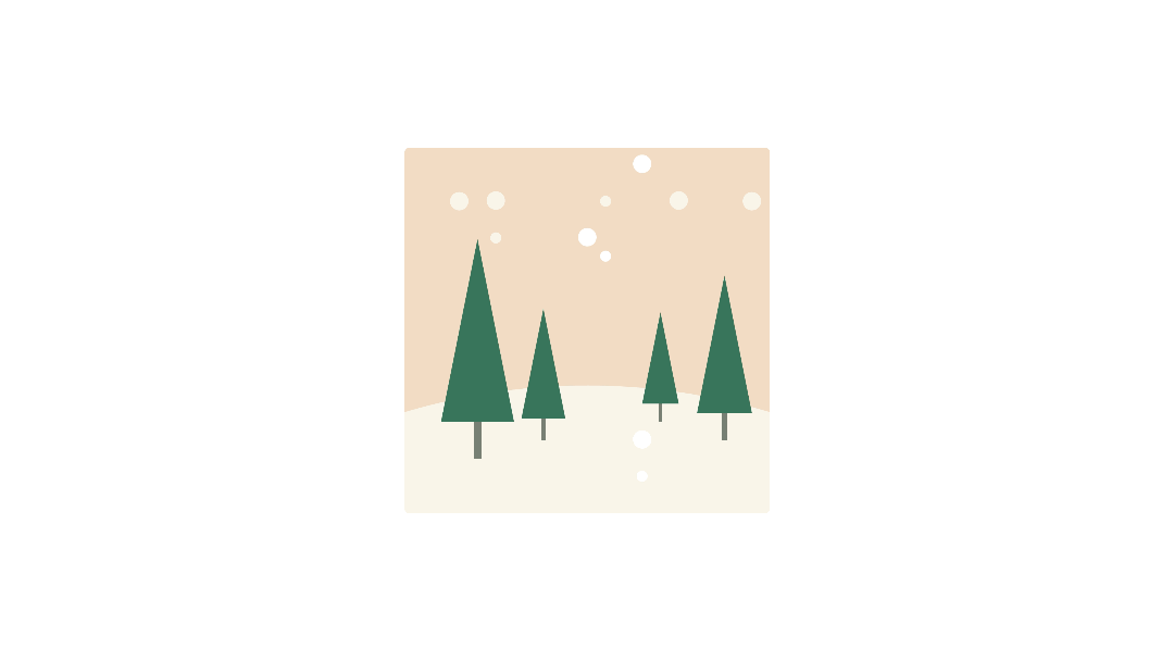
How to Draw a Forest with SVG
Rotation is not the only way we can generate images from simple shapes. In this example, we define a tree shape and then place it at various positions in different sizes to draw a forest.
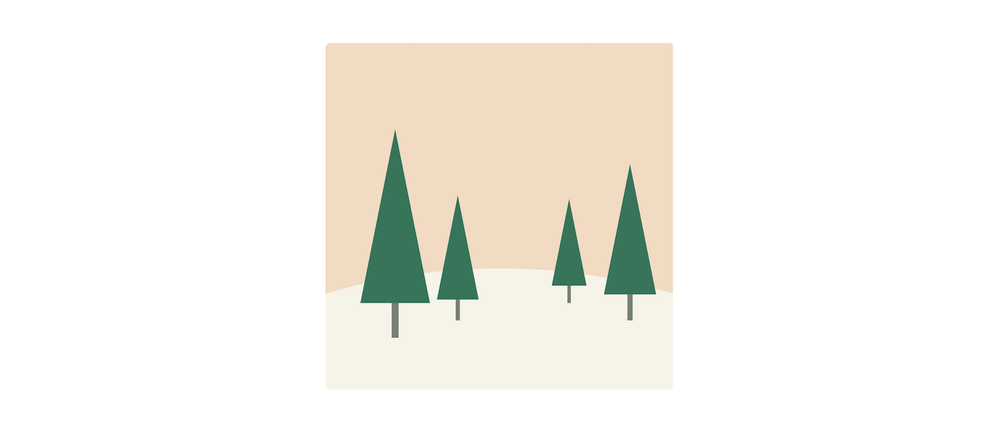 Forest made out of reused image elements
First, we create a background out of a rectangle and a circle. Then we define a tree shape from a simple polygon and a line.
Then we can reuse it in a similar way as we did in the snowflake example. We move it to the defs section, wrap it into a group element, set an ID for it, and then reuse it with the use element.
Here we also position the reused elements by setting an x and y coordinate and to add some perspective to the image we use the scale transformation.
<svg width="200" height="200" viewBox="-100 -100 200 200">
  <defs>
    <g id="tree">
      <polygon points="-10,0 10,0 0 -50" fill="#38755b" />
      <line x1="0" y1="0" x2="0" y2="10" stroke="#778074" stroke-width="2" />
    </g>
  </defs>

  <rect x="-100" y="-100" width="200" height="200" fill="#F1DBC3" />
  <circle cx="0" cy="380" r="350" fill="#F8F4E8" />

  <use href="#tree" x="-30" y="25" transform="scale(2)" />
  <use href="#tree" x="-20" y="40" transform="scale(1.2)" />
  <use href="#tree" x="40" y="40" />
  <use href="#tree" x="50" y="30" transform="scale(1.5)" />
</svg>
How to Make a Curvy Tree with SVG
The path element becomes really powerful when we start using curves. One of them is the quadratic Bézier curve that not only defines an endpoint for a segment but also has a control point. The control point is an invisible coordinate towards which the line is bending, but not touching it.
 Christmas Tree made using Quadratic Bézier curves
<svg width="200" height="400" viewBox="-100 -200 200 400">
  <path
    d="
      M 0 -80
      Q 5 -75 0 -70
      Q -10 -65 0 -60
      Q 15 -55 0 -50
      Q -20 -45 0 -40
      Q 25 -35 0 -30
      Q -30 -25 0 -20
      Q 35 -15 0 -10
      Q -40 -5 0 0
      Q 45 5 0 10
      Q -50 15 0 20
      Q 55 25 0 30
      Q -60 35 0 40
      Q 65 45 0 50
      Q -70 55 0 60
      Q 75 65 0 70
      Q -80 75 0 80
      Q 85 85 0 90
      Q -90 95 0 100
      Q 95 105 0 110
      Q -100 115 0 120
      L 0 140
      L 20 140
      L -20 140"
    fill="none"
    stroke="#0C5C4C"
    stroke-width="5"
  />
</svg>
Here we have a series of quadratic Béziers curves (Q) where the control points get further and further away from the center of the tree as the path goes down.
How to Make a Bell with SVG
While the quadratic bezier curve (Q) is great when we want to bend a line, often it’s not flexible enough.
With a cubic Bezier (C), we not only one have one control point but two. The first control point sets the initial direction of the curve and the second one defines from which direction the curve should arrive to its endpoint.
If these directions match the directions of the line before and the line after the curve, then we have a smooth transition between the path segments.
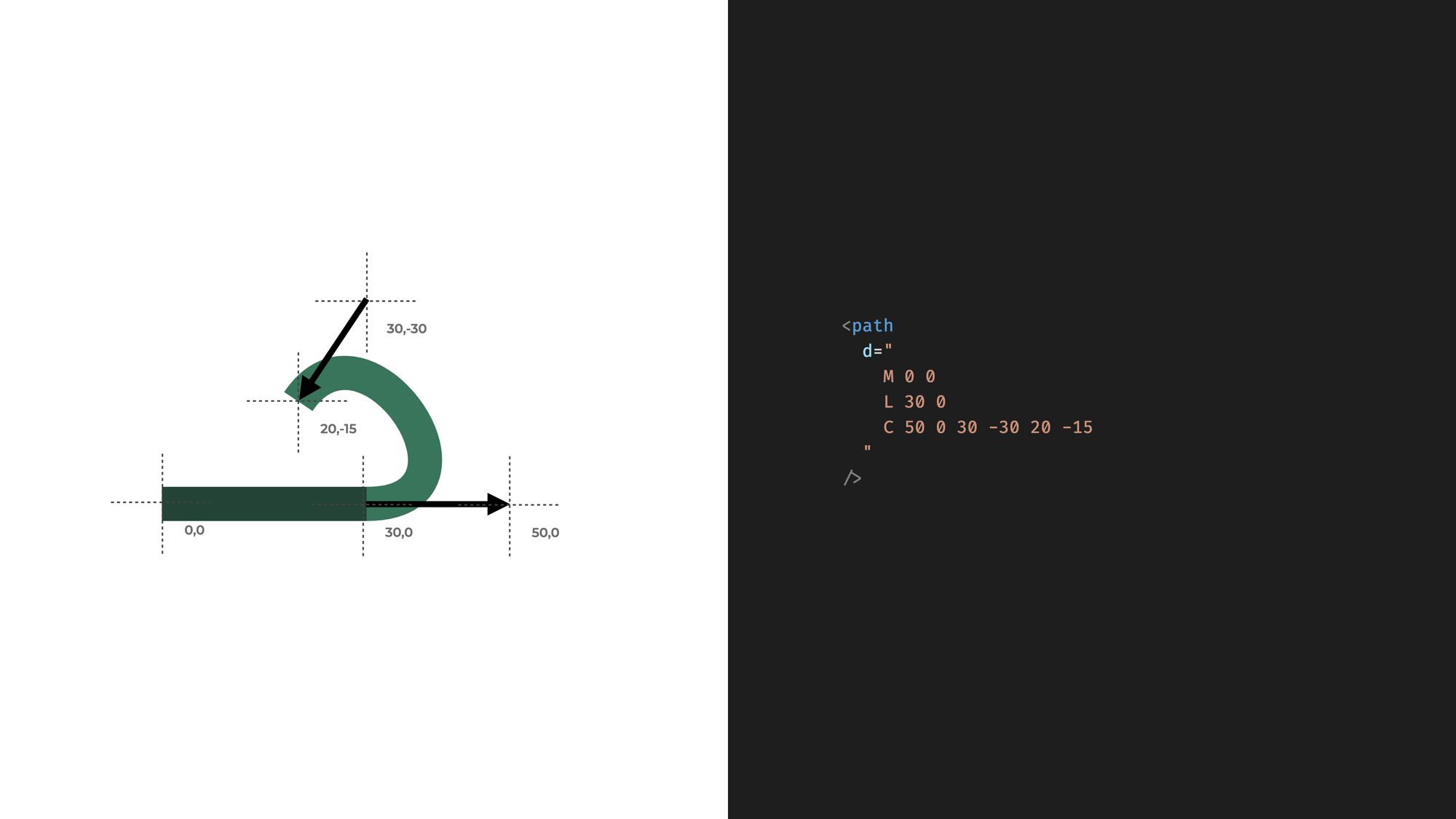 With Cubic Bézier curves we can set two control points
The next example uses both quadratic and cubic Béziers to form a bell. Here the bottom of this bell is defined with straight lines. Then a quadratic Béziers starts the bell cloak. Next a cubic Bezier smoothly continues the quadratic bezier as it forms the top of the bell. Then we reach the bottom part with another quadratic bezier.
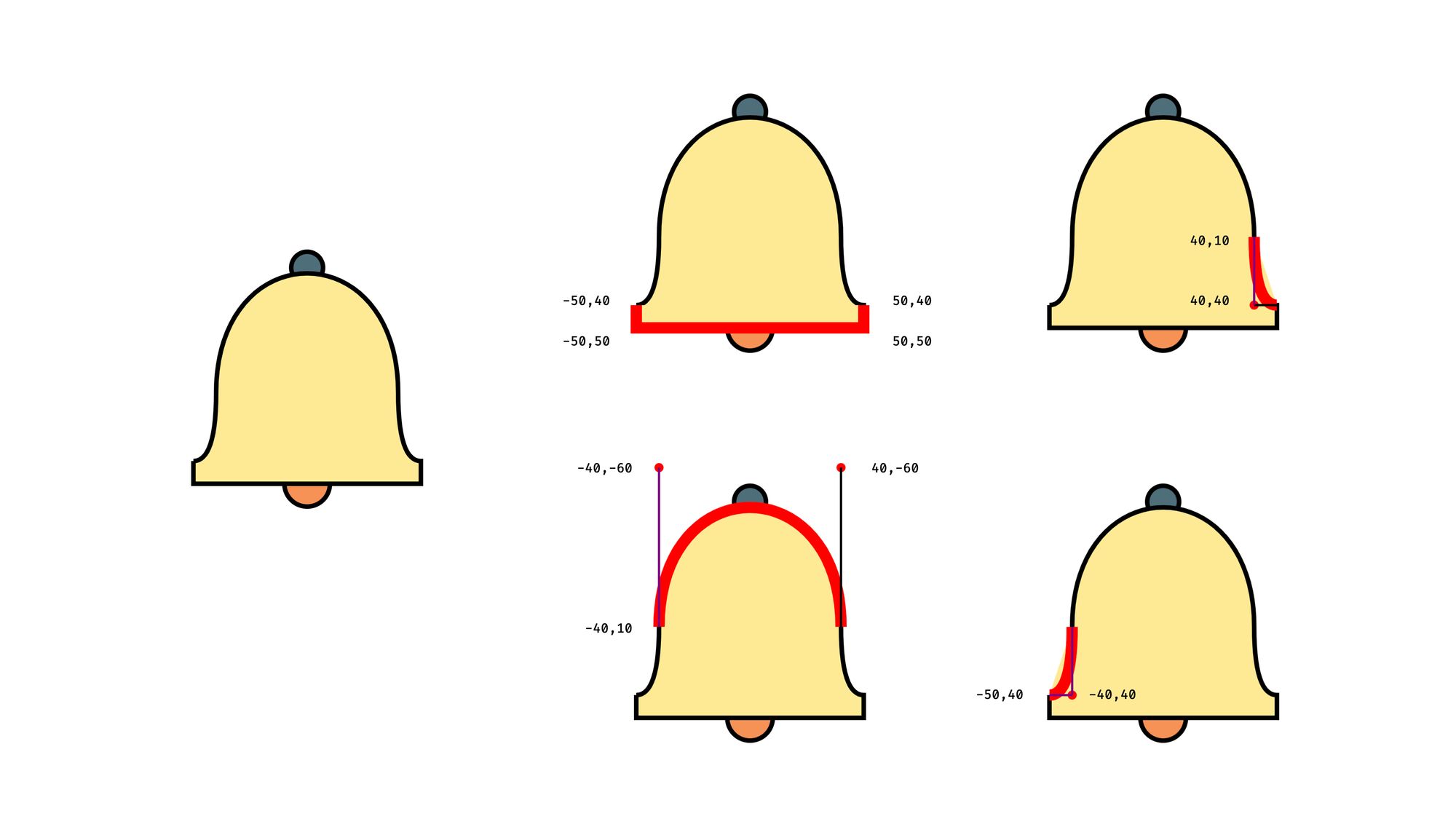 Bell example made out of different curves and straight lines
<svg width="200" height="200" viewBox="-100 -100 200 200">
  <g stroke="black" stroke-width="2">
    <circle cx="0" cy="-45" r="7" fill="#4F6D7A" />
    <circle cx="0" cy="50" r="10" fill="#F79257" />
    <path
      d="
        M -50 40
        L -50 50
        L 50 50
        L 50 40
        Q 40 40 40 10
        C 40 -60 -40 -60 -40 10
        Q -40 40 -50 40"
      fill="#FDEA96"
    />
 </g>
</svg>
How to Write Text Along a Path
Drawing shapes is not the only use case for paths. We can also use them to render text along an invisible path. We can define a path in the definitions section and use it in a textPath element to make the text go around the circle. Here we use arc again, but you can use any other path and the text will follow the stroke.
 With the
 text-path property we can make a text follow a path
<svg width="200" height="200" viewBox="-100 -100 200 200">
  <defs>
    <path id="text-arc" d="M 0, 50 A 50 50 0 1 1 1,50" />
  </defs>

  <text
    fill="#0c5c4c"
    font-family="Tahoma"
    font-size="0.77em"
    font-weight="bold"
  >
    <textPath href="#text-arc">
      Happy Holidays! Happy Holidays! Happy Holidays!
    </textPath>
  </text>
</svg>
How to Animate an SVG with CSS
To continue our forest example, we can add a snowing effect with a similar animation. We can animate the transform property from CSS.
 Animation effect made with SVG and CSS
We extend our forest example with simple reusable snowflakes and add a bunch of them to the scene with various CSS classes to set some variation in speed and appearance. Then we add animation in CSS to make them look like falling snow. It’s a bit glitchy and not the most sophisticated animation, but you get the idea.
<svg width="200" height="200" viewBox="-100 -100 200 200">
  <defs>
    <g id="tree">
      <polygon points="-10,0 10,0 0 -50" fill="#38755b" />
      <line x2="0" y2="10" stroke="#778074" stroke-width="2" />
    </g>
    <circle id="big" cx="0" cy="0" r="5" fill="white" />
    <circle id="small" cx="0" cy="0" r="3" fill="white" />
  </defs>

  <rect x="-100" y="-100" width="200" height="200" fill="#F1DBC3" />
  <circle cx="0" cy="380" r="350" fill="#F8F4E8" />

  <use href="#tree" x="-30" y="25" transform="scale(2)" />
  <use href="#tree" x="-20" y="40" transform="scale(1.2)" />
  <use href="#tree" x="40" y="40" />
  <use href="#tree" x="50" y="30" transform="scale(1.5)" />

  <use href="#big" x="0" y="0" class="flake fast" />
  <use href="#big" x="-50" y="-20" class="flake fast opaque" />
  <use href="#big" x="30" y="-40" class="flake fast" />
  <use href="#big" x="50" y="-20" class="flake fast opaque" />
  <use href="#big" x="30" y="50" class="flake slow" />
  <use href="#big" x="-70" y="-80" class="flake slow opaque" />
  <use href="#big" x="30" y="50" class="flake slow" />
  <use href="#big" x="90" y="-80" class="flake slow opaque" />
  <use href="#small" x="10" y="-50" class="flake slow" />
  <use href="#small" x="-50" y="-60" class="flake slow opaque" />
  <use href="#small" x="30" y="70" class="flake slow" />
  <use href="#small" x="10" y="-80" class="flake slow opaque" />
</svg>
.flake {
  animation-duration: inherit;
  animation-name: snowing;
  animation-iteration-count: infinite;
  animation-timing-function: linear;
}

.flake.opaque {
  opacity: 0.7;
}

.flake.slow {
  animation-duration: 5s;
}

.flake.fast {
  animation-duration: 3s;
}

@keyframes snowing {
  from {
    transform: translate(0, -100px);
  }
  to {
    transform: translate(0, 100px);
  }
}
How to Make a Clock That Shows the Actual Time
SVG elements can be manipulated from JavaScript the same way as any other HTML tag.
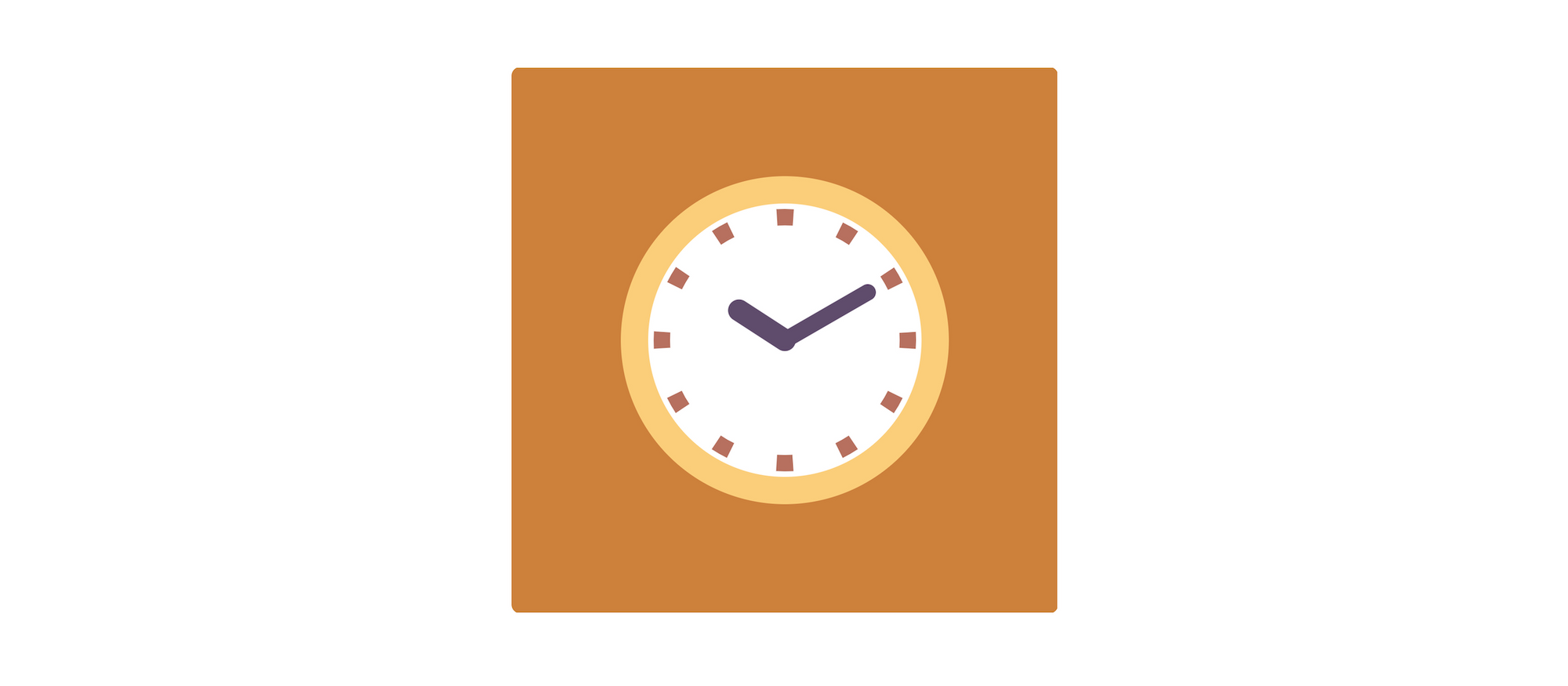 Clock example made with SVG and JavaScript
In this example, we are using a short code snipped to show the actual time on a clock. We access the hour and minute hands in JavaScript with getElementById then set their transform attribute with a rotation that reflects the current time. Below you see the actual SVG showing the current time.
For a more detailed tutorial on how to make a clock with SVG and JavaScript, check out How to Code an Animated Watch.
<svg width="200" height="200" viewBox="-100 -100 200 200">
  <rect x="-100" y="-100" width="200" height="200" fill="#CD803D" />

  <circle r="55" stroke="#FCCE7B" stroke-width="10" fill="white" />

  <circle
    r="45"
    stroke="#B6705F"
    stroke-width="6"
    stroke-dasharray="6 17.56194490192345"
    stroke-dashoffset="3"
    fill="none"
  />

  <g stroke="#5f4c6c" stroke-linecap="round">
    <line id="hours" y2="-20" stroke-width="8" />
    <line id="minutes" y2="-35" stroke-width="6" />
  </g>
</svg>
window.addEventListener("DOMContentLoaded", () => {
  const hoursElement = document.getElementById("hours");
  const minutesElement = document.getElementById("minutes");

  const hour = new Date().getHours() % 12;
  const minute = new Date().getMinutes();

  hoursElement.setAttribute("transform", `rotate(${(360 / 12) * hour})`);
  minutesElement.setAttribute("transform", `rotate(${(360 / 60) * minute})`);
});
How to make a Data-driven Diagram with SVG and React
SVGs also work well with frontend libraries. Here’s an example of a React component that generates a data-driven diagram.
In this example we have two things. We are generating a list of rectangles to create a column diagram based on some arbitrary data. And we also generate a series of coordinates for a polyline.
 We can use JavaScript to generate a Data-Driven Diagram
For simple use cases, you can code your own diagram like this. But if you need more complex diagrams then check out the D3 library. The D3 library uses SVG under to hood to create all sorts of diagrams.
function Diagram() {
  const dataPoints = [3, 4, 7, 5, 3, 6];
  const sineWave = Array.from({ length: 115 })
    .map((item, index) => `${index - 55},${Math.sin(index / 20) * 20 + 10}`)
    .join(" ");

  return (
    <svg width="200" height="200" viewBox="-100 -100 200 200">
      {dataPoints.map((dataPoint, index) => (
        <rect
          key={index}
          x={index * 20 - 55}
          y={50 - dataPoint * 10}
          width="15"
          height={dataPoint * 10}
          fill="#CD803D"
        />
      ))}

      <polyline points={sineWave} fill="none" stroke="black" stroke-width="5" />
    </svg>
  );
}
Next Steps – Making SVGs Interactive with JavaScript
Under the hood, SVGs can be quite confusing at first. Lots of coordinates, letters and strange parameters. Once you understand their foundations, though, you can use them to your advantage and start coding images.
And we are just getting started. Adding JavaScript to the mix will introduce a whole new level.
For more examples check out svg-tutorial.com or my YouTube tutorial with 12 more examples on how to use SVGs for your next project!