By Petr Gazarov
I was recently asked by a designer to create a text input style like the search input on TripAdvisor. I liked it a lot. I’m going to share my solution as a step-by-step guide so you can build it yourself.
The implementation involves both CSS and JavaScript. For our version, I’m going to assume you have a basic knowledge of SCSS and React.
Here is the finished CodePen:
Let’s build it
First, we will create a simple React component and render it to the DOM:
class App extends React.Component {
  render() {
    return (
      <div className='input-wrapper'>
        <input
          placeholder='Search...'
          spellCheck={false}
        />
      </div>
    );
  }
}

ReactDOM.render(
  <App />,
  document.getElementById('root')
);
Add some CSS to it:
$input-font-size: 30px;
$input-line-height: 70px;
$font-family: Roboto Slab, sans-serif;

body {
  background-color: #222222;
}

.input-wrapper {
  width: 500px;
  margin: 50px auto;
}

input {
  height: 60px;
  width: 100%;
  min-width: 100%;
  padding: 0;
  border-radius: 0;
  line-height: $input-line-height;
  background-color: transparent;
  color: white;
  font-size: $input-font-size;
  border: none;
  outline: none;
  border-bottom: 3px solid #333333;
  font-family: $font-family;
}
Add an HTML container for ReactDOM to render into:
<div id="root"></div>
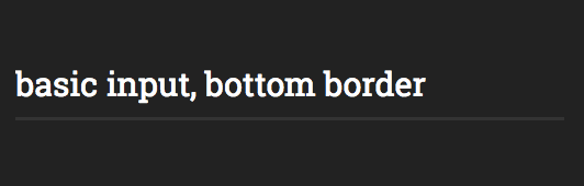
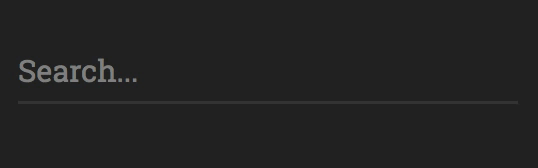
This gets us the basic text input with bottom border.
Now let’s add life to the border!
The difficulty with implementing the highlight is that the width needs to be level with the end of the text. It also needs to work with any font-family and font-size.
Since the input element width is fixed, we need some other trick to detect where the end of the text is at any given time.
Let’s say we can use a second element with dynamic width — in our example it will be a span element with input-highlight class. Next, we will copy the input text and place it inside of the span.
I switched the input from uncontrolled to controlled, by providing a value prop.
Our React component now looks like this:
class App extends React.Component {
  render() {
    return (
      <div className='input-wrapper'>
        <input
          placeholder='Search...'
          spellCheck={false}
          value='basic input, bottom border'
        />
        <span className='input-highlight'>
          basic input, bottom border
        </span>
      </div>
    );
  }
}
Add the following CSS rules for input-highlight
Note: we use SCSS variables here to make sure the font properties are the same between input and span:
.input-highlight {
  font-size: $input-font-size;
  line-height: $input-line-height;
  font-family: $font-family;
  max-width: 100%;
}
This got us here:
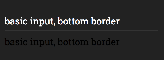
Next, let’s add a top border on the span and position it so its border superimposes input’s bottom border. Also, since input-highlight now has position: absolute, the parent element will need the position: relative rule.
.input-highlight {
  font-size: $input-font-size;
  line-height: $input-line-height;
  font-family: $font-family;
  max-width: 100%;

  border-top: 3px solid white;
  position: absolute;
  left: 0;
  bottom: 0;
  height: 0;
}

.input-wrapper {
  width: 500px;
  margin: 50px auto;
  position: relative;
}
 Cool, right?
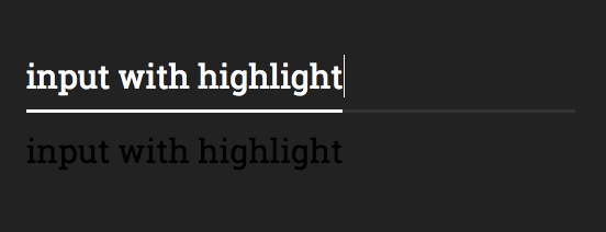
The span element ends with the text. This makes its width a perfect measure of the width of the text in the input!
Now, the easy part: let’s use JavaScript to update the text in the span every time input contents changes. We will use React state to update the value of both input and span simultaneously.
Here is our updated component:
class App extends React.Component {
  constructor() {
    super();

    this.state = {
      inputValue: ''
    };

    this.onInputChange = this.onInputChange.bind(this);
  }

onInputChange(e) {
    const { value } = e.target;

    this.setState({
      inputValue: value
    });
  }

render() {
    const { inputValue } = this.state;

    return (
      <div className='input-wrapper'>
        <input
          onChange={this.onInputChange}
          placeholder='Search...'
          value={inputValue}
          spellCheck={false}
          />
        <span className='input-highlight'>
          { inputValue.replace(/ /g, "\u00a0") }
        </span>
      </div>
    );
  }
}
The .replace(/ /g, "\u00a0") part is necessary for React to deal with spaces properly.
Then, hide the span by adding the following lines to theinput-highlight CSS selector:
color: transparent;
user-select: none;
overflow: hidden;
We need the overflow: hidden on the span in order to limit its width (otherwise it will cause the container to stretch horizontally — thanks Prasanna and Andrea for pointing it out in the comments!)
Finishing it up
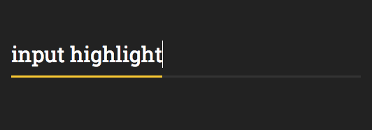
It already works very nicely. The last touch is adding a different onFocus color for the highlight.
To accomplish this, we need a way to style the span based on the focus state of the input. The input and span are siblings, so we will be using CSS sibling selector(+).
Here is the code for the full input selector, including the sibling selector for input-highlight:
input {
  height: 60px;
  width: 100%;
  min-width: 100%;
  padding: 0;
  border-radius: 0;
  line-height: $input-line-height;
  background-color: transparent;
  color: white;
  font-size: $input-font-size;
  border: none;
  outline: none;
  border-bottom: 3px solid #333333;
  font-family: $font-family;

  &:focus {
    + .input-highlight {
      border-top: 3px solid #fbc91b;
    }
  }
}
Thanks for sticking around! If you like this post, share it with more people by recommending it.