

As designers, colour is a huge component of our work. But many of us struggle with the usage of colours in our designs.
In this article, you will learn about the 60-30-10 colour rule, how it's used, and see a practical example of it.
What is the 60-30-10 rule?
In the design world, the 60-30-10 rule is a rule that helps to guide designers on choosing and pairing colours for their designs.
To put it simply, this rule says that the dominant/primary colour should take up 60% of your design, the secondary colour should take up 30%, while an accent colour should take up 10% of your design.
Why is This Rule so Important?
- Emphasizing Key Elements: The 60-30-10 rule is great at emphasizing key elements in your design. The dominant colour draws attention to large surfaces and establishes the overall mood of the design. The secondary colour supports it, while the accent colour at 10% highlights specific features or parts of the design.
- Visual Balance: To achieve visual balance in a design, one colour/element should not overpower the others. The 60-30-10 rule ensures that there is a sense of equilibrium and balance, by allocating percentages to each colour.
- Simplicity and Consistency: Having 3 established colours simplifies the design process. It narrows down your choices and prevents overwhelming combinations of colours.
How to Choose Colours for Your Designs
The 60-30-10 rule has three components:
- The Primary Colour: This is the dominant colour of the design. It forms the foundation of the colour scheme and covers the majority of the design (60%). The primary colour is typically a neutral colour and is often used as the background of the design. Colours like white, blue, beige, and so on can be used as primary colours.
- The Secondary Colour: This colour supports the dominant colour and adds more visual interest to the design. It covers about 30% of the design. The secondary colour can be used for typography, icons, and subheadings/subtitles in a design. Colours like teal, black, dark blue, and others can be used as secondary colours.
- The Accent Colour: This colour usually covers about 10% of the design. It helps highlights specific sections of the design like buttons, call-to-action elements, or any element that needs emphasis in a design. Accent colours are usually colours that have high contrast. Colours like yellow, orange, light green, and others make good accent colours.
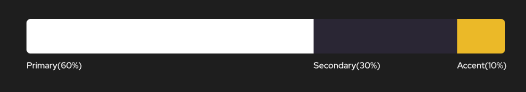 Illustration of the 60-30-10 rule
It's important to choose colours that complement each other for your designs. This will contribute to the overall aesthetics and create a dynamic and engaging visual experience.
If you are worried about what colours to use while designing, you can always check out free colour palette generators. Some colour palette generators you try out include:
Example Hero Page Using the 60-30-10 Rule
I designed an hero page to give an illustration of how the rule works.
Step 1- Choosing a Frame
I had to choose what desktop frame I wanted to use for the hero page. I chose Macbook Air.
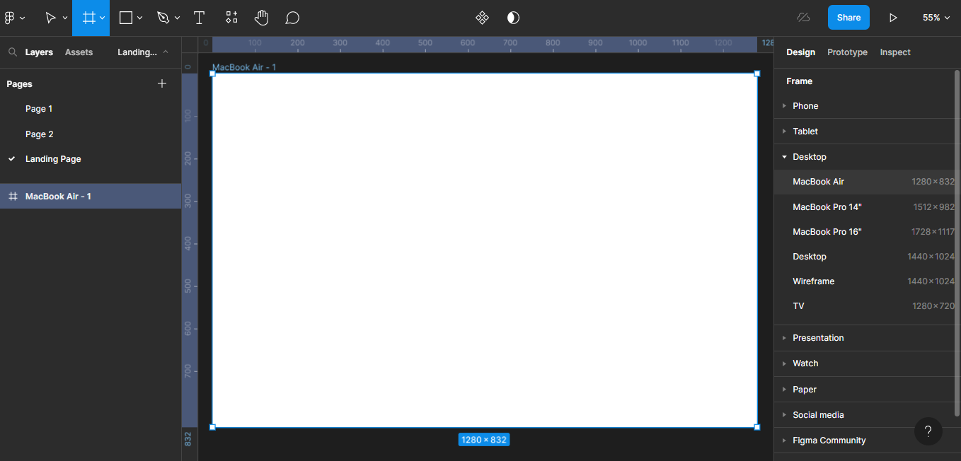 Macbook Air Desktop frame
Step 2- Adding a Grid
Next, I added a grid to the frame. I used these specifications: Columns-12, Margin-100.
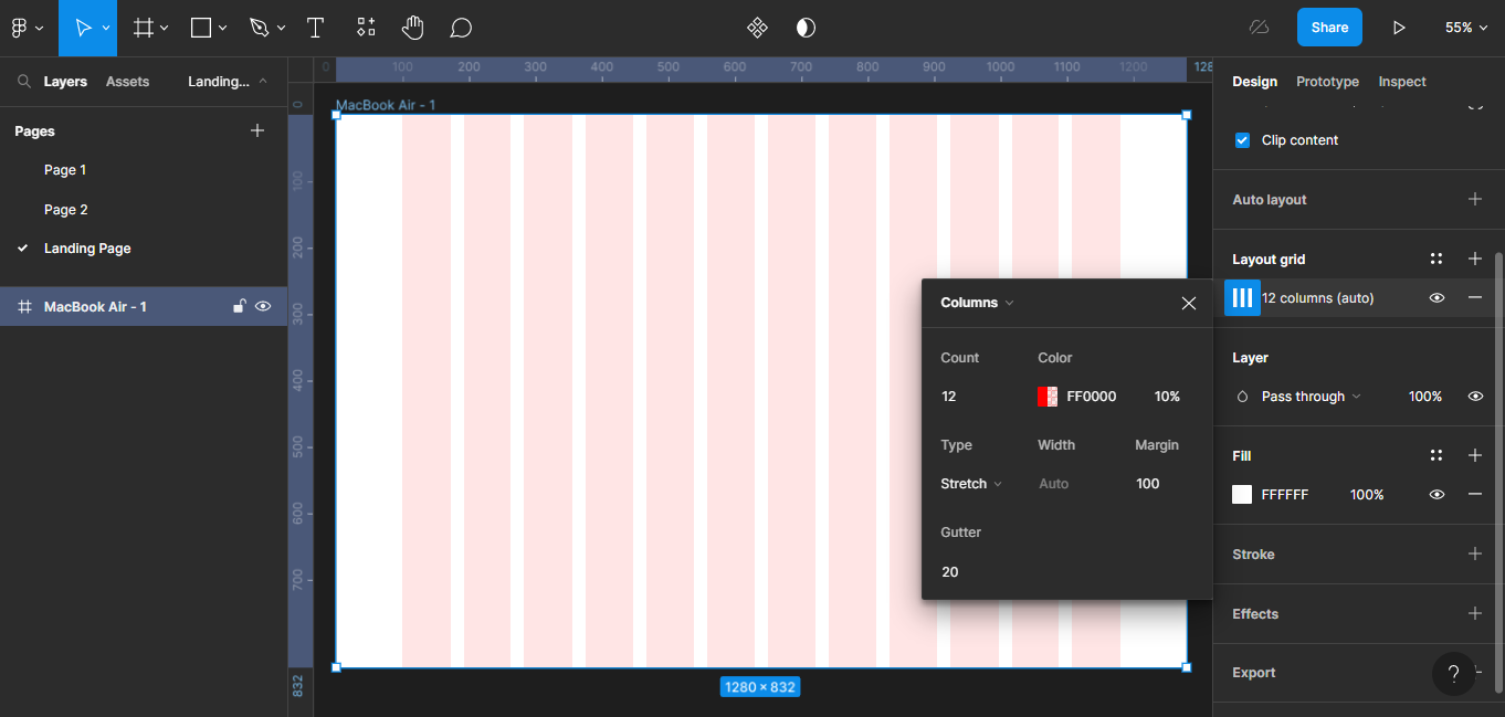 Adding the Grid
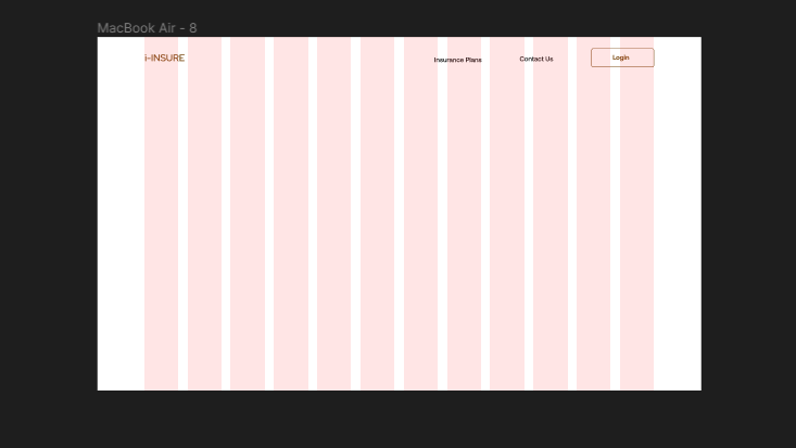
Step 3- Adding Content
Next up, I added the logo and the navigation bar.
 Adding the logo and nav bar
I already knew how I wanted the structure of my hero page to look like, so I just added the rest of my design content.
 My Completed Hero Page Illustrating the 60-30-10 Rule.
For the design above:
- My primary colour is white. It covers the background of the design. It enhances readability and legibility of other elements in the design. Also, I chose white because it's a neutral colour, as I mentioned earlier.
- My secondary colour is a saturated black. It supports the primary colour, and is used for text and typography.
- My accent colour is a shade of brown. It adds some pop, and provides some contrast in the design.
Conclusion
The 60-30-10 rule is used in different design sectors because of how useful it is to designers. Also, it is not a strict requirement and can be adjusted to suit individual preferences and design goals.
By following the 60-30-10 rule, you can achieve a well-balanced color scheme that ensures visual interest and coherence in your design. Basically, just choose:
- Your primary colour – a neutral colour,
- Your secondary colour – a colour that supports the primary colour, and
- Your accent colour – a colour that pops!
Whatever colours you decide to use for your design depend on the design objectives and the overall aesthetic you want to achieve. Remember that mastery of colours come with adequate practice. So make sure to practice more and you will see a lot of improvement in your usage of colours.