by Colm Tuite
The Design Tool Dilemma
A detailed look at two opposing narratives emerging in the design tool space.
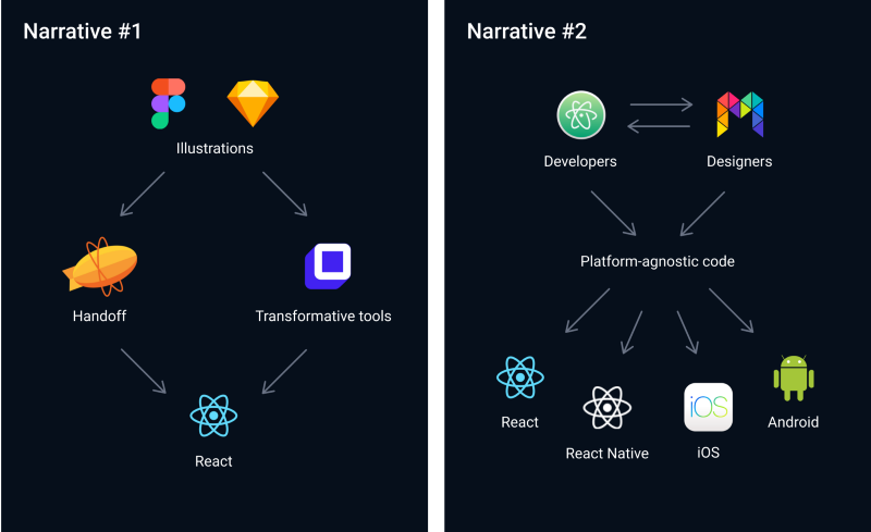
There are two opposing narratives in the design tool space which have been evolving for many years. These narratives reflect two very different schools of thought when it comes to understanding the specific value our tools provide and which direction they should be headed.
The first narrative is selling the notion that design artefacts can and should be the Single Source of Truth™ for the product. In this narrative, code is secondary—its job is to reproduce the design artefacts as accurately as possible. Platform constraints are mostly ignored in favour of speed and boundless creativity.
Let’s call this the “bridging the gap” narrative.
The second narrative is centered around the idea that everyone collaborating on a product can and should be contributing to that same product. In this narrative, code is everything—it is the product. Platform constraints are respected and understood. Decisions are made in context and tools embrace their target mediums.
We will call this the “collaborative” narrative.
So where did these narratives come from? How much sense does each one make? Let’s take a closer look.
Narrative #1: Bridging the gap
For as long as digital designers have used design tools, we have always had a burning desire to have our ideas realised in production. To own the design process from idea to deployment has always been the holy grail. If you look at the evolutionary timeline of our design tools, you can see this desire manifesting itself.
Around 2005, when my digital design career began, most of us were using either Illustrator or Photoshop to create vector-based illustrations of whatever product we were designing. This remained the status quo for many years—with most design job postings demanding fluency in Adobe’s Creative Suite.
Until one day, in 2010, Sketch arrived and shook the tree. Sketch was simpler, cheaper and much more focused. Of course, designers fought it at first, but ultimately found its clean UI and refined feature set refreshing.
Then more recently, Figma arrived. Figma expanded on the revolution that Sketch started. The feature set is very similar, but in terms of execution, I don’t think it’s close. Almost every feature has been surprisingly well implemented. Shockingly well, even.
Prototyping tools added an extra layer of realism—taking the static pictures our design tools exported and stitching them together, simulating touch events and screen transitions.
But there was still an observable gap to be bridged between design and development workflows. How could we take the next step?
The controversial “Developer Handoff”, of course. InVision and Abstract launched “Inspect”. Avocode, Marvel and Zeplin released “Handoff”. Figma and Sketch attempted to export CSS. The idea being that when designers had something worth sharing, they could hand their work off to developers in a format that developers understood.
The most recent notch on this timeline has been a new breed of tools promising to convert static pictures into production code. Supernova Studio, Rapid UI, PageDraw, Teleport, Sketch2React and Anima Launchpad are just a handful of the startups leading this charge.
At first glance, you may not notice anything unusual about this timeline. Our tools have just been improving exponentially, as one might expect. They’re becoming more performant, more robust, and more feature-rich. If you limit your outlook to the past 10 years, this all seems like a natural progression.
But go back just a little further and you will notice something very peculiar.
Let’s journey back, for a moment, to a time when print was the primary form of marketing communication. It was a simpler time. Endless debates about tools or frameworks were kept to a minimum. Occasionally, some upstart would mention QuarkXPress but the rebellion never lasted long. Most design professionals used Illustrator, Photoshop and InDesign. Adobe ruled the roost and that was that.
Most notably though, designers were designing the end product, not imitations of it—the end product being stationery, posters, books, brand identities, brochures and other print material. Designers had direct influence over the product they were designing.
This was possible because print designers had (and still have) a good command of the medium they were designing for. There was a close correlation between input and output constraints.
For example, print designers knew there would be slight differences in how colours might be reproduced on a thick card stock as opposed to a lighter 120gsm letterhead. Designers were responsible for adding 3mm bleed and trim marks to accommodate inaccuracies in printer alignment. Designers were aware of turnaround times — they knew that fancy effects like debossing or hot foiling were more costly to reproduce.
Especially when the digital print revolution arrived, many designers began investing time and money in learning as much as they could about the print medium. Print design software embraced the medium and catered to it.
Then at some point, web design became the primary focus and millions of print designers became web designers overnight.
I’m not knocking this shift in focus. I myself made the transition from print to digital. Many of the skills graphic designers study are transferrable to other industries, and I love to see people expanding their horizons.
The issue was that we now had very little knowledge of the new medium we were designing for. Rather than spend time understanding this new medium, we tried to tame it. This became evident as we struggled to fit everything into a 960px container, referred to interfaces as “pages” and coined terms like “brochure website”.
Most designers couldn’t write code, so we did what we could: draw pictures. To do it, we used the thing that had served us well for decades before: our graphic design software.
Designers were no longer designing the end product, but imitations of it.
This paradigm shift went unaddressed for a long time, because image-based design was still very much a crucial part of designing for the web. Many of you will fondly remember creating enormous sprite sheets to hack effects like gradients and rounded corners. Rollover buttons, anyone?
Fast forward to today, though, and image-based hacks have been completely displaced by CSS. Even the use of raster images as a form of communication is subsiding in favour of more performant and/or more immersive assets like CSS animations, SVG illustrations, and video.
Today, the correlation between the web and print is about as close as the correlation between the web and architecture.
Unfortunately, our tools haven’t adapted fast enough. Our current crop of digital design tools are very much an extension of print design tools. Young designers are enthusiastically learning digital design through the lens of static drawing tools.
Sure, there have been some impressive advancements, but for the most part, they are still just vector-based drawing tools optimised for illustration. Because of this, our tools lack the context and nuance necessary to make informed design decisions.
Narrative #2: Collaboration
Rather than encourage drawing imitations of the end product, this narrative advocates taking code and making it easier to digest so that whole teams can collaborate on it.
Strangely, the origin of both narratives can be traced back to around the same time. Adobe Dreamweaver, the infamous WYSIWYG visual code editor, arrived on the scene in 1997. Softpress Freeway arrived a year earlier in 1996, and Microsoft Frontpage even earlier in 1995, just 5 years after Photoshop and more than a decade before Sketch.
Unfortunately, these tools were often more of a hindrance than a help. They were optimised for exporting to production, making them too cumbersome for the design process.
Gradually, a wave of designers, including myself, ditched the WYSIWYG editors in favour of a less restrictive design tool: the text editor.
For a long time, typing code was pretty gnarly. But over time, a healthy eco-system of tools began to sprout around code, significantly lowering the barrier-to-entry. Today, we have code-based design tools which don’t require any coding knowledge at all.
Let’s take a closer look at the evolution of code-based design tools so far.
Code formatting and syntax highlighting were some of the first “tools” focused on making code more digestible. Applying colour and structure improved readability and scannability. Recently, tools like Prettier have automated this.
Preprocessors and templating languages arrived around 2006. Tools like Haml, Sass, LESS, CoffeeScript and others improved code manageability even further by encouraging brevity, abstracting some of the visual complexity, and automating some of the more common tasks.
JSX is a JavaScript syntax extension developed by Facebook which looks not too dissimilar to the template languages that came before it. React’s component API also helps to promote reuse and abstract visual complexity, again, helping our cause of making code more digestible and accessible.
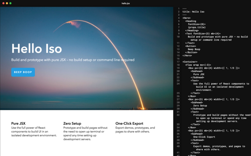
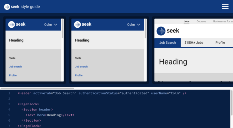
More recently, we are seeing tools remove barriers-to-entry like having to set-up dev environments and tinker with the command line etc. Compositor ISO and SEEK’s Style Guide Sandbox are doing some amazing work here.
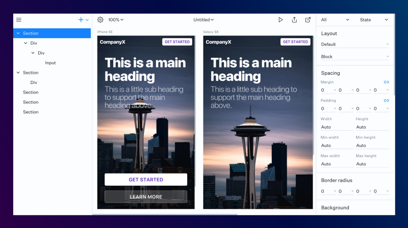
Modulz (a design tool I’m building) and UXPin are also making code more accessible by removing barriers-to-entry. These tools visualise JSX, using familiar layers to represent it and a GUI for manipulating component props.
Polypane are building a smart design environment where you can preview your designs across a multitude of browsers, devices and viewports. Another example of a workflow which considers the full context of the target medium.
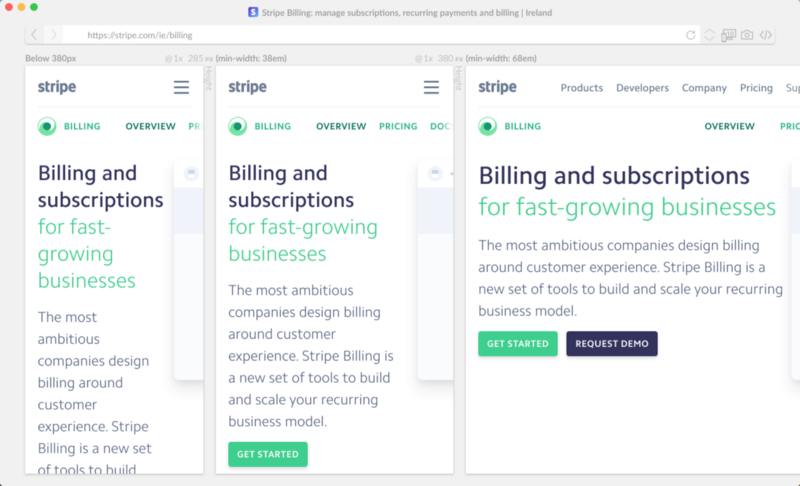
These visual code editors are simply the next step in the progression of making code easier to write. All of this innovation makes sense and is possible because a huge portion of front-end development is inherently visual.
Spoiler alert: I agree with Jason’s prediction. Browser dev tools have already begun to move in this direction, offering GUIs for visually manipulating CSS styles like transitions, shadows, and colour.
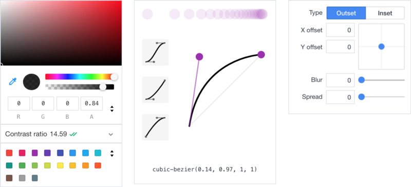
Of course, browser dev tools operate on compiled code, but these same visual tools can apply to precompiled code, too. Compositor Lab and Modulz Editor make it easy to edit React components visually.
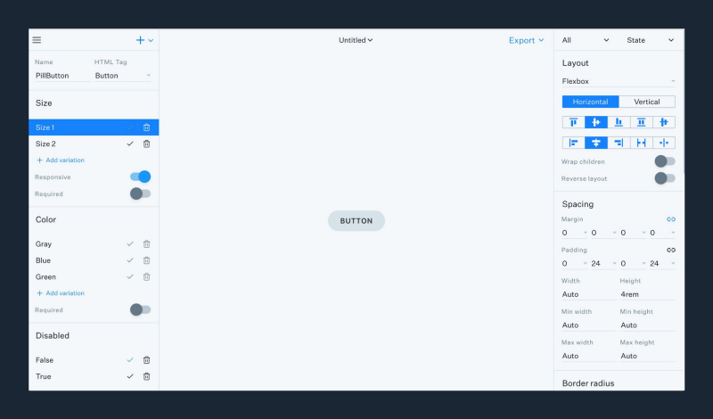
Xcode is a hugely underrated tool—allowing teams to design, develop, test and debug their products through a combination of code editing and direct manipulation.
Airbnb’s Lona is one of the most promising visual code editors I’ve seen. Lona Studio provides a graphical interface for building component systems, mocking up new screens from existing components, previewing designs with real data, experimenting with multiple screen sizes, and much more.
This same progression can also be observed in other industries like game design, music production, architecture, video editing, etc. Among others, Maya, Unity, Cubase, Logic Pro and Final Cut all provide tools for direct manipulation so whole teams can collaborate on the same product.
While each of these tools functions at a different level of abstraction, they all share the same goal: to make code more digestible, more manageable, more visual, and more accessible to a wider audience.
Though these tools may look very different, the underlying concept remains constant. There is no fundamental paradigm shift. There is no duplication of work. No wasted effort. There are no fake simulations or inaccurate renderings. There is no lack of context. There is just code, in many forms.
By continuing with this narrative, we can expose UI designers to the reality of the mediums we’re designing for, while hiding all of the irrelevant complexity, enabling ourselves to make well-informed design decisions.
The dilemma
Design teams, companies, and investors have invested huge amounts of both time and money in supporting a broken design process: the traditional image-based workflow.
An entire industry has been built upon this shaky foundation: tools to draw pictures, tools to add interactions to pictures, tools to version pictures, tools to store pictures, tools to extract data from pictures. Each of them attempting to make these static imitations seem more like the real product—as if by layering simulations on top of simulations we could somehow bridge the impossible distance between vector graphics and interactive software.
Today, our digital products are embracing increasingly complex technologies: micro-interactions, animations, AR, VR, voice input, audio output, video, multiple pixel-densities, infinite viewport dimensions, brightness detection, etc. As designers continue to explore these new territories, vector-based drawing tools will continue to be exposed for their shortcomings.
Consider how the design landscape might change over the next five years. How will each of these narratives play out? To get an accurate sense, I think it’s best to go back to basics and ask ourselves some tough questions.
What does it mean to design digital products today? Which aspects of design ought a design tool expedite, automate, or simplify?
I still remember how Rebekah Cox, one of my all-time favourite designers, defined what product design meant at Quora in the early days.
“A user interface is the product of a design. A design is a set of decisions about a particular product.” — Rebekah Cox
It’s been almost a decade since I first read this definition of design, but it stuck with me all those years. It was the first time I understood that an interface is the result of the design, not the design itself. The design is the set of decisions that led to the product.
So, if design is a set of decisions, which decisions go into designing the digital products of today? Here’s a small sample off the top of my head:
- How should a button behave when hovered, pressed, focused, or disabled?
- How should this UI behave when there is no data to populate it?
- How will this UI cope when populated with unusually long data strings?
- In which order should elements receive focus when tabbing through?
- Should any keyboard shortcuts be available to interact with this UI?
- Should any voice commands be available to interact with this UI?
- Should any sounds play while interacting with this UI?
- How will this colour or font render across all of the most common permutations of browsers, browser versions, and operating systems?
- How will the tiny change I’m making to this button component impact other areas of the product?
- How should x component behave when its data has not yet loaded?
- How should x component behave while its data is loading?
- How should this layout adapt to the web’s infinite array of possible viewport dimensions, aspect ratios, and pixel densities?
These are the kinds of decisions that digital product designers mull over daily. Not only must we make these decisions, but we must test them, scrutinise them, communicate them, and sell them.
But such nuanced product decisions cannot be captured in a collection of vectors, even with interactions layered on top.
Earlier, I referred to “developer handoff” as being controversial. What I was getting at is this: the heavily promoted workflow of going from static mockups to code makes little sense considering the vast differences between the two mediums.
The problem with “developer handoff” is not in the name. Nor is the problem in the implementation. Even the notion of designers passing their work along the production line is conceptually sound.
The problem is that there is nothing useful to “handoff”. Getting the information out of the vectors is not the hard part. Honestly, most of it is useless anyway. It’s getting the necessary information in that’s the challenge. This is the reason that vector-based drawing tools are not well-suited to UI design. Vector graphics are physically incapable of holding the kind of information necessary to adequately inform the design of a digital product.
But even if we could somehow pack these decisions into vector graphics, illustration tools do not provide an environment conducive to making key decisions about a digital product. You cannot make well-informed product design decisions in an environment that lacks any context of the medium you’re designing for.
These are the decisions that make or break digital products. If you want to be the one to make these decisions, you must become familiar with the many environments in which your product will exist.
“Production code is a surrogate for decision-making power. Production code is the source of truth. It is the realtime sum total of all the conversations, all the decisions, all the politics…it is everything. Whoever is pushing code to production is running the product. Everyone else only has influence.” — Rebekah Cox
Rebekah proposes that the people with the most decision-making power are those closest to the code.
If our design tools are to provide us with the same level of product influence that developers have enjoyed exclusively for decades, they need to move on from the broken workflows of the past and continue to embrace the interactive mediums of the future.
If you’re interested in Modulz, the new design tool I’m working on, we post regular updates on Twitter. If you want to chat about tooling or systems, feel free to reach out to me via email or Twitter.
Shoutout to Dave Feldman, Adam Morse, Scott Raymond, Patrick Smith, Michael Le, Kilian Valkhof, David Tuite and others for helping out with editing.
