By Austin Belcak
When it comes to crafting the perfect resume to land your dream job, you probably think of just about everything but the font. But font is a key part of your first impression to recruiters and employers.
In this post, I’m going to walk you through the 10 best fonts for your resume (and when to use each). We’ll also talk about why employers care about font choice and how you can use it to set yourself apart from the competition.
Does Your Resume Font Really Matter?
Imagine an ad for a sleek, ultra-thin cell phone. What kind of design and font do you picture in the marketing materials?
You probably dreamed up something as slender and condensed as the phone itself. You wouldn’t expect a marketing team to use anything flowery, ornate, or thick and bold if they’re trying to get customers to think thin:
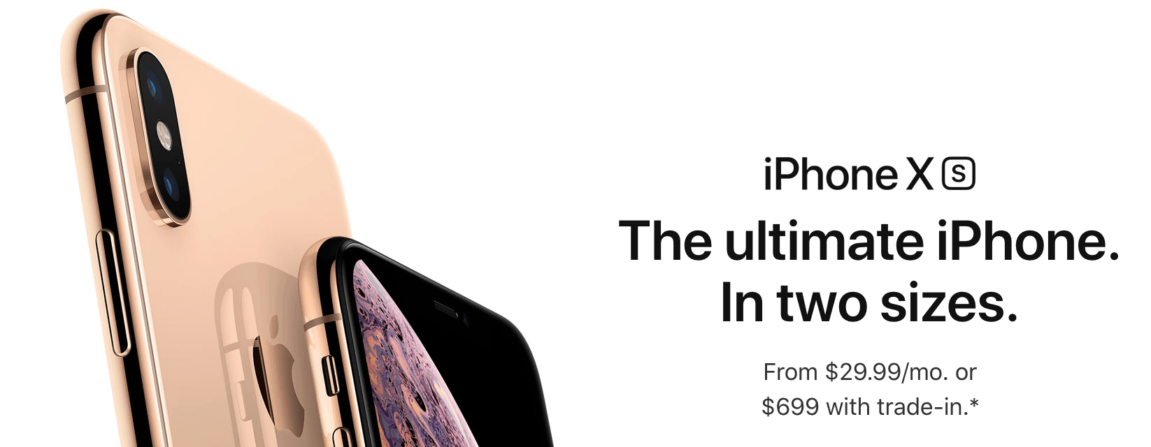
Image courtesy of Apple.com
Now imagine an ad for a fantasy novel. How would the words pop on the page?
You probably didn’t imagine something traditional and straightforward, right? If you’re going to dive into a fairy tale universe packed with dragon-slayers and towering castles, you’ll probably expect to see a font with a few flourishes and curlicues.
Font choice is a crucial part of any marketing team’s design. Every aspect of an advertisement’s design, from the imagery to the layout and the way the words appear on the page, should get a potential customer thinking positively about the product or service being sold.
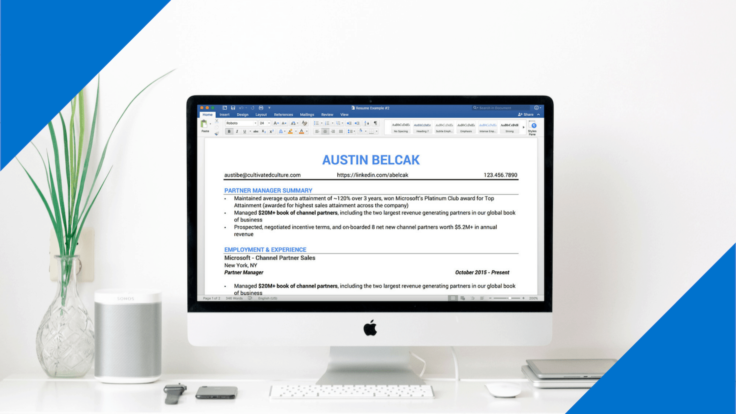
When you craft your resume, think of yourself as a marketing team of one. You’re designing for the recruiter’s or employer’s first impression of you with your cover letter and resume. You’re selling yourself in every aspect of your self-branding, from content to timeliness and format.
When your name lands on an employer’s desk or in their inbox, you want them to come away with a great impression of you. They aren’t seeing you in person, and there are no other context clues to give them any other ideas than what you present them with–even something as seemingly small as format or font. Because everything they see about you will be written in your chosen font, it will make a much bigger difference than you might imagine.
You don’t have to take my word for it, either. There’s plenty of scientific evidence to prove that font affects consumers’ perceptions of a product or company, and employers’ perceptions of job applicants:
One study at Wichita State University, for example, showed that respondents associated fonts like Times New Roman and Arial with stability. Courier New and Georgia meant “maturity” in participants’ minds, while Agency FB was associated with rigidity and Kristen symbolized excitement.
Other research indicates that it’s not just the font choice, but the consistency of that choice with other aspects of marketing, that really makes the difference. If font and other visual and tonal elements (like resume design, formatting, paragraphs, graphics, and style choices like bold and italics) all give the same consistent message — such as “this applicant has the relevant skills,” “this applicant is reliable and dependable,” or “this applicant is creative and visually-oriented,” that message is likelier to stick in your reader’s brain. But if just one aspect, like font, is off, it could undermine the entire message, weakening every aspect of your introduction.
Remember that the presentation of your resume and cover letter together are a way for you to self-brand. If your brand messaging is consistent across design and content, form and function, font and tone, you’re much likelier to make a sale–or, in this case, to get invited for an interview.
What’s the Big Deal About Resume Fonts Anyways?
So, why does a small thing like font choice make such a big impact on your ability to get hired?
Our brains make connections every second, working overtime to flesh out the meaning of everything we read and see. We connect certain aesthetics and words with emotions, character traits, and moods.
Think about it: You’d probably feel confused if you went to a fresh fruit smoothie shop and saw grungey, gritty, dark decor. That’s because, due to your past experiences, you probably already associate smoothie shops with breezy, tropical environments and bright, cheery colors.
As typeface designer and author Cyrus Highsmith told The Week, “Typography is the detail and the presentation of a story. It represents the voice of an atmosphere, or historical setting of some kind. It can do a lot of things.”
Think of the typography as the mood-setter for your resume; instead of lighting a candle, you’re creating an atmosphere with the aesthetic of your font and other design choices.
We bring our past experiences and myriad associations to everything we do. Your resume font should activate those connections in your recruiters’ and potential employers’ minds, causing them to connect you with traits like professionalism, honesty, and skill.
Like each applicant, each font has a “personality.” If a font is difficult to read or doesn’t reflect the job you’re applying for, it could leave a recruiter with a bad taste in their mouth (even if they aren’t aware of it). And because you’ve already put so much thought and effort into your resume, you don’t want something small like font selection to have a negative impact.
Next, we’ll go over how to make the best possible impression with your resume typeface. Once you choose a font you like, you can use my free resume builder to create a beautiful, ATS-friendly resume with our recruiter approved templates.
How to Choose the Best Font for Your Resume
The two most important factors when selecting a font for your resume are readability and professionalism.
The last thing you want to do is to make a recruiter or employer’s life harder, so your resume font should always be straightforward and highly readable. They shouldn’t have to squint to read overly light, thin fonts, or struggle to make out complex symbols or typefaces.
Professionalism, meanwhile, is all about tone. Just as we discussed in the previous section, even “silent” choices like font and formatting can convey tone as easily as your word choice. The tone of your font should match the tone of your workplace personality and your level of professionalism.
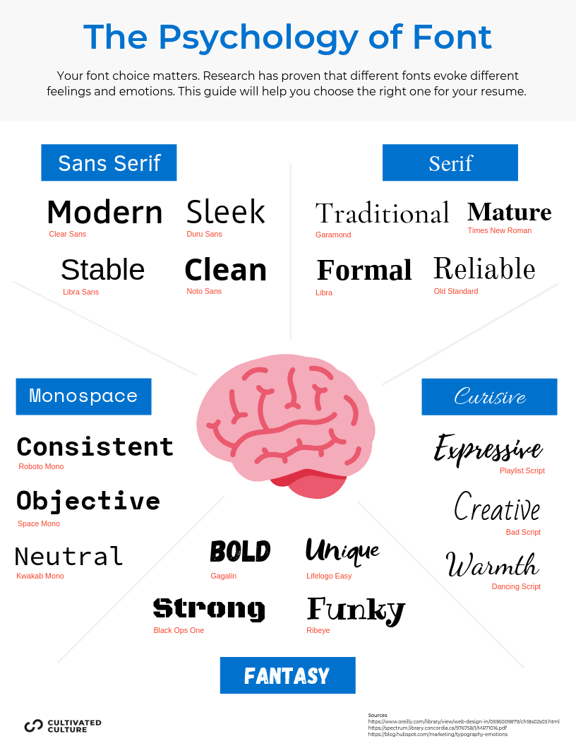
In terms of both readability and professionalism, there are a few broad “font families” that we commonly associate with the workplace and with professional settings. Let’s go over each of the five main font families, or broad categories, from which you have to choose when you’re writing your resume or CV.
The Differences Between “Font Families”
Every font belongs to a “family” of fonts, which have similar characteristics and leave similar (though not identical) impressions. The first decision you have to make in terms of selecting a resume font is which font family is best for your goals.
These are the five broad categories that fonts fall into:
Serif: Serif fonts, like Times New Roman, belong to one of the largest and most common “font families.” Letters in serif fonts have decorative serifs, or little “tails,” on certain character strokes.
Sans Serif: Sans serif literally means “without serif,” so you can guess these typefaces don’t have–tails! Examples of sans serif typefaces include Arial and Helvetica. Sans serif typefaces have become highly popular in the digital marketplace, partly because of their less formal, more straightforward and minimalist look.
Monospace: Commonly associated with newspapers and typewriters, monospace fonts like Courier and Courier New were designed so that each letter would take up the same amount of space on a given line. Each letter is the same width. This allows for clean, consistent graphic design, as there’s no size variability between the characters. Monospace fonts have also become a popular design choice in recent years because they’re a bit nostalgic, calling back to the days of typewriters and telegrams.
Cursive: Cursive fonts, like the famous Comic Sans, are meant to appear handwritten or “scribbled” to give text a personalized touch. Certain fonts in this category might be rarely used in professional settings, but in the vast majority of cases, these are used for graphic design or marketing materials rather than cover letters or CVs.
Fantasy: Fantasy fonts are not useful for resumes or cover letters–there might be an out-there exception, but I haven’t found any yet–but they are used for decorative and design purposes, like signage and certain marketing materials. Examples of fantasy typefaces include Impact and Western. They are typically used for headers or other shorter texts, because they’re not the easiest to read.
Our recommendation for 2019: With the five font families to choose from, what’s the best option for your resume?
In today’s world, a clean, modern sans serif font is recommended. This is partly because the workforce has gone increasingly digital, making even professional interactions slightly less formal and more straightforward and concise.
Sans serif fonts are more contemporary in look and feel than the more conformist and traditional serif fonts. They cater to today’s minimalist, cut-to-the-chase, 280-character-driven economy. They cut out all the extra distraction and get right to the point, just like you want to do in your job search.
While you might make a different decision for your resume font in your job search–if you’re in an ultra-traditional and more conservative profession that expects a high level of formality, for example — sans serif fonts are generally the best option.
Now that we’ve narrowed it down to a certain font family, we’ll break down the top 10 best resume fonts and what job categories they might be ideal for.
Breaking Down The 10 Best Resume Fonts
In 2019’s marketplace, these are the 10 best resume fonts based on reliability, perception, and style:
Open Sans (Modern)
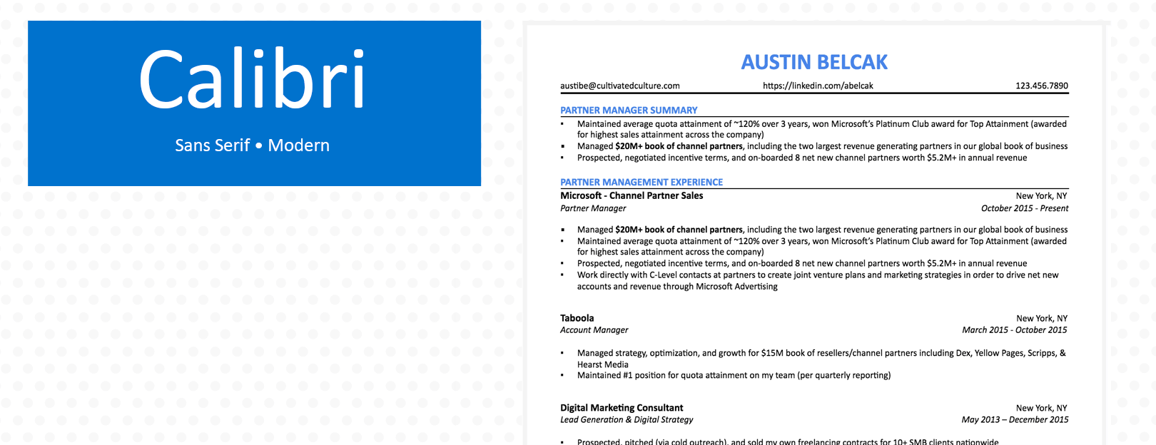
Calibri (Modern)
Helvetica (Modern)
Avenir (Modern)
Lato (Modern)
Roboto (Modern)
Avant Garde (Modern)
Museo (Modern)
Georgia (Classic)
Garamond (Classic)
For each one, we’ll delve a bit into the font’s history and aesthetic, as well as its pros and cons and when to use each:
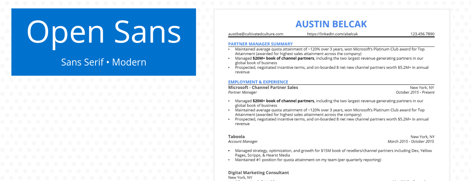
Open Sans
Open Sans, released in 2011, is one of Google’s signature fonts. Its letters are tall and wide.
Pros: Open Sans is wildly popular for web design for a reason: optimal readability. The wide-open letters are easy to read on any screen, big or small. Because it’s used as Mozilla’s default font in many cases, and for many Google pages, it’s familiar to the eye.
Cons: Open Sans is widely perceived as “flat” or “neutral,” which can be a very good thing for a resume. But if you want to stand out a bit or for your resume to have a bit more personality, it might not be the best choice.
Alternatives: Adelle Sans is similar to Open Sans and is a great substitute.
Calibri
Calibri came on the scene in the early 2000s as the Microsoft Word replacement for the classic Times New Roman.
Pros: Calibri can be easily read on any computer and won’t mess up the formatting no matter where it’s sent. Everyone has seen it before, so it’s not distracting. It’s a sans serif font, so it’s clean and sleek. It’s a good choice for a standard resume or for work at a digital-first company.
Cons: Calibri is a little “safe,” as it’s the default Microsoft Word font and is used by many other applicants. But standing out from the pack isn’t always the best goal when it comes to resume font. Instead, you want your resume itself to do the work. But Calibri might not be the best choice for a creative career at a quirky company.
Alternative: Arial, which is the default typeface for Google Docs, is somewhat similar to Calibri in its optimal readability for the web. It’s also similarly straightforward and legible.
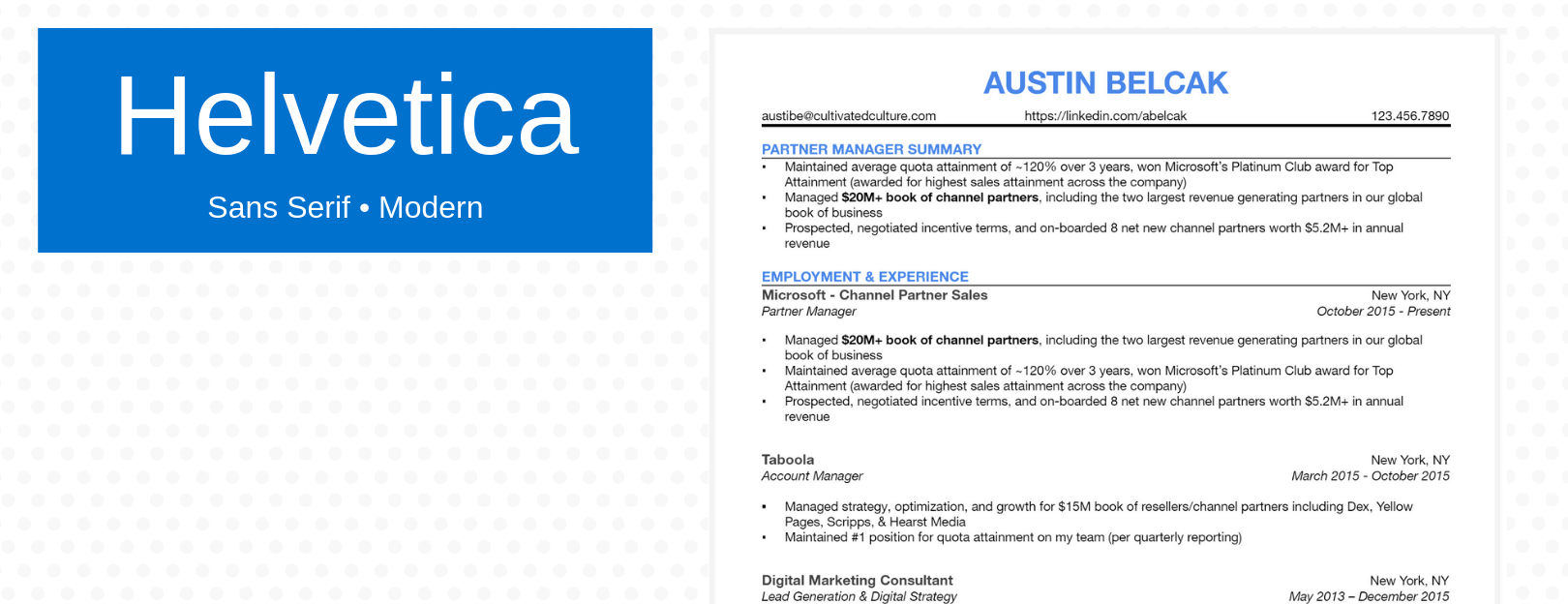
Helvetica
Helvetica was designed in the 1950s and comes with a little bit of elegance and flourish. It’s frequently rated as one of the more attractive typefaces.
Pros: Helvetica is a softer, beautiful sans serif typeface. It’s modern while still being a bit pretty and not too stark. Because it’s not always used for resumes, it stands out a bit without being too far “out there.” It might be a good choice for a design company (especially because it’s frequently used in graphic design) or a profession that puts a premium on aesthetic.
Cons: Helvetica is only pre-loaded on Macs, so it will convert to a different font on other systems.
Alternatives: Swiss, Arial, and Folio are all similar to Helvetica in “font personality.”
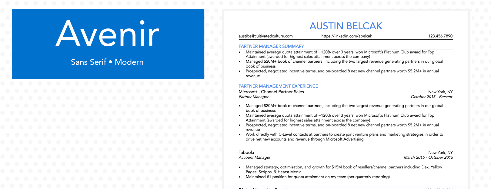
Avenir
Avenir comes from the French word meaning “future.” Designed in 1988, this geometric sans serif font is warm and lively, with curved edges and a few selective tails.
Pros: Avenir isn’t odd enough to be distracting, but it’s not a standard “safe” resume font. It might be a good choice for a future-forward company. It’s also consistently rated one of the favorite fonts of designers, so it could be good for any aesthetic-focused or creative profession. Finally, it’s versatile: It comes in a variety of weights.
Cons: Avenir is not a very common choice for resumes, so it might be a tad jarring to a highly traditional or formal eye.
Alternatives: Nunito, with its rounded letters, is very similar to Avenir.
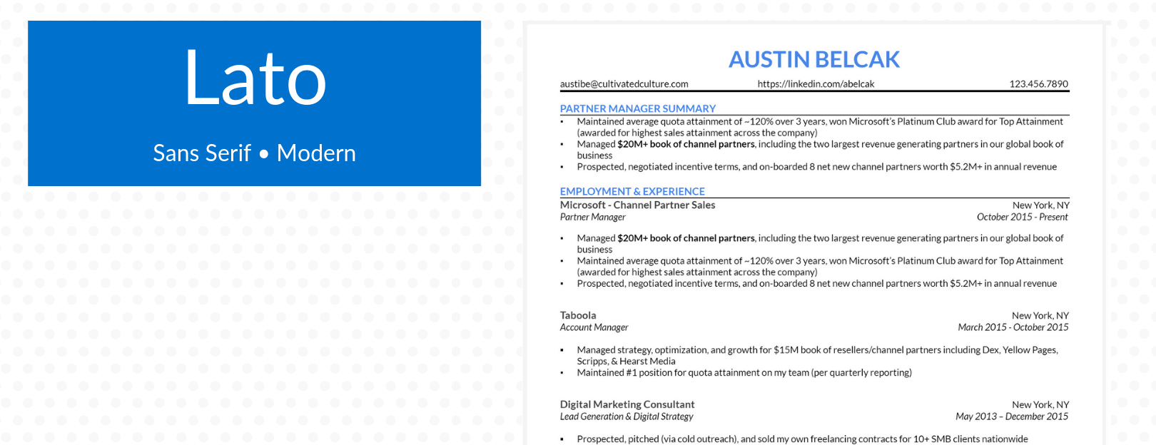
Lato
Lato, designed in 2010, is named after the Polish word for “summer” because it was meant to be as cheery as the warmest season. It is professional enough to be serious, but has a touch of brightness in its typeface style.
Pros: Lato is an increasingly common choice for resumes because of how readable it is. It’s an approachable and stylish font, while remaining professional. Finally, Lato is open-source, which means anyone can download it for free.
Cons: Lato is not one of the resume “classics,” which is always a tiny bit of a gamble. Microsoft Word does not list Lato as one of its defaults, which means it won’t show up for every recruiter or employer. If you download and install the font, make sure you send your resume to PDF format so the recruiter/hiring manager will see the same formatting you do!
Alternatives: Brandon Grotesque and Open Sans are both similar to Lato.
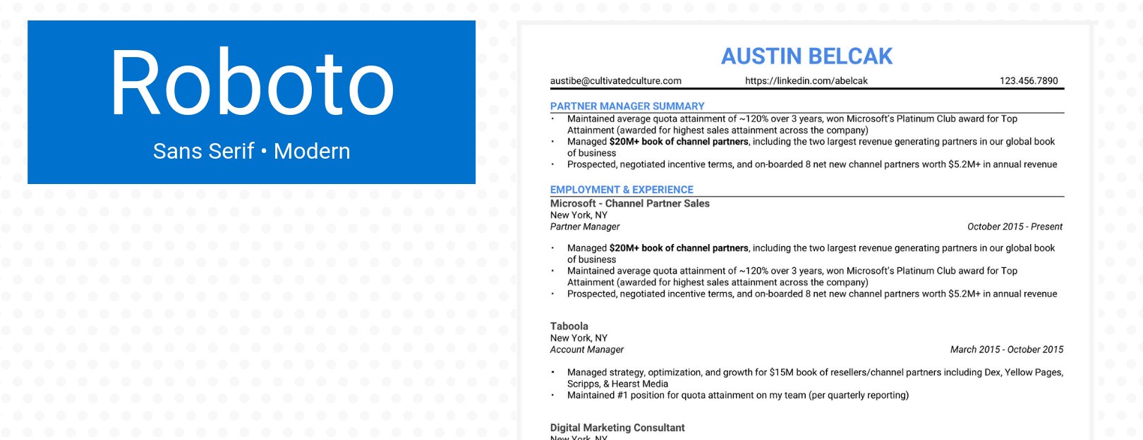
Roboto
Released by Google in 2011, Roboto probably looks familiar, especially if you do a lot of traveling: It’s used for Google Maps. It’s similar to the other fonts optimized for the web, with a more slender, sleek typeface.
Pros: Because it’s open-source, Roboto is free for anyone to use. It’s also optimized for web readability, so like Open Sans, it’s legible on any screen. It’s also sleek and contemporary, so it’s great for any modern company, especially those that put web presence at a premium (such as marketing).
Cons: Roboto appears a little less formal than some other fonts, so it’s not ideal for academic applications or very traditional work environments.
Alternatives: Roboto is somewhat similar in style to Helvetica and Arial.
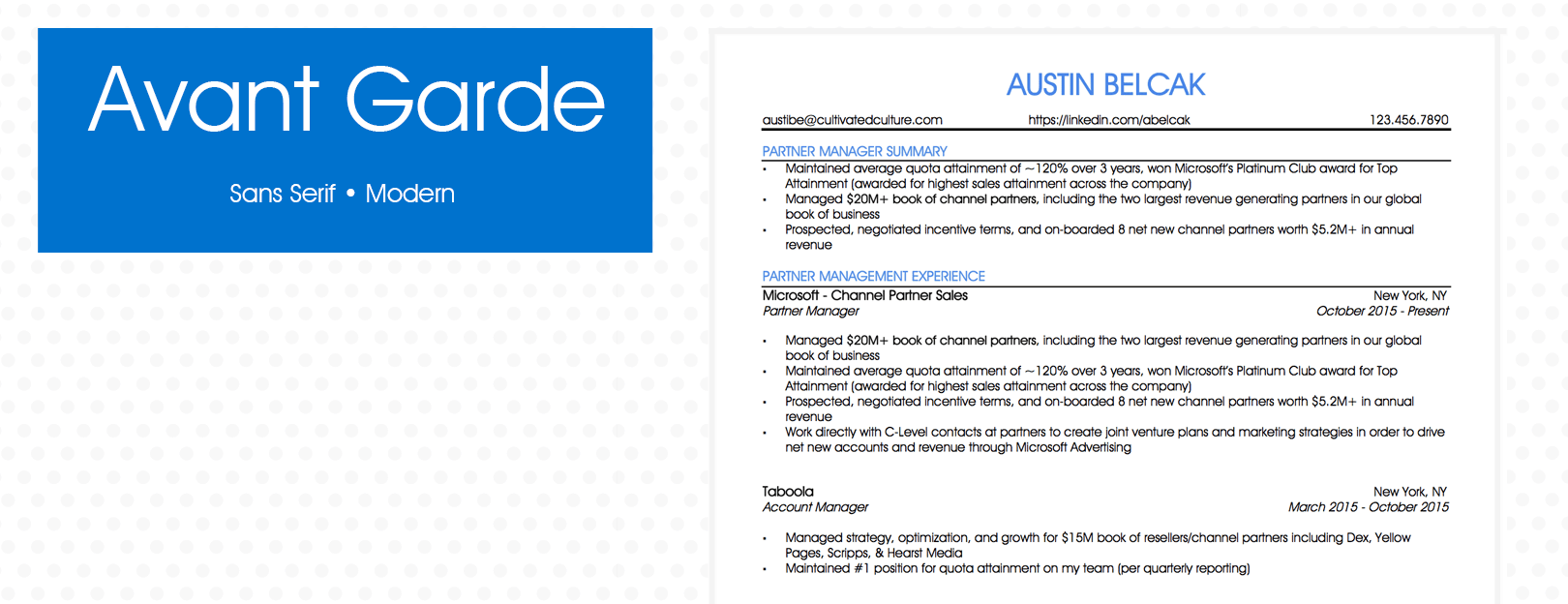
Avant Garde
Inspired by the 1920s German Bauhaus movement, Avant Garde is a unique typeface that is having a comeback after being used frequently in 1970s advertisements. Its letters are wide, and several of them have quirky flourishes, like the sloped “v” and curliqued Q.
Pros: Avant Garde is interesting enough to stand out while remaining readable for the web. It’s a solid choice for creative types and people who want to highlight their unique personalities.
Cons: Avant Garde is, well, avant garde. It’s not a default or standard resume font, so it’s not the best choice for an executive-level position in a traditional field.
Alternatives: Avant Garde is similar to Harmonia Sans.
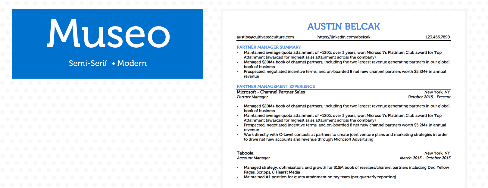
Museo
Released in 2009, Museo began with the uppercase “U,” with two flatly curved horizontal tails. It’s warm and approachable.
Pros: Museo is frequently used in web design. It would be a great choice for a customer service or sales job that requires a friendly, open demeanor, or for work in an artisanal or artistic field like fashion or design. It’s open-source, so it’s free to use.
Cons: Museo is warm and friendly, but that can be a drawback if your recruiter is highly traditional. It might be distracting in some cases.
Alternatives: Use Calvert in place of Museo if you’re looking for a similar vibe.
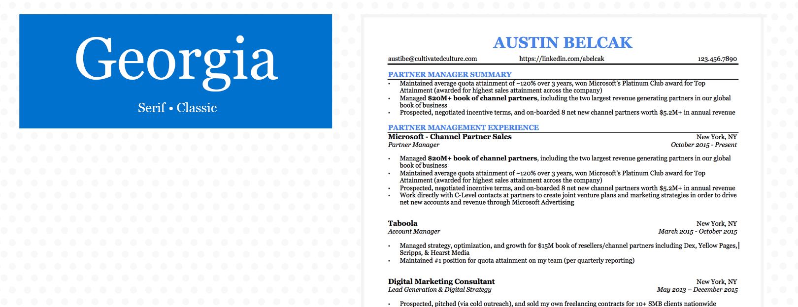
Georgia
Georgia was released in 1993 and is widely used by companies like Amazon, The New York Times, and Yahoo as a default font. It’s a serif font, so it has a classic look with a bit of warmth.
Pros: Georgia was specifically designed to be read on screens, so it’s highly accessible for screen readers with visual impairments and is legible even on mobile phones. It’s professional and standard while still having a touch of fun and flair.
Cons: Georgia is so widely used and familiar that it might not make you stand out among other applicants.
Alternatives: Georgia and Times New Roman are often used interchangeably. Georgia almost appears to be an “updated” version of TNR.

Garamond
Garamond came out in 1989, but it has a much longer history. The typeface was inspired by 16th-century design and is often used in print.
Pros: Garamond has an old-school, vintage look that lends it a touch of class. It’s a good example of a font with a distinct personality, making it a solid choice for academic or literary fields.
Cons: Garamond’s retro look means it’s probably not ideal for ultra-contemporary companies.
Alternatives: Cormorant, Sabon, and Minion are strong alternatives to Garamond.
The Best Font Size for Your Resume
Remember that readability is one of the most important aspects of resume font choice.
Font size is a key aspect of your reader’s ability to scan your resume quickly, pick out the important parts, and come away with a solid, positive impression of you. A recruiter might be sifting through dozens or even hundreds of resumes at a time (or more), and making their job simpler is the first and easiest way to make yours stand out in a good way.
It can be be tempting to cram every last thing you’ve ever done onto your resume, but cutting out the extraneous parts of your work history can do you some good in more ways than one. With too many sections on your resume, it can quickly become overwhelming to the eye.
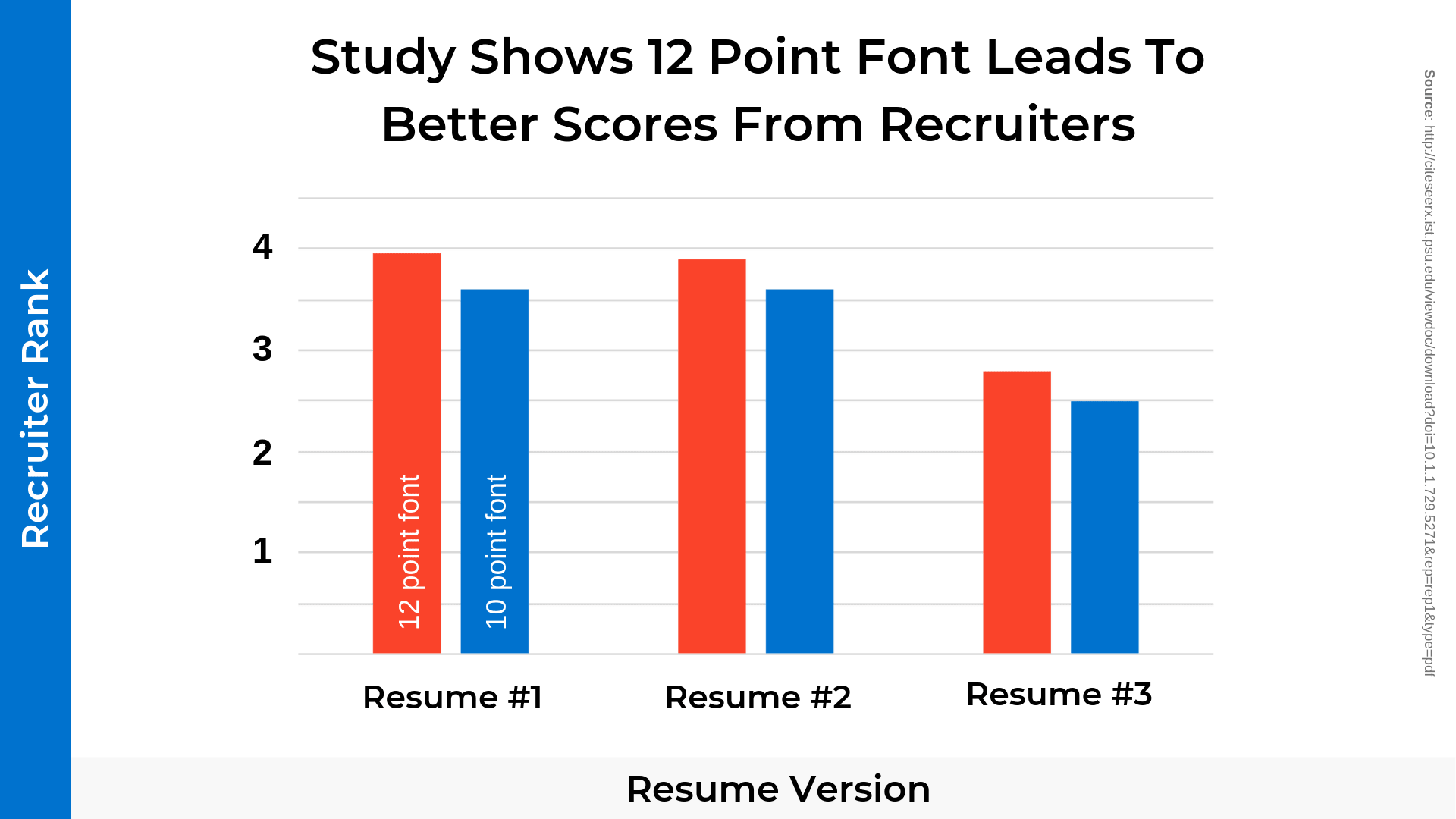
What’s more, if you include too much content, you’ll probably be required to shrink your font size to 10 (never, ever go below 10!). But a slightly larger font size gives employers a better impression; one study at Stephen F. Austin Universityshowed that resumes using 12-pt. font were evaluated more highly than those in 10-pt. font.
Since the ultimate goal is to make your resume as easy to read as you possibly can, the optimal font size is between 12 and 14. 10 can be used if you’re highly experienced and have an extremely lengthy resume, but it’s not ideal. Try cutting out a few things that aren’t directly relevant to the job at hand and see if you can make your resume a little easier on the eyes with a larger font.
This exercise can also improve your resume overall by making it more straightforward and concise. No matter how much you might want to include your high school volunteer history, it’s much more important that a recruiter sees only the most relevant and applicable education and work experience right away–no muss, no fuss.
In the same vein, be wary of any light or thin fonts, as your reader will likely get frustrated if your resume is hard to read. Use black instead of grey or any other color so that your resume is optimized for readability.
How to Leverage Formatting to Make Your Resume Font Pop
In addition to choosing a font, you can also use various formatting styles to make certain areas of your resume stand out.
The first rule of resume formatting is to use any special styles, like bold or italics, sparingly. You don’t want your reader to feel overwhelmed by mixed styles or too many italics sections on a page. Be selective about any special characters. White space is your resume’s best friend, and will allow your reader to scan the documents quickly, cherry-picking the most important parts with ease.
The next rule of using bold and italics on your resume are to do so consistently. It might seem like an obvious rule, but it’s also often broken. If you bold your previous job titles and use italics for subtitles, for example, do so for every previous job you list, even if they’re different in some way. Establish a pattern with your style choices right away, and your reader will follow your lead.
You can use bold in your resume to highlight specific key aspects of your background that are relevant to a given job, or to set apart particular sections for optimal scannability. For example, you could use bold to highlight special skills you used (such as expertise in a given software program) that are specifically mentioned in the job description. Or, you could use bold, along with a slightly larger font size, for headings.
Italics, meanwhile, are best used for subtitles below headings, or for extra emphasis on a specific aspect of your education or work history, like measurable outcomes. For example, you could use italics to denote the dates during which you worked at a particular job. They’re also frequently used to share quantitative data, like “Grew quarterly sales by 13%.”
How To Find & Download Non-Standard Resume Fonts (For Free!)
You may have noticed that a few of the fonts I recommended don’t show up when you try to find them in Microsoft Word or Google Docs.
Despite being some of the best choices out there for your resume, these fonts aren’t always part of the standard package with Microsoft or Google. The good news is, you can easily download and add them yourself without spending a dime!
Here’s how to add custom fonts to Microsoft Word:
Find a site where you can download fonts for free. Font Squirrel, Dafont, and 1001 Free Fonts are all great options.
Search for the font you want and download either the OTF or TTF file to your desktop
Open the file you downloaded and click “Install Font”
Restart any applications where you want to use the font (Microsoft Word, Photoshop, etc.)
You should see your new font appear as an option in the drop down!
Adding new fonts to Google Docs is much easier. All you need to do is:
Open any Google Doc
Click on the Font drop down and click “More fonts…”
Search for the font you want, select it, and click “OK”
Your new font should appear in your drop down as an option
Resume Fonts: The Bottom Line
Together, we’ve gone through every aspect of resume fonts, from why they matter in the first place to how to choose the best one to fit your professional goals.
Remember to keep readability and professionalism in mind when you choose a font for your cover letter and CV. When in doubt, select a contemporary sans serif typeface and a 12-14-pt. font size. Use bold and italics consistently but sparingly, and remember that white space is your friend.
In addition, the way we’ve thought about resume fonts in this article is a good model for how you should approach all of your introductory materials during the job application process.
Every aspect of your cover letter and CV or resume should be carefully curated to highlight relevant experience and traits. And because your potential employer doesn’t have anything to go on other than what you provide them with, it’s important to make every letter – and every typeface – count.