

Fonts are not always free. If you're fetching a font that isn't already on your user's phone or computer, they'll have to download it. And this will impact performance.
In documents and subtitles, embedding fonts can easily increase the file size tenfold. As for the web, here are some popular fonts and a potential network impact:
| Font | Size | Wi-Fi | Regular 4G/LTE | Regular 3G |
|---|---|---|---|---|
| Roboto | 160 KB | 0.04 s | 0.34 s | 1.81 s |
| Montserrat | 217 KB | 0.06 s | 0.45 s | 2.41 s |
| Inter | 253 KB | 0.07 s | 0.53 s | 2.80 s |
| Noto Sans | 292 KB | 0.08 s | 0.60 s | 3.21 s |
| JetBrains Mono | 125 KB | 0.04 s | 0.27 s | 1.43 s |
Size is based on rendering "Hello, Čihař!" in regular, bold, italic, and bold italic – it varies based on what characters you use. The estimated network speeds and latency are taken from Throttling - Firefox Source Docs.
On the modern web, we've normalized fetching fonts from client-side, or embedding fonts in resources that are served to users. While this may be tempting, it actually makes very little sense for most use-cases.
This isn't suggesting to never use external fonts. Just a reminder that fonts aren't free, and that it's a good idea to review if it's worth packaging or fetching external fonts when it's avoidable.
Instead, I'd recommend you consider an expansive font selection, featuring typefaces available across operating systems. There are times we should fetch external fonts, but it shouldn't be the default attitude in everything that we build.
In short, you may just need an arbitrary typeface to show arbitrary text on your website. That's fine. But it's worth sticking to the wide array of typefaces already installed on the client's operating system.
In other words… only fetch an external font when it actually enhances the user experience!
Why?
Given the number of typefaces available on all operating systems, there are likely many suitable options for your use-case.
There's no need to specifically fetch Roboto, Inter, or another font that's similar enough to the preinstalled options.
This is particularly relevant to corporate websites, blogs, forums, and web applications.
The user is there to consume content or get a task done. Unless you're looking to be creative, the average user doesn't know, and doesn't care, what typeface it has so long as it's legible.
Meanwhile, they may care for other things impacted by your font choices…
Performance
Whether we're talking about embedding fonts in offline documents, or fetching fonts on the web, it increases the overall size and load time of resources.
Typefaces can be upwards of 160 KB per font face. The impact of this can be significant on slower networks or old mobile devices.
Particularly on the web, you'd derive more value building a lightning-fast user experience, than fetching a typeface the user didn't ask for.
Until the typeface has finished fetching, sites can choose to block rendering or swap, neither of which is ideal.
Font swapping is when the font changes shortly after visiting the site, leading to a flicker and an increase in Cumulative Layout Shift.
A demo of blocking and font swapping on the MDN website. I refreshed with the cache disabled on a high-spec laptop connected to Wi-Fi with no throttling.
A demo of the MDN website using Nimbus Sans, based on Helvetica, instead of external fonts. I refreshed under the same conditions.
Dropping external fonts is pretty simple, but can improve load time, reduce bandwidth usage, and avoid font swapping, which all improve your Core Web Vitals and SEO.
Privacy
When fetching fonts from a third-party server such as Google Fonts, client information is leaked to the third party. This includes the IP Address, User-Agent, and Referer, among other headers.
Every website that loads a typeface from Google Fonts has given Google the potential to track the visitor. The domain you visited, the time you accessed it, what browser and operating system you're on, and so on. They can form a timeline of the websites you visit from the fonts alone.
Google states that they don't track or store this information. But given the nature of the internet, they inevitably must receive it.
A German court has actually ruled that websites that load Google Fonts are violating GDPR:
"A regional court in the German city of Munich has ordered a website operator to pay €100 in damages for transferring a user's personal data — i.e., IP address — to Google via the search giant's Fonts library without the individual's consent." (Source: German Court Rules Websites Embedding Google Fonts Violates GDPR)
This problem can be avoided by self-hosting fonts. If you're going to use an external font, make sure you consider this.
But you should also know that some users disable custom fonts or block third-party fonts, so you should still specify at least a generic family name regardless.
"You should always include at least one generic family name in a
font-familylist, since there's no guarantee that any given font is available. This lets the browser select an acceptable fallback font when necessary." (Source: MDN Documentation for font-family)
Familiarity
Users are familiar with the experience of their operating system.
Maybe not how it works under the hood, or even how to perform simple operations, but they do encounter the welcome screen, context menus, and their preinstalled applications regularly.
It's safer to stick with typefaces the user already has access to because these are the typefaces the user is already accustomed to reading from.
This argument is in a similar vein to why it's a good idea to use the system date picker, color picker, or modal/dialog boxes instead of creating custom ones.
Users are familiar with their system!
From my experience, often one of the following occurs:
The user couldn't tell that an external font was used, making it largely redundant. Most non-specialists experience this everyday, it's hard to even tell that websites are using different fonts from each other unless you're conscious of it.
The user was able to tell, and thus has a different reading experience than what they're used to. The potential for disruption depends on the needs of the user, but that risk is often unnecessary.
Unless you have a reason to change it, it's best to stick with what the user is familiar with.
Who Else Does This?
Wikipedia is the most notable example, and they even have a page elaborating on the topic: Meta page on Wikipedia's use of typography.
Some of the most popular sites don't fetch a single font on their landing page, in favor of using system fonts only:
| Site | Font Stack |
|---|---|
-apple-system, BlinkMacSystemFont, "Segoe UI", Roboto, Helvetica, Arial, sans-serif |
|
| Wikipedia | -apple-system, 'BlinkMacSystemFont', 'Segoe UI', 'Roboto', 'Inter', 'Helvetica', 'Arial', sans-serif |
-apple-system, BlinkMacSystemFont, "Segoe UI", Roboto, "Helvetica Neue", Arial, "Apple Color Emoji", "Segoe UI Emoji", "Segoe UI Symbol", sans-serif |
|
| Bing | "-apple-system", HelveticaNeue, Roboto, Arial, sans-serif |
You can verify for yourself by inspecting the site with your browser's development tools.
There are no outgoing network requests for fonts, and the font-family properties are set to system fonts only.
Exceptions
There are times loading and embedding fonts does make sense, particularly if the look and feel you're after is significantly different from common system fonts:
You're targeting an environment that doesn't have typefaces available.
To fit with existing branding, like an in-house font.
A creative or unique design, especially relevant for gaming and artsy sites.
Icon fonts like OpenMoji, but note that most clients come with emojis already.
A website that's literally for distributing, displaying, and testing fonts.
Consequences
If you apply a local font stack, your text content may not look pixel-for-pixel identical across clients. But you should measure success by the user experience.
It's important for the site to feel familiar, but there are more significant changes between clients already, like the human-interface, resolutions, and DPI.
Compared to this, it's fine if the arch of the a has a slightly different radius, or the tick on the l is a few pixels longer. In fact, this is unlikely to get noticed, so it's unlikely to impact the user experience at all.
Users would sooner have qualms with the difference in speed or a flicker, before the difference between similar typefaces.
Another argument is that allowing different typefaces may make the layout difficult to manage. Glyphs can have different widths, and therefore take up varying space.
But modern sites should be following responsive design, so you should be taking the time to make the pages fluid anyway.
To minimize impact, you can use web safe fonts.
If you dislike how limiting that is, pick a typeface included with your operating system, and find similar typefaces on other operating systems.
Even better if you can pick metrically compatible typefaces.
Comparison
Let's visit a website and see what it's like to disable downloadable fonts.
I'll also replace all font stacks to use Helvetica.
Note, my computer doesn't actually have Helvetica installed, so my operating system automatically translates this to Nimbus Sans, which is based on Helvetica. Nimbus Sans is preinstalled on Debian.
In the case of MDN, is the second version really so undesirable that we need to load a 252 KB font, given the penalties and demonstrations raised above? Ultimately, this one is down to user preference, so I'll let you decide.
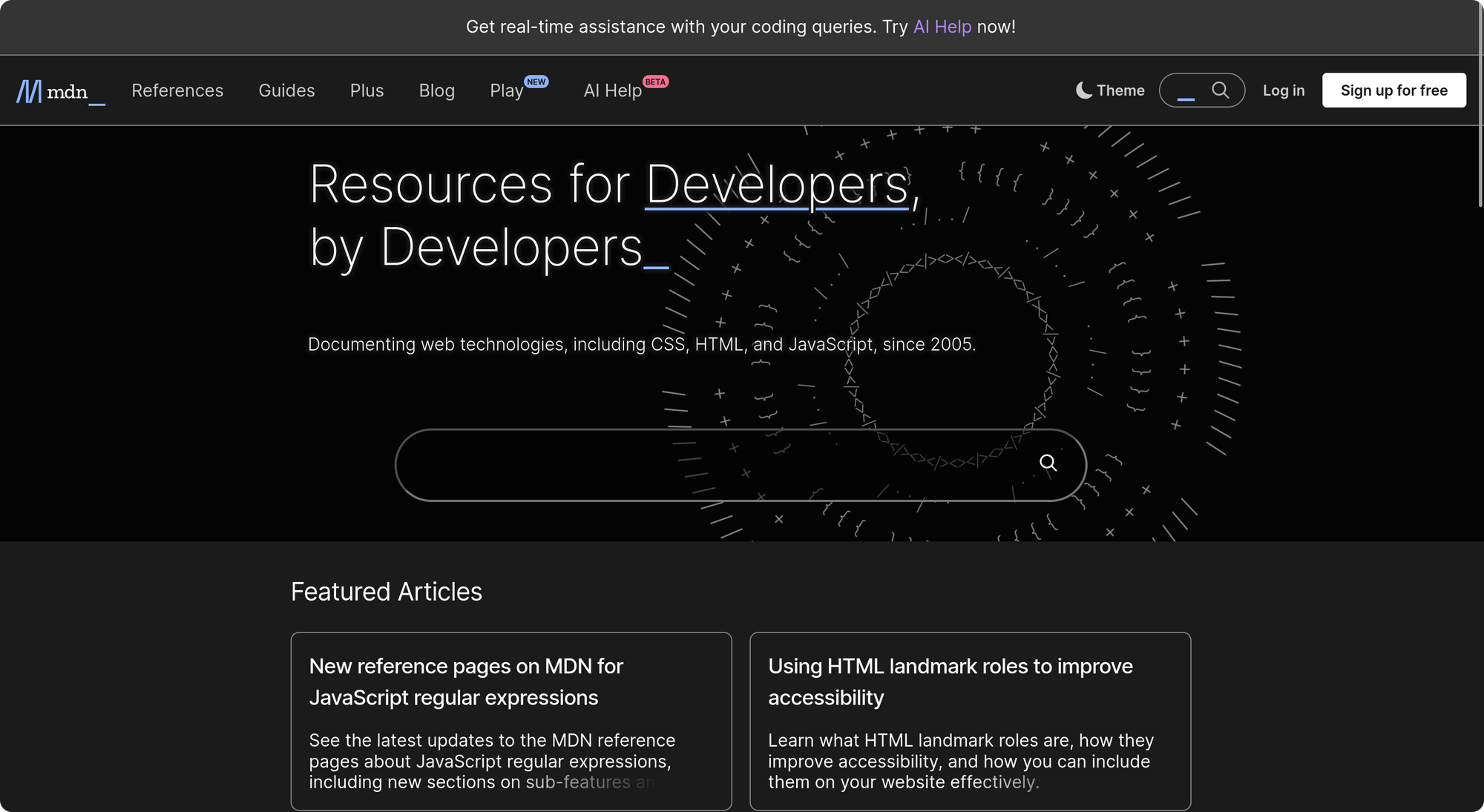
MDN, with the Inter typeface fetched from client-side.
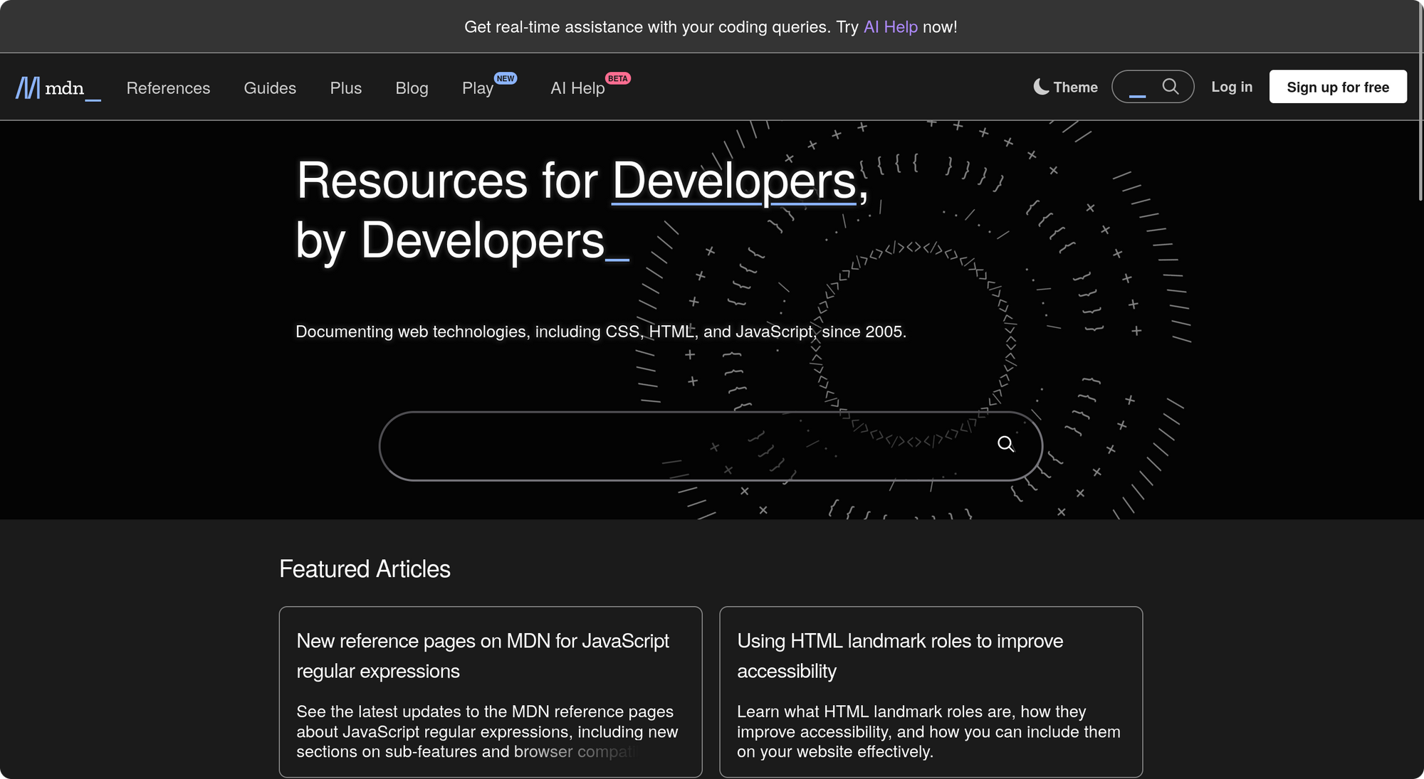
MDN, with the font-family overridden to use Helvetica.
On the flip side, that doesn't mean to never fetch fonts. There are examples where the aesthetic may be more valuable to the user experience than the performance penalty.
Let's look at Framasoft. They went for a more creative look and feel, also featuring a lot of David Revoy's illustrations.
Using Tovari Sans was a design choice which enhances the user experience, and isn't easily replaceable with a local font stack.
If we were to take that font away, the page feels inconsistent and unpolished. Even if we cleaned up the CSS, we'd still be detracting from the theme of the website.
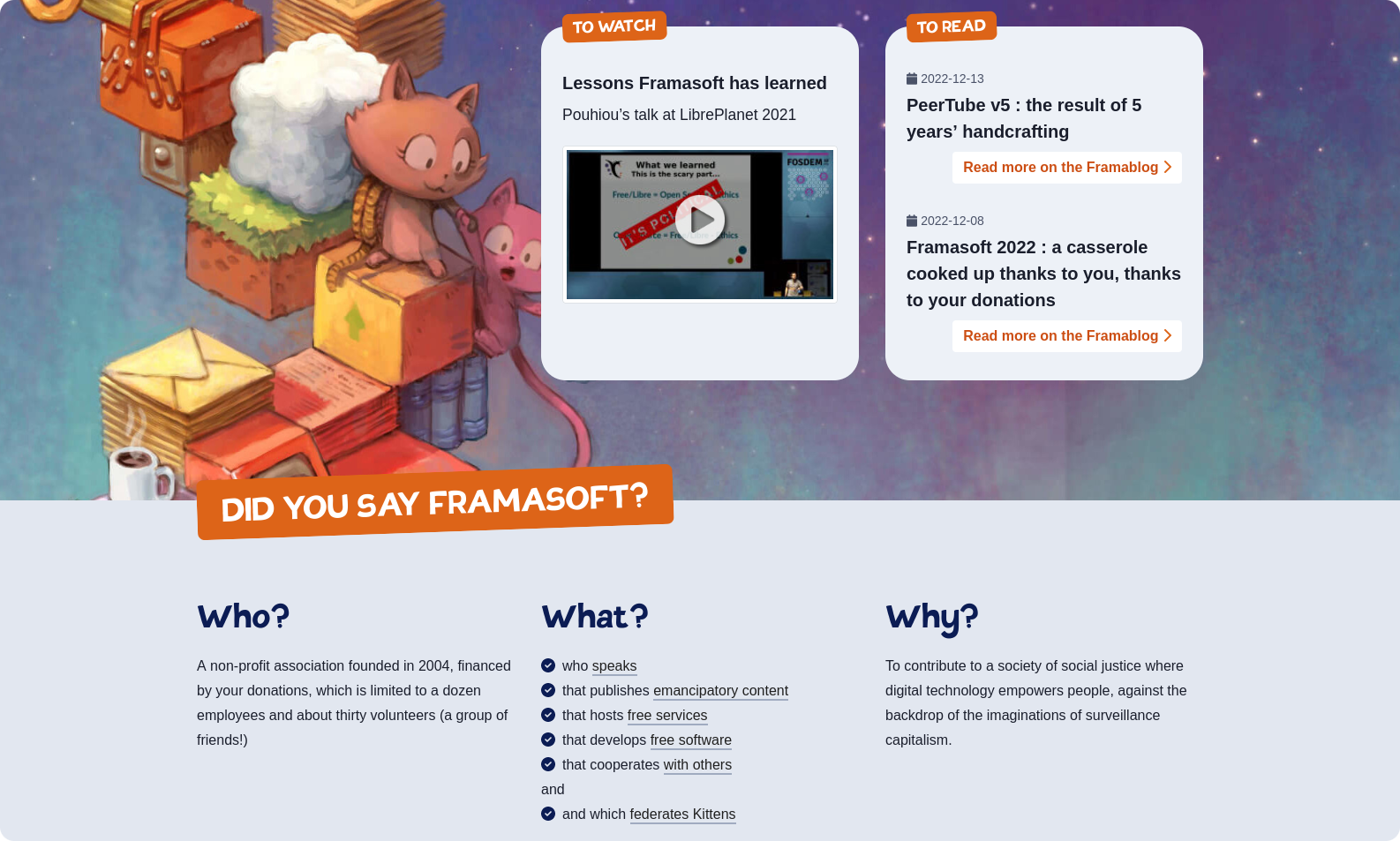
Framasoft, with the Tovari Sans typeface fetched from client-side.
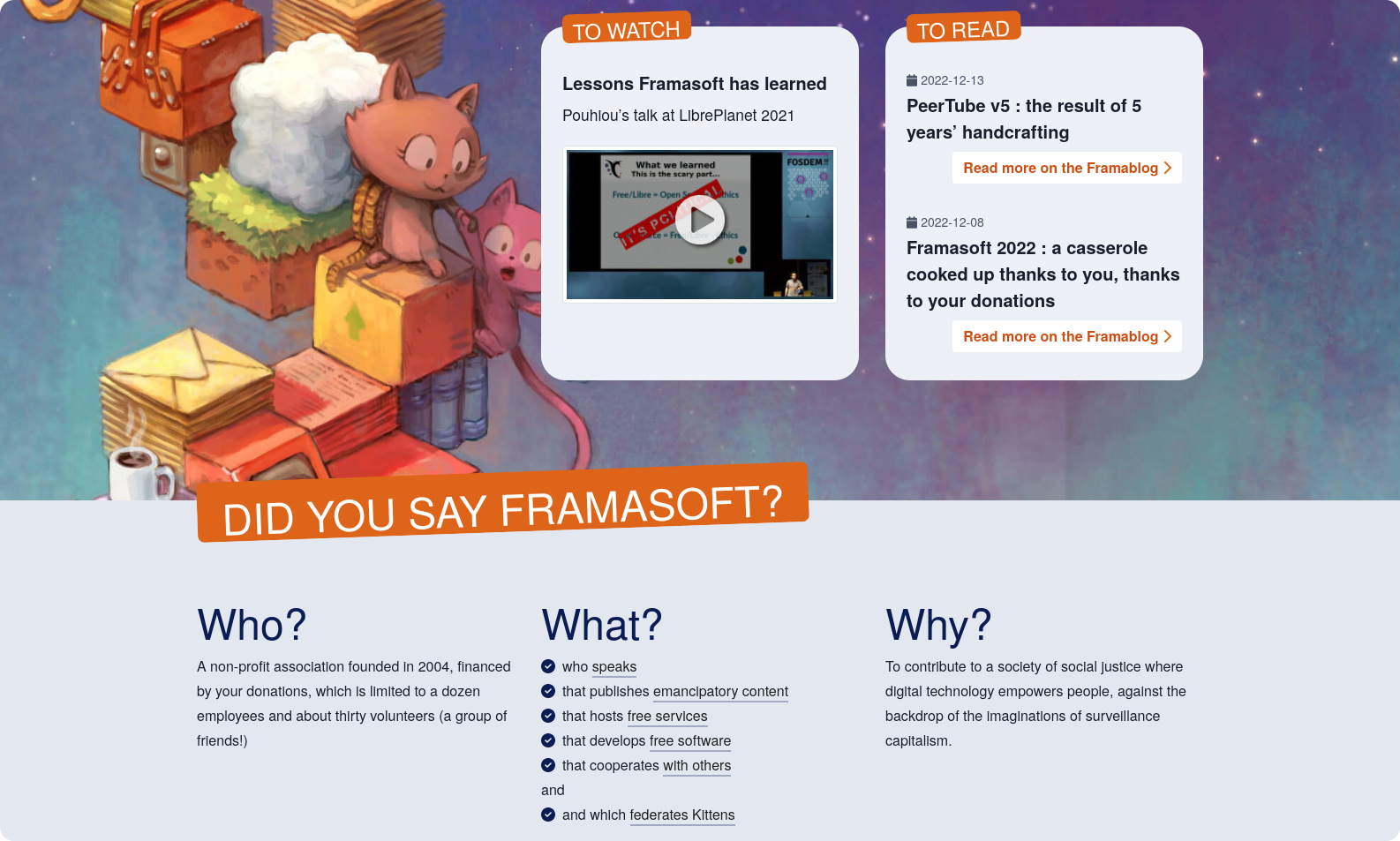
Framasoft, with the font-family overridden to use Helvetica.
Resources
Whether you want to go local, or just need to specify some fallback fonts, here are some helpful resources for picking out your font stack:
Cross-Platform Font Stacks
There are countless articles and resources available online that feature predefined font lists you can use. These are referred to as "font stacks".
In particular, I'd like to highlight a resource by Dan Klammer, a designer and web developer who created Modern Font Stacks (GitHub repository), a website that helps you pick out native font stacks for your project.
Modern Font Stacks proposes a list of fonts for a variety of styles like Neo-Grotesque (a style of sans-serif) or Monospace Code (a style of monospace) and offers a visualization of how it will look across operating systems. It runs through a description of each stack, the CSS to use it, metadata like the weights available, and which of the fonts you personally have installed.
Some font classifications don't explicitly include a font from every operating system that exists, but remember that the generic font family (sans-serif, serif, monospace, cursive, and so on) at the end will have you covered.
If you like the stack, you can run with it. But don't feel constrained either, you can also use it as a starting point and tweak the font stack to your needs.
I've included images from the GitHub repository (at the time of writing), featuring proposed font stacks for two of the most common styles used on the internet today:

Base font stack proposed by Modern Font Stacks for the Neo-Grotesque style, a type of sans-serif font.

Base font stack proposed by Modern Font Stacks for the Monospace Code style, a type of monospace font.
Conclusion
In the end, the user experience is what matters most. Sometimes that means prioritizing visual design, other times that means prioritizing performance.
I hope this was worth your time, and that with the knowledge you can make an informed decision when choosing fonts for your next project.
Feedback and questions welcome, you can hit me up on GitHub or Mastodon.
Cover art illustrated by hashrock and released under CC BY 4.0.