
By Chaitanya Prabuddha
As a frontend developer, it's your job to make sure that the user interface of a software program functions properly.
It's a difficult job because you have to make sure that every component works the way it's supposed to so that users have a good experience.
Frontend development is in high demand right now. Frontend developers manage the UI / UX of the software. And this is important because users interact directly with the front end of an application.
In this article, we are going to talk about some of the most valuable skills that beginner frontend developers can cultivate. Learning the following skills will help you advance in your career.
Learn Modern JavaScript (ES6)
The JavaScript programming language has evolved from ES1 to ES6 over the past 25 years, and it has included some wonderful new capabilities with each new release.
In 2015, ES6 was published as a new standardised version of JavaScript. ECMAScript 2015 is another name for it. And ES6 has many new features that can help you write better code.
With Object-Oriented Classes, Arrow Functions, String Literals, and much more, it is the foundation for modern libraries like React and Vue.
Helpful Features of ES6
Destructuring assignment
➡ You can read values from an array or attributes from an object into individual variables using the destructuring assignment.
Examples of how the destructuring assignment works in ES6:
let myName, myRole;
let array = ['Chaitanya', 'Web Developer'];
[myName, myRole] = array;        //positional assignment occurs here
console.log(myName, my Role);   //Chaitanya Web Developer
let myName, myRole;
let object = {myName:'Chaitanya', myRole:'Web Developer'};
({myName, myRole}=object);
   //properties (keys) are matched with the local variable names

console.log(myName, myRole);
   //Chaitanya Web Developer
Arrow function expressions
➡ Arrow function expressions are a new syntax for creating ordinary function expressions. We can ignore the function and return with one-liner code using arrow function expressions.
Example of arrow function expressions in ES6:
let getName = ((firstName, lastName) => {
 let myRole = 'Web Developer';
 return `My name is ${firstName} ${lastName}
 I am a ${myRole}.`;
});
Default parameters
➡ The default value for function arguments in JavaScript is undefined. So sometimes it's more practical to use a different value instead. We can do this using default function parameters.
Example of how default parameters work in ES6:
function add(number1, number2) {
 return number1+number2;
}

add (3,4);   //returns 7
add(3);     //returns NaN as number2 is undefined
function add(num1, num2=7) {
 return num1+num2;
}

add (5,2)   //returns 7
add(3)     //returns 10 as num2 has default value = 7
How to Learn ES6
- JavaScript ES6, ES7, ES8: Learn to Code on the Bleeding Edge (Full Course)
- ES6 Javascript Tutorial For Beginners | ES6 Crash Course
- Modern JavaScript – Learn Imports, Exports, Let, Const, and Promises in ES6+
Web Performance and Quality
It's critical that your website runs smoothly and without errors. The time it takes for your website to load is affected by multiple factors related to web performance.
There are steps you can take to increase your site's performance if you're having problems with your site taking too long to load.
How to improve web performance:
- Use optimised and smaller images. TinyPNG is a good choice for compressing images without losing a lot of quality.
- Remove unwanted CSS and JavaScript, as it makes your code bulky.
- Get a good hosting provider. Some good ones to check out are Linode, Digital Ocean, or SiteGround.
- WordPress Tip: Remove unwanted plugins. I don't recommend using more than 10 plugins, unless it's required.
It doesn't matter if you create the most amazing website ever. If it doesn't work effectively and deliver content quickly to your users, it won't matter.
Users don't like to wait more than 3 seconds for a website to load – that's not much time. So if your site takes longer than that, your bounce rate will go through the roof.
Chrome DevTools
Chrome Developer Tools are included in the Google Chrome browser and experienced developers use them all the time for iterating, debugging, and analysing websites.
Google Chrome DevTools include:
- A console panel that interacts with JavaScript on the page as a shell or collects logs and diagnostic data.
- A device toolbar which helps you to create responsive websites.
- Elements that are used to govern CSS and the Document Object Model (DOM).
- Web performance insights.
- Security and network functions.
You can learn more about Chrome DevTools here.
Chrome DevTools are very useful tools once you understand how to use them comfortably. You can use this Chrome DevTools - Crash Course by freeCodeCamp to learn more about them.
Version Control with Git
Git, or Global Information Tracker, is an open source distributed version control system. It's software that tracks changes in a set of files, and developers typically use it to coordinate when they're working on source code together during software development.
After all your hard work coding, the last thing you want to do is start your work from the beginning if somethings doesn't go according to the plan. In this situation, Git will help you to go back to the previous version of your software without losing any code.
Knowing the basics of Git is a skill that you (and your potential employers and clients) will appreciate.
How to learn Git
- Git and GitHub for Beginners - Crash Course
- Git for Professionals Tutorial - Tools & Concepts for Mastering Version Control with Git
Responsive Design
People access the internet on everything from smartphones and tablets to laptops and desktops – and these all have different screen sizes. So responsive design (which helps you design apps that work on all screen sizes) should be a top priority in any application or website you develop.
💡Fun Fact: mobile traffic > desktop computer traffic.
How Responsive Design Works
A website with mobile-friendly features, content, and media is referred to as a responsive site. Responsive websites adjust to the device that a visitor is using, including smartphones, tablets, and PCs.
Best Practices for Responsive Design
- You should use scalable vector graphics (SVGs).
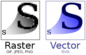 Normal Images vs SVG
Don't forget about the navbar menu. Make sure to build a hamburger menu for small screen devices.
Test your responsive website on a variety of devices and browsers, as usual. You can use Google Mobile-Friendly Test and Screen Test for testing your website.
One thing to keep in mind about responsive design is that it is a built-in feature of CSS frameworks like Tailwind and Bootstrap. This means that these frameworks help you to make websites more responsive for all device sizes with a little less work.
A unresponsive website with amazing design is worthless today. The majority of people will likely visit your app or website on a mobile device.
How to learn responsive design for a website
- Introduction To Responsive Web Design - HTML & CSS Tutorial
- Bootstrap CSS Framework - Full Course for Beginners
- UI / UX Design Tutorial – Wireframe, Mockup & Design in Figma
Learn to Work with Frameworks
CSS and JavaScript frameworks are sets of files that take care of a lot of the heavy lifting for you by offering standard features. Instead of starting with a blank text page, you may start with a code file that already has a lot of JavaScript in it.
JavaScript and CSS frameworks are changing how developers write code. Some frameworks were built to help you create complicated user interfaces, while others thrive at displaying your website's content.
Choosing the right framework is as important as learning it. Popular frameworks are not always a good choice, and you should pick one according to your specific requirements.
That being said, there are some that are in very high demand that are really worth learning.
Recommended JavaScript frameworks:
- React — It's a free and open-source front-end JavaScript framework for creating UI component-based user interfaces. Meta maintains it.
- Vue — Vue.js is an open-source front-end JavaScript framework for creating single-page apps and user interfaces. Evan You created it.
- Svelte — Rich Harris designed Svelte, a free and open-source front-end compiler that is presently maintained by Vercel.
Recommended CSS frameworks:
- Bootstrap — Bootstrap is an open-source framework for interface components that includes CSS and JavaScript-based templates.
- Tailwind CSS — Tailwind CSS is a utility-first CSS framework that includes classes for creating custom UI designs.
- Bulma — Bulma is an open-source CSS framework. It has a lot of built-in capabilities that help you get things done faster and with less CSS.
That's a Wrap!
Thanks for reading this article. I also write regularly on my newsletter The Learners. You can signup directly here. 👇👇