By James Barnard
Blink and you’ll miss it: How a two-day design project went by in an instant

I recently completed a short project for the Sky Atlantic series The Tunnel, “a British-French crime drama”. With the third series Vengeance soon to be released, Toby Welch (friend and producer of the show) reached out to me. He needed help filling some gaps in post-production
Usually (in Britain anyway), if a brand is used on a TV show, then the makers have obtained express permission to use it. I once met a graphic designer who worked on a well-known ITV soap. Their job it was to create fake drinks labels of all the spirits behind the bar because using the real ones would have been a legal ball-ache.
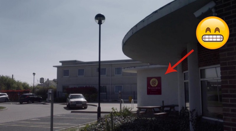
So when we film an exterior shot of our protagonists driving up to a hotel and pulling over outside, we can’t show the real name of the hotel. We have to come up with a fake one. And when shooting a show, it’s not always practical, timely or cost-effective to make real signage for a wall or the side of a building. It’s often cheaper to digitally add it later in post.
The brief
Toby needed two logos for the VFX team to superimpose on to two different scenes. The first was for an exterior shot of our protagonists driving up to a hotel and pulling over outside. He needed a fairly budget looking logo, and he would provide a pre-approved hotel name (signed off by legal).
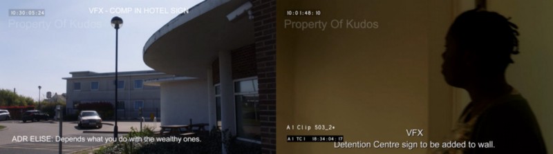
The second was for a fake institution called the “Kent & District IMMIGRATION REMOVAL CENTRE”. This needed to be in a plain, black and white style that feels like ‘government’ and accompanied by a private security company badge. This would be added to an interior wall that an actress would walk past. I was provided with the unedited movie clips and asked to come up with some options.
This was a pretty cool brief, which turned out to be more work than I’d originally thought.
Research
The first part of any branding project is research. For the hotel brand, I tried to find a color palette that was an amalgamation of the many roadside hotels that are so recognizable as cheap in the UK. Brands that want to scream ‘budget’ are often orange. However, hotels usually try and fake their luxuriousness with something like a blue gradient.
Without wanting to sound like a pretentious, creative industry w*nker, it’s incredibly tricky to not make the design look too good. You want to submit something to the client that says…
“Honestly, I’m a good designer!”
…but you can’t because anything too stylish or premium will be less believable in the scene!
The government sign was a little easier. The toughest part was picking a font that says ‘government’ without actually using the font on Gov.uk’s website, which you’re not allowed to do (I checked). Toby had an idea of using a nautical emblem like an anchor, and I looked up Kent’s sigil, which is a rearing horse.
First draft
With a first draft done, I submitted some options…
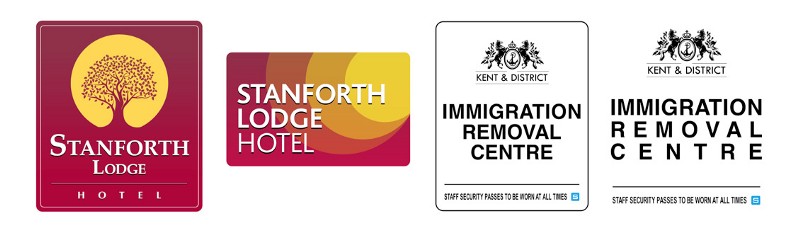
…which were met with a pretty positive response from the execs. The next round of amends tweaked the (far too intricate) tree to something a little bolder. The gap between the logo and the camera would be a factor, so the logomark for the hotel would need to stand out from a distance. Good advice for any branding project.
The immigration sign was met with approval, but the blue security logo was far more important to the scene than I’d realized. This needed some more work, and after another round of research of security firm logos, we eventually settled on these:
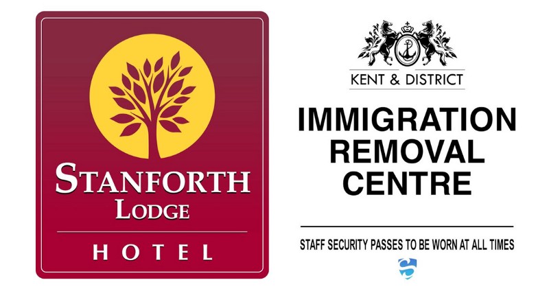
The final scenes
As it turns out, the scene with the white wall was so hard for the VFX guys to track, that they ended up going with a much simpler adaptation in the final scene. There is such a wash of white on screen, with no frame of reference to track the movement of the camera, the team mocked a shorter version up onto a metal plaque. Thankfully, my corporate security logo survived.
I found the whole experience fascinating. It took two days of back and forth, plus lord-knows how much VFX work, to produce signs that appear on screen for a total of fewer than 11 seconds. All to tell the story just that little bit better.
I think that is superb, and I can not imagine what an involved process creating an entire TV series like this must be. Hats off to Toby and the team. Fingers crossed I get more work like this. Graphic design for TV and Film. It’s a dream job.