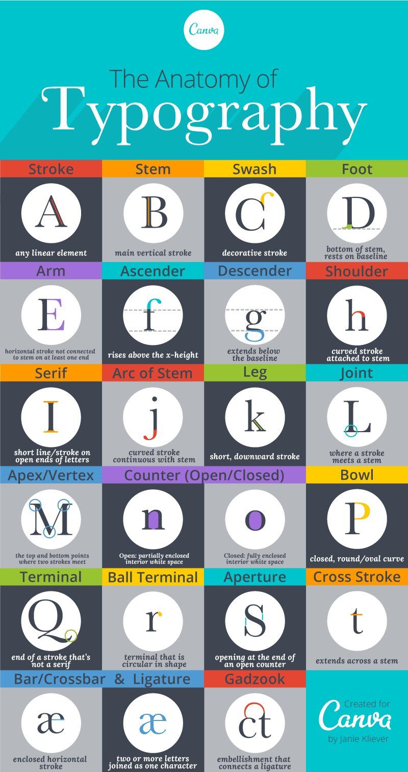
The anatomy of letterforms describes the different elements that make up printed letters in a typeface. The figure below shows the different parts of the letters in a typeface:
 _Source: https://en.wikipedia.org/wiki/Typeface_anatomy_
According to "Typeface anatomy", the typographic parts of a glyph are as follows:
1) x-height; 2) ascender line; 3) apex; 4) baseline; 5) ascender; 6) crossbar; 7) stem; 8) serif; 9) leg; 10) bowl; 11) counter; 12) collar; 13) loop; 14) ear; 15) tie; 16) horizontal bar; 17) arm; 18) vertical bar; 19) cap height; 20) descender line
Generally speaking, a typeface consists of 3 main parts:
- Strokes
- Terminals
- Space
Strokes
Stroke refers to the main body of the letterform. They may be straight, as in letters like l, z, k, v or curved like in c or o. The different parts of the stroke are given below:
- The imaginary line on which most characters sit is known as the baseline** (4).
- Baseline (4): The imaginary line that most characters are situated on
- Capline (19): Another imaginary line that dictates the height of all uppercase characters. This is sometimes called the capheight
- Meanline: The imaginary line that marks the top of lowercase letters
- X-height (1): The height of the lowercase x character, and represents the distance between the baseline and the meanline.
- Stem (7): The main stroke in a letterform, which is often vertical or diagonal
- Crossbar (6): These are the strokes that connect two separate lines in capital letters such as A and H, or the horizontal stroke in the lowercase t
- Ascender (5): When the stroke of a lowercase letter goes above the meanline such as with l
- Ascender line** (2):** The imaginary line depicting the distance between the baseline and the top of the ascender
- Descender: When the stroke of a lowercase letter falls below the baseline like with g
- Descender line** (20):** The imaginary line depicting the distance between the baseline and the bottom of the descender
- Shoulder: Sometimes called an arch, this is a curved, arching stroke like the one at the top of R, and also found in h, n, and m
- Bowl (10): A curved, closed stroke like the ones in d, b, R, D, and B
- Leg (9): The downward diagonal stroke as in K and R
- Bar: The short, horizontal stroke in letters that do not cross a vertical line like the center of e, and the middle stroke of both E and F
- Arm (17): The long horizontal stroke at the top or bottom of a character like in E and F
- Tittle: The dot above characters like the one in i or j. This is sometimes called a dot or jot
- Loop (13): The open or closed bottom section of a double-story g in some typefaces
Terminals
Terminals are the end of the strokes and can be either serif** or sans-serif**.
A seriffed terminal has protrusions on the edges which can be described as a wedge, bulbous, teardrop, or slab. On the other hand, sans-serif terminals do not have any of those features at the end of strokes.
These days, sans-serif is used on digital displays since they have better legibility, especially on lower resolution displays where serif terminals are hard to depict.
Space
Space refers to the white space that is found between the letters and also inside letters like o and p with closed loops.
Below are some basic definitions to help you understand how type is described and measured.
Describing and measuring type
Typeface vs. font
Often these terms can be used interchangeably. But in the case of typography, there is a difference, however slight.
Typeface is a set of glyphs or characters – which include letters, numbers, and punctuation – that share a distinct sense of style. Common examples are Arial, Times New Roman, and Roboto.
Font is a small, specific subset of a typeface, and describes how the typeface is presented. For example, bold Roboto 8pt is one example of a font, while italicized Roboto 12pt is another distinct font.
 Source: https://www.canva.com/learn/typography-terms/
Type families
Different options for a given typeface, most of which include bold, italic, and roman at a bare minimum. Other examples of type families include condensed bold, condensed black, ultralight, light, regular, ultralight italic, light italic, regular italic, and so on.
Point Sizes
The point is used to measure the size of a font. One point is equal to 1/72 of an inch. When a character is referred to as 12pt, the full height of the text block (such as a block of movable type), and not just the character itself, is being described. Because of this, two typefaces at the same point size may appear as different sizes, based on the position of the character in the block and how much of the block the character fills.
Pica
How lines of text are measured generally. One pica equals 12 points, and six picas equal one inch on a page or screen.
Tracking / Letter-spacing and kerning
These elements control the distance between characters and can be used to adjust legibility.
Tracking, or letter-spacing, is the space between characters across an entire block of block of text such as a magazine article.
Kerning is the space between individual characters. If you've ever typed a word in an editor and thought it looked off – the letters being either too close together or too far apart – it was probably a kerning issue.
Leading
This refers to the vertical distance between lines of text, and is measured from one baseline to the next.