By Emmanuel Ohans
This article will cover all the fundamental concepts you need to get good with the CSS Flexbox model. It’s a long one, so I hope you’re ready for it.
If you prefer to read the entire tutorial in a single .pdf document, here’s the download link — no strings attached, & if you want a more immersive experience, use the interactive course — it is free. No strings attached.
A note on Flexbox’s learning curve
Here’s a tweet from Philip Roberts, a developer whom I respect very much:
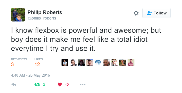
Learning Flexbox may not be fun at first. It will challenge what you know about layouts in CSS. But that’s fine. Everything worth learning begins that way.
Flexbox is certainly something you should take seriously. It paves the way for the modern style of laying out content, and it’s not going away anytime soon. It has emerged as a new standard. So with outstretched arms, embrace it!
What you’ll learn
I’ll first walk you through the basics of Flexbox. I believe any attempt at understanding Flexbox must begin here.
Learning the fundamentals is cool. What’s even cooler is applying these fundamentals to build real-world apps.
I’ll walk you through building a lot of “small things.” Afterwards, I’ll wrap things up with this music app completely laid out with Flexbox.
Doesn’t that look pretty?
I’ll get into the inner workings of Flexbox while you learn to build the music app layout. You’ll also get a feel for the role Flexbox plays in responsive web design, too.
I’m excited to show you all this.
But before you get started building user interfaces, I’m going to walk you through some drills, first. This may seem boring, but it’s all part of the process of getting you adept at Flexbox.
Let’s get started.
Introduction

CSS has evolved a lot over the past few years. Designers loved the introduction of filters, transitions, and transforms. But something was missing. Something we all craved.
Crafting Intelligent page layouts with CSS seemed to have persisted for too long, and this got many of us writing hacky CSS.
We always had to deal with floats, table display hacks, and the consequences they brought. If you’ve written CSS for sometime, you can probably relate to this. And if not, welcome to a better world!
It seems like our prayers as designers and front-end developers have finally been heard. This time, in grand style.
Now we can all ditch those hacky CSS tricks. No more incessant use of floats, table-cell displays.
It’s time to embrace a cleaner modern syntax for crafting intelligent layouts. Welcome the CSS Flexbox model.
What Is Flexbox?
According to the specification, the Flexbox model provides for an efficient way to layout, align, and distribute space among elements within your document — even when the viewport and the size of your elements is dynamic or unknown.
If that sounds too formal, I understand the feeling. In just a bit, I’ll explain what that means in plain English.
Whether you write CSS in your dreams, or you’re just getting started, you’ll feel right at home.
How do I start using the Flexbox model?
This is the first question everyone asks, and the answer is much simpler than you may have expected.
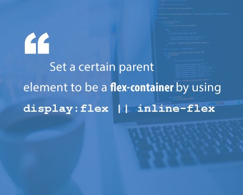
To start using the Flexbox model, all you need to do is first define a flex-container.
In regular HTML, laying out a simple list of items takes this form:
<ul> <!--parent element--> <li></li> <!--first child element--> <li></li> <!--second child element--> <li></li> <!--third child element--></ul>
If you glanced at that, you must have seen that the unordered list (ul) houses the list elements(li).
You’d call the ul the parent element, and the li the child element.
To use the Flexbox model, you must make a parent element a flex container (AKA flexible container).
You do this by setting display: flex or display: inline-flex for the inline variation. It's that simple, and from there you're all set to use the Flexbox model.
What actually happens is, a Flexbox formatting context is immediately initiated.
Told you it wasn't as difficult as you expected.
Using an unordered list and a bunch of list elements, below is what initiating a Flexbox formatting context looks like.
/*Make parent element a flex container*/ul { display: flex; /*or inline-flex*/}
Style the list items just a bit, so you may see what’s going on here.
li { width: 100px; height: 100px; background-color: #8cacea; margin: 8px;}
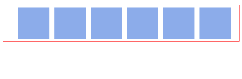
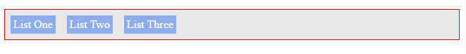
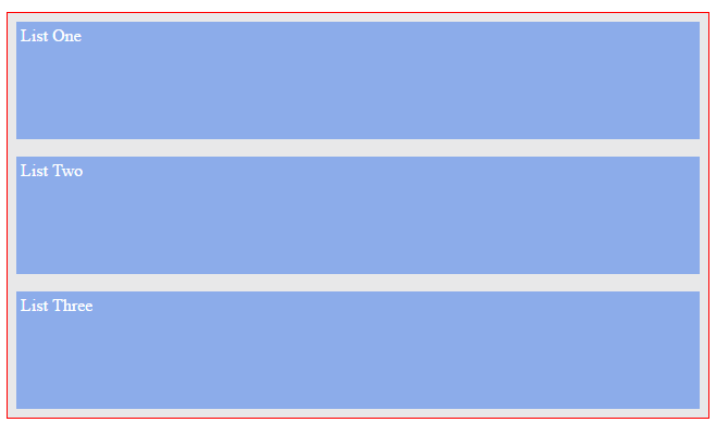
Here is what you should have:
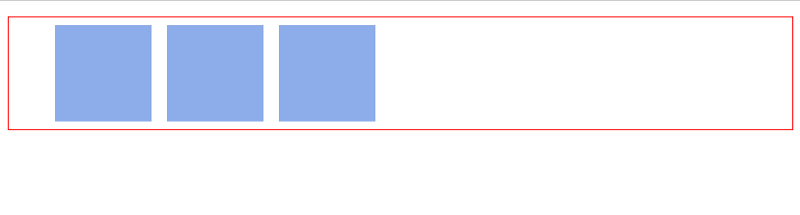
You may not have noticed, but something has happened already. The Flexbox formatting context is now initiated.
Remember that ‘li’ elements are by nature block elements, which means they stack vertically, and this applies for other CSS block elements, such as ‘div’.
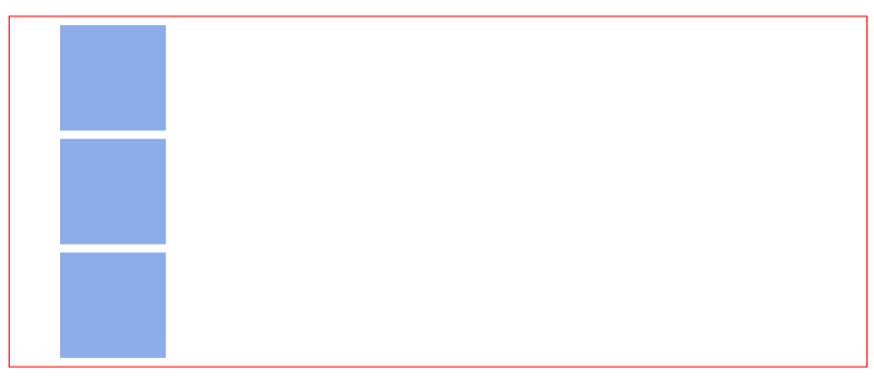
The image above is the result you may have hoped for.
However, with the inclusion of that simple one-liner, display:flex, you can immediately see a change in layout.
The list elements are now stacked horizontally, from left to right. Just like they would if you used float.

The Flexbox model kicks in as soon as you introduce the “flex display” on any parent element.
You may not understand why that change in the orientation of the list elements came to be. I promise I’ll go into the inner workings of that very soon. For now, blind trust would suffice.
Understanding that the inclusion of the “flex display” starts off the Flexbox model.
There’s one more thing I need to call your attention to.
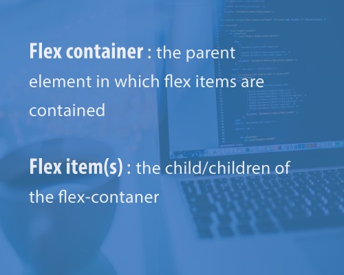
As soon as you set the display property to flex, the unordered list automatically becomes the flex container and the child elements (in this case, the list elements li) become flex items.
These terms would come up over and over again as I walk you through some more interesting things the Flexbox model has in place.
I’ve used two key words, and I’d like to lay more emphasis on them. They are vital to understanding what lies ahead.
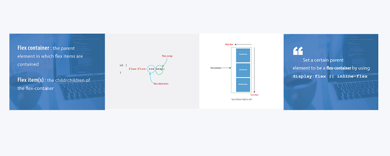
- Flex container : The parent element you’ve set
display: flexon. - Flex items : The children elements within a Flex container.
This is the foundation for using the Flexbox model.
The Flex Container Properties
Flex-direction || Flex-wrap || Flex-flow || Justify-content || Align-items || Align-content

In the section above, I established some fundamental principles. What flex-containers and flex-items are, and how to initiate the Flexbox model.
Now is a good time to put all of that to good use.
Having set a parent element as a flex container, a couple of alignment properties are made available to be used on the flex container.
Just like you’d define the width property on a block element as width: 200px, there are 6 different properties the flex container can take on.
The good news is that defining these properties doesn’t require a different approach from what you’re already used to.
1. Flex-direction
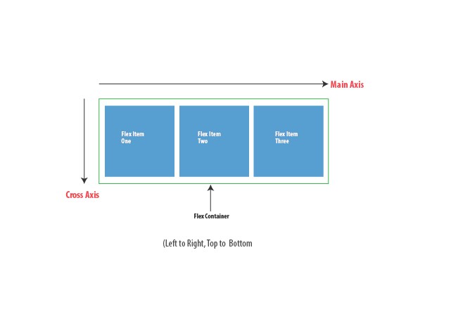
The Flex-direction property controls the direction in which the flex-items are laid along the main axis.
It may take any of four values.
/*where ul represents a flex container*/ul { flex-direction: row || column || row-reverse || column-reverse; }
In layman’s terms, the flex-direction property let's you decide how the flex items are laid out. Either horizontally, vertically or reversed in both directions.
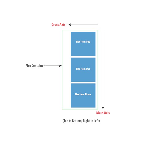
Technically, “horizontal” and “vertical” isn't what the directions are called in the "flex world".
These are described as main-axis and cross axis. The defaults are shown below.
In layman’s terms again, the main-axis’ default direction feels like “horizontal.” From left to right.
The cross-axis feels like “vertical.” From top to bottom.

By default, the flex-direction property is set to row and it aligns the flex-item(s) along the main axis. This explains what happened with the unordered list at the start of this article.
Even though the flex-direction property wasn't explicitly set, it took on the default value of row.
The flex items were then laid across the main-axis, stacking horizontally from left to right.
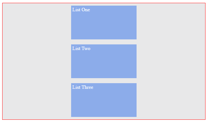
If the flex-direction property is changed to column, the flex-items will be aligned along the cross axis.
They would stack from top to bottom, not from left to right any longer.
2. Flex-wrap
The flex-wrap property can take on any of three values:
//where ul represents a flex containerul { flex-wrap: wrap || nowrap || wrap-reverse; }
I’ll explain how the flex-wrap property works by walking you through an example.
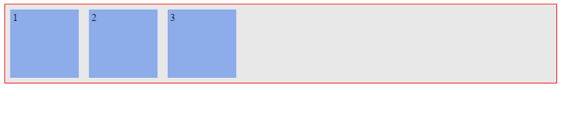
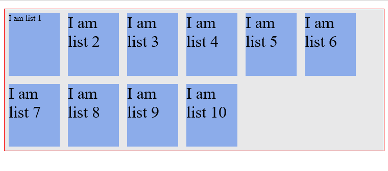
Try sticking a lot more list items into the unordered list.
What do you think? Will the flex container resize to accommodate more, or will it break up the list items unto another line?
/*adding 3 more li elements*/<ul> <!--parent element--> <li></li> <!--first child element--> <li></li> <!--second child element--> <li></li> <!--third child element--> <li></li> <li></li> <li></li></ul>
Fortunately, the flex-container adapts to accommodate the new flex-items
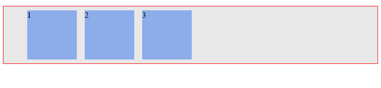
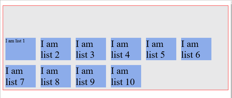
Go a bit further.
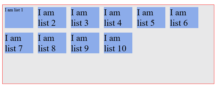
Add a ridiculous amount of flex-items to the parent element. Make it a total of 10 items.
What happens?
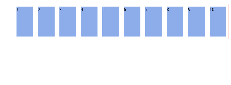
Again, the flex container adapts to fit all children in, even if the browser needs to be scrolled horizontally.
This is the default behavior of every flex container. A flex container will keep on accommodating more flex items on a single line.
This is because the flex-wrap property defaults to nowrap. This causes the flex container to NOT wrap.
ul { flex-wrap: nowrap; /*Keep on taking more flex items without breaking (wrapping)*/}
The no-wrap isn’t a iron-clad value. It can be changed.
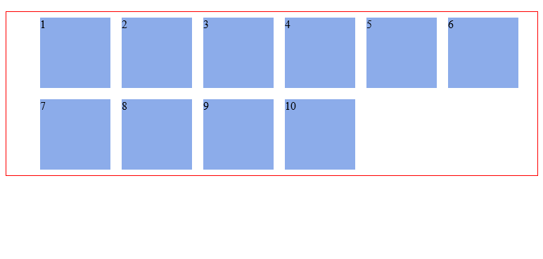
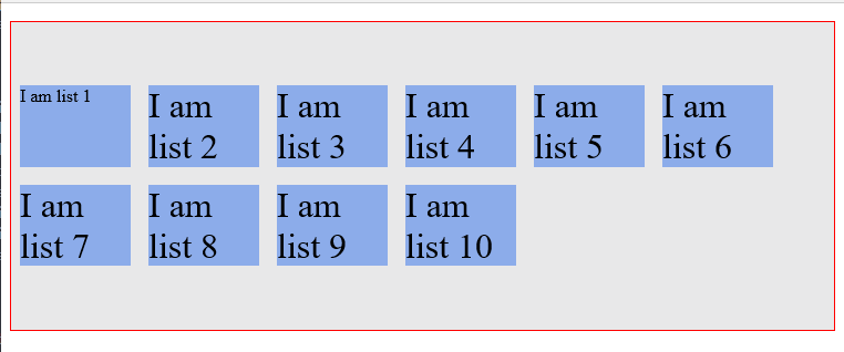
With that number of flex-items, you certainly want the flex-items to “wrap” within the flex-container.
“Wrap” is a fancy word to say, “when the available space within the flex-container can no longer house the flex-items in their default widths, break unto multiple lines.
This is possible with the wrapvalue.
ul { flex-wrap: wrap;}
With this, the flex-items now break up into multiple lines when needed.
In this case, when a single line can no longer contain all the list items in their default width, they break up into multiple lines. Even on resizing the browser.
Here’s what that looks like.
Note that the flex items are now displayed in their default widths. There’s no need to force multiple flex items unto one line.
There’s one more value, wrap-reverse.
Yes, you guessed right. It lets the flex items break unto multiple lines, but in the reverse direction.
3. Flex-flow
The flex-flow is a shorthand property which takes flex-direction and Flex-wrap values.
Ever used the border shorthand property? border: 1px solid red.
It's the same concept here. Multiple values declared in one line.
See the example below.
ul { flex-flow: row wrap; /*direction "row" and yes, please wrap the items.*/}
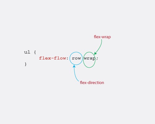
Try out the other combinations this could take. flex-flow: row nowrap, flex-flow: column wrap, flex-flow: column nowrap
The results produced are not different from what you’ve seen with the flex-direction and flex-wrap values.
I'm sure you understand what those would produce.
Give them a try.
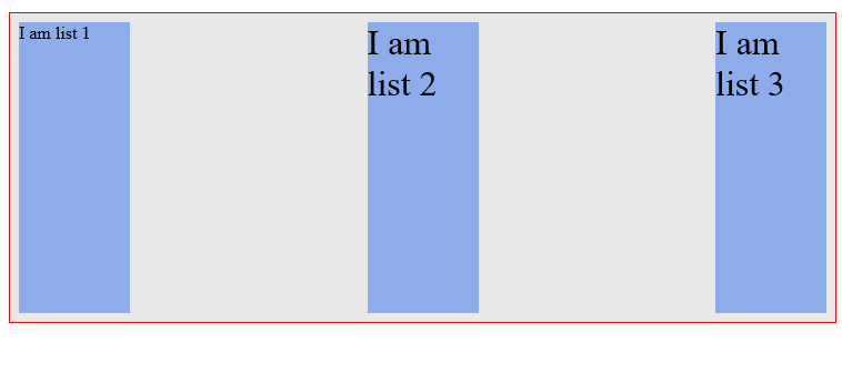
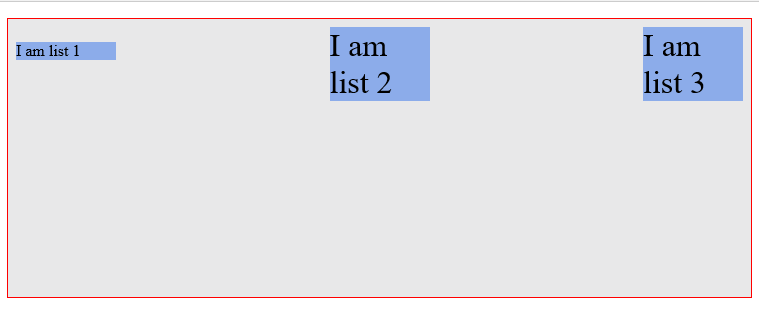
4. Justify-content
Life’s really good with the Flexbox model. If you still doubt that, the justify-content property may convince you.
The justify-content property takes on any of the 5 values below.
ul { justify-content: flex-start || flex-end || center || space-between || space-around}
And what exactly does the justify content property bring to the table?
Well, It may remind you of the text-align property.
The justify content property defines how flex items are laid out on the main axis.
A quick example.
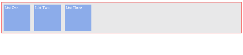
Consider the simple unordered list below.
<ul> <li>1</li> <li>2</li> <li>3</li></ul>
Add up some basic styling.
ul { border: 1px solid red; padding: 0; list-style: none; background-color: #e8e8e9; }
li { background-color: #8cacea; width: 100px; height: 100px; margin: 8px; padding: 4px; }
You should have this:
With the justify-content property, the three flex-items may be aligned across the main-axis in whatever way you desire.
Here's the breakdown of what's possible.
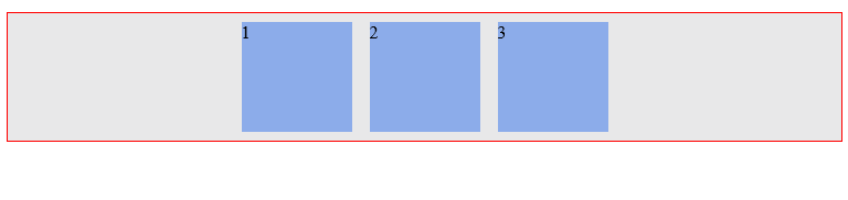
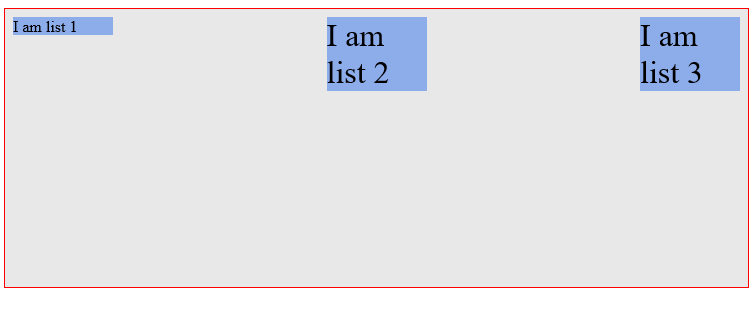
(i) Flex-start
The default value is flex-start.
flex-start groups all flex-items to the start of the main axis.
ul { justify-content: flex-start; }
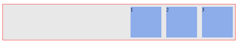
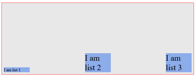
(ii) Flex-end
flex-end groups the flex-items to the end of the main axis.
ul { justify-content: flex-end; }
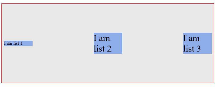
(iii) Center
Center does just what you'd expect: it centers the flex items along the main axis.
ul { justify-content: center; }
(iv) Space-between
Space-between keeps the same space between each flex item.
ul { justify-content: space-between; }
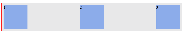
Um, did you notice anything different here?
Take a look at the descriptive image below.

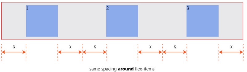
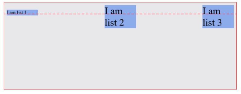
(v) Space-around
Finally, space-around keeps the same spacing around flex items.
ul { justify-content: space-around; }
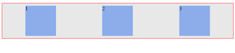
A second look doesn’t hurt.
See the descriptive image below.
Don’t worry if these seem like too much to get a hold of. With a bit of practice you will get very comfortable with the syntax.
Be sure to understand how they affect the display of flex items along the main axis.
5. Align-items
The align-items property is somewhat similar to the justify-content property.
Having understood the justify-content property, this should be easier to take in.
Align-items can be set to any of these values: flex-start || flex-end || center || stretch || baseline
/*ul represents any flex container*/ul { align-items: flex-start || flex-end || center || stretch || baseline}
It defines how flex-items are laid out on the cross axis. This is the difference between the align-items property and justify-content.
Below is how the different values affect flex items.
Do not forget the direction being affected by these properties. The cross-axis.
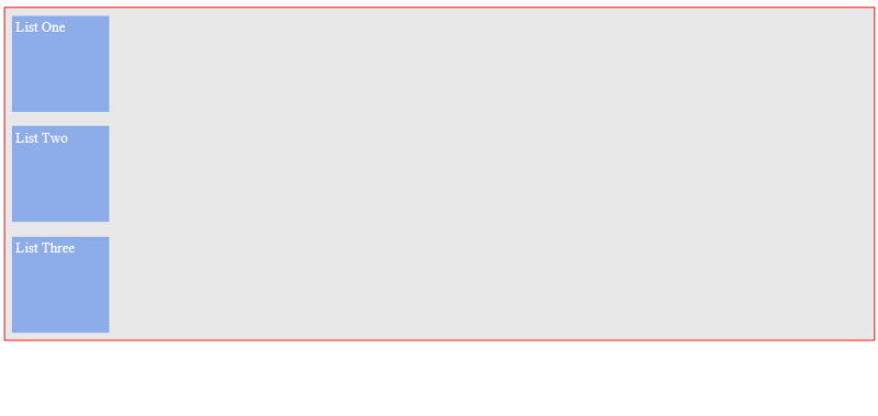
(i) Stretch
The default value is stretch. This will “stretch” the flex-items so they fill the entire height of the flex container.
(ii) Flex-start
The flex-start does what you expect. It groups the flex items to the start of the cross-axis.
(iii) Flex-end
As expected, flex-end groups the flex items to the end of the cross-axis.
(iv) Center
The center value is equally predictable. It aligns the flex items to the center of the flex-container.
(v) Baseline
And the baseline value?
It aligns flex-items along their baselines.
“Baseline” really sounds fancy.
The result appears to look just like flex-start but it is subtly different.
What the heck is “baseline”?
The image below should help.
Notice how all the flex-items are aligned to have their content seat on the “baseline”?
6. Align-content
While discussing the wrap property, do you remember what happened when you added more flex-items to the flex-container?
You got a multi-line flex container.
The align-content property is used on multi-line flex-containers.
It takes the same values as align-items apart from baseline.
By definition, it controls how the flex-items are aligned in a multi-line flex container.
Just like align-items, the default value is also stretch
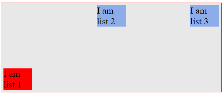
These are values you should now be familiar with. So, here’s how they affect a multi-line flex-container with 10 flex-items.
(i) Stretch
With stretch, the flex items are “stretched” to fit the available space along the cross-axis.
The spacing you see between the flex items below is owing to the margin set on the items.
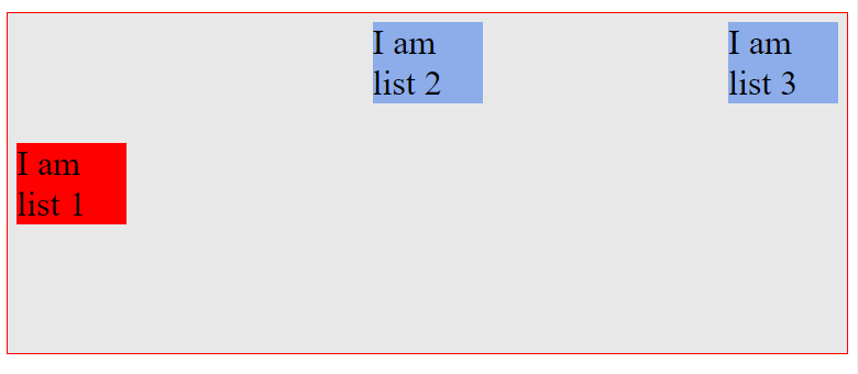
(ii) Flex-start
You’ve seen the flex-start value before.
This time it aligns the items in the multi-line container to the start of the cross-axis.
Remember the default cross axis is from top-to-down.
Thus, the flex items are aligned to the top of the flex container.
(iii) Flex-end
The flex-end value aligns the flex items to the end of the cross-axis.
(iv) Center
Like you may have guessed, center aligns the flex-items to the center of the cross-axis.
That’s the last of the flex-container properties.
You now understand how to use the various flex-container properties.
You’ll use these to work through the practical sections coming up.
The Flex Item Properties
Order || Flex-grow || Flex-shrink || Flex-basis
In the previous section, I explained flex-containers and their alignment properties.
Beautiful indeed.
Sure you’re getting a feel of what lies ahead.
I’d take my focus off flex-containers now, and walk you through flex-items and their alignment properties.
Like flex-containers, a couple alignment properties are also made available on all flex-items, too.
Let me walk you through them.
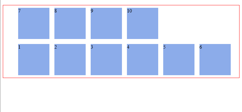
1. Order
The order property allows for reordering the flex items within a container.
Basically, with the order property you can move a flex-item from one position to another. Just like you would do with “sortable” lists.
This is done without affecting the source code. Which means the position of the flex items in the HTML source code isn’t changed.
The default value for the order property is 0. It may take on either negative or positive values.
It’s worth noting that flex items are re-ordered based on the number values of the order property. From lowest to highest.
An example always does the trick. Consider the unordered list below:
<ul> <li>1</li> <li>2</li> <li>3</li> <li>4</li> </ul>
By default, the flex items all have an order value of 0.
Just as you expected, you get this (see below) after some basic styling.
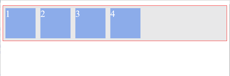
The Flex items are displayed just as specified in the HTML source order. Flex item 1, then 2, 3, and 4.
What if for some reason you wanted the flex-item 1 to appear last? Without changing the source order in the HTML document?
“Without changing the source order” means you do not get to do this:
<ul> <li>2</li> <li>3</li> <li>4</li> <li>1</li> </ul>
Now that’s where the order property comes in.
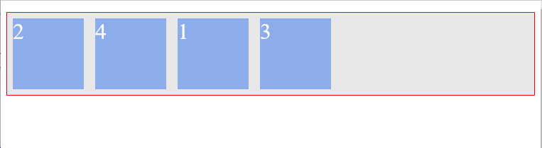
All you need to do is make the order value of flex-item 1 higher than that of other list items.
If you ever used the z-index property on block elements, you'd be familiar with this sort of thing.
/*select first li element within the ul */ li:nth-child(1) { order: 1; /*give it a value higher than 0*/ }
The flex items are then re-ordered from lowest to highest.
Do not forget that by default, list-items 2, 3, and 4 all have the order value of 0.
Now, flex-item 1 has an order value of 1.
Flex-items 2, 3, and 4 all have an order value of 0. So, the HTML source order is kept — no modifications made to the default display.
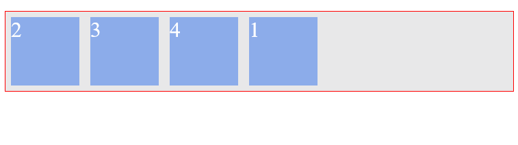
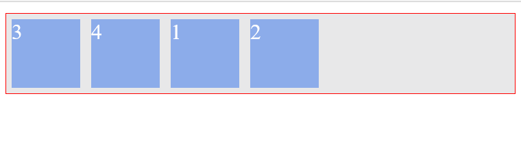
What if you gave flex-item 2 an order value of 2?
Yes, you guessed right. It goes up the stack too. It now represents the flex-item with the highest order value.
And what happens when two flex items have the same order value?
In the example below, flex-item 1 and 3 are given the same order values
li:nth-child(1) { order: 1; }
li:nth-child(3) { order: 1; }
The items are still arranged from lowest to highest order value.
This time, flex-item 3 appears last because it comes after flex-item 1 in the source file (HTML document).
The re-ordering is based on the positions in the source file, when two or more flex items have the same order value.
That was a lot of explanation.
I’d move on to some other property.
2. Flex-grow and flex-shrink
The beauty of flex items is being “flexible.”
The flex-grow and flex-shrink properties allow us play around this “flexibility” even more.
The flex-grow and flex-shrink properties control how much a flex-item should “grow” (extend) if there are extra spaces, or “shrink” if there are no extra spaces.
They may take up any values ranging from 0 to any positive number. 0 || positive number
Let me demystify that.
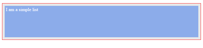
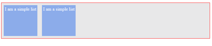
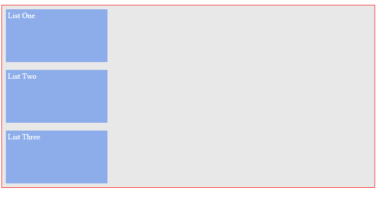
Consider the simple unordered list below. It comprises just one list item.
<ul> <li>I am a simple list</li></ul>
ul { display: flex;}
With a bit more styling, it appears like this.
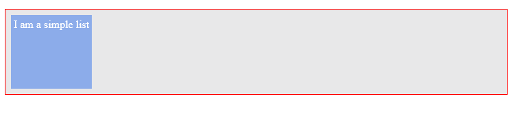
By default, the flex-grow property is set to 0. By implication, the flex-item does NOT grow to fit the entire space available.
The value 0 is like a “turn-off” switch. The flex-grow switch is turned off.
However, if you changed the flex-grow value to 1, here's what happens.
The flex-item now “grows” to occupy all the available space. The switch is turned on!
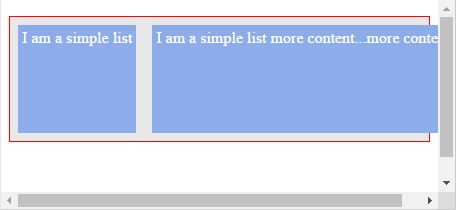
If you tried resizing your browser, the flex-item would also “shrink” to accommodate the new screen width.
Why? By default, the shrink property is set to 1. Which means the flex-shrink switch is also turned on!
I’ll take a closer look at the flex-grow and flex-shrink properties in a bit in case you still don't feel confident with your understanding of this.
3. Flex-basis
Remember how I said the beauty of the flex-items is being “flexible”? Well, it appears you also have a control over that.
The flex-basis property specifies the initial size of a flex-item. Before the flex-grow or flex-shrink properties adjust it's size to fit the container or not.
The previous statement is really important- so i’m taking a moment to reinforce that.
The default value is flex-basis: auto. Flex-basis can take on any values you'd use on the normal width property. That is, percentages || ems || rems || pixels etc
Note that when trying to set the basis property to a zero based value, use the unit also. Use flex-basis: 0px not just flex-basis: 0
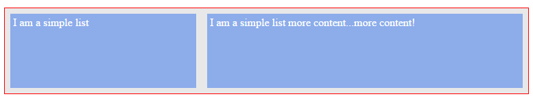
I’d bring back the “one list” example here again.
<ul> <li>I am a simple list</li></ul>
ul { display: flex}
li { padding: 4px; /*some breathing space*/}
By default, the initial width of the flex item is influenced by the default value, flex-basis: auto.
The width of the flex-item is computed "automatically" based on the content size (and obviously, plus whatever padding you set too).
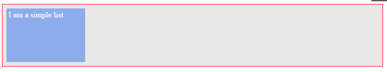
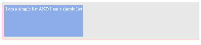
This means if you increased the content in the flex-item, it automatically resizes to fit.
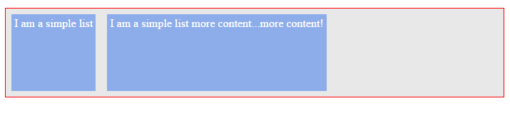
<ul> <li>I am a simple list AND I am a simple list</li></ul>
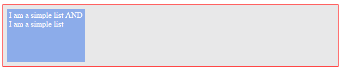
If, however, you want to set the flex-item to a fixed width, you can also do this:
li { flex-basis: 150px;}
Now the flex-item has been constrained to a width of 150px.
It’s getting even more interesting.
4. The flex shorthand
The flex shorthand allows you set the flex-grow, flex-shrink and flex-basis properties all at once.
When appropriate, I advice you set all three properties at once using the flex shorthand than doing so individually.
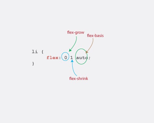
li { flex: 0 1 auto;}
The code above is equal to setting the three properties: flex-grow: 0; flex-shrink: 1; flex-basis: auto
Please note the order.
Flex-grow first, then flex-shrink, and then flex-basis. The acronym, GSB may help.
What happens if you fail to set one of the values in the flex-shorthand?
If you set only the flex-grow and flex-shrinkvalues, flex-basis would default to zero.
This is called an absolute flex. And when you set only the flex-basis, you get a relative flex.
/*this is an absolute flex item*/li { flex: 1 1; /*flex-basis defaults to 0*/}
/*this is a relative flex item*/li { flex-basis: 200px; /*only flex-basis is set*/}
I know what you’re thinking. What’s the purpose of the relative and absolute flex?
I answer that question later in this article. Again, blind trust will suffice for now.
Let’s take a look at some very useful flex shorthand values.
1. flex: 0 1 auto
/*again, the "li" represents any flex-item*/li { flex: 0 1 auto;}
This is same as writing flex: default and it's the default behavior of all flex items.
Let me break this down, just a bit.
It’s easier to understand this by taking a look at the flex-basis property first.
The flex-basis is set to auto, which means the initial width of the flex-item will be automatically determined based on the size of the contents.
Got that?
Moving on to the next property, the flex-grow value is zero. This means the flex-grow property wouldn't tamper with the initial width of the flex item.
The grow switch is off.
Since flex-grow controls the “growth” of the flex-items and it’s set to zero, the flex-items will not “grow” to fit the screen.
Finally, the flex shrink value is 1. It says this — “shrink the flex-item when it is necessary”
Here is what this looks like when applied to some flex items.
flex: 0 1 auto
Notice how the flex items don’t grow. The width is computed automatically, and they shrink upon resizing the browser — if necessary.
2. Flex: 0 0 auto
/*again, the "li" represents any list-item*/
li { flex: 0 0 auto;}
This is same as flex: none.
Using the same framework I established earlier, the width is computed automatically BUT the flex item does NOT grow or shrink (they are both set to zero).
The grow and shrink switches are both off.
It’s essentially a fixed width element whose initial width is based off of the content size in the flex item.
See how this flex shorthand affects two flex items. One housing more content than the other.
Flex: 0 0 auto
The first thing you should notice is, the flex items both have different widths.
That is expected since the widths are computed automatically, based on the content size.
Try resizing your browser, and you’ll notice that the flex items don’t shrink with its width. They pop out of the parent element, and you have to scroll your browser horizontally to view all the content.
No worries, I’ll show you how to deal with this weird behavior later.
3. Flex: 1 1 auto
This is same as flex: auto.
Use the framework I established earlier.
This says, "compute initial width automatically, but grow to fit the entire available space and shrink if necessary"
The grow and shrink switches are turned on, and the widths computed automatically.
Flex: 1 1 auto
This time around, the items fill up the available space and they shrink upon resizing the browser too.
4. Flex: "positive number"
Where “positive number” represents any positive number (without the quotes)
This is the same as flex: “positive number” 1 0.
flex: 2 1 0is the same as writingflex:2 2 represents any positive number.
/*again, the "li" represents any list-item*/li { flex: 2 1 0; /*same as flex: 2*/}
Following the same framework I established earlier, this says, “set the initial width of the flex item to zero (ehm, no width?), grow the item to fill the available space, and finally shrink the item whenever possible”
With the flex items having “no width”, how’s the width computed?
The flex-grow value takes over, and determines the extent the flex item “widens”.
That takes care of the no-width problem.
It’s more practical to use this flex shorthand when you have more than one flex item whose initial widths, flex-basis are set to any zero based values e.g. 0px
What really happens is, the widths of the flex items are computed based on the ratios of the flex-grow value.
I’d break that down just a bit.
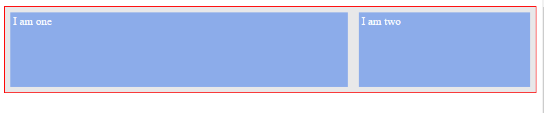
Consider two list items marked up and styled below.
<ul> <li>I am One</li> <li>I am Two</li></ul>
ul { display: flex;}
/*first flex-item*/li:nth-child(1) { flex: 2 1 0; /*same as just writing flex: 2*/}
/*second flex-item*/li:nth-child(2){ flex: 1 1 0; background-color: #8cacea;}
Remember that setting flex-grow : 1 lets the flex-item fill up the available space. The grow switch is turned on.
Here you have two flex-items. One has aflex-grow property of 1 and the other 2, what then happens?
You have the grow switches turned on for both items. However, the magnitude of growth differs. 1 and 2.
They both expand to fill up the available space, but in some proportion.
Here’s how it works.
The latter takes up 2/3 of the available space while the former takes 1/3.
You know how I arrived at that?
Basic mathematics ratio. individual ratio / total ratio I hope you didn’t skip those math classes.
You see what’s happening?
Even though both flex-items have contents of the same size (approximately), they however take up different spaces.
The widths are not based on the content size, but the grow values.
One is about two times the other.
5. Align-self
The align-self property takes a step further in giving us so much control over flex items.
You already saw how the align-items property helps in collectively aligning all flex-items within a flex-container.
What if you wanted to change the position of a single flex-item along the cross-axis, without affecting the neighboring flex-items?
This is where the align-self property comes to the rescue.
It may take on any of these values: auto || flex-start || flex-end || center || baseline || stretch
/*target first list item*/li:first-of-type { align-self: auto || flex-start || flex-end || center || baseline || stretch}
These are values you’re already familiar with, but as a refresher here’s how they affect a particular targeted item.
In this case, the first item within the container.
The targeted flex-item is in red.
1. Flex-end
flex-end aligns the targeted item to the end of the cross axis.
2. Center
center aligns the targeted item to the center of the cross axis.
3. Stretch
stretch “stretches” the targeted flex item to fill up the available space along the cross axis.
4. Baseline
baseline aligns the targeted flex item along the baseline.
It does look like the same result as flex-start but I’m sure you understand what the baseline is.
I explained that much earlier.
5. auto
auto sets the value of the targeted flex item to the parent’s align-items value or stretch if the element has no parent.
In the case below, the flex-container has an align-items value of flex-start
This aligns all the flex-items to the start of the cross-axis.
The targeted flex-item now inherits the flex-start value — the parent’s align-items value.
This is the base styling on the flex-items used above. Just so you understand what’s going on even better.
ul { display: flex; border: 1px solid red; padding: 0; list-style: none; justify-content: space-between; align-items: flex-start; /*affects all flex-items*/ min-height: 50%; background-color: #e8e8e9;}
li { width: 100px; background-color: #8cacea; margin: 8px; font-size: 2rem;}
You’re pretty much getting ready for the fun part now :-)
Absolute and Relative flex-items.
Having covered some ground in previous sections, it’s important to clarify a few important concepts here too.
What really is the difference between an absolute and relative flex-item?
The major difference between these two is got to do with spacing and how they are computed.
The spacing within a relative flex item is computed based on it’s content size. In an absolute flex item, it is based solely on “flex”, not content.
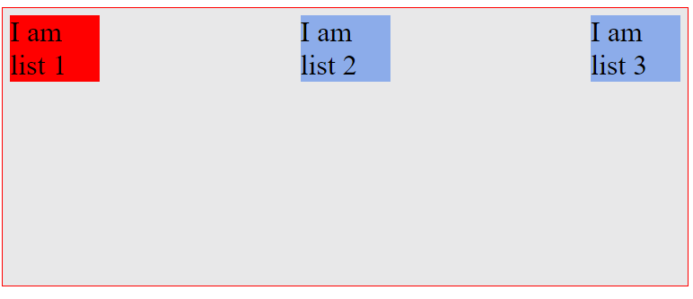
Consider the markup below.
<ul> <li> This is just some random text to buttress the point being explained. Some more random text to buttress the point being explained. </li>
<li>This is just a shorter random text.</li></ul>
Two list elements. One has far more texts than the other.
Add a bit of styling.
ul { display: flex; /*flexbox activated*/}
li { flex: auto; /*remember this is same as flex: 1 1 auto;*/ border: 2px solid red; margin: 2em;}
Here’s the result:

If you already forgot, flex: 1 1 auto is the same as setting: flex-grow: 1 flex-shrink: 1 and flex-basis: auto
Using the framework I established earlier, the initial widths of the flex-items are automatically computed flex-basis: auto, and then they "grow" to fit the available space flex-grow: 1.
When flex-items have their widths computed automatically, flex-basis: auto, it is based on the size of the content contained within the flex-items.
The flex-items in the example above do NOT have contents of the same size. Hence, the sizes of the flex-items would be unequal.
Since the individual widths weren’t equal in the first place (it was based off content), when the items grow, the widths also stay unequal.
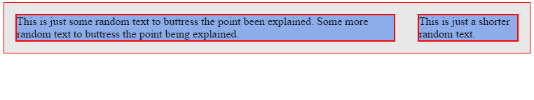
The flex-items in the example above are relative flex-items.
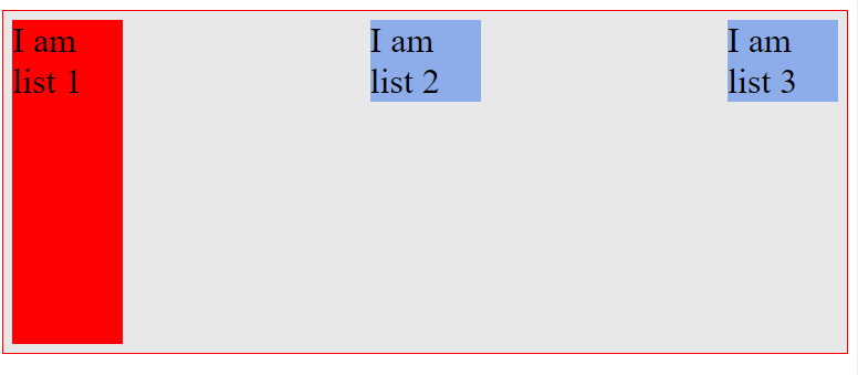
Let’s make the flex-items absolute — meaning this time their widths should be based on “flex” NOT content size.
A “one-liner” does the magic.
li { flex: 1 ; /*same as flex: 1 1 0*/}
See the result below.
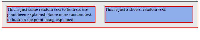
Do you see both flex-items have the same widths this time?
The initial widths of the flex-items is zero flex-basis: 0, and then they “grow” to fit the available space.
When there are two or more flex-items with zero based flex-basis values, they share the spacing available based on the flex-grow values.
I talked about this earlier.
Now the widths aren’t computed based on content size. The widths are based on the flex value specified.
So you got that. Right?
Absolute flex-items have their widths based solely on flex, while relative flex items have their widths based on content size.
Auto-margin Alignment
Beware of margin: auto alignment on flex items.
When you use margin: auto on flex-items, things can look quite weird.
You do need to understand what's going on. It may result in unexpected results, but I'm going to explain all that.
When you use margin: auto on a flex-item, the direction (left, right or both) that has the value auto will take up any empty spaces available.
That’s a difficult one to catch.
Here’s what I mean.
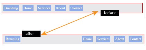
Consider the navigation bar marked up and styled below:
<ul> <li>Branding</li> <li>Home</li> <li>Services</li> <li>About</li> <li>Contact</li></ul>
ul { display: flex;}li { flex: 0 0 auto;}
See the result of that below.
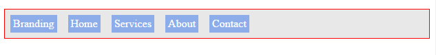
There are a couple of things to note here:
- The
flex-growvalue is set to zero. This explains why the list items don't grow - The flex-items are aligned to the start of the main-axis (the default behavior)
- Owing to the items being aligned to the start of the main-axis, some extra space is left on the right. You see that?
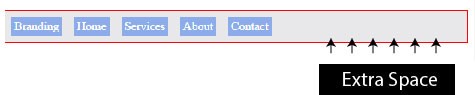
Now use margin: auto on the first list item (branding) and see what happens.
li:nth-child(1) { margin-right: auto; /*applied only to the right*/}
What just happened?
The extra space that existed has now been distributed to the right of the first flex-item.
Do you remember what I said earlier?
When you use margin:auto on a flex-item, the direction (left, right or both) that has the valueauto will take up any empty spaces available.
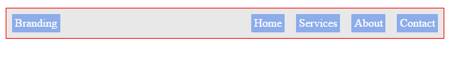
What if you wanted an auto margin alignment on both sides of a flex-item?
/*you may use the margin shorthand to set both sides if you wish*/li:nth-child(1) { margin-left: auto; margin-right: auto}
Now the space is distributed across both sides of the flex-item.
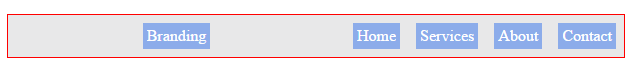
So, is there a trade off with the cool auto-margin alignment?
It appears there’s one. It can be a source of frustration if you don’t pay attention too.
When you use the auto-margin alignment on a flex-item, the justify-content property no longer works.
For instance, setting a different alignment option on the flex-container above via the justify-content property, has no impact on the layout.
ul { justify-content: flex-end;}

Practical Use cases
Navigation systems are a very big part of every website or application. Every website on the planet has got some sort of navigation system in place.
Take a look at these popular sites and how they approach their navigation systems.
Do you see how Flexbox can help you build these layouts more efficiently?
Take a closer look to see where the auto-margin feature may come in very handy too.
(i) Bootstrap Navigation

(ii) AirBnB desktop Navigation

(iii) Twitter desktop Navigation
I recommend you actually write code as a form of practice. I have written a practical guide here: The Most Popular Navigation Bars Created with Flexbox
Go take a look.
I’ll wait.
What happens when you switch flex-direction?
Fair warning: there’s some weird stuff on the way.
When starting off with learning the Flexbox model, this part was the most confusing.
I bet a lot of newcomers to the “flex world” find it that way too.
You remember when I talked about the default main and cross axis being in the “left to right” and “top to bottom” directions?
Well, you can change that too.
This is exactly what happens when you use flex-direction: column as described in an earlier section.
When you use flex-direction: column, the main and cross axis are changed as seen below.

If you’ve ever written any text in the English language, then you already know the language is written from left to right and top to bottom.
That’s equally the direction taken for the default main and cross axis of the Flexbox, too.
However, on switching the flex direction to column, it no longer follows the "English Language" pattern but Japanese!
Oh yes, Japanese.
If you’ve written any text in the Japanese language, then this will be familiar. (For the record, I’ve never written any text in Japanese.)
Japanese text is traditionally written from top to bottom! Not so weird, huh?
That explains why this can be a bit confusing for English writers.

Take a look at this example. The standard unordered list with 3 list items, except this time I’ll change the flex-direction.
<ul> <li></li> <li></li> <li></li> </ul>
ul { display: flex; flex-direction: column;}
Here’s the look before the change in direction:
And afterward:
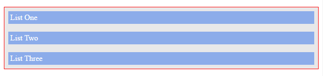
So what happened?
The “text” is now written in Japanese style — from top-to-down (main-axis).
There’s something you may find funny, I’d love to point out.
You see the width of the items fill up the space, right?
If you were to change that before now, you’d just deal with the flex-basis and(or) flex-grow properties.
Let's see how those affect our new layout.
li { flex-basis: 100px;}
…and here’s what you’d get.
Wow — what? The height is affected, but not the width?
As I said earlier, the flex-basis property defines the initial-width of every flex-item.
I was wrong — or better put, I was thinking in “English”. Let’s switch to Japanese for a bit.
It doesn’t always have to be “width”.
Upon switching flex-direction, please note that every property that affected the main-axis now affects the new main-axis.
A property like flex-basis that affected the width of the flex-items along the main-axis now affects the height NOT width.
The direction has been switched!
So even if you used the flex-grow property, it'd affect the height too.
Essentially, every flex property that operated on the horizontal axis (the then main-axis) now operates vertically, the new main-axis.
It's just a switch in directions.
Here’s one more example. I promise you’ll have a better understanding after this one.
Reduce the width of the flex-items we looked at just before now, and they no longer fill the entire space:
li { width: 200px;}
What if you wanted to move the list items to the center of the screen?
In English language, which is how you’ve dealt with flex-containers until now. That’d mean “move the flex-items to the center of the main-axis”.
So, you’d have used justify-content: center
But doing that now does not work.
Since the direction’s changed, the center is along the cross-axis — not the main-axis.
Take a look again:
So please think in terms of Japanese text.
The main-axis is from top-to-down, you don’t need that.
The cross-axis is from left to right. Sounds like what you need.
You need to “move the flex-items to the center of the cross-axis.”
Any flex-container property rings a bell here?
Yeah, the align-items property .
The align-items property deals with alignment on the cross-axis.
So to move those to the center, you'd do this:
ul { align-items: center;}
And voila! You’ve got the flex-items centered.
It can get a bit confusing, I know. Just go over it one more time if you need to.
While studying the Flexbox model, I noticed a lot of CSS books skipped this part.
A bit of thinking in Japanese text would go a long way to help.
It’s worth understanding that all Flexbox properties work based on the flex-direction that’s in place.
I’m sure you learned something new again. I’m having fun explaining this. I hope you are having fun too :-)
Oh my gosh, Flexbox solved that?
Some classic problems many designers face with CSS have been trivially solved by Flexbox.
Philip Walton, in his solved-by-flexbox project lists 6 classic problems (as of this writing).
He extensively discusses the previous limitations with CSS, and the current solution Flexbox provides.
I recommend you take a look after completing this article.
In the practical section coming up, I’ll explain some of the concepts he addresses as I walk you through building a music app layout with Flexbox.
Flexbugs and gotchas for non-compliant browsers
If you’re the not the type of person who writes CSS in their dreams, you may want to watch this github repository.
Some people who are smarter than I am curate a list of Flexbox bugs and their workarounds there.
It’s the first place I look when something isn’t working as I expect.
I’ll be working you through some prominent bugs in the practical section coming next too.
So you’re covered!
Building a Music App Layout with Flexbox

After walking through the boring rigorous stuffs, you deserve some fun project.
It’s time to walk through a practical example and apply your newly acquired Flexbox skills.
It took me days to come up with a good project.
Out of the lack of a creative option, I came up with a music app layout for cats.
I call it catty music.
Maybe by 2036, we’d have cats singing in rock bands somewhere in Mars :-)
Here’s what the finished layout looks like, and it is completely laid out with Flexbox.
You can view it online here.
If you view that on a mobile device, you’ll have a slightly different look. That’s something you’ll work on in the responsive design section of this article.
I’ve got a confession to make though.
I’ve done something considered wrong by many.
I’ve completely built the overall layout with Flexbox.
For many reasons, this may not be ideal. But it’s intentional in this scenario. I set out to show you all the things you can do with Flexbox, all wrapped up within a single project.
If you’re curious as to when it’s considered right or wrong to use the Flexbox model, you may check out my article on that.
Flexbox is awesome but it’s NOT welcome here!
_Flexbox is arguably the best thing that happened to most of us (if you write css) but does that make it perfect for all…_medium.com
There, I got that off my chest. Now I’m sure no one’s going to yell at me after reading this.
Everything in Catty Music is laid out using the Flexbox model — this is intentional to show off what’s possible.
So let’s get this thing built!
As with any reasonable project, a bit of planning goes a long way sifting through inefficiencies.
Let me take you through a planned approach to building the catty music layout.
Where do you start?
Whenever building a layout with Flexbox, you should start by looking out for what sections of your layout may stand out as flex-containers.
You then leverage the powerful alignment properties Flexbox makes available.
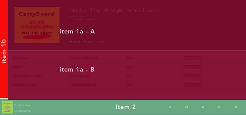
The Breakdown
You may have the overall containing body as a flex container (contained within the red border in the image below) and have the other sections of the layout split into flex-items (items 1 and 2).
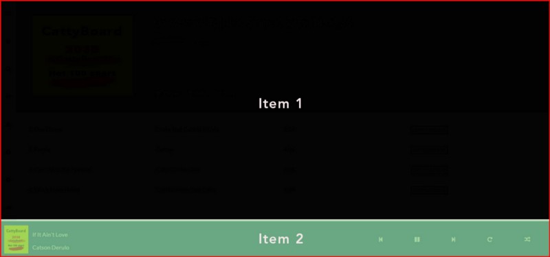
This makes total sense, as item 1 contains every part of the layout other than the “footer” — the section that contains the music control buttons.
Did you know that a flex-item could also be made a flex-container?
Yep, it’s possible!
You can nest as deep as you want (though the sane thing to do is to keep this to a reasonable level).
So, with that new revelation comes this…
Item 1 (the first flex-item) may also be made a flex container.
The sidebar(item 1b) and main section(item 1a) would then be flex-items.
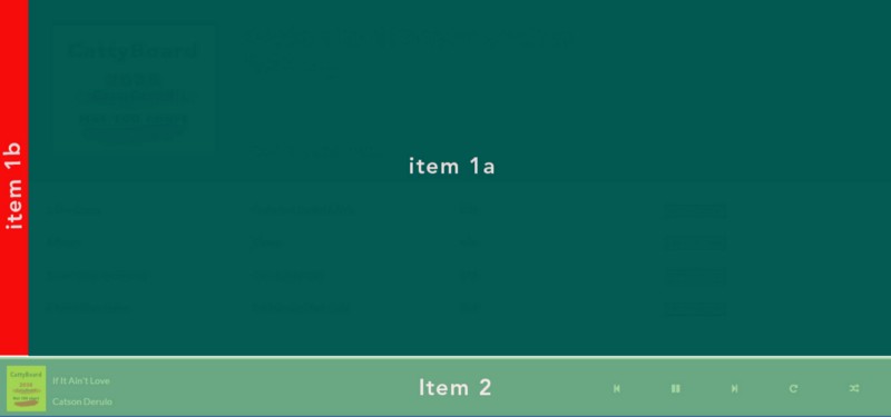
You’re still with me, right?
Decomposing your layout like this gives you a really good mental model to work with.
When you begin building even more complex layouts with the Flexbox model, you’d see how vital this is.
You do not need a fancy image like the ones above. A simple rough paper sketch should be just fine to get you going.
You remember I said you could nest as deep as you wanted? It appears you may do one more nesting here.
Take a look at the main section above (Item 1a).
It could also be made a flex container to house the sections highlighted below. “Item 1a — A” and “Item 1a — B”
You may decide not to make the main section (item 1a) a flex container and just put within it two “divs” to house the highlighted sections.
Yes that’s possible, since “Item 1a — A” and “Item 1a — B” are stacked vertically.
By default, “divs” stack vertically. It’s how the box model works.
If you choose to make the main section a flex-container, you get the powerful alignment properties at your disposal. Just in case you need them at any time.
The “flex” in Flexbox means flexible.
Flex-containers are by default flexible, kind off responsive.
This may be another reason to use a flex-container over regular “divs”. This depends on the case scenario though.
I’ll touch up on some other things as you build catty music. You should get to writing some code now.
Basic HTML Setup
Start off with the basic HTML set up below.
<!DOCTYPE html> <html> <head> <title>Catty Music</title> </head> <body>
<main></main> <!--to contain the main section of the app-->
<footer></footer> <!--to contain the music control buttons and song details-->
</body></html>
So style this …
html, body { height: 100%; /*setting this explicitly is important*/ }
body { display: flex; /*flex superpowers activated! */ flex-direction: column; /*Stack the flex-items (main and footer elements) vertically NOT horizontally*/ }
The first step to using the Flexbox model is establishing a flex container.
This is exactly what the code above does. It sets the body element’s display property to flex
Now you have a flex container, the body element.
The flex items are defined too (item 1 and item 2) — as in the breakdown earlier done.
Note that you should take another look at the images I showed in my initial breakdown earlier if this concept still seems fuzzy for you.
Keeping the image of the end in view, you should get the flex-items working.
Make the footer stick to the bottom.
The footer which houses the music controls sticks to the bottom of the page while the main section fills up the remaining space.
How do you do that?
main { flex: 1 0 auto; /*fill the available space*/ }
footer { flex: 0 0 90px; /*don't grow or shrink - just stay at a height of 90px.*/ }
Please see the comments in the code listing above.
Thanks to the flex-grow property. It's relatively easy to have the main section fill the entire space.
Just set the flex-grow value to 1. You should also set the flex-shrink property to zero. Why?
The reason may not be evident here because the flex-direction is changed.
In some browsers, there’s a bug that allows flex-items to shrink below their content size. It’s quite a weird behavior.
The workaround to this bug is to keep the flex-shrink value at 0 , not the default value of 1, and also set the flex-basis property to auto.
It’s like saying: “Please compute the size of the flex item automatically, but never shrink.”
With this shorthand value, you still get the default behavior of flex items.
The flex item would shrink upon resizing the browser. The resizing isn’t based on the shrink property. It is based on the recomputing the width of the flex item automatically. flex-basis: auto
This will cause the flex-item to be at least as big as its width or height (if declared) or its default content size.
Please don’t forget the framework for which I broke down the flex-shorthand properties. There's going to be a lot of shorthand stuff coming up.
Now that things are coming together, let’s put in a bit of styling to define spacing and colors:
body { display: flex; flex-direction: column; background-color: #fff; margin: 0; font-family: Lato, sans-serif; color: #222; font-size: 0.9em; } footer { flex: 0 0 90px; padding: 10px; color: #fff; background-color: rgba(61, 100, 158, .9); }
Nothing magical yet.
Here’s what you should have now:

Seeing how things are beginning to take shape, you’ll make it even better.
Fix the sidebar.
If you’re coding along, update your HTML document.
<main> <aside> <!--This represents the sidebar and contained in it are icon sets from font-awesome--> <i class="fa fa-bars"></i> <i class="fa fa-home"></i> <i class="fa fa-search"></i> <i class="fa fa-volume-up"></i> <i class="fa fa-user"></i> <i class="fa fa-spotify"></i> <i class="fa fa-cog"></i> <i class="fa fa-soundcloud"></i> </aside>
<section class="content"> <!--This section will house everything other than the sidebar--> </section>
</main>
The listing above is quite explanatory.
For the icon sets, I am using the popular Font Awesome library.
Having your desired icon is as simple as just adding a CSS class. This is what I’ve done within the aside tag.
As explained earlier, the “main” section above will also be made a flex container. The sidebar (represented by the aside tag), and the section will be flex-items.
main { flex: 1 0 auto; /*Is a flex item*/ display: flex; /*I just included this! - now a flex container with flex items: sidebar & main content section*/ }
Alright, this is getting interesting, huh?
Now you have the main section as a flex container. Deal with one of its flex items, the sidebar.
Just as you made the footer stick to the bottom of the page, you also want the sidebar to stick — this time to the left of the page.
aside { flex: 0 0 40px; /*do not grow or shrink. Stay fixed at 40px*/ }
The sidebar should have icons stacked vertically.
You can make the sidebar a flex-container and give it a flex-direction that lets all icons stack vertically.
Then apply an alignment property to have the icons in position.
See how you may do this in the listing below.
aside { /* ... */
display: flex; /*Now a flex-container too*/ flex-direction: column; /*stack icons vertically*/ /*since direction is changed, this works on the vertical direction*/
justify-content: space-around;
align-items: center; /*direction is changed! This affects the horizontal direction. Places Icons in the center*/ background-color: #f2f2f2; /*make me pretty*/ }
aside i.fa { font-size: 0.9em; /*font size for the icons*/ }
I’ve obsessively commented through the code above and now see how pretty everything is laid out.
Super neat with few lines of codes.
Reasonable codes, no messy hacks.

The main content section is currently empty. Don’t forget it’s the second list-item. The sidebar is first.
Put in some stuff there.
Adding content to the main section.
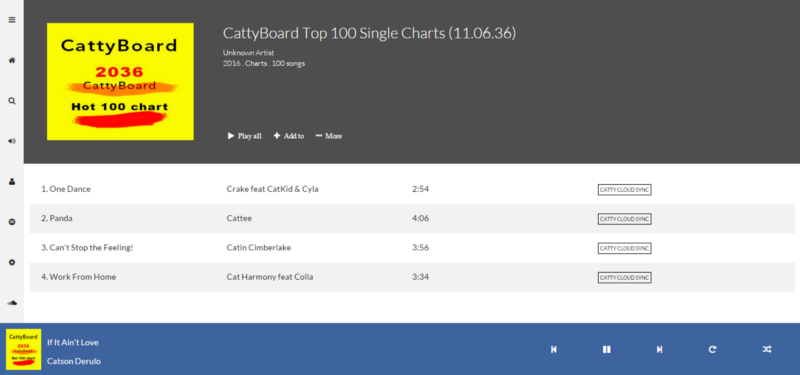
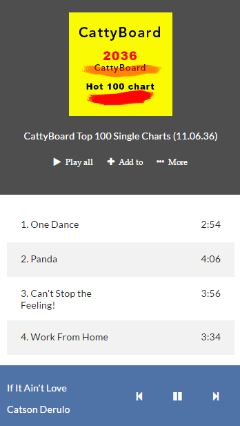
You may take a look at the finished project again, so you don’t lose sight of where this is headed.
More importantly, it’d help you understand the next code listing.
Update your HTML document and have these within the .content section.
<section class="content"> <!--This section was empty. Populating it with content-->
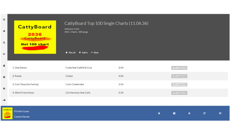
<div class="music-head"> <!--First list item: contains music details-->
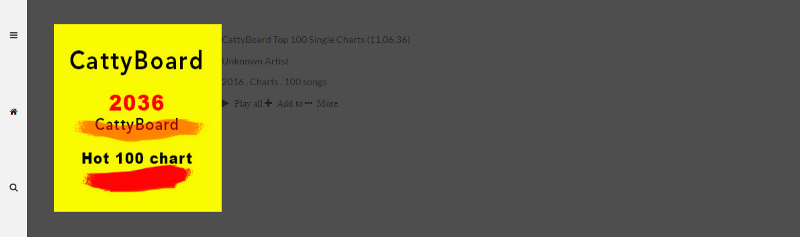
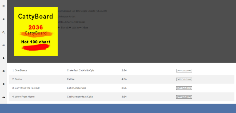
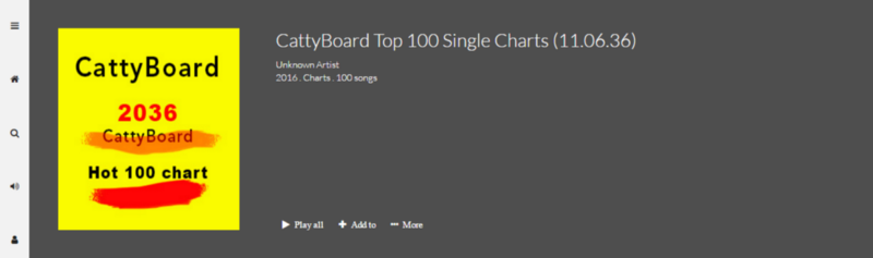
<img src="images/cattyboard.jpg" /> <!--Album art-->
<section class="catty-music"> <!--other details of the album--> <div> <p>CattyBoard Top 100 Single Charts (11.06.36)</p> <p>Unknown Artist</p> <p>2016 . Charts . 100 songs</p> </div>
<div> <!--Music controls--> <i class="fa fa-play"> Play all</i> <i class="fa fa-plus"> Add to</i> <i class="fa fa-ellipsis-h"> More</i> </div> </section>
</div> <!--end .music-head-->
<!--Second list item: Contains a list of all songs displayed-->
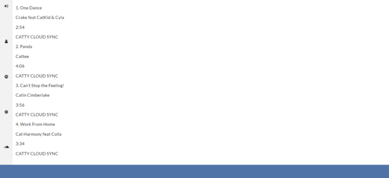
<ul class="music-list"> <li> <p>1. One Dance</p> <p>Crake feat CatKid & Cyla</p> <p>2:54</p> <p><span class="catty-cloud">CATTY CLOUD SYNC</span></p> </li>
<li> <p>2. Panda</p> <p>Cattee</p> <p>4:06</p> <p><span class="catty-cloud">CATTY CLOUD SYNC</span></p> </li>
<li> <p>3. Can't Stop the Feeling!</p> <p>Catin Cimberlake</p> <p>3:56</p> <p><span class="catty-cloud">CATTY CLOUD SYNC</span></p> </li>
<li> <p>4. Work From Home</p> <p>Cat Harmony feat Colla</p> <p>3:34</p> <p><span class="catty-cloud">CATTY CLOUD SYNC</span></p> </li> </ul></section>
Um, I added a bit more than the last time but its pretty simple.
I populated the empty content section with a div that holds the album art and some details of the catty album.
The ul holds a list of songs from the album.
The song title, artiste, duration and "catty cloud sync" are contained in individual paragraphs within the list.
So what are you going to do with styling?
See what I did?
First off, you should make the .content section a flex container.
.content { display: flex;
flex: 1 1 auto; /*this makes sure the section grows to fill the entire available space and shrinks too*/
flex-direction: column;}
You should also deal with it’s flex-items:
.music-head { flex: 0 0 280px; /*Same memo, don't grow or shrink - stay at 280px*/
display: flex; padding: 40px; background-color: #4e4e4e;}
.music-list { flex: 1 0 auto; list-style-type: none; padding: 5px 10px 0px;}
.music-head holds the album art and other related album details.
Same memo, do not grow or shrink but keep a height of 280px.
Height? Not width? Yes!
The parent element already had the flex-direction switched.
Oh, you're going to need this to be a flex-container later on too. So put in display: flex
.music-list holds the list of songs and it fills up the remaining available space shared with .music-head above.
This doesn’t feel very pretty yet but c’mon you’re doing great if still following.
Thumbs up.

There are a few problems here.
- The list of songs look terrible.
- The section containing the music art has really ugly looking text.
Again, I’ll walk you through solving these problems.
Below are the solutions I propose.
Dealing with the list of songs
Each list of songs contain 4 paragraphs. Song title, artiste, duration, and “catty cloud sync”.
There’s got to be a way to put all of this in one line with each paragraph taking up equal space along this line.
Flexbox to the rescue!
The concept here is the same employed in many grid systems.
Translate that to code.
li { display: flex; /*Paragraphs are now displayed on one line*/ padding: 0 20px; /*Some breahing space*/ min-height: 50px;}
li p { flex: 0 0 25%; /*This is the sweet sauce*/}
You see what’s happening there with the paragraphs?
flex: 0 0 25%;
“Don’t grow or shrink but each paragraph should take up 25% of the available space”.
The space is shared equally among the paragraphs.
Using this Technique
This technique is invaluable. You can use it to create unequal content areas. Say, a 2 column view.
One section can take up 60% of the available space, and the other 40%
.first-section: 0 0 60%;
.second-section: 0 0 40%;
You can use this technique for making grid systems.
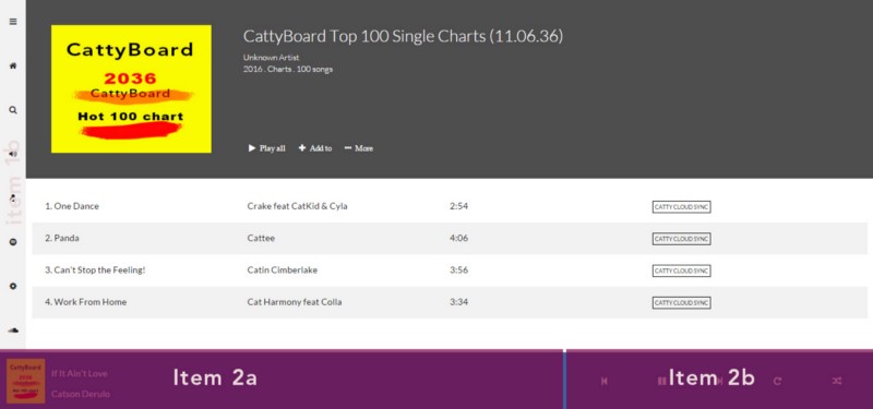
Here is how the lists should look now.
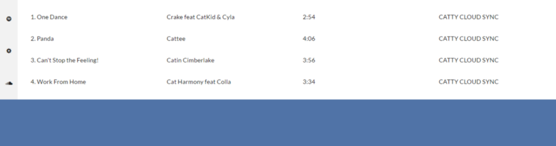
Give the lists alternating colors, deal with the “catty cloud sync” label too.
li span.catty-cloud { border: 1px solid black; font-size: 0.6em; padding: 3px;}
li:nth-child(2n) { background-color: #f2f2f2;}
So, you’re killing it, and really getting to understand the flexbox lingo better.
This is what you should have now.
The second problem will be dealt with now.
Making the album details text look prettier.
Really simple stuff going on below.
.catty-music{ flex: 1 1 auto; display: flex; flex-direction: column; font-weight: 300; color: #fff; padding-left: 50px;}
.catty-music div:nth-child(1){ margin-bottom: auto;}
.catty-music div:nth-child(2){ margin-top: 0;}
.catty-music div:nth-child(2) i.fa{ font-size: 0.9em; padding: 0 0.7em; font-weight: 300;}.catty-music div:nth-child(1) p:first-child{ font-size: 1.8em; margin: 0 0 10px;}
.catty-music div:nth-child(1) p:not(:first-child){ font-size: 0.9em; margin: 2px 0;}
and you did it.
You’re pretty much done.
A quick exercise
I’ve saved the footer for you to work on as an exercise.
Try fixing the footer yourself. Just employ the same techniques. You can do this you know?
If you get stuck, you can always check out the full source code for catty music.
You may break the entire footer into flex-items too, and get going from there.
Wow. I can’t believe you got to this point. That’s great! You’re becoming a Flexbox ninja now.
Next, you will see how Flexbox helps with responsive designs.
Responsive design with Flexbox
Books have been written on responsive design, good books at that.
Since this article focuses on the Flexbox model, I wouldn’t be taking a deep plunge into the general state of responsive designs.
Like I stated somewhere earlier, we do get some responsiveness out of the box with the Flexbox model.
Flexbox as in “flexible box”.
However, it is possible to target various screen sizes via media queries and then change the flex behavior.
Here’s an example.
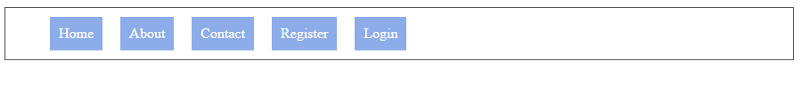
The handy unordered list comes to the rescue again.
<ul> <li>Home</li> <li>About</li> <li>Contact</li> <li>Register</li> <li>Login</li> </ul>
and with a bit of styling…
ul { list-style-type: none; display: flex; border: 1px solid #4e4e4e; }
li { flex: 0 0 auto; padding: 10px; margin: 10px; background-color: #8cacea; color: #fff; font-size: 1em; }
You’re a pro at this flex stuff now, so you understand what’s going on up there.
Here’s how the navigation bar looks.
While this may be cool for desktops and tablets, at certain screen sizes it particularly doesn’t look good.
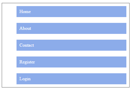
On mobile, you’d want to stack the nav items vertically.
Then comes in media queries.
@media screen and (max-width: 769px) {
/* code here only applies to screen devices that have a width lesser than 769px*/ ul { flex-direction: column; /* On smaller devices, switch the direction*/ }
}
If you knew a few things about responsive designs before now, that’s great.
Just transpose the Flexbox model unto your existing knowledge and you’re good to go.
By the way, I made the assumption that you understand what media queries are.
If you don’t, see the quick brief below.
Media Queries
Media queries are at the heart of responsive design. They let you target specific screen sizes and specify codes to be run on the devices alone.
The most popular form in which media queries are used is something called the @media rule.
It looks like this:
@media screen and (max-width: 300px) { /*write your css in this code block*/}
Looking at it, you can almost guess what that does.
“For a screen device with a maximum width of 300px … do this and that ”
Any styles within the code block will only apply to devices that match the expression, “ screen and (max-width: 300px)”
I guess that helped clear up some confusion.
Quick Exercise
Catty music is displayed differently on mobile devices. That’s great news. What’s even better is you should try to recreate this.
In the event that you get stuck, the link to the repository for this tutorial is in the next section. The solution to this is also in the repo.
You’re almost at the end!
In the concluding section, I’ll discuss browser support, helpful links and resources to get you moving.
Conclusion

You’ve learned how to use the flex-container and flex-item alignment properties.
I walked you through an understanding of absolute and relative flex, auto-margin alignments and switching flex direction.
You also had a chance to apply your “flex skills” to building Catty Music and then I touched up on responsive design too.
It’s been a long ride indeed.
Now, I’d explain some final concepts to you. Help you with resources and links I think you’ll find very helpful.
How’s the browser support for Flexbox?
This is a common question asked when looking to use the Flexbox model in production.
I can’t answer the question perfectly, but the caniuse website does justice to this.
Here’s a screenshot from caniuse, and browser support is quite impressive. You may see for yourself here.
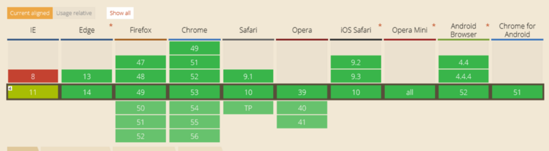
Early in my career, I glanced over caniuse many times and still could not grasp what the data represented meant. So here’s a brief explanation.
At the right bottom of the caniuse website is a legend.
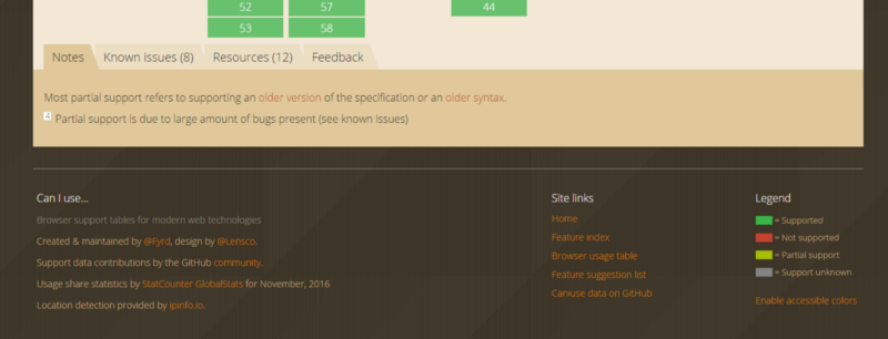
Take a look at the image above, or just visit the site, find the legend and you’d be good to go.
That’s actually all there is to it.
Additional resources
I hope you find these helpful:
- Get the entire Understanding Flexbox article as a PDF document — direct link
- The Flexbox Interactive Course
- Play with the Catty Music code online
- The Repo for the entire “Understanding Flexbox” tutorial
- Flexbox Froggy: A Cool Flexbox Game
Finally, I must say thanks for following along.
Want to become Pro?
Download my free CSS Grid cheat sheet, and also get two quality interactive Flexbox courses for free!