
Imagine this situation: you are working on a time-sensitive project, and you need to implement some specific UI components that comply with accessibility best practices.
You may know about some libraries that are full of pre-designed UI elements, each with their own style. But here's the catch – you might only need a handful of these components. So why make your application bulkier? In reality, a significant portion of the bundled styles might go unused.
Well don't worry – that's where un-styled UI components come in.
What are Un-styled UI Components?
Un-styled UI components are accessible UI building blocks without pre-set styles. This grants you unmatched authority over the visual presentation and behavior of these interfaces.
The term "un-styled" doesn't signify a lack of design – rather, it refers to a blank slate that lets you infuse your creativity and branding without the limitations that come with traditional UI elements.
This enables you to tailor the components to your application's distinct needs, while also prioritizing aesthetics and accessibility.
Benefits of Un-styled UI Components
Let's delve into the key features that set un-styled components apart and explore why they may be a must-have for your upcoming projects.
Control Over Visual Appearance and Functionality:
Conventional UI libraries have preset styles that might not align with your design or aesthetics.
Let's use this scenario, for instance: you're working on an e-commerce platform that needs a product catalog. With unstyled UI components, you can tweak each product card's look, hover effects, and interactions to mirror your brand's identity.
This freedom extends to colors, typography, and layout choices, resulting in a coherent, captivating experience unique to your app.
Reduced Overhead and Enhanced Performance:
Often, in personal projects, we only require a handful of components from extensive libraries. But incorporating these libraries can introduce unnecessary styles and bulk that slow things down.
Un-styled components tackle this issue by letting you include only what you need. This speeds up your app, making it leaner and more efficient, without unnecessary dependencies.
Flexibility for Customization
Un-styled components empower you to craft elements seamlessly tailored to your project's demands. This covers their appearance, movements, and reactions to user interactions.
Whether you're building a simple form or a complex interactive feature, un-styled components give you the freedom to mold every detail to align with your design and purpose, harmonizing with your app's overall style.
Accessibility and User-Friendliness
Crafting accessible interfaces that adhere to WAI-ARIA design principles is important for developers. Unstyled UI components, often designed with accessibility in focus, offer enhanced usability for a broader user spectrum. This abstraction eliminates manual implementation.
Future-Ready Development
Technology evolves, and so do design trends and user expectations. Un-styled components ensure you're primed for what lies ahead. Integrating them empowers you to adapt your app's look and feel as trends shift, without being constrained by outdated styles.
Modular and Scalable Architecture
Un-styled components resemble building blocks that seamlessly fit into your project. This streamlines your code and makes it easier to manage. It also lets you reuse these blocks across different app sections, saving time while preserving consistency as your project expands.
Exploring Popular Un-styled UI Components
To give you more context into how un-styled components work, we'll now compare modal components from five common un-styled UI component libraries.
For most of these components, the Dialog components facilitate the creation of interactive, visually pleasing modal boxes for actions like profile editing, confirming decisions, or displaying extra information without navigating from the main content.
I'll also outline the overall features of these component libraries so you'll be able to integrate them into your future projects.
Let's now dive into a selection of the most notable un-styled UI component libraries and examine their dialog components.
Radix UI
Radix UI's Dialog component, which you can find in the @radix-ui/react-dialog package, is a versatile tool that helps you build popup windows in your React apps. It allows you to interact with certain areas of your program without leaving the current screen.
You can create many types of popup windows, including those that stop the flow (modal) and those that do not (non-modal).
For designing comprehensive dialogs, you have numerous building pieces including Trigger, Portal, Overlay, Content, Title, Description, and Close. You can style it to match your design. It also adheres to accessibility requirements so that everyone can use it.
When you press the Escape key or click the close button, the dialog closes. For screen reader users, special components such as Title and Description are available.
The documentation is extensive and provides examples for several scenarios and It works well with the React ecosystem.
Sample code from Radix:
To get started with Radix, you can run this command on your terminal:
npm install @radix-ui/react-popover@latest -E
To use the dialog component, you can import the components like so:
import React from 'react';
import * as Dialog from '@radix-ui/react-dialog';

const DialogComponent = () => (
  <Dialog.Root>
    <Dialog.Trigger asChild>
      <button>Open profile</button>
    </Dialog.Trigger>
    <Dialog.Portal>
      <Dialog.Overlay className="DialogOverlay" />
      <Dialog.Content className="DialogContent">
        <Dialog.Title className="DialogTitle">Edit profile</Dialog.Title>
        <Dialog.Description className="DialogDescription">
          Make changes to your profile here. Click save when you're done.
        </Dialog.Description>
        <fieldset>
          <label className="Label" htmlFor="name">
            Name
          </label>
          <input className="Input" id="name" defaultValue="Chinenye A" />
        </fieldset>
        <fieldset className="Fieldset">
          <label className="Label" htmlFor="username">
            Username
          </label>
          <input className="Input" id="username" defaultValue="@chinenye" />
        </fieldset>
        <div style={{ display: 'flex', marginTop: 25, justifyContent: 'flex-end' }}>
          <Dialog.Close asChild>
            <button className="Button green">Save changes</button>
          </Dialog.Close>
        </div>
        <Dialog.Close asChild>
          <button className="IconButton" aria-label="Close">
         Button
          </button>
        </Dialog.Close>
      </Dialog.Content>
    </Dialog.Portal>
  </Dialog.Root>
);

export default DialogComponent;
Here's what it looks like:
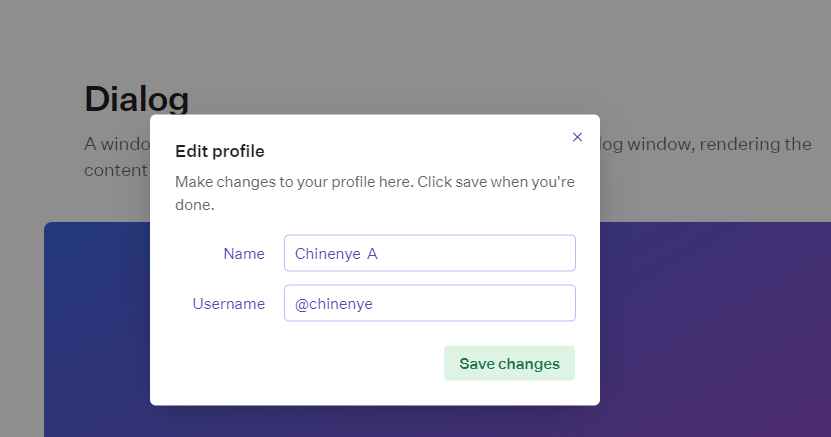 Modal screen of the dialog component from Radix UI
To learn more about Radix and its other components, you can check out their documentation here.
shadcn's UI Component
shadcn UI components, which are based on Radix UI and Tailwind CSS, deliver a seamless and integrated user experience.
shadcn is efficient and lightweight because you can install only the components that you require. It supports two kinds of popup windows:
- Those that require a response before closing
Alert Dialog - Those that don't (which is useful for displaying messages)
The shadcn UI component is versatile since you can overlay content on the main screen or another popup. It's simple to use for keyboard and screen reader users as well.
To make your popups more visually appealing, you can apply effects like fading, sliding, or zooming. You can combine this with menus such as Context Menus or Dropdown Menus (also part of the Shadcn components) to increase functionality.
The components for the dialog are divided into sections like DialogTrigger, DialogContent, DialogHeader, among others for simpler implementation.
Sample code from shadcn:
To get started, you can install the shadcn dialog component by runningnpx shadcn-ui@latest add dialog.
To use the component on your projects, you can import them like this:
import {
  Dialog,
  DialogContent,
  DialogDescription,
  DialogHeader,
  DialogTitle,
  DialogTrigger,
} from "@/components/ui/dialog"

<Dialog>
  <DialogTrigger>Open</DialogTrigger>
  <DialogContent>
    <DialogHeader>
      <DialogTitle>Are you sure absolutely sure?</DialogTitle>
      <DialogDescription>
        This action cannot be undone. This will permanently delete your account
        and remove your data from our servers.
      </DialogDescription>
    </DialogHeader>
  </DialogContent>
</Dialog>
And here's the result of the above code:
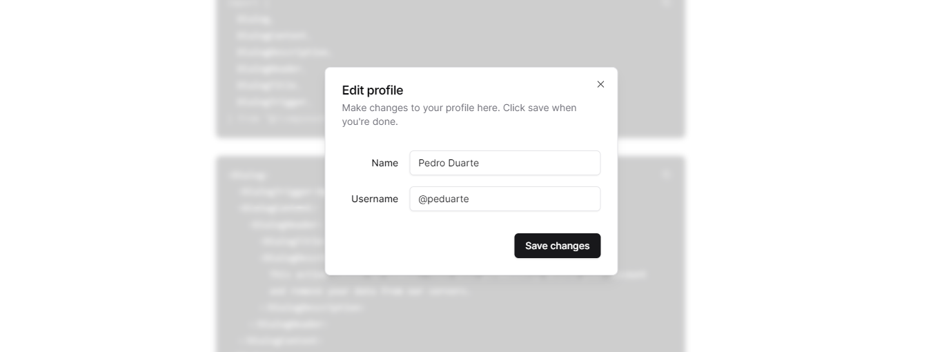 Shadcn dialog display
You can read their documentation for other use cases.
Headless UI Library:
Headless UI Library provides a fully managed, flexible approach to constructing modal windows. You can use it in both React and Vue applications.
The library lets you customize popup windows to match the look and feel of your program. It also has built-in accessibility features, making it usable by keyboard and screen reader users.
To fit the appearance of your application, you can style the Dialog and Dialog.Panel components with className or style props. The Dialog.Panel can have an overlay or backdrop that can be animated individually to grab attention. It enables you to use CSS to build scrollable dialogs.
The library provides seamless transitions while opening and dismissing popups, which improves the visual experience.
Code Sample from Headless UI:
To get started with this library, you can run this command to install it:npm install @headlessui/react.
You can use the dialog components as depicted below:
import { Dialog, Transition } from '@headlessui/react'
import { Fragment, useState } from 'react'

export default function MyModal() {
  let [isOpen, setIsOpen] = useState(true)

  function closeModal() {
    setIsOpen(false)
  }

  function openModal() {
    setIsOpen(true)
  }

  return (
    <>
      <div className="fixed inset-0 flex items-center justify-center">
        <button
          type="button"
          onClick={openModal}
          className="rounded-md bg-black bg-opacity-20 px-4 py-2 text-sm font-medium text-white hover:bg-opacity-30 focus:outline-none focus-visible:ring-2 focus-visible:ring-white focus-visible:ring-opacity-75"
        >
          Open dialog
        </button>
      </div>

      <Transition appear show={isOpen} as={Fragment}>
        <Dialog as="div" className="relative z-10" onClose={closeModal}>
          <Transition.Child
            as={Fragment}
            enter="ease-out duration-300"
            enterFrom="opacity-0"
            enterTo="opacity-100"
            leave="ease-in duration-200"
            leaveFrom="opacity-100"
            leaveTo="opacity-0"
          >
            <div className="fixed inset-0 bg-black bg-opacity-25" />
          </Transition.Child>

          <div className="fixed inset-0 overflow-y-auto">
            <div className="flex min-h-full items-center justify-center p-4 text-center">
              <Transition.Child
                as={Fragment}
                enter="ease-out duration-300"
                enterFrom="opacity-0 scale-95"
                enterTo="opacity-100 scale-100"
                leave="ease-in duration-200"
                leaveFrom="opacity-100 scale-100"
                leaveTo="opacity-0 scale-95"
              >
                <Dialog.Panel className="w-full max-w-md transform overflow-hidden rounded-2xl bg-white p-6 text-left align-middle shadow-xl transition-all">
                  <Dialog.Title
                    as="h3"
                    className="text-lg font-medium leading-6 text-gray-900"
                  >
                    Payment successful
                  </Dialog.Title>
                  <div className="mt-2">
                    <p className="text-sm text-gray-500">
                      Your payment has been successfully submitted. We’ve sent
                      you an email with all of the details of your order.
                    </p>
                  </div>

                  <div className="mt-4">
                    <button
                      type="button"
                      className="inline-flex justify-center rounded-md border border-transparent bg-blue-100 px-4 py-2 text-sm font-medium text-blue-900 hover:bg-blue-200 focus:outline-none focus-visible:ring-2 focus-visible:ring-blue-500 focus-visible:ring-offset-2"
                      onClick={closeModal}
                    >
                      Got it, thanks!
                    </button>
                  </div>
                </Dialog.Panel>
              </Transition.Child>
            </div>
          </div>
        </Dialog>
      </Transition>
    </>
  )
}
Here's what that looks like:
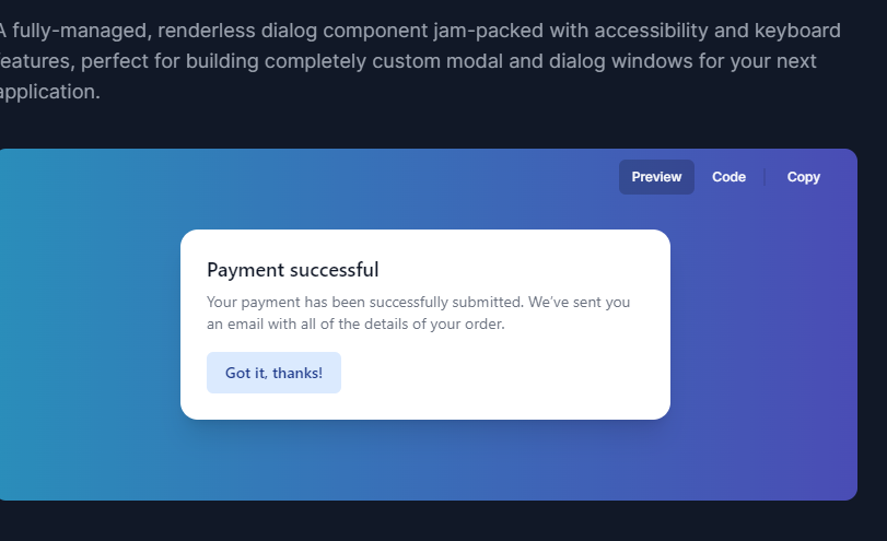 Sample modal made with Headless UI
For more details about this component, you can check out their documentation.
PrimeReact UI
PrimeReact UI has a flexible Dialog component that lets you show content in overlay windows.
The dialog's appearance and disappearance times can be changed. It includes tools like resizing and drag-and-drop as well.
It automatically inserts a scrollbar for easy navigation if the material is too long. Based on various screen widths, you can adjust the dialog's width. The position setting allows you to place the dialog in different screen corners.
It is compatible with screen readers and keyboard navigation because it was created with accessibility in mind. Keyboard keys allow users to traverse the dialog. It complies with integration best practices and works nicely with other libraries.
Code sample from PrimeReact UI:
To get started, run this command on your terminal:
npm install primereact
Here is a code snippet of the dialog component:
import React, { useState } from "react";
import { Button } from 'primereact/button';
import { Dialog } from 'primereact/dialog';

export default function BasicDemo() {
    const [visible, setVisible] = useState(false);

    return (
        <div className="card flex justify-content-center">
            <Button label="Show" icon="pi pi-external-link" onClick={() => setVisible(true)} />
            <Dialog header="Header" visible={visible} style={{ width: '50vw' }} onHide={() => setVisible(false)}>
                <p className="m-0">
                    Lorem ipsum dolor sit amet, consectetur adipiscing elit, sed do eiusmod tempor incididunt ut labore et dolore magna aliqua.
                    Ut enim ad minim veniam, quis nostrud exercitation ullamco laboris nisi ut aliquip ex ea commodo
                    consequat. Duis aute irure dolor in reprehenderit in voluptate velit esse cillum dolore eu fugiat nulla pariatur.
                    Excepteur sint occaecat cupidatat non proident, sunt in culpa qui officia deserunt mollit anim id est laborum.
                </p>
            </Dialog>
        </div>
    )
}
Here's what it looks like:
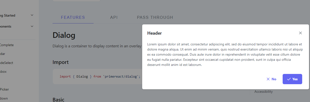 Position of dialog component on center-right of the screen
For more information about the library, visit their documentation here.
Reach UI Dialog Component:
The Reach UI Dialog component is a great option for designing user friendly and accessible popup windows.
It provides accurate control and is simple to use. It functions flawlessly on a variety of gadgets. It has usability enhancing accessibility features, and it's simple to make alert popups.
It also supports pinch zooming and is compatible with iPads and iPhones.
Code Sample from Reach UI:
To get started, you can run this command on your terminal to install the components: npm install @reach/dialog.
To use the components within your application, you can import them like this:
import { Dialog, DialogOverlay, DialogContent } from "@reach/dialog";
import "@reach/dialog/styles.css";

function Dialog() {
  const [showDialog, setShowDialog] = React.useState(false);
  const open = () => setShowDialog(true);
  const close = () => setShowDialog(false);

  return (
    <div>
      <button onClick={open}>Open Dialog</button>

      <Dialog isOpen={showDialog} onDismiss={close}>
        <button className="close-button" onClick={close}>
          <VisuallyHidden>Close</VisuallyHidden>
          <span aria-hidden>×</span>
        </button>
        <p>Hello there. I am a dialog</p>
      </Dialog>
    </div>
  );
}
Here's what they look like:
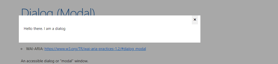 Dialog component from reach ui
To learn more about this library and its components, you can check out their documentation here.
Wrapping Up
This article highlighted several popular un-styled component libraries, including Radix UI, shadcn's UI Component, Headless UI Library, PrimeReact UI, and Reach UI Dialog Component.
To sum up, using un-styled UI components lets you customize your components according to your needs. It also brings performance efficiency and future adaptability.
These components offer reduced overhead, as they let you use only the components you need. This results in a more efficient application.
The flexibility of un-styled components also lets you tailor elements for specific project requirements, while prioritizing accessibility and user-friendliness. Integrating un-styled UI components elevates your ability to create accessible, visually appealing, and efficient user interfaces.