By Ewa Mitulska-Wójcik
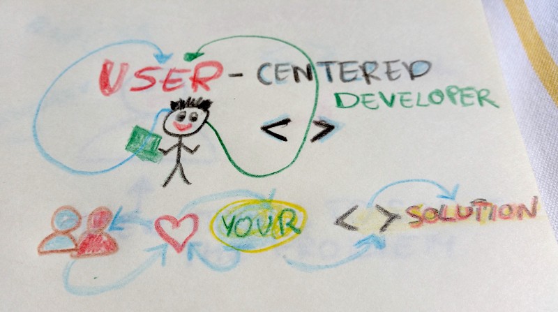
User-centered front end developers are in demand now.
User Experience (UX) is the language of business.
And as User Testing concludes in their annual report from 2015:
In the coming years, companies will invest more heavily in creating products and experiences based on continuous feedback from their customers, and customer experience will become a shared responsibility among all teams in an organization.
The project to stand out from the crowd needs to fit users’ “just right” measure. There are multitude of projects where the role of a UX designer is in the hands of front end developer. Psychology and usability are complimentary to javascript. Sure you can stop at code level, but it’s much more fun and benefits if you go beyond this artificial job title lines. For your clients and their users code is a tool, not a goal in itself.
Teams you will work in may lack a UX designer, researchers, or a graphic dude. Nobody says you have to become a visual or interaction designer and hopefully you will collaborate in a team with great designers and researchers. However, if you want to make projects you join successful, then you’d better get interested at least in some basics of UX. Perfect projects and teams do not meet each other at every corner.
Great experience equals happy users. Happy users lead to retention. It makes greater chance for higher revenue. This brings income. That makes everybody happy and your code is really used by millions of people. Then you start being more and more proud of what you code because it solves real problems of the users. Sure code level is extremely important, if the product is buggy nobody wants to use it. Yet the code can pass each test you run, but if users don’t like the results, it has got short legs in business.
Let me introduce you to the few basics of user experience to rise the chances for successful implementations. Here are the 5 short rules to start with.
1. The product is for users
If it does not solve their problems, sooner or later the product owner will stop investing in it. Get to know the people who are in the target group. At least understand the basics.
The whole team should be aware what to build and for whom.
Ask often, test often, iterate. What’s the problem they want to solve? What’s their goal? What are they anxious about? Is it a teenager girl, or an elderly man (be careful with generalizations)? Is it a backend developer or a hairdresser? When will they come to the product, what they need to find first? How can you make it easier for them? Where should they go next?
What’s the minimum of information that you really need to get from them to help them solve the problem? Make your users feel like home. Take benefit of conventions and best practices.
A bit of domain knowledge does not hurt, it is an bonus of being a developer. Each project teaches you a new world, isn’t it great? Take benefit of it and observe the world around. It may help you a lot to create products users will love.
2. Don’t make me think is the first usability rule
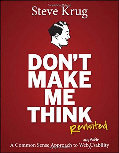 _You should [read it](http://www.amazon.com/gp/product/0321965515/ref=pd_lpo_sbs_dp_ss_1?pf_rd_p=1944687622&pf_rd_s=lpo-top-stripe-1&pf_rd_t=201&pf_rd_i=0321344758&pf_rd_m=ATVPDKIKX0DER&pf_rd_r=0NKBX55V2MNMHSHD8CJA" rel="noopener" target="blank" title=") if you want to develop your usability skills.
Krug’s book is the condensed bible of usability. Great product is about being clear, taking advantage of conventions and providing the interface that is just in time and place. Front end is not just javascript behind the actions users take. Being consistent, visual hierarchy, getting rid of visual noise and writing human alerts and input labels matters for usability of the product.
Users scan pages to find the information, make it easy for them by the way it looks. Use appropriate headings, font sizes, affordable buttons, meaningful labels, etc.
If you have any influence on the copy, remember that happy blah blah blah talk is annoying. If your write alerts, use the language the users speak. Be informative and helpful.
Make sure the navigation is clear, not overloaded, logical for a user. You may also use breadcrumbs as indicators to show where users are if the site is really complex.
Breadcrumbs work best if they are at the top of the page, the > sign is placed between levels, and the last element is bolded. If the menu is visible for a user then the interaction is much bigger than when hidden behind hamburger bar.
Be careful and don’t exaggerate with number of items and levels in menu. Your user does not have to see all at once. You can introduce the next items the moment a user is on the right level and really needs it.
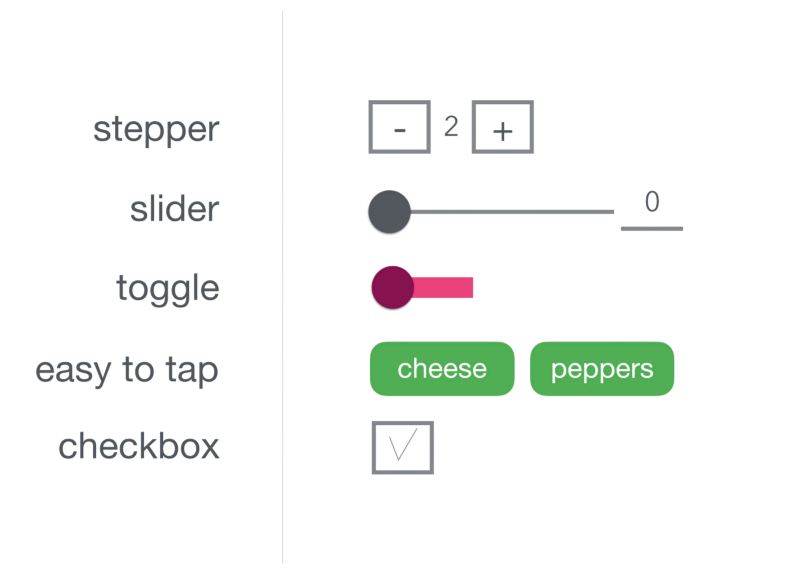
3. Mobile is not a desktop version but squeezed to smaller size
Imagine you implement a mobile version of an app where you can decide on layout. You don’t have ready designs and you are asked to build it with Bootstrap components. Start mobile first. It makes you focus on the most important elements and interactions first.
You can build prototype, wireframe or at least sketch first. The easiest thing to do is pen and paper. You can help yourself with Sketch, Experience Design, or simply google for any other wireframe or prototyping tool. If you are not a visual designer but still have to do the prototype work, go for prototyping tools such as Proto.io where you have ready to use UI library elements.
Mobile means comfortable for fast tap, slide, or tick. So if you want to create a form, use steppers, sliders, radio groups, or switchers instead of old school desktop text inputs.
Mobile is touch first. Mobile means horizontal and vertical. Mobile is used usually with one hand with a thumb size. It also means that the most convenient touch area is at the bottom of the screen.
Mobile benefits from variety of device capabilities built in e.g. gallery access, camera, movement sensors, microphone, or GPS. Take benefit of it.
When it comes to mobile and UX, let me leave you for the moment with Luke Wroblewski. You can learn a lot from him.
4. Your code sets the rules, so make sure they are right
Don’t ask users for their shoe size during their first visit unless you are a shoe shop. Even if you create a shoe shop, you can provide the info about the range of numbers available, and let users play first with colors, patterns, or occasions.
A lot of apps start with a sign up wall, which makes drop offs the most visible metric. Have a look at the article I wrote about human form design.
Whether you implement a solution for a client or build your own product consider benefits of building a relationship. Give your users a chance to try the product before you serve them a credit card input to fill in during sign up for a free trial. Don’t build walls. You would like your users use what you coded, right? Let them try.
Gradual engagement and graceful degradation are your dials.
Make sure your images are optimized. Use minified versions of your code when you push it to production. Run Google page test to optimize. Test on low speed net connection. Take care of those who care about each bite of transfer. Make your product usable both at broadband and GPRS.
5. Pixel perfect times full of multilevel animations are dead
Great product experience is based on usability and benefits. It’s not a pixel shooting game. The pixel perfectionism went away with desktop only display.
It’s great that you can play with complex CSS…
...but don’t introduce extra animation noise just to show your skills.
If you want show off, practice on CodePen, and keep it for your portfolio. Animation is perfect when it’s meaningful.
UX is much more than that. That was just an intro for those who are new to the subject. If you liked it, click the Medium heart icon and recommend it to others. If you would like to hear more from me about usability, user interaction design, user research, prototyping, etc., let me know in the comments.
Happy user-centered coding!
I am a web learner. I am a Free Code Camper. I publish at Medium and tweet about UX and startups at thedoerdoes. I love useful solutions and great collaboration.