By Bert Carremans
In my previous story on forecasting air pollution, I looked into using recurrent neural networks (RNN and LSTM) to forecast air pollution in Belgium. As a small side project, I thought it would be interesting to plot the air pollution over time on a map. The Folium package is a great tool for doing that.
We will plot the quantities of 6 air pollutants in Belgium:
- Ozone (O3)
- Nitrogen Dioxide (NO2)
- Carbon Monoxide (CO)
- Sulphur Dioxide (SO2)
- Particulate Matter (PM10)
- Benzene (C6H6)
The data is downloaded from the website of the European Environment Agency (EEA). If you want to use data from other European countries, I encourage you to visit their website. It has datasets for many EU countries and is very well documented.
The datasets we will use are:
- BE2013–2015_aggregated_timeseries.csv
- BE_2013–2015_metadata.csv
The pollutant IDs are described in the EEA’s vocabulary of air pollutants.
- 1 = Sulphur Dioxide
- 5 = Particulate Matter
- 7 = Ozone
- 8 = Nitrogen Dioxide
- 10 = Carbon Monoxide
- 20 = Benzene
Project set-up
Importing packages
from pathlib import Path
import pandas as pd
import numpy as np

import seaborn as sns
import folium
from folium.plugins import TimestampedGeoJson

project_dir = Path('/Users/bertcarremans/Data Science/Projecten/air_pollution_forecasting')
Air pollutants
We’ll make a dictionary of the air pollutants and their dataset number, scientific notation, name, and bin edges. The bin edges are based on the scale on this Wikipedia page.
pollutants = {
    1: {
        'notation' : 'SO2',
        'name' :'Sulphur dioxide',
        'bin_edges' : np.array([15,30,45,60,80,100,125,165,250])
    },
    5: {
        'notation' : 'PM10',
        'name' :'Particulate matter < 10 µm',
        'bin_edges' : np.array([10,20,30,40,50,70,100,150,200])
    },
    7: {'notation' : 'O3',
        'name' :'Ozone',
        'bin_edges' : np.array([30,50,70,90,110,145,180,240,360])
    },
    8: {'notation' : 'NO2',
        'name' :'Nitrogen dioxide',
        'bin_edges' : np.array([25,45,60,80,110,150,200,270,400])
    },
    10: {'notation' : 'CO',
        'name' :'Carbon monoxide',
         'bin_edges' : np.array([1.4,2.1,2.8,3.6,4.5,5.2,6.6,8.4,13.7])
    },
    20: {'notation' : 'C6H6',
        'name' :'Benzene',
         'bin_edges' : np.array([0.5,1.0,1.25,1.5,2.75,3.5,5.0,7.5,10.0])
    }
}
Loading the metadata
In the metadata, we have the coordinates for every SamplingPoint. We’ll need that information to plot the SamplingPoints on the map.
meta = pd.read_csv(project_dir / 'data/raw/BE_2013-2015_metadata.csv', sep='\t')
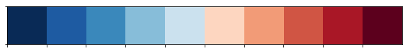
Color scale
There are 10 bin edges for which we will use a different color. These colors were created with ColorBrewer.
color_scale = np.array(['#053061','#2166ac','#4393c3','#92c5de','#d1e5f0','#fddbc7','#f4a582','#d6604d','#b2182b','#67001f'])
sns.palplot(sns.color_palette(color_scale))
Data Preparation
Loading the time series data
We convert the date variables to datetime. That way we can easily use them later to slice the Pandas DataFrame.
def load_data(pollutant_ID):
    print('> Loading data...')
    date_vars = ['DatetimeBegin','DatetimeEnd']
    filename = 'data/raw/BE_' + str(pollutant_ID) + '_2013-2015_aggregated_timeseries.csv'
    agg_ts = pd.read_csv(project_dir / filename, sep='\t', parse_dates=date_vars, date_parser=pd.to_datetime)
    return agg_ts
Data cleaning
We’ll do some basic cleaning of the data:
- Keep only records with DataAggregationProcss of P1D to have daily data
- Remove records with UnitOfAirPollutionLevel of count
- Remove variables redundant for the visualization
- Remove SamplingPoints which have less than 1000 measurement days
- Insert missing dates and imputing the AirpollutionLevel with the value of the next valid date
def clean_data(df):
    print('> Cleaning data...')
    df = df.loc[df.DataAggregationProcess=='P1D', :]
    df = df.loc[df.UnitOfAirPollutionLevel!='count', :]
    ser_avail_days = df.groupby('SamplingPoint').nunique()['DatetimeBegin']
    df = df.loc[df.SamplingPoint.isin(ser_avail_days[ser_avail_days.values >= 1000].index), :]
    vars_to_drop = ['AirPollutant','AirPollutantCode','Countrycode','Namespace','TimeCoverage','Validity','Verification','AirQualityStation',
               'AirQualityStationEoICode','DataAggregationProcess','UnitOfAirPollutionLevel', 'DatetimeEnd', 'AirQualityNetwork',
               'DataCapture', 'DataCoverage']
    df.drop(columns=vars_to_drop, axis='columns', inplace=True)

    dates = list(pd.period_range(min(df.DatetimeBegin), max(df.DatetimeBegin), freq='D').values)
    samplingpoints = list(df.SamplingPoint.unique())
    new_idx = []
    for sp in samplingpoints:
        for d in dates:
            new_idx.append((sp, np.datetime64(d)))

    df.set_index(keys=['SamplingPoint', 'DatetimeBegin'], inplace=True)
    df.sort_index(inplace=True)
    df = df.reindex(new_idx)
    df['AirPollutionLevel'] = df.groupby(level=0).AirPollutionLevel.bfill().fillna(0)
    return df
Plotting air pollution over time
Loading all of the dates for all sampling points would be too heavy for the map. Therefore, we will resample the data by taking the last day of each month.
Note: The bin edges that we use in this notebook should normally be applied on (semi-)hourly averages for O3, NO2 and CO. In the datasets we are using in this notebook, we have only daily averages. As this notebook is only to illustrate how to plot time series data on a map, we will continue with the daily averages. On the EEA website, you can, however, download hourly averages as well.
def color_coding(poll, bin_edges):
    idx = np.digitize(poll, bin_edges, right=True)
    return color_scale[idx]

def prepare_data(df, pollutant_ID):
    print('> Preparing data...')
    df = df.reset_index().merge(meta, how='inner', on='SamplingPoint').set_index('DatetimeBegin')
    df = df.loc[:, ['SamplingPoint','Latitude', 'Longitude', 'AirPollutionLevel']]
    df = df.groupby('SamplingPoint', group_keys=False).resample(rule='M').last().reset_index()
    df['color'] = df.AirPollutionLevel.apply(color_coding, bin_edges=pollutants[pollutant_ID]['bin_edges'])
    return df
To show the pollution evolving over time, we will use the TimestampedGeoJson Folium plugin. This plugin requires GeoJSON input features. In order to convert the data of the dataframe, I created a small function create_geojson_features that does that.
def create_geojson_features(df):
    print('> Creating GeoJSON features...')
    features = []
    for _, row in df.iterrows():
        feature = {
            'type': 'Feature',
            'geometry': {
                'type':'Point',
                'coordinates':[row['Longitude'],row['Latitude']]
            },
            'properties': {
                'time': row['DatetimeBegin'].date().__str__(),
                'style': {'color' : row['color']},
                'icon': 'circle',
                'iconstyle':{
                    'fillColor': row['color'],
                    'fillOpacity': 0.8,
                    'stroke': 'true',
                    'radius': 7
                }
            }
        }
        features.append(feature)
    return features
After that, the input features are created and we can create a map to add them to. The TimestampedGeoJson plugin provides some neat options for the time slider, which are self-explanatory.
def make_map(features):
    print('> Making map...')
    coords_belgium=[50.5039, 4.4699]
    pollution_map = folium.Map(location=coords_belgium, control_scale=True, zoom_start=8)

    TimestampedGeoJson(
        {'type': 'FeatureCollection',
        'features': features}
        , period='P1M'
        , add_last_point=True
        , auto_play=False
        , loop=False
        , max_speed=1
        , loop_button=True
        , date_options='YYYY/MM'
        , time_slider_drag_update=True
    ).add_to(pollution_map)
    print('> Done.')
    return pollution_map
def plot_pollutant(pollutant_ID):
    print('Mapping {} pollution in Belgium in 2013-2015'.format(pollutants[pollutant_ID]['name']))
    df = load_data(pollutant_ID)
    df = clean_data(df)
    df = prepare_data(df, pollutant_ID)
    features = create_geojson_features(df)
    return make_map(features), df
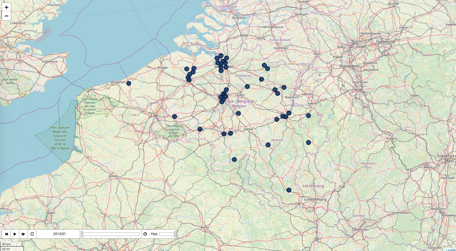
Below are the maps per air pollutant. You can click on the image to go to a web page with the interactive map. By clicking on the play button, you can see the evolution of the air pollutant over time.
Sulphur dioxide
pollution_map, df = plot_pollutant(1)
pollution_map.save('../output/pollution_so2.html')
pollution_map
 _https://bertcarremans.github.io/air_pollution_viz/pollution_so2.html_
Particulate matter
pollution_map, df = plot_pollutant(5)
pollution_map.save('../output/pollution_pm.html')
pollution_map
 _https://bertcarremans.github.io/air_pollution_viz/pollution_pm.html_
The other visualizations can be found at:
- https://bertcarremans.github.io/air_pollution_viz/pollution_c6h6.html
- https://bertcarremans.github.io/air_pollution_viz/pollution_co.html
- https://bertcarremans.github.io/air_pollution_viz/pollution_no2.html
- https://bertcarremans.github.io/air_pollution_viz/pollution_o3.html
Conclusion
With this story, I want to demonstrate how easy it is to visualize time series data on a map with Folium. The maps for all the pollutants and the Jupyter notebook can be found on GitHub. Feel free to re-use it to map the air pollution in your home country.