
Your web layout is to your website what a floor plan is to a building. Without them, you’re just building castles in the air.
The first thing to do when you have a website or application to build or design is to decide on the layout. This is important because it is within this layout that you specify how elements are arranged so that you can assess them in their intended manner and hierarchy.
Basically, the aim of every web layout is to reduce confusion, enhance usability and to ultimately give your users an enjoyable experience. Some of the main elements of a layout are navigation, menus and content.
In web and front-end development, having a layout in mind ahead of building can help you decide on what CSS layout module to use: Flexbox or Grid.
In this article, we’re going to learn what each of these tools are and the best way to use them by building a simple yet beautiful landing page.
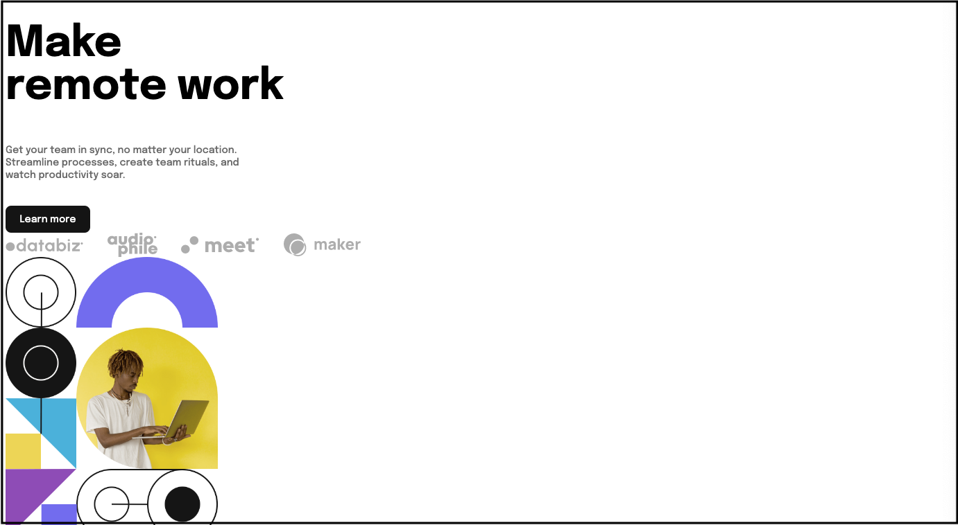
What We're Going To Build
 landing page design
Check it out on Codepen here.
Project Functionality
- Web Layout: Create a beautiful landing page
- Mobile Responsiveness
Prerequisites
- Basic knowledge of HTML and CSS.
- An IDE (text editor) like VS Code
- A web browser
Setup
- Create a folder for your project and open in an IDE.
- Within your project folder, create index.html and style.css files.
- Create an asset folder to store images.
- Within your index.html file, create your HTML boilerplate and link your CSS file and font URL within the
<head>tag.
Resources
- Font: https://fonts.googleapis.com/css2?family=Epilogue:wght@500;700&family=Poppins:wght@400;500;700&display=swap
- Desktop Image: https://i.postimg.cc/0Nt97Bhf/image-hero-desktop.png
- Mobile Image: https://i.postimg.cc/ZnYfhwwW/image-hero-mobile.png
- Client Logo (Databiz): https://i.postimg.cc/gJ9Y84m6/client-databiz.png
- Client Logo (Audiophile): https://i.postimg.cc/15DDqYSD/client-audiophile.png
- Client Logo (Meet): https://i.postimg.cc/5ybQqfbv/client-meet.png
- Client Logo (Maker): https://i.postimg.cc/g2NsxByN/client-maker.png
How to Use Flexbox
Generally, HTML elements align according to their default display style. This means, without external styling with CSS, block elements like p and div will start on a new line. Inline elements like input and span, on the other hand, are arranged next to each other on the same line.
However, the concept of Flexbox allows you to easily place these elements either horizontally or vertically in what’s often referred to as one dimension. In order to achieve this, at least two elements are required: flex container and flex item. These refer to a parent and child element, respectively.
In responsive design, the purpose of Flexbox is to allow containers and their child elements to fill defined spaces or shrink depending on a device’s dimensions.
Flex-direction and Axes
Flex-direction is an important property of CSS Flexbox, because it is what determines the direction that flex items are arranged in. It does this by pointing out the main axis of a flex container.
There are two main axes, namely main axis and cross axis. The main axis is the defined direction of how your flex items are placed in the flex container, whilst the cross axis is always the axis at the opposite side of the main axis.
It can be dangerous to try using the concept of x and y axis from math to understand this. This is mainly because in Flexbox the main axis can be vertical or horizontal, always depending on the value of the flex-direction.
The values accepted by the flex-direction property include row (which is default), row-reverse, column, and column-reverse. For the purposes of this project, we’re going to look at row and column.
 flex-direction: row
When the flex-direction attribute has a value of row, the main axis is horizontal and the cross axis is vertical, as shown in the image above. This means flex items will be arranged horizontally.
Since the row is the default value, if you display a container as flex but don't specify the flex-direction, the flex items will automatically be in a row.
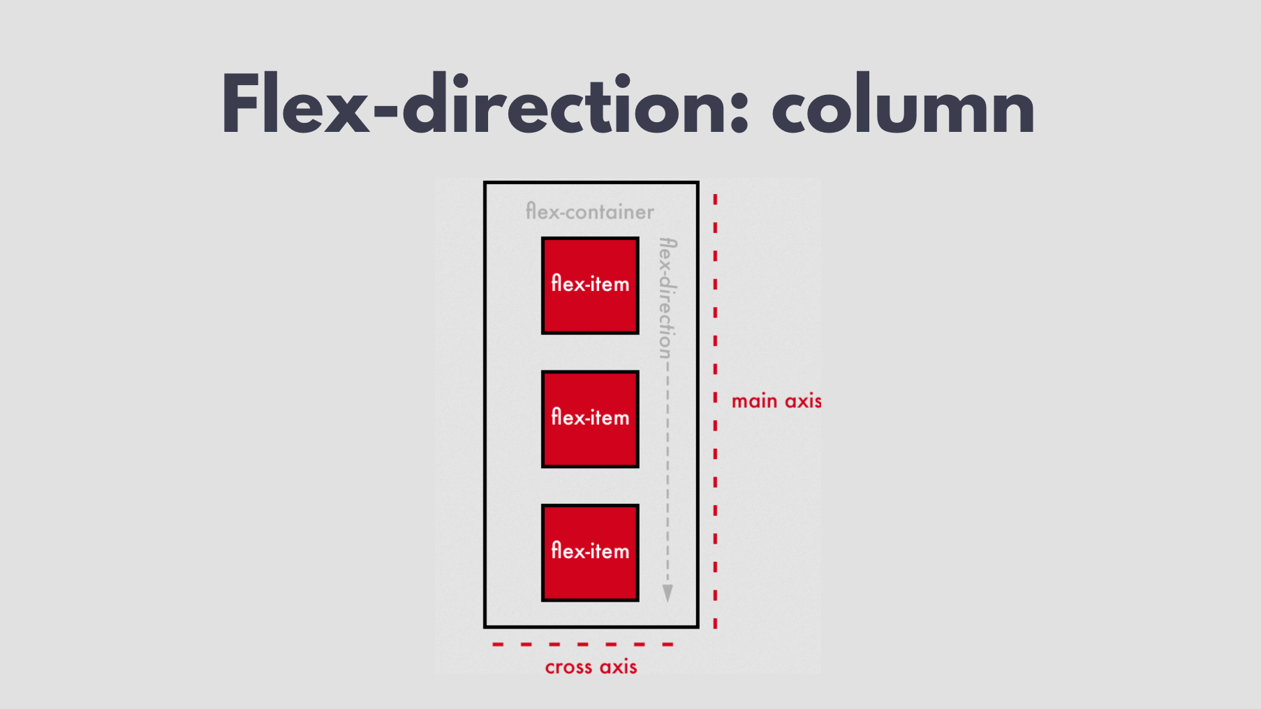 flex-direction: column
When the flex-direction attribute has a value of column, the main axis is vertical and the cross axis is horizontal, as shown in the image above. This means flex items will be arranged vertically.
How to Build the Navbar
Now that we know how Flexbox works, let’s start building our navbar. We'll first provide the content within it, that is the menu items and logo. We’ll give them descriptive classes so that we can easily reference them within our CSS file.
<nav>
      <h2 class="logo">snap</h2>
      <ul class="menu-items">
        <li>Features</li>
        <li>Company</li>
        <li>Careers</li>
        <li>About</li>
      </ul>
      <ul class="cta-btns">
        <li>Login</li>
        <li>Register</li>
      </ul>
</nav>
The image below is the output for the code above. Because both <ul> and <li> are block elements, each of the items we specified within them will be displayed on a new line.
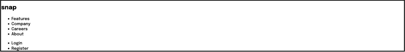 Navbar content output
Flexbox layout display is declared on parent containers and affects child elements. This means that if you had a list of groceries in an unordered list, display flex can’t be applied on the <li>s which are child elements in this case. Instead, to display them as flex, you’d first have to create a parent container and apply it to that.
In our CSS code below, we're defining the font style and size for our project as well as our navbar logo. We're also displaying our nav elements and some of the elements within those as flex.
* {
  font-family: "Epilogue", sans-serif;
  font-size: 0.85rem;
}

.logo {
  font-size: 1.3rem;
}

nav,
.cta-btns,
.menu-items {
  display: flex;
}
The image below is the output for the code above. The elements have been displayed as flex. Yet because we didn't specify the flex-direction, they're automatically arranged in a row.
But as you can see below using the ruler (red line), the flex items are not aligned as they should be. Let's fix that by learning another important flex element.
 Flex without alignment
How to use the align-items attribute
This is a Flexbox attribute that controls the arrangement of flex items on the cross axis. The values it takes are flex-start, flex-end and center depending on the element's alignment needs. The image below shows how each of them works.
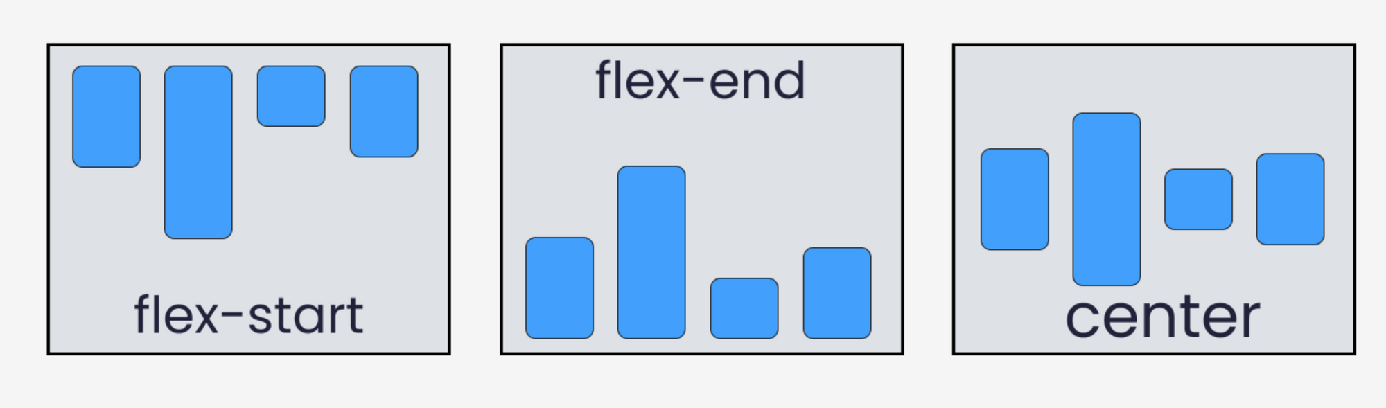 Image credit: freeCodeCamp
From the image above, we can see that if we want to ensure that the flex items within our <nav> are aligned properly, on that element we must give the align-items attribute a value of center. So we have to add an attribute of align-items and a value of center to our flex container as shown in the CSS code below:
nav,
.cta-btns,
.menu-items {
  display: flex;
  align-items: center;
}
As you can see in the image below, the flex items are now aligned as they should be.
 Flex with center alignment
But once again there is something missing. We want to have our items spread out properly on the navbar: the logo on the extreme left, login and register at the extreme right, and the rest in the middle.
We can achieve this with the justify-content attribute. Let's learn about it next and then implement it.
How to use the justify-content attribute
This is a Flexbox attribute that controls the arrangement of flex items on the main axis. It also defines how browsers distribute space between and around flex items within a flex container.
To achieve responsiveness, it helps with allocating any excess space that is leftover after flex-items have been arranged.
 justify-content styles
From the styles associated with the various values of the justify-content attribute, we can see that the bottom two are more similar to what we're trying to achieve.
We can either go for the space around or the space-between and provide some padding on the sides to push the items on the extreme ends from the edges. We also give the list-syle attribute a value of none to remove the dots in front of the list items.
li {
  list-style: none;
}

nav {
  justify-content: space-between;
}
 justify-content navbar output
Now that we have the items placed at their desired positions, we need to create slight spaces between them. In this case, we're going to give each list item a margin-right of 1rem. We also set other styles like size of fonts, color and a border for the register item.
nav {
  margin: 0 1.5rem 1.5rem 1.5rem;
  justify-content: space-between;
}

.logos-section {
  display: flex;
}

.menu-items li,
.cta-btns li {
  font-size: 0.7rem;
  margin-right: 1rem;
  color: hsl(0, 0%, 41%);
}

.cta-btns li:nth-last-child(1) {
  border: 1px solid gray;
  padding: 0.2rem 0.7rem;
  border-radius: 0.3rem;
}
 Navbar with styles
After implementing the above code, this is the final look of our navbar. And this marks the end of our Flexbox section. Next, we'll build the final part of our landing page with CSS Grid.
How to Use CSS Grid
CSS Grid is a life-changing tool for creating web layouts. It helps you make both simple and complex layouts. The main difference is that while Flexbox helps with one dimensional arrangement of elements, CSS grid is able to do two dimensional arrangements.
The concept of axes we learnt about under Flexbox still applies here. You can use CSS Grid to arrange elements on the main axis and cross axis at the same time.
In summary, Flexbox, allows you to either arrange elements horizontally (in a row) or vertically (in a column). But with CSS Grid you can align elements both vertically and horizontally.
The CSS Grid layout is declared only on parent elements or containers. In effect, all its children become grid items. Once you have the target container, you give it an attribute of display and value of grid. The size of a grid’s row and column can be determined with grid-template-rows and grid-template-columns, respectively.
How to Build the Homepage
Just like we did with the navbar, let's start by defining our content within a <main> section in our HTML file.
Looking at our target image, we have two main sections: the left section will have text and logos whilst the right section has a hero image. That’s for the web view of our project.
Let's start by defining our content. The section with class text-side contains: heading, paragraph text, button and logo. The section with class img-side only contains an image.
<main>
      <section id="text-side">
        <h1>Make <br />remote work</h1>
        <p>
          Get your team in sync, no matter your location. Streamline processes,
          create team rituals, and watch productivity soar.
        </p>
        <button>Learn more</button>
        <div class="clients-logos">
          <img src="./assets/images/client-databiz.svg" />
          <img src="./assets/images/client-audiophile.svg" />
          <img src="./assets/images/client-meet.svg" />
          <img src="./assets/images/client-maker.svg" />
        </div>
      </section>
      <section class="img-side">
        <img src="./assets/images/image-hero-desktop.png" />
      </section>
    </main>
Within the main section, we created the two sections we needed and gave them descriptive id's: text-side and img-side.
Within the text-side, we added a heading, paragraph text, button and a div to display clients' logos. The only thing we need for the img-side is the display image.
/* Client Logos */
.clients-logos img {
  width: 5rem;
  margin-right: 1rem;
}

.clients-logos {
  margin-top: 4rem;
}

.clients-logos img:nth-child(2) {
  width: 3rem;
}

/* Main */
main h1 {
  font-size: 3rem;
}

main p {
  font-size: 0.7rem;
  width: 18rem;
  color: hsl(0, 0%, 41%);
  line-height: 0.9rem;
}

main button {
  background-color: hsl(0, 0%, 8%);
  color: #fff;
  border: none;
  font-size: 0.7rem;
  padding: 0.6rem 1rem;
  border-radius: 0.4rem;
  margin-top: 1rem;
}

#text-side {
  margin-top: 3rem;
}
/* Hero Image */
.img-side img {
  width: 20rem;
}
Within our CSS file, we need to style the client logos div as well as the child elements. We also set a font-size for the heading and paragraph. Next, we style our button and assign a width to our image.
 pre-grid homepage display
The image above shows how our web page will look after defining the content and styling just the heading, button and logos – that is, we haven't declared our container as a grid yet. Because almost all the elements we have here are block elements, we see them align on top of one another.
Grid Template Rows and Columns
The grid-template-columns property specifies the number and widths of columns in a grid, defining a grid container's column by specifying the size of its tracks and line names.
The grid-template-rows property is the direct opposite. It specifies the number and heights of rows in a grid, also defining a grid container's row by specifying the size of its tracks and line names.
As you can see in the image below, grid-template-rows arranges elements from the top to bottom of the device screen. grid-template-columns arranges elements from the left to right side of the device screen.
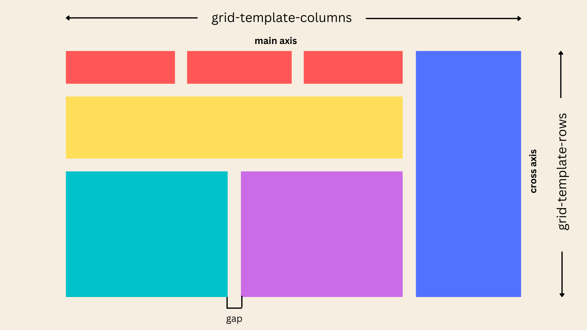
For our project, we're going to make use of grid-template-columns since we want to arrange our two sections side by side, letting each section occupy an equal part of the overall project width. We do this by assigning it as an attribute on the same container that we specified a display of grid on.
 display: grid
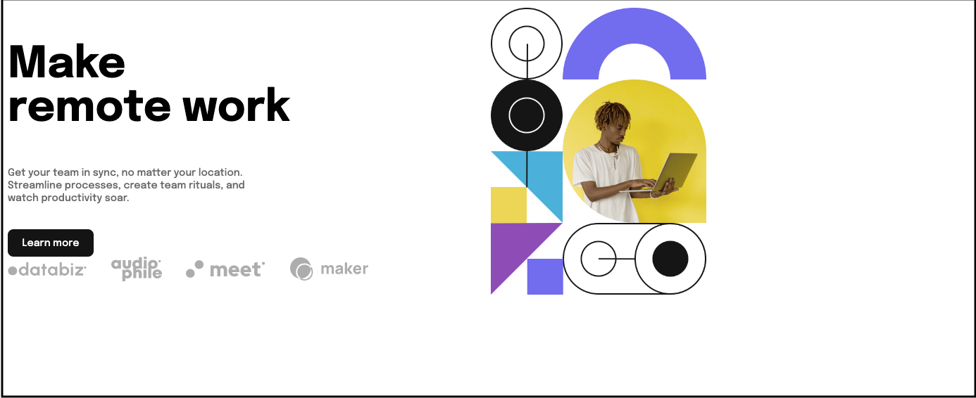
Now that the two sections inside our <main> tag have been placed equally using the grid-template-columns, we have two last things to do.
We need to align them horizontally, by positioning both elements in the center of the page, with the extra space on the left of the image, evenly distributed on both sides. We also need to align them vertically by positioning both of them in the center of the page, with the extra space on the bottom, evenly distributed above and beneath.
Align and Justify in CSS Grid
Good news – we don't have to learn any new concepts to achieve our desired alignments in CSS Grid Layouts. Because fortunately, align-items and justify-content, as we learnt earlier, are not exclusive to Flebox. You can also use them to position items both horizontally and vertically.
main {
  display: grid;
  grid-template-columns: repeat(2, 1fr);
  height: 70vh;
  align-items: center;
  justify-content: center;
  margin-left: 8rem;
}
As you can see in the code above, we only had to give the value of center to both align-items and justify-content attributes on the parent tag (grid container).
To ensure that we see the effect of position in the perfect center, we also had to specify a height for the section. The image below is the final output of our project.
 Landing page final look
How to Make it Responsive
So far, everything we've built is for the web. But for the sake of users who want to access the landing page on mobile, we have to make our project accessible on smaller screens. In our case, we're looking at screens that are greater than 300px but less than 480px.
As you can see in the code below, we're hiding our nav items and displaying an emoji with class of mobile-nav. Beside that, we're hiding the desktop header image and showing the mobile header image.
/* Responsive */
@media (min-width: 300px) and (max-width: 480px) {
  * {
    font-size: 1rem;
  }

  body {
    height: 100vh;
    width: 100vw;
    overflow-y: hidden;
    overflow-x: hidden;
  }

  nav {
    margin: 0 1.5rem 0 1.5rem;
  }

  nav ul {
    display: none;
  }

  .mobile-nav {
    display: block;
    margin-right: 2rem;
  }

  main {
    display: grid;
    grid-template-columns: 100%;
    margin: 0 auto;
  }

  /* Clients logos */
  .clients-logos {
    margin-top: 2rem;
  }

  .desktop-logos {
    display: none;
  }

  .mobile-logos {
    display: block;
  }

  /* Images */
  .desktop-img {
    display: none;
  }
  .mobile-img {
    display: block;
    margin-top: 3rem;
  }

  .cta-btns,
  .menu-items {
    display: none;
  }

  main h1 {
    font-size: 2.5rem;
  }

  /* Client Logos */
  .clients-logos img {
    width: 4.5rem;
    margin-right: 0.8rem;
  }

  .attribution {
    width: 13rem;
    margin: 8rem auto 0 auto;
    text-align: center;
  }
}
Full Project Code
This is the project we’ve built together in this article:

Here's the full HTML code:
<!DOCTYPE html>
<html lang="en">
  <head>
    <meta charset="UTF-8" />
    <meta name="viewport" content="width=device-width, initial-scale=1.0" />
    <!-- displays site properly based on user's device -->
    <link rel="preconnect" href="https://fonts.googleapis.com" />
    <link rel="preconnect" href="https://fonts.gstatic.com" crossorigin />
    <link
      href="https://fonts.googleapis.com/css2?family=Epilogue:wght@500;700&family=Poppins:wght@400;500;700&display=swap"
      rel="stylesheet"
    />
    <link rel="stylesheet" href="style.css" />
    <link
      rel="icon"
      type="image/png"
      sizes="32x32"
      href="./images/favicon-32x32.png"
    />

    <title>Web Layout | Landing Page</title>

    <!-- Feel free to remove these styles or customise in your own stylesheet 👍 -->
  </head>
  <body>
    <nav>
      <div class="logos-section">
        <h2 class="logo">snap</h2>
        <ul class="menu-items">
          <li>
            Features<svg
              width="10"
              height="6"
              xmlns="http://www.w3.org/2000/svg"
            >
              <path
                stroke="#686868"
                stroke-width="1.5"
                fill="none"
                d="m1 1 4 4 4-4"
              />
            </svg>
          </li>
          <li>
            Company<svg
              width="10"
              height="6"
              xmlns="http://www.w3.org/2000/svg"
            >
              <path
                stroke="#686868"
                stroke-width="1.5"
                fill="none"
                d="m1 1 4 4 4-4"
              />
            </svg>
          </li>
          <li>Careers</li>
          <li>About</li>
        </ul>
      </div>
      <ul class="cta-btns">
        <li>Login</li>
        <li>Register</li>
      </ul>
      <p class="mobile-nav">🌚</p>
    </nav>
    <main>
      <section id="text-side">
        <h1>Make <br />remote work</h1>
        <p>
          Get your team in sync, no matter your location. Streamline processes,
          create team rituals, and watch productivity soar.
        </p>
        <button>Learn more</button>
        <div class="clients-logos">
          <img src="https://i.postimg.cc/gJ9Y84m6/client-databiz.png" />
          <img src="https://i.postimg.cc/15DDqYSD/client-audiophile.png" />
          <img src="https://i.postimg.cc/5ybQqfbv/client-meet.png" />
          <img src="https://i.postimg.cc/g2NsxByN/client-maker.png" />
        </div>
      </section>
      <section id="img-side">
        <img
          class="desktop-img"
          src="https://i.postimg.cc/0Nt97Bhf/image-hero-desktop.png"
        />
        <img
          class="mobile-img"
          src="https://i.postimg.cc/ZnYfhwwW/image-hero-mobile.png"
        />
      </section>
    </main>
    <div class="attribution">
      Challenge by
      <a href="https://www.frontendmentor.io?ref=challenge" target="_blank"
        >Frontend Mentor</a
      >. Coded by <a href="https://codehemaa.com">Ophy Boamah</a>.
    </div>
  </body>
</html>
Here's the full CSS code:
* {
  font-family: "Epilogue", sans-serif;
  font-size: 1.3rem;
}

.logo {
  font-size: 1.3rem;
}

li {
  list-style: none;
}

nav,
.cta-btns,
.menu-items {
  display: flex;
  align-items: center;
}

nav {
  margin: 0 1.5rem 1.5rem 1.5rem;
  justify-content: space-between;
}

.mobile-nav {
    display: none;
}

.logos-section {
  display: flex;
}

.menu-items li,
.cta-btns li {
  font-size: 0.7rem;
  margin-right: 1rem;
  color: hsl(0, 0%, 41%);
}

.cta-btns li:nth-last-child(1) {
  border: 1px solid gray;
  padding: 0.2rem 0.7rem;
  border-radius: 0.3rem;
}

/* Client Logos */

.clients-logos img {
  width: 8rem;
  margin-right: -3rem;
}

.clients-logos {
  margin-top: 1rem;
  margin-left: -2rem;
  display: flex;
  width: 10rem;
}

.clients-logos img:nth-child(2) {
  width: 7rem;
}

/* Main */
main {
  display: grid;
  grid-template-columns: repeat(2, 1fr);
  height: 70vh;
  align-items: center;
  justify-content: center;
  margin-left: 8rem;
}
/* Images */
.desktop-img {
  display: block;
}
.mobile-img {
  display: none;
}

main h1 {
  font-size: 3rem;
}

main p {
  font-size: 0.7rem;
  width: 18rem;
  color: hsl(0, 0%, 41%);
  line-height: 0.9rem;
}

main button {
  background-color: hsl(0, 0%, 8%);
  color: #fff;
  border: none;
  font-size: 0.7rem;
  padding: 0.6rem 1rem;
  border-radius: 0.4rem;
  margin-top: 1rem;
}

#text-side {
  margin-top: 3rem;
}
/* Hero Image */
#img-side img {
  width: 20rem;
}

.attribution {
  font-size: 0.7rem;
  text-align: center;
  margin-top: 5.5rem;
}

.attribution a {
  color: hsl(228, 45%, 44%);
  font-size: 0.7rem;
}

/* Responsive */
@media (min-width: 300px) and (max-width: 480px) {
  * {
    font-size: 1rem;
  }

  body {
    height: 100vh;
    width: 100vw;
    overflow-y: hidden;
    overflow-x: hidden;
  }

  nav {
    margin: 0 1.5rem 0 1.5rem;
  }

  nav ul {
    display: none;
  }

  .mobile-nav {
    display: block;
    margin-right: 2rem;
  }

  main {
    display: grid;
    grid-template-columns: 100%;
    margin: -3rem auto 0 auto;
  }

  /* Clients logos */
  .clients-logos {
    margin-top: 2rem;
  }

  .clients-logos img {
  width: 30rem;
}

.clients-logos {
  margin-top: 1rem;
  display: flex;
}

.clients-logos img:nth-child(2) {
  width: 7rem;
}

  /* Images */
  .desktop-img {
    display: none;
  }
  .mobile-img {
    display: block;
    margin-top: 3rem;
  }

  .cta-btns,
  .menu-items {
    display: none;
  }

  main h1 {
    font-size: 2.5rem;
  }

  /* Client Logos */
  .clients-logos img {
    width: 4.5rem;
    margin-right: 0.8rem;
  }

  .attribution {
    width: 13rem;
    margin: 10rem auto 0 auto;
    text-align: center;
  }
}
Conclusion
As a web developer, layouts should be the first thing you consider before writing code. Thankfully, CSS Grid and Flexbox have revolutionized the way we structure and build website and web app layouts.
This makes these concepts a must know so you can specify the arrangement of elements on the web. We've discussed the fundamentals, so that you can easily build up on the knowledge and create beautiful web pages and apps.
Thanks for reading 👋🏾. I hope you found this helpful.