
In this article, I'm going to show you how to theme your website so users can customize certain elements to their tastes.
We'll talk about website themes, how theming works, and we'll end with a demo so you can see it in action. Let's dive in.
Table of Contents:
What is a Website Theme?
What is theming?Why Should You Care About Theming?
“It’s their screen, machine and software”
Theming increases readability
All the cool cats are using it - theming in the wildHow to Use Theme Properties
What are theme properties?
What are CSS custom properties?
How to set up theme properties in Gatsby.js
How to store the theme properties
How to transform theme properties to CSS custom propertiesHow to Use the Theme Switcher Component
The markup
How to set up the state
How to update the state
How to persist state toLocalStorage
Who is this article for?
This article is aimed at developers who already have a basic knowledge of CSS, React, and Gatsby who want to learn how to create a user theme-able Gatsby or React app.
By the end of this article, you should understand how theming works and how to implement theming on your Gatsby sites.
What is a theme?
In order to understand what website theming is, let's first look at what a website theme is and what make up a theme.
A theme in the context of a website is the overall look, feel, and style of your website. A theme may include:
fonts
font size
color schemes
layouts
aesthetics
A theme controls the design of your website. It determines what your website looks like from the surface, and it is the part of your website that has a direct impact on your users.
A theme is also a set of styles worn by a website.
What is Theming?
Theming is to a website what clothes are to our bodies. Imagine wearing the same clothes to a meeting, a wedding, and a farm - sounds funny right? Of course you probably wouldn't do that if you had the choice.
For each occasion you would wear the appropriate type or style of dress. That’s what website theming is – it allows our users to choose the look and feel of our website with a set of styles based on different occasions.
Theming is simply giving users the ability to make customizations to our websites and apps. You can also think about theming as a set of customizations users can make to our websites or applications based on their choices.
Theming happens when the user is able to tell your website what they prefer to see, for example:
Clicking a button to change the background of a website to red or black
Increasing or decreasing the font size of a site website/application
Clicking a button to remove content not relevant to the user.
Here’s a tip: letting or asking your users to determine your website theme from scratch is a bad idea. You or your team should provide users with an accessible and usable default theme, since in most cases many users will never customize “their view” on your website no matter how easy it is. |
Why should you care about website theming?
Apart from letting users know you care about their personal preferences, there are other reasons to let your users theme your website. Some of them include:
“It’s their Screen, Machine and Software”
This is a quote from Jakob Nielsen's 2002 article: Let users control font size.
The fact that your website is running on the user’s screen, machine, and software (and probably draining their batteries too) is enough reason them to be able to customize their experience on your site.
Theming improves website readability
Quoting D. Bnonn from the article: 16 Pixels Font Size: For Body Copy. Anything Less Is A Costly Mistake
Fact: Most Web Users Hate The “Normal” Font Size.
With this fact in mind, theming can help readers out by allowing them to choose the font size that suites their eyes best.
Oh and here is another quote from the same article.
Readership = Revenue.
All the cool cats are using it – theming in the wild
A lot of developers have used the idea of theming to create dark mode versions of their websites. Other’s have taken this idea further to allow users change font-size, colors, and background based on individual preferences.
Here's an example of this kind of customization in the Twitter web app:
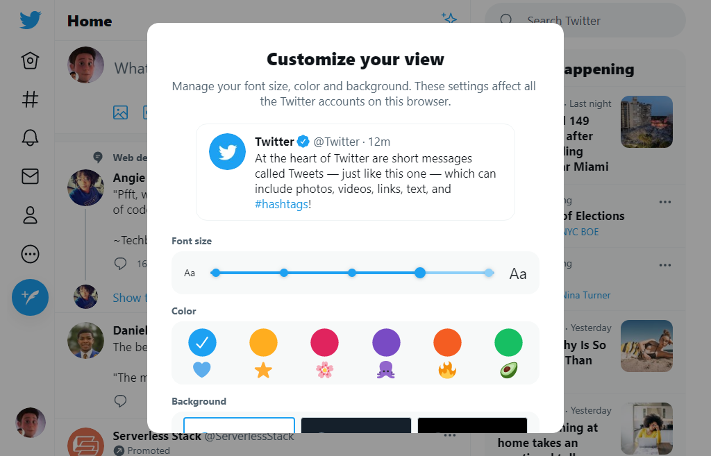
Twitter customize theme UI
Still not feeling motivated yet? If you still need more proof that theming is a good idea, here’s a whole list of websites, apps, and software that use theming to provide dark and light modes for their users.
How to Use Theme Properties
Now that you know what theming is and have seen sites that use this idea of theming in their websites and applications, let’s learn what theme properties are.
What are theme properties?
Theme properties are a set of CSS custom properties that make up a theme. Remember that “a theme is a set of styles worn by a website” – so theme properties are all the properties that make up the styles a site wears. For example:
[data-theme="default"] {
  --font-size: 20px;
  --background: red;
}
In the example above, [data-theme="default"] is our theme, while all the CSS custom properties inside are the theme properties. You get the idea, right?
Here’s a tip: your theme properties don’t have to be just CSS custom properties. They can also be any valid CSS properties that you want to apply to a specific theme.
Before we move forward, let’s first understand what CSS custom properties are
What are CSS Custom Properties (also known as CSS variables)?
CSS custom properties are entities which hold values that you can reuse throughout an entire site or document.
For the sake of this tutorial we are not going to cover CSS custom properties in depth. You can read more about custom properties here.
Also there are a lot of great tutorials out there that cover CSS custom properties and how to use them for theming, so we’ll leave the theory to those other articles.
For a strategic guide on how to use CSS custom properties for theming check out this awesome article: A Strategy Guide To CSS Custom Properties.
Although we are not covering CSS custom properties in depth, I want to point out a few reasons why CSS custom properties are ideal for website theming:
They are reusable – you can use them throughout your CSS
They reduce the complexity of our code, since you no longer need to create different stylesheet to achieve a theme-able website
They are available at runtime, which means you can update their value in the browser, via JavaScript, with immediate results.
How to Set Up Theme Properties in Gatsby.js
Of course you can hard code theme properties directly inside your CSS file like any other CSS properties. But having to scroll up a few lines of your CSS code anytime you want to make a few changes to your themes sounds tedious, right?
Max Böck in his article “Color Theme Switcher” advises defining our themes in a central location.
Having a central location (file) where you can easily access and manage your themes sounds like an interesting idea. And this is the kind of thing Gatsby was made for.
Quoting the Gatsby docs:
“A core feature of Gatsby.js is it’s ability to load data from anywhere.”
This means you can source data from a JSON file which will be available at build time. When you import this data you can then iterate over it with the Array.map method and render it in a React component.
How to Store Theme Properties
In your Gatsby project folder, create a directory called content if it doesn't already exists. Then add a new file called themes.json with the following content:
[
  {
    "id": "default",
    "colors": {
      "primary-color": "#0250bb",
      "text": "#20123a",
      "text-alt": "#42425a",
      "border": "#ededf0",
      "background": "#ffffff",
      "background-alt": "#f9f9fa",
      "color-scheme": "light"
    }
  },
  {
    "id": "dark",
    "colors": {
      "primary-color": "#7f5af0",
      "text": "#fffffe",
      "text-alt": "#94a1b2",
      "border": "#010101",
      "background": "#16161a",
      "background-alt": "#242629",
      "color-scheme": "dark"
    }
  },
  {
    "id": "warm",
    "colors": {
      "primary-color": "#ff8e3c",
      "text": "#0d0d0d",
      "text-alt": "#2a2a2a",
      "background": "#eff0f3",
      "background-alt": "#fff",
      "border": "rgba(0,0,0,.1)",
      "color-scheme": "light"
    }
  },
// Add other themes here
]
Each theme gets an id, a set of theme properties, and a CSS color-scheme property.
Here’s a tip – we use the CSS color-scheme property to tell which color scheme (light/dark) our webpage should be rendered in. For a better understanding of color-scheme please refer to this color scheme guide.
How to Transform Theme Properties to CSS Custom Properties
Right now, the color themes stored in our content/themes.json files are just raw data. They need to be transformed into CSS custom properties before they can actually do anything meaningful.
Data is a collection of facts, such as numbers, words, measurements, observations or just descriptions of things.
We are going to need our CSS custom properties to be dynamically generated and added as an inline <style> to the <head> of all our site pages.
You need to install two important plugins for this tutorial: react-helmet, a document head manager for React, and gatsby-plugin-react-helmet to allow server rendering of data that's added with React Helmet.
Install these plugins with this command:
npm installl gatsby-plugin-react-helmet react-helmet
To use these plugins you need to add it to the plugin array in your gatsby-config.js file located at the root of the project directory:
plugins: [gatsby-plugin-react-helmet]
Since you are going to use React helmet on all your pages, it makes sense to use it in your Layout.js file. In your layout.js file add the following code:
import React from "react"
import { Helmet } from "react-helmet"
import themes from "../../content/themes.json"
// other imports

export default function Layout({ children }) {
  function colors(theme) {
    return `
          --primary-color: ${theme.colors["primary-color"]};
          --text: ${theme.colors["text"]};
          --text-alt: ${theme.colors["text-alt"]};
          --background: ${theme.colors["background"]};
          --background-alt: ${theme.colors["background-alt"]};
          --border: ${theme.colors["border"]};
          --shadow: ${theme.colors["shadow"]};
          color-scheme: ${theme.colors["color-scheme"]};
    `
  }

  return (
    <>
      <Helmet>
        // other head meta tags

        <style type="text/css">{`
    ${themes
      .map(theme => {
        if (theme.id === "default") {
          return `
          :root {
            ${colors(theme)}
          }
        `
        } else if (theme.id === "dark") {
          return `
          @media (prefers-color-scheme: dark) {
            ${colors(theme)}
          }
        `
        }
      })
      .join("")}
    ${themes
      .map(theme => {
        return `
        [data-theme="${theme.id}"] {
          ${colors(theme)}
        }
      `
      })
      .join("")}
  `}
        </style>
      </Helmet>
      <Header />
      <main id="main">{children}</main>
      <Footer />
    </>
  )
}
Let's break this down a bit.
First, the themes and react-helmet are imported from content/themes.json and React respectively:
import React from "react"
import { Helmet } from "react-helmet"
import themes from "../../content/themes.json"
// other imports

export default function Layout({ children }) {
  return (

  )
}
It creates a function which will transform our themes to CSS custom properties:
function colors(theme) {
    return `
          --primary-color: ${theme.colors["primary-color"]};
          --text: ${theme.colors["text"]};
          --text-alt: ${theme.colors["text-alt"]};
          --background: ${theme.colors["background"]};
          --background-alt: ${theme.colors["background-alt"]};
          --border: ${theme.colors["border"]};
          --shadow: ${theme.colors["shadow"]};
          color-scheme: ${theme.colors["color-scheme"]};
    `
  }
Inside our <Helmet> we add a <style> tag to our document’s head.
Here’s a tip – if you need to add a style to the document’s head, you have to render the style as a string within curly braces.
In the first Array.map method, we check if there’s a theme with id equal to default. If there is, we set it as our default color scheme in the :root{}. We also check if there’s a theme with id equal to dark. If there is, we use it when the prefers-color-scheme of the user is dark:
${themes
      .map(theme => {
        if (theme.id === "default") {
          return `
          :root {
            ${colors(theme)}
          }
        `
        } else if (theme.id === "dark") {
          return `
          @media (prefers-color-scheme: dark) {
            ${colors(theme)}
          }
        `
        }
      })
      .join("")}
In the last Array.map method, we iterate over our themes and each theme gets a [data-theme=""] attribute selector:
 ${themes
      .map(theme => {
        return `
        [data-theme="${theme.id}"] {
          ${colors(theme)}
        }
      `
      })
      .join("")}
Now if you inspect the head of your site you should see all the theme properties in your content/themes.json file nicely generated as CSS custom properties. In fact if you add the attribute data-theme="name of your theme" to your html tag via the dev tools, your theme should work perfectly well.
How to Use the Theme Switcher Component
Well, we can't have users manually editing our site via dev tools anytime they want to use a different theme on our site. So all that’s left in this tutorial is to create a UI so that users can easily Theme our website.
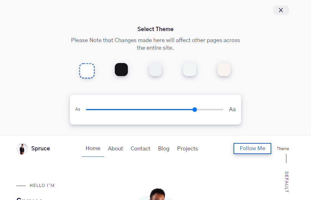
The Markup
Create a new file called themes.js in your components directory and add the following code:
import React from "react"
import themes from "../../content/theme.json"

const Theme = () => {

  return (
    <div className="theme">
      <div className="theme-close text-right">
        <button>x</button>
      </div>
      <div className="theme-wrapper__inner">
        <div className="theme-header text-center">
          <strong className="theme-title">Select Theme</strong>
          <p>
            Please Note that Changes made here will affect other pages across
            the entire site.
          </p>
        </div>
        <div className="theme-content">
          <ul className="schemes">
            {theme.map(data => {
              return (
                <li className="scheme">
                  <button
                    className="scheme-btn js-scheme-btn"
                    aria-label={`${data.id}`}
                    name="scheme"
                    value={`${data.id}`}
                    style={{ backgroundColor: `${data.colors["background"]}` }}
                  ></button>
                </li>
              )
            })}
          </ul>
        </div>
        <div className="theme-content">
          <div className="theme-range">
            <label htmlFor="font" title={state.font}>
              <span className="text-xsmall">Aa</span>
              <input
                type="range"
                name="font"
                min="10"
                max="20"
                step="2"
                className="theme-range__slider"
              />
              <span className="text-large">Aa</span>
            </label>
          </div>
        </div>
      </div>
    </div>
  )
}
export default Theme
Let’s break down this code a bit so we know what's going on.
First we import our themes from content/themes.js and iterate over it with a Array.map method. For each theme, I created a button with a background color equal to its background-color with a value equal to its id.
<ul className="schemes">
            {theme.map(data => {
              return (
                <li className="scheme">
                  <button
                    className="scheme-btn js-scheme-btn"
                    aria-label={`${data.id}`}
                    name="scheme"
                    value={`${data.id}`}
                    style={{ backgroundColor: `${data.colors["background"]}` }}
                  ></button>
                </li>
              )
            })}
</ul>
To change the font size of our text, I also added an input field of type range with a min value of 10px and max value of 20px.
<input
  type="range"
  name="font"
  min="10"
  max="20"
  step="2"
  className="theme-range__slider"
  />
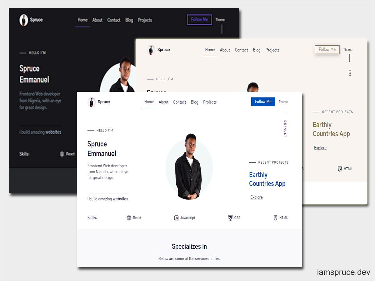
With some added CSS (which we won't cover in this tutorial) we now have a UI that looks like the one below:
iamspruce.dev customize theme UI
How to Set Up the State
We'll start by importing the useState() hook from React:
import React, { useState} from "react"

const Theme = () => {

  return (
  )
}
We use React Lazy Initialization, which lets us pass a function to useState() that we'll use during the initial render.
Quoting the React docs:
"If the initial state is the result of an expensive calculation, you may provide a function instead, which will be executed only in the initial render."
import React, { useState} from "react"
import themes from "../../content/theme.json"

const Theme = () => {
 const [state, setState] = useState(() => {
     const localVal =
       typeof window !== "undefined" && window.localStorage.getItem("theme")
     let obj = {
       font: 15,
       scheme: "default",
     }
     return localVal !== null ? JSON.parse(localVal) : obj
   })
  return (

  )
}

export default Theme
In our case, we’re using it to check for the value in localStorage(). If the value exists, will use that as our initial value. Otherwise, will use the default obj.
We’re checking if the window object exists (typeof window !== “undefined”) because at build time the window’s object does not exist. If you run gatsby build without checking if the windows object exists or not, you’ll get an error that looks like this:
WebpackError: ReferenceError: localStorage is not defined
How to Update the State
The next step is to have an onClick and onChange eventListener update our state. For that we are going to create a function:
import React, { useState} from "react"
import themes from "../../content/theme.json"

const Theme = () => {
 const [state, setState] = useState(() => {
     const localVal =
       typeof window !== "undefined" && window.localStorage.getItem("theme")
     let obj = {
       font: 15,
       scheme: "default",
     }
     return localVal !== null ? JSON.parse(localVal) : obj
   })
// the update function
  const update = e => {
    const { name, value } = e.target
    setState(prevState => ({
      ...prevState,
      [name]: value,
    }))
  }

  return (

  )
}
We passed in a Object as an initial value for our useState because we can update multiple states with one useState hook. We now need to set the update function on our UI:
...
{theme.map(data => {
  return (
    <li className="scheme">
       <button
       onClick={update} // set the update function to an Onclick event
       className="scheme-btn js-scheme-btn"
       aria-label={`${data.id}`}
       name="scheme"
       value={`${data.id}`}
       style={{ backgroundColor: `${data.colors["background"]}` }}
       ></button>
    </li>
   )
})}

<input
  type="range"
  name="font"
  min="10"
  max="20"
  step="2"
  className="theme-range__slider"
  onChange={update} // set the update function to an Onchange event
  value={state.font}
/>
How to Persist Our Changes In LocalStorage
The final step is to make sure we update localStorage and our website with the current values from our state whenever the state value changes. For that we’ll use the useEffect Hook, which lets us run some code after React has updated the DOM.
import React, { useState} from "react"
import themes from "../../content/theme.json"

const Theme = () => {
 const [state, setState] = useState(() => {
     const localVal =
       typeof window !== "undefined" && window.localStorage.getItem("theme")
     let obj = {
       font: 15,
       scheme: "default",
     }
     return localVal !== null ? JSON.parse(localVal) : obj
   })

  const update = e => {
    const { name, value } = e.target
    setState(prevState => ({
      ...prevState,
      [name]: value,
    }))
  }

// persisting state to localStorage
  useEffect(() => {
    window.localStorage.setItem("theme", JSON.stringify(state))
    let root = document.documentElement
    root.setAttribute("data-theme", state.scheme)
    root.style.setProperty("--font-size", `${state.font}px`)
  }, [state])

  return (

  )
}
Congratulations! If you made it this far you now have a complete user theme-able website. The overall design of our switch theme UI now looks like this:
For a live preview of the site, visit https://www.iamspruce.dev/.
Conclusion
There's really no limit with what you can do with theming. Although this tutorial uses Gatsby.js, you can easily apply these concepts to other React-based static site generators.
If you found this tutorial useful, kindly follow me on Twitter @sprucekhalifa .
Happy coding!