By Deborah Kurata
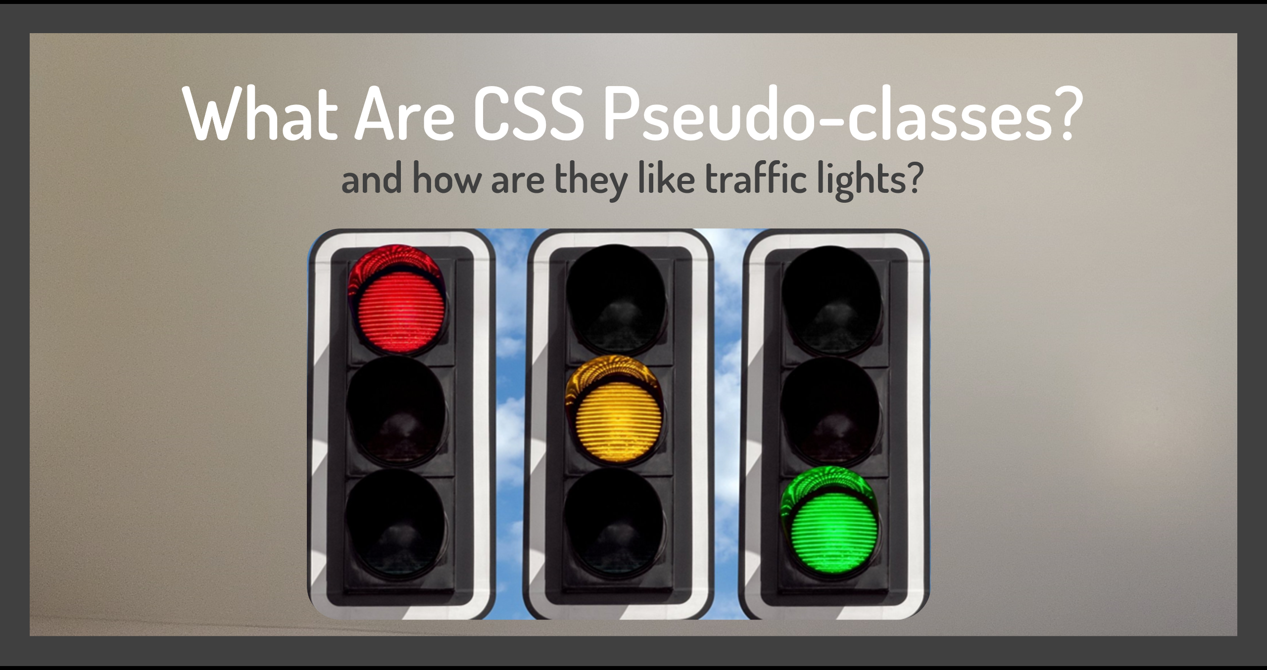
To make sense of CSS pseudo-classes, we need to understand state. In this context, the word state means a situation or condition that something is in at a particular point in time.
Take the state of a stoplight, for example. At any point in time it has one of three states:
- Red state: Stop
- Yellow state: Accelerate ... oh no! ... it's caution
- And green state: Go
When we talk about the "state of the stoplight", we're referring to one of these three possibilities.
How is state related to pseudo-classes? Let's look at an example.
 Figure 1. Default link styles
On the web page in Figure 1, notice that the links to GitHub and LinkedIn are currently blue and underlined. Mouse down on a link and you see that it turns red as shown in Figure 2.
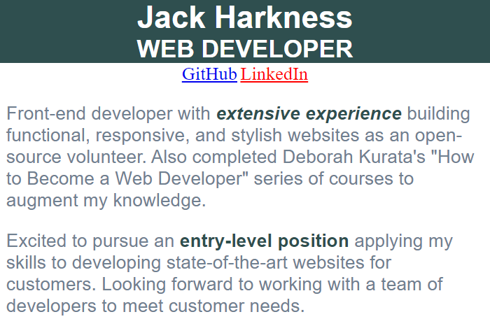 Figure 2. Default link active style
Click on the link, and it turns purple as you can see in Figure 3.
 Figure 3. Default link visited style
We add links to an HTML page using anchor elements, denoted with an "a".
<a href="http://www.github.com">GitHub</a>
<a href="#">LinkedIn</a>
As you saw in the figures, by default the anchor element has multiple states: blue when it's not yet clicked, red when it's active, and purple when it has been clicked.
If we simply style an anchor element, using a CSS element selector as shown below, the link won't have any of that additional coloring for the different states.
a {
  color: darkslategray;
}
How do we style these anchor states? You guessed it! With pseudo-classes. Let's examine what pseudo-classes are and walk through two examples. You can view the associated video here:
What Is a Pseudo-class?
A CSS pseudo-class is a fancy name for a keyword added to a CSS selector that identifies the HTML element's state. We can then style the element when it is in that particular state.
To add a pseudo-class to a selector, add a colon and the pseudo-class name:
a:active {
  color:orange;
}
The a:active adds the active pseudo-class to the anchor element selector. We can then style the anchor link to look a certain way when it's in its active state.
Let's look at two examples using pseudo-classes.
How to Style Anchor States
An anchor element has four states:
- link: when the link has not yet been clicked.
- visited: when the link has been clicked (clicking a link "visits" that linked page, hence the name "visited").
- hover: When the mouse is hovered over the link.
- active: for the moment the mouse is clicked down on the link
We style these states using pseudo-classes. In the below example, we specify the "a" (or anchor) element selector, a colon, and the name of the anchor state.
a:link {
  color: slategray;
}
a:visited {
  color: darkslategray;
}
a:hover {
  color: yellow;
}
a:active {
  color:orange;
}
It's recommended that you declare these pseudo-classes in the stylesheet in this order because of the CSS precedence rules. Find more information about CSS precedence rules here. In short, styles declared later override those declared earlier. For the anchor element, we want the active state to take precedence, which is why it's last.
Use these states as needed when you style your anchors.
To see these states in action and try your own custom styles, check out this project.
Now let's look at another type of HTML element, the input element checkbox.
How to Style a Checkbox Checked State
Here we have a checkbox for "Add me to your mailing list". It's currently in an "unchecked" state.
 Figure 4. Default checkbox
Here is the same checkbox in the "checked" state with default styling. We want to style the "checked" state to add our own custom look.
 Figure 5. Default checkbox checked style
Let's say we want to change the background color, maybe the blue clashes with our design. And we want to change the border by removing the existing border and adding our own outline color. Like this:
HTML
<input type="checkbox" id="mailing-list">
<label for="mailing-list">Add me to your mailing list</label>
CSS
#mailing-list:checked {
  border: none;
  accent-color: white;
  outline: 2px solid  orange;
}
Here we use a CSS id selector and a pseudo-class to style a checkbox's checked state. We remove the border, set the background color (called accent-color), and provide our own orange outline.
The resulting checked state looks like this:
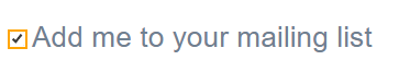 Figure 6. Custom checkbox checked style
Use this technique to give your webpages a custom look.
To see these states in action and try your own custom styles, check out this project.
Wrapping Up
A pseudo-class is a keyword added to a selector that styles an element's state. We saw how to add pseudo-classes for anchor element states and for the checked state of a checkbox.
Many other HTML elements also have states, and we can style those states using pseudo-classes. For a list of these pseudo-classes, see the Mozilla Developer Network (MDN) Web Docs.
For more information on styling with CSS, check out my course: "Gentle Introduction to CSS for Beginners" and subscribe to my YouTube channel.
Green light ... go! Now let's go out there and style our element states.