

In CSS, there is a property called box-sizing that allows you to determine how the width and the height for an element is calculated.
A lot of CSS resets will change the default box model from content-box to border-box to make the layouts easier to work with.
But what does box-sizing: border-box actually do?
In this article, we will explore the box-sizing property and how it affects the layout for your web pages.
The Default Box Model
The default box model is set to content-box. This means that the width and height of an element are calculated based on the content inside the element.
If you add any padding or border to the element, then those values will be added to the final width of the element.
In this example, we have a red box that has a width of 200px, height of 200px, padding of 20px, and a black border set to 5px.
<div class="box"></div>
.box {
  background-color: #ff0000;
  width: 200px;
  height: 200px;
  padding: 20px;
  border: 5px solid black;
}
If you right click on the div element and inspect it inside the dev tools, you will see that the width of the box is 250px and the height is 250px.
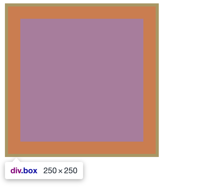 example of box set to 250px by 250px
This is because the padding and border are added to the width and height of the box. The total width and height are now 250px by 250px instead of 200px.
When you are building out your layouts, you have to remember to calculate the padding and border into the width and height of the element. This can be a bit of a pain and can lead to unexpected results.
A way to avoid this is to use the box-sizing property set to border-box.
How to Work with box-sizing: border-box
When you set the box-sizing property to border-box, the width and height of the element are calculated based on the content, padding and border of the element.
In this revised example, we are using the * selector to set the box-sizing property to border-box for all elements on the page. This is known as a global CSS reset.
<div class="box"></div>
*,
*:before,
*:after {
  box-sizing: border-box;
}

.box {
  background-color: #ff0000;
  width: 200px;
  height: 200px;
  padding: 20px;
  border: 5px solid black;
}
Now when you inspect the box element, you will see that the width and height are set to 200px like we specified in the stylesheet. The browser is accounting for the added padding and border and adjusting the content box accordingly.
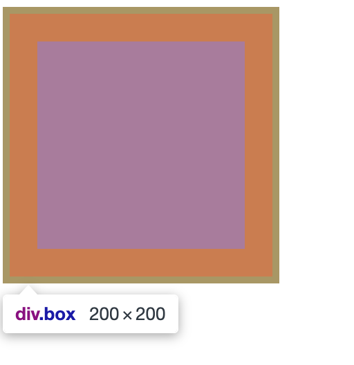 example of dev tools showing box width of 200px
What do the *, *:before and *:after selectors do?
The reason why we are using the *, *:before and *:after selectors is to ensure that the border-box value is applied to all elements on the page.
The * selector selects all elements, the *:before selector selects all elements before the content, and the *:after selector selects all elements after the content.
To learn more about the :before and :after pseudo elements, check out this freeCodeCamp article.
Conclusion
Having to remember to calculate the padding and border into the width and height of your elements can be a pain and lead to unexpected results in your layouts.
Setting the box-sizing property to border-box for all elements on the page by using the *, *:before and *:after selectors will save you a lot of time debugging and fixing layout issues in your CSS.