
Frameworks like React, Vue, and Angular all help developers create modular systems using components, but that doesn't usually include a good way to see them all from a higher point of view.
So how can we use Storybook to build libraries and design systems that self-document as we build them?
- What is Storybook?
- What are we going to build?
- Step 0: Bootstrapping an app
- Step 1: Installing Storybook
- Step 2: Creating a new button
- Step 3: Using our new Button component
- Repeat: Creating a new Header component
- More Storybook features
What is Storybook?
Storybook is a JavaScript tool that allows developers to create organized UI systems making both the building process and documentation more efficient and easier to use.
Once you build out a component, Storybook lets you create a "story" file where you can then import your component and create various use case examples in an iFramed sandbox using that component.
This provides an organized and focused environment to build new components and work on existing ones.
What are we going to build?
We're going to bootstrap a new React JS app using Create React App.
Inside that app, we're going to install Storybook and create a few new components that will help us learn how to create new components that we can work on in a story and then use it in a React app.
Step 0: Bootstrapping an app
To get started, we're going to start from scratch with Create React App. This will help us focus on getting productive in Storybook rather than walking through integrating it into a current app.
That said, if you're already working with an app created using Create React App that's not ejected, you should be able to still follow on with Part 1 and beyond just the same!
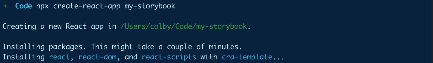
So let's get started by navigating to where we want to create our new app and run the Create React App command:
npx create-react-app my-storybook
Note: feel free to replace my-storybook with the directory name of your choice.
Once that's finished running, you can navigate to the directory:
cd my-storybook
And we're ready to go!
Step 1: Installing Storybook
Storybook luckily makes it really easy to get started with a standard installation of React. Particularly with Create React App, Storybook automatically detects that we're using an app created using CRA and installs the dependencies and scaffolds everything for us.
Initializing Storybook
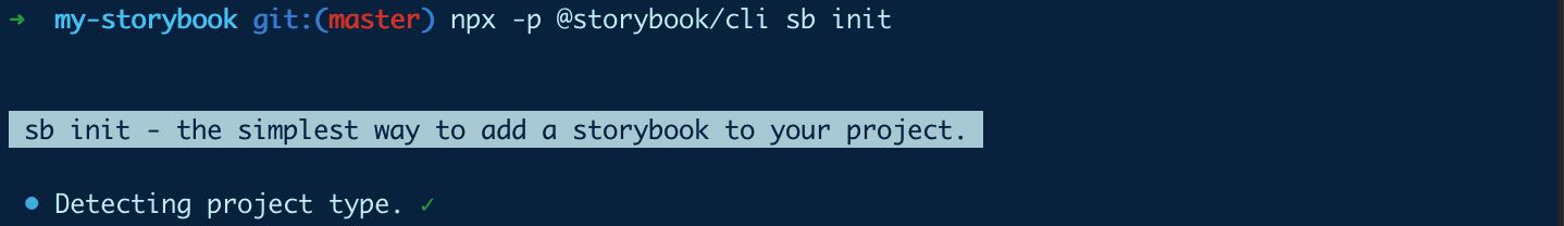
To get started installing Storybook, run:
npx -p @storybook/cli sb init
If you aren't using Create React App or it didn't work, you can check out their available guides in their docs.
After that's finished, all of our Storybook dependencies should be installed.
Starting up Storybook
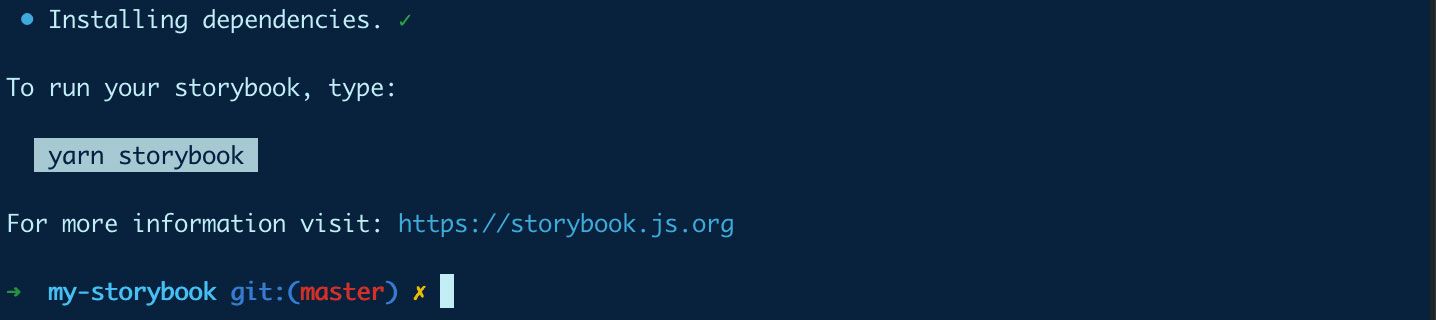
So now we're ready to get moving! Finally, run:
yarn storybook
# or
npm run storybook
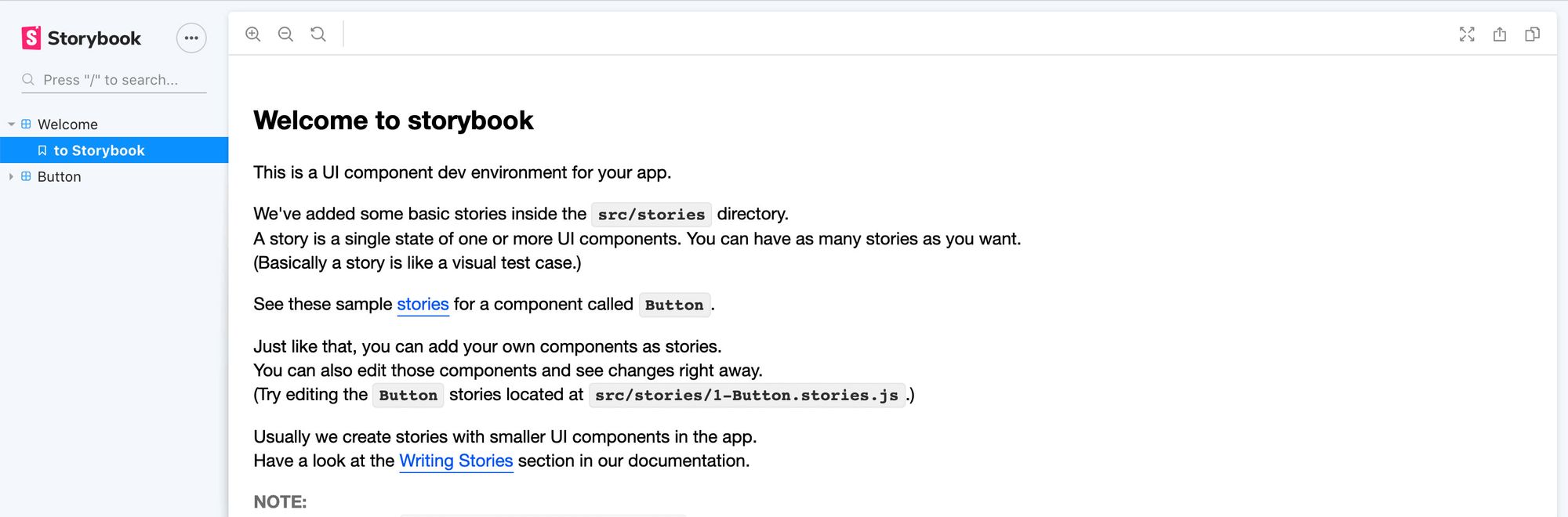
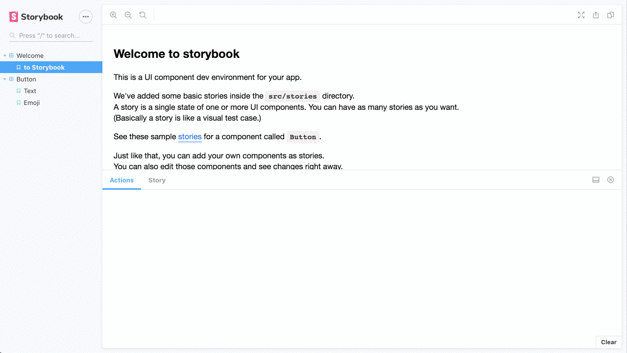
And once everything finishes loading, Storybook will open a new tab in your browser and you should now see a welcome message inside of your new Storybook dashboard!
Step 2: Creating a new button
If you took a second to poke around the dashboard, you might have noticed that it comes pre-loaded with a Button that's available as a demo.
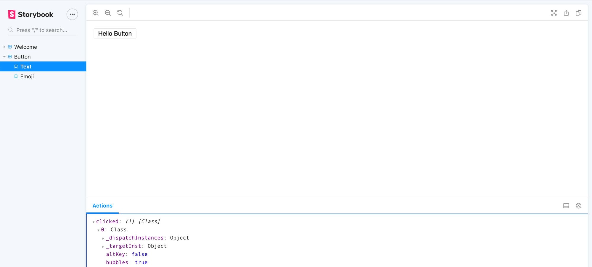
You should also notice if you click the button, you actually see an action print out inside of the Actions tab at the bottom. This shows the event that's captured from the button click.
It's simple, but this is great to get a nice feel about what to expect in storybook. The only issue is, this is meant purely for demonstration purposes, so let's build our own button to replace it.
Creating a new Button component
To get started, let's first create a few directories:
- Under
src, create a new folder calledcomponents - Under
components, create a new folder calledButton
Once you create those folders, create a new file called index.js inside of your src/components/Button folder and inside add:
// Inside src/components/Button/index.js

export { default } from './Button';
This will import the next file we created called Button.js which will allow us to more easily import our files with src/components/Button instead of /src/components/Button/Button.
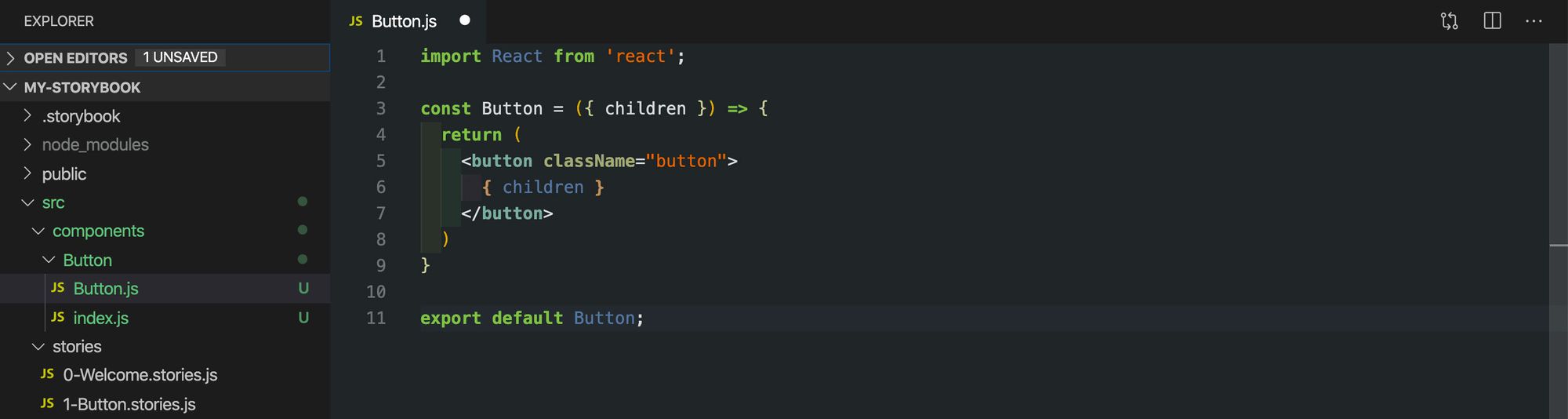
Next, let's create Button.js right next to our index.js file with the following content:
// Inside src/components/Button/Button.js

import React from 'react';

const Button = ({ children, ...rest }) => {
  return (
    <button className="button" {...rest}>
      { children }
    </button>
  )
}

export default Button;
Here, we're creating a new component called Button that adds a class of button to the element and passes through the children. We're a additionally destructuring the rest of the props into the rest variable and spreading that value into the <button> element.
If you've followed along, your files should now look like this:
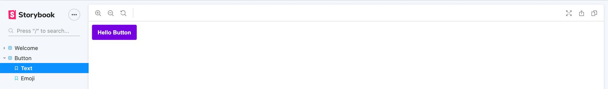
Using our new Button component
So now that we have our Button component, let's use it!
Open up the file src/stories/1-Button.stories.js and replace the line that's importing Button with:
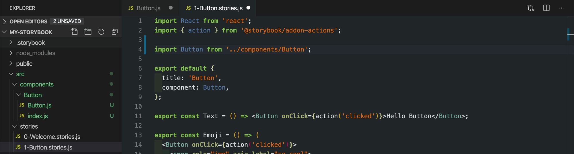
And once you hit save, you can open back up your browser tab with your Storybook dashboard, and you can now see a button that looks mostly similar, but it uses the browser's default styles for the <button> element. You'll even notice that if you click it, the event will still be logged under the Actions tab.
Styling our Button component
Finally, we probably don't want to use the browser default styles, so let's make it look nice.
In our src/components/Button directory, add a new file Button.css and add the following content:
/* Inside src/components/Button/Button.css */

.button {
  color: white;
  font-weight: bold;
  background-color: blueviolet;
  border: none;
  padding: .8em 1em;
  border-radius: .2rem;
}
This applies a few styles to our .button class like adding a background color and changing the font color to white.
But if you open Storybook, you'll notice it didn't do anything. To use it, we need to import it into our component.
Inside src/components/Button/Button.js add the following at the top under the React import:
import './Button.css';
And once you save that and open up your browser, you should now see our new button with our updated styles!
Step 3: Using our new Button component
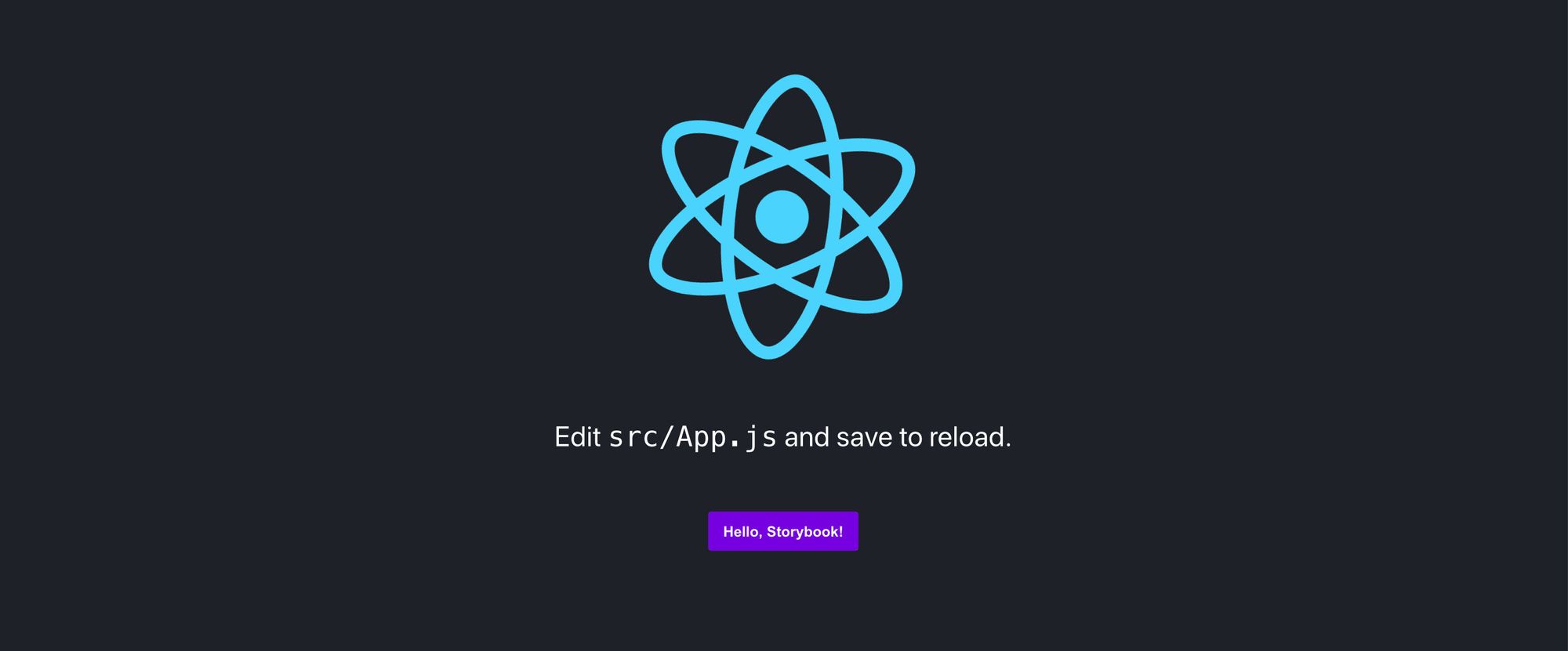
The ultimate goal of our component is to use it right? So let's add it to our app.
Switching over to the React app
First we'll need to either start our React app in a new terminal tab or kill the Storybook process and start the React process there. To start the React app using Create React App, run:
yarn start
# or
npm run start
Once that loads, we should have our standard Create React App if you're following along with me:

Importing and using the new button
Next, inside of src/App.js, let's import our new Button at the top of the page:
import Button from './components/Button';
With Button imported, we can use it. Here, we can simply add it anywhere we want in the page. I'm going to replace the Learn React link with:
<p>
  <Button>Hello, Storybook!</Button>
</p>
And if we save and reload the page, we should now see our Button on the page!
Repeat: Creating a new Header component
The great thing about Storybook and React (or any of the supported frameworks) is that this process scales to as many components as you want.
So let's build another component!
Creating our Header component
Similar to our Button, let's start off by creating the set of directories and files that give us our component.
Since we already did this once, I'm going to provide the code without walking through what's going on.
Let's start off by spinning back up our Storybook server with:
yarn storybook
# or
npm run storybook
Create a Header directory inside the src/components directory.
Create an index.js file inside of src/components/Header with the following content:
// In src/components/Header/index.js

export { default } from './Header';
Create a Header.js file inside of src/components/Header with the following content:
// In src/components/Header/Header.js

import React from 'react';
import './Header.css';

const Header = ({ children }) => {
  return (
    <h2 className="header">
      { children }
    </h2>
  )
}

export default Header;
Create a Header.css file inside of src/components/Header with the following content:
/* In src/components/Header/Header.css */

.header {
  font-family: sans-serif;
  font-size: 2.5em;
  color: blueviolet;
  border-bottom: solid 5px aqua;
  padding-bottom: .2em;
  box-shadow: 0 5px 0 blueviolet;
}
Now if you notice, if you try to open up Storybook, again, nothing will happen. This time we need to create a new story file.
Creating a new Story file
Inside src/stories, add a new file called 2-Header.stories.js:
// Inside src/stories/2-Header.stories.js
import React from 'react';
import Header from '../components/Header';
export default {
title: 'Header',
component: Header,
};
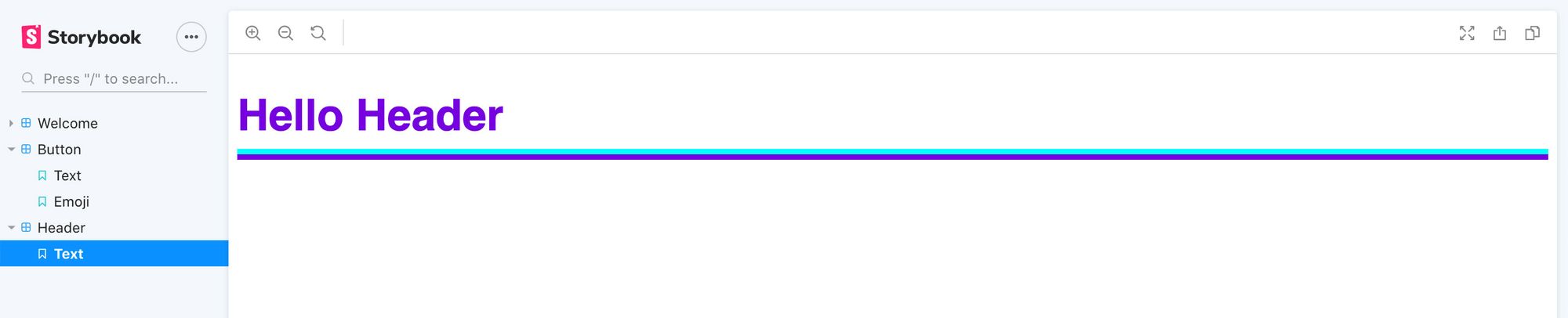
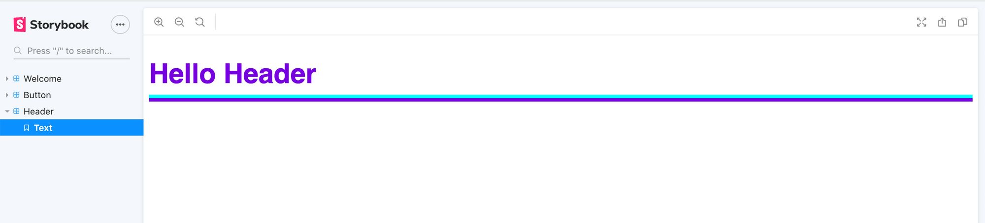
export const Text = () => <Header>Hello Header</Header>;
Here's a breakdown of our story file:
- First, we import our component – this is pretty standard any time we want to use it
- The first thing we export is a
defaultobject. With Storybook, it expects the default export to be the configuration of our story, so here we provide it with a title and we pass in the component that we're using for this story - The second and last thing we export is the
Textconstant. With Storybook, any non-default export will be considered a variation that will get nested under the title that you provide in the default export
And if you save this file and open up your Storybook dashboard in the browser, you should now see the new header!
Using the Header component
Using our component is just the same as our Button component, so inside of src/App.js, let's add our Header.
After starting your React server, first import our new Header:
// In src/App.js

import Header from './components/Header';
Then add it to the top of the page:
// In src/App.js
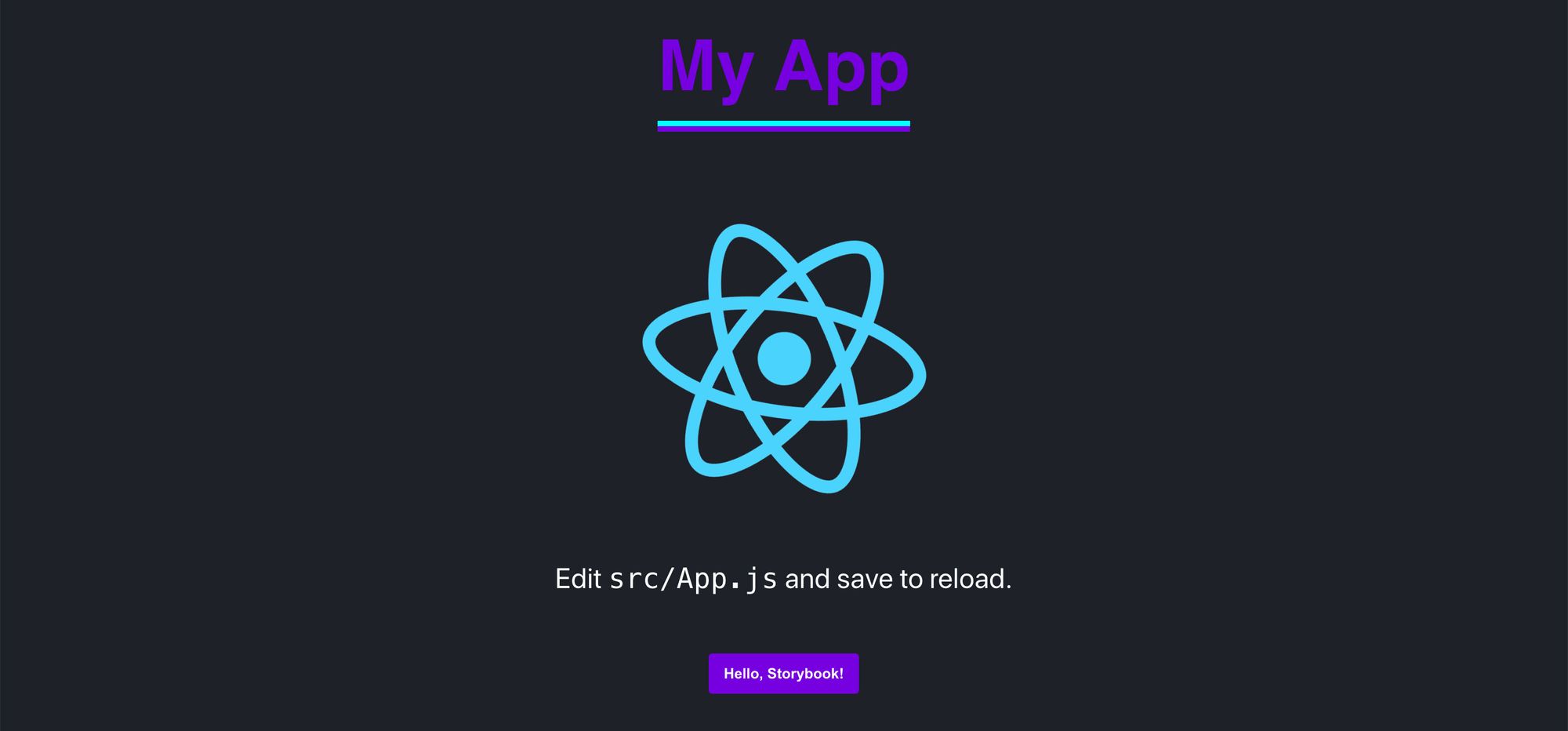
<Header>My App</Header>
And if you open the page, we'll see our new Header!
Adding more components
As you've noticed with our second Repeat step – adding a new component is pretty much the same process for any type of component we want to add. Once we have it in our library, we can develop it in a focused environment and then import it to our app to use.
You can now use this to manage your library of components and better maintain an entire system for your project!
More Storybook features
Storybook doesn't stop with just adding components, it provides the ability to configure Addons that enhance the core capabilities opening up a lot of possibilities.
Here are some of my favorites...
Story Source
When building a component system, the hope is that people can easily use these components. But if you don't have documentation, someone would have to open up the file or try to find another use example.
Instead, Story Source shows the code source of the story file you created allowing someone browsing your Storybook dashboard to get an example right along with the component output!
Storyshots
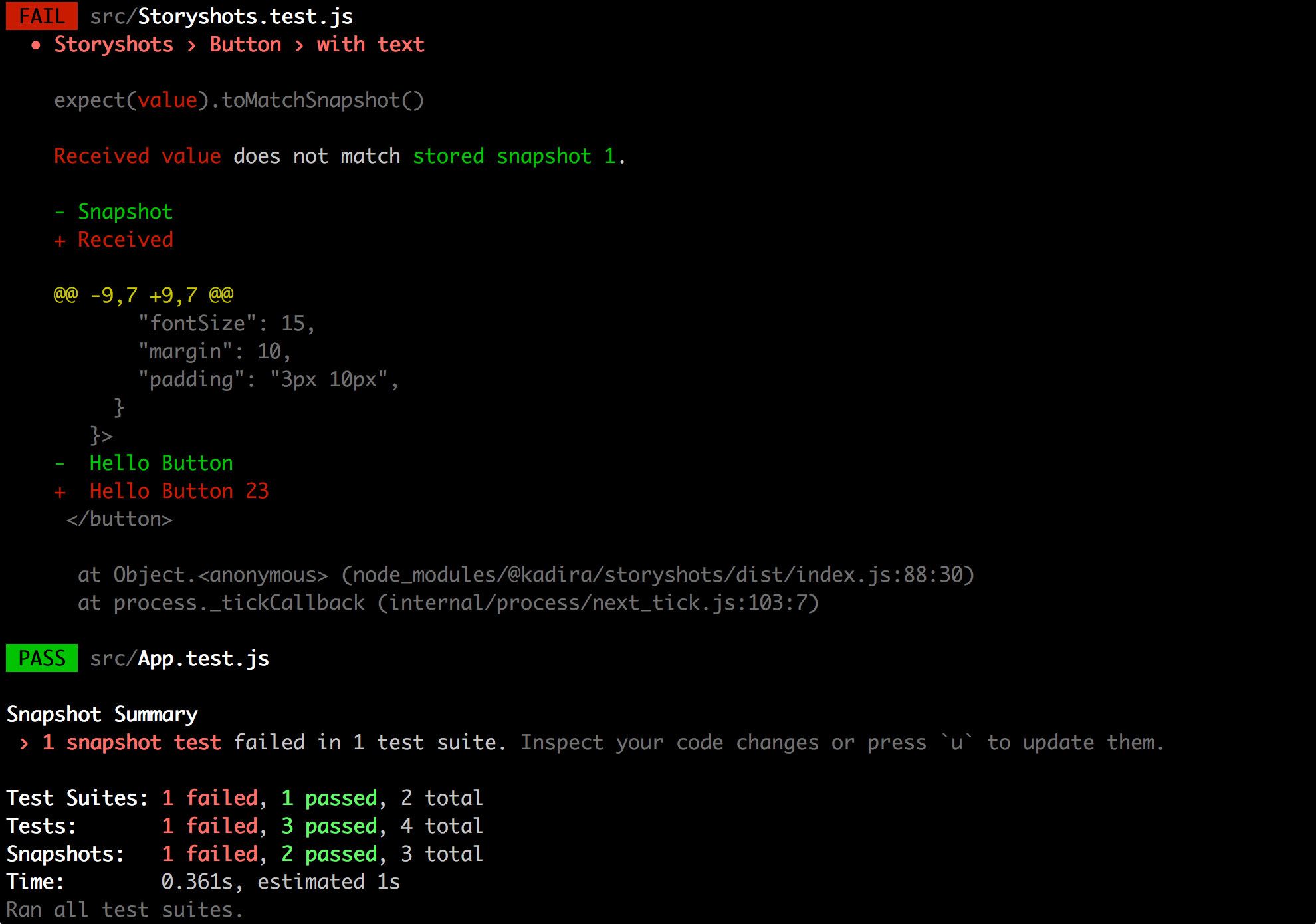
If you're a fan of automated testing, you might have heard of using Jest or another tool for adding snapshot testing to your app.
StoryShots is a way to easily add Jest snapshot testing to your component system. It creates snapshots based off of the stories you create so you can make sure that your components aren't fundamentally changing (or breaking) during development.
What's your favorite part of Storybook?
Continue the conversation!
.@storybookjs is an awseome tool to manage a library of components for your project’s design system ?
— Colby Fayock (@colbyfayock) June 9, 2020
It makes it fun to create and update components in a focused env ??
I walk through what Storybook is and how to get started ?#webdev #100DaysOfCodehttps://t.co/4TLFlmp4Df