

Accessibility is a word that is often thrown around in the design field. As a UI/UX/Web Designer, you might have heard this word a few times and you might wonder why it's important.
In this article, you will learn:
- What accessibility means
- Some myths surrounding accessibility
- How to make your work more accessible
- Some practical accessibility examples
Let's get started!
What is Accessibility?
There are so many definitions of accessibility on the web. But to me, accessibility in digital/web design simply means designing to make content usable for people with disabilities.
Working with accessibility in mind involves designing websites, applications, and digital interfaces that can be navigated by individuals with visual, hearing, motor, or cognitive impairments.
Some Myths Surrounding Accessibility
Like every topic under the sun, lots of people have different opinions about accessibility. Some might be true, some might be false.
Below, I'll share some popular misconceptions about accessibility.
Myth: people with disabilities don't use my platform
You might be designing for a governmental or corporate platform and think that people with disabilities will not use your platform.
This is an incorrect notion to have. There are different forms of disability, including temporary and permanent disabilities. You have no control over who might use your platform at any time or what they might need.
Myth: accessibility is only for people with disabilities
While accessibility measures are crucial for individuals with disabilities, they also benefit a wide range of people, including the elderly, those with temporary disabilities, individuals with situational limitations, and even people without apparent disabilities.
Accessibility best practices make websites and apps easier for everyone to use in various ways.
Myth: accessibility is all about adding ALT text
Alt (alternative) text is an assistive technology which is a valuable tool. But you shouldn't only use alt text as a substitute for general/wider accessibility best practiceds.
Assistive technologies work best when used in conjunction with accessible designs and content.
Myth: you should build accessible sites just so you don't get in trouble with the law
Although accessibility is a legal and ethical requirement, you shouldn't build it into your designs because of that reason alone.
You should build accessible websites and apps because accessibility helps anyone who comes to your platform interact with it well.
Why is Accessibility Important?
Accessibility is important for a number of reasons. They include:
- Improved Usability: Accessibility improves the usability of a website or application. Features like clear navigation, intuitive design, and so on benefit all users. They also contribute to user satisfaction, usability and overall engagement with products and services.
- Broad User Base: When your platform is accessible, it increases your user base, as people from different backgrounds and situations can use your platform. This expands the reach and customer base of your product.
- Enhanced User Experience: Incorporating accessibility in your designs will enhance the experience of your users (disabled or not), making it easier to interact with your platform.
- Equal Rights & Inclusion: Accessibility promotes inclusivity and prevents discrimination based on disabilities. Everyone deserves to have equal access to opportunities, information, and social services.
- Legal & Ethical Requirements: Legally and ethically, accessibility is a requirement for different domains and platforms. Adhering to these legal requirements ensures compliance and helps your client avoid potential legal issues.
How to Make Your Designs More Accessible
Understanding Accessibility Guidelines
Familiarize yourself with accessibility standards such as the Web Content Accessibility Guidelines(WCAG). These guidelines provide comprehensive recommendations for designing accessible digital content.
Use Sufficient Color Contrast
Opt for color combinations that are accessible for individuals with color blindness or low vision. Use tools to check the color contrast ratio and ensure that text is easily distinguishable from the background.
Here's an example of creating sufficient color contrast:
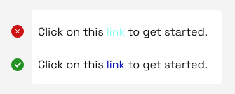 Color contrast example
In the example above, in the first sentence, the highlighted word (link) does not contrast well with the rest of the sentence. Compare with the second sentence where "link", is perfectly contrasting and has an underline, to create more emphasis.
It's more likely that the second sentence is accessible for individuals with color blindness or low vision.
Create Inclusive Forms
Design forms that are user-friendly. Include clear labels, instructions and, error messages. Make sure to enable users navigate and complete the form without relying solely on a mouse.
Here's an example of creating an inclusive form:
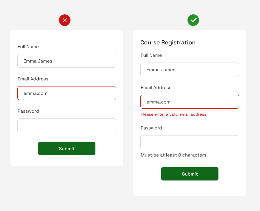 User-friendly form example
The first form has some issues:
- It does not have any header (to indicate what the form is for).
- It shows an error field without explaining what it indicates.
- The form does not specify the number of characters the password should have, all of which are very helpful to the user(s).
All these were corrected in the second form, where:
- A header was added indicating that the form is for "Course Registration".
- The error field specifically explains what's wrong – the user entered an invalid email address.
- The number of password characters as required by the platform was stated.
Implement Responsive Design
Some designers design for desktop versions only, not considering accessibility. But it's much more helpful to make your design responsive.
Ensuring that your designs are adaptable to different screen sizes and resolutions accommodates individuals who use various devices. This is a great way to make your designs more accessible.
Here's an example of implementing responsive design:
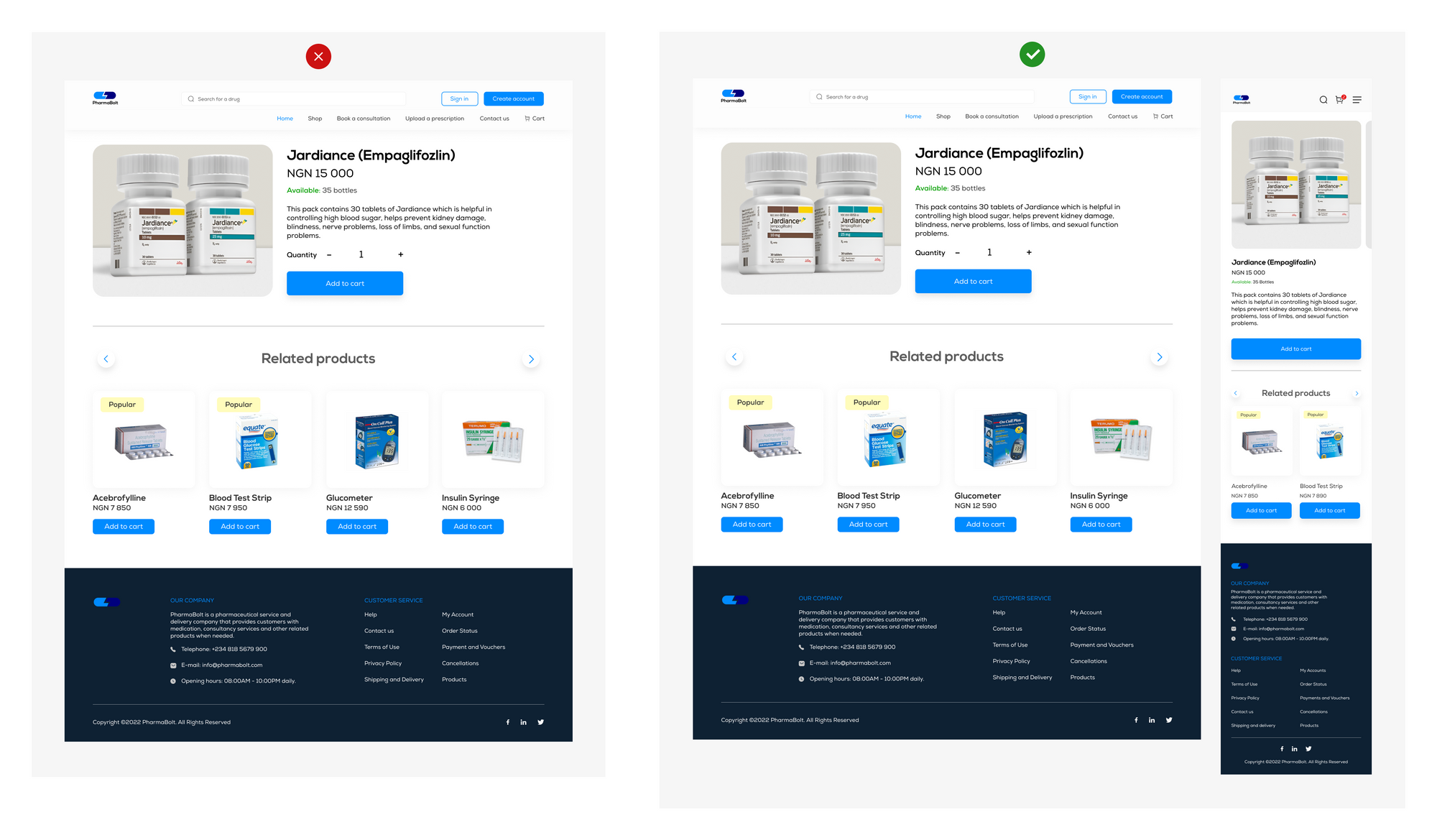 Responsive Design example
Above is an example of a product description page of a website. The first image on the left shows the desktop version only. In the second image, the design has been made more accessible – you can see the mobile responsive version as well.
Designing for different screen sizes shows that your design accommodates individuals who use various devices, as stated earlier.
Provide Feedback and Error Handling
Making sure your designs provide adequate feedback accompanied by the next step to take, gives a great user experience. Error notifications can completely discourage a user if not handled correctly. As such, adequate feedback is necessary to make your design accessible.
These are few ways of making your designs accessible, amongst others. You can make an accessibility checklist to help remind yourself of accessibility when designing. To help further, check out accessibilitychecklist.org to find out.
Here's an example of how to provide feedback and handle errors:
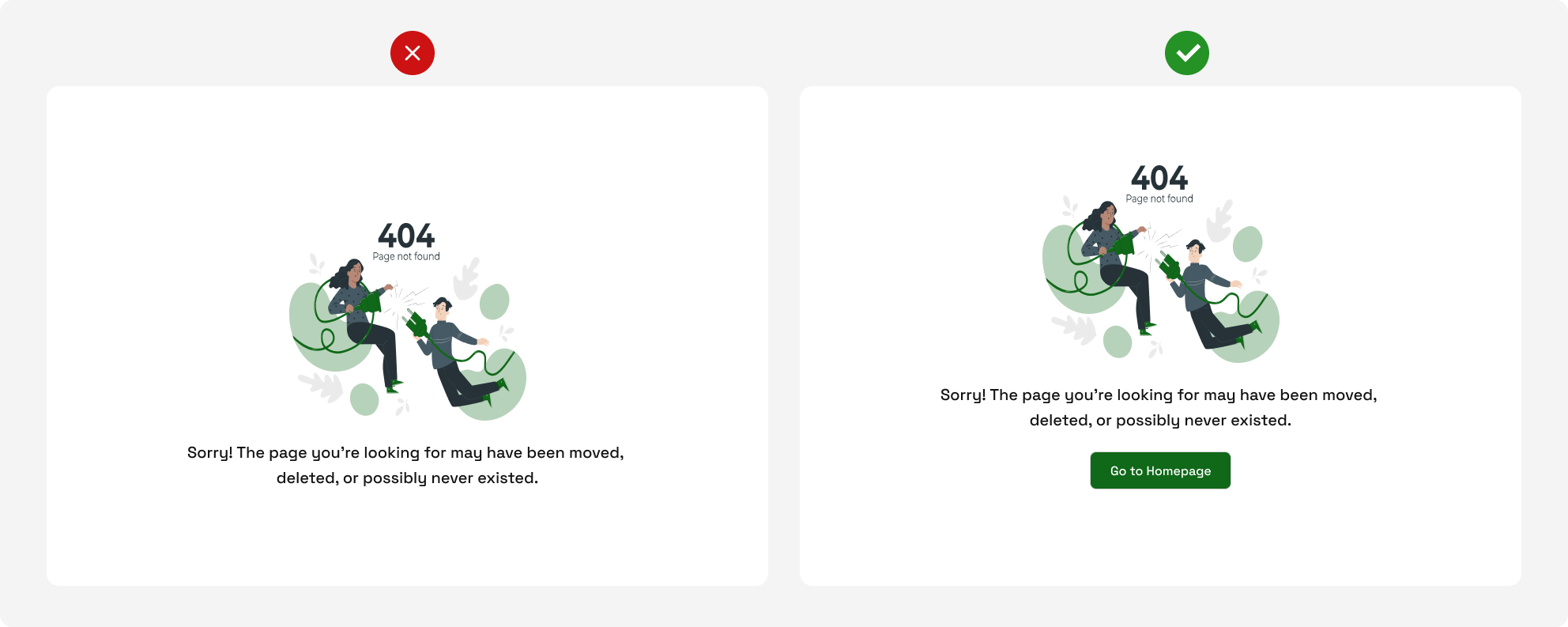 Error handling example
In the example above, the first 404 page tells the user what error occurred, and what might be the cause – but does not suggest a way of fixing the error. Meanwhile, the second 404 page explains the error that occurred and provides a way of fixing it – "Go to homepage".
Conclusion
Accessibility is important to customer retention and the growth of a business. As a UI/UX/Web designer, it's your responsibility to incorporate accessibility into your product and give your users an awesome experience. Remember, your user is the priority.