

In this article, I'll talk about what ChakraUI is and why you should use it.
Chakra UI is a component-based library. It's made up of basic building blocks that can help you build the front-end of your web application.
It is customizable and reusable, and most importantly it supports ReactJs, along with some other libraries too.
Here's what we'll cover in this article:
- What is Chakra UI?
- How to get Started and Install Chakra UI
- Chakra UI Customization and Features
- How Chakra UI affects your Lighthouse Score
- How to use Dark Mode in Chakra UI
- Conclusion
What is Chakra UI?
Have you ever struggled with whether to focus more on the back-end or front-end of your project? Well believe me, both are equally important.
I started using Chakra UI because I wanted to focus on my back-end code more than being stuck on "How to center a div element?".
Chakra UI is extremely simple to use, especially when you are familiar with how to use ReactJs components.
How to Get Started and Install Chakra UI
Inside your respective directory, install ChakraUI using Yarn or NPM
yarn add @chakra-ui/react @emotion/react@^11 @emotion/styled@^11 framer-motion@^4
npm i @chakra-ui/react @emotion/react@^11 @emotion/styled@^11 framer-motion@^4
For React:
For ChakraUI to get initialised you first need to add <ChakraProvider> in your index.js file.
import React from "react"

// 1. import `ChakraProvider` component
import { ChakraProvider } from "@chakra-ui/react"

function App({ Component }) {
 // 2. Use at the root of your app
 return (
   <ChakraProvider>
     <Component />
   </ChakraProvider>
 )
}
For Next.js
Go to pages/_app.js and add the following lines of code:
import { ChakraProvider } from "@chakra-ui/react"
function MyApp({ Component, pageProps }) {
 return (
   <ChakraProvider>
     <Component {...pageProps} />
   </ChakraProvider>
 )
}
export default MyApp
(Source: Chakra UI Docs)
You can refer the documentation to checkout ChakraUI’s support for other libraries: https://chakra-ui.com/docs/getting-started
ChakraUI Customization and Features
Style Props
Chakra UI supports Reactjs, and every component is customizable using the Style props. They map to almost all necessary CSS properties that are available.
For example, for margin-top in CSS, you would write it as
<Text mt={8} >. This will set a top margin of 8px on the selected element.
Chakra UI is inspired by TailwindCSS's color palette, so you can find all your favorite colors!
How to override ChakraUI's default theme
You can override Chakra UI's default theme and create your own theme with the colors of your choice. You can do this using Chakra UI’s CSS variables.
All you need to do is either make a new theme.js file or edit the existing index.js file on React or the _app.js file on Nextjs.
// 1. Import `extendTheme`
import { extendTheme } from "@chakra-ui/react"

// 2. Call `extendTheme` and pass your custom values
const theme = extendTheme({
 colors: {
   brand: {
     100: "#f7fafc",
     // ...
     900: "#1a202c",
   },
 },
})

// 4. Now you can use these colors in your components
function Usage() {
 return <Box bg="brand.100">Welcome</Box>
}
(Source: Chakra Ui Docs)
For more information on overriding the ChakraUI default theme, visit the Chakra UI docs at https://chakra-ui.com/docs/theming/customize-theme
Responsive styles
How about responsiveness? The biggest headache, for me at least. I don't enjoy this part, but with Chakra UI, it’s no longer a huge pain.
For example, consider the line of code below:
<Box m={[2, 3]} />
(Source: Chakra UI Docs)
So now by defining this value inside an array, the Box component will be 8px on all viewports, and 16px from the first breakpoint.
Now we can override this in many ways, one of which is easier to understand – using the object syntax.
<Text fontSize={{ base: "24px", md: "40px", lg: "56px" }}>
 This is responsive text
</Text>
(Source: Chakra UI Docs)
So now on smaller screens, the fontSize is 24px, on medium size it's 40px, and on larger screens it's 56px.
You might have noticed that Chakra UI strictly follows the ReactJs syntax for defining inline styles by capitalizing the second word (that is fontSize) as in the CSS property font-size for its style props too.
For more information on Responsive styles visit the ChakraUI docs at https://chakra-ui.com/docs/features/responsive-styles
Stack Component
Another commonly-used feature which I used to dislike in CSS is the flex property. It's a bit confusing to grasp how the property works.
Well it’s my honor to say here – “Chakra UI to the rescue🚀!”
I'd like to introduce you to the Stack component.
Stack is a simple layout component which you can use to stack elements, vertically and horizontally.
So there is Stack, HStack (short hand for Horizontal Stack), and VStack (short hand for Vertical stack). You might have guessed it right by now, but HStack will stack the elements horizontally and VStack will do the same layout vertically – but most importantly with zero CSS.
For more information on the Stack component, visit the Chakra UI Docs at https://chakra-ui.com/docs/layout/stack.
How Chakra UI affects your Lighthouse Score
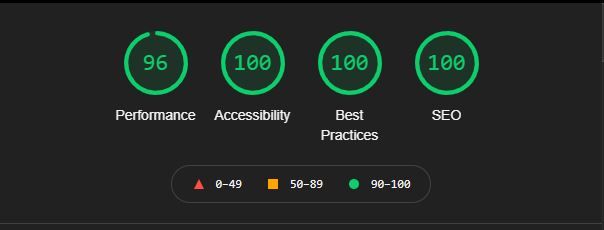
When you're finally ready to deploy a web application, you should first run it through Google Lighthouse.
Google Lighthouse is an automation tool that is in-built on your Chrome developer tools. It helps you run audits on your web applications, and determines a score based on their performance, accessibility, progressive web apps, SEO, and much more.
The word we want to look out for here is Accessibility.
What is Web Accessibility?
As a developer, it’s our responsibility to make the web acessible for everyone, and Google is taking this matter very seriously.
When websites are properly designed, it helps everyone. Proper design means that, for example, screen readers should be able to properly read out the elements on your page to a user. These principles are reflected in the the Web Accessibility Initiative (WAI).
Good accessibility doesn't just benefit people with disabilities. It's also helpful to users with smartphones, smart TVs, screens of all sizes, older people who might not see their screens very well, users with color blindness, and people using slow internet connections.
For more information on WAI you can visit their official site at https://www.w3.org/WAI/.
What does ChakraUI have to do with accessibility?
ChakraUI follows all the standards laid down by WAI for all its components. So all you have to do is add the Aria-label property to the Chakra component.
This is just what Chakra does behind-the-scenes to help you during the development process.
But why do we have to follow WAI anyways? What if we don’t?
As I said, Google is takes accessibility very seriously. As a result, the search engine will rank your page based partly on your accessibility score. That’s why Lighthouse has dedicated audits for accessibility.
How to use Dark Mode in ChakraUI
Dark mode is ever more popular these days, and ChakraUI makes it easy to use.
Let's say that you're in a React project with the below index.js file:
import React from 'react'
import ReactDOM from 'react-dom'
import App from './components/App'
import { ChakraProvider } from '@chakra-ui/react'

ReactDOM.render(
  <ChakraProvider>
    <App />
  </ChakraProvider>,
  document.getElementById('root')
)
All you need to do to initialise Dark mode on your site is make a few changes in the index.js file and make a Button component for toggling dark mode.
Let’s initialise the hook for toggling between dark and light mode first.
Head over to the index.js file, and type in the following lines of code:
import React from 'react'
import ReactDOM from 'react-dom'
import App from './components/App'
import { ChakraProvider, ColorModeScript } from '@chakra-ui/react'

ReactDOM.render(
  <ChakraProvider>
    <ColorModeScript initialColorMode="light" />
    <App />
  </ChakraProvider>,
  document.getElementById('root')
)
The hook ColorModeScript will track the mode which is currently set on the site.
Set the prop initialColorMode to “light”, “dark”, or “system”.
Now head over to your App.js file.
Install react-icons using npm like this:
npm i react-icons
Import two React icons:
import { FaMoon, FaSun } from 'react-icons/fa'
Import the following ChakraUI component and useColorMode hook and initialise the hook.
import {IconButton, useColorMode } from '@chakra-ui/react

const { colorMode, toggleColorMode } = useColorMode()
The hook is similar to the useState hook, except that toggleColorMode will set the theme of the site to dark or light mode globally, while colorMode will store the value "light" or "dark".
Now let's bring in the icon button and give the component the following props:
<IconButton
    icon={colorMode === 'light' ? <FaSun /> : <FaMoon />}
    isRound="true"
    size="lg"
    alignSelf="flex-end"
    onClick={toggleColorMode}
/>
Now when you click the button the site should change to Dark mode, and toggle between the two icons.
How easy was that?
Conclusion
Chakra UI has helped me boost my development process to another level. It's very flexible, the documentation is great, and there are a lot of pre-built templates to help you speed up the process.
Two of the templates I want to call out are Choc UI and Chakra-Templates.
Chakra UI also has a very active community on Discord.
Thank you for Reading so far 🎉
If you did like this article, share it with your co-workers. I tweet about my development journey as a Self-taught developer, so hit me up on Twitter.
Until then, have an amazing week!