
By Sameeha Rahman
[first-born](https://github.com/99xt/first-born) is a React Native UI Component Framework, which follows the design methodology Atomic Design by Brad Frost.
Version 1.0.0 was recently published as an npm module on the 1st of April (it ain’t no joke though…).
In this article, we will see a demo of the existing components offered by first-born.
The Design Methodology
The Atomic Design methodology follows the principle that user interfaces can be deconstructed to 5 different phases.
According to this design methodology, the phases are described as follows:
- Atoms: The basic, standalone elements, like Text, Icons, Buttons or TextInput boxes.
- Molecules: A combination of different atoms, which together have better operational value. For example, a TextInput with a Text label to explain the content or display an error in data entered.
- Organisms: A combination of different molecules functioning together to form complex structures. For example, a form of many TextInput molecules.
- Template: A combination of different organisms that form the basis of the page. This includes the layout and context of these organisms.
- Page: All the above working together in a single real-life instance, gives rise to a page. It is also the actual implementation of the template.
Getting Started
Let us first create a new React Native app using the CLI:
react-native init firstBornExample
Once it is created, move into the app folder:
cd firstBornExample
To add first-born into the app, install it like this:
npm i --save @99xt/first-born
first-born has two other dependencies we will need to install ourselves.
npm i --save create-react-class react-native-vector-icons
We will then need to follow this guide to set up react-native-vector-icons for the app.
create-react-class does not have additional set-up steps.
And we’re good to go!
Usage
To import the components, the statement will look like this:
import { <name of component> } from '@99xt/first-born'
The module comes with the following inbuilt components:
Atoms
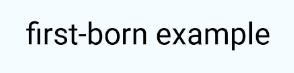
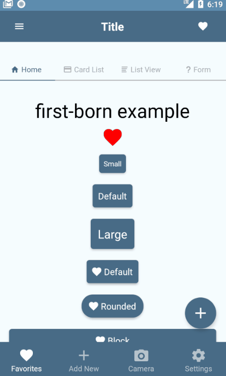
The Text atom has a fixed set of sizes. These sizes differ depending on the underlying app platform. We can also pass a color to this Text atom.
<Text size="h4">first-born example</Text>
 Text (Android)
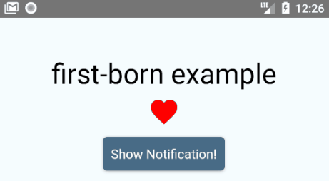
The Icon atom is built on top of react-native-vector-icons Ionicons class. Ionicons come with two different renditions of one icon for both Android and iOS. This class will render the icon according to the underlying platform.
<Icon name="heart" color="red"/>
 Icon (Android)
The Button atom can be rendered in multiple ways. It only accepts Texts, Icons, and Images as child items to display. It has 3 different sizes, as well as 4 different tags that will render the button in many combinations.
render() {
    return (
      <View style={styles.container}>
        <Button size="small">
          <Text>Small</Text>
        </Button>
        <Button >
          <Text>Default</Text>
        </Button>
        <Button size="large">
          <Text>Large</Text>
        </Button>
        <Button >
          <Icon name="heart" />
          <Text>Default</Text>
        </Button>
        <Button rounded>
          <Icon name="heart" />
          <Text>Rounded</Text>
        </Button>
        <Button block>
          <Icon name="heart" />
          <Text>Block</Text>
        </Button>
        <Button rounded block>
          <Icon name="heart" />
          <Text>{"Rounded & Block"}</Text>
        </Button>
        <Button outline>
          <Icon name="heart" />
          <Text>Outline</Text>
        </Button>
        <Button outline transparent>
          <Icon name="heart" />
          <Text>{"Outline & Transparent"}</Text>
        </Button>
      </View>
    );
}
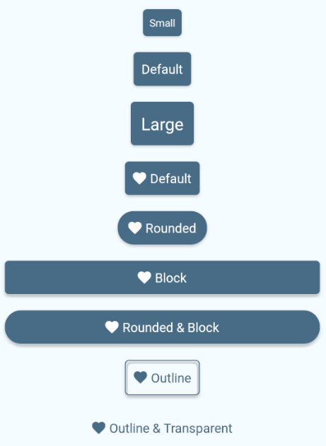 Buttons (Android)
The Input atom is a styled react-native TextInput. It displays a colored border to the user if the TextInput is in focus. The onChangeText method is mandatory.
<Input placeholder="Name" onChangeText={this.handleTextChange} />
...
handleTextChange = (text) => {
  this.setState({ text: text })
}
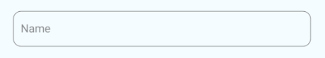 Input (Android)
This also supports indicating an error to the user. To use this feature, we will need to create a validation method. This method should return a boolean depending on the validity of the text entered. One such scenario is checking if an email address follows the conventional format. This method is that passed in the isValid property.
checkInputValidity = (text) => {
  const regex = /^\w+([\.-]?\w+)*@\w+([\.-]?\w+)*(\.\w{2,3})+$/;
  return regex.test(text);
}
...
<Input placeholder="Email" isValid={this.checkInputValidity} />
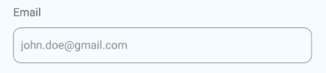 Input Validation (Android)
The TextArea atom is a styled react-native TextInput. It displays a colored border to the user if the TextInput is in focus. It also increases in height with more data entered.
<TextArea placeholder="Description"/>
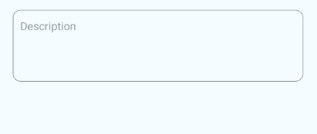 TextArea (Android)
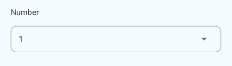
The Picker atom is a styled react-native Picker component. On Android, the picker is a dropdown that extends from the initial Picker component. On iOS, clicking the first-born Picker will open a modal for the user to pick the value.
<Picker>
    <Picker.Item value="1" label="1" />
    <Picker.Item value="2" label="2" />
    <Picker.Item value="3" label="3" />
</Picker>
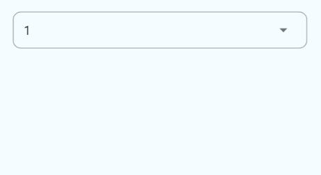 Picker (Android)
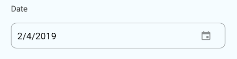
The DatePicker atom is a styled react-native View component, which looks like a TextInput. On Android, when the View is clicked, it runs the [DatePickerAndroid](https://facebook.github.io/react-native/docs/datepickerandroid) API. On iOS, clicking the View will open a modal for the user to pick the date from the [DatePickerIOS](https://facebook.github.io/react-native/docs/datepickerios) component.
<DatePicker />
 DatePicker (Android)
Molecules
This molecule uses the DatePicker atom and includes the Text atom as a label. The label property of this element is mandatory.
<FormDatePicker label="Date" />
 FormDatePicker (Android)
This molecule uses the Picker atom and includes the Text atom as a label. The label property of this element is mandatory.
<FormPicker label="Number">
    <Picker.Item value="1" label="1" />
    <Picker.Item value="2" label="2" />
    <Picker.Item value="3" label="3" />
</FormPicker>
 FormPicker (Android)
We can also pass data as an array of objects, which have the keys’ value and label. The data in both keys need to be of type String.
pickerData = [
    {
        value: "1",
        label: "1"
    },
    {
        value: "2",
        label: "2"
    },
    {
        value: "3",
        label: "3"
    }
];
...
<FormPicker label="Number" pickerData={this.pickerData} />
This molecule uses the Input atom and includes the Text atom as a label. The label property of this element is mandatory.
<FormInput label="Name" />
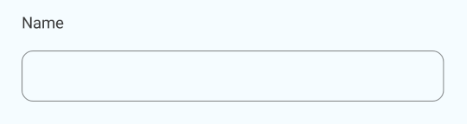 FormInput (Android)
This molecule uses the TextArea atom and includes the Text atom as a label. The label property of this element is mandatory.
<FormTextArea label="Description" />
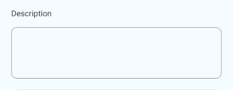 FormTextArea (Android)
The Card molecule displays a View with an image, heading, and description. Of the three, the heading is mandatory. The style of this molecule differs according to the underlying platform.
<Card title="Heading Only" />
<Card title="Heading" description="And Description" />
<Card title="Heading" description="Description" image={require("./path/to/an/image.png")} />
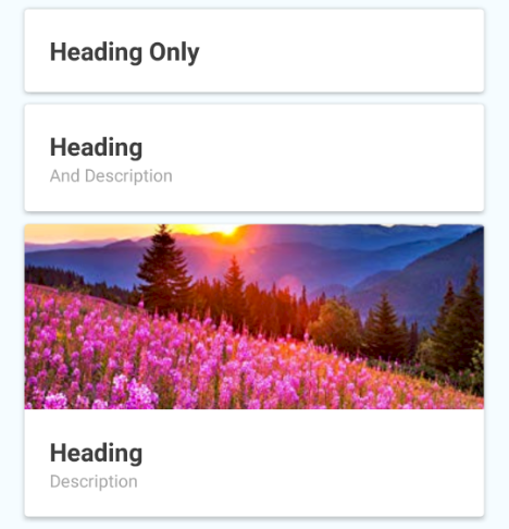 Card (Android)
The ListItem molecule displays a View with an image, heading, and description. Of the three, the heading is mandatory. The style of this molecule differs according to the underlying platform.
<ListItem title="Heading Only" />
<ListItem title="Heading" description="And Description" />
<ListItem title="Heading" description="Description" image={require("./path/to/an/image.png")} />
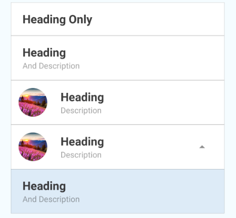 ListItems (Android)
The Notification molecule displays a banner at the top of the page. The reference to the component is passed to the NotificationManager. Invoking the showAlert method of this manager, we can send the message to be displayed to the user.
Add the Notification as the very last element of the parent View.
<Notification ref={"alert"} />
We will need to register this Notification molecule when the page mounts. This is to pass the reference of the Notification to the manager.
componentDidMount() {
    NotificationBarManager.registerMessageBar(this.refs.alert);
}
To clean up, we will also need to unregister this molecule as the page is unmounted.
componentWillUnmount() {
    NotificationBarManager.unregisterMessageBar();
}
To display the Notification bar, run the below method, passing the message to be displayed.
NotificationBarManager.showAlert({
    message: 'Your alert message goes here'
});
 Notification (Android)
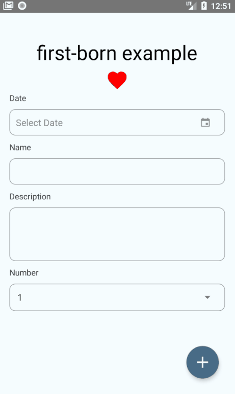
This molecule is equivalent to the Android Floating Action Button (FAB). It can be either a singular action or expand to display many actions.
If the FAB contains a singular action, we use the onPress property to pass the method to be run when the button is clicked.
<FloatingButton onPress={this.handleShowNotification} />
 FAB with singular action
If the FAB needs to expand to display many actions, and action array needs to be created. Each action object in the array needs to contain at a minimum:
- Unique
name iconorimagepositionfrom the top (starts at 1) when the FAB is expanded- method to run
onPress
const actions = [
    {
        icon: 'help',
        name: 'bt_accessibility',
        position: 2,
        onPress: () => Alert.alert('Hello', 'Accessibility')
    },
    {
        icon: 'pin',
        name: 'bt_room',
        position: 1,
        onPress: () => Alert.alert('Hello', 'Location')
    },
    {
        icon: 'videocam',
        name: 'bt_videocam',
        position: 3,
        onPress: () => Alert.alert('Hello', 'Video')
    }
];
We then pass the array to the FloatingButton in the property actions:
<FloatingButton actions={this.actions} />
 FAB with multiple actions
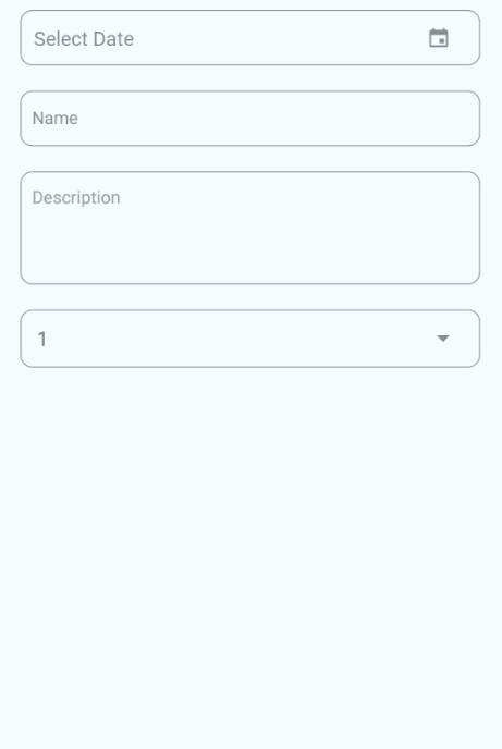
Organisms
Form
The Form organism is built of the form molecules, FormInput, FormPicker, FormDatePicker, and FormTextArea.
To render this organism, an array containing details of each field needs to be passed. The child components are rendered according to the type specified in each object.
The mapping is as follows:
- ‘text’ —
FormInput - ‘textarea’ —
FormTextArea - ‘date’ —
FormDatePicker - ‘picker’ —
FormPicker
The object of each field can only contain the properties specified to the mapped field type. In simpler terms, an object of type ‘text’, must only contain the properties that the FormInput molecule accepts.
 Form (Android)
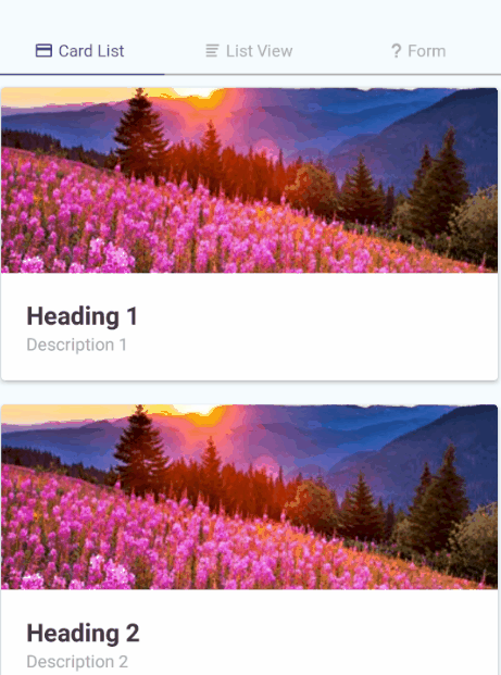
This organism currently renders a read-only list of Cards, either horizontally or vertically. It requires an array of objects which have the same properties as a Card molecule.
const listData = [
    {
        title: "Heading 1",
        description: "Description 1",
        image: require("./path/to/an/image.png")
    },
    {
        title: "Heading 2",
        description: "Description 2",
        image: require("./path/to/an/image.png")
    },
    {
        title: "Heading 3",
        description: "Description 3",
        image: require("./path/to/an/image.png")
    }
];
To render the list, pass the array above to the data property. Add the boolean property horizontal, if we wish for a horizontally scrolling list.
<CardList data={this.listData} />
<CardList data={this.listData} horizontal />
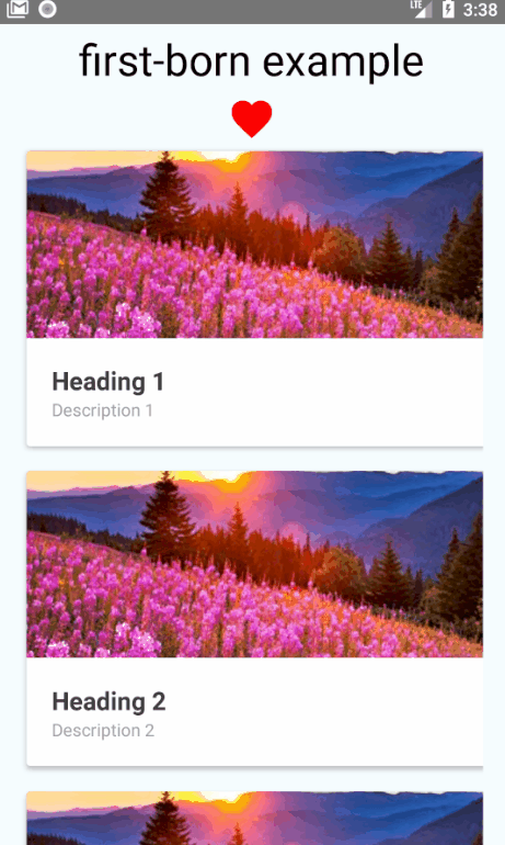 CardList (Android)
This organism currently renders a read-only list of ListItem’s vertically. It requires an array of objects which have the same properties as a ListItem molecule. The same list used for a CardList can be used here as well.
<ListView data={this.listData} />
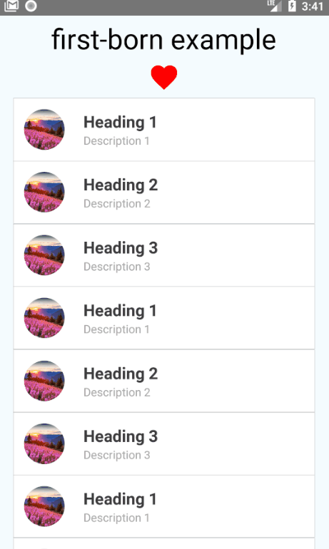 ListView (Android)
The NavBar organism is a page header that renders according to the underlying platform. It is rendered at the top of the page, right inside the page’s main View component.
To form the NavBar, all three child elements (NavBarRight, NavBarLeft, and NavBarBody) need to be included to align the elements correctly.
<NavBar>
    <NavBarLeft />
        <NavBarBody>
            <Text>Title</Text>
        </NavBarBody>
    <NavBarRight/>
</NavBar>
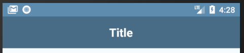 NavBar with title only (Android)
We can also include buttons to the header with the NavBarButton component. This button can be added as children to the NavBarRight and NavBarLeft components.
The NavBarButton can be used in two ways:
- It has a property
type, that accepts the values ‘back, ‘drawer’ and ‘search’. This renders the corresponding icons to each type by default. - We can create a custom button by including either
Texts,IconsorImagesas children in theNavBarButtoncomponent.
<NavBar>
    <NavBarLeft >
        <NavBarButton type="drawer" />
    </NavBarLeft>
    <NavBarBody>
        <Text>Title</Text>
    </NavBarBody>
    <NavBarRight>
        <NavBarButton>
            <Icon name="heart" />
        </NavBarButton>
    </NavBarRight>
</NavBar>
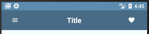 NavBar with buttons (Android)
The TabBar organism is a page footer that renders according to the underlying platform. It is rendered at the very bottom of the page, right before the closing tag of the page’s main View component.
The TabBar contains multiple TabItems, depending on the number of pages in the tab navigation. A TabItem accepts either Texts, Icons or Images as children.
<TabBar>
    <TabItem active>
        <Icon name="heart" />
        <Text>Favorites</Text>
    </TabItem>
    <TabItem>
        <Icon name="add" />
        <Text>Add New</Text>
    </TabItem>
    <TabItem>
        <Icon name="camera" />
        <Text>Camera</Text>
    </TabItem>
    <TabItem>
        <Icon name="settings" />
        <Text>Settings</Text>
    </TabItem>
</TabBar>
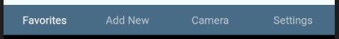 TabBar with text only (Android)
 TabBar with icons only (Android)
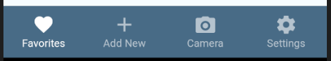 TabBar with icons and text (Android)
The PillView navigation is used to display different sections on a page. On Android, it renders as a header tab bar. On iOS, it renders as pills.
It requires two arrays to be passed to it, to successfully render the organism. One is a list of the scenes it will display. The second is the components to be displayed in the header (PillBar).
The pill scene only requires one key in the object. It is used to denote the scene to display on the view when the corresponding PillItem is clicked.
The pill header will require at least one of either Text, Icon or Image to render on the PillItem.
const pillScenes = [
    { scene: <CardList data={this.listData} /> },
    { scene: <ListView data={this.listData} /> },
    { scene:
        <View style={styles.innerContainer}>
            <Form formElements={this.formElements} />
        </View>
    }
];
const pillHeaders = [
    {
        title: 'Card List',
        icon: "card"
    },
    {
        title: 'List View',
        icon: "list"
    },
    {
        title: 'Form',
        icon: "help"
    }
];
We will then pass the two arrays to the PillView item like this:
<PillView pillHeaders={this.pillHeaders} pillScenes={this.pillScenes} />
 PillView (Android)
And that is all the components first-born has to offer (so far…).
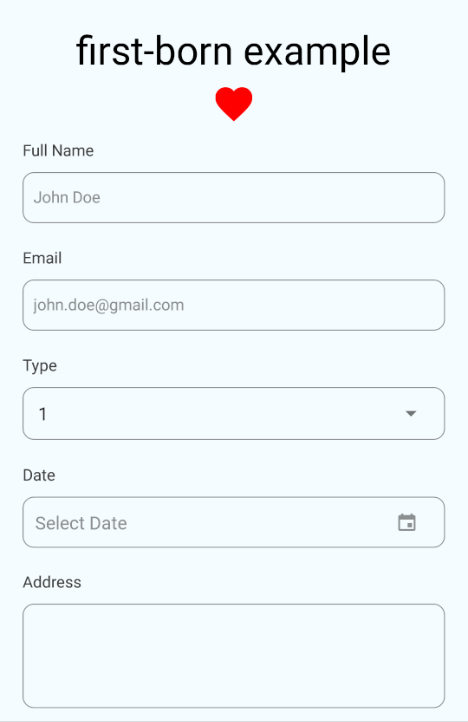
Once the code is a bit better assembled, we would end up with an app similar to this:
 Final implementation of all features
Give first-born a try and please do let me know how it goes for you.
Find the Demo repo here.
If you wish to see how first-born Navigation elements work with external navigation modules, have a look at the following repos;
React Navigation: first-born-react-navigation-example
React Native Router Flux: first-born-rnrf-example