CSS Flexbox gives you the tools to create basic and advanced website layouts in flexible and responsive ways.
This tutorial discusses everything you need to know to use Flexbox like a pro.
Table of Contents
- What Is Flexbox?
- Flex Container vs. Flex Item: What's the Difference?
- What Is a
flexValue in CSS? - What Is an
inline-flexValue in CSS? - Properties for Specifying Flexbox's Layout
- What Are the Flexible Containers Properties?
- What Is Flexbox's
flex-directionProperty? - What Is Flexbox's
flex-wrapProperty? - What Is Flexbox's
flex-flowProperty? - What Is Flexbox's
justify-contentProperty? - What Is Flexbox's
align-itemsProperty? - What Is Flexbox's
align-contentProperty? - What Are the Flexible Items Properties?
- What Is Flexbox's
align-selfProperty? - What Is Flexbox's
orderProperty? - What Is Flexbox's
flex-growProperty? - What Is Flexbox's
flex-shrinkProperty? - What Is Flexbox's
flex-basisProperty? - What Is Flexbox's
flexProperty? - How to Center Elements Horizontally with Flexbox
- How to Center Elements Vertically with Flexbox
- How to Center Elements Horizontally and Vertically with Flexbox
- Overview
So, without any further ado, let's understand what Flexbox is.
What Is Flexbox?
Flexbox makes browsers display selected HTML elements as flexible box models.
Flexbox allows easy resizing and repositioning of a flexible container and its items one-dimensionally.
Note:
- "One-dimensionally" means Flexbox allows laying out box models in a row or column at a time. In other words, Flexbox cannot lay out box models in a row and column at the same time.
- Flexbox is sometimes called a flexible box layout module.
- Use the grid layout module if you need to resize and reposition elements two-dimensionally.
Flex Container vs. Flex Item: What's the Difference?
A flex container is an HTML element whose display property's value is flex or inline-flex.
Flex items are the direct children of a flex container.
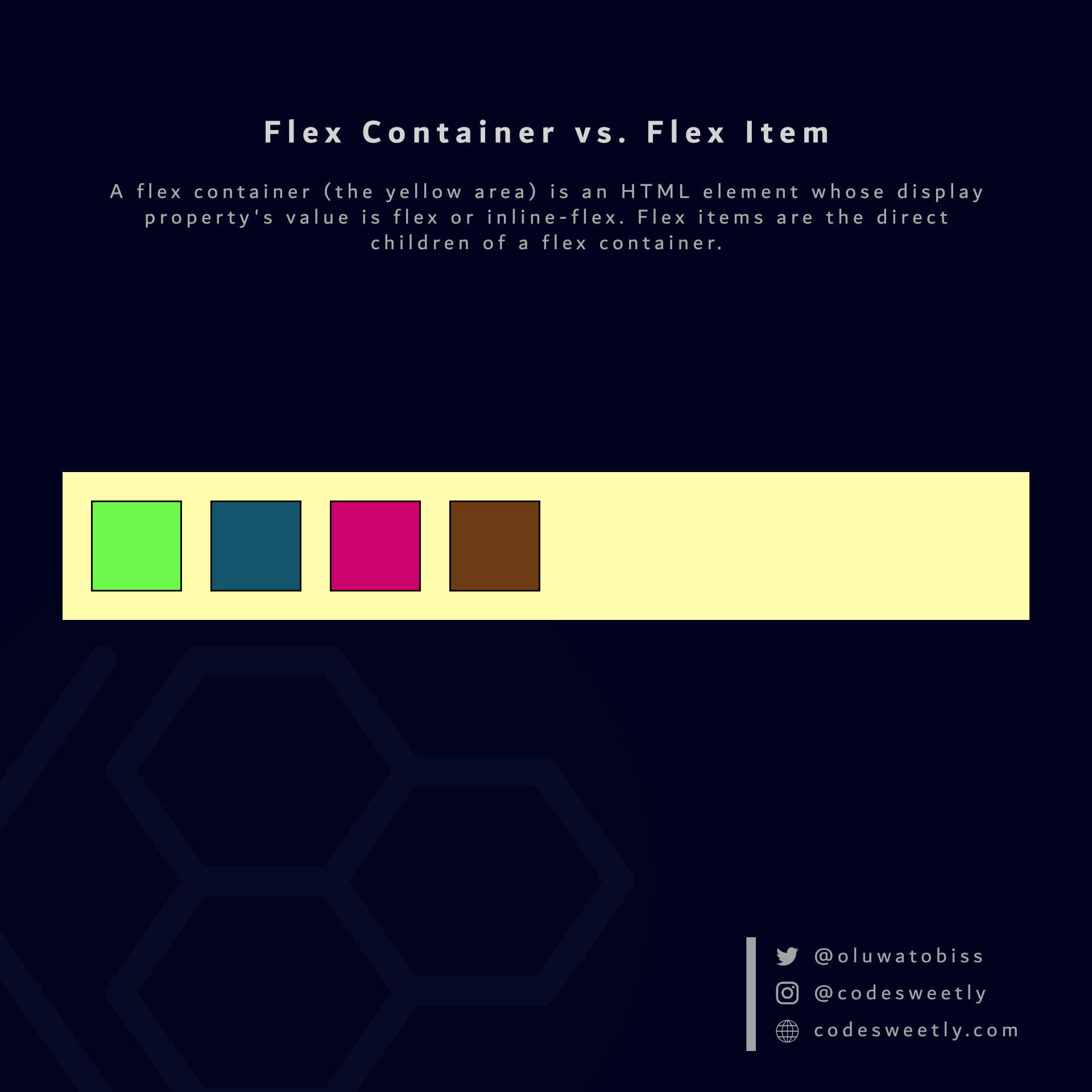 A flex container (the large yellow area in the image) is an HTML element whose display property's value is flex or inline-flex. Flex items (the smaller boxes within the yellow container) are the direct children of a flex container.
What Is a flex Value in CSS?
flex tells browsers to display the selected HTML element as a block-level flexible box model.
In other words, setting an element's display property's value to flex turns the box model into a block-level flexbox.
Here's an example:
section {
  display: flex;
  background-color: orange;
  margin: 10px;
  padding: 7px;
}
The snippet above used the flex value to convert the HTML document's <section> elements from regular <section> nodes to block-level flexible box models.
Note:
- Converting an HTML node to a flexible box model makes the element's direct children become flexible items.
- The
display: flexdirective only affects a box model and its direct children. It does not affect grandchildren nodes.
Let's now discuss inline-flex.
What Is an inline-flex Value in CSS?
inline-flex tells browsers to display the selected HTML element as an inline-level flexible box model.
In other words, setting an element's display property's value to inline-flex turns the box model into an inline-level flexbox.
Here's an example:
section {
  display: inline-flex;
  background-color: orange;
  margin: 10px;
  padding: 7px;
}
The snippet above used the inline-flex value to convert the HTML document's <section> elements from regular <section> nodes to inline-level flexible box models.
Note:
- Converting an HTML node to a flexible box model makes the element's direct children become flexible items.
- The
display: inline-flexdirective only affects a box model and its direct children. It does not affect grandchildren nodes.
Properties for Specifying Flexbox's Layout
On converting a regular HTML element to a flex (or inline-flex) box model, Flexbox provides two categories of properties for positioning the flexible box and its direct children:
- Flexible containers properties
- Flexible items properties
What Are the Flexible Containers Properties?
A flexible container's properties specify how browsers should layout items within the flexible box model.
Note: We define a flexible container's property on the flex container, not its items.
The six (6) types of flex container properties are:
flex-directionflex-wrapflex-flowjustify-contentalign-itemsalign-content
Let's discuss the six types now.
What Is Flexbox's flex-direction Property?
flex-direction tells browsers the specific direction (row or column) they should lay out a flexible container's direct children.
In other words, flex-direction defines a flexbox's main axis.
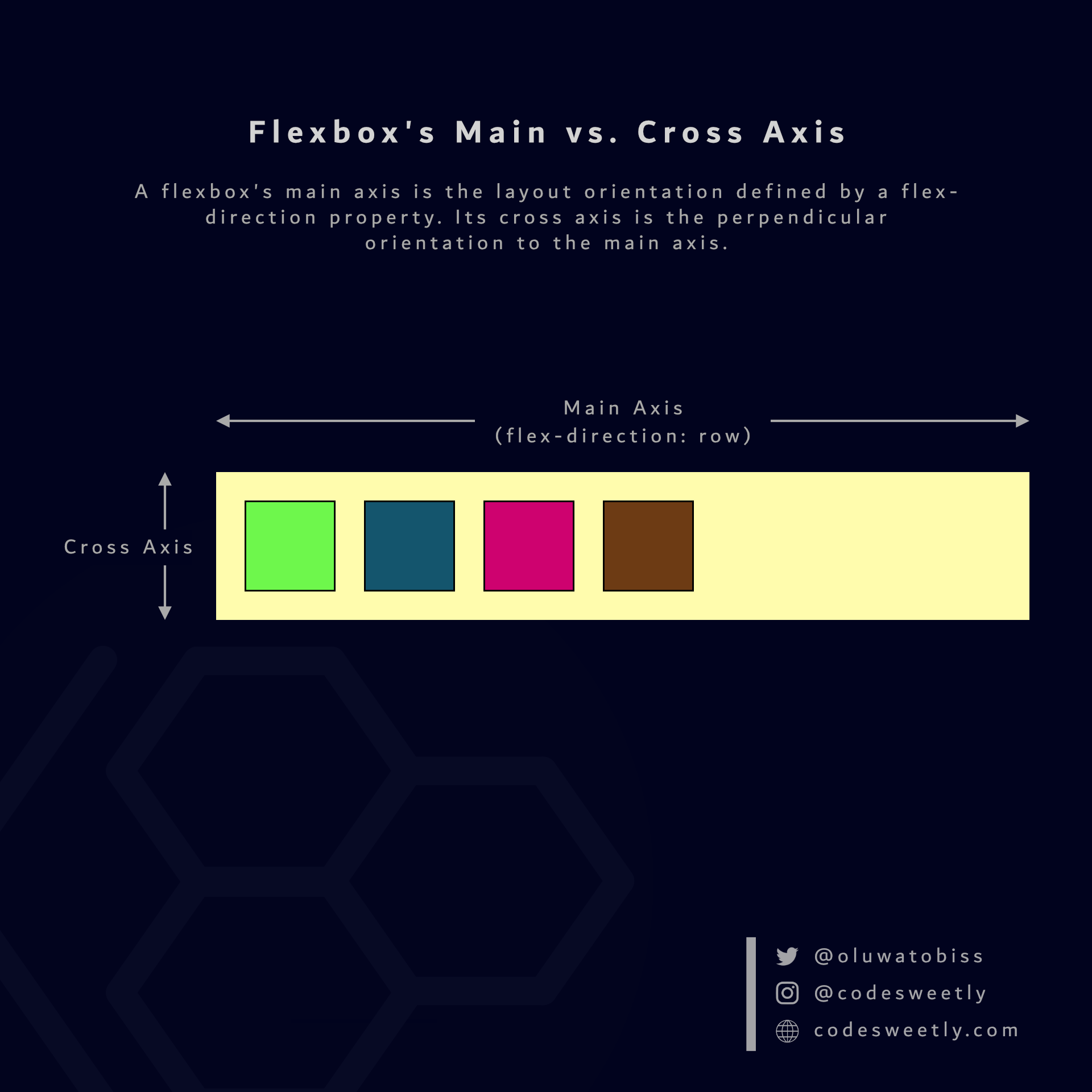 A Flexbox's main axis is the layout orientation defined by a flex-direction property. Its cross axis is the perpendicular orientation to the main axis.
Here's an example:
section {
  display: flex;
  flex-direction: column;
  background-color: orange;
  margin: 10px;
  padding: 7px;
}
The snippet above organized the flexible <section> containers' items in the column direction of your browser's default language.
Tip: Use flex-direction: column-reverse (or flex-direction: row-reverse) to reverse the browser's layout direction.
What Is Flexbox's flex-wrap Property?
flex-wrap specifies whether browsers should wrap overflown flexible items onto multiple lines.
The flex-wrap property accepts the following values:
nowrapwrapwrap-reverse
Let's discuss the three values.
What is flex-wrap: nowrap in CSS flexbox?
nowrap is flex-wrap's default value. It forces all items within a flexible container into a single line (that is, row-wise or column-wise direction).
In other words, nowrap tells browsers not to wrap a flexible container's items.
Note: Suppose the total width (or height) of all the items in a flexible container is greater than the flexbox's width (or height). In such a case, nowrap will cause the elements to overflow out of the container.
Here's an example:
section {
  width: 130px;
  display: flex;
  flex-wrap: nowrap;
  background-color: orange;
  margin: 10px;
  padding: 7px;
}
The snippet above used nowrap to force browsers to lay out the flexible containers' items in a single line.
What is flex-wrap: wrap in CSS flexbox?
wrap moves all overflow items within a flexible container to the next line.
In other words, wrap tells browsers to wrap a flexible container's overflow items.
Here's an example:
section {
  width: 130px;
  display: flex;
  flex-wrap: wrap;
  background-color: orange;
  margin: 10px;
  padding: 7px;
}
We used wrap to wrap the flexible containers' overflow items to the next line.
What is flex-wrap: wrap-reverse in CSS flexbox?
wrap-reverse moves all overflow items within a flexible container to the next line in reverse order.
Note: wrap-reverse does the same thing as wrap—but in reverse order.
Here's an example:
section {
  width: 130px;
  display: flex;
  flex-wrap: wrap-reverse;
  background-color: orange;
  margin: 10px;
  padding: 7px;
}
We used wrap-reverse to wrap the flexible containers' overflow items to the next line in reverse order.
What Is Flexbox's flex-flow Property?
flex-flow is a shorthand for the flex-direction and flex-wrap properties.
In other words, instead of writing:
section {
  display: flex;
  flex-direction: column;
  flex-wrap: wrap;
}
You can alternatively use the flex-flow property to shorten your code like so:
section {
  display: flex;
  flex-flow: column wrap;
}
What Is Flexbox's justify-content Property?
justify-content specifies how browsers should position a flexible container's items along the flexbox's main axis.
The justify-content property accepts the following values:
flex-startcenterflex-endspace-betweenspace-aroundspace-evenly
Let's discuss these six values.
What is justify-content: flex-start in CSS Flexbox?
flex-start is justify-content's default value. It aligns a flexible container's items with the main-start edge of the flexbox's main axis.
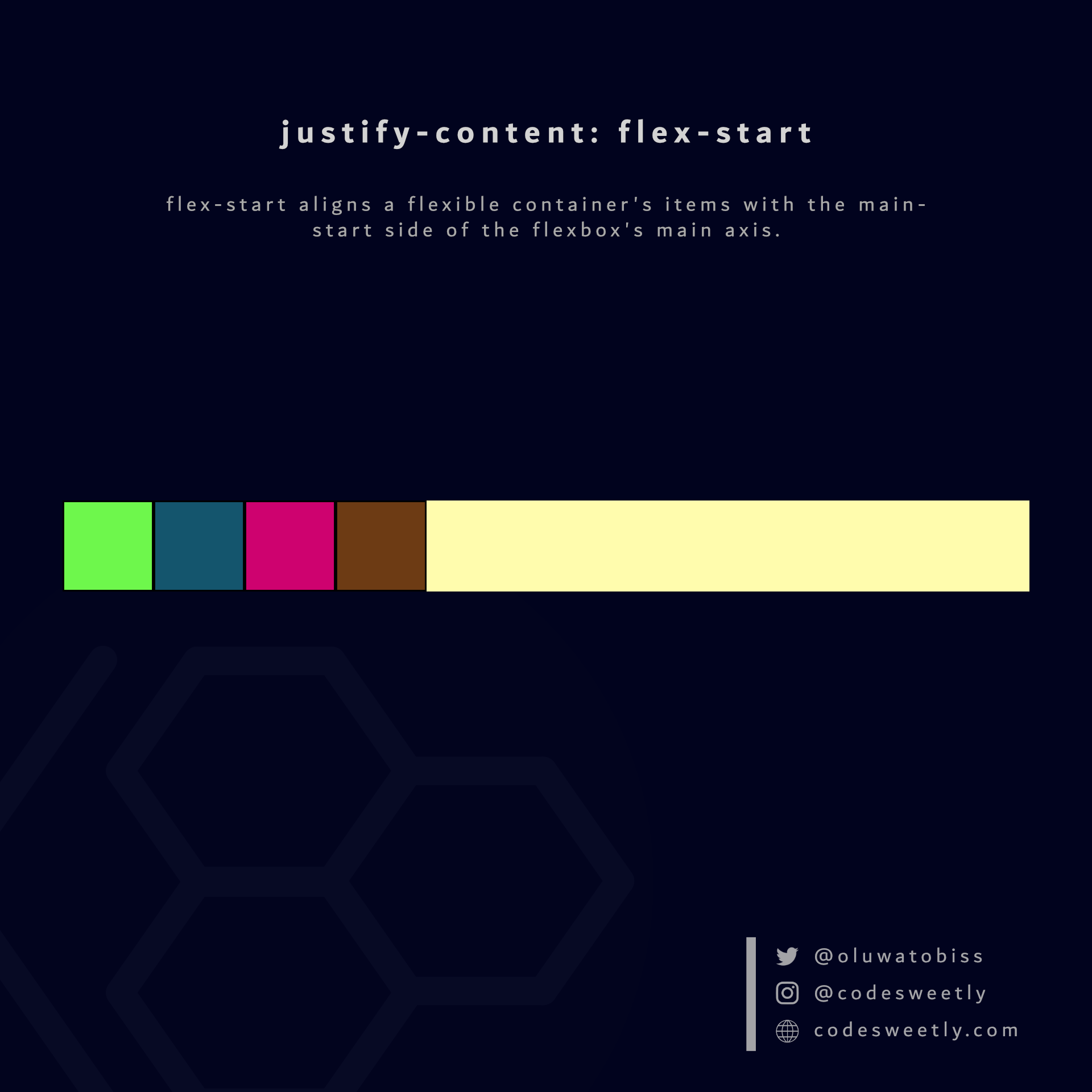 flex-start aligns a flexible container's items with the main-start side of the flexbox's main axis.
Here's an example:
section {
  display: flex;
  justify-content: flex-start;
  background-color: orange;
  margin: 10px;
}
The snippet above used the flex-start value to align the flexible container's items to the flexbox's main-start edge.
What is justify-content: center in CSS Flexbox?
center aligns a flexible container's items to the center of the flexbox's main axis.
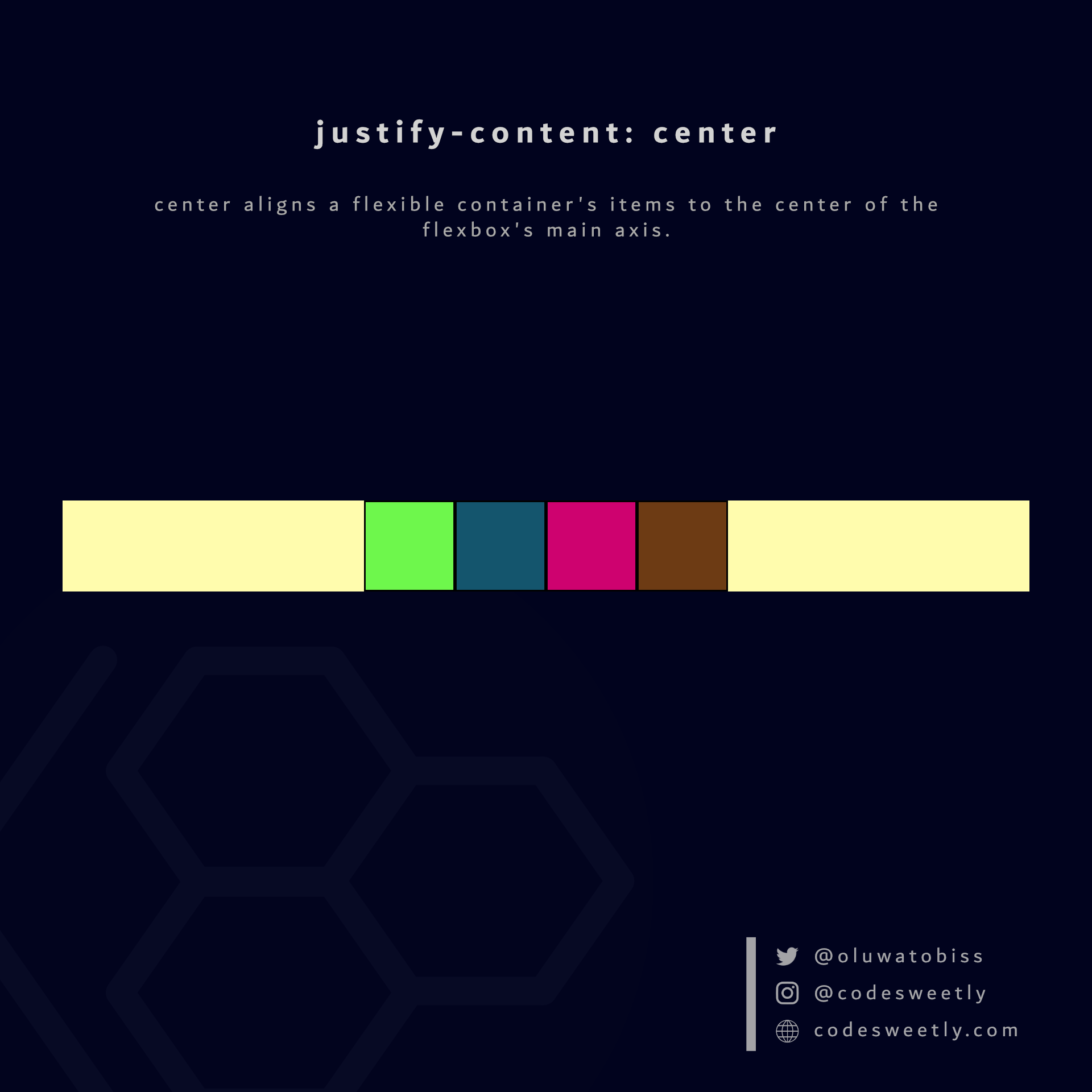 center aligns a flexible container's items to the center of the flexbox's main axis.
Here's an example:
section {
  display: flex;
  justify-content: center;
  background-color: orange;
  margin: 10px;
}
We used the center value to align the flexible container's items to the center of the flexbox.
What is justify-content: flex-end in CSS Flexbox?
flex-end aligns a flexible container's items with the main-end side of the flexbox's main axis.
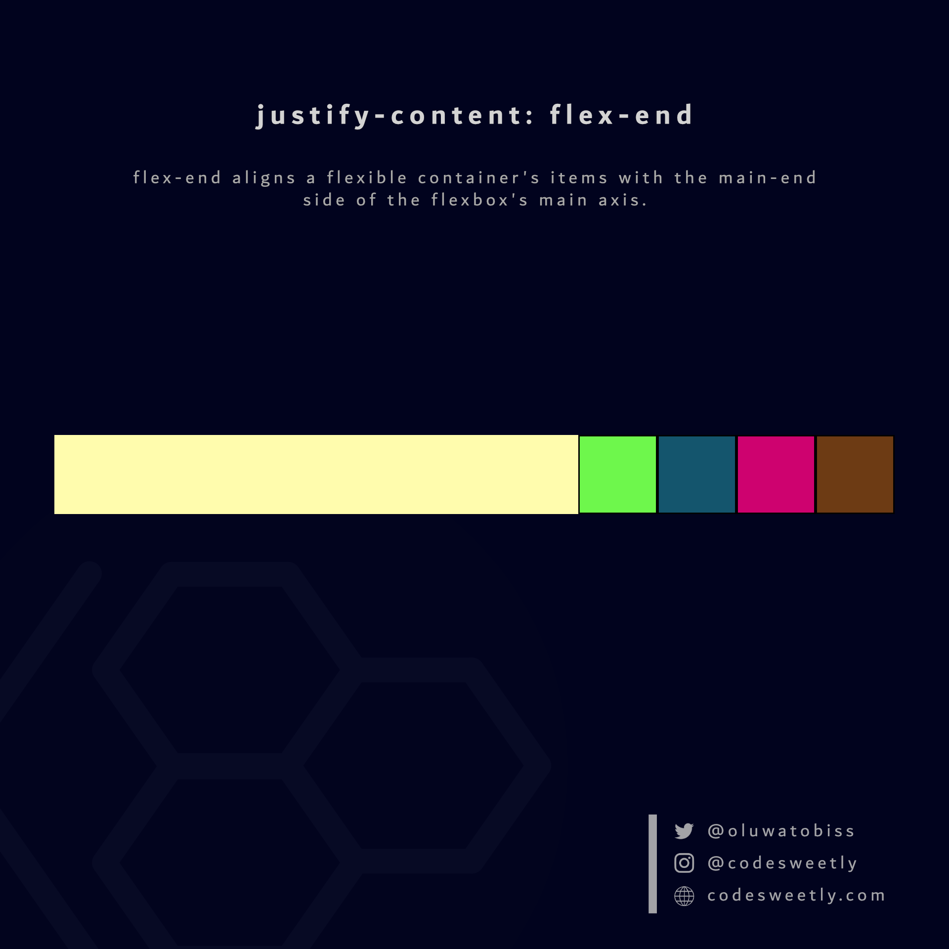 flex-end aligns a flexible container's items with the main-end side of the flexbox's main axis.
Here's an example:
section {
  display: flex;
  justify-content: flex-end;
  background-color: orange;
  margin: 10px;
}
We used the flex-end value to align the flexible container's items to the flexbox's main-end side.
What is justify-content: space-between in CSS Flexbox?
space-between does the following:
- It aligns a flexible container's first item with the main-start edge of the flexbox's main axis.
- It aligns the container's last item with the main-end edge of the flexbox's main axis.
- It creates even spacing between each pair of items between the first and last item.
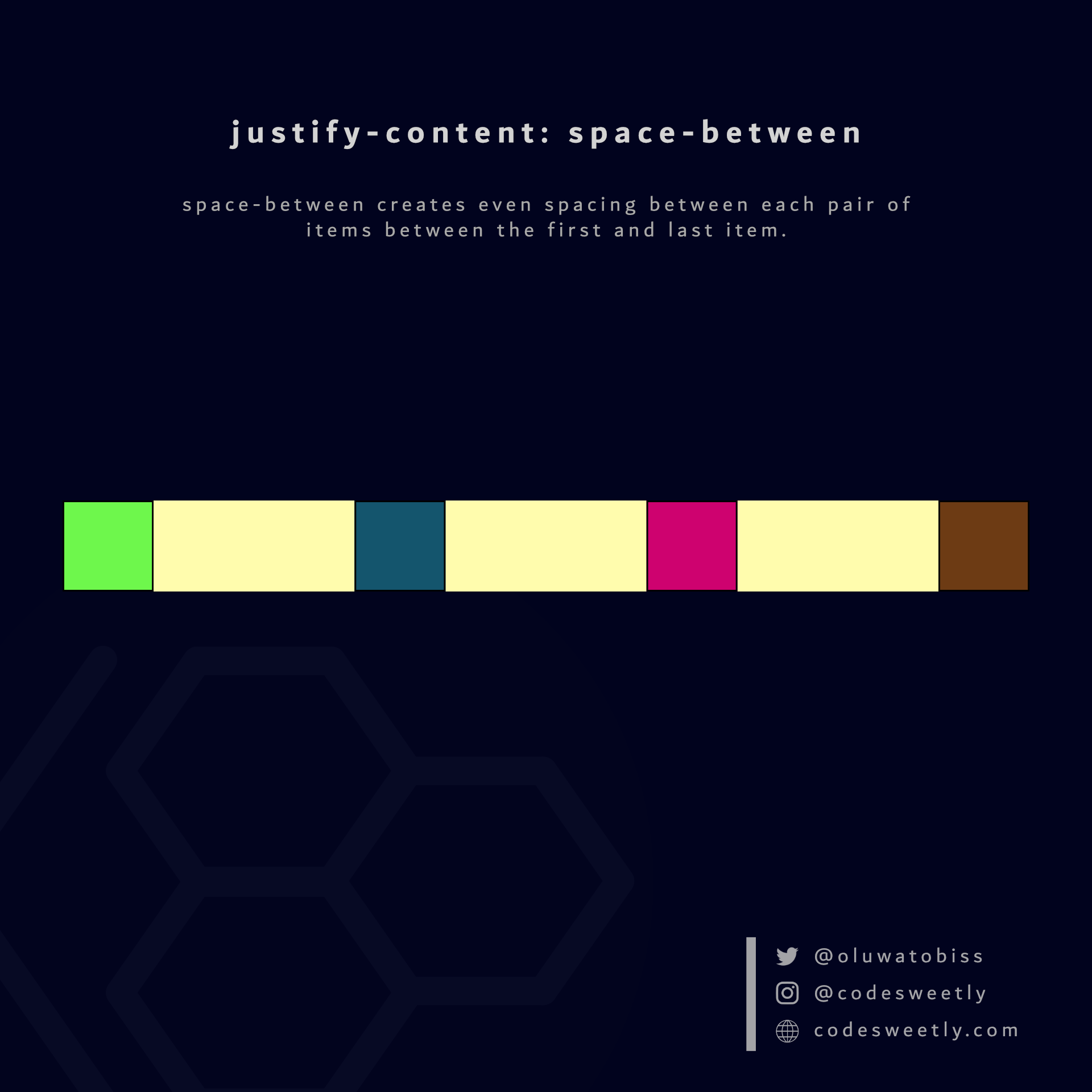 space-between creates even spacing between each pair of items between the first and last item.
Here's an example:
section {
  display: flex;
  justify-content: space-between;
  background-color: orange;
  margin: 10px;
}
The snippet above used the space-between value to create even spacing between each pair of items between the first and last flex item.
What is justify-content: space-around in CSS Flexbox?
space-around assigns equal spacing to each side of a flexible container's items.
Therefore, the space before the first item and after the last element is half the width of the space between each pair of elements.
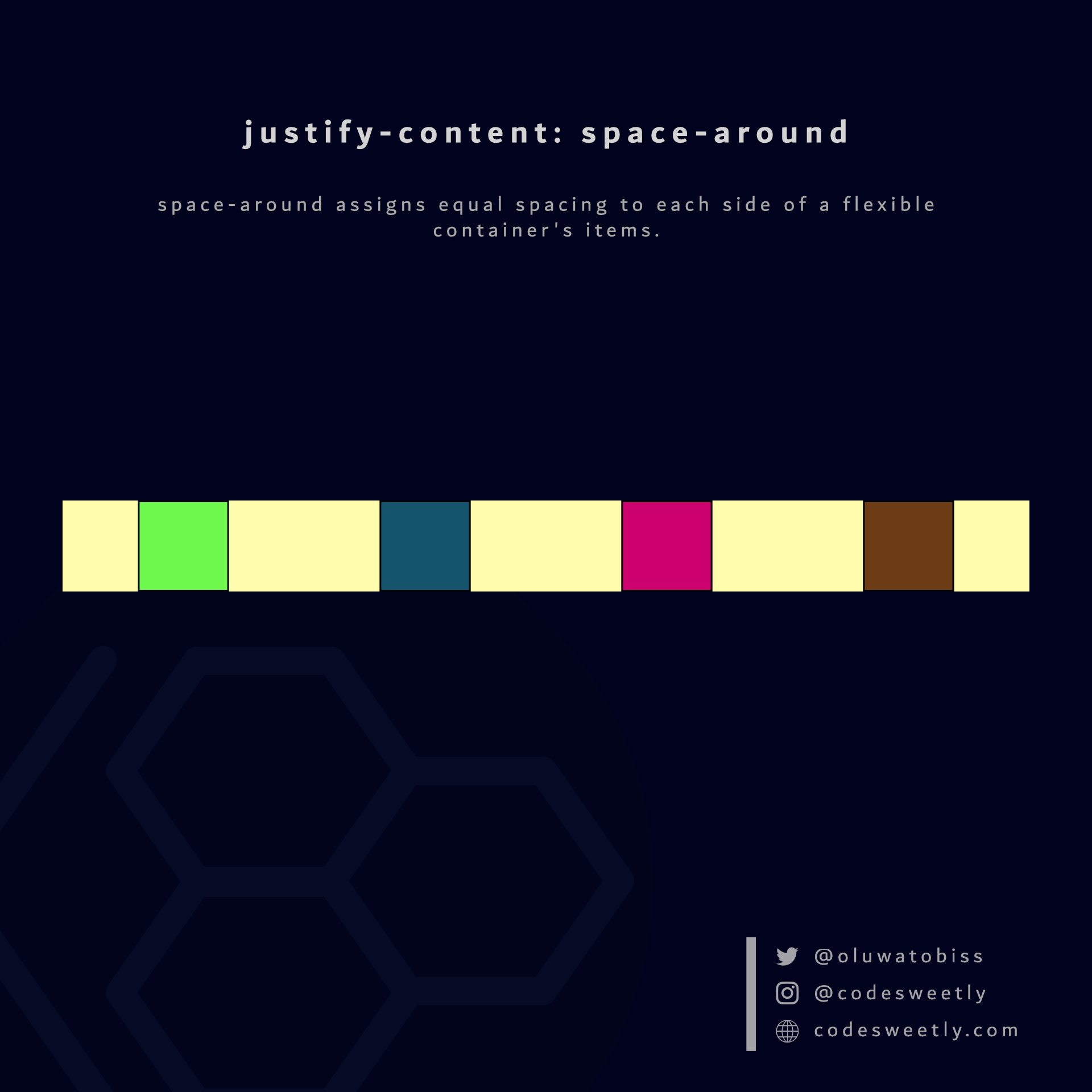 space-around assigns equal spacing to each side of a flexible container's items.
Here's an example:
section {
  display: flex;
  justify-content: space-around;
  background-color: orange;
  margin: 10px;
}
The snippet above used the space-around value to assign equal spacing to each side of the flexible container's items.
What is justify-content: space-evenly in CSS Flexbox?
space-evenly assigns even spacing to both ends of a flexible container and between its items.
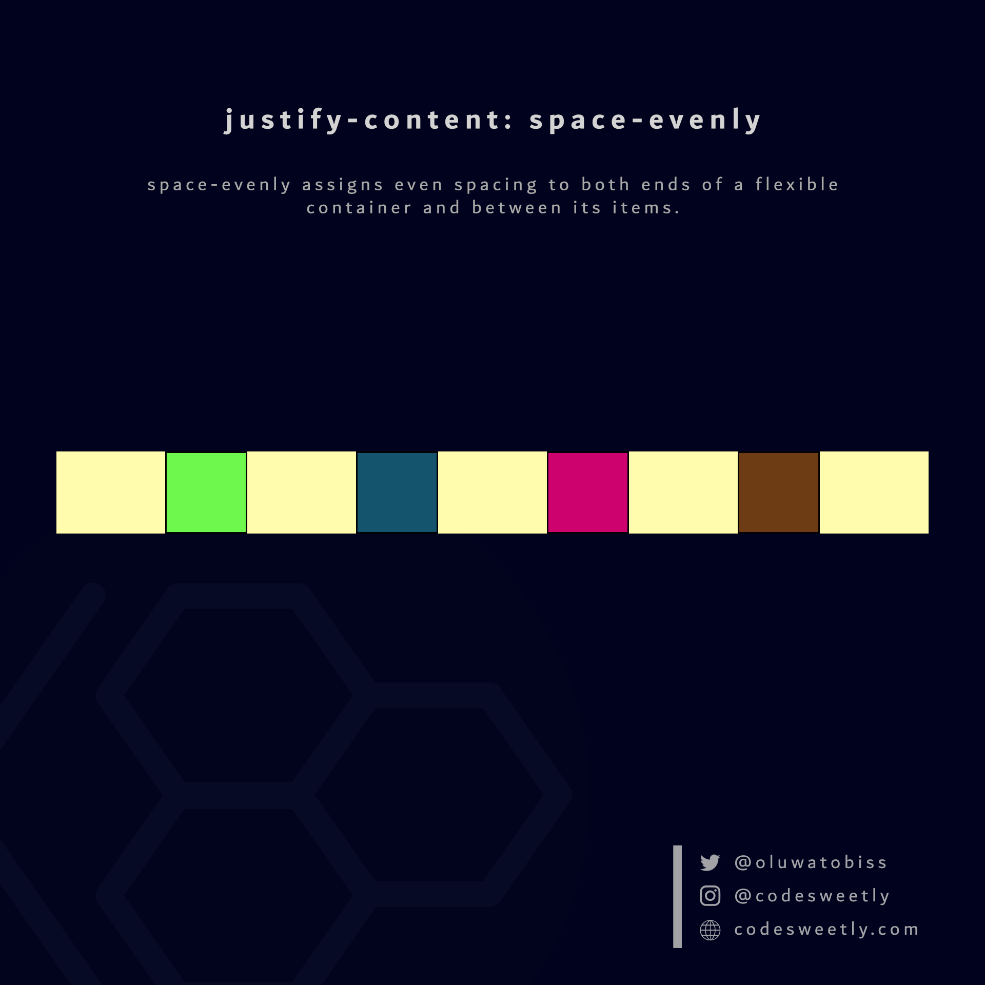 space-evenly assigns even spacing to both ends of a flexible container and between its items.
Here's an example:
section {
  display: flex;
  justify-content: space-evenly;
  background-color: orange;
  margin: 10px;
}
We used the space-evenly value to assign even spacing to both ends of the flexbox and between its items.
Let's now discuss the fifth type of flexible container property.
What Is Flexbox's align-items Property?
align-items specifies how browsers should position a flexible container's items along the cross-axis of the flexbox.
The align-items property accepts the following values:
stretchflex-startcenterflex-endbaseline
Let's discuss the five values.
What is align-items: stretch in CSS Flexbox?
stretch is align-items' default value. It stretches a flexible container's items to fill the flexbox's cross-axis.
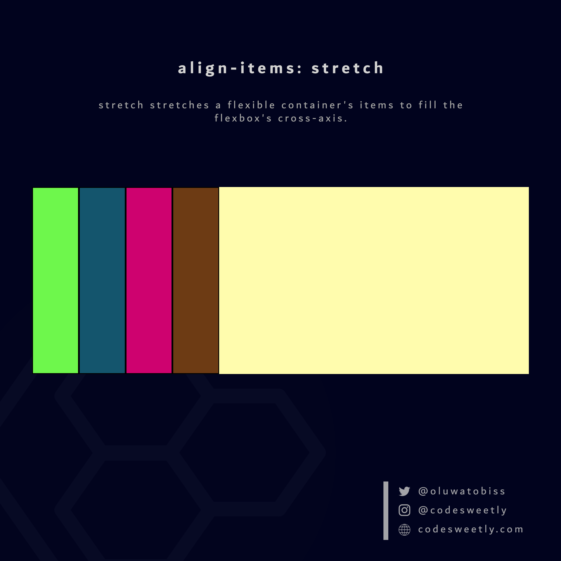 stretch stretches a flexible container's items to fill the flexbox's cross-axis.
Here's an example:
section {
  display: flex;
  align-items: stretch;
  background-color: orange;
  margin: 10px;
  height: 300px;
}
The snippet above used the stretch value to stretch the flexible items to fill the <section>'s cross-axis.
What is align-items: flex-start in CSS Flexbox?
flex-start aligns a flexible container's items with the cross-start edge of the flexbox's cross-axis.
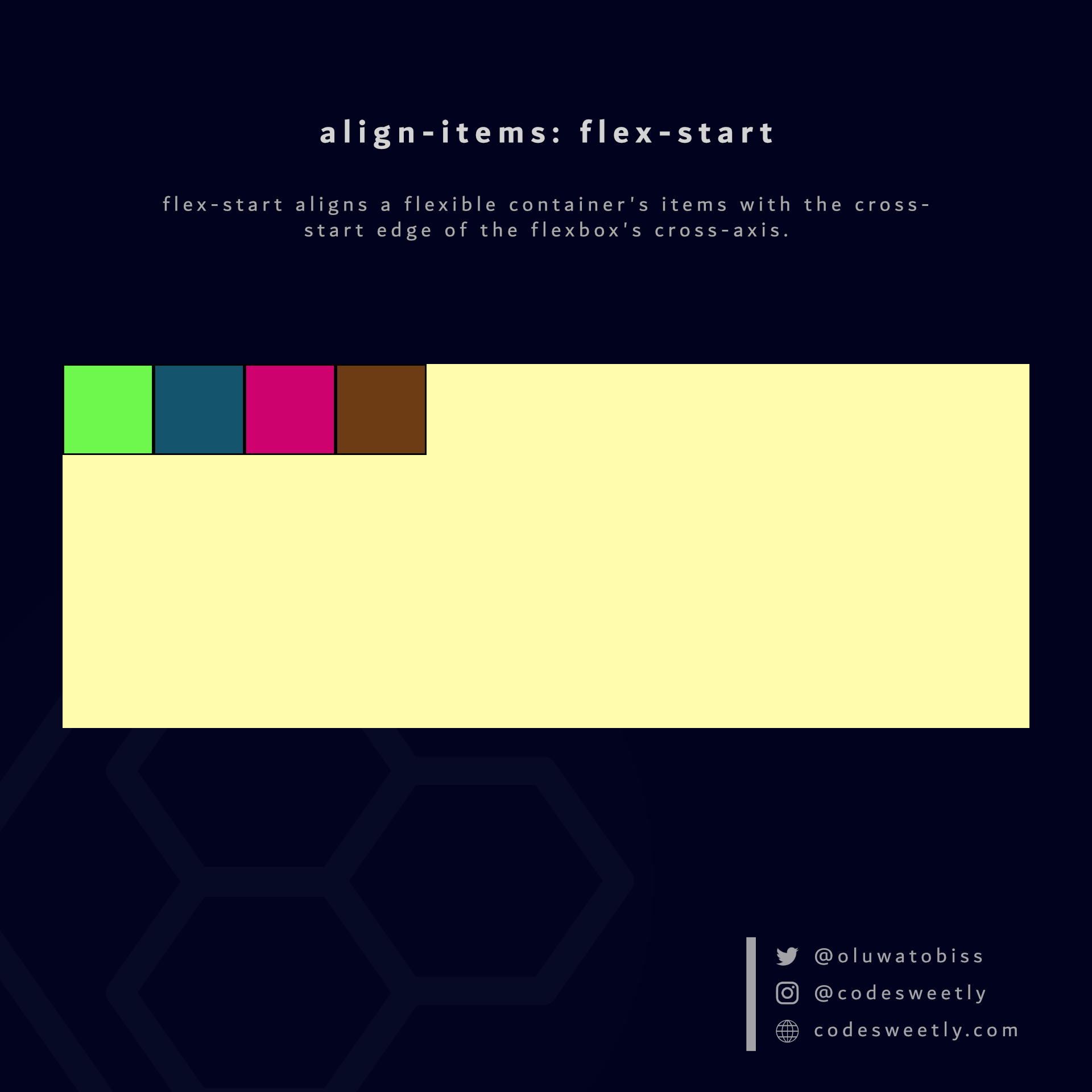 flex-start aligns a flexible container's items with the cross-start edge of the flexbox's cross-axis.
Here's an example:
section {
  display: flex;
  align-items: flex-start;
  background-color: orange;
  margin: 10px;
  height: 300px;
}
We used the flex-start value to align the flexible items to the cross-start edge of the <section>'s cross-axis.
What is align-items: center in CSS Flexbox?
center aligns a flexible container's items to the center of the flexbox's cross-axis.
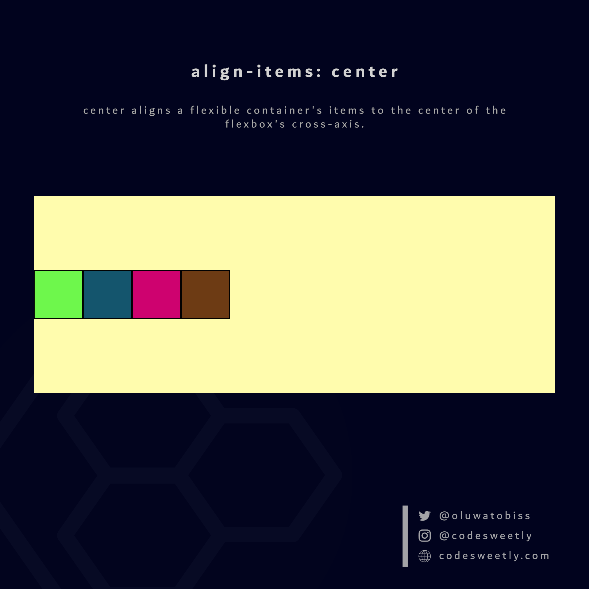 center aligns a flexible container's items to the center of the flexbox's cross-axis.
Here's an example:
section {
  display: flex;
  align-items: center;
  background-color: orange;
  margin: 10px;
  height: 300px;
}
The snippet above used the center value to align the flexible items to the center of the <section>'s cross-axis.
What is align-items: flex-end in CSS Flexbox?
flex-end aligns a flexible container's items with the cross-end edge of the flexbox's cross-axis.
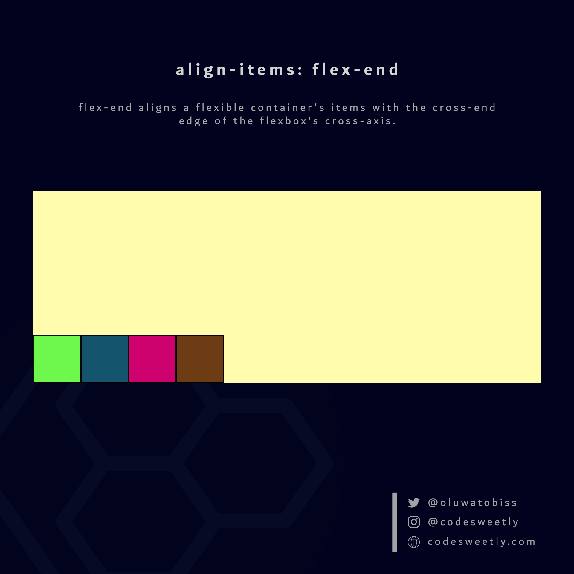 flex-end aligns a flexible container's items with the cross-end edge of the flexbox's cross-axis.
Here's an example:
section {
  display: flex;
  align-items: flex-end;
  background-color: orange;
  margin: 10px;
  height: 300px;
}
We used the flex-end value to align the flexible items to the cross-end edge of the <section>'s cross-axis.
What is align-items: baseline in CSS Flexbox?
baseline aligns a flexible container's items with the baseline of the flexbox's cross-axis.
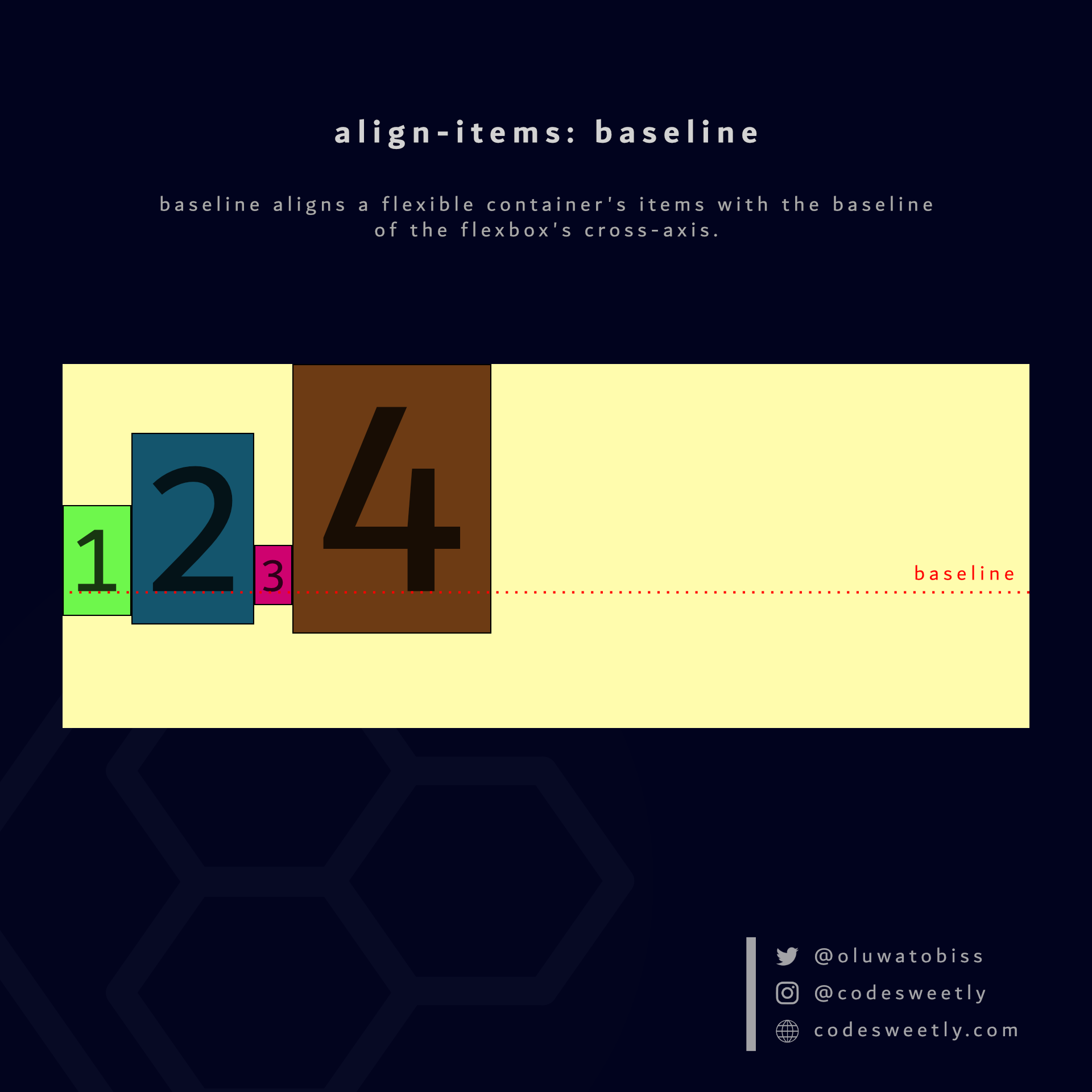 baseline aligns a flexible container's items with the baseline of the flexbox's cross-axis.
Here's an example:
section {
  display: flex;
  align-items: baseline;
  background-color: orange;
  margin: 10px;
}
The snippet above used the baseline value to align the flexible items to the <section>'s baseline.
Now, let's talk about the sixth CSS flexible container property type.
What Is Flexbox's align-content Property?
align-content specifies how browsers should position a flexible container's lines along the flexbox's cross-axis.
Note: The align-content property does not affect a flexbox with only one line—for instance, a flexible container with flex-wrap: nowrap. In other words, align-content works only on flexboxes with multiple lines.
The align-content property accepts the following values:
stretchflex-startcenterflex-endspace-betweenspace-aroundspace-evenly
Let's discuss the seven values.
What is align-content: stretch in CSS Flexbox?
stretch is align-content's default value. It stretches the flexible container's lines to fill the flexbox's cross-axis.
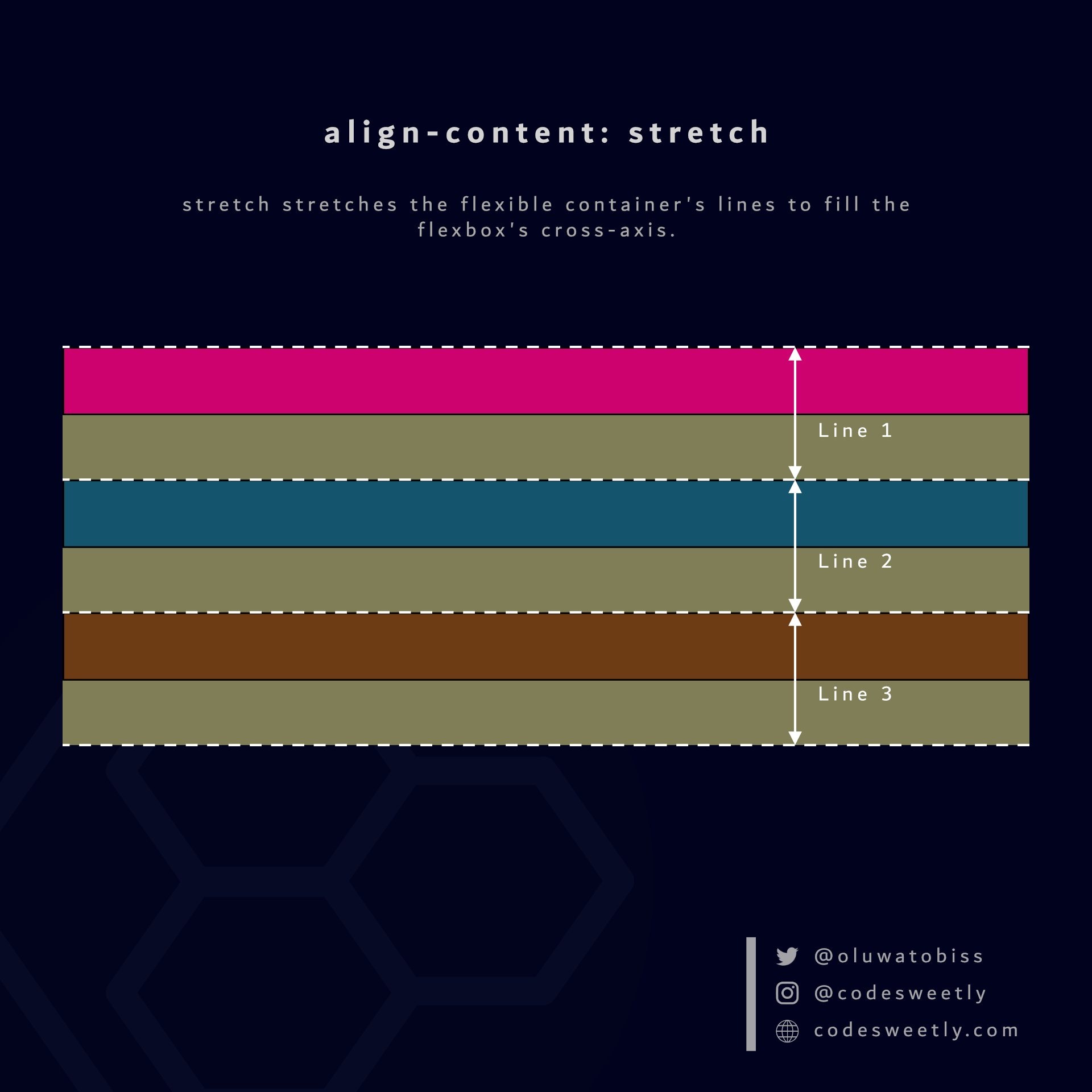 stretch stretches the flexible container's lines to fill the flexbox's cross-axis.
Here's an example:
section {
  display: flex;
  flex-wrap: wrap;
  align-content: stretch;
  background-color: orange;
  margin: 10px;
  width: 90px;
  height: 500px;
}
The snippet above used the stretch value to stretch the flexbox's lines to fill the <section>'s cross-axis.
What is align-content: flex-start in CSS Flexbox?
flex-start aligns a flexible container's lines with the cross-start edge of the flexbox's cross-axis.
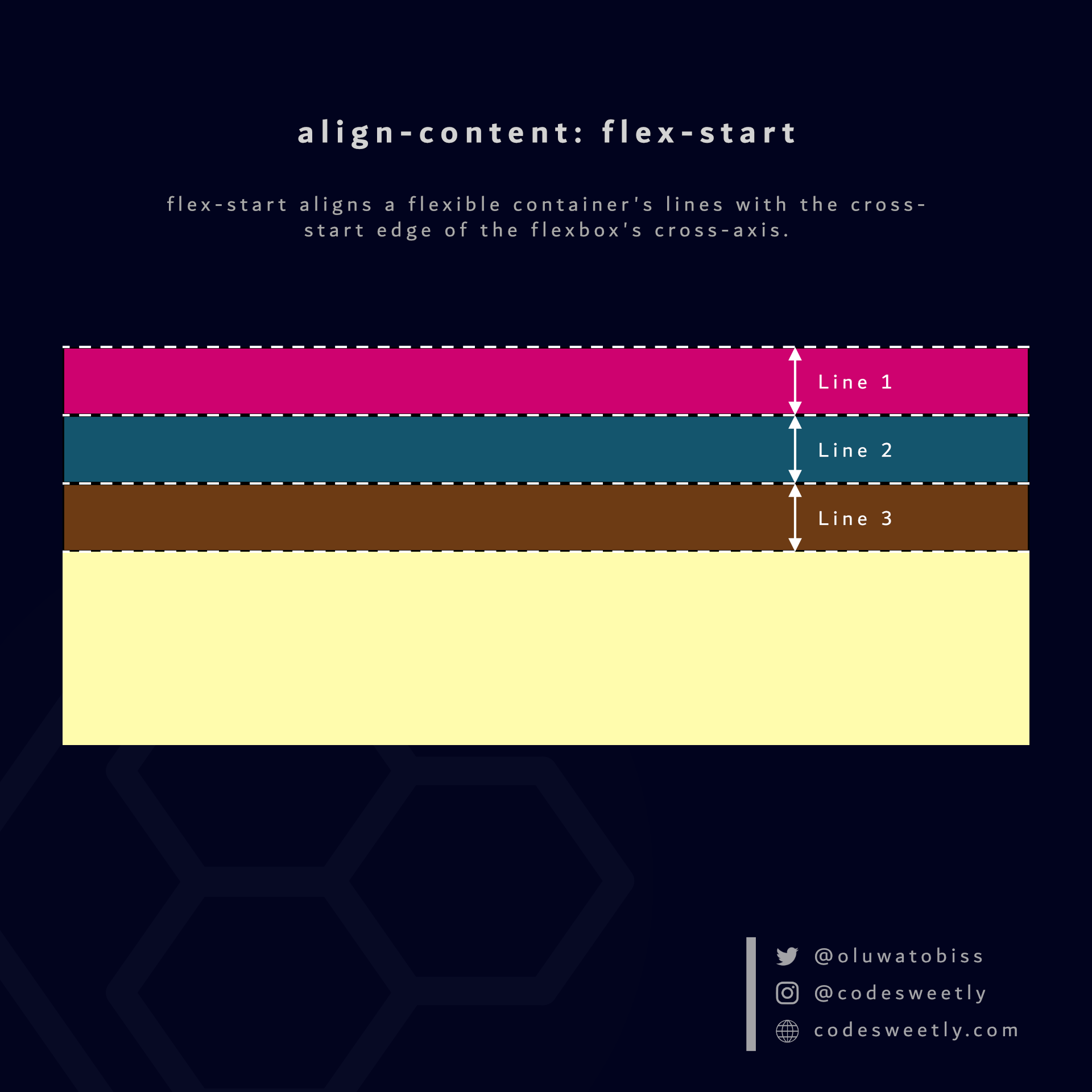 flex-start aligns a flexible container's lines with the cross-start edge of the flexbox's cross-axis.
Here's an example:
section {
  display: flex;
  flex-wrap: wrap;
  align-content: flex-start;
  background-color: orange;
  margin: 10px;
  width: 90px;
  height: 500px;
}
The snippet above used the flex-start value to align the flexbox's lines to the cross-start edge of the <section>'s cross-axis.
What is align-content: center in CSS Flexbox?
center aligns a flexible container's lines to the center of the flexbox's cross-axis.
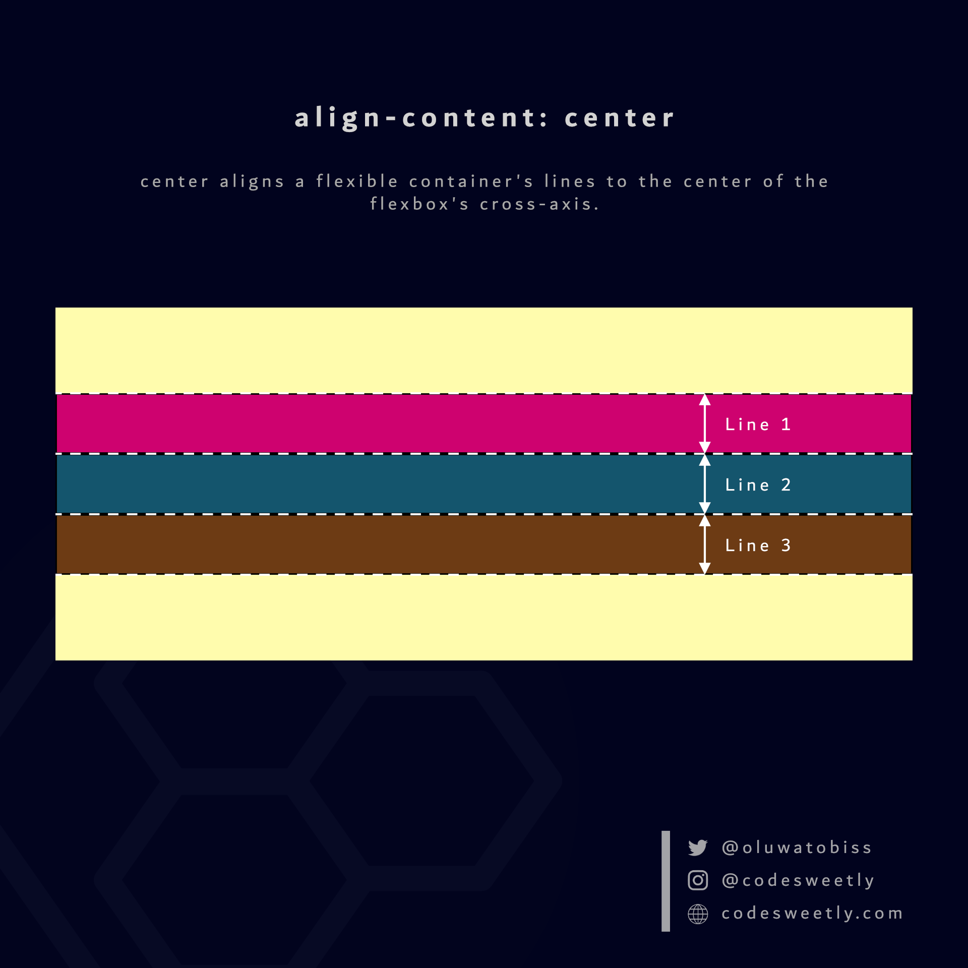 center aligns a flexible container's lines to the center of the flexbox's cross-axis.
Here's an example:
section {
  display: flex;
  flex-wrap: wrap;
  align-content: center;
  background-color: orange;
  margin: 10px;
  width: 90px;
  height: 500px;
}
We used the center value to align the flexbox's lines to the center of the <section>'s cross-axis.
What is align-content: flex-end in CSS Flexbox?
flex-end aligns a flexible container's lines with the cross-end edge of the flexbox's cross-axis.
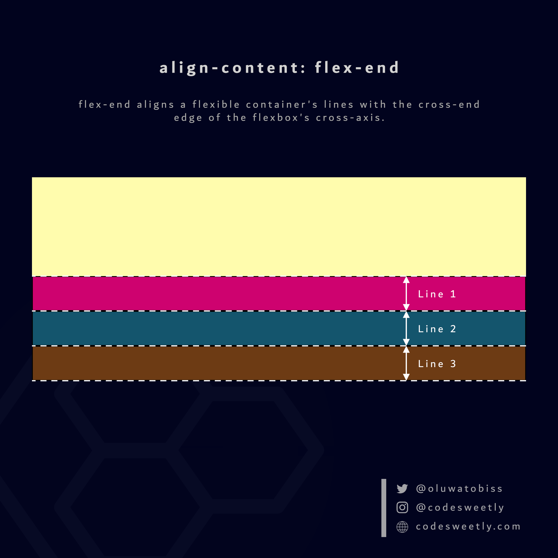 flex-end aligns a flexible container's lines with the cross-end edge of the flexbox's cross-axis.
Here's an example:
section {
  display: flex;
  flex-wrap: wrap;
  align-content: flex-end;
  background-color: orange;
  margin: 10px;
  width: 90px;
  height: 500px;
}
We used the flex-end value to align the flexbox's lines to the cross-end edge of the <section>'s cross-axis.
What is align-content: space-between in CSS Flexbox?
space-between does the following:
- It aligns the flexbox's first line with the main-start edge of the flexible container's main axis.
- It aligns the flexbox's last line with the main-end side of the flexible container's main axis.
- It creates equal spacing between each pair of lines between the first and last line.
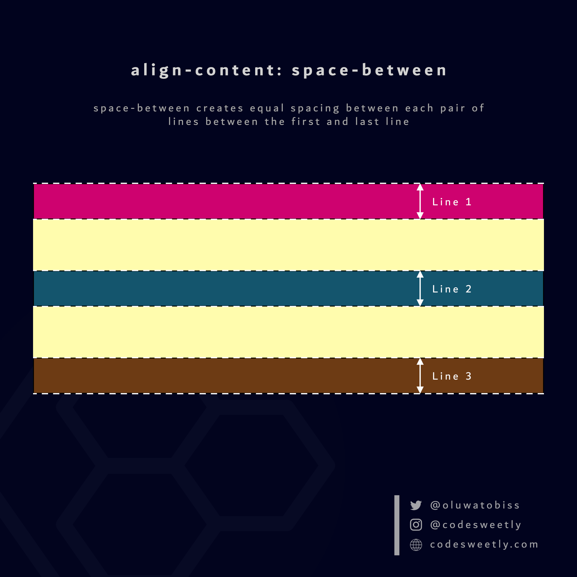 space-between creates equal spacing between each pair of lines between the first and last line
Here's an example:
section {
  display: flex;
  flex-wrap: wrap;
  align-content: space-between;
  background-color: orange;
  margin: 10px;
  width: 90px;
  height: 500px;
}
The snippet above used the space-between value to create equal spacing between each pair of lines between the first and last line.
What is align-content: space-around in CSS Flexbox?
space-around assigns equal spacing to each side of a flexible container's lines.
Therefore, the space before the first line and after the last one is half the width of the space between each pair of lines.
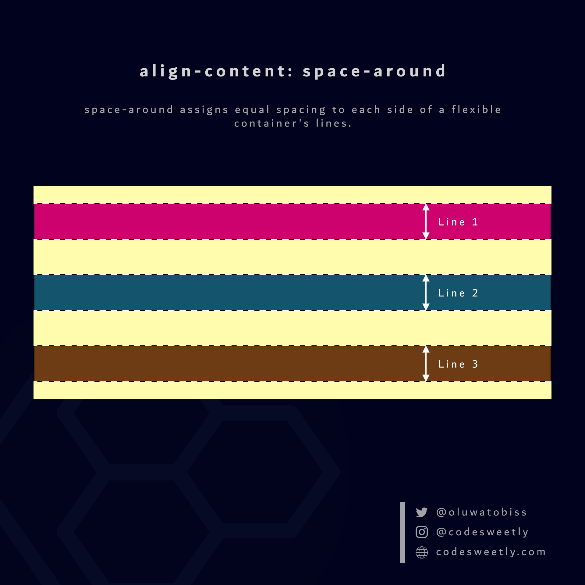 space-around assigns equal spacing to each side of a flexible container's lines.
Here's an example:
section {
  display: flex;
  flex-wrap: wrap;
  align-content: space-around;
  background-color: orange;
  margin: 10px;
  width: 90px;
  height: 500px;
}
The snippet above used the space-around value to assign equal spacing to each side of the flexible container's lines.
What is align-content: space-evenly in CSS Flexbox?
space-evenly assigns even spacing to both ends of a flexible container and between its lines.
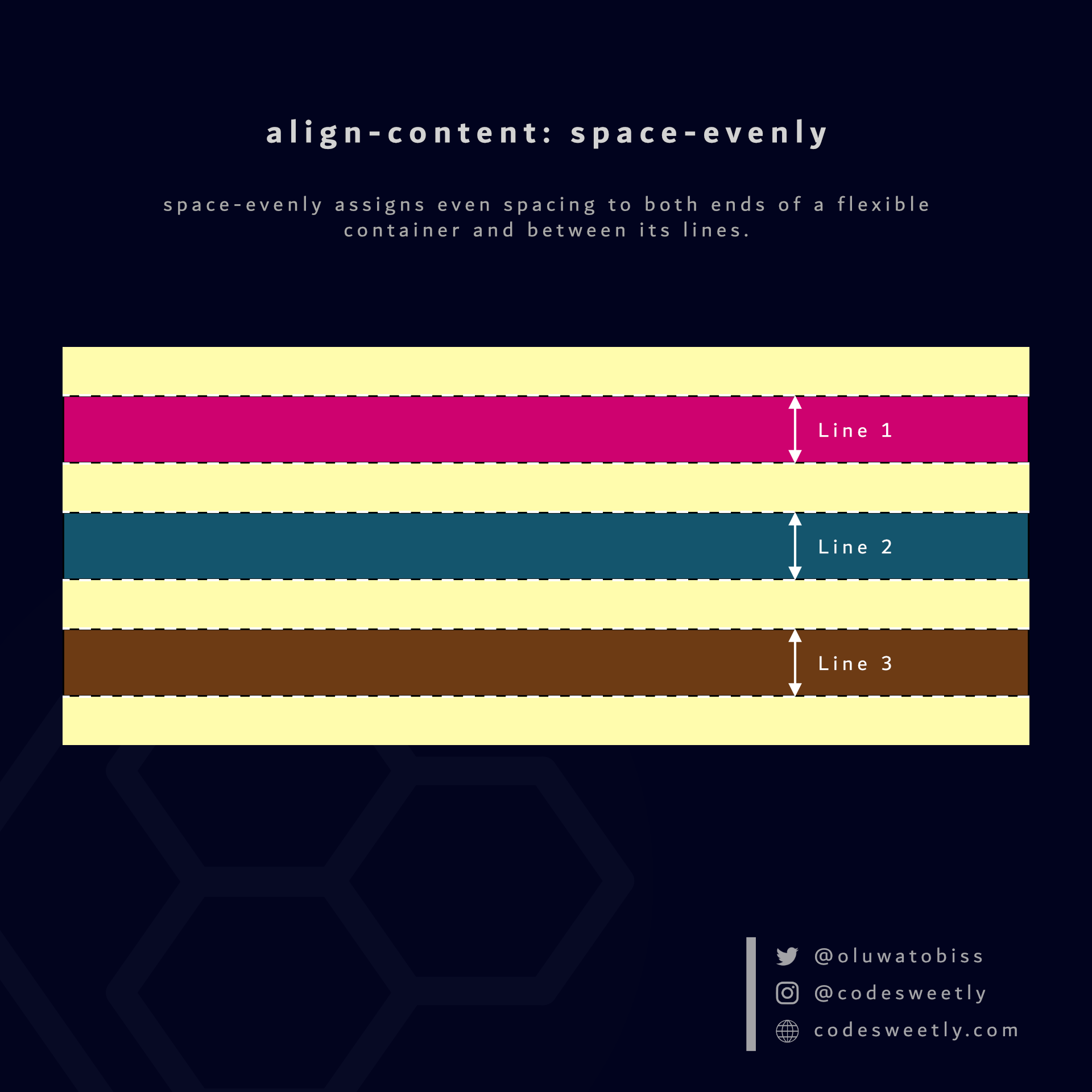 space-evenly assigns even spacing to both ends of a flexible container and between its lines.
Here's an example:
section {
  display: flex;
  flex-wrap: wrap;
  align-content: space-evenly;
  background-color: orange;
  margin: 10px;
  width: 90px;
  height: 500px;
}
We used the space-evenly value to assign even spacing to both ends of the flexbox and between its lines.
So, now that we know the types of CSS flexible container properties, we can discuss the flex item properties.
What Are the Flexible Item's Properties?
A flexible item's properties specify how browsers should layout a specified item within the flexible box model.
Note: We define a flexible item's property on the flex item, not its container.
The six (6) types of flex item properties are:
align-selforderflex-growflex-shrinkflex-basisflex
Let's discuss the six types now.
What Is Flexbox's align-self Property?
align-self specifies how browsers should position selected flexible items along the flexbox's cross-axis.
Note:
align-selfaffects only the selected flexible item—not all the flexbox's items.align-selfoverrides thealign-itemsproperty.
The align-self property accepts the following values:
stretchflex-startcenterflex-endbaseline
Let's discuss the five values.
What is align-self: stretch in CSS Flexbox?
stretch stretches the selected flexible items to fill the flexbox's cross-axis.
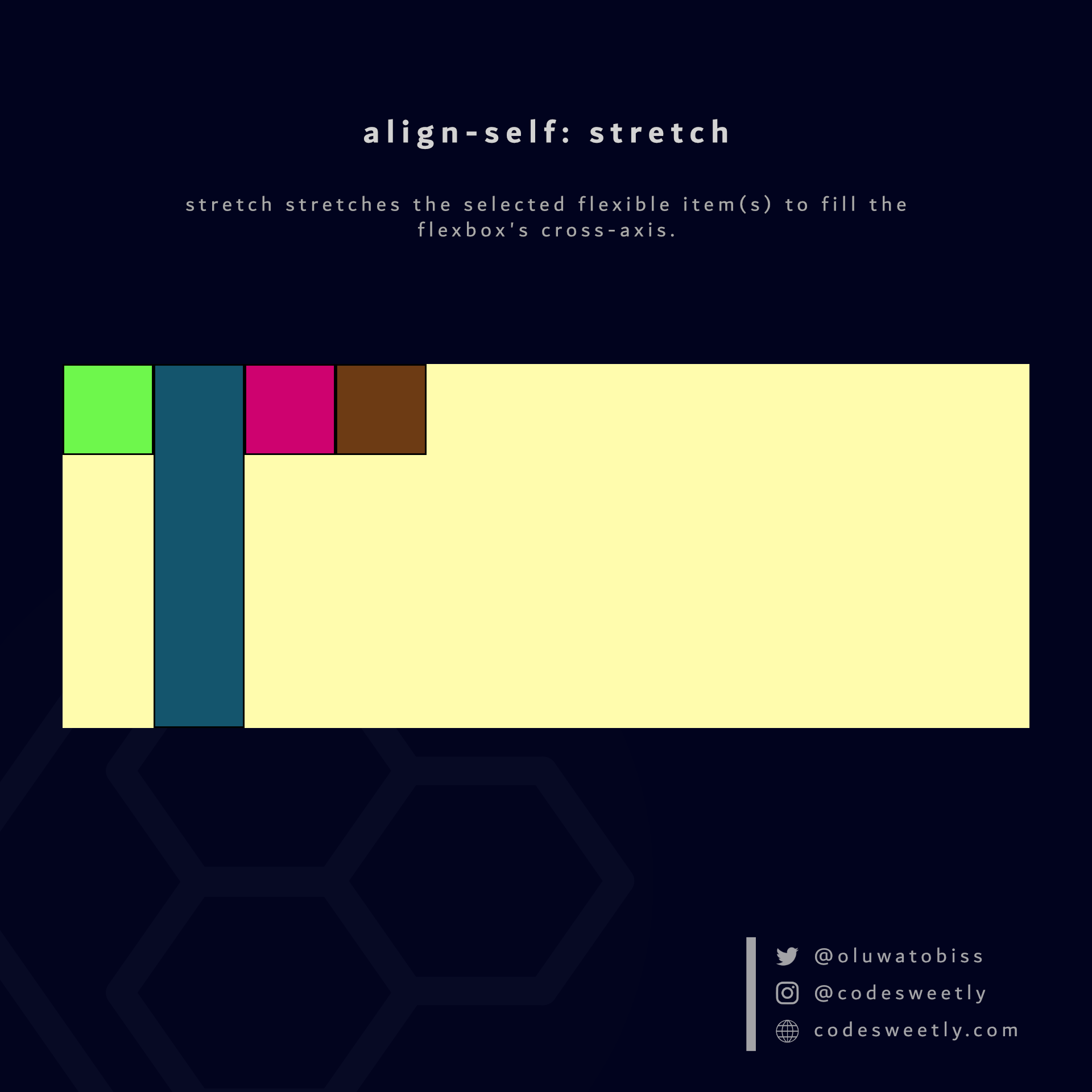 stretch stretches the selected flexible item(s) to fill the flexbox's cross-axis.
Here's an example:
.flex-item2 {
  align-self: stretch;
}
We used the stretch value to stretch flex-item2 to fill its container's cross-axis.
What is align-self: flex-start in CSS Flexbox?
flex-start aligns the selected flexible items with the cross-start edge of the flexbox's cross-axis.
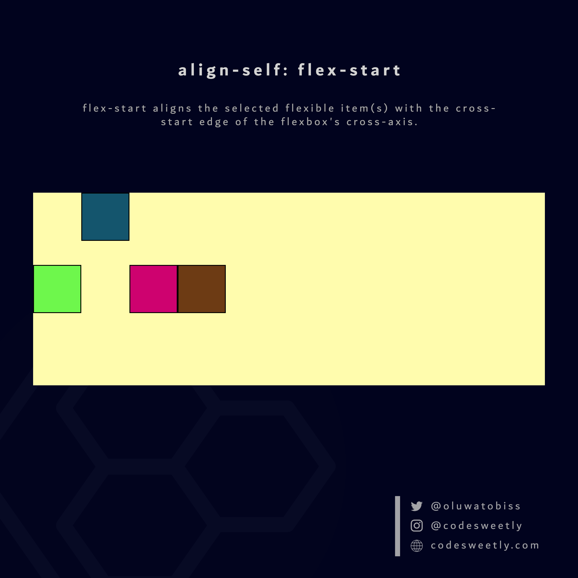 flex-start aligns the selected flexible item(s) with the cross-start edge of the flexbox's cross-axis.
Here's an example:
.flex-item2 {
  align-self: flex-start;
}
The snippet above used the flex-start value to align flex-item2 to the cross-start edge of its container's cross-axis.
What is align-self: center in CSS Flexbox?
center aligns the selected flexible items to the center of the flexbox's cross-axis.
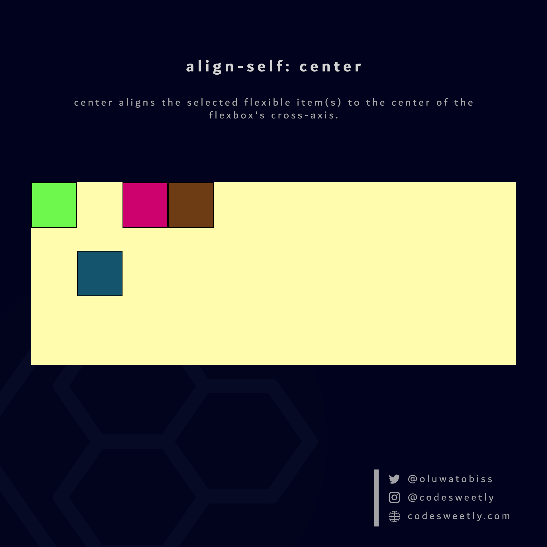 center aligns the selected flexible item(s) to the center of the flexbox's cross-axis.
Here's an example:
.flex-item2 {
  align-self: center;
}
The snippet above used the center value to align flex-item2 to the center of its container's cross-axis.
What is align-self: flex-end in CSS Flexbox?
flex-end aligns the selected flexible items with the cross-end edge of the flexbox's cross-axis.
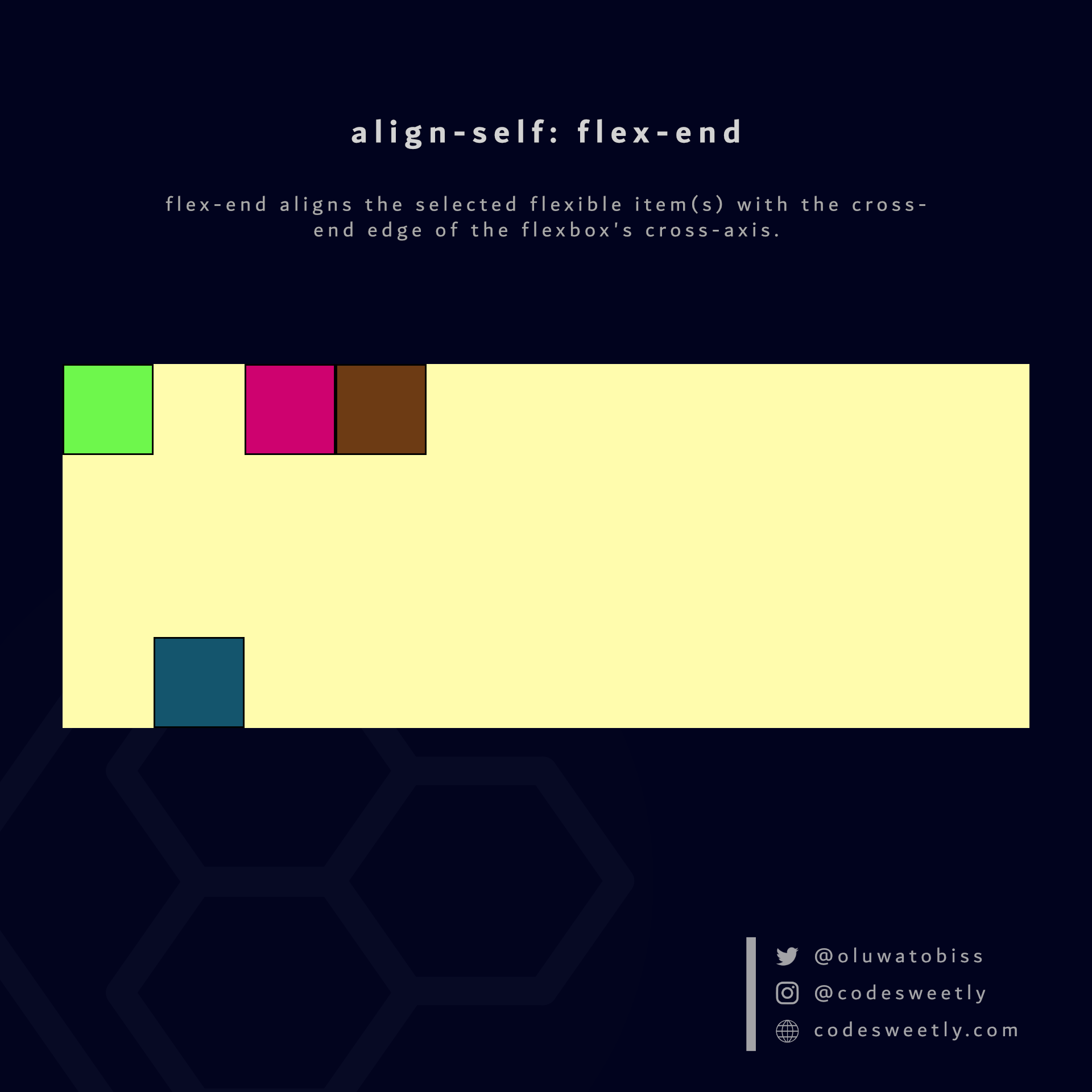 flex-end aligns the selected flexible item(s) with the cross-end edge of the flexbox's cross-axis.
Here's an example:
.flex-item2 {
  align-self: flex-end;
}
The snippet above used the flex-end value to align flex-item2 to the cross-end edge of its container's cross-axis.
What is align-self: baseline in CSS Flexbox?
baseline aligns the selected flexible items with the baseline of the flexbox's cross-axis.
Here's an example:
.flex-item2 {
  font-size: 3rem;
  align-self: baseline;
}
We used the baseline value to align flex-item2 to its container's baseline.
Let's now discuss the second type of flexible item property.
What Is Flexbox's order Property?
order changes a flexible item's default order (arrangement).
In other words, order allows you to reposition a flexbox's item without altering your HTML code's layout.
Here's an example:
<ul style="display: flex; flex-direction: column">
  <li style="order: 6">1</li>
  <li style="order: 4">2</li>
  <li style="order: 1">3</li>
  <li style="order: 7">4</li>
  <li style="order: 2">5</li>
  <li style="order: 5">6</li>
  <li style="order: 3">7</li>
</ul>
The HTML snippet above used the order property to change the unordered list's arrangement.
So, instead of the following order:
- 1
- 2
- 3
- 4
- 5
- 6
- 7
The browser will display this:
- 3
- 5
- 7
- 2
- 6
- 1
- 4
Use the order property with caution, as it prevents screen readers from accessing the correct reading order of an HTML document. Only use it if it is super important to use CSS to change the HTML code's layout.
But in most cases, it is best to rearrange the HTML code directly rather than using CSS.
Note: The style="value" syntax, in the HTML snippet above, is the inline CSS technique for styling HTML elements.
What Is Flexbox's flex-grow Property?
flex-grow tells browsers how much of the flexbox's left-over space they should add to the selected flexible item's size.
Note: A left-over space refers to the space remaining after browsers have deducted the sum of all flexible items' sizes from the flexbox's size.
Here's an example:
.flex-item3 {
  flex-grow: 0.5;
}
<section>
  <div class="flex-item1">1</div>
  <div class="flex-item2">2</div>
  <div class="flex-item3">3</div>
  <div class="flex-item4">4</div>
</section>
We used the flex-grow property to make browsers add half of <section>'s left-over space to flex-item3's size.
Note: flex-grow's default value is 0.
What Is Flexbox's flex-shrink Property?
flex-shrink tells browsers how much the specified flexible item should shrink when the sum of all items' sizes exceeds the flexbox's size.
In other words, suppose the flexbox's size is insufficient to fit the flexible items. In that case, browsers will shrink the items to fit the container.
Therefore, flex-shrink allows you to specify the shrinking factor of a flexible item.
Here's an example:
.flex-item3 {
  flex-shrink: 0;
}
We used the flex-shrink property to prevent browsers from shrinking flex-item3.
Note:
- Browsers will not shrink flexible items with a
flex-shrinkvalue of0. flex-shrink's default value is1.
What Is Flexbox's flex-basis Property?
flex-basis sets the initial length of a flexible item.
Here's an example:
.flex-item3 {
  flex-basis: 100px;
}
We used the flex-basis property to set flex-item3's initial length to 100px.
Note the following:
autoisflex-basis' default value.- A
flex-basis' value (other thanauto) has higher specificity thanwidth(orheight). Therefore, suppose you define both for a flexible item. In that case, browsers will useflex-basis. - The
flex-basisproperty sets the content box's initial width. But you can use the box-sizing property to make it set the border box's width instead.
What Is Flexbox's flex Property?
flex is a shorthand for the flex-grow, flex-shrink, and flex-basis properties.
In other words, instead of writing:
.flex-item3 {
  flex-grow: 0.5;
  flex-shrink: 0;
  flex-basis: 100px;
}
You can alternatively use the flex property to shorten your code like so:
.flex-item3 {
  flex: 0.5 0 100px;
}
Note the following:
flex: autois equivalent toflex: 1 1 auto.flex: noneis equivalent toflex: 0 0 auto.flex: initialsets theflexproperty to its default value. It is equivalent toflex: 0 1 auto.flex: inheritinherits its parent element'sflexproperty's values.
So, now that we know the flexbox properties developers use to layout flexible boxes and their direct children, we can discuss how to center elements with flexbox.
How to Center Elements Horizontally with Flexbox
You can center any element horizontally within its container by:
- Setting its container's
displayproperty toflex - Setting the flexible container's
justify-contentproperty tocenter
Here's an example:
section {
  display: flex;
  justify-content: center;
  background-color: orange;
  width: 100%;
  height: 400px;
}
How to Center Elements Vertically with Flexbox
You can center any element vertically within its container by:
- Setting its container's
displayproperty toflex - Setting the flexible container's
align-itemsproperty tocenter
Here's an example:
section {
  display: flex;
  align-items: center;
  background-color: orange;
  width: 100%;
  height: 400px;
}
How to Center Elements Horizontally and Vertically with Flexbox
You can center any HTML element horizontally and vertically within its container by:
- Setting its container's
displayproperty toflex - Setting the flexible container's
justify-contentandalign-itemsproperties tocenter
Here's an example:
section {
  display: flex;
  justify-content: center;
  align-items: center;
  background-color: orange;
  width: 100%;
  height: 400px;
}
Overview
In this article, we discussed all the Flexbox tools you need to create basic and advanced website layouts in flexible and responsive ways.
Thanks for reading!
If you like the images I used in this tutorial, you can get them all in this booklet.
And here's a useful ReactJS resource:
I wrote a book about React!
- It's beginner friendly ✔
- It has live code snippets ✔
- It contains scalable projects ✔
- It has plenty of easy-to-grasp examples ✔
The React Explained Clearly book is all you need to understand ReactJS.