By Prajwal Kulkarni
Whether you're an Apple fan or not, you'll likely agree that Apple sure does have a groundbreaking UI. And iMessage is definitely an important part of that design.
The curved arrow is something that I have always really liked and have wanted to replicate for a long time.
After a lot of trial and error, I was finally able to find a workaround to build a similar version of iMessage's chat bubble. In this article, I'll take you through the steps required to build a chat bubble that looks like Apple's iMessage.
If you're building a chat application or intending to display information in the form of a message, I'd definitely recommend that you try out this style as it makes your app look cool and professional.
Prerequisites
This article assumes that you know the basics of:
- JSX
- React Native
- HTML & CSS
What is a Chat Bubble?
A chat bubble is basically a container that holds text. Chat bubbles are mostly used in Instant Messaging apps to display chat logs effectively.
The conventional method is that sent messages are displayed on the right side of the screen and received messages are shown on the left, with different colors used to differentiate between sent and received message(s).
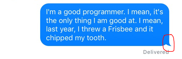
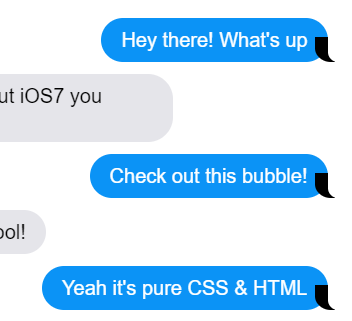
Most messaging apps have a basic chat bubble which is a regular container with rounded corners. The main differentiating factor between other apps and iMessage is the presence of a small curved-like arrow anchoring the text container, which looks like this:
How to Build a Chat Bubble that Looks like iMessage
If we look at the above image carefully, we can see that the iMessage chat bubble is a combination of a regular chat bubble with an added arrow in the corner.
The main challenge lies in tying the arrow to the text container.
Before directly hopping into the code, I'd want you to know how this arrow-like element is created and added.
First, check out this code, which shows how to implementation this arrow using HTML & CSS. Below is its code snippet.
p {
  max-width: 255px;
  word-wrap: break-word;
  margin-bottom: 12px;
  line-height: 24px;
  position: relative;
    padding: 10px 20px;
  border-radius: 25px;

  &:before, &:after {
    content: "";
        position: absolute;
    bottom: 0;
    height: 25px;
  }
}

.from-me {
    color: white;
    background: #0B93F6;
    align-self: flex-end;

    &:before {
        right: -7px;
    width: 20px;
    background-color: #0B93F6;
        border-bottom-left-radius: 16px 14px;
    }

    &:after {
        right: -26px;
    width: 26px;
    background-color: white;
        border-bottom-left-radius: 10px;
    }
}
.from-them {
    background: #E5E5EA;
    color: black;
  align-self: flex-start;

    &:before {
        left: -7px;
    width: 20px;
    background-color: #E5E5EA;
        border-bottom-right-radius: 16px;
    }

    &:after {
        left: -26px;
    width: 26px;
    background-color: white;
        border-bottom-right-radius: 10px;
    }
}
If you just browse straight through the code it might seem quite awful. So let's break it down at an atomic level and later glue it all back together.
The <**p>** tag includes style constraints such as margin-bottom, position, padding and so on. Note that the max-width used here is 255px, which is a static value. But we'll be using a dynamic approach, as the chat bubbles need to be responsive across various screen sizes.
The &:before and &:after within the <p> style defines two elements with no content in it. They're positioned absolute with respect to the <p> tag (text container), and are placed at the bottom. They have a height of 25px (the height of the arrow).
Going further, the .from-me (sent messages) style defines that the text be white, background blue (#0b936f), and that it's placed at the right side of the screen (align-self: flex-end).
Now comes the important part – extending the &:before and &:after, which is the actual implementation of the arrow.
The &:before has a width of 20px and is placed at 7 pixels negative to the right. It has a border-bottom-left radius of 16px, which is what gives the curved look to the arrow.
Similarly, the &:after has a width of 26px and is placed at 26 pixels negative to the right. Since -7px > -26px, &:after is placed right side of the &:before element and partially overlaps it.
If you still feel confused, don't worry – just refer to the images below to gain a clearer insight into what I've been talking about.
 &:before with black background and bottom-left-radius
 &:after overlapping &:before with green background
 &:after background changed to white to match the background of the chat screen.
 &:before background updated to #0b93f6 to match chat bubble color.
So basically the arrowhead is created by overlapping two elements at the bottom corner of the chat bubble and adjusting the background colors to match those of the chat bubble and chat screen.
Further ahead, the translation of CSS and HTML into JSX is fairly simple, as most of the things are quite straightforward.
How to Build the React Native Version
Before starting, I want to note that this works best with FlatList, and I recommend that you use it, and not other components or functions such as map (which lacked consistency across different screens and devices).
The three steps we're going to follow here are:
- Create chat bubble with arrow head
- Add styles to chat bubble and arrow head
- Embed chat bubble in FlatList
So let's get started.
First, we'll create the chat bubble with the arrow head, like this:
<View style={{
                    backgroundColor: "#0078fe",
                    padding:10,
                    marginLeft: '45%',
                    borderRadius: 5,
                    //marginBottom: 15,
                    marginTop: 5,
                    marginRight: "5%",
                    maxWidth: '50%',
                    alignSelf: 'flex-end',
                    //maxWidth: 500,

                    borderRadius: 20,
                  }} key={index}>


                    <Text style={{ fontSize: 16, color: "#fff", }} key={index}>{item.text}</Text>

                      <View style={styles.rightArrow}></View>

                      <View style={styles.rightArrowOverlap}></View>


</View>


//Recevied Message
      <View style={{
                    backgroundColor: "#dedede",
                    padding:10,
                    borderRadius: 5,
                    marginTop: 5,
                    marginLeft: "5%",
                    maxWidth: '50%',
                    alignSelf: 'flex-start',
                    //maxWidth: 500,
                    //padding: 14,

                    //alignItems:"center",
                    borderRadius: 20,
                  }} key={index}>


                      <Text style={{ fontSize: 16, color: "#000",justifyContent:"center" }} key={index}> {item.text}</Text>
                      <View style={styles.leftArrow}>

                      </View>
                      <View style={styles.leftArrowOverlap}></View>


                    </View>
The Outermost <View> tag acts as the 'p' tag in comparison with the HTML version. The remaining two <View> tags act as &:before and &:after.
Next, we'll add styles to the chat bubble and arrow head like this:
const styles = StyleSheet.create({
rightArrow: {
  position: "absolute",
  backgroundColor: "#0078fe",
  //backgroundColor:"red",
  width: 20,
  height: 25,
  bottom: 0,
  borderBottomLeftRadius: 25,
  right: -10
},

rightArrowOverlap: {
  position: "absolute",
  backgroundColor: "#eeeeee",
  //backgroundColor:"green",
  width: 20,
  height: 35,
  bottom: -6,
  borderBottomLeftRadius: 18,
  right: -20

},

/*Arrow head for recevied messages*/
leftArrow: {
    position: "absolute",
    backgroundColor: "#dedede",
    //backgroundColor:"red",
    width: 20,
    height: 25,
    bottom: 0,
    borderBottomRightRadius: 25,
    left: -10
},

leftArrowOverlap: {
    position: "absolute",
    backgroundColor: "#eeeeee",
    //backgroundColor:"green",
    width: 20,
    height: 35,
    bottom: -6,
    borderBottomRightRadius: 18,
    left: -20

},
})
Then we'll embed it into FlatList:
<FlatList
        //inverted
        style={{backgroundColor:"#eeeeee"}}
        data={this.state.chat_log}
        ref={ref => (this.FlatListRef = ref)} // assign the flatlist's ref to your component's FlatListRef...


        renderItem = {({item,index})=>{

          rowId={index}

            if (SENT_MESSAGE) { //change as per your code logic


                return (

                  <View style={{
                    backgroundColor: "#0078fe",
                    padding:10,
                    marginLeft: '45%',
                    borderRadius: 5,

                    marginTop: 5,
                    marginRight: "5%",
                    maxWidth: '50%',
                    alignSelf: 'flex-end',
                    borderRadius: 20,
                  }} key={index}>


                    <Text style={{ fontSize: 16, color: "#fff", }} key={index}> {item.text}</Text>

                      <View style={styles.rightArrow}>

                      </View>
                      <View style={styles.rightArrowOverlap}></View>


                  </View>
                )


            } else {


                return (
                  <View style={{
                    backgroundColor: "#dedede",
                    padding:10,
                    borderRadius: 5,
                    marginTop: 5,
                    marginLeft: "5%",
                    maxWidth: '50%',
                    alignSelf: 'flex-start',
                    //maxWidth: 500,
                    //padding: 14,

                    //alignItems:"center",
                    borderRadius: 20,
                  }} key={index}>


                      <Text style={{ fontSize: 16, color: "#000",justifyContent:"center" }} key={index}> {item.text}</Text>
                      <View style={styles.leftArrow}>

                      </View>
                      <View style={styles.leftArrowOverlap}></View>


                  </View>
                )


            }


        }

        keyExtractor={(item,index)=>index.toString()}
        />
Values such as borderRadius, padding, margin, and backgroundColor are arbitrary values and can be changed if you wish. So feel free to play around and make those changes to best fit your requirements.
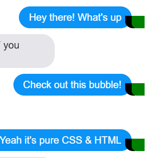
The result of the above code looks like this:
 Chat bubble appearance, as tested on several devices(Android).
Looks cool, doesn't it ? ;)
Conclusion
Congratulations! You've built a chat bubble that looks just like the one iMessage uses.
I hope you found this article helpful. If so, do share it with your friends and colleagues.
Still have questions? Don't hesitate to get in touch with me, and I'll respond to you as soon as possible.