
By Dillion Megida
TailwindCSS is an awesome utility-first CSS library for creating beautiful layouts with less customized CSS.
There's a good chance you've heard about Tailwind. But, have you tried using it?
In this article, I'll share the things that make Tailwind different from other component libraries I know. And I'll discuss why you should start using it.
Note that everything here is my opinion. I'm not saying I've used all the component libraries in the world, lol.
Before TailwindCSS
...there were component libraries like Bootstrap and Material UI, to name a few. These libraries come with a set of pre-defined components. For instance, the most common (or heard of) is probably PrimaryButton.
These libraries reduce the hassle of designing elements from scratch with CSS. Most of these libraries also do an amazing job of making the components customizable by the user, so that they do not have to stick to the creator's decisions.
However, this customizability most of the time involves overwriting. For example, creating new classes to overwrite the existing styles provided by the library.
This is not a big issue per se (depending on the user, for me it is), but you still have to go with the "Do I like the way this is styled? No. Let me overwrite it" kind of flow.
Some developers may see these already made components as just what they need. But creators cannot always make something perfect for every user. Thankfully, as stated earlier, they do a great job of making the components customizable.
Then came TailwindCSS
Tailwind is a utility-first CSS library. This means that they are focused on utilities. They provide utility classes like borders, colors, background colors, and so on. They don't necessarily define how your component looks. You decide that using different classes they provide.
This is why I love Tailwind. Of course, overwriting styles is still possible here, but that's very rare. The wonderful team behind the product created many classes for different needs. Without the need to overwrite, you can configure the default styles that you want the library to use in the config file. Pretty awesome right?
If any of these terms do not make sense to you just now, do not worry. We'll get into more detail as we proceed with the article.
Examples of utitlity classes
Before we get started using TailWindCSS, let me show you a few classes that make the tool awesome.
rounded: adds aborder-radiusof 0.25rem to an element.text-gray-400: adds a light gray color (#cbd5e0). 300 adds something lighter and 500, something darker.bg-gray-100: adds a light gray (#f7fafc) background color.md:text-gray-100: adds a media query for an element such that screen widths greater than or equal to the medium screen (768px by default) applies a very light gray (#f7fafc) to the element. Neat yeah?hover:underline: adds an underline to a text when hovered on.xs:text-lg: similar tomd.., this applies a media query for an element such that a font size of 1.125rem (by default) is used for an element when the screen width is greater than or equal to the extra small screen (640px by default).mt-20: applies amargin-topof 5rem to an element.awesome-responsive: ok, this does not exist ?
All these options are also customizable of course. We'll see that later in this article.
As seen in the classes, they don't (on their own) determine the final look of an element or the layout of a page. It's their combination by you the developer that determines that. This gives you full control without having to overwrite.
At this point, I want to believe you find TailWindCSS awesome, so let's get started using it.
Installation and configuration
Their installation documentation explains the installation process in detail. For the sake of completeness, I'll share the installation steps here.
1. Install package with npm
npm install tailwindcss
2. Add Tailwind to your CSS
@tailwind base;
@tailwind components;
@tailwind utilities;
h1 {
  color: purple;
}
@tailwind is not a valid CSS syntax. But, tailwind uses these directives (as they are called) to generate the built CSS. h1 will also be added to the stylesheet as-is.
h1 is not compulsory. I was trying to show you that any other thing can be added.
3. Create your config file
This step is optional, but it allows you to specify some default values. With this configuration, tailwind will generate the right CSS. Remember I said earlier that overwriting would be minimal as Tailwind allows you to configure your default styles.
To create your config file, do this:
npx tailwindcss init
npx because tailwind was not installed globally. This way, the local installed package is used.
The above code will create a template config file similar to this:
module.exports = {
  purge: [],
  theme: {
    extend: {},
  },final
  variants: {},
  plugins: [],
}
This documentation explains how to configure the file.
4. Using Tailwind with PostCSS
PostCSS helps the build process of the tailwind stylesheet output the correct CSS code. In your postcss.config.js file, add this:
module.exports = {
  plugins: [
    // ...
    require('tailwindcss'),
    require('autoprefixer'),
    // ...
  ]
}
autoprefixer is also added (a plugin of PostCSS) to add vendor prefixes to properties.
To build your css, run the following:
npx postcss tailwind.css -o public/style.css
This takes the tailwind.css file (with the directives), and outputs the processed content to the public stylesheet provided.
Now you're ready to use Tailwind.
How to use Tailwind in your project
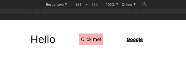
With the public stylesheet populated, all pages linked to the stylesheet can use the styles. An example is:
<div
  className='flex justify-center mt-10 items-center'
>
  <h1 className='text-xl md:text-4xl'>
    Hello
  </h1>
  <button
    className='bg-red-300 p-2 rounded mx-20 hover:bg-red-600 hover:text-white'
  >
    Click me!
  </button>
  <a
    href='https://google.com'
    className='underline font-bold'
  >
    Google
  </a>
</div>
Here's what the classes are doing for the elements:
flex-display: flex.justify-center-justify-content: center.mt-10-margin-top: 2.5remitems-center-align-items: centertext-xl-font-size: 1.25remmd:text-xl- md means medium size. The default is 768px but you can change that in the config file.
Here's what the class does for you:
    @media only screen and (min-width:768px) {
      element {
        font-size: 1.25rem;
      }
    }
bg-red-300-background-color: #feb2b2rounded-border-radius: 0.25remmx-20-margin-left: 5remandmargin-right: 5remhover:bg-red-600- applies a background color of#e53e3eon hover pseudo state.hover:text-white- applies a color of white on hover pseudo state.underline:text-decoration: underlinefont-bold:font-weight: bold
Here's the result for a screen greater than 768px:
and for a screen less than 768px:
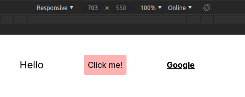
Notice the difference in the h1 element?
This article cannot contain all (or even the most special) features of Tailwind. You can start from here to learn more.
Wrap up
That's an introduction to the beautiful Tailwind!
In summary, TailwindCSS does not define the way your component looks. You define that by combining several classes together.
I personally love TailwindCSS because it gives me that feel of vanilla CSS (I love my vanilla CSS ?) while at the same time making things easy for me.
While it abstracts the styles for me, I'm not entirely unaware of what's going on. For instance, with PrimaryButton, I do not know the paddings and colors that made up that component. But with mt-10, I understand that it's simply margin-top:2.5rem.
If you have any questions or contributions to this article, you can find me on the bird app ?