

In recent years, OTT (over-the-top) video streaming platforms have become more innovative and convenient to use. In their user interfaces, movies and series titles are arranged so that the titles are clearly visible.
In this tutorial, I’ll guide you through the process of creating an image carousel component that looks just like the ones you see on many OTT platforms (think Netflix).
We'll start by creating atomic components, such as Tags,Description, Title, and so on that will display various information about each movie title. Then, we'll stitch these components together via a compound pattern to create a Banner component that displays each movie title in the form of an image. Finally, we'll use the HeroBanner component to build the image carousel component using the Swiper package.
By the end of this post, you'll have the knowledge and skills to create a beautiful and functional image carousel component that will impress your users. Let's get started!
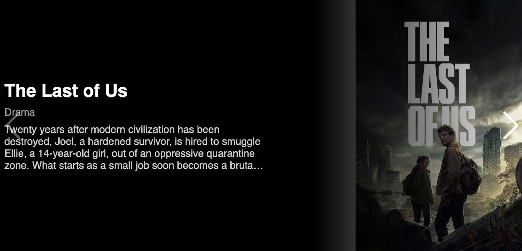
Table of Contents
- Prerequisites
- How to Build the Banner component
- How to Build the Individual Components
- How to Stitch All the Components Together with the Compound Pattern
- How to Build the Image Carousel Component
- Summary
Prerequisites
Before heading on to the next sections, make sure you're comfortable with the following topics:
- CSS – An Intermediate knowledge of CSS is required to style the small components that we will be creating in this Post.
- Styled components – You'll need to be familiar with what styled-components are since we will be using it to create a version of a component that contains static/dynamic css in it. You can learn more about styled-components here.
- Compound pattern – We'll use this pattern to stitch individual components together so that they can be used later in a convenient way. You can read more about compound pattern here.
- TypeScript – We'll use TypeScript in this entire tutorial. It provides good type-safety on top of JavaScript. Having some basic knowledge of it will definitely be fruitful here.
How to Build the Banner Component
The below gif represents an image carousel component. If you don’t know what an image carousel is, then let me give you a brief overview.

An image carousel is a component that consists of images that rotate a fixed number of times or can be rotated with the help of navigation icons.
In this tutorial, we'll create this component. But before jumping into the image carousel, we'll start with a very basic component which is the Banner component.
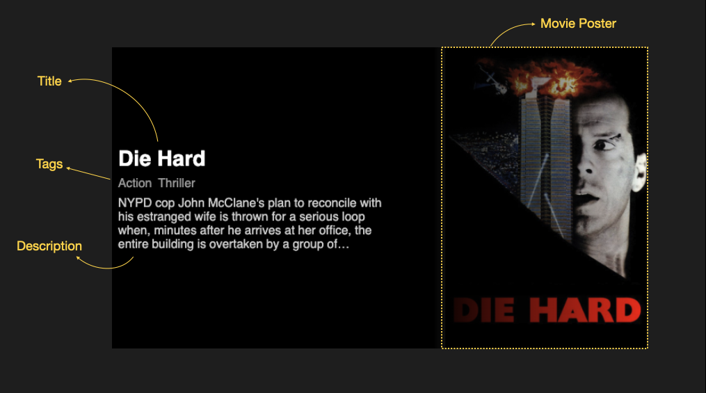
Banner Component is going to be a component that will help us to display:
- Title
- Tags
- Description
- Background image
After that, with the help of styled-components and CSS, we'll make it look beautiful just like we see on most OTT platforms.
Building this component involves the below steps:
- Building the individual components
- Stitching all the components together with the compound pattern
How to Build the Individual Components
Our banner component will comprise of some basic smaller components that cannot be further broken down. These components are known as atomic components. Let's first build the simplest component which is the Title component:
First, create a functional component like below:
const Title = (props: { title: string }) => <div>{props.title}</div>;
We'll also need to style this component. We create a styled div component and place it inside the above Title component like this:
const StyledTitle = styled.div`
  font-size: 28px;
  font-weight: 600;
  color: white;
`;

const Title = (props: { title: string }) => (
  <StyledTitle>{props.title}</StyledTitle>
);
The next component in our line-up is the Tags component. It's a div element that maps over the string (tags) and displays them in the span element:
Create a functional component that accepts an array of strings as a prop and displays them in the span element with a map function:
const Tags = (props: { tags: string[] }) => {
  return (
    <div>
      {props.tags.map((tag: string, index: number) => (
        <span key={`tag-${tag}-index`}>{tag}</span>
      ))}
    </div>
  );
};
Now let's create a styled div component that acts as a replacement for the above div element. We create this wrapper component to apply styles to the children's elements:
const StyledTag = styled.div`
  padding: 0.5rem 0;

  & span {
    margin-right: 0.5rem;
    font-size: 1rem;
    font-weight: 500;
    color: rgba(255, 255, 255, 0.6);
  }
`;
Finally, we stitch these components together:
const Tags = (props: { tags: string[] }) => {
  return (
    <StyledTag>
      {tags.map((tag: string, index: number) => (
        <span key={`tag-${tag}-index`}>{tag}</span>
      ))}
    </StyledTag>
  );
};
Similarly, we create another component called the Description component. It helps to display the description of the movie title. It’s also a functional component that accepts a description prop and displays it using a styled-component:
const StyledDescription = styled.div`
  text-align: start;
  color: rgba(255, 255, 255, 0.8);
  display: -webkit-box;
  max-width: 50%;
  -webkit-line-clamp: 4;
  -webkit-box-orient: vertical;
  overflow: hidden;
`;

const Description = (props: { description: string }) => (
  <StyledDescription>{description}</StyledDescription>
);
Finally, we'll create the Banner component. The purpose of this component is to display the background image of the movie title along with the children passed to it. Let's create a very basic version of this component:
const Banner = (props) => {
  return (
    <div
      style={{
        backgroundImage: `url(${props.image})`,
        width: "100%",
        height: "400px",
      }}
    >
      <div>{props.children}</div>
    </div>
  );
};

<Banner image="https://m.media-amazon.com/images/M/MV5BZjRlNDUxZjAtOGQ4OC00OTNlLTgxNmQtYTBmMDgwZmNmNjkxXkEyXkFqcGdeQXVyNzkwMjQ5NzM@._V1_.jpg">
  <h1 style={{ color: "yellow" }}>Die hard</h1>
</Banner>;
If we execute this component, it does what we expect it to do, “Show a background Image along with children component” like below:

But the style seems to be off – we don’t want this component to look this ugly. What we need is to apply CSS to get things in the right places at the right positions 🙂 (pun intended).
We want the movie poster to be at the right and all the children components should be to the left of it. Now let's create a styled component to do this:
const StyledContainer = styled.div`
  height: 400px;
  width: 100%;
  display: flex;
  background-image: linear-gradient(90deg, rgba(0, 0, 0, 1) 60%, transparent),
    url(${(props) => props.image});
  background-size: contain;
  background-repeat: no-repeat;
  background-position: right;

  & > div {
    display: flex;
    flex-direction: column;
    justify-content: center;
    align-items: flex-start;
    padding-left: 10px;
  }
`;

const Banner = (props) => {
  return (
    <StyledContainer image={props.image}>
      <div>{props.children}</div>
    </StyledContainer>
  );
};

<Banner image="https://m.media-amazon.com/images/M/MV5BZjRlNDUxZjAtOGQ4OC00OTNlLTgxNmQtYTBmMDgwZmNmNjkxXkEyXkFqcGdeQXVyNzkwMjQ5NzM@._V1_.jpg">
  <h1 style={{ color: "yellow" }}>Die hard</h1>
</Banner>;
We have created a new styled component called StyledContainer. It consists of CSS that will align the image to the right and apply a black gradient around the container so that only the movie title is visible.
Next, in the & > div section we make sure the all the children components are aligned to the left. Here is what it will look like:

Yupiee! our Banner component is all set. Let's now test this banner component with all the components that we created above. Place the Title, Tags, and Description component inside the Banner component like below:
<Banner image="https://m.media-amazon.com/images/M/MV5BZjRlNDUxZjAtOGQ4OC00OTNlLTgxNmQtYTBmMDgwZmNmNjkxXkEyXkFqcGdeQXVyNzkwMjQ5NzM@._V1_.jpg">
  <Title title="Die Hard" />
  <Tags tags={["Action", "Thriller"]} />
  <Description description="NYPD cop John McClane's plan to reconcile with his estranged wife is thrown for a serious loop when, minutes after he arrives at her office, the entire building is overtaken by a group of terrorists. With little help from the LAPD, wisecracking McClane sets out to single-handedly rescue the hostages and bring the bad guys down." />
</Banner>;
 This is how our Banner component will look like.
How to Stitch All the Components Together with the Compound Pattern
We want our Banner component to be easy to use, and it should be flexible. We can stitch the Title, Tags, and Description components into the Banner component with the help of a compound pattern.
Components created with this pattern share the state and logic between their internal components. An example of such a compound pattern is a Menu component provided by semantic UI.
<Menu>
  <Menu.Item />
</Menu>;
The advantage of using such a pattern is that we just need to import one component – in our case we will just import the Banner component. All its internal components can be used directly like below:
<Banner.Title />
<Banner.Tags />
<Banner.Description />
Now let's start doing the same for our Banner component.
Since we have all the components ready, I have placed the same inside one file:
import "./styles.css";
import styled from "styled-components";
import React from "react";

export type BannerProps = {
  title: string,
  tags: string[],
  description: string,
  image: string,
};

const StyledTitle = styled.div`
  font-size: 28px;
  font-weight: 600;
  color: white;
`;

const StyledTag = styled.div`
  padding: 0.5rem 0;

  & span {
    margin-right: 0.5rem;
    font-size: 1rem;
    font-weight: 500;
    color: rgba(255, 255, 255, 0.6);
  }
`;

const StyledDescription = styled.div`
  text-align: start;
  color: rgba(255, 255, 255, 0.8);
  display: -webkit-box;
  max-width: 50%;
  -webkit-line-clamp: 4;
  -webkit-box-orient: vertical;
  overflow: hidden;
`;
const Container = styled.div`
  height: 400px;
  width: 100%;
  display: flex;
  background-image: linear-gradient(90deg, rgba(0, 0, 0, 1) 60%, transparent),
    url(${(props: Pick<BannerProps, "image">) => props.image});
  background-size: contain;
  background-repeat: no-repeat;
  background-position: right;

  & > div {
    display: flex;
    flex-direction: column;
    justify-content: center;
    align-items: flex-start;
    padding-left: 10px;
  }
`;

const Title = ({ title }: Pick<BannerProps, "title">) => (
  <StyledTitle>{title}</StyledTitle>
);

const Tags = ({ tags }: Pick<BannerProps, "tags">) => {
  return (
    <StyledTag>
      {tags.map((tag) => (
        <span key={`tag-${tag}`}>{tag}</span>
      ))}
    </StyledTag>
  );
};

const Description = ({ description }: Pick<BannerProps, "description">) => (
  <StyledDescription>{description}</StyledDescription>
);

const Banner = (props: any) => {
  return (
    <Container image={props.image}>
      <div>{props.children}</div>
    </Container>
  );
};

Banner.Title = Title;
Banner.Tags = Tags;
Banner.Description = Description;

export default Banner;
Quick explanation of the above code:
First, we create the typings for the Banner Component called BannerProps. It looks like this:
export type BannerProps = {
  title: string;
  tags: string[];
  description: string;
  image: string;
};
Next, we place all the atomic components that we created here. We also make sure that we use the BannerProps type in each function definition of the atomic components, for example:
const Title = ({ title }: Pick<BannerProps, "title">) => (
  <StyledTitle>{title}</StyledTitle>
);
As you can see, we use the Pick utility function of TypeScript to pick up only the title prop from the Banner props.
Lastly, we stitch all these components by creating a new property to the Banner component like below and export this component:
Banner.Title = Title;
Banner.Tags = Tags;
Banner.Description = Description;

export default Banner;
NOTE: For the purpose of this tutorial, we are using the compound pattern, but you can use these atomic components independently. I chose to use the compound pattern here to teach you how to use it. You can apply it in different scenarios like when building a select button or a menu component.
Nice job – we have finally stitched all our atomic components into a single Banner component. In the next section, we are going to talk about using this component.
How to Build the Image Carousel Component
Finally, we have arrived at the point where we can build the image carousel component. In this section we are going to do the following things:
- Build a Banner Tile component that will act as a single image inside the carousel
- Build the image carousel component.
Let's create the Banner Tile component first. The intention of this component is to use the Banner component.
First, we will start by creating sample data which we can iterate over. Create a file named sampledata.json and place the following content inside it:
{
  "data": [
    {
      "title": "The Last of Us",
      "genres": ["Drama"],
      "cover_url": "https://www.themoviedb.org/t/p/w600_and_h900_bestv2/uKvVjHNqB5VmOrdxqAt2F7J78ED.jpg",
      "description": "Twenty years after modern civilization has been destroyed, Joel, a hardened survivor, is hired to smuggle Ellie, a 14-year-old girl, out of an oppressive quarantine zone. What starts as a small job soon becomes a brutal, heartbreaking journey, as they both must traverse the United States and depend on each other for survival."
    },
    {
      "title": "Fight Club",
      "genres": ["Drama", "Thriller", "Comedy"],
      "cover_url": "https://www.themoviedb.org/t/p/w300_and_h450_bestv2/pB8BM7pdSp6B6Ih7QZ4DrQ3PmJK.jpg",
      "description": "A ticking-time-bomb insomniac and a slippery soap salesman channel primal male aggression into a shocking new form of therapy. Their concept catches on, with underground fight clubs forming in every town, until an eccentric gets in the way and ignites an out-of-control spiral toward oblivion."
    },
    {
      "title": "Creed III",
      "genres": ["Drama", "Thriller"],
      "cover_url": "https://www.themoviedb.org/t/p/w600_and_h900_bestv2/cvsXj3I9Q2iyyIo95AecSd1tad7.jpg",
      "description": "After dominating the boxing world, Adonis Creed has been thriving in both his career and family life. When a childhood friend and former boxing prodigy, Damien Anderson, resurfaces after serving a long sentence in prison, he is eager to prove that he deserves his shot in the ring. The face-off between former friends is more than just a fight. To settle the score, Adonis must put his future on the line to battle Damien - a fighter who has nothing to lose."
    },
    {
      "title": "Die Hard",
      "genres": ["Action", "Thriller"],
      "cover_url": "https://www.themoviedb.org/t/p/w1280/yFihWxQcmqcaBR31QM6Y8gT6aYV.jpg",
      "description": "NYPD cop John McClane's plan to reconcile with his estranged wife is thrown for a serious loop when, minutes after he arrives at her office, the entire building is overtaken by a group of terrorists. With little help from the LAPD, wisecracking McClane sets out to single-handedly rescue the hostages and bring the bad guys down."
    }
  ]
}
NOTE: I used the themoviedb.org to get the above data.
Next, create a file named BannerTile.tsx inside the components directory. Then create a functional component that makes use of the Banner component like below:
import Banner, { BannerProps } from "./Banner";

export default function BannerTile(props: BannerProps) {
  const { title, image, tags, description } = props;
  return (
    <Banner image={image}>
      <Banner.Title title={title} />
      <Banner.Tags tags={tags} />
      <Banner.Description description={description} />
    </Banner>
  );
}
Now to test this component, we can use sampledata.json. Go through the following steps to test the BannerTile component:
First, we should import the data from the sampledata.json:
const sampleData = require('./sampledata.json');
Next, we iterate over this data with the map function. We also make sure that we call the BannerTile component on each of the data:
<div>
  {sampleData.data.map((item: SampleData, index: number) => (
    <BannerTile
      key={`key-${item.title}-${index}`}
      title={item.title}
      tags={item.genres}
      image={item.cover_url}
      description={item.description}
    />
  ))}
</div>;
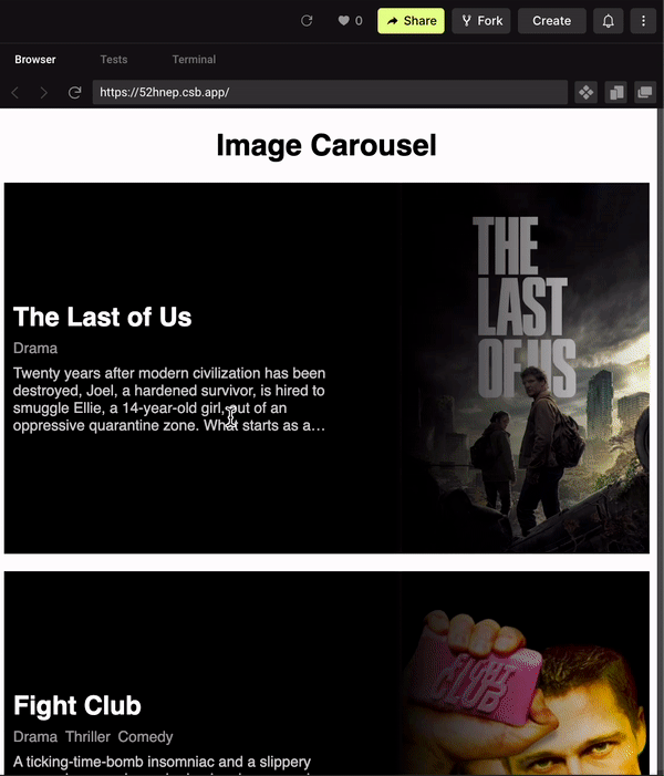
The output after running this code will look like the below:
To implement the image carousel we can use a package called Swiper. We just need to place all the BannerTiles inside the component that is provided by the swiper. Now without any further delay, let's get started.
To install the swiper package, use the below command:
npm i swiper
Now let's create a new file named HeroBanner.tsx. This file will contain the HeroBanner component. The purpose of this component is to iterate over the movie data and display them via the image carousel and the BannerTile component.
Once we have installed the swiper library we can start consuming it. As per the swiper.js documentation, we need to import the CSS provided by it:
import "swiper/css";
import "swiper/css/navigation";
Next, we also need to import the components from swiper.js that will help us to build the image carousel. Import the following components:
import { Swiper, SwiperSlide } from "swiper/react";
import { Navigation } from "swiper";
Now let's also import the BannerTile, the types associated with the Banner, and the sampleData from the sampledata.json:
import "swiper/css";
import "swiper/css/navigation";

import { Swiper, SwiperSlide } from "swiper/react";
import { Navigation } from "swiper";

import BannerTile from "./BannerTile";
import { BannerProps } from "./Banner";

const sampleData = require("../utilities/sampledata.json");
The sampleData that we imported just now only contains the title, genres, cover_url, and description. This is the perfect time to make use of the type BannerProps to filter out only the types that we need.
type SampleData = Pick<BannerProps, 'title' | 'description'> & {
    genres: string[];
  cover_url: string;
}
Now let's start with actually building this component. Create a functional component called HeroBanner and place the following code inside it:
const HeroBanner = () => (
  <Swiper navigation modules={[Navigation]} slidesPerView={1}>
    {sampleData.data.map((item: SampleData, index: number) => (
      <SwiperSlide key={`key-${item.title}-${index}`}>
        <BannerTile
          title={item.title}
          tags={item.genres}
          image={item.cover_url}
          description={item.description}
        />
      </SwiperSlide>
    ))}
  </Swiper>
);
In the HeroBanner component we do the following things:
- We use the
Swipercomponent provided by the swiper.js library that acts as a wrapper container around all the images, that is theBannerTilecomponent. We made sure that there is only one slide per view. - While mapping over the
sampleDatawe make sure that each of theBannerTilecomponent is wrapped by theSwiperSlidecomponent.
To know more about the swiper’s React components you can refer to their documentation.
The final output will look something like the below:
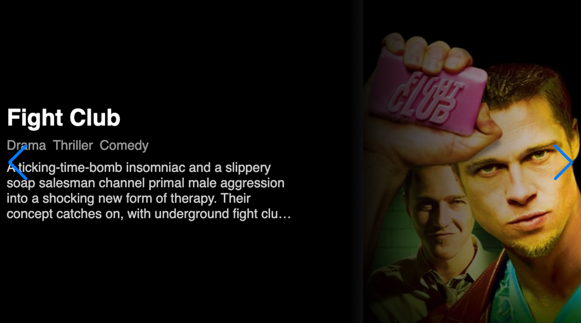
We finally got what we wanted: an image carousel component that just looks and functions like the ones on popular OTT platforms.
But there is one last thing we need to do here. We need to make sure that the left and the right arrow are white so they stand out. To do that we make use of styled-components:
export const StyledSwiper = styled(Swiper)`
  & .swiper-button-next,
  .swiper-button-prev {
    color: white;
  }
`;
Now we edit our HeroBanner component. We replace the Swiper component with the StyledSwiper component like below:
const HeroBanner = () => (
  <StyledSwiper navigation modules={[Navigation]} slidesPerView={1}>
    {sampleData.data.map((item: SampleData, index: number) => (
      <SwiperSlide key={`key-${item.title}-${index}`}>
        <BannerTile
          title={item.title}
          tags={item.genres}
          image={item.cover_url}
          description={item.description}
        />
      </SwiperSlide>
    ))}
  </StyledSwiper>
);
Here is how it will look:
 Now that looks nice
Summary
This is how you can create an image carousel for movie titles. In this tutorial, you learned:
- How to create atomic components
- How to stitch all the components together via the compound pattern
- How to create a BannerTile component that displays the information related to each movie
- How to build an image carousel component with swiper.js
The entire code for this tutorial can be found here.
Thank you for reading!