
As a web developer, sometimes centering a div feels like one of the toughest jobs on planet Earth.
Well, not anymore. In this article, you'll learn 10 different ways to center a div. We will explore how to center divs using the CSS position property, CSS Flexbox, and CSS Grid.
After reading this whole article, I am confident that you will start centering divs like a pro.
How to Center a Div
For this tutorial, I will be using the same HTML for all 10 methods that we'll discuss below. The HTML just contains a parent div and a child div inside it.
The main aim of this article is to center the inner div with respect to its parent. I will only be changing the CSS files, but you'll be able to see all 10 different methods take effect.
The main HTML file goes like this:
<!DOCTYPE html>
<html lang="en">
  <head>
    <meta charset="UTF-8" />
    <meta http-equiv="X-UA-Compatible" content="IE=edge" />
    <meta name="viewport" content="width=device-width, initial-scale=1.0" />
    <title>Centering divs</title>
    <link rel="stylesheet" href="./basicStyle.css" />
    <!-- Change the link of CSS file here -->
    <link rel="stylesheet" href="" />
    <style>
      * {
        box-sizing: border-box;
        margin: 0px;
        padding: 0px;
      }
    </style>
  </head>
  <body>
    <div id="parentContainer">
      <div id="childContainer"></div>
    </div>
  </body>
</html>
With just the basic styling as given in the following lines:
#parentContainer {
  width: 400px;
  height: 400px;
  background-color: #f55353;
}
#childContainer {
  width: 100px;
  height: 100px;
  background-color: #feb139;
}
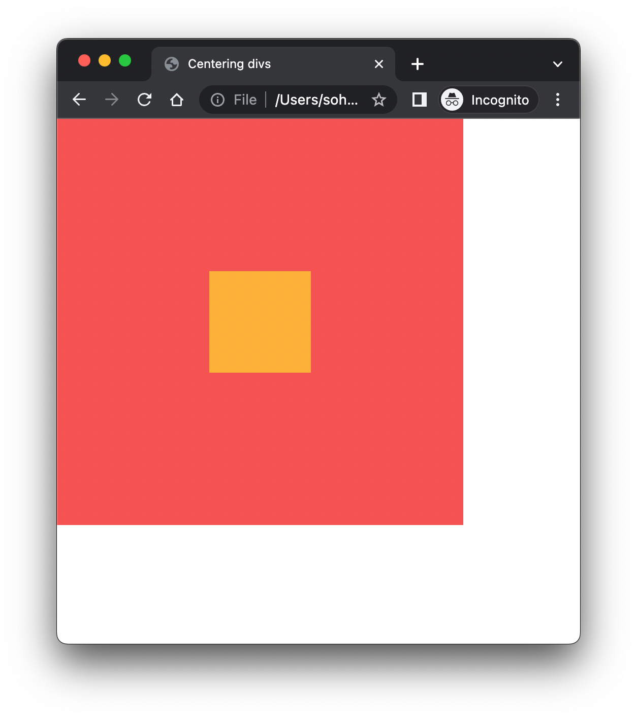
We will get something like this:
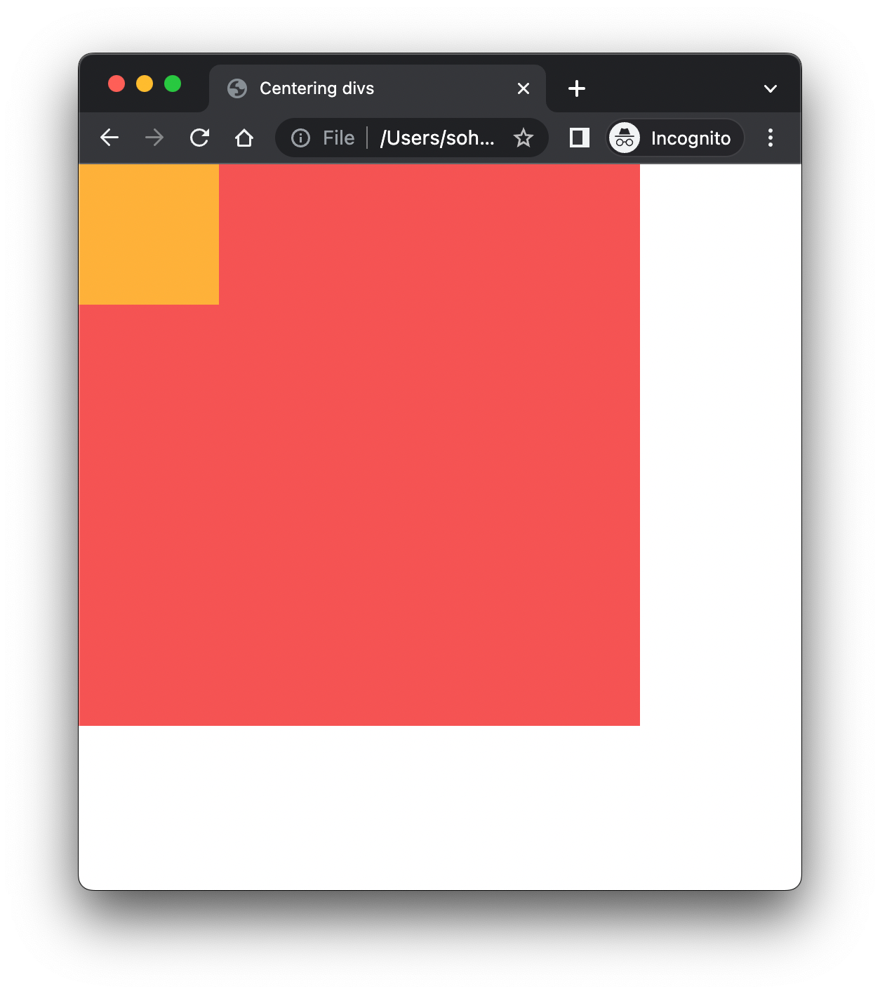 What the basic HTML and CSS styling gives us.
We just make a parent div and give it a width and height of 400px, and a color of #f55353.
Similarly we create a child div inside it and give it a width and height of 100px and give it a color of #feb139.
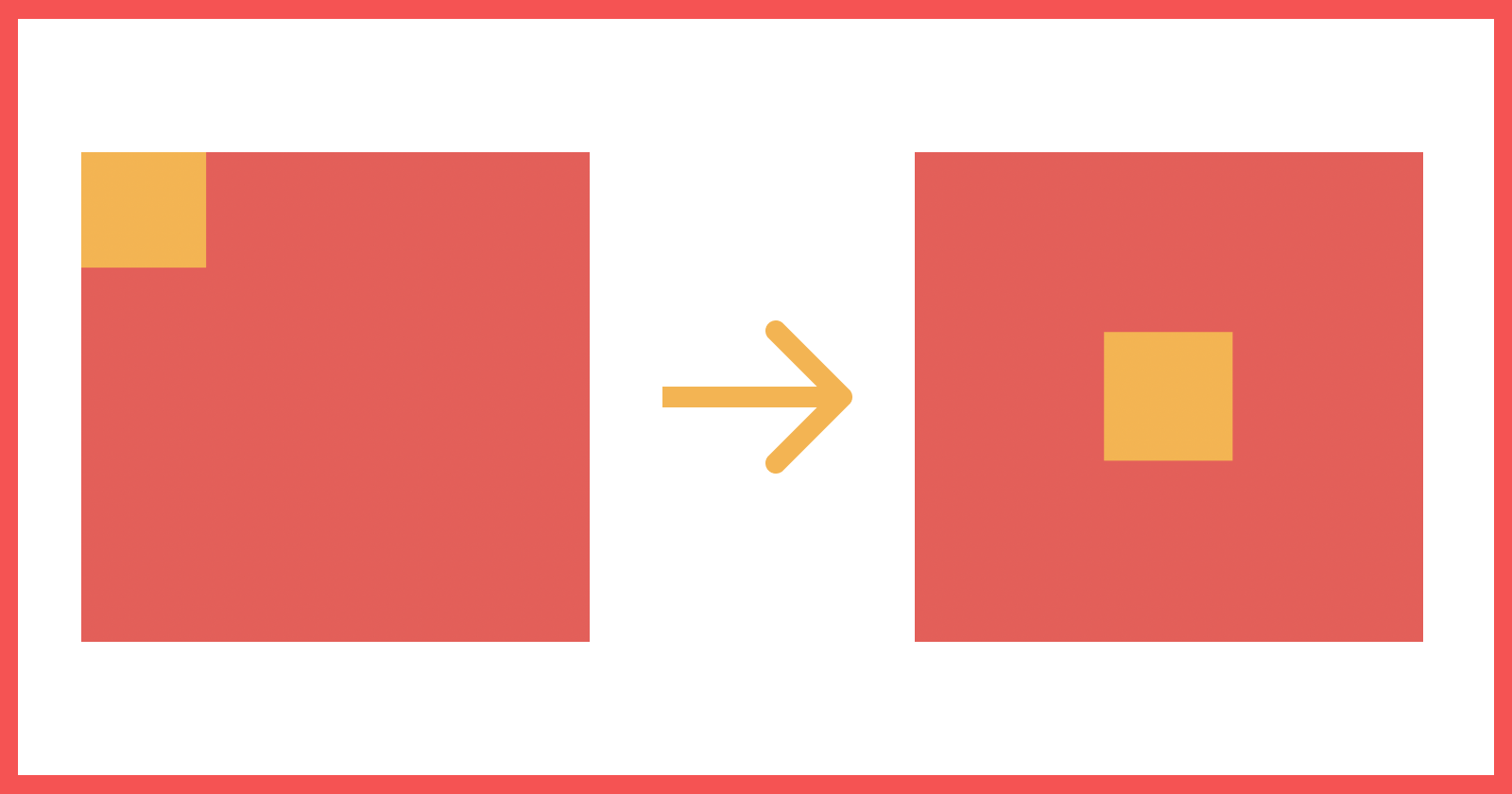
The final goal of this article will be to make this transformation:
How to Center a Div using the CSS position Property
1. How to use position: relative, absolute and top, left offset values
#parentContainer {
  position: relative;
}
#childContainer {
  position: absolute;
  top: 50%;
  left: 50%;
  transform: translate(-50%, -50%);
}
The position property in CSS sets how the element is positioned on the page. The default value of the position property is static. The other values that the position property takes are relative, absolute, fixed and sticky.
Now when we give a position: absolute to a DOM element, it becomes absolute with respect to the whole page. This would be useful if we wanted to center the div with respect to the whole page.
On the other hand, setting the parent element to position: relative, makes the children element (with position: absolute) absolute, relative to the parent element and not the whole page.
In the above example we do just that. We give the parent element a position: relative and child a position: absolute.
Along with the position property, we can specify four other properties viz. top, right, bottom and left which then determines the final location/ position of the element.
The top and bottom specify the vertical positioning of the element where as left and right specify the horizontal positioning.
2. How to use position: relative and absolute, top, left, right and bottom offset values and margin: auto
#parentContainer {
  position: relative;
}
#childContainer {
  position: absolute;
  top: 0;
  left: 0;
  bottom: 0;
  right: 0;
  margin: auto;
}
Continuing with our knowledge of positions from point 1 above, we use the margin property in CSS here. margin: auto lets the browser select a suitable margin for the child element.
In most of the cases it allows the child element to take its specified width and the browser distributes the remaining space equally between the left and right margin pair or top and bottom margin pair or amongst both pairs.
If we mention only top: 0, bottom: 0 and margin: auto, it centers the child element vertically.
Similarly if we mention only left: 0, right: 0 and margin: auto, then it will center the child horizontally.
And if we mention all the properties as shown in the code block above, then we get a perfectly centered div both horizontally and vertically.
How to Center a Div Using CSS Flexbox
3. How to use Flexbox, justify-content, and align-item
The above two methods are based on more of a classical method of aligning elements in the page. The modern approaches makes use of Flexbox (for one directional layout modeling) and Grid layout (for more complex two dimensional layout modeling) properties.
Let's see the Flexbox approach:
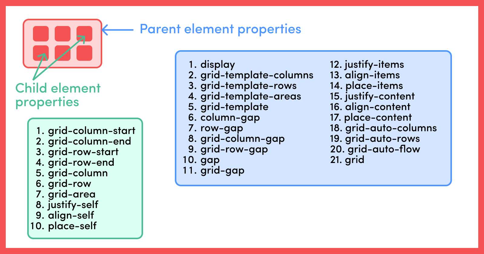
Flexbox is not just a single property, but it is a module which comprises of a set of properties. Some of these properties are meant to be for the container (that is, the parent container) and some for the child elements inside it.
The below diagram shows a list of properties that are meant for parent and child elements with respect to Flexbox.
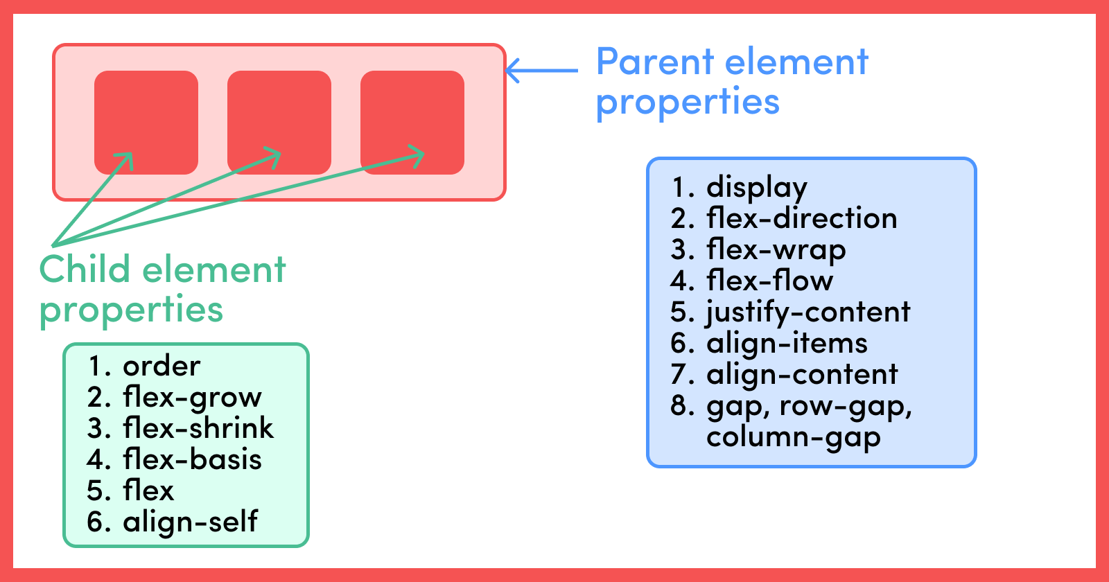
Now it is not possible to cover all the properties in this article. Rather let's look into some of the properties we are using in this article.
As mentioned above, there are two different entities in the Flexbox model, the parent container and the children element.
The display: flex property defines a container as a flex container. flex-direction is another parent container property which can take in either of the four values row (default value), row-reverse, column and column-reverse.
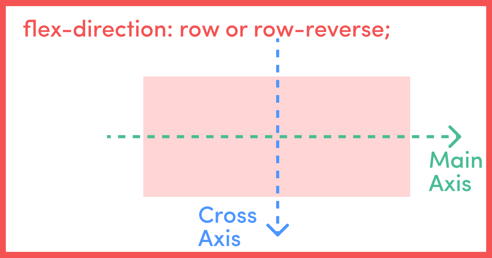
When working with Flexbox, we need to take two different axes into consideration, that is the main axis and cross axis.
For the cases where flex-direction is row or row-reverse, the horizontal axis is the main axis and vertical axis is the cross axis.
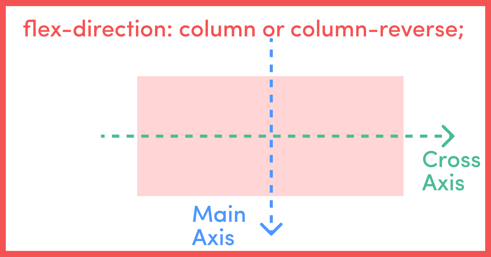
Similarly, when the flex-direction is column or column-reverse, then the vertical axis is the main axis and horizontal axis is the cross axis. Refer to the below diagrams for visual clarity:
The justify-content property of the parent container defines the alignment of its children along the main axis. Thus justify-content: center sets the alignment of all its child elements at the center with respect to the main axis.
Similarly, the align-items property of the parent container defines the alignment of its children along the cross axis. Thus align-items: center sets the alignment of all its child elements at the center with respect to the cross axis.
So the below code block will perfectly align our child element at the center of the parent element both vertically and horizontally.
In this method, we do not need to specify anything explicitly for the child element. display: flex, justify-content and align-items handle everything from the parent component.
#parentContainer {
  display: flex;
  justify-content: center;
  align-items: center;
}
4. How to Use Flexbox, justify-content, and align-self
This method is just an alternative to the above method and is quite similar to it.
But in place of using the align-items property (in the parent container property), which sets the alignment for all the childern elements with respect to cross axis, we use align-self (in the child elements) which sets the alignment of individual flex items on the cross axis.
#parentContainer {
  display: flex;
  justify-content: center;
}
#childContainer {
  align-self: center;
}
5. How to Use Flexbox and margin: auto
Flexbox gives us very powerful alignment and space distribution capabilities. Also as mentioned above, margin: auto lets the browser select a suitable margin for the child element.
In most cases it allows the child element to take its specified width and the browser distributes the remaining space equally between the left and right margin pair or top and bottom margin pair or amongst both the pairs.
This means that setting the parent container as flex and giving the child a margin: auto alows the browser to evenly distribute the leftover space along both the vertical and horizontal directions.
#parentContainer {
  display: flex;
}
#childContainer {
  margin: auto;
}
How to Center a Div Using CSS Grid
6. How to Use Grid, justify-content, and align-items
CSS Grid or just Grid is used for two dimensional layout modeling compared to Flexbox which you use for one dimensional modeling.
Similar to Flexbox, we have the concept of a grid container or parent container and grid items or children items.
The below diagram lists down all the properties you can use for the parent and children. As CSS Grid is a huge topic in itself, it's not in the scope of this article to discuss about each and every property. So let's discuss the properties that we're using in this article.
display: grid initiates an element to become a grid container.
justify-items and align-items align the items inside the grid along the inline (row) axis and block (column) axis respectively.
On the other hand, if the total size of the grid is less than the grid container (which can happen if all the grid items are sized with non-flexible units like px), then in that case we can control the alignment of the grid within the grid container using justify-content and align-content.
justify-content and align-content aligns the grid along the inline (row) axis and block (column) axis respectively.
You can find a comprehensive explanation of all these properties here: A Complete Guide to Grid
As for our case there is only one grid cell and only one child element inside it, so we can use justify-content or justify-items as well as align-content or align-items interchangeably and get the same result.
#parentContainer {
  display: grid;
  justify-content: center;
  align-items: center;
}
7. How to Use Grid and place-items
You can use place-items to set both align-items and justify-items properties in the same declaration. Similarly place-content sets both justify-content and align-content is the same declaration.
As mentioned above, in this use case we can use justify-content or justify-items as well as align-content or align-items interchangeably. In the same way we can also use place-items as well as place-content interchangeably and get the same result (specifically for this use case. For any other use case we need to analyse which property should be used).
#parentContainer {
  display: grid;
  place-items: center;
}
8. How to Use Grid, align-self, and justify-self
Similar to Flexbox, Grid also supports individual grid item alignment using the align-self and justify-self properties (properties to be specified in the children element).
justify-self aligns grid items inside a grid cell along the inline (row) axis whereas align-self aligns the grid items inside the grid cell along the block (column) axis.
#parentContainer {
  display: grid;
}
#childContainer {
  align-self: center;
  justify-self: center;
}
9. How to Use Grid and place-self
The place-self property sets both justify-self and align-self properties in a single declaration. So assigning a child element to place-self: center centers the child both vertically and horizontally.
#parentContainer {
  display: grid;
}
#childContainer {
  place-self: center;
}
10. How to Use Grid and margin: auto
Similar to Flexbox, Grid also gives us powerful alignment and space distribution capabilities.
As seen in point 5, we can do a similar process with Grid instead of using Flexbox and we'll get the same result if we asign margin: auto to the child element.
#parentContainer {
  display: grid;
}
#childContainer {
  margin: auto;
}
Here's The Result
Well as expected, following any of the above methods will result in this:
Summary
In this article, we saw how to center a div using 10 different methods. Those methods were:
- Using position: relative, absolute and top, left offset values
- Using position: relative and absolute, top, left, right and bottom offset values and margin: auto
- Using flexbox, justify-content and align-item
- Using flexbox, justify-content and align-self
- Using flexbox and margin: auto
- Using grid, justify-content and align-items
- Using grid and place-items
- Using grid, align-self and justify-self
- Using grid and place-self
- Using grid and margin: auto
We also looked at what all these properties like justify-content, align-items, position and so on meant and how we can use some of them together to center our divs.
Some good resources
- A Complete Guide to Flexbox
- A Complete Guide to Grid
- Learn Flexbox and Grid by Building a Responsive Landing Page
GitHub link
You can find the GitHub link for all the files for all the methods mentioned above here: Github Link
Wrap Up
Thanks for reading! I hope you liked this article on 10 different methods to center a div and I hope that they come handy to you in the future.
Do consider sharing this article with your friends – I'd really appreciate that. Stay tuned for more amazing content. Peace out! 🖖