

Bootstrap is an awesome CSS framework that can help you create stylish and sleek websites.
Some developers and teams find that code written in Bootstrap is easier to maintain than regular CSS, so they prefer Bootstrap to vanilla CSS.
But if everyone used Bootstrap with its default styles, then every site would look the same – and quickly, the internet would become pretty bland. Fortunately, Bootstrap is also highly customizable.
How to Customize Bootstrap
If you're a beginner, you can customize Bootstrap with a custom CSS stylesheet. CSS specificity is important here. You write custom CSS, with the same or higher specificity, and link to it in the head section of your index.html after the line which links to the original Bootstrap CSS.
<!-- index.html -->
<head>

    <link rel="stylesheet" href="./node_modules/bootstrap/dist/css/bootstrap.min.css">
    <!-- custom CSS should come after Bootstrap CSS -->
    <link rel="stylesheet" href="./custom.css"

</head>
For small tweaks this is OK. But for larger projects, this can be time-consuming and there may be a lot of redundant style declarations. So there has to be another, cleaner, way.
How to Use Sass with Bootstrap
The solution is to use Sass – a CSS preprocessor. Sass is compiled down to CSS before it's used on web pages.
Until Bootstrap version 3.x, you had a choice between CSS preprocessors: Less or Sass. But since version 4, Bootstrap uses only Sass. The source code for the Bootstrap 4 and 5 frameworks is written entirely in Sass, which is a testimony to how mature Sass has become.
You may have heard the tagline, "Sass is CSS with superpowers". If you want to learn Sass, the official website is an excellent resource. You can also refer to other tutorials on freeCodeCamp, like this one on how to use Sass with CSS, or this video course on how to use Sass with Bootstrap 5.
Sass comes with two syntaxes. The older one uses indentation and the newer SCSS syntax (SCSS for Sassy CSS) uses CSS-like curly braces.
SCSS is a superset of CSS. So CSS code saved with a .scss extension (or SCSS interspersed with CSS) is also valid Sass code.
In this tutorial, we are going to use the SCSS version. Whatever the style is, indented Sass or CSS-like SCSS, the Sass compiler will transpile it to vanilla CSS to be used on the browser.
What we are going to do in this tutorial
We will change the primary and secondary theme colors Bootstrap ships with.
We will also change the default media breakpoints Bootstrap uses.
Once we can do these, it will become easy to do other customizations.
The Prerequisites
Node.js with npm or yarn
A code editor, preferably VS Code.
A basic understanding of Sass
Download Bootstrap from the official website: https://getbootstrap.com
Since we have Node.js installed, I'm going to use the npm version.
npm i bootstrap
We also need to install the Sass compiler. We can get the official dart-sass version from their website. Whether you're on Windows, Mac, or Linux you just need to download the dart-sass package, unzip it, and add it to the path (environment variables).
There is a npm sass package. Also, there is a Live Sass Compiler VS Code extension with over 2 million installs. Feel free to use whatever Sass compiler you're comfortable with.
Here, we are going to use the npm package: sass.
After downloading Bootstrap, and the Sass compiler, in the node-modules directory, there is a folder named bootstrap.
There are also three folders inside it: dist, js, and scss.
All the compiled CSS is in dist, the Bootstrap JavaScript code in js, and all the Sass files are in the scss folder.
How to change the primary and secondary theme colors
For customization, our idea is to override the .scss files and recompile them.
The official Bootstrap documentation advises against changing the core bootstrap files whenever possible. So we are going to create a custom.scss stylesheet.
And we are going to import all of Bootstrap in the custom.scss file.
//custom.scss

@import "../node_modules/bootstrap/scss/bootstrap";
Variables are suffixed with a !default (a Sass flag) in Bootstrap. The !default flag tells the compiler to set the value only if the value is not defined.
So, we set the variables before the @import directive so that, later, the compiler sets our value instead of the default ones.
//custom.scss

$primary: teal;
$secondary: green;

@import "../node_modules/bootstrap/scss/bootstrap";
We also need an HTML file to preview the results.
<!-- index.html -->
<!DOCTYPE html>
<html lang="en">
<head>
    <meta charset="UTF-8">
    <meta http-equiv="X-UA-Compatible" content="IE=edge">
    <meta name="viewport" content="width=device-width, initial-scale=1.0">
    <title>Welcome! Customize Bootstrap with Sass</title>
    <link rel="stylesheet" href="./node_modules/bootstrap/dist/css/bootstrap.min.css"
</head>
<body>
 <div class="container" >
 <div class="row">
    <nav class="navbar navbar-expand-lg navbar-light bg-primary">
        <div class="container-fluid">
          <a class="navbar-brand" href="#">Customize Bootstrap</a>
          <button class="navbar-toggler" type="button" data-bs-toggle="collapse" data-bs-target="#navbarSupportedContent" aria-controls="navbarSupportedContent" aria-expanded="false" aria-label="Toggle navigation">
            <span class="navbar-toggler-icon"></span>
          </button>
          <div class="collapse navbar-collapse" id="navbarSupportedContent">
            <ul class="navbar-nav me-auto mb-2 mb-lg-0">
              <li class="nav-item">
                <a class="nav-link active" aria-current="page" href="#">Home</a>
              </li>
              <li class="nav-item">
                <a class="nav-link" href="#">Link</a>
              </li>
              <li class="nav-item dropdown">
                <a class="nav-link dropdown-toggle" href="#" id="navbarDropdown" role="button" data-bs-toggle="dropdown" aria-expanded="false">
                  Dropdown
                </a>
                <ul class="dropdown-menu" aria-labelledby="navbarDropdown">
                  <li><a class="dropdown-item" href="#">Action</a></li>
                  <li><a class="dropdown-item" href="#">Another action</a></li>
                  <li><hr class="dropdown-divider"></li>
                  <li><a class="dropdown-item" href="#">Something else here</a></li>
                </ul>
              </li>
              <li class="nav-item">
                <a class="nav-link disabled" href="#" tabindex="-1" aria-disabled="true">Disabled</a>
              </li>
            </ul>
            <form class="d-flex">
              <input class="form-control me-2" type="search" placeholder="Search" aria-label="Search">
              <button class="btn btn-outline-success" type="submit">Search</button>
            </form>
          </div>
        </div>
      </nav>
<div class="container">
<div class="row">

  <div class="col-xl pt-3">
    Lorem ipsum dolor sit amet consectetur adipisicing elit. Vero, laborum hic, quia maiores animi nobis eligendi est eos saepe architecto reiciendis! Aliquam inventore distinctio reprehenderit corporis amet assumenda officiis dolorem, animi delectus sunt dolor commodi. Adipisci nam nemo labore eligendi quas, rem ipsum iusto eveniet itaque vero necessitatibus! Quas, cupiditate tempora unde nam exercitationem libero aut labore deserunt nesciunt voluptate dignissimos quis porro reprehenderit maiores excepturi, esse, nisi dolores sit tenetur voluptatum corrupti alias provident pariatur? Quam illo unde autem, fugit numquam dolores, odio sed rem saepe exercitationem fuga, nisi soluta sunt officiis! Similique, vero repudiandae quae dignissimos fuga natus!
    </div>

  <div class="col-xl pt-3 ">
    Lorem ipsum dolor sit, amet consectetur adipisicing elit. Numquam, aliquid, cumque nisi tenetur similique labore repudiandae voluptas qui hic blanditiis beatae sapiente autem dolore! Quam, cupiditate nostrum laboriosam blanditiis vel ratione, repellat, incidunt modi tempore soluta ab nesciunt? Ab similique illum suscipit exercitationem et, aut quisquam neque atque recusandae rem delectus facilis. Magnam rerum fugit minus explicabo vel! Hic quibusdam laudantium dolorum, pariatur ipsam veritatis voluptate animi, nesciunt dolorem autem dicta. Debitis quae nam dicta autem ipsum mollitia! Ipsum ipsa, molestias fugiat officiis aut illum ullam architecto maxime labore vitae. Ipsum quos neque rerum, esse iste quo explicabo eos ipsa?
    </div>

</div>
</div>

<div class="mt-5 pt-5 mb-5 text-center">
  <button type="button" class="btn btn-primary">Primary</button>
  <button type="button" class="btn btn-secondary">Secondary</button>
  <button type="button" class="btn btn-success">Success</button>
  <button type="button" class="btn btn-danger">Danger</button>
  <button type="button" class="btn btn-warning">Warning</button>
  <button type="button" class="btn btn-info">Info</button>
  <button type="button" class="btn btn-light">Light</button>
  <button type="button" class="btn btn-dark">Dark</button>
  <button type="button" class="btn btn-link">Link</button>
</div>

 </div>

 </div>

</body>
</html>
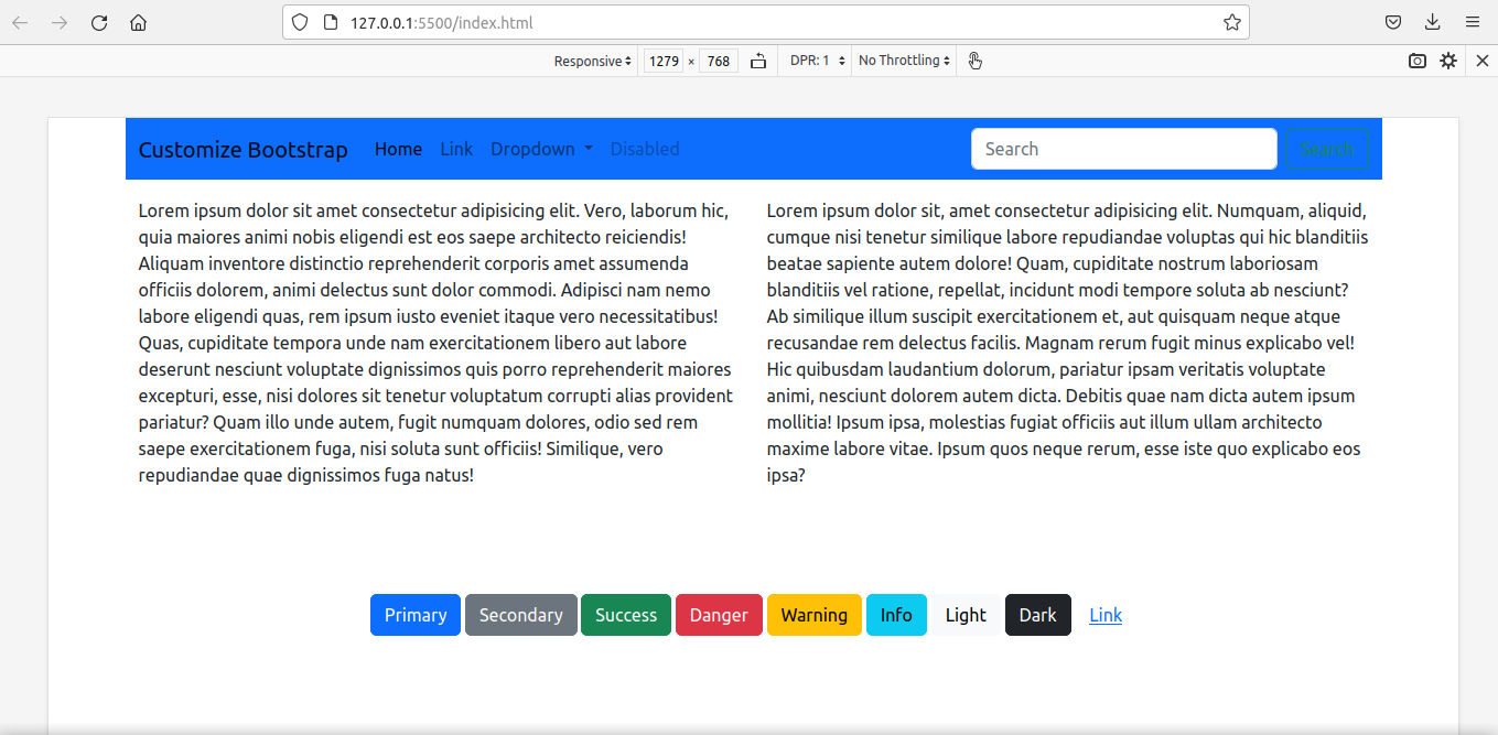
We have not compiled Sass yet. To see the default styles, run Live Server.
If Live Server is not installed, you can download the free extension from the VS Code extensions marketplace.
This is what we see:
It is time to compile our custom Sass file.
Compilation syntax is simple: Specify the source and destination folders separated with a colon.
I have my custom.scss file in a folder called custom_scss.
sass custom_scss/custom.scss:assets/css/custom_bootstrap.css
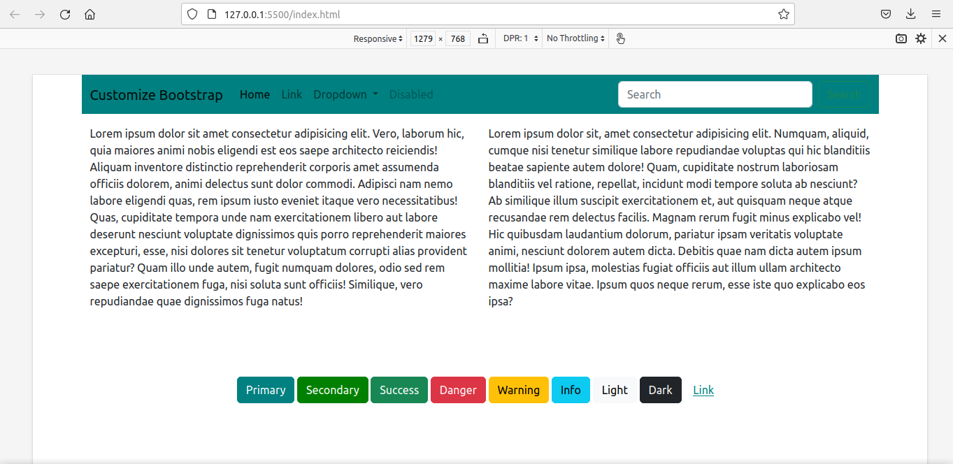
After recompiling, we have the customized bootstrap in the assets/css/custom_bootstrap.css file.
Instead of the default bootstrap file, we are going to use this customized bootstrap stylesheet.
<!-- index.html -->
<head>

<link rel="stylesheet" href="./assets/css/custom_bootstrap.css"> `

</head>
Then run the Live Server again.
We get the webpage customized with our new styles.
How to change the grid breakpoints
We'll now customize the media breakpoints. Alongside, we have to redefine container-max-widths also.
The easiest way is to simply override the variables:
$primary: teal;
$secondary:green;

$grid-breakpoints: (
  xs: 0,
  sm: 576px,
  md: 768px,
  lg: 992px,
  xl: 1280px,
  xxl: 1600px
);

$container-max-widths: (
  sm: 540px,
  md: 720px,
  lg: 960px,
  xl: 1220px,
  xxl: 1520px
);

@import '../node_modules/bootstrap/scss/bootstrap'
Since this would violate DRY principles (Don't Repeat Yourself), using the map-merge() function is a better option.
We have to import functions first in the custom.scss file to make map.merge() available.
We have to import variables also because $grid-breakpoints (to be used inside the function) is defined there.
//custom.scss

$primary: teal;
$secondary: green;

@import '../node_modules/bootstrap/scss/functions';
@import '../node_modules/bootstrap/scss/variables';
This is the code:
//custom.scss

$primary: teal;
$secondary: green;

//We have to import the functions first to use map.merge()

@import '../node_modules/bootstrap/scss/functions';

// We have to import the variables beforehand to
//use the variable $grid-breakpoints.
// Otherwise, compiler will show error - '$grid-breakpoints
//undefined.'

@import '../node_modules/bootstrap/scss/variables';

$new-breakpoints: (
    xl: 1280px,
    xxl:1600px
);

$grid-breakpoints: map-merge($grid-breakpoints, $new-breakpoints);

$new-container-max-widths: (
  xl: 1220px,
  xxl:1520px
);

$container-max-widths: map-merge($container-max-widths, $new-container-max-widths);

@import "../node_modules/bootstrap/scss/bootstrap";
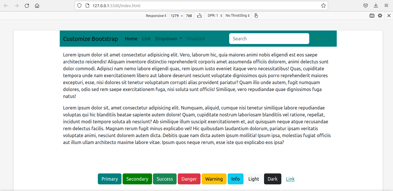
We compile again and use the newest file in place of the older one.
<link rel="stylesheet" href="./assets/css/custom_bootstrap.css">
This is the final result:
It is not just theme colors and media breakpoints. Borders, spacing, box-shadow, fonts, icons...you can customize anything.
I have put up all the above code in this GitHub repo.
For exploring further, the official Bootstrap documentation is an excellent resource in this regard.
Conclusion
In this tutorial, I've shown you how we can use Sass to customize Bootstrap.
Even if we are in a project that uses React with Bootstrap, the idea is the same. Create a custom .scss file, make customizations, import bootstrap, recompile, and then link to the customized file in place of the original bootstrap file.
Happy Learning!