By Nick McCullum
In an earlier freeCodeCamp tutorial, I explained how to create auto-updating data visualizations in Python.
Some readers reached out to ask if there was any way to make the visualizations interactive. Fortunately, an easy solution is already available!
In this tutorial, I will teach you how you can create interactive data visualization in Python. These visualizations are excellent candidates for embedding on your blog or website.
The Specific Data Visualization We Will Be Working With
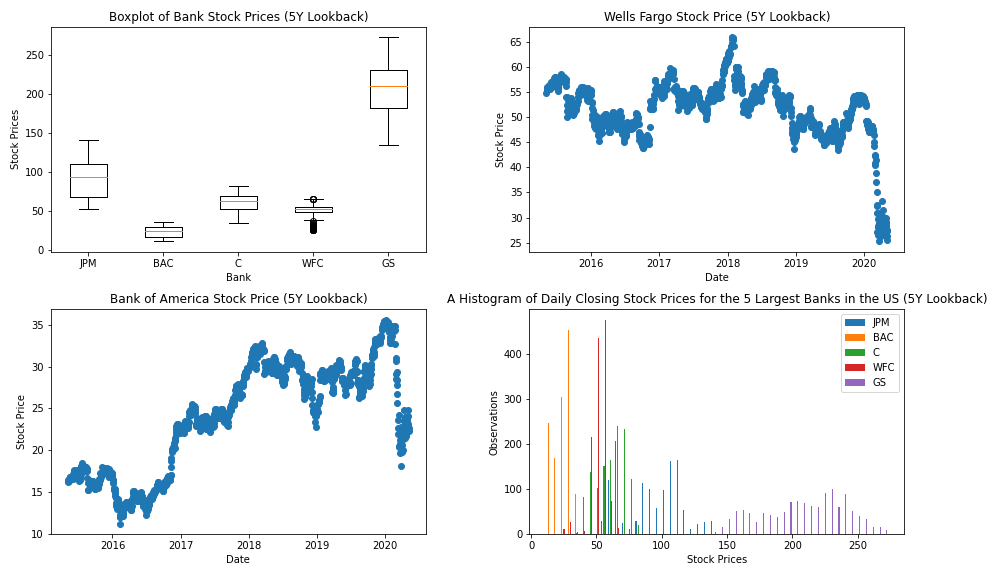
Instead of building an entire data visualization from scratch in this article, we will be working with the visualization that we created in my last tutorial.
The visualization uses pandas, matplotlib, and Python to present various data points from the 5 largest publicly-traded banks in the United States.
Here is a static image of the visualization we created:
The actual code for the visualization is included below. We covered this in the last tutorial, but please note that you will need to generate your own IEX Cloud API key and include it in the IEX_API_Key variable in order for the script to work.
########################
#Import dependencies
########################

import pandas as pd
import matplotlib.pyplot as plt

########################
#Import and clean data
########################

IEX_API_Key = ''

tickers = [
            'JPM',
            'BAC',
            'C',
            'WFC',
            'GS',
            ]

#Create an empty string called `ticker_string` that we'll add tickers and commas to
ticker_string = ''

#Loop through every element of `tickers` and add them and a comma to ticker_string
for ticker in tickers:
    ticker_string += ticker
    ticker_string += ','

#Drop the last comma from `ticker_string`
ticker_string = ticker_string[:-1]

#Create the endpoint and years strings
endpoints = 'chart'
years = '5'

#Interpolate the endpoint strings into the HTTP_request string
HTTP_request = f'https://cloud.iexapis.com/stable/stock/market/batch?symbols={ticker_string}&types={endpoints}&range={years}y&cache=true&token={IEX_API_Key}'

#Send the HTTP request to the IEX Cloud API and store the response in a pandas DataFrame
bank_data = pd.read_json(HTTP_request)

#Create an empty list that we will append pandas Series of stock price data into
series_list = []

#Loop through each of our tickers and parse a pandas Series of their closing prices over the last 5 years
for ticker in tickers:
    series_list.append(pd.DataFrame(bank_data[ticker]['chart'])['close'])

#Add in a column of dates
series_list.append(pd.DataFrame(bank_data['JPM']['chart'])['date'])

#Copy the 'tickers' list from earlier in the script, and add a new element called 'Date'.
#These elements will be the column names of our pandas DataFrame later on.
column_names = tickers.copy()
column_names.append('Date')

#Concatenate the pandas Series togehter into a single DataFrame
bank_data = pd.concat(series_list, axis=1)

#Name the columns of the DataFrame and set the 'Date' column as the index
bank_data.columns = column_names
bank_data.set_index('Date', inplace = True)

########################
#Create the Python figure
########################

#Set the size of the matplotlib canvas
fig = plt.figure(figsize = (18,8))

################################################
################################################
#Create subplots in Python
################################################
################################################

########################
#Subplot 1
########################
plt.subplot(2,2,1)

#Generate the boxplot
plt.boxplot(bank_data.transpose())

#Add titles to the chart and axes
plt.title('Boxplot of Bank Stock Prices (5Y Lookback)')
plt.xlabel('Bank')
plt.ylabel('Stock Prices')

#Add labels to each individual boxplot on the canvas
ticks = range(1, len(bank_data.columns)+1)
labels = list(bank_data.columns)
plt.xticks(ticks,labels)

########################
#Subplot 2
########################
plt.subplot(2,2,2)

#Create the x-axis data
dates = bank_data.index.to_series()
dates = [pd.to_datetime(d) for d in dates]

#Create the y-axis data
WFC_stock_prices =  bank_data['WFC']

#Generate the scatterplot
plt.scatter(dates, WFC_stock_prices)

#Add titles to the chart and axes
plt.title("Wells Fargo Stock Price (5Y Lookback)")
plt.ylabel("Stock Price")
plt.xlabel("Date")

########################
#Subplot 3
########################
plt.subplot(2,2,3)

#Create the x-axis data
dates = bank_data.index.to_series()
dates = [pd.to_datetime(d) for d in dates]

#Create the y-axis data
BAC_stock_prices =  bank_data['BAC']

#Generate the scatterplot
plt.scatter(dates, BAC_stock_prices)

#Add titles to the chart and axes
plt.title("Bank of America Stock Price (5Y Lookback)")
plt.ylabel("Stock Price")
plt.xlabel("Date")

########################
#Subplot 4
########################
plt.subplot(2,2,4)

#Generate the histogram
plt.hist(bank_data.transpose(), bins = 50)

#Add a legend to the histogram
plt.legend(bank_data.columns,fontsize=10)

#Add titles to the chart and axes
plt.title("A Histogram of Daily Closing Stock Prices for the 5 Largest Banks in the US (5Y Lookback)")
plt.ylabel("Observations")
plt.xlabel("Stock Prices")

plt.tight_layout()

################################################
#Save the figure to our local machine
################################################

plt.savefig('bank_data.png')
Now that we have an understanding of the specific visualization we'll be working with, let's talk about what it means for a visualization to be interactive.
What Does It Mean for a Visualization to be Interactive?
There are two types of data visualizations that are useful to embed on your website.
The first type is a static visualization. This is basically an image - think .png or .jpg files.
The second type is a dynamic visualization. These visualizations change in response to user behavior, usually by panning or zooming. Dynamic visualizations are not stored in .png or .jpg files but usually in svg or iframe tags.
This tutorial is about creating dynamic data visualizations. Specifically, the visualization we want to create will have the following characteristics:
- You will click a button in the bottom left to enable dynamic mode.
- Once dynamic mode is enabled, you can zoom and pan the visualization with your mouse.
- You can also crop and zoom to a specific section of the visualization.
In the next section of this tutorial, you will learn how to install and import the mpld3 library, which is the Python dependency that we'll use to create our interactive charts.
How to Import the mpld3 Library
To use the mpld3 library in our Python application, there are two steps that we need to complete first:
- Install the
mpld3library on the machine we're working on. - Import the
mpld3library into our Python script.
First, let's install mpld3 on our local machine.
The easiest way to do this is using the pip package manager for Python3. If you already have pip installed on your machine, you can do this by running the following statement from your command line:
pip3 install mpld3
Now that mpld3 is installed on our machine, we can import it into our Python script with the following statement:
import mpld3
For readability's sake, it is considered a best practice to include this import along with the rest of your imports at the top of your script. This means that your import section will now look like this:
########################
#Import dependencies
########################

import pandas as pd
import matplotlib.pyplot as plt
import mpld3
How To Transform a Static matplotlib Visualizations into an Interactive Data Visualization
The mpld3 library's main functionality is to take an existing matplotlib visualization and transform it into some HTML code that you can embed on your website.
The tool we use for this is mpld3's fig_to_html file, which accepts a matplotlib figure object as its sole argument and returns HTML.
To use the fig_to_html method for our purpose, simply add the following code to the end of our Python script:
html_str = mpld3.fig_to_html(fig)
Html_file= open("index.html","w")
Html_file.write(html_str)
Html_file.close()
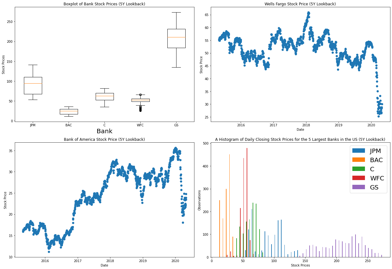
This code generates the HTML and saves it under the filename index.html in your current working directory. Here's what this looks like when rendered to a webpage:
When you hover over this visualization, three icons will appear in the bottom left. The left icon returns the visualization to its default appearance. The middle icon enables dynamic mode. The right icon allows you to crop and zoom to a specific spot in the visualization.
A Common Error With Working With pandas and mpld3
When creating the interactive visualization in this tutorial, you may come across the following error generated by mpld3:
TypeError: array([ 1.]) is not JSON serializable
Fortunately, there is a well-documented solution to this error on GitHub.
You need to edit the _display.py file found in Lib\site-packages\mpld3 and replace the NumpyEncoder class by this one:
class NumpyEncoder(json.JSONEncoder):
    """ Special json encoder for numpy types """

    def default(self, obj):
        if isinstance(obj, (numpy.int_, numpy.intc, numpy.intp, numpy.int8,
            numpy.int16, numpy.int32, numpy.int64, numpy.uint8,
            numpy.uint16,numpy.uint32, numpy.uint64)):
            return int(obj)
        elif isinstance(obj, (numpy.float_, numpy.float16, numpy.float32,
            numpy.float64)):
            return float(obj)
        try: # Added by ceprio 2018-04-25
            iterable = iter(obj)
        except TypeError:
            pass
        else:
            return list(iterable)
         # Let the base class default method raise the TypeError
        return json.JSONEncoder.default(self, obj)
Once this replacement is made, then your code should function properly and your index.html file should generate successfully.
Final Thoughts
In this tutorial, you learned how to create interactive data visualizations in Python using the matplotlib and mpld3 libraries. Here is a specific summary of what we covered:
- The definition of a dynamic data visualization
- How to install and import the
mpld3library for Python - How to use the
mpld3library to transform amatplotlibvisualization into a dynamic visualization that you can embed on your website - How to fix a common error that users of the
mpld3library experience
This tutorial was written by Nick McCullum, who teaches Python and JavaScript development on his website.