![Astro UI Framework [Full Book]](https://www.freecodecamp.org/news/content/images/size/w2000/2023/06/large-heading.png)
By Emmanuel Ohans
Astro is a new UI framework that's designed for speed. And if you want to learn how to use it, you've come to the right place.
Table of Contents
- Introduction
- Chapter 1: Build your first Astro Application
- Chapter 2: Astro Components In-depth
- Chapter 3: Build Your Own Component Island
- Chapter 4: The Secret Life of Astro Component Islands
- Chapter 5: Oh my React! (How to Build a React Documentation Site Clone)
- Chapter 6: Server-side Rendering (SSR) in Astro
- Chapter 7: Be Audible! (How to Build a Fullstack Astro Project)
- Chapter 8: Build Your Own Astro Integrations
- Conclusion

Introduction
I'm not one of those bandwagon-jumping folks who drool over every shiny new library or framework that hits the scene just because it's trending. I'm more of a "wait-and-see" kinda person.
So, you're probably wondering why I wrote a book about the reasonably new UI framework, Astro.
Well, let me tell you.
I’ve been in this game for almost a decade now, and I've seen frameworks come and go like a bad case of indigestion. And Astro may not live forever, either.
But here's the thing: when you use a new UI framework, it's not just about getting stuff to work and slapping some apps together willy-nilly. No, no, no. The real magic lies in understanding the principles and concepts behind the framework's creation. And that's exactly the mindset I had when I wrote this book.
You’ve got to ask yourself: what makes this framework so unique? How is it different from all the other fluff out there? How can you apply its mental model to the bigger picture of developing applications for the web? Plus, what framework-agnostic principles can you pick up along the way?
The good news is I've got answers to all these burning questions sprinkled throughout the book like confetti.
Now, let's talk about performance, shall we? Of course, that’s a whole different ballgame depending on what kind of application you're dealing with. But for specific applications, for example content-focused applications, Astro is a total game-changer. Its performance defaults are off the charts.
The more I researched Astro, the more I was fascinated to write this book.
And here's the kicker: this book goes beyond just Astro. In specific chapters, we will discuss concepts you can apply to whatever framework you work with. And that's not just cool – that’s downright practical.
Astro is paving the way for a new architecture on the web: the component island architecture. And my goal is to help you understand it well enough to build some seriously robust production applications.
So, don't just scratch the surface. Instead, let’s dive deep and get to know this framework.
This is why I am writing this book. And hey, six months in, and I’m still loving it.
So, what are you waiting for? Grab your favourite drink (tea over coffee, here), dig in, and let's get building!
Cheers 🥂
A Note About This Book
Okay, if you haven’t already noticed, I write like I speak. I use plain language and analogies that even my nan could (potentially) understand — when I do it right.
This book does not read in a typical technical documentation style—sorry, fellow nerds.
In my opinion, technical books should be easy on the eyes and a breeze to read. And why not have a bit of a laugh while we're at it?
If you're up for a good time while you learn a thing or two (well, a lot more), then let's get cracking!
This Book vs the Official Documentation
Some resources just parrot the official documentation. But I don't find these very helpful.
As such, this book differs from the official documentation in a couple of ways:
- The tone of writing: this book adopts a non-technical documentation writing style for ease of understanding. Whether you appreciate this or not is left to your taste.
- Doesn’t follow the Diataxis framework: the Astro technical documentation is written following the Diataxis framework. The framework suggests structuring content around four distinct types: tutorial, how-to-guide, explanation, and reference.
This book breaks out of this strict structure to emphasise understanding and practical learning. This book is not a reference and doesn’t aim to replace the official Astro references. In the Diataxis lingo, understanding Astro may be defined as a mix of how-to guides and a careful blend of tutorials with elaborate explanations interwoven. - Advanced usage: some advanced Astro uses are tucked away in the official references – without explanations or practical examples. This is perfectly fine for a documentation site. Experienced engineers can spend time digging into these. However, this book bridges the gap.
For example, consider building custom Astro integrations. You will not find a better (practical) resource than this book. - Real-world applications: sometimes, to piece together a puzzle, it’s essential to see it at play in near real-world examples. This book explains important concepts and goes beyond that to put them to practice in comparative real-world examples.
- Saves time: This book will save you countless hours tinkering with references and code samples as a by-product of the above distinctions. Yes, you can spend hours digging deep into the docs or Astro source code, but I’ve spent hours (months, actually) doing so! So I can present the learnings without you doing as much of the work. But don’t be fooled – you still have to do the work of reading the book.
Consider reading (or skimming) the official documentation after reading this book or using it as a reference. This book complements the official docs, it does not replace them.
How the Book is Structured
Every chapter in this book is one of the following:
- A concept chapter
- A project chapter
- A project and concept chapter
The mix of these different chapter types will keep you engaged and make your learning effective. Remember, the goal is proper understanding.
Concept chapters
 Concept chapters are the foundational chapters for the rest of the book.
In concept chapters, we’ll learn the core concepts of Astro. These chapters will include code examples and throwaway applications. We will build no real-world projects in these chapters.
Project chapters
 Showtime! Bring together what we've learned to build a real-world project.
In project chapters, we’ll apply previous concepts we’ve learned towards building a near real-world project.
Concept and project chapters
 Bring together the best of the worlds. Build and learn new concepts along the way.
A project and concept chapter focuses on building a real-world application while introducing new concepts.
Chapters Overview
Below’s a summary of the chapters of the book:
Chapter 1: Build your first application with Astro
The book begins hands-on with a project and concept chapter.
In this chapter, we’ll learn the basics of Astro while building a feature-rich personal website.
Chapter 2: Astro components in-depth
This is a concept chapter that goes in-depth into Astro components. We will go beyond the basics and master (arguably) the essential Astro entity.
We will start by exploring an argument to ditch the JavaScript runtime overhead where appropriate. We will then study the behaviour of Astro component markup, styles and scripts, and the powerful template syntax.
Chapter 3: Build your own component island
This project chapter moves away from Astro and considers the component island architecture in isolation.
We will consider an overview of application rendering, comprehend the island architecture from the ground up, and build our own implementation from scratch.
This chapter will solidify your fundamental knowledge of the new web performance-focused architecture pattern.
Chapter 4: The Secret Life of Astro Component Islands
This is a concept chapter where we’ll get hands-on experience working with framework components in Astro. I’ll introduce you to responsible hydration and why it matters.
We will build many throwaway applications to explore how component islands work in Astro and why they are significant.
Chapter 5: Oh My React! (The React Documentation Site Clone)
In this project and concept chapter, we will explore techniques for handling large amounts of content within an Astro application. Additionally, we will examine real-world use cases to provide practical examples.
This chapter will solidify the previous concepts learned and introduce some new ones while we build out a clone of the React documentation site with production best practices.
Chapter 6: Server-side rendering (SSR) in Astro
This concept chapter will explore server-side rendering and the new features unlocked in an Astro server-side rendered application. We will explore dynamic routing, API endpoints, Server streaming, and much more.
Chapter 7: Be Audible! (Full stack Astro Project)
This project chapter will take you beyond static sites into building full stack applications with Astro. In this chapter, I’ll argue that if you can build the app as an MPA and leverage component islands, you can build it with Astro.
Chapter 8: Build your own Astro integrations
This is a project and concept chapter where we’ll answer the question, what happens when you want a feature outside what Astro provides by default?
We will leverage hooks into Astro’s build process to build custom functionalities. These are called Astro integrations.
Chapter 9: Conclusion
Here, we will step back and appreciate how far we’ve come. Then we will reiterate the features that make Astro stand out. Features you’ve already seen in practice!
This is where our journey likely ends, and your journey into the world of Astro begins.
Prerequisites
I tried to make this book “work for everyone”, but that’s incredibly difficult.
So, to make the best out of this book:
- You should already know some HTML, CSS and JS: this is not a web development beginner guide.
- You should already know the basics of TypeScript: I don’t expect you to be a TypeScript champion, but surface-level understanding will prepare you for all the TypeScript in this book.
I wrote this book specifically for mid, senior, and senior+ engineers, and the book contains chapters of varying technical difficulty. But I’ve done my best to explain these clearly and visually to satisfy different skill levels.
Typographic Conventions
When text is written in a monospaced font, it typically represents code samples. These samples may be self-contained fragments or refer to a specific section of an application's code.
Below’s an example:
---
const { author } = Astro.props;
const book = "Understanding Astro.js";
---

<h1 data-name={book}>A new book</h1>
Sometimes, to show the source of the code, I added a comment to the file path at the top of the code block, as shown below:
{/** 📂 src/pages/index.astro **/}
---
const { author } = Astro.props;
const book = "Understanding Astro.js";
---

<h1 data-name={book}>A new book</h1>
With code fragments referring to changes in a nearby application code, you’ll find an ellipsis to signify no code changes in the previous code, like this:
// ...
<h1 data-name={book}>A changed book name</h1>
The code above suggests the previous code block remains the same, except for the new <h1> with A changed book name.
Finally, the book uses the npm package manager. For example, the code to install a package will be described as shown below:
npm install some-package
You can use the associated commands for other package managers, such as yarn or pnpm.
Phew! That’s enough housekeeping. Now, let’s dive into Astro!
Want to get the eBook?

- 500+ pages of value
- 4+ practical project chapters
- 100+ carefully crafted illustrations and images
- Learn techniques to build faster applications
- Integrate React, Svelte, Vue, Tailwind and more into an Astro project
- Learn to build your own component islands implementation from scratch
- Learn to build full stack applications with Astro (without sacrificing performance)
- Go beyond the basics and parse Astro code into ASTs and build custom project features
Download the free ebook on GitHub.
 Chapter one.
Chapter 1: Build your first Astro Application
"Long is the road to learning by precepts, but short and successful by examples." – Seneca the Younger.
This essay will get started with the basics of Astro by building a practical application: a personal website. To view the complete application, see the GitHub repo.
What you’ll learn
- Build a personal website with Astro.
- Set up a local development environment for Astro.
- Familiarity with Astro components, layouts, and pages.
- A working knowledge of styles and scripts in Astro.
- Theming Astro sites via CSS variables.
- Leveraging markdown pages for ease.
- Deployment of a static Astro application.
Project Overview
I remember my first commercial web development project. In retrospect, it was a disaster. One built by a passionate self-taught engineer, but a disaster still.
Let’s make your first Astro project one you’ll remember for good.
Getting started
Astro is a web framework designed for speed. Before we get to the good stuff, let’s ensure we’re both on the same page.
Install Node.js
Firstly, make sure you have Node.js installed.
If you're unsure, run node --version in your terminal. You will get back a Node version if you have Node.js installed.
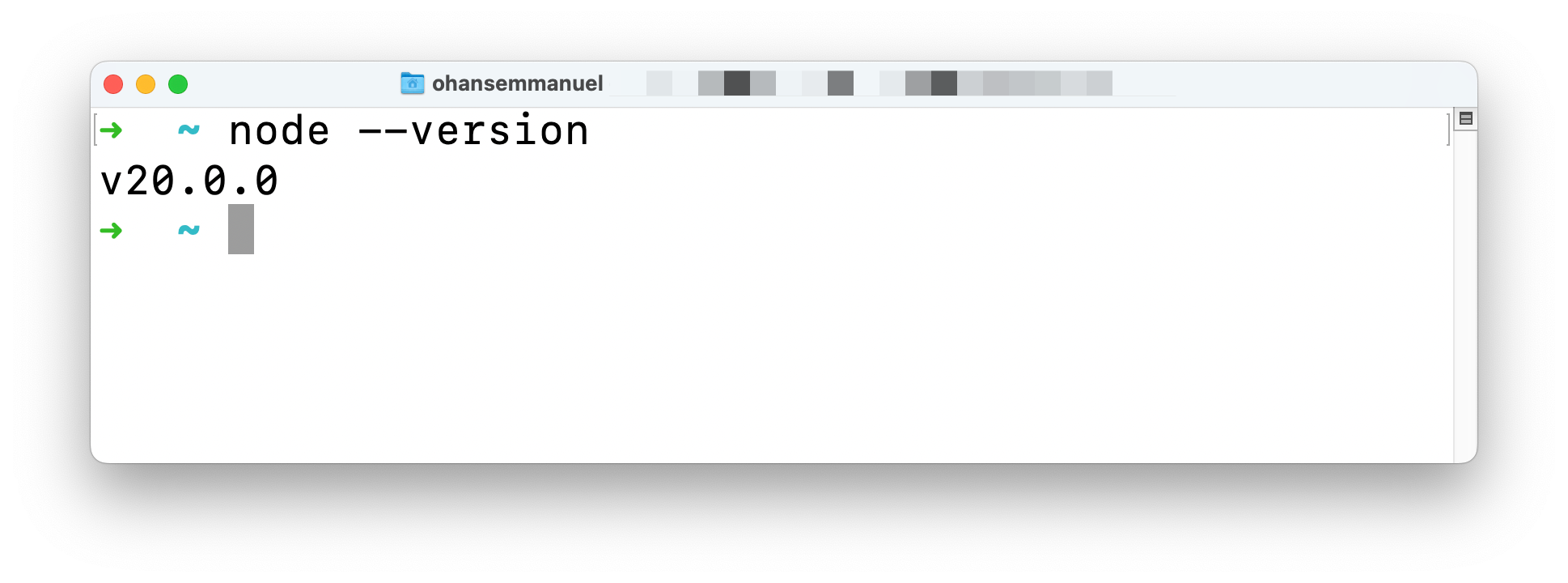 Get NodeJS version from the CLI.
Don’t have Node installed? Then, visit the official download page and install the necessary package for your operating system. It’s as easy as installing any other computer program. Click, click, click!
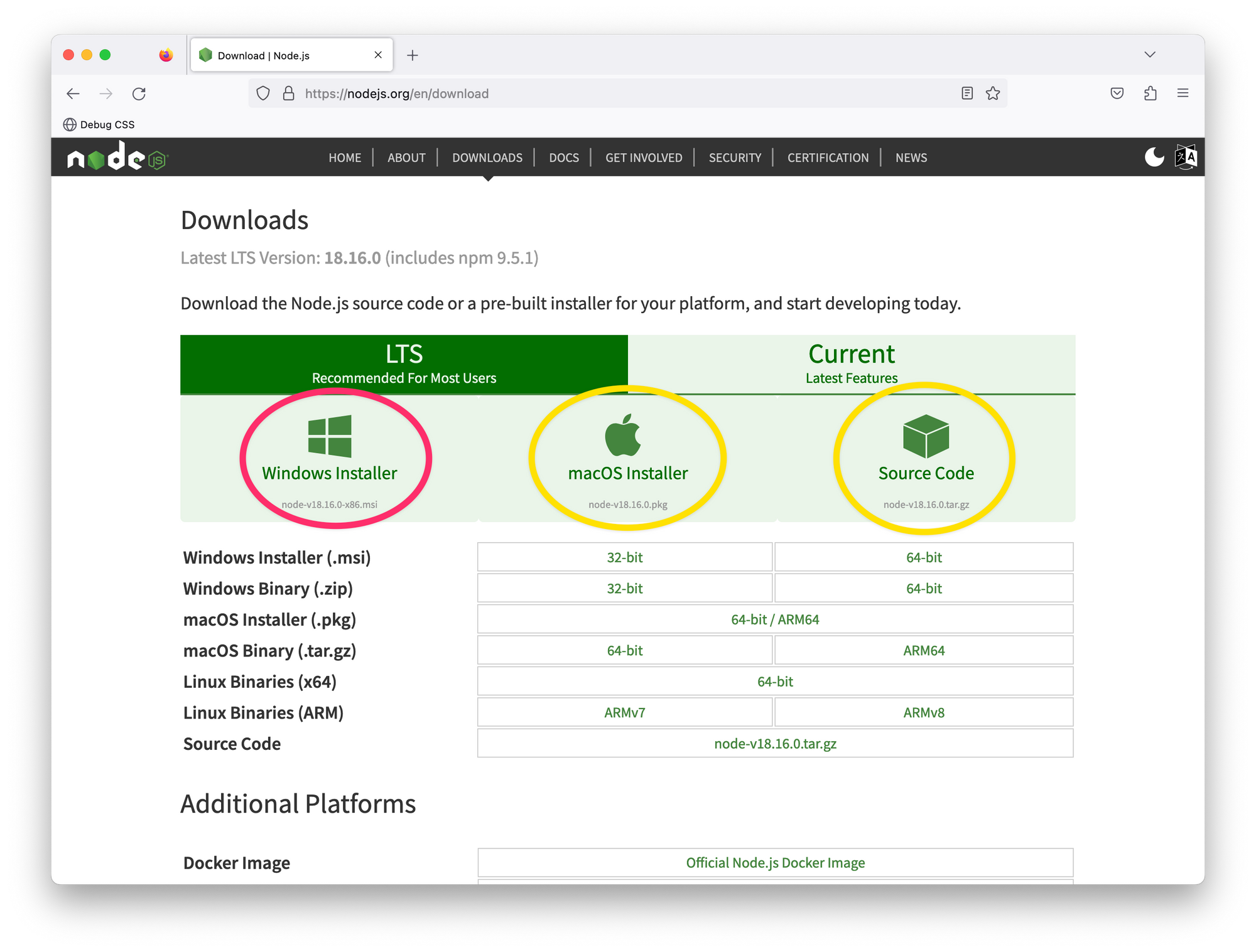 The NodeJS download page.
How to set up your code editor
I’ll avoid any heated debate(s) on what code editor you should be writing software with. Quite frankly, it doesn't matter to me.
However, I use Visual Studio Code (VSCode).
You can develop Astro applications with any code editor, but VSCode is also the officially recommended editor for Astro.
If you’re building with VSCode, install the official Astro extension. This helps with syntax and semantic highlighting, diagnostic messages, IntelliSense, and more.
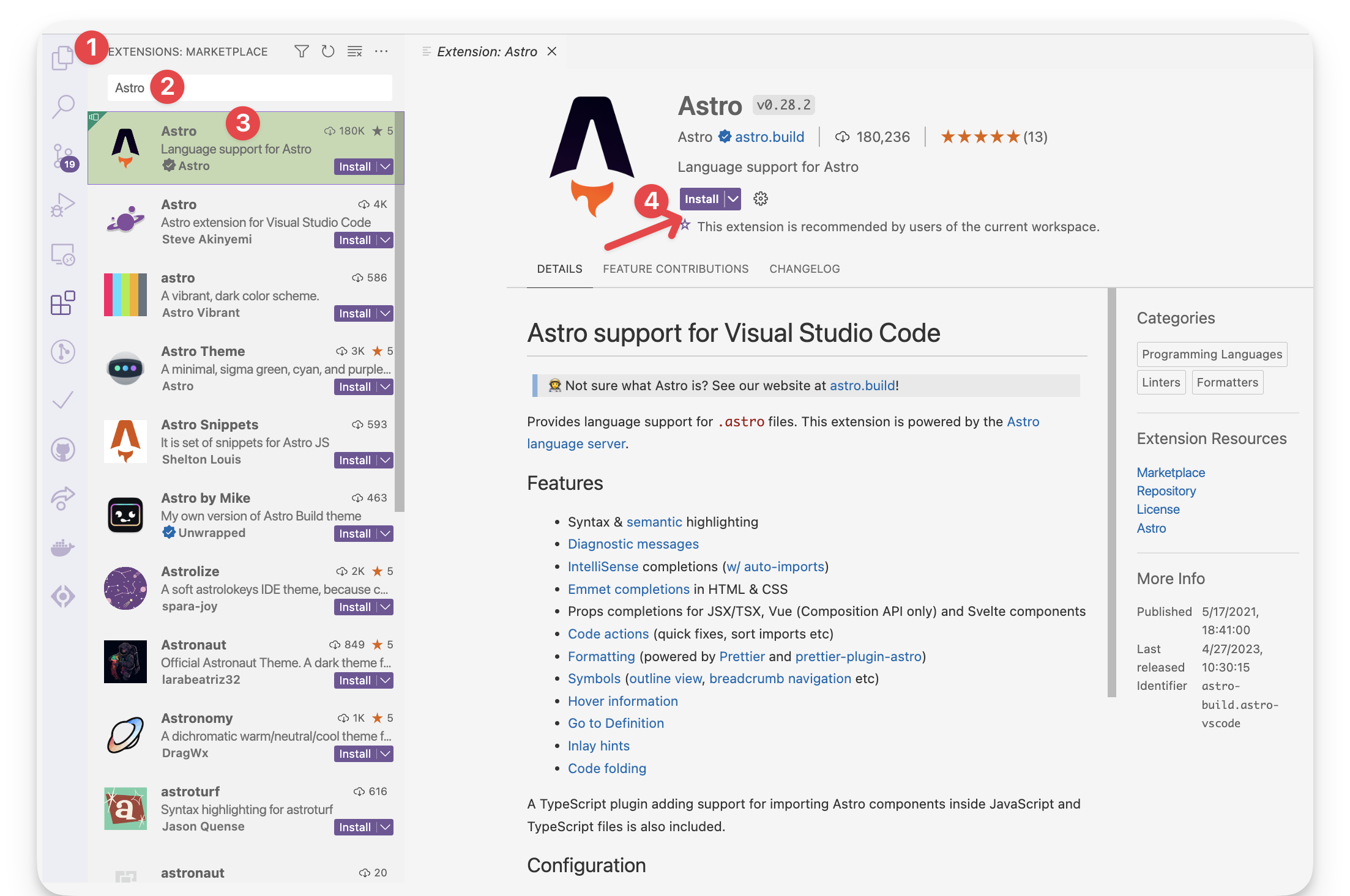 The official Astro VSCode extension.
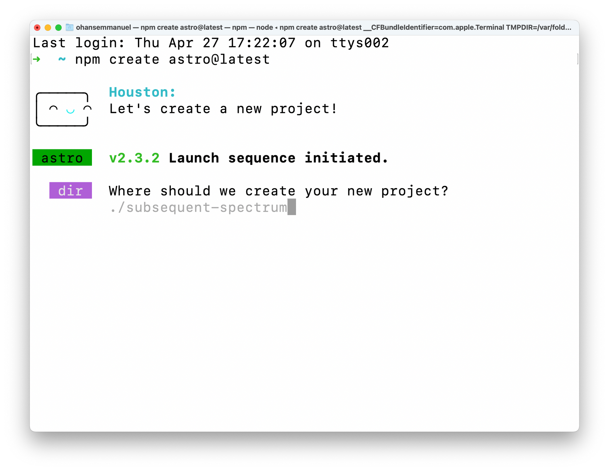
Let’s now get started setting up our first Astro project. To do this, we must install Astro. The fastest way to do this is to use the Astro automatic CLI.
To start the install wizard, run the following command:
npm create astro@latest
If on pnpm or yarn, the command looks as follows:
# using pnpm
pnpm create astro@latest


# using yarn
yarn create astro
 Starting a new project with the Astro CLI wizard.
This will start the wizard, which will guide us through helpful prompts. It’s important to mention that we can run this from anywhere on our machine and later choose where exactly we want the project created.
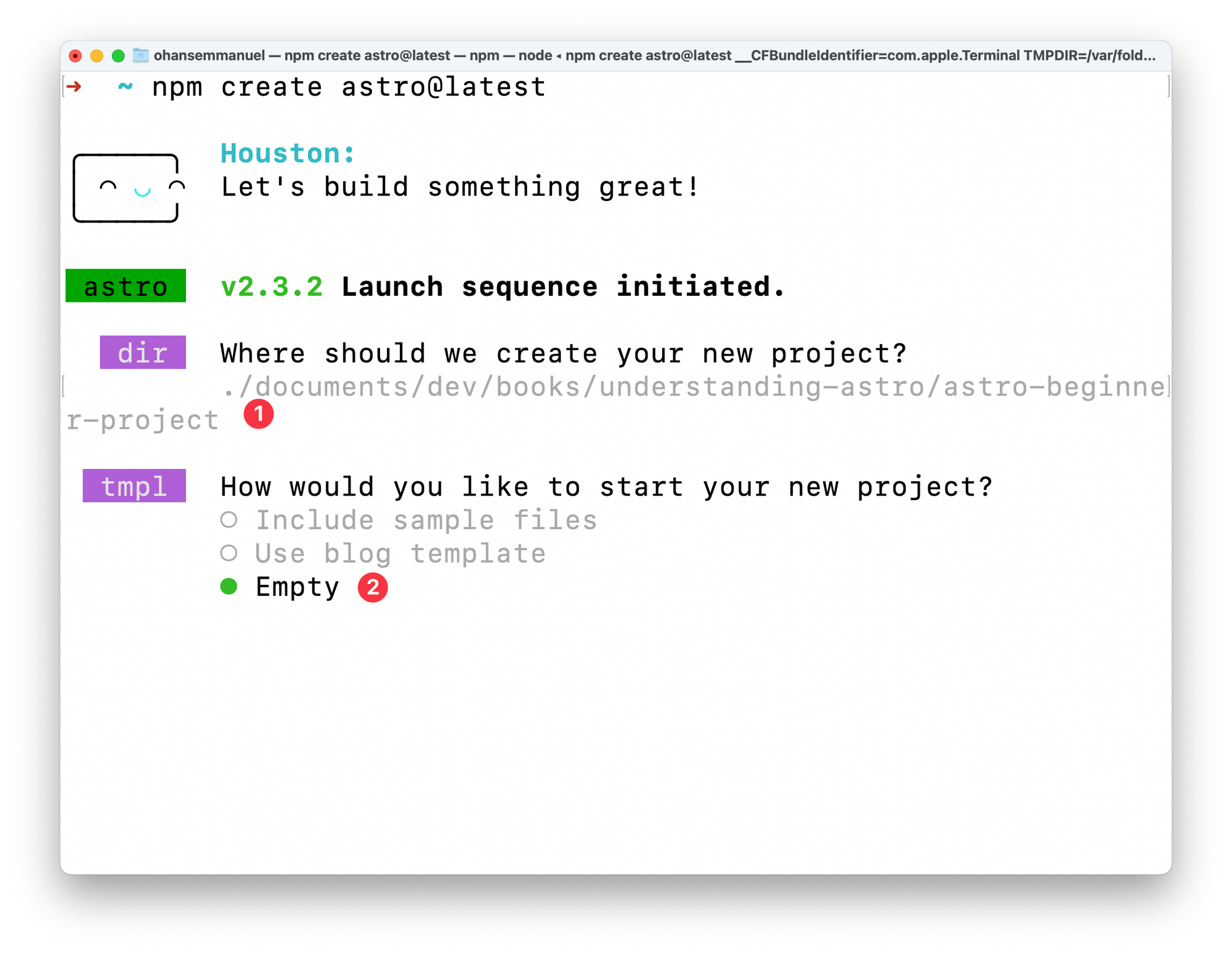
When asked, “Where should we create your new project?” go ahead and pass a file path. In my case, this is documents/dev/books/understanding-astro/astro-beginner-project.
Alternatively, we could have run the npm create astro@latest command in our desired directory and just entered a shorter file path, for example, ./astro-beginner-project.
When asked, “How would you like to start your new project?” go ahead and choose “Empty”.
 Answering the template CLI prompt.
We want a fresh start to explore Astro from the ground up.
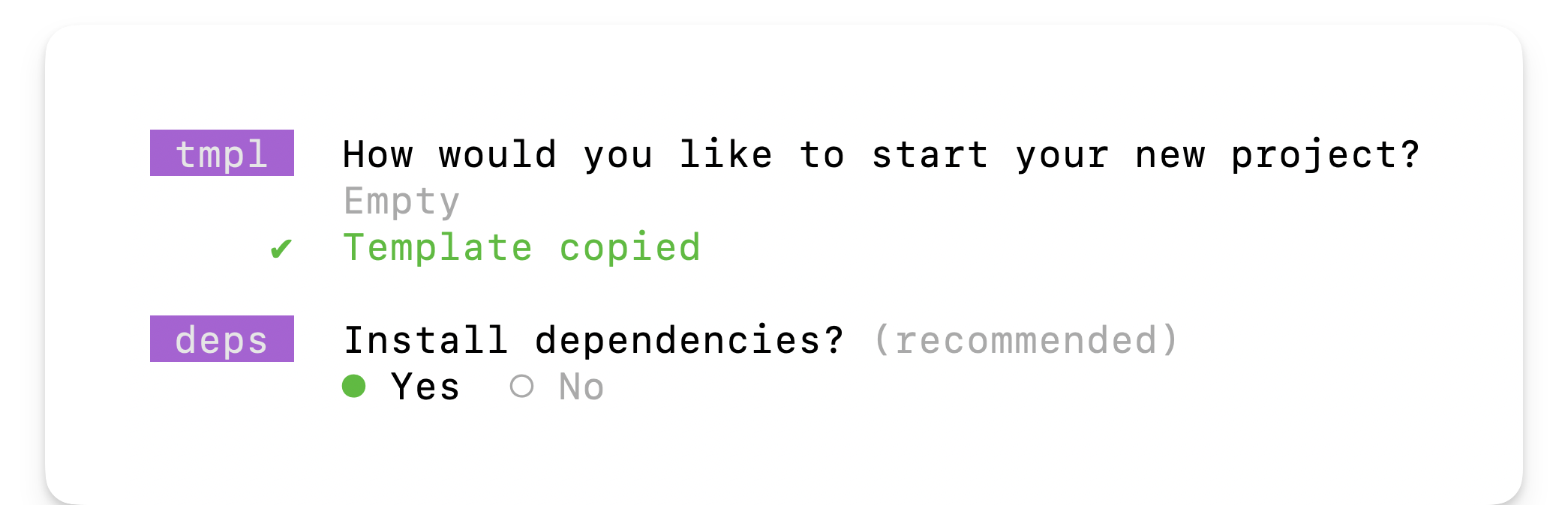
Now, we will be asked whether to install dependencies or not. Select yes and hit enter to continue the installation.
 Installing dependencies in the CLI prompt.
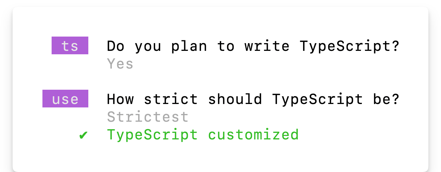
Once the dependencies are installed, answer the “Do you plan to write TypeScript?” prompt with a yes and choose the “strictest” option.
We want strong type safety.
 Choosing Typescript in the CLI prompt.
Afterwards, answer the “Initialise a new Git repository?” question with whatever works for you. I’ll go with a yes here and hit enter.
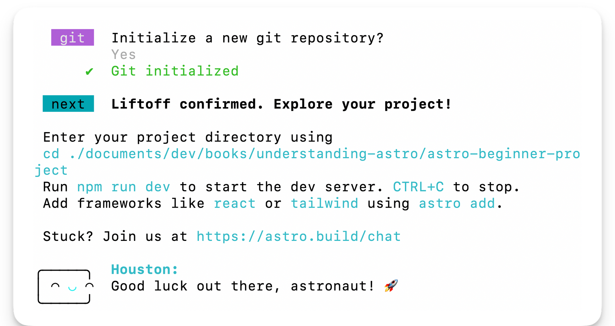 Initialising git in the CLI prompt.
And voilà! Believe it or not, our new project is already created and ready to go!
Change into the directory where you set up the project. In my case, this looks like the following:
cd ./documents/dev/books/understanding-astro/astro-beginner-project
And then run the application via the following:
npm run start
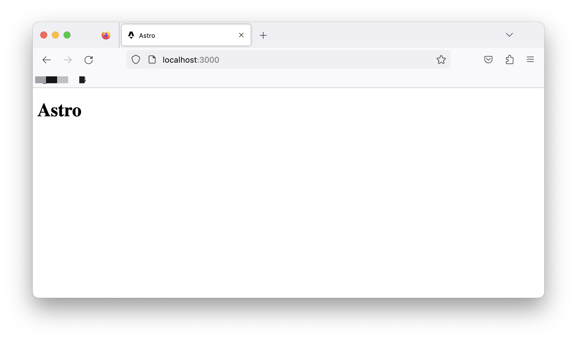
This will start the live application on an available local port 🚀
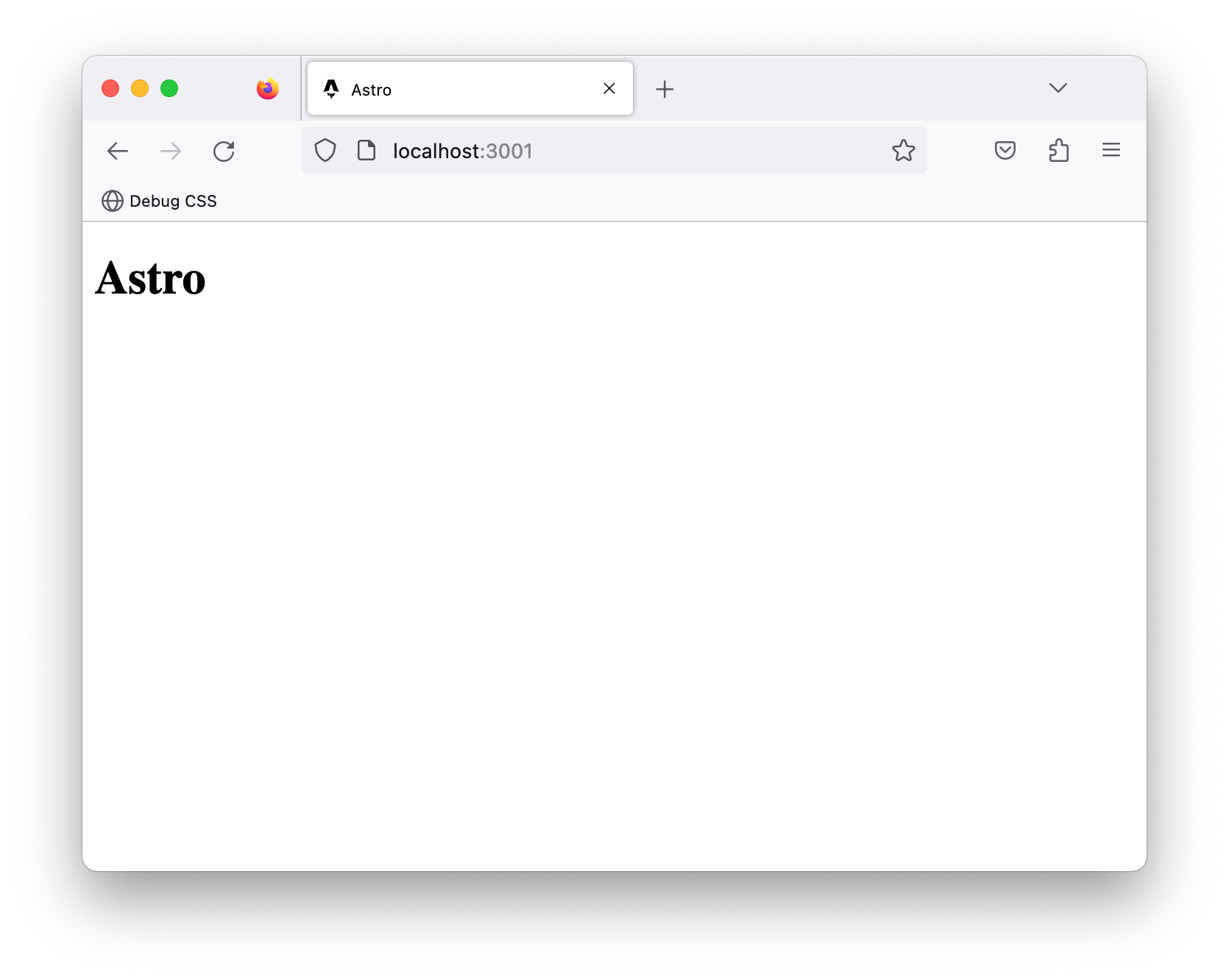 The basic Astro project running on localhost:3000
Project Structure
Open the newly created project in your code editor, and you’ll notice that the create astro CLI wizard has included some files and folders.
Astro has an opinionated folder structure. We can see some of this in our new project. By design, every Astro project will include the following in the root directory:
| File / Directory | What? |
|---|---|
|
astro.config.mjs |
The Astro configuration file. This is where we provide configuration options for our Astro project. |
|
tsconfig.json |
A Typescript configuration file. This specifies the root files and Typescript compiler options. |
|
package.json |
A JSON file that holds the project metadata. This is typically found at the root of most Node.js projects. |
|
public/ |
This directory holds files and assets that will be copied into the Astro build directory untouched, e.g., fonts, images and files such as robots.txt |
|
src/ |
The source code of our project resides here. |
Let’s now look at the files in our newly generated project.
tsconfig.json file
The content of our tsconfig.json file is the following:
{
  "extends": "astro/tsconfigs/strictest"
}
The extends property points to the base configuration file path to inherit from, that is, inherit the typescript configuration from the file in astro/tsconfigs/strictest.
Using your editor, navigate to the referenced path – for example in vscode by clicking on the link while holding CMD. This will navigate us to node_modules/astro/tsconfigs/strictest.json, where we’ll find a well-annotated file:
{
  ...
  "compilerOptions": {
    // Report errors for fallthrough cases in switch statements
    "noFallthroughCasesInSwitch": true,

    // Force functions designed to override their parent class to be specified as `override`.
    "noImplicitOverride": true,

    // Force functions to specify that they can return `undefined` if a possible code path does not return a value.
    "noImplicitReturns": true,
     ...
  }
}
This is very well annotated, so we won’t spend time on this. But the compilerOptions for TypeScript are set in this file. The point to make here is Astro keeps a list of TypeScript configurations (base, strict and strictest) that our project leverage when we initialise via the CLI wizard.
In this example, we’ll leave the tsconfig.json file as is. TypeScript (and consequently the tsconfig.json file) is optional in Astro projects. But I strongly recommend you leverage TypeScript. We’ll do so all through the book.
package.json file
The package.json file is easy to reason about. It holds metadata about our project and includes scripts for managing our Astro project, like npm start, npm run build, and npm preview.
package-lock.json file
The package-lock.json file is an autogenerated file that holds information on the dependencies/packages for our project. We won’t be touching this file manually. Instead, it is automatically generated (and updated) by npm.
Note that a project’s lock file may differ depending on the package manager, for example yarn or pnpm.
astro.config.mjs file
Most frameworks define a way for us to specify our project-specific configurations. For example, Astro achieves this via the astro.config file.
import { defineConfig } from 'astro/config';

export default defineConfig({});
At the moment, it defines an empty configuration. So we’ll leave it as is. But this is the right place to specify different build and server options, for example.
src/env.d.ts file
d.ts files are called type declaration files. Yes, that’s for TypeScript alone, and they exist for one purpose: to describe the shape of some existing module. The information in this file is used for type checking by TypeScript.
/// <reference types="astro/client" />
The content of the file points to astro/client. This is essentially a reference to another declaration file at astro/client.d.ts
src/pages/index.astro file
As mentioned earlier, the src folder is where the source code for our project resides. But what’s the pages directory, and why’s there an index.astro file?
First, consider the contents of the index.astro file:
---
---

<html lang="en">
  <head>
    <meta charset="utf-8" />
    <link rel="icon" type="image/svg+xml" href="/favicon.svg" />
    <meta name="viewport" content="width=device-width" />
    <meta name="generator" content={Astro.generator} />
    <title>Astro</title>
  </head>
  <body>
    <h1>Astro</h1>
  </body>
</html>
You’ll notice that it looks remarkably similar to standard HTML, with some exceptions.
Also, notice what’s written within the <body> tag: an <h1> element with the text Astro.
If we visit the running application in the browser, we have the <h1> rendered.
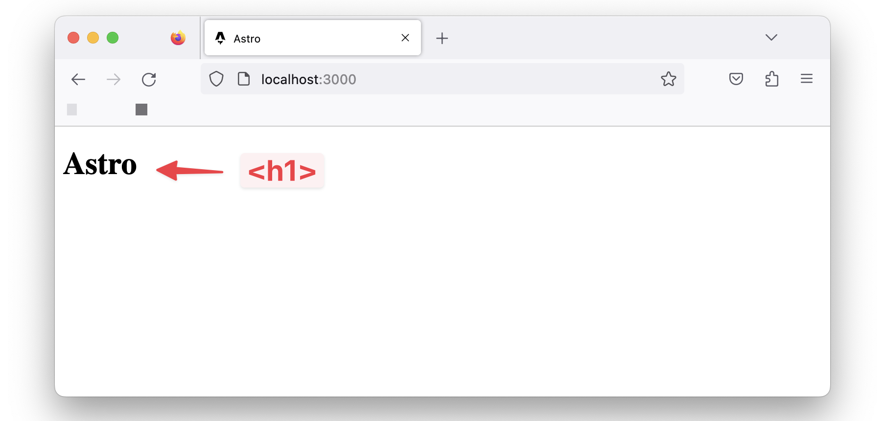 The rendered page heading.
Now change the text to read <h1>Hello world</h1> and notice how the page is updated in the browser:
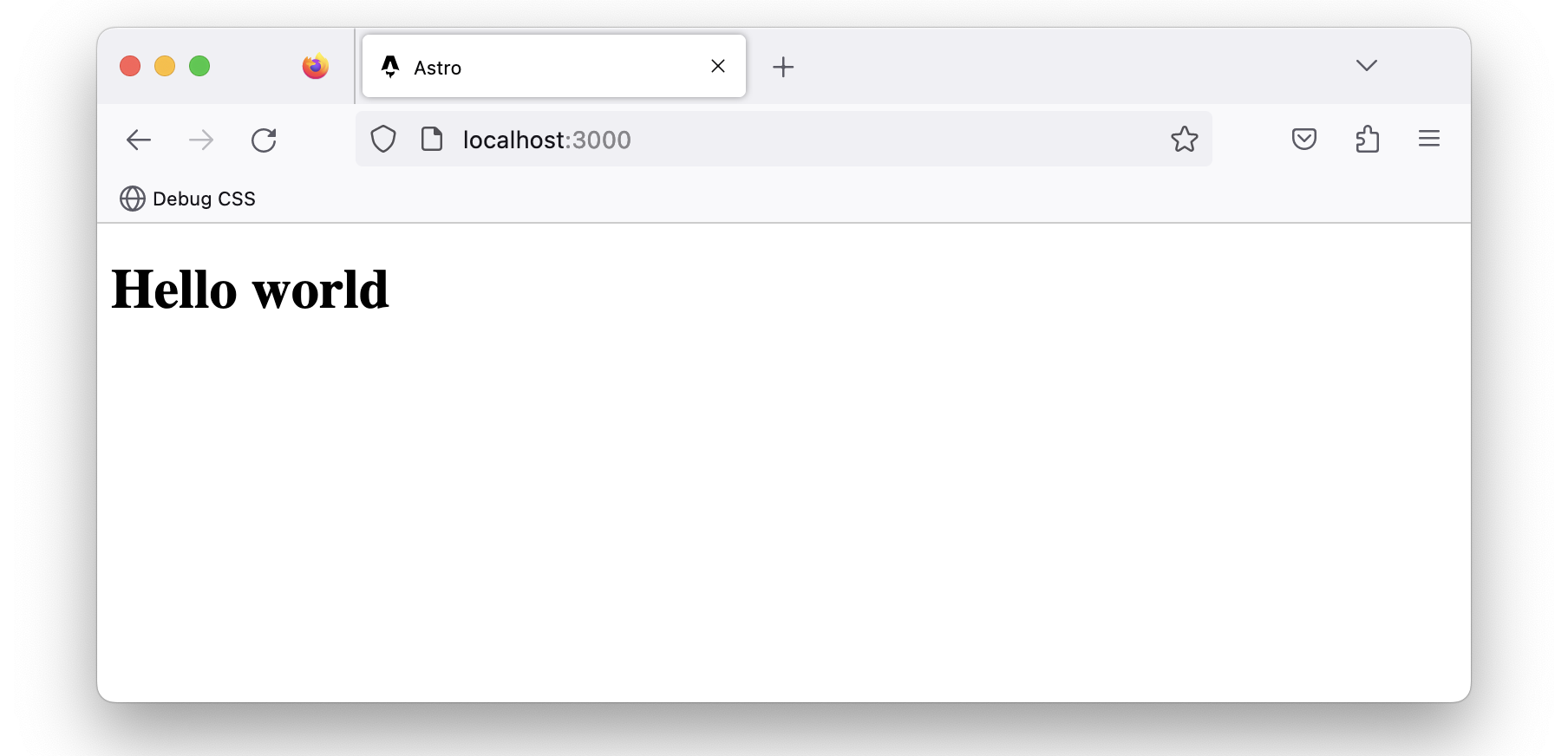 The updated page heading.
This leads us nicely to discuss pages in Astro — what I consider the entry point to our application.
Introduction to Astro Pages
Astro leverages a file-based routing system. It achieves this by using the files in the src/pages directory.
For example, the src/pages/index.astro file corresponds to the index page served in the browser.
 The project’s index page.
Let’s go ahead and create an src/pages/about.astro page with similar content to index.astro as shown below:
// 📂 src/pages/about.astro
---
---

<html lang="en">
  <head>
    <meta charset="utf-8" />
    <link rel="icon" type="image/svg+xml" href="/favicon.svg" />
    <meta name="viewport" content="width=device-width" />
    <meta name="generator" content={Astro.generator} />
    <title>About us</title>
  </head>
  <body>
    <h1>About us</h1>
  </body>
</html>
- Copy and paste the exact content of
index.astroinabout.astro. - Change the
<h1>to have the textAbout us.
Now, if we navigate to /about in the browser, we should have the new page rendered.
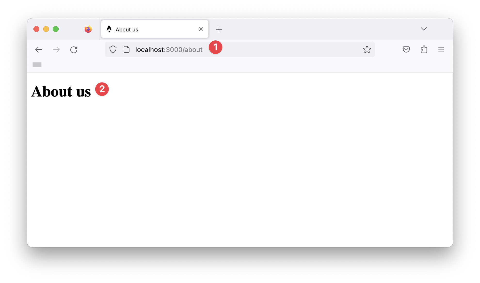 The “About us” page.
What makes a valid Astro page?
We’ve defined Astro pages as files in the src/pages/directory. Unfortunately, this is only partly correct.
For example, if we duplicate the favicon.svg file in public/favicon.svg into the pages directory, does this represent a favicon page?
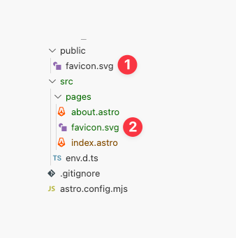 Duplicating the favicon in the pages directory.
Even though index.astro and about.astro correspond to our website’s index and about pages, /favicon will return a 404: Not found error.
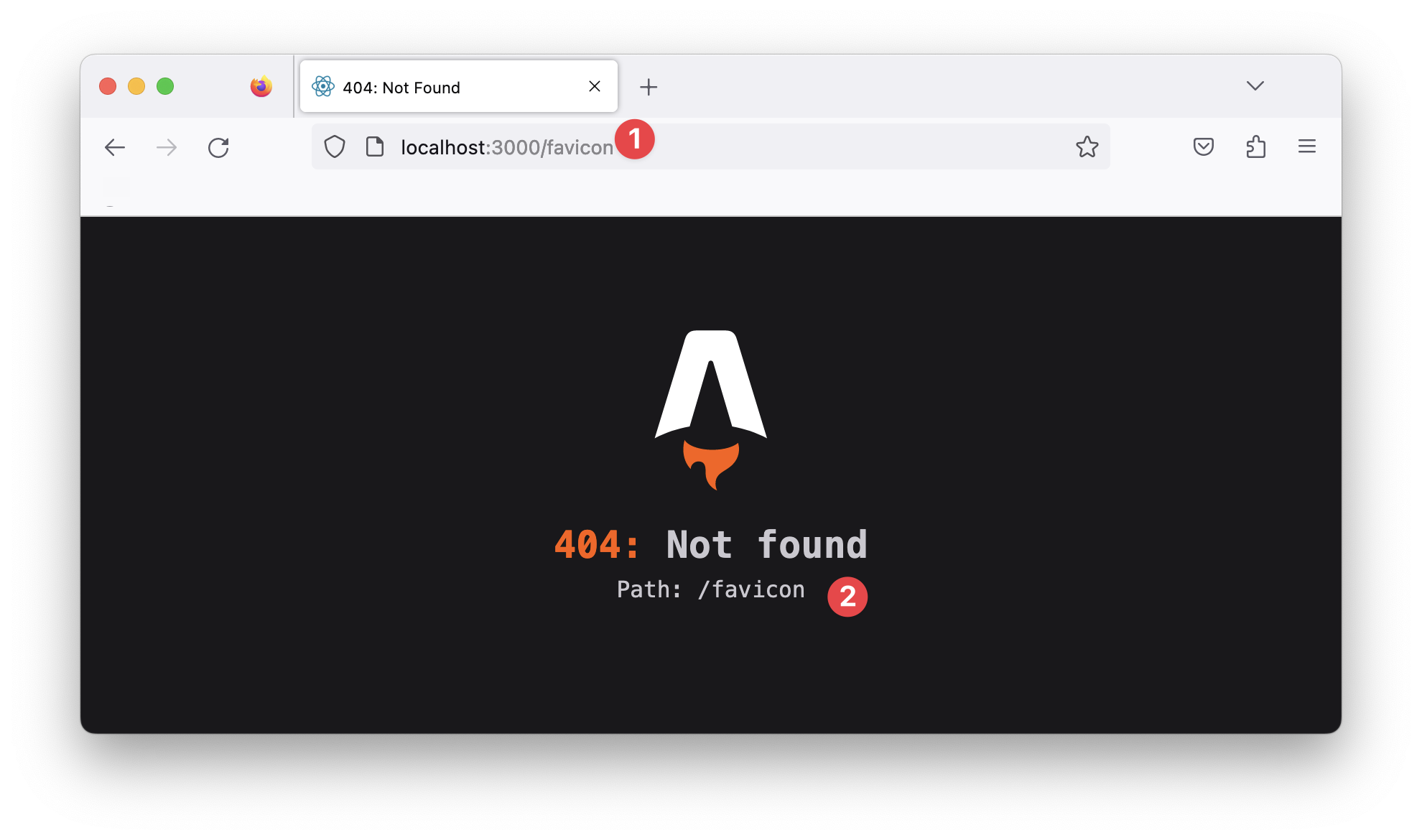 The /favicon route.
This is because only specific files make a valid astro page. For example, if we consider the index and about files in the pages directory, you perhaps notice something: they both have the .astro file ending!
In layperson’s terms, these are Astro files, but a more technical terminology for these is Astro components.
So, quick quiz: what is an Astro component?
That’s easy—a file with the .astro ending.
10 points to you! Well done.
Anatomy of an Astro component
We’ve established that index.astro and about.astro represent Astro components and are valid Astro pages.
Now, let’s dig into the content of these files.
Consider the contents of the index.astro page:
// 📂 src/pages/index.astro
---
---

<html lang="en">
  <!-- removed for brevity -->

</html>
Notice the distinction between the two parts of this file’s content.
The section at the bottom contains the page’s markup:
// 📂 src/pages/index.astro
// ...
<html lang="en">
  <!-- removed for brevity -->
</html>
This part is called the component template section.
While the top section contains a rather strange divider-looking syntax:
---
---
This part is called the component script section, and the --- is called a fence.
Together, these make up an Astro component.
Let’s take the component script section for a spin.
The section’s name hints at what this section of the component does. Within the component script code fence, we may declare variables, import packages and fully take advantage of JavaScript or TypeScript.
Oh yes, TypeScript!
Let’s start by creating a variable to hold our user’s profile picture, as shown below:
// 📂 src/pages/index.astro
---
const profilePicture = "https://i.imgur.com/JPGFE75.jpg";
---
We may then take advantage of the component template section to reference this image as shown below:
// 📂 src/pages/index.astro
---
const profilePicture = "https://i.imgur.com/JPGFE75.jpg";
---

<html lang="en">
  <head>
    <meta charset="utf-8" />
    <link rel="icon" type="image/svg+xml" href="/favicon.svg" />
    <meta name="viewport" content="width=device-width" />
    <meta name="generator" content={Astro.generator} />
    <title>Astro</title>
  </head>
  <body>
    <!-- 👀 Look here  -->
    <img
      src={profilePicture}
      alt="Frau Katerina's headshot."
      width="100px"
      height="100px"
    />
  </body>
</html>
Note that the profilePicture variable is referenced using curly braces { }. This is how to reference variables from the component script in the component markup.
Now we should have the image rendered on the home page:
 Rendering the user profile photo.
It’s not much, but it’s honest work, eh?
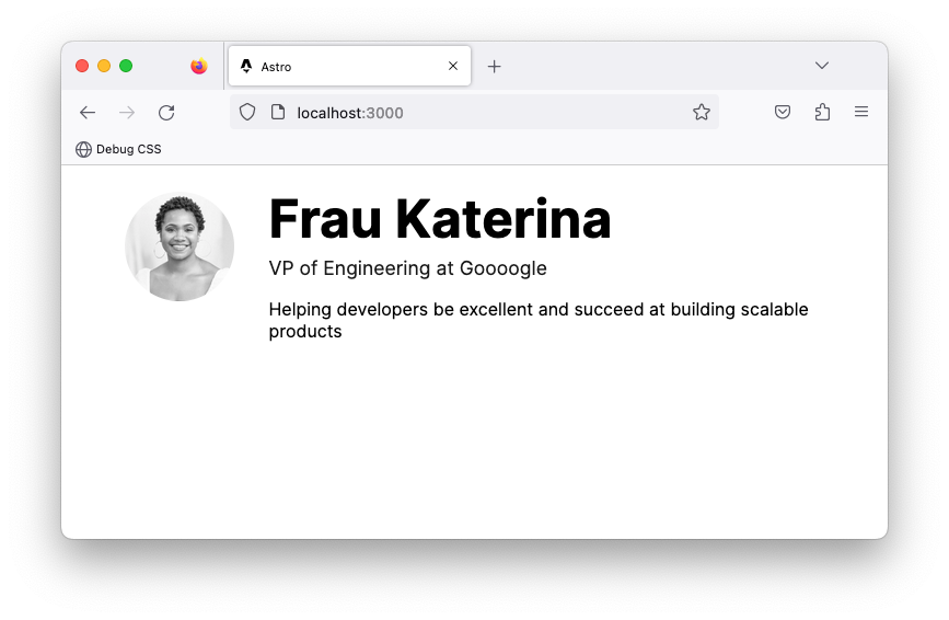
Let’s go ahead and flesh out the page to have the user’s profile markup:
// 📂 src/pages/index.astro
// ...
  <body>
    <!-- Look here 👀 -->
    <div>
      <img
        src={profilePicture}
        alt="Frau Katerina's headshot."
        width="100px"
        height="100px"
      />
      <div>
        <h1>Frau Katerina</h1>
        <h2>VP of Engineering at Goooogle</h2>
        <p>
          Helping developers be excellent and succeed at building scalable
          products
        </p>
      </div>
    </div>
  </body>
// ...
As you might have noticed, we’re writing HTML looking syntax in the component markup section!
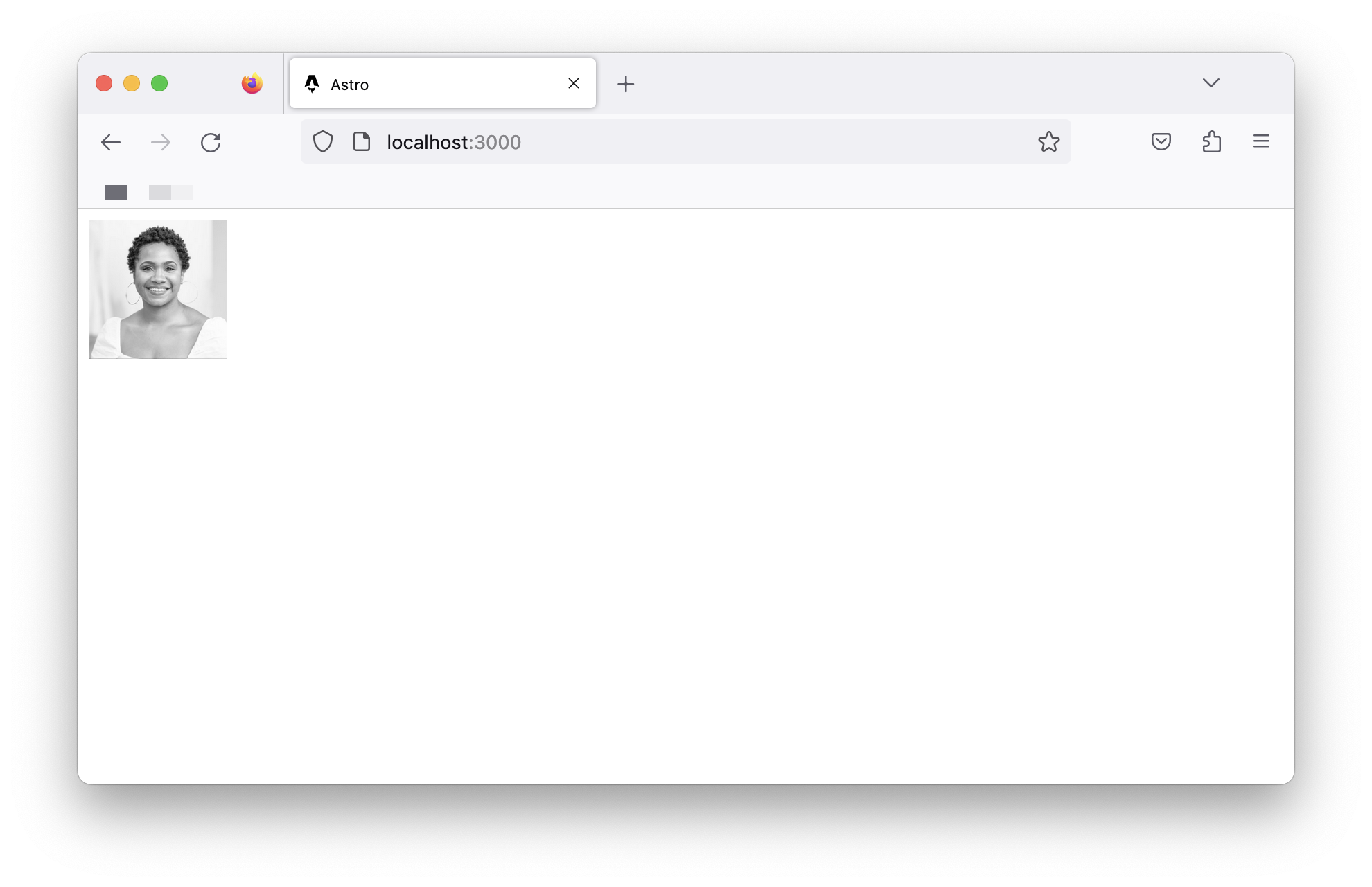
Now we should have the user photo and their bio rendered in the browser as follows:
 The user profile photo and bio.
Component Styles
Styling in Astro is relatively easy to reason about. Add a <style> tag to a component, and Astro will automatically handle its styling.
While it’s possible to select elements directly, let’s go ahead and add classes to the component markup to make this easier:
// 📂 src/pages/index.astro
// ...
<div class="profile">
    <img
      src={profilePicture}
      class="profile__picture"
      {/** ... **/}
    />
    <div class="profile__details">
      <h1>Frau Katerina</h1>
      {/** ... **/}
    </div>
</div>
// ...
Add a <style> tag, and write CSS as usual:
// ...
<style>
  .profile {
    display: flex;
    align-items: flex-start;
    flex-wrap: wrap;
    padding: 1rem 0 3rem 0;
  }

  .profile__details {
    flex: 1 0 300px;
  }

  .profile__details > h1 {
    margin-top: 0;
  }

  .profile__picture {
    border-radius: 50%;
    margin: 0 2rem 1rem 0;
  }
</style>
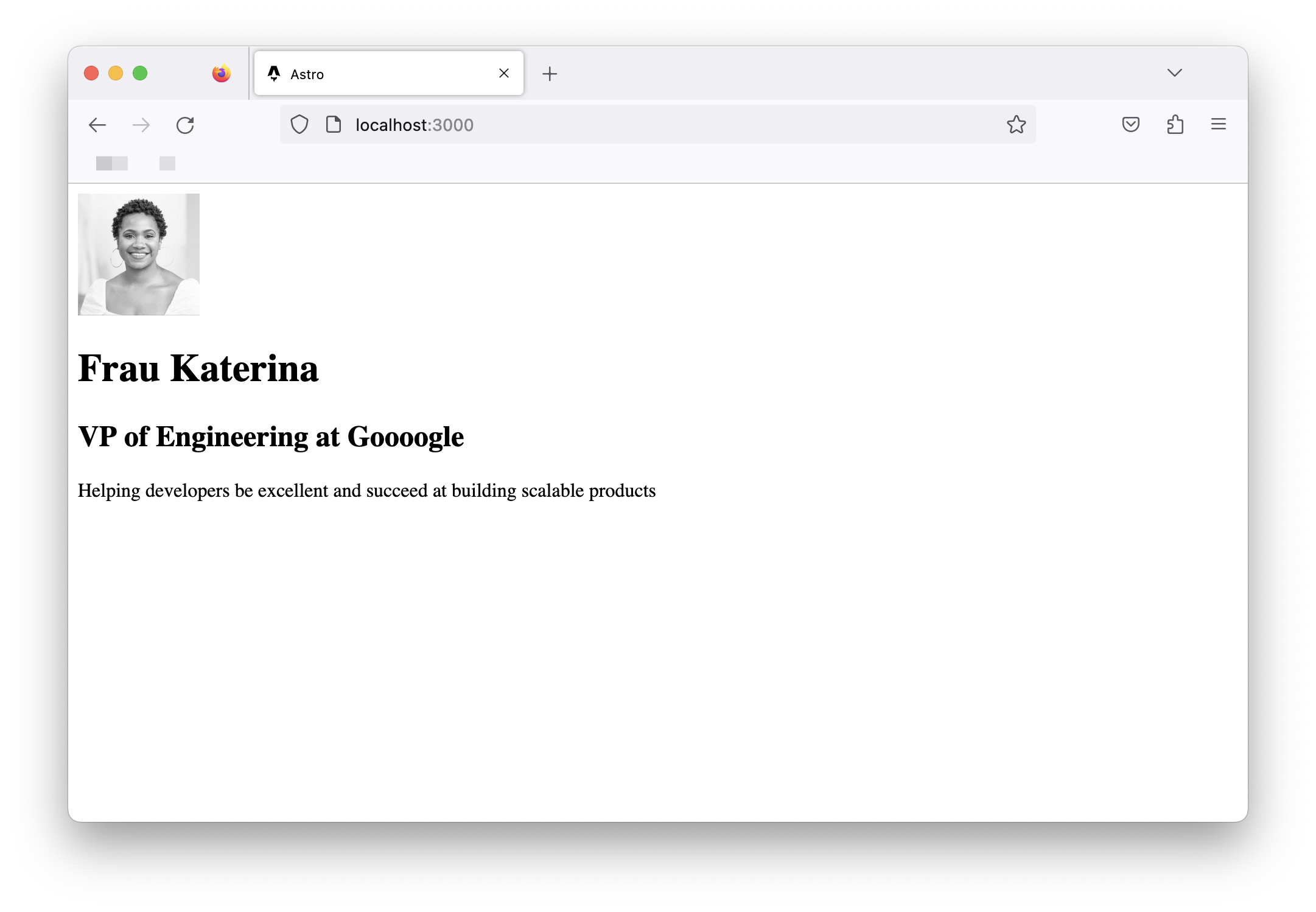
The user details should now be styled as expected.
 Applying styles to the index.astro page component.
If we inspect the eventual styles applied to our UI elements via the browser developer tools, we’ll notice that the style selectors look different.
For example, to style the user name, we’ve written the following CSS:
.profile__details > h1 {
  margin-top: 0;
}
However, what’s applied in the browser looks something like this:
.profile__details:where(.astro-J7PV25F6) > h1:where(.astro-J7PV25F6) {
  margin-top: 0;
}
Why is this?
The actual style declarations for the h1 element remain unchanged. The only difference here is the selector.
The h1 element now has auto-generated class names, and the selector is now scoped via the :where CSS selector.
This is done internally by Astro. This makes sure the styles we write don’t leak beyond our component. For example, if we styled every h1 in our component as follows:
h1 {
  color: red
}
The eventual style applied in the browser will be similar to the following:
h1:where(.astro-some-unique-id) {
  color: red
}
This will ensure all other h1 in our project remains the same, and this style only applies to our specific component h1.
Page Layouts
Look at the pages of our completed application. You may notice that they all have identical forms.
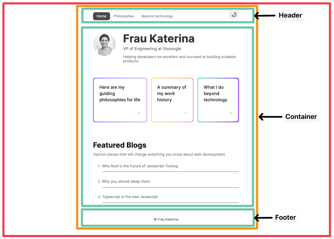 A breakdown of the application page structure.
There’s a navigation bar, a footer, and some container that holds the page’s main content.
Should we repeat these similar UI structures across all pages?
Most people will answer “No”. So, is there a way to share reusable UI structures across pages?
Yes, yes, yes! This is where layouts come in.
Layouts are Astro components with a twist. They are used to provide reusable UI structures across pages, for example navigation bars and footers.
Conventionally, layouts are placed in the src/layouts directory. This is not compulsory but is a widespread pattern.
Let’s go ahead and create our first layout in src/layouts/Main. We’ll do this by moving away all the reusable UI structures currently in index.astro as follows:
// 📂 src/layouts/Main.astro
---
---

<html lang="en">
  <head>
    <meta charset="utf-8" />
    <link rel="icon" type="image/svg+xml" href="/favicon.svg" />
    <meta name="viewport" content="width=device-width" />
    <meta name="generator" content={Astro.generator} />
    {/* Add a new meta description tag */}
    <meta name="description" content="Frau Katarina's website" />
    {/* Title is hardcoded as Astro, for now. */}
    <title>Astro</title>
  </head>
  <body>
    <main>
      {/* We want the content of each page to go here */}
    </main>
  </body>
</html>
- We’ve moved the
<html>,<head>and<body>elements to theMain.astrolayout. - We’ve also introduced a new
<meta name=description />tag for SEO. - We’ve equally introduced a
<main>element where we want the rest of our page to go in. - Note that the file name of the layout is capitalised, that is
Main.astro, notmain.astro.
On the one hand, layouts are unique because they mostly do one thing: provide reusable structures. But, on the other hand, they aren’t unique. They are like other Astro components and can do everything a component can.
How to Render Components and Slots
Rendering an Astro component is similar to how you’d attempt to render an HTML element. For example, we’d render a div by writing the following:
<div>
 render something within the div
</div>
The same goes for Astro components.
To render the Main.astro component, we’d do something similar:
<Main>
  render something within the Main component
</Main>
Let’s put this into practice. We may now use the Main layout in the index.astro page. To do this, we will do the following:
- Import the
Mainlayout from"../layouts/Main.astro" - Substitute the
<html>,<head>and<body>elements for the<Main>layout inindex.astro.
---
import Main from "../layouts/Main.astro";

const profilePicture = "https://i.imgur.com/JPGFE75.jpg";
---

<Main>
  <div class="profile">
    <img
      src={profilePicture}
      class="profile__picture"
      alt="Frau Katerina's headshot."
      width="100px"
      height="100px"
    />
    <div class="profile__details">
      <h1>Frau Katerina</h1>
      <h2>VP of Engineering at Goooogle</h2>
      <p>
        Helping developers be excellent and succeed at building scalable
        products
      </p>
    </div>
  </div>
</Main>
If we checked our app, we’d have a blank index page.
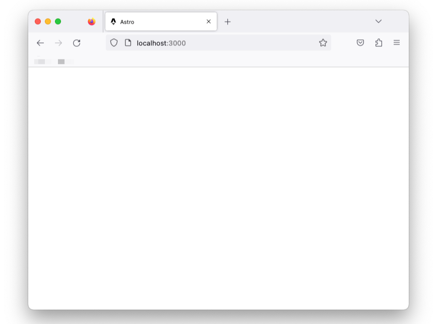 Blank application page.
Why’s that?
Unlike HTML elements, the child elements in the <Main> tag aren’t automatically rendered.
{/** Child div will not be automatically rendered */}
<Main>
  <div>Hello from child</div>
<Main>
The <Main> layout component is rendered, and nothing else. The child components aren’t. Hence, the empty page.
To render the child elements of an Astro component, we must specify where to render these using a <slot /> element.
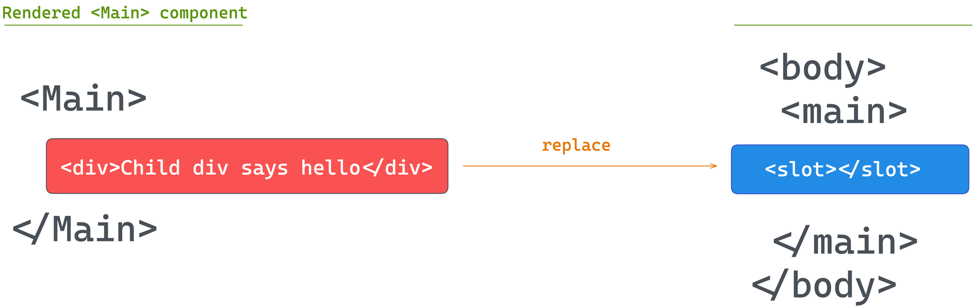 Injecting child elements into a slot.
Let’s add a <slot> within Main.astro :
//...
  <body>
    <main>
      {/* We want the content of each page to go here */}
       <slot />
    </main>
  </body>
 Page refactored to use a reusable layout component.
We should now have our page rendered with the reusable layout in place.
Capitalising Component Names
We’ve capitalised the file name of the Main.astro layout component, but is this important?
Theoretically, the answer to that is no.
We could create a file with a lower cased name, for example mainLayout.astro and import the component as follows:
import Main from "../layouts/mainLayout.astro";
This is perfectly correct.
But where we encounter issues is if we name the imported component with a lowercase:
// main NOT Main
import main from "../layouts/mainLayout.astro";
In this case, we’ll encounter issues when we attempt to render the component, as the name collides with the standard HTML main element.
For this reason, it’s common practice to capitalise both component file names and the imported variable name.
The Global Style Directive
The Main layout is in place but doesn’t add much to our page. Let’s start by adding some styles for the headers and also centre the page’s content:
<!-- 📂 src/layouts/Main.astro -->
<style>
  h1 {
    font-size: 3rem;
    line-height: 1;
  }

  h1 + h2 {
    font-size: 1.1rem;
    margin-top: -1.4rem;
    opacity: 0.9;
    font-weight: 400;
  }

  main {
    max-width: 40rem;
    margin: auto;
  }
</style>
With this, we’ll have the main element centred, but the headers, h1 and h2 remain unstyled.
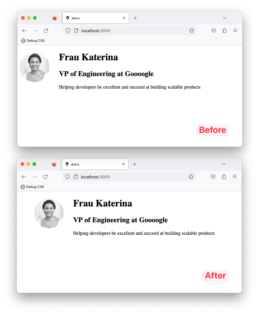 A comparison of the changes before and after the layout component style.
This is because styles applied via the <style> tag are locally scoped by default.
Can you tell me why?
The main element resides in the Main layout. But the header h1 and h2 exist in a different index.astro component.
For our use case, we need global styles.
We need to break out of the default locally scoped styles the Astro component provides, but how do we do this?
Global styles can be a nightmare — except when truly needed. For such cases, Astro provides several solutions. The first is using what’s known as a global style template directive.
I know that sounds like a mouthful! But in simple terms, template directives in Astro are different kinds of HTML attributes that can be used in Astro component templates.
For example, to break out of the default locally scoped <style> behaviour, we can add a is:global attribute as shown below:
<style is:global>
 ...
</style>
This will remove the local CSS scoping and make the styles available globally.
 Global styles now inlined in the page via <style>.
Custom Fonts and Global CSS
Base layout components like Main.astro are a great place to have global properties such as global styles and custom fonts.
We’ve added global styles via the is:global template directive. But alternatively, we could have all global styles imported into Main.astro from a global.css file.
In cases where a project requires importing some existing global css file, this is the more straightforward approach.
For example, let’s refactor our project to use global.css. To do so, move the entire CSS content within the <style is:global> element into src/styles/global.css. Then import the styles in the Main.astro component frontmatter:
// 📂 src/layouts/Main.astro
---
import "../styles/global.css";
---
This will load and inject style onto the page.
Now, let’s turn our attention to global fonts.
We will use the Google Inter font for the project, but how do we do this?
Technically speaking, to add Inter to our project, we must add the <link>s to Inter on every page required.
But instead of repeating ourselves on every page, we can leverage the shared Main.astro layout component.
Go ahead and add the <link>s to the Inter font as shown below:
// 📂 src/layouts/Main.astro
<html lang="en">
  <head>
    {/** 👀 Look here ... */}
    <link rel="preconnect" href="https://fonts.googleapis.com" />
    <link rel="preconnect" href="https://fonts.gstatic.com" crossorigin />
    <link
      href="https://fonts.googleapis.com/css2?family=Inter:wght@400;500;700&display=swap"
      rel="stylesheet"
    />
  </head>
  {/** ... */}
</html>
We may now update the global.css file to use the new font family:
body {
  font-family: "Inter", sans-serif;
  padding: 0 0.5rem; /* Additional body style */
}
And boom! We have sorted global fonts.
 The page with global fonts and styles.
Independent Astro Components
We’ve discussed two special types of Astro components: layouts and pages.
But a working site is made up of more than just layouts and pages. For example, different blocks of user interfaces are typically embedded within a page. These independent and reusable blocks of user interfaces can also be represented using Astro components.
Let’s put this into practice by creating NavigationBar and Footer components to be used in the Main.astro layout.
When creating components, a standard convention is to have them in the src/components directory. Let’s go ahead and create one.
// 📂 src/components/Footer.astro
<footer>© Frau Katerina</footer>
<style>
footer {
/* Applies top and bottom paddings */
padding: 3rem 0;
/* Centers the text content */
text-align: center;
/* Makes the font smaller */
font-size: 0.9rem;
}
</style>
Let’s also create a NavigationBar component:
// 📂 src/components/NavigationBar.astro
---
---

<nav>
  <ul>
    <li>
      <a href="/">Home</a>
    </li>

    <li>
      {/** Link points nowhere for now*/}
      <a href="#">Philosophies</a>
    </li>

    <li>
      {/** Link points nowhere for now*/}
      <a href="#">Beyond technology</a>
    </li>
  </ul>
</nav>

<style>
  nav {
    display: flex;
    align-items: flex-start;
    padding: 2rem 0;
  }

  ul {
    display: flex;
    flex-wrap: wrap;
    padding: 0;
    margin: 0 auto 0 0;
  }

  nav li {
    opacity: 0.8;
    list-style: none;
    font-size: 0.95rem;
  }

  a {
    padding: 0.5rem 1rem;
    border-radius: 10px;
    text-decoration: none;
  }
</style>
Now render the NavigationBar and Footer as shown below:
// 📂 src/layouts/Main.astro
---
//...
import Footer from "../components/Footer.astro";
import NavigationBar from "../components/NavigationBar.astro";
---

{/** ... **/}
<main>
  <NavigationBar />

  <slot />

  <Footer />
</main>
 Navigation bar and footer rendered.
How to Add Interactive Scripts
An integral part of Astro’s philosophy is shipping zero JavaScript by default to the browser.
This means our pages get compiled into HTML pages with all JavaScript stripped away by default.
You might ask, what about all the JavaScript written in the component script section of an Astro component?
The component script and markup will be used to generate the eventual HTML page(s) sent to the browser.
For example, go ahead and add a simple console.log to the frontmatter of the index.astro page:
// 📂 src/pages/index.astro
---
console.log("Hello world!");
---
Inspect the browser console and notice how the log never makes it to the browser!
So, where’s the log?
Astro runs on the server. In our case, this represents our local development server. So, the console.log will appear in the terminal where Astro serves our local application.
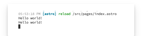 Astro server logs.
When we eventually build our application for production with npm run build, Astro will output HTML files corresponding to our pages in src/pages.
In this example, the Hello world! message will be logged but not get into the compiled HTML pages.
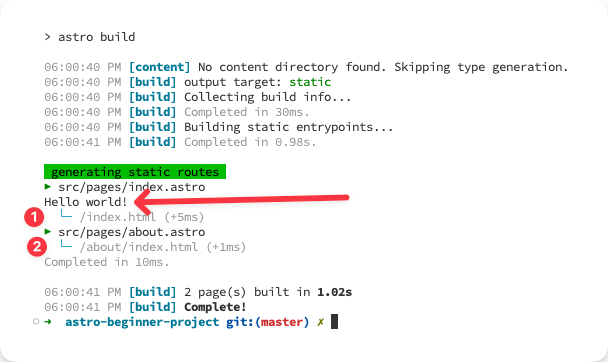 Logs during building the production application.
To add interactive scripts, that is scripts that make it into the final HTML page build output, add a <script> element in the component markup section.
For example, let’s move the console.log from the frontmatter to the markup via a <script> element:
// 📂 src/pages/index.astro
---
---
// ...

<script>
  console.log("Hello world!");
</script>
We should have Hello world! logged in the browser console:
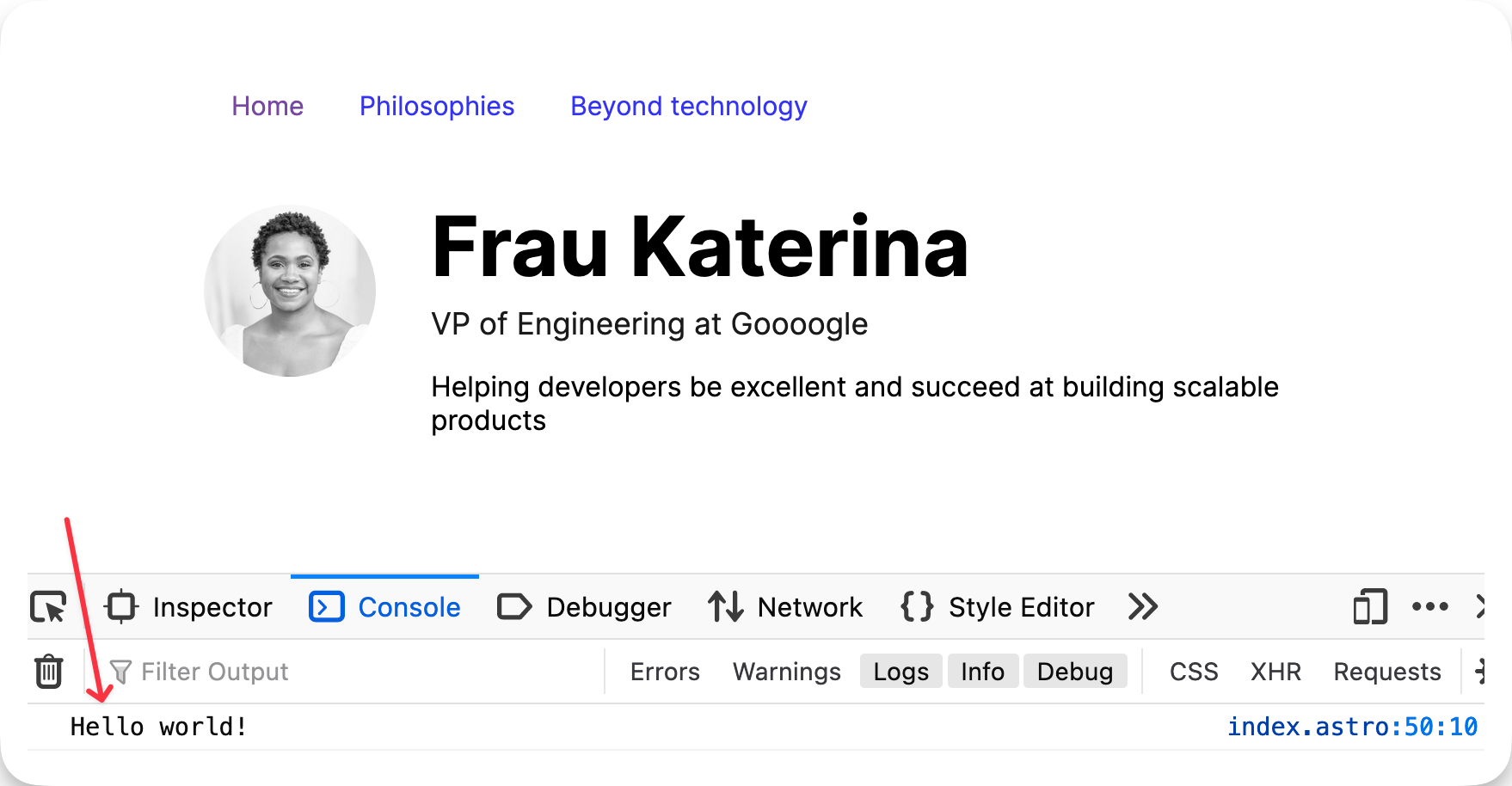 The browser “Hello world” log.
Interactive Theme Toggle
Let’s put our newly found knowledge of client-side scripts to good use.
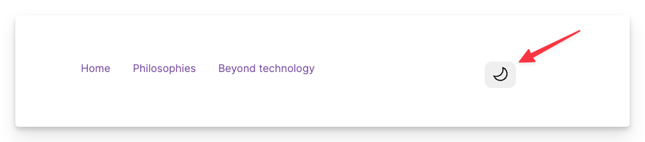
Create a new ThemeToggler.astro component in the src/components directory.
Add the following markup:
// 📂 src/components/ThemeToggler.astro
<button aria-label="Theme toggler">
  <svg width="25px" xmlns="http://www.w3.org/2000/svg" viewBox="0 0 24 24">
    <path
      class="sun"
      fill-rule="evenodd"
      d="M12 17.5a5.5 5.5 0 1 0 0-11 5.5 5.5 0 0 0 0 11zm0 1.5a7 7 0 1 0 0-14 7 7 0 0 0 0 14zm12-7a.8.8 0 0 1-.8.8h-2.4a.8.8 0 0 1 0-1.6h2.4a.8.8 0 0 1 .8.8zM4 12a.8.8 0 0 1-.8.8H.8a.8.8 0 0 1 0-1.6h2.5a.8.8 0 0 1 .8.8zm16.5-8.5a.8.8 0 0 1 0 1l-1.8 1.8a.8.8 0 0 1-1-1l1.7-1.8a.8.8 0 0 1 1 0zM6.3 17.7a.8.8 0 0 1 0 1l-1.7 1.8a.8.8 0 1 1-1-1l1.7-1.8a.8.8 0 0 1 1 0zM12 0a.8.8 0 0 1 .8.8v2.5a.8.8 0 0 1-1.6 0V.8A.8.8 0 0 1 12 0zm0 20a.8.8 0 0 1 .8.8v2.4a.8.8 0 0 1-1.6 0v-2.4a.8.8 0 0 1 .8-.8zM3.5 3.5a.8.8 0 0 1 1 0l1.8 1.8a.8.8 0 1 1-1 1L3.5 4.6a.8.8 0 0 1 0-1zm14.2 14.2a.8.8 0 0 1 1 0l1.8 1.7a.8.8 0 0 1-1 1l-1.8-1.7a.8.8 0 0 1 0-1z"
    ></path>
    <path
      class="moon"
      fill-rule="evenodd"
      d="M16.5 6A10.5 10.5 0 0 1 4.7 16.4 8.5 8.5 0 1 0 16.4 4.7l.1 1.3zm-1.7-2a9 9 0 0 1 .2 2 9 9 0 0 1-11 8.8 9.4 9.4 0 0 1-.8-.3c-.4 0-.8.3-.7.7a10 10 0 0 0 .3.8 10 10 0 0 0 9.2 6 10 10 0 0 0 4-19.2 9.7 9.7 0 0 0-.9-.3c-.3-.1-.7.3-.6.7a9 9 0 0 1 .3.8z"
    ></path>
  </svg>
</button>
- For accessibility, the button has an
aria-labelofTheme toggler. - The
SVGhas a fixed width of25px, rendering two<path>elements. - The first
<path>visually represents a sun icon. The second is a moon icon. - By default, both icons (sun and moon) are rendered. Our goal is to toggle the displayed icon based on the active theme.
Then import the component and render it in the NavigationBar:
// 📂 src/components/NavigationBar
---
import ThemeToggler from "./ThemeToggler.astro";
---

<nav>
  <ul>
    {/** ... **/}
  </ul>
  {/** 👀 Look here **/}
  <ThemeToggler />
</nav>
 The sun and moon icons rendered in the toggle button.
Let’s add some <style> to ThemeToggler:
// 📂 src/components/ThemeToggler.astro
// ...
<style>
  button {
    cursor: pointer;
    border-radius: 10px;
    border: 0;
    padding: 5px 10px;
    transition: all 0.2s ease-in-out;
  }

  button:hover {
    /* Make the button smaller (scale down) when hovered */
    transform: scale(0.9);
  }

  button:active {
    /** Return the button to its standard size when active */
    transform: scale(1);
  }

  .sun {
    /* Hide the sun icon by default. This assumes a light theme by default */
    fill: transparent;
  }
</style>
Now, we should have a decent-looking theme toggler.
 A styled theme toggle button.
The :global() Selector
Let’s take a moment to consider the strategy we’ll use for toggling the theme.
We’ll toggle a CSS class on the root element whenever a user clicks the toggle.
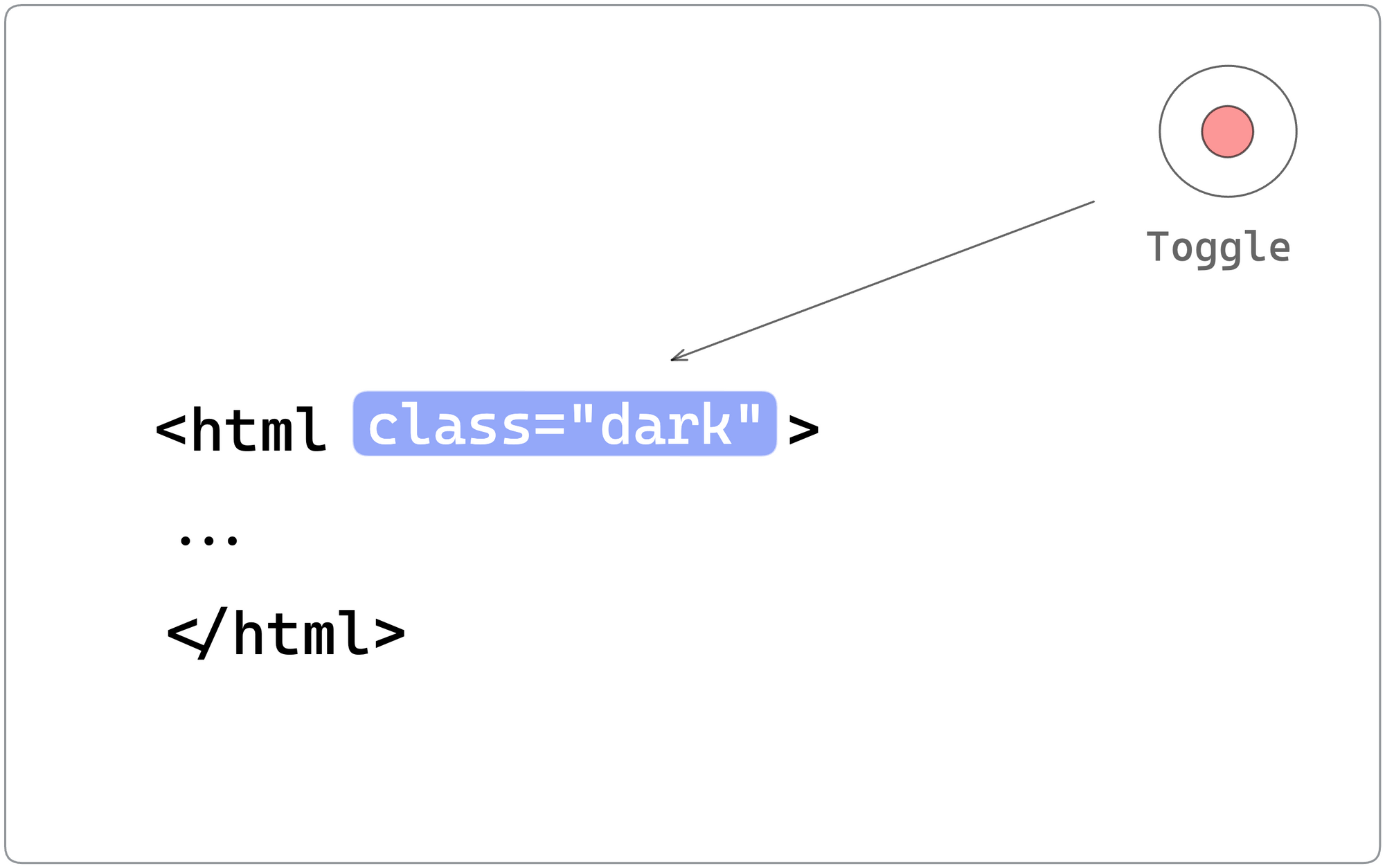 Adding a new “dark” class on toggle.
For example, if the user was viewing the site in light mode and clicked to toggle, we’ll add a .dark class to the root element and, based on that, apply dark-themed styles.
If the user is in dark mode, clicking the toggle will remove the .dark class. We’ll refer to this as a class strategy for toggling dark mode.
Based on this strategy, we must update our local ThemeToggler style to display the relevant icon depending on the global .dark class.
To do this, we will leverage the :global selector.
Here’s how we’d achieve this:
<!-- 📂 src/components/ThemeToggler.astro -->
<style>
 /**...**/

 /** If a parent element has a .dark class, target the .sun icon and make the path black (shows the icon) */
 :global(.dark) .sun {
   fill: black;
 }

 /** If a parent element has a .dark class, target the .moon icon and make the path transparent (hides the icon) */
 :global(.dark) .moon {
   fill: transparent;
 }
</style>
To see this at work, inspect the page via the developer tools, and add a dark class to the root element. The toggle icon will be appropriately changed.
 Inspecting icon change with a root dark class.
In practice, limit :global only to appropriate use cases, because mixing global and locally scoped component styles will become challenging to debug. But this is permissible, given our use case.
Event Handling
We’ve handled the styles for our toggle, assuming a .dark root class. Now, let’s go ahead and handle the toggle click event with a <script> element.
<!-- 📂 src/components/ThemeToggler.astro -->
<script>
  /** Represent the toggle theme class with a variable */
  const DARK_THEME_CLASS = "dark";

  /** Grab the toggle */
  const toggle = document.querySelector("button");
  /** Grab the document root element. In this case <html>  */
  const rootEl = document.documentElement;

  if (toggle) {
    toggle.addEventListener("click", () => {
      /** toggle the "dark" class on the root element */
      rootEl.classList.toggle(DARK_THEME_CLASS);
    });
  }
</script>
Notice that this is standard JavaScript. Nothing fancy going on here.
- The toggle is selected via
document.querySelector("button"). - To set up an event listener, we use the
.addEventListenermethod on the button. - On clicking the button, we toggle the class list on the root element: adding or removing the “dark” class.
With this in place, the toggle icon changes when clicked to either that of the sun or moon.
Excellent!
Theming via CSS Variables
CSS variables are outstanding, and we’ll leverage them for theming our application.
Firstly, let’s go ahead and define the colour variables we’ll use in the project.
// 📂 styles/global.css
html {
  --background: white;
  --grey-200: #222222;
  --grey-400: #444444;
  --grey-600: #333333;
  --grey-900: #111111;
}

html.dark {
  --background: black;
  --grey-200: #eaeaea;
  --grey-400: #acacac;
  --grey-600: #ffffff;
  --grey-900: #fafafa;
}
- Set the variables on the root
HTMLelement to be globally scoped. - A CSS variable is a property that begins with two dashes,
--– for example--background. - For simplicity, we’ll stick to the minimal grey palette above.
The first visual change we’ll make is to add the following color and background style declarations to the body element:
// 📂 styles/global.css
body {
  color: var(--grey-600);
  background: var(--background);
}
With this seemingly simple change, we should now have the text and background colour of the body react to clicking the toggle.
 Dark mode activated.
Finally, update the navigation links in NavigationBar to reflect theme preferences:
/* 📂 src/components/NavigationBar.astro */
<style>
  /* ... */
  a {
    color: var(--grey-400);
    padding: 0.5rem 1rem;
    border-radius: 10px;
    text-decoration: none;
  }

  a:hover {
    color: var(--grey-900);
  }
</style>
 Navigation links styled for dark mode.
How to Access Global Client Objects
Question! 🙋🏼
Where should we access global objects such as window.localStorage? Within an Astro component frontmatter or an interactive <script>?
At this point, I hope the answer to the question is clear from previous examples.
Since Astro runs on the server, attempting to access a window property within the frontmatter of a component will result in an error.
---
{/** ❌ this will fail with the error: window is undefined **/}
 const value = window.localStorage.getItem("value")
---
To access window properties, we need the script to run on the client – that is, in the browser. So, we must leverage one or more client-side scripts.
A good use case for this is remembering the user’s theme choice.
If users toggle their theme from light to dark and refresh the browser, they lose the selected theme state.
How about we save this state to the browser’s local storage and restore the selected theme upon refresh?
Well, let’s do that!
Here are the first steps we’ll take:
- Grab the current state of the theme, that is dark or light, when the theme toggle is clicked.
- Save the theme value to the browser’s local storage in the form:
{
  COLOUR_MODE: "LIGHT" | "DARK"
}
Here’s that translated in code:
<!-- 📂 src/components/ThemeToggler.astro -->
<script>
  const DARK_THEME_CLASS = "dark";
  /** Represent the local storage key by a variable */
  const COLOUR_MODE = "COLOUR_MODE";
  /** Represent the local storage values by variables */
  const LIGHT_THEME = "LIGHT";
  const DARK_THEME = "DARK";
  /** ... **/
  toggle.addEventListener("click", () => {
    /** ... */
    /**Get the current theme mode, i.e., light or dark */
    const colourMode = rootEl.classList.contains(DARK_THEME_CLASS)
      ? DARK_THEME
      : LIGHT_THEME;

    /** Save the current theme to local storage   */
    window.localStorage.setItem(COLOUR_MODE, colourMode);
  });
</script>
We have saved the theme to local storage but must now set the active theme as soon as the page is loaded and the script is executed.
Here’s the annotated code required to achieve this:
<!-- 📂 src/components/ThemeToggler.astro -->
<script>
  {/**... **/}
  const getInitialColourMode = () => {
    /** Get colour mode from local storage **/
    const previouslySavedColourMode = window.localStorage.getItem(COLOUR_MODE);
    if (previouslySavedColourMode) {
      return previouslySavedColourMode;
    }
    /** Does the user prefer dark mode, e.g., through an operating system or user agent setting? */
    if (window.matchMedia("(prefers-color-scheme: dark)").matches) {
      return DARK_THEME;
    }
    /** Default to the light theme */
    return LIGHT_THEME;
  };
  /**Get initial colour mode */
  const initialColourMode = getInitialColourMode();
  const setInitialColourMode = (mode: string) => {
    if (mode === LIGHT_THEME) {
      rootEl.classList.remove(DARK_THEME_CLASS);
    } else {
      rootEl.classList.add(DARK_THEME_CLASS);
    }
  };
  /** Set the initial colour mode as soon as the script is executed */
  setInitialColourMode(initialColourMode);
{/**... **/}
</script>
Now, give this a try. First, toggle the theme and refresh to see the theme choice preserved.
The Magic of Scripts
Client-side scripts added via a <script> may seem like your typical vanilla JavaScript, but they’re more capable in specific ways.
The most crucial point is that Astro processes these. This means within a <script>, we can import other scripts or import npm packages, and Astro will resolve and package the script for use in the browser.
<script>
 /** ✅ valid package import **/
 import { titleCase } from "title-case";

 const title = titleCase("string")

 alert(title)
</script>
/** ✅ valid script reference **/
<script src="path-to-script.js"/>
Another critical point is the <script> fully supports TypeScript. For example, in our solution, we typed the parameter for the setInitialColourMode function:
// mode is of type string
const setInitialColourMode = (mode: string) => {
  ...
};
We don’t have to sacrifice type safety within the client <script> elements and can go on to write standard TypeScript code. Astro will strip out the types at build time and only serve the processed JavaScript to the browser.
Here’s a summary of what Astro does:
NPMpackages and local files can be imported and will be bundled.- TypeScript is fully supported within the
<script>. - If a single
Astrocomponent with a<script>is used multiple times on a page, the<script>is processed and only included once. - Astro will process and insert the script in the
<head>of the page with atype=moduleattribute. - ❗️The implication of
type=moduleis that the browser will defer the script, that is load in parallel and execute it only after the page’s parsed.
How to Leverage Inline Scripts
By default, Astro processes <script>s. However, to opt out of Astro’s default script processing, we may pass a is:inline directive as shown below:
<script is:inline>
 // Imports will not be processed
 // Typescript not supported by default
 // Script will be added as is, e.g., multiple times if the component is used more than once on a page.
</script>
In the real world, we quickly realise that the defaults don’t always satisfy every project requirement.
For example, consider the un-styled flash of incorrect theme when we refresh our home page. For a user who chose the dark theme previously, refreshing the page shows light-themed rendered content before changing to dark after the script is parsed.
 Transitioning light themed content viewed on Regular 3G throttling.
This occurs because we restore the user-chosen theme only after the page’s HTML has been parsed, that is the default behaviour of processed Astro scripts.
To prevent this, we will use the is:inline directive, which will make the script blocking, that is, it'll be executed immediately and stops parsing until completed.
Since scripts with the is:inline attribute aren’t processed, they’ll be added multiple times if used in reusable components that appear more than once on the page.
So, let’s go ahead and move the theme restoration code bit into Main.astro — because the Main layout is only included once per page.
We’ll also make sure to add this within the <head> of the layout, as shown below:
<!-- 📂 src/layouts/Main.astro -->
<head>
   <!-- ... -->
    <!-- 👀 add is:inline -->
    <script is:inline>
      const DARK_THEME_CLASS = "dark";
      const COLOUR_MODE = "COLOUR_MODE";
      const LIGHT_THEME = "LIGHT";
      const DARK_THEME = "DARK";
      const rootEl = document.documentElement;
      const getInitialColourMode = () => {
        /** ... */
      }
      const initialColourMode = getInitialColourMode();
      // 👀 remove string type on mode
      const setInitialColourMode = (mode) => {
         /** ... */
      };
      /** Set the initial colour mode as soon as the script is executed */
      setInitialColourMode(initialColourMode);
    </script>
  </head>
We’re explicitly adding this to the <head> because Astro will not process the is:inline script. As such, it won’t be moved to the head by Astro.
Be careful with is:inline as it removes the default non-blocking nature of scripts. But it’s ideal for this use case.
Open your developer tools and throttle the network. Then go ahead and refresh after toggling dark mode. We should have eradicated the flash of incorrect theme:
 Throttling the network via the chrome developer tools.
Global Selectors in Scripts
Understanding how Astro processes the <script> in our components helps us make informed decisions.
We know the <script> will eventually be bundled and injected into our page’s <head>.
But consider our selector for registering the theme toggle clicks:
// 📂 src/components/ThemeToggler.astro
const toggle = document.querySelector("button");
The problem with this seemingly harmless code is that document.querySelector will return the first element that matches the selector — a button element.
This will be selected if we add a random button somewhere on the page before our theme toggle button.
// 📂 src/layouts/Main.astro
<button> Donate to charity </button>
<Nav />

//...
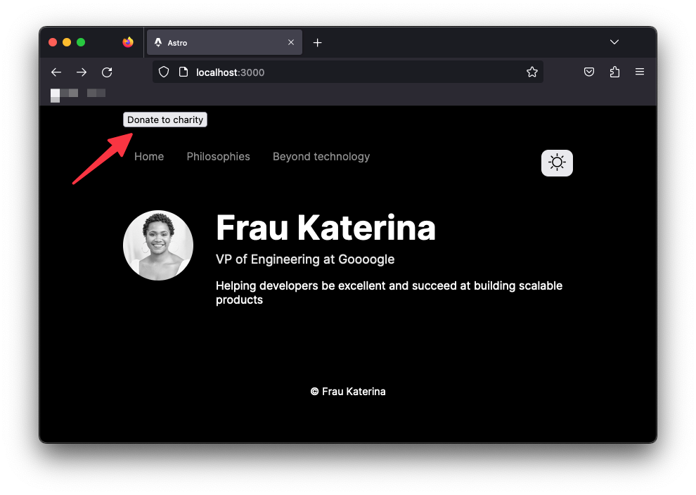 The donate to charity button.
This button, which has nothing to do with theme toggling, will now be responsible for toggling the user’s theme.
Clicking “donate to charity” now toggles the theme. This is unacceptable.
The lesson here is to be mindful of your DOM selectors and be specific where possible, for example via ids or classes:
document.querySelector("#some-unique-id")
Let’s refactor our solution to use a data attribute.
<!-- 📂 src/components/ThemeToggler.astro -->
<button aria-label="Theme toggler" data-theme-toggle>
  <!-- ... -->
</button>

<script>
  /** 👀 Look here */
  const toggle = document.querySelector("[data-theme-toggle]");
  // ...
</script>
With the more specific selector, only an element with the data attribute theme-toggle will be selected, leaving <button> Donate to charity </button> out of our theme toggle business.
Markdown Pages
We’ve established that not all file types are valid pages in Astro. We’ve seen Astro components as pages, but allow me to introduce markdown pages.
Markdown is a popular, easy-to-use markup language for creating formatted text. I’m sure my nan does not know markdown, so it’s safer to say it’s a famous text format among developers.
It’s no surprise Astro supports creating pages via markdown. So, let’s put this to the test.
We’ll create two new pages to replace our dead Philosophies and Beyond technology navigation links.
 The dead navigation links.
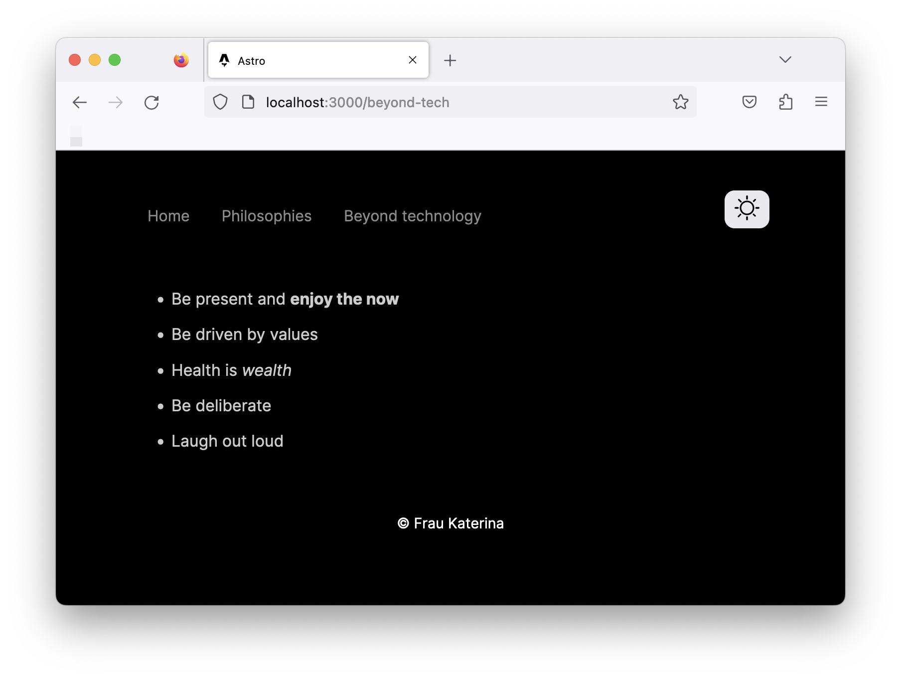
Create the first page in src/pages/philosophies.md with the following content:
- Be present and enjoy the now
- Be driven by values
- Health is wealth
- Be deliberate
- Laugh out loud
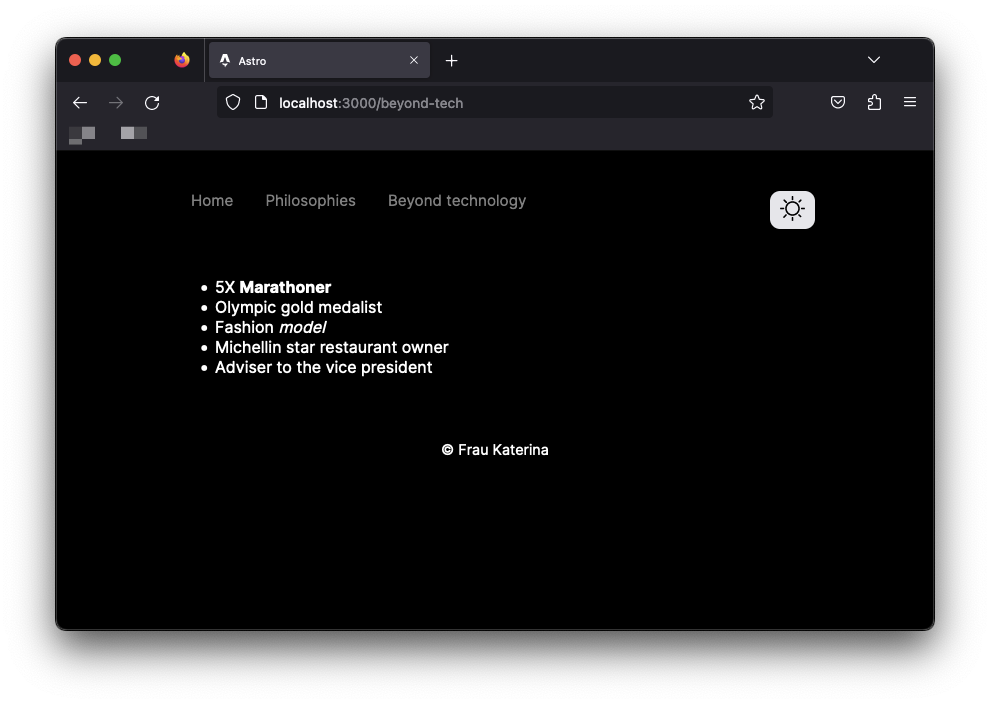
Create the second page in src/pages/beyond-tech.md with the following content:
- 5X Marathoner
- Olympic gold medalist
- Fashion model
- Michellin star restaurant owner
- Adviser to the vice president
These files are written in markdown syntax.
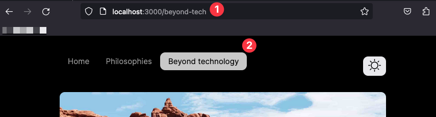
As with Astro component pages, markdown pages eventually get compiled to standard HTML pages rendered in the browser. The same file-based routing is also used. For example, to access the philosophies and beyond-tech pages, visit the /philosophies and /beyond-tech routes, respectively.
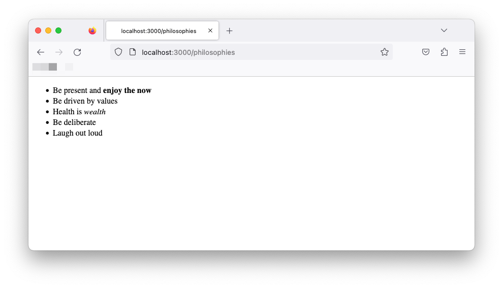 The philosophies page
How to Navigate Between Pages
Navigating between pages in Astro requires no magic wand. Surprise!
Astro uses the standard <a> element to navigate between pages. This makes sense as each page is a separate HTML page.
Let’s update the navigation links to point to the new markdown pages as shown below:
<!-- 📂 NavigationBar.astro -->

<li>
  <a href="/">Home</a>
</li>

<li>
  <a href="/philosophies">Philosophies</a>
</li>

<li>
  <a href="/beyond-tech">Beyond technology</a>
</li>
Clicking any of these links should now lead us to their appropriate pages.
Markdown Layouts
Let’s face it – we won’t be winning any design awards for our current markdown pages. This is because they seem off and don’t share the same layout as our existing page. Can we fix this?
You’ve probably realised I ask questions and then provide answers. All right, you’ve got me. So that’s my trick to make you think about a problem — hoverer brief — before explaining the solution.
Believe it or not, Astro component frontmatter was inspired by markdown. The original markdown syntax supports frontmatter for providing metadata about the document. For example, we could add a title metadata as shown below:
---
title: Understanding Astro
---
This is excellent news because Astro leverages this to provide layouts for markdown pages.
Instead of the so dull I can’t take it page, we can utilise a layout to bring some reusable structure to all our markdown pages.
Let’s get started.
With Astro markdown pages, we can provide layouts for a markdown page by providing a layout frontmatter metadata as shown below:
---
layout: path-to-layout
---
First, let’s reuse the same Main layout by adding the following to both markdown pages:
// add at the top of the Markdown pages.
---
layout: ../layouts/Main.astro
---
The markdown pages should now reuse our existing layout with the theming, navigation and footer all set in place.
 Using the Main layout in the markdown pages.
Since Main.astro includes our global.css files, let’s go ahead and provide some default global styles for paragraphs and lists:
{/** 📂 src/styles/global.css **/}
p,
li {
  font-size: 1rem;
  color: var(--gray-400);
  opacity: 0.8;
}

li {
  margin: 1rem 0;
}
 Global list styles are now applied to the Markdown pages.
We should now have these styles take effect on our markdown pages! Isn’t life better with shared layout components? 😉
How to Compose Layouts
Layouts are Astro components, meaning we can compose them – that is, render one layout in another.
For example, let’s create a separate Blog.astro layout that composes our base Main.astro layout.
// 📂 src/layouts/Blog.astro
---
import Main from "./Main.astro";
---

<Main>
  <slot />
</Main>
Composing the layouts in this way means we can reuse all the good stuff in Main.astro while extending Blog.astro to include only blog-specific elements.
The separation of concern significantly improves legibility and forces each layout to have a single responsibility.
Now, at this point, the markdown pages have the same layout markup and styles from Main.astro. We’ve made no customisations. But we can already change the beyond-tech and philosophies pages to use the new Blog.astro layout as shown below:
---
layout: ../layouts/Blog.astro
---
Component Props
As we build reusable components, we often find situations where we must customise certain values within a component. For example, consider the <title> in our Main.astro layout component:
// 📂 src/layouts/Main.astro
<title>Astro</title>
A hardcoded title on every page where the Main layout is used is ridiculous.
To foster reusability, components can accept properties. These are commonly known as props.
Props are passed to components as attributes.
<Main title="Some title" />
The prop values are then accessed via Astro.props. This is better explained with an example.
Go ahead and update Main to accept a title prop as shown below:
// 📂 src/layouts/Main.astro
---
// ...
const { title } = Astro.props;
---

<html lang="en">
  <head>
    {/** ... **/}
    {/** 👀 look here **/}
    <title>{title}</title>
  </head>
     {/** ... **/}
</html>
To enforce TypeScript checks, define the Props type alias or interface.
// Either of these is valid
type Props = {
  title: string
}

interface Props {
  title: string
}
For simplicity, I’ll stick to a type alias for the Main layout:
// 📂 src/layouts/Main.astro
---
type Props = {
  title: string
}

const { title } = Astro.props;
---
// ...
With the type declared, we’ll have TypeScript error(s) in files where we’ve used <Main> without the required title prop.
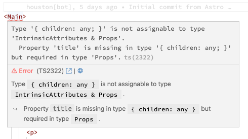 Invalid title props error.
Update the index.astro and Blog.astro pages to pass a title prop to Main:
// 📂 src/layouts/index.astro
<Main title="Frau Katarina">
{/* ... */}
// 📂 src/layouts/Blog.astro
<Main title="Frau Katarina | Blog">
{/* ... */}
How to Leverage Markdown Frontmatter Properties
All markdown pages in our application will have a title, subtitle, and poster. Luckily, a great way to represent these is via frontmatter properties.
Update the markdown pages to now include these properties, as shown below.
📂 src/pages/beyond-tech.md:
---
layout: ../layouts/Blog.astro
poster: "/images/road-trip.jpg"
title: "Beyond Technology"
subtitle: "Humans are multi-faceted. Beyond tech, I indulge in the following:"
---
...
📂 src/pages/philosophies.md:
---
layout: ../layouts/Blog.astro
poster: "/images/philosophies.jpg"
title: "My Guiding Philosophies"
subtitle: "These are the philosophies that guide every decision and action I make."
---
...
Note that poster points to image paths. These paths reference the public directory. So /images/philosophies.jpg points to an image in public/images/philosophies.jpg.
If you’re coding along, feel free to download any image from Unsplash and move them to the public directory.
Adding metadata to our markdown pages doesn’t do us any good if we can't use them.
Luckily, markdown layouts have a unique superpower — they can access markdown frontmatter via Astro.props.frontmatter.
Let’s go ahead and globally handle this in our Blog.astro layout component. Below’s the component script section:
// 📂 src/layouts/Blog.astro
---
// import the type utility for the markdown layout props
import type { MarkdownLayoutProps } from "astro";
// import the base layout: Main.astro
import Main from "./Main.astro";

// defined the Props type
type Props = MarkdownLayoutProps<{
  // Define the expected frontmatter props here
  title: string;
  poster: string;
  subtitle: string;
}>;

// get properties from the markdown frontmatter
const { poster, title, subtitle } = Astro.props.frontmatter;
---
- The
MarkdownLayoutPropsutility type accepts a generic and returns the type for all the properties available to a markdown layout. So feel free to inspect the entire shape. MarkdownLayoutPropsaccepts our frontmatter property type definition as a generic, that istitle,posterandsubtitle. These are properties we’ve added in the frontmatter of our Markdown pages.type Props = ...orinterface Props {}is how we provide types for an Astro component.- The final line deconstructs the properties from
Astro.props.frontmatterwith full TypeScript support.
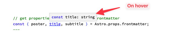 Typescript support in the Markdown layout.
Equally update the layout markup to render the image, title, and subtitle:
<!-- 📂 src/layouts/Blog.astro -->
<Main>
  <figure class="figure">
    <img
      src={poster}
      alt=""
      width="100%"
      height="480px"
      class="figure__image"
    />
    <figcaption class="figure__caption">
      Poster image for {title.toLowerCase()}
    </figcaption>
  </figure>

  <h1>{title}</h1>
  <h2>{subtitle}</h2>

  <slot />
</Main>

<style>
  h1 + h2 {
    margin-bottom: 3rem;
  }

  .figure {
    margin: 0;
  }

  .figure__image {
    max-width: 100%;
    border-radius: 10px;
  }

  .figure__caption {
    font-size: 0.9rem;
  }
</style>
Most of the markup is arguably standard. However, note the title.toLowerCase() call for the poster image caption. This is possible because any valid JavaScript expression can be evaluated within curly braces { } in the component markup.
Our markdown pages will now have styled titles, subtitles, and poster images. With all this handled in one place — the markdown layout.
 The fully formed Markdown page.
Interactive Navigation State
Now that we’re pros at handling interactive scripts in Astro let’s go ahead and make sure that we style our active navigation links differently.
As with all things programming, there are different ways to achieve this, but we will go ahead and script this.
<!-- 📂 src/components/NavigationBar.astro -->
<script>
  const { pathname } = window.location;
  const activeNavigationElement = document.querySelector(
    `nav a[href="${pathname}"]`
  );

  if (activeNavigationElement) {
    activeNavigationElement.classList.add("active");
  }
</script>
- Get the
pathnamefrom thelocationobject. This will be in the form"/beyond-tech","/philosophiesor"/". - Since the
pathnamecorresponds to thehrefon the anchor tag element, we may select the active anchor tag via:document.querySelector(nav a[href="${pathname}"]). - Finally, we add the
activeclass to the active anchor tag.
Finally, add the relevant style for the active tag:
/* 📂 src/components/NavigationBar.astro */
<style>
  /* ... */
 a.active {
  background: var(--grey-900);
  color: var(--background);
 }
</style>
Violà! We should now have the active anchor tag styled differently.
 Active anchor tag styles.
Component Composition
Our first look at component composition was with the Main and Blog layouts. Let’s take this further.
Our goal is to create a set of different yet identical cards. Each card acts as a link to a blog and will have a title and some background gradient.
 The eventual card layout we will build.
To achieve this, we’ll have a Cards.astro component that renders multiple Card.astro components.
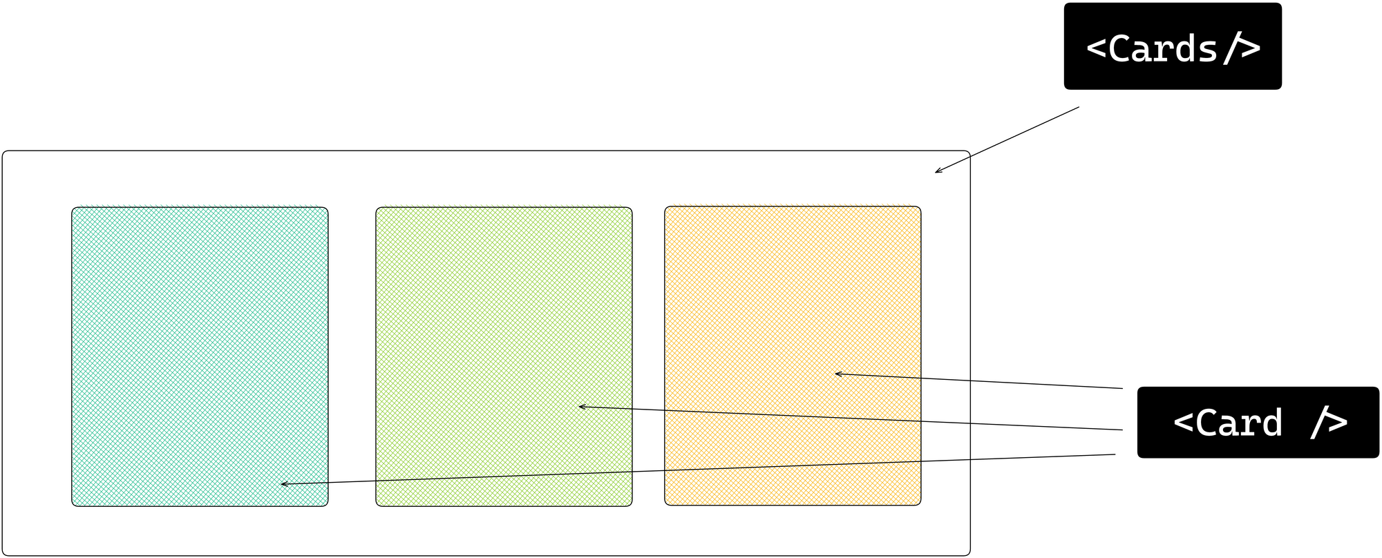 The card composition visualised.
Let’s start by creating Card.astro.
Define the relevant component props and relevant markup as shown below:
// 📂 src/components/Card.astro
---
{/** Export the Props type alias **/}
export type Props = {
  to: string;
  title: string;
  gradientFrom: string;
  gradientTo: string;
};

// Get component props from Astro.props
const { title, to } = Astro.props;
---
<a href={to} class="card">
<div class="card__inner">
<div class="card__title">{title}</div>
<!-- Render the arrow via HTML entity name: → = →-->
<div class="card__footer">→</div>
</div>
</a>
<style>
.card {
/** local CSS variable reused below */
--radius: 10px;
padding: 4px;
border-radius: var(--radius);
text-decoration: none;
transition: all 0.2s ease-in-out;
}
.card:hover {
transform: scale(0.95);
}
.card__inner {
background: var(--background);
padding: 1.5rem;
border-radius: var(--radius);
display: flex;
flex-direction: column;
}
.card__title {
font-size: 1.2rem;
color: var(--grey-900);
font-weight: 500;
line-height: 1.75rem;
}
.card__footer {
padding-top: 2rem;
font-size: 1.2rem;
color: var(--grey-900);
margin: auto 0 0 auto;
}
</style>
Now, go ahead and create the Cards.astro component as follows:
// 📂 src/components/Cards.astro
---
// Import the Card component
import Card from "./Card.astro";
// Import the Card Props type
import type { Props as CardProp } from "./Card.astro";

// Define the Props for this component
type Props = {
  cards: CardProp[]; // accepts an array of CardProps
};

// Retrieve the cards prop
const { cards } = Astro.props;
---
<div class="cards">
  <!-- Dynamically render multiple Card components and spread the required card props -->
   {cards.map((card) => <Card {...card} />)}
</div>

<style>
  .cards {
    display: flex;
    flex-direction: column;
    gap: 1rem;
  }

  /* Since this is standard CSS, we can have media queries here */
  @media screen and (min-width: 768px) {
    .cards {
      flex-direction: row;
    }
  }
</style>
To see the fruits of our labour, we must now import and render Cards in the index.astro page component.
// 📂 src/pages/index.astro
---
// ...
import Cards from "../components/Cards.astro";
---
<Main>
<div class="profile">
{/** ... **/}
</div>
{/** 👀 look here **/}
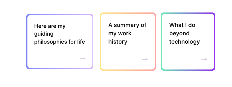
<Cards
cards={[
{
title: "Here are my guiding philosophies for life",
gradientFrom: "#818cf8",
gradientTo: "#d8b4fe",
to: "/philosophies",
},
{
title: "A summary of my work history",
gradientFrom: "#fde68a",
gradientTo: "#fca5a5",
to: "/work-summary",
},
{
title: "What I do beyond technology",
gradientFrom: "#6ee7b7",
gradientTo: "#9333ea",
to: "/beyond-tech",
},
]}
/>
</Main>
 The rendered cards.
Clicking any of the links will point to the respective blog page.
Let’s not forget to add the new work-summary.md page:
// 📂 src/pages/work-summary.md
---
layout: ../layouts/Blog.astro
poster: "/images/work-summary.jpg"
title: "Work summary"
subtitle: "A summary of my work:"
---

- VP Engineering at Google
- VP Engineering at Facebook
- VP Engineering at Tesla
- VP Engineering at Amazon
- VP Engineering at Netflix
There we go!
The Template Flow of Data
As we’ve discussed, the data in the frontmatter runs on the server and is not available in the browser.
As we’ve built our application, we’ve frequently leveraged data in the frontmatter in the template section, as shown below:
---
 const data = "Understanding Astro"
---

//Use data in the template
<h1>{data}</h1>
This is easy to reason about for our static website. We know this will eventually be compiled into HTML.
But consider a more robust markup that includes <style> and <script> elements. How do we reference data from the frontmatter in these markup sections?
---
 const data = "Understanding Astro"
---

// ✅ Use data in the template
<h1>{data}</h1>

// styles
<style>
 {/** ❌referencing data here will fail */}
</style>

// scripts
<script>
{/** ❌referencing data here will fail */}
 console.log(data)
</script>
One answer is via the define:vars template directive.
define:vars will pass our variables from the frontmatter into the client <script> or <style>. It’s important to note that only JSON serialisable values work here.
Let’s give this a shot.
We must reference the gradientFrom and gradientTo variables passed as props in our <style>.
First, to make the variables available within <style>, we’ll go ahead and use define:vars as follows:
// 📂 src/components/Card.astro
---
const { title, to, gradientFrom, gradientTo } = Astro.props;
// ...
---

<style define:vars={{gradientFrom, gradientTo }}>
  {/** ... **/}
</style>
define:vars accepts an object of variables we want available within <style>.
The variables are defined but not used yet.
Now, we can reference the variables via custom properties (aka css variables) as shown below:
/** 📂 src/components/Card.astro **/
<style define:vars={{gradientFrom, gradientTo }}>
  /** 👀 look here **/
  .card {
    background-image: linear-gradient(
      to right,
      var(--gradientFrom),
      var(--gradientTo)
    );
  }
 /** ... **/
</style>
And voilà!
Our cards are now more beautiful than ever.
 Applying dynamic gradients to the cards.
The Dark Side of define:vars
We’ve seen define:vars come in handy for using variables from the frontmatter of an Astro component. But be careful when using define:vars with scripts.
Using define:vars with a <script> is similar to using the is:inline directive.
Astro will not bundle the script and will be added multiple times if the same component is rendered more than once on a page.
Here’s an example to make this clear.
In Card.astro, go ahead and add a <script> with the define:vars directive as follows:
/** 📂 src/components/Card.astro **/
<script define:vars={{ gradientFrom }}>
  console.log(gradientFrom);
</script>
Inspect the elements via the developer tools. You’ll notice that the <script> is inlined and unprocessed, that is, just as we’ve written it, apart from being wrapped in an immediately invoked function execution (IIFE).
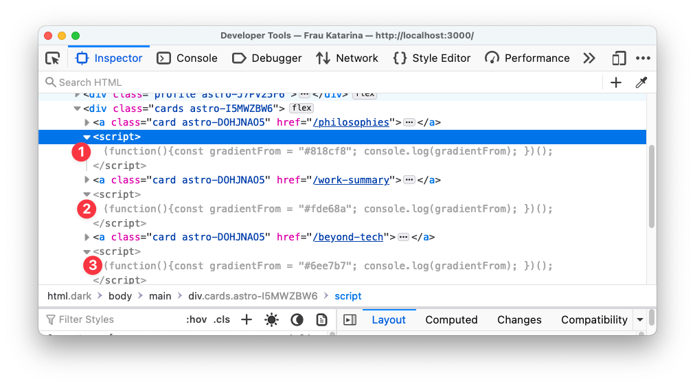 The inlined scripts.
The script is also added three times — with a different value of gradientFrom for each rendered card.
With scripts, a better solution (except the inline behaviour is ideal for your use case) is to pass the data from the component frontmatter to the rendered element via data- attributes and then access these via JavaScript.
For example, we may rewrite the previous solution as shown below:
---

---
<a href={to} class="card" data-gradientfrom={gradientFrom}>
 ...
</a>
...
<script>
  const card = document.querySelector(".card");

  // narrow the type of card to HTMLElement to access ".dataset"
  if (card instanceof HTMLElement) {
    // access data in dataset.gradientfrom
    console.log(card.dataset.gradientfrom);
  }
</script>
Note that this is a contrived example and only retrieves the first card element with its associated gradientfrom data. Still, this demonstrates how to prevent unwanted behaviours with define:vars in <script>s.
How to Load Multiple Local Files
Let’s go ahead and create a new blog directory to hold some more markdown pages. The pages and their content are shown below:
📂 pages/blogs/rust-javascript-tooling.md :
---
layout: "../../layouts/Blog.astro"
poster: "/images/adventure.jpg"
title: "Why Rust is the Future of Javascript Tooling"
subtitle: "How to create fast, speedy developer experiences."
---

- Rust is fast
- Yes, it is fast
- Touted as the new C++
- Did I mention it's pretty fast?
📂 pages/blogs/sleep-more.md :
---
layout: "../../layouts/Blog.astro"
poster: "/images/sleeping-cat.jpg"
title: "Why you should sleep more"
subtitle: "Sleep is great for you. Here's why:"
---

- Sleep
- Sleep more
- Sleep a little more
📂 pages/blogs/typescript-new-javascript.md :
---
layout: "../../layouts/Blog.astro"
poster: "/images/coding.jpg"
title: "Typescript is the new Javascript"
subtitle: "Typescript is becoming a standard for web development these days:"
---

- Type safety
- Type safety!
- Even more type safety!
We aim to list these blog titles on our home page. One way to do this would be to render all link elements in index.astro manually:
<!-- 📂 src/pages/index.astro -->
...
<Main>
 ...
 <div class="featured-blogs">
    <h3 class="featured-blogs__title">Featured Blogs</h3>
    <p class="featured-blogs__description">
      Opinion pieces that will change everything you know about web development.
    </p>
 </div>

 <ol class="blogs">
    <li class="blogs__list">
      <a href="blogs/typescript-new-javascript" class="blog__link"
        >Typescript is the new Javascript</a
      >
    </li>

    <li class="blogs__list">
      <a href="/blogs/rust-javascript-tooling" class="blog__link"
        >Why Rust is the future of Javascript tooling</a
      >
    </li>

    <li class="blogs__list">
      <a href="/blogs/sleep-more" class="blog__link"
        >Why you should sleep more</a
      >
    </li>
 </ol>
</Main>
Then update our component styles:
<!-- 📂 src/pages/index.astro -->
...
<style>
  ...
  .featured-blogs {
    margin: 0;
    padding: 3rem 0 0 0;
  }
  .featured-blogs__title {
    font-size: 2rem;
    color: var(--gray-900);
  }

  .featured-blogs__description {
    margin-top: -1.2rem;
  }

  .blogs {
    font-size: 1rem;
    font-weight: 500;
  }

  .blogs__list {
    border-bottom: 1px solid;
    border-color: var(--gray-200);
  }

  .blog__link {
    opacity: 1;
    height: 100%;
    display: block;
    padding: 1rem 0;
    color: var(--gray-200);
    text-decoration: none;
    transition: opacity 0.2s ease-in-out;
  }

  .blog__link:hover {
    opacity: 0.7;
  }
</style>
This isn’t necessarily a wrong approach to getting this done. We will now have a list of the blogs, as expected.
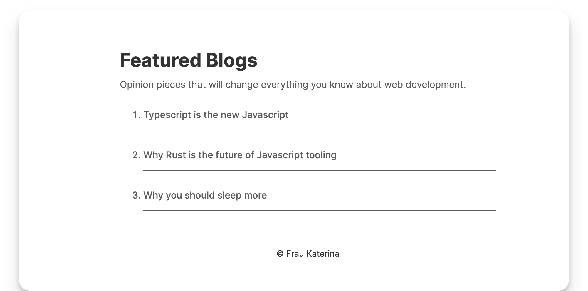 The rendered blog list.
A better solution is to use Astro.glob() to load multiple files.
Astro.glob() accepts a single URL glob parameter of the files we’d like to import. glob() will then return an array of the exports from the matching file.
Talk is cheap, so let’s put this into action.
Instead of manually writing out the list of blog articles, we will use Astro.glob() to fetch all the blog posts:
// 📂 src/pages/index.astro
---
const blogs = await Astro.glob<{
  poster: string;
  title: string;
  subtitle: string;
}>("../pages/blogs/*.md");
...
---
...
- Note the argument passed to
.glob, that is../pages/blogs/*.md. This relative glob path represents all markdown files in the/blogsdirectory. - Also note the typing provided.
.globimplements a generic, which, in this case, represents the markdown frontmatter object type.
{
    poster: string;
    title: string;
    subtitle: string;
}
Now, we may replace the manual list with a dynamically rendered list, as shown below:
// 📂 src/pages/index.astro
...
  <ol>
    {
      blogs.map((blog) => (
        <li class="blogs__list">
          <a href={blog.url} class="blog__link">
            {blog.frontmatter.title}
          </a>
        </li>
      ))
    }
  </ol>
- Dynamically render the blog list using the
.maparray function. Astro.glob()returns markdown properties including frontmatter andurlwhereblog.urlrefers to the browser url path for the markdown file.
And voilà! Same result with a much neater implementation.
How to Deploy a Static Astro Site
We’ve come a long way! Now, let’s deploy this baby into the wild.
Deploying a static website is relatively the same regardless of the technology used to create the site.
At the end of your deployment build, we’ll have static assets to deploy to any service we choose.
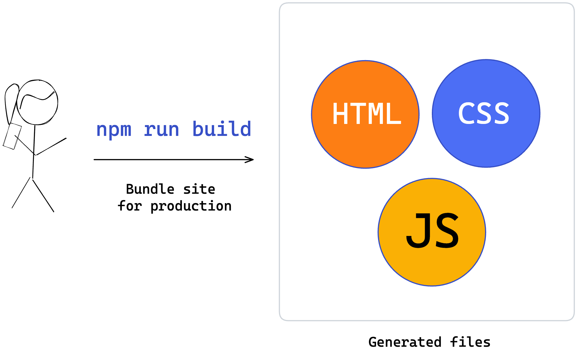 Generating production builds.
Once this is done, we must wire up a static web server to serve this content when your users visit the deployed site.
NB: a static web server is a web server that serves static content. It essentially serves any files (for example, HTML, CSS, JS) the client requests.
This breaks down the process of deploying a static website into two parts:
- Create the static production assets
- Serve the static assets via a static web server
Let’s go through these steps.
1. Create static production assets
To build our application for production, run the command:
npm run build
This will internally run the astro build command and build our application production static assets.
By default, these assets will exist in the dist folder.
2. Serve the static assets via a static web server
Choosing a web server will come down to your choice. I’ll go ahead and explain how to use Netlify. But the steps you'll take with your web server provider will look similar.
Go over to Netlify and create an account.
 The Netlify homepage.
Once you create an account and sign in, you’ll find a manual section to deploy a site.
 The Netlify dashboard.
Now, click browse to upload and upload the dist folder containing our static production assets.
Once the upload is completed, you’ll have your site deployed with a random public URL, as shown below:
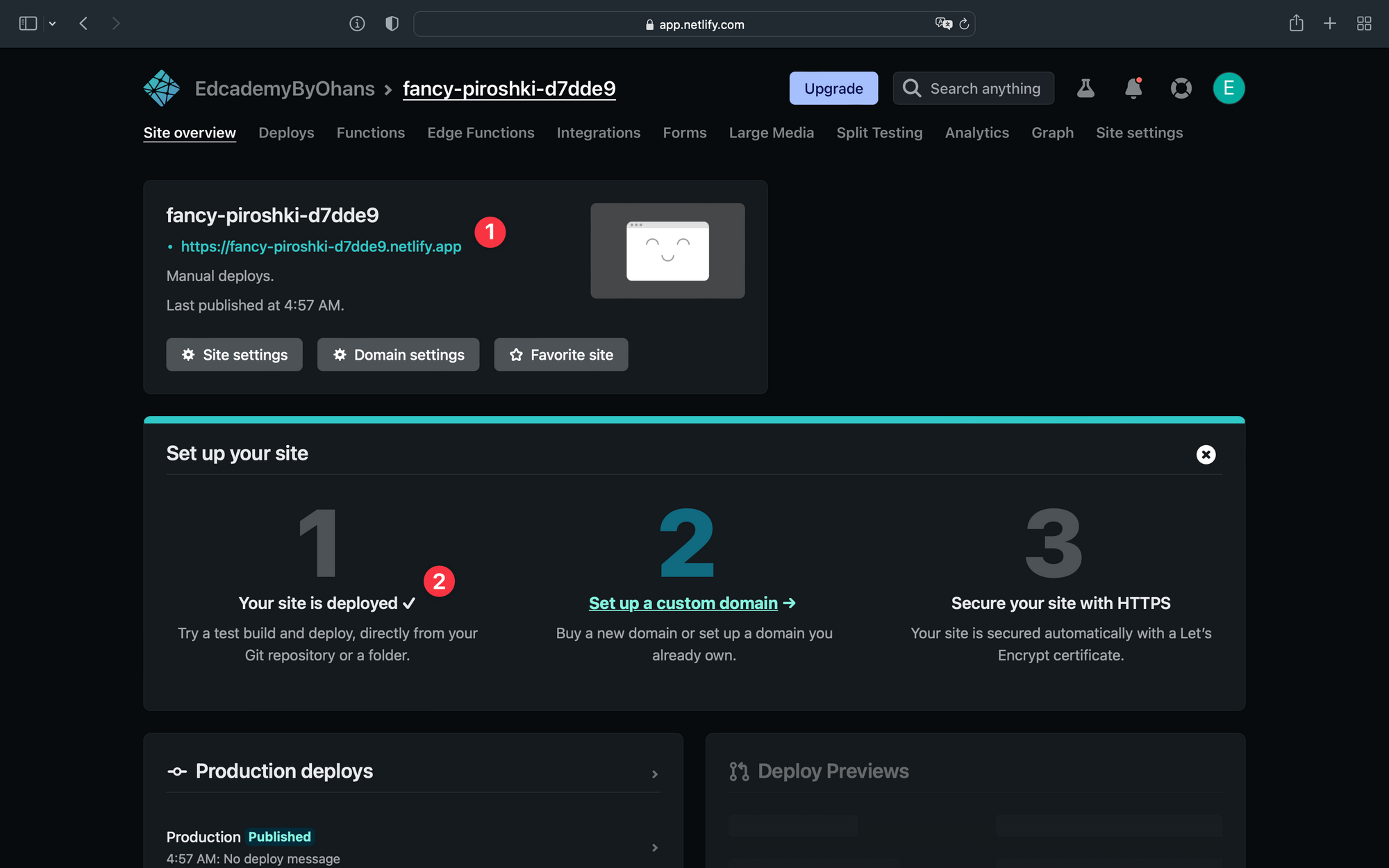 Deployed Netlify site URL.
Visit the URL to view your newly deployed website!
The Problem with Manual Deployments
Manual deployments are great for conceptually breaking down the process of deploying a static website.
But in the real world, you may find this less optimal.
The main challenge here is that every change made to your website requires you to build the application and re-upload it to your server manually.
 Manually redeploying after new changes.
This is a well-known problem with a standardised solution. The solution involves automating the entire process of deploying static websites by connecting your website to a Git provider.
How to Automate the Deployment of a Static Website
Automating the deployment of a static website looks something like this:
Step 1: Write and push your code to a Git provider like GitHub.
Step 2: Connect the GitHub project to your static web server provider, for example Netlify.
Step 3: You provide your website’s build command and the location of the built assets to your web server provider, for example Netlify.
Step 4: Your web server provider automatically runs the build command and serves your static assets.
Step 5: Anytime you make changes to the GitHub project, your web server provider picks up the changes and reruns step 4, that is automatically deploying your website changes.
To see this process in practice with Netlify, go over to your dashboard and connect a Git provider (step 1).
 Netlify: connecting a Git provider.
I’ll go ahead to select GitHub, authorise Netlify, and select the GitHub project (step 2).
 Netlify: selecting the Github project.
Once that’s selected, provide the settings for your application deployment (Step 3). By default, Netlify will suggest the build and publish directory. Check these to make sure there are no errors.
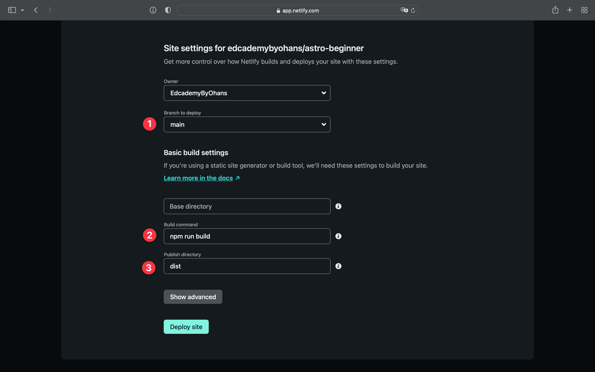 Netlify: suggested build command and publish directory.
Hit deploy, and your site will be live in seconds (step 4).
To see the redeployment after a new change, push a new change to the connected git repository.
How Fast is Our Astro Website?
Astro boasts of insanely fast websites compared to frameworks like React or Vue.
Let’s put this to the test by following the steps below:
- Visit the newly deployed website on Chrome.
- Open the Chrome developer tools.
- Go to the Lighthouse tab.
- Analyse the page load.
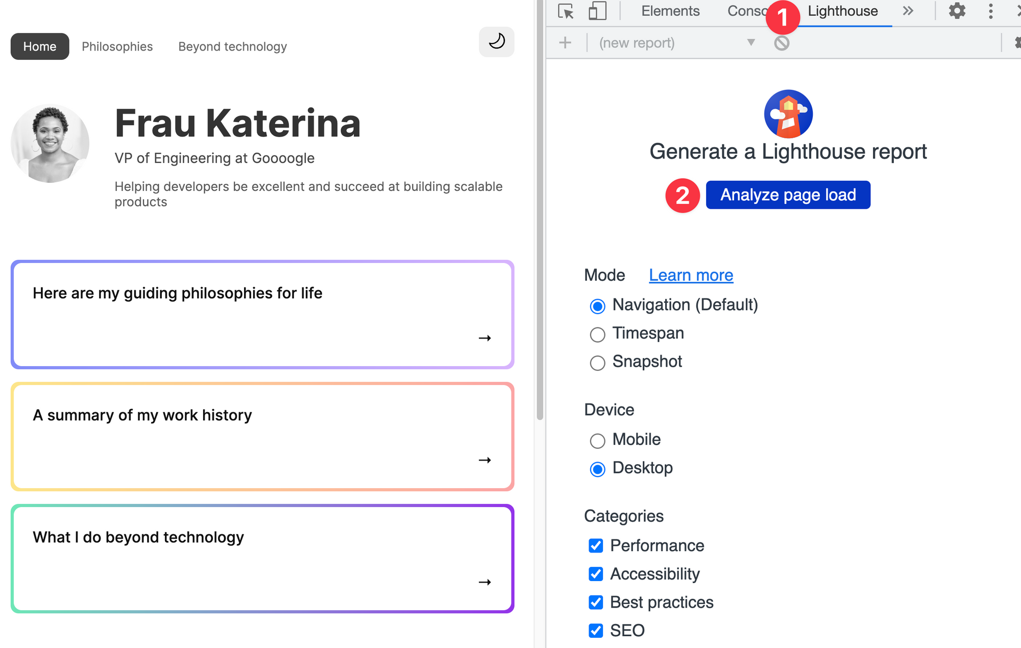 Analysing page load via lighthouse.
Here’s my result running the test:
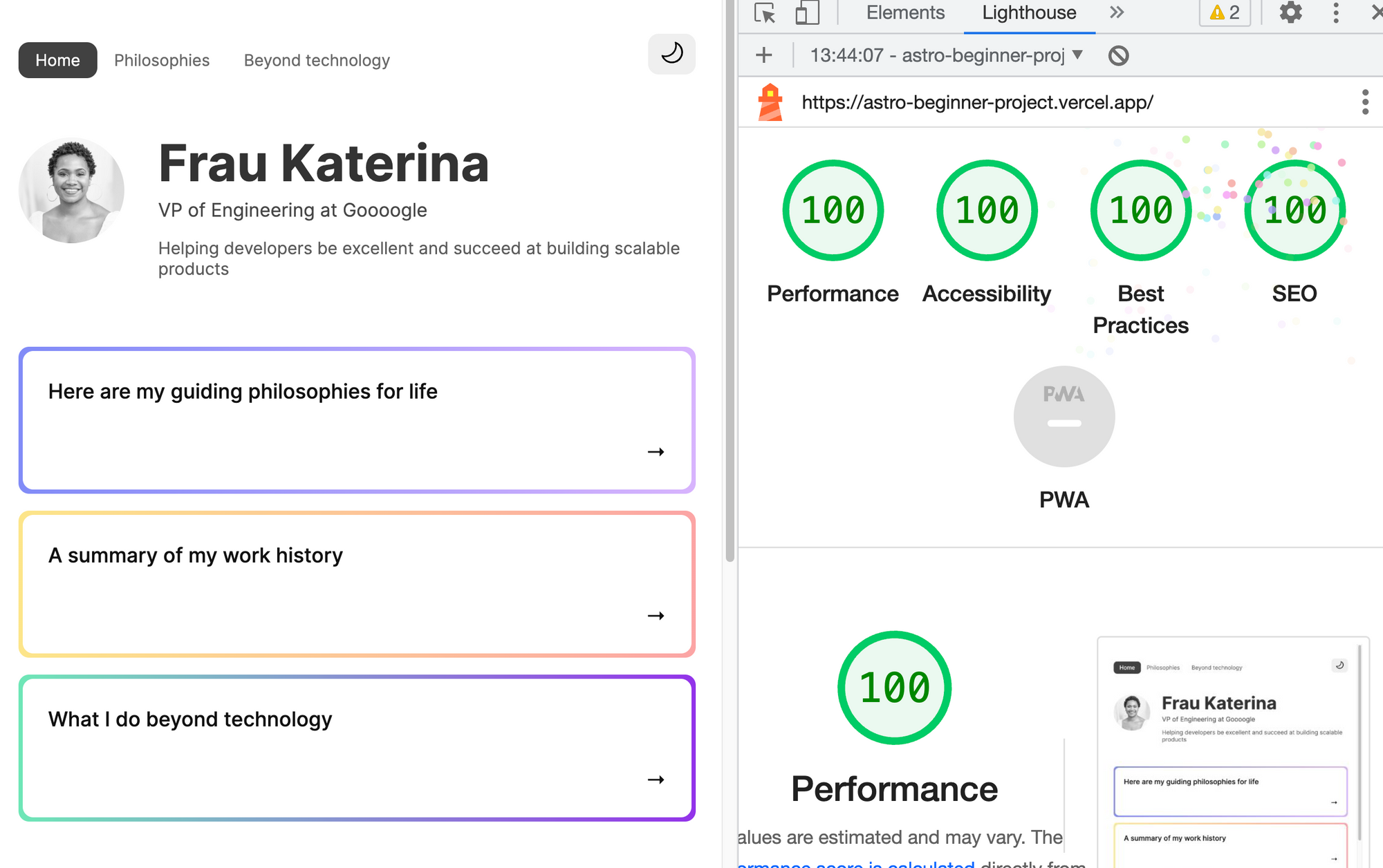 Lighthouse 100% scores.
If this were a school examination, we would have just scored A+ on performance without trying.
This is a fast website!
Feel free to run the test on other pages.
Wrapping Up This Chapter
This has been a lengthy introduction to Astro! We’ve delved into building a project and learned a handful of Astro’s capabilities, from installation to project structure to the nuances of inline scripts and, eventually, project deployment.
Why stop here? We’ve only just scratched the surface.
 Chapter two.
Chapter 2: Astro Components In-Depth
In this section, you'll beyond the basics and master the essential Astro entity.
What You’ll Learn
- What zero JavaScript means in practical terms.
- Why we should consider ditching the JavaScript runtime overhead.
- Truly understand what an Astro component is.
- Understand the behaviour of Astro component markup, styles and scripts.
- Learn the powerful Astro template syntax and how it differs from
JSX.
Introduction
Consider the Pareto principle:
The Pareto principle, also known as the 80/20 rule, states that 20% of the input can significantly impact 80% of the outcome in a particular situation or system.
 The Pareto principle illustrated
Now, pay attention because this is where things get spicy. When it comes to working with Astro components, I've got a sneaky suspicion that that magic 20% yields a whopping 80% productivity.
So, let's get cracking and master these Astro components, shall we?
The Backbone of Astro
At the time of writing, consider the definition of Astro components from the official docs:
Astro components are the basic building blocks of any Astro project. They are HTML-only templating components with no client-side runtime.
The first part of the sentence is clear as daylight: Astro components are the basic building blocks of any Astro project.
 Like a fun game of Tetris, Astro components are how we build Astro applications.
The second part of the sentence leaves room for interpretation or ambiguity: they are HTML-only templating components with no client-side runtime.
But in this sentence lies the heartbeat of Astro components.
Let’s explore this in practical terms.
The JavaScript runtime fatigue
To truly appreciate Astro components, we must turn to our “standard” user interface framework components, for example those provided by React or Vue.
Your level of familiarity with these frameworks doesn’t matter. I’ll explain the following steps as clearly as possible. So trust me and follow along.
Firstly, create a new React project called test-react-app with the following terminal command:
npx create-react-app test-react-app
This utilises the create-react-app utility.
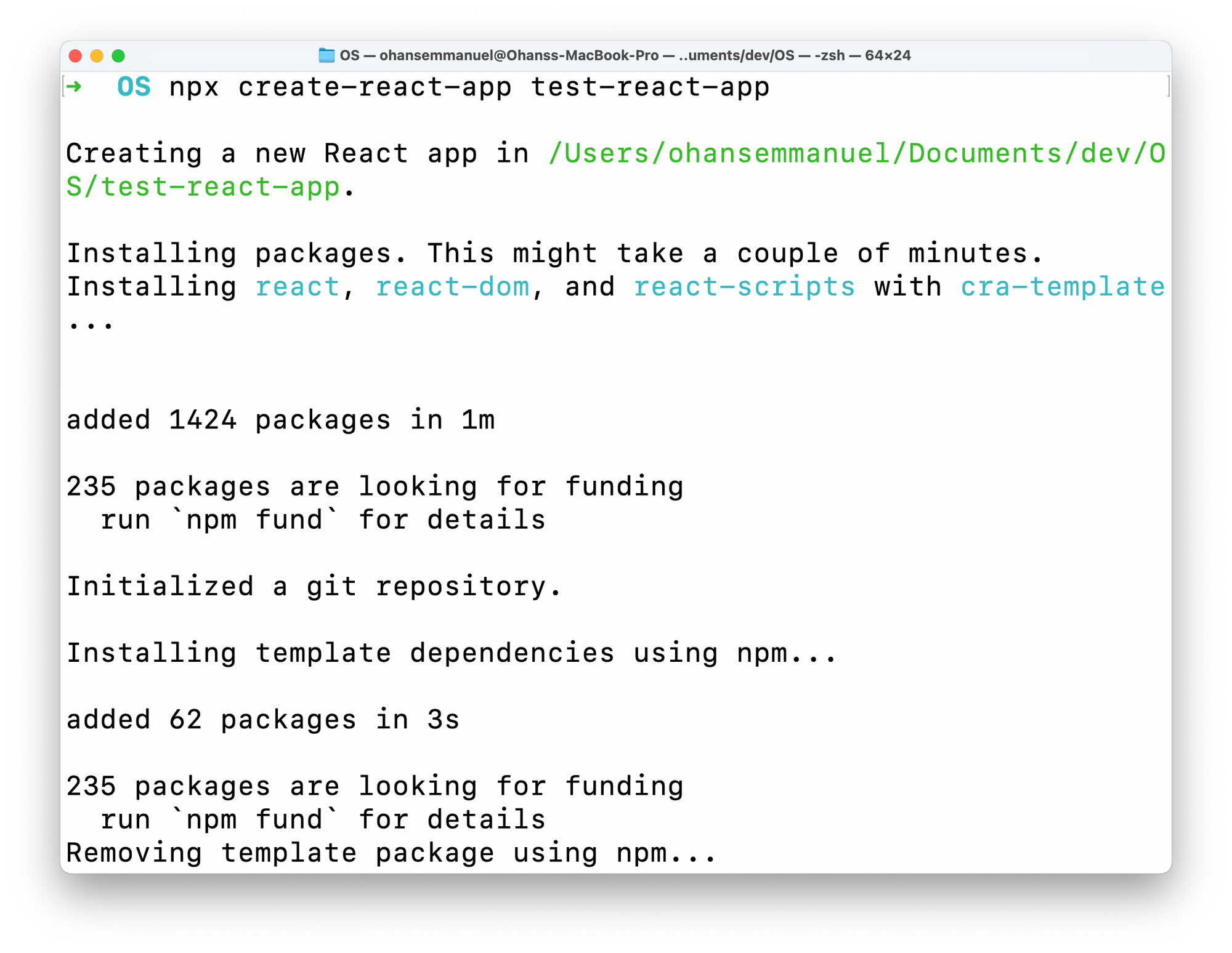 Creating a new React project from the terminal.
This will create a new React app in the test-react-app directory.
Now change the current directory, install dependencies, and start up the React application with the following command:
cd test-react-app && npm install && npm run start
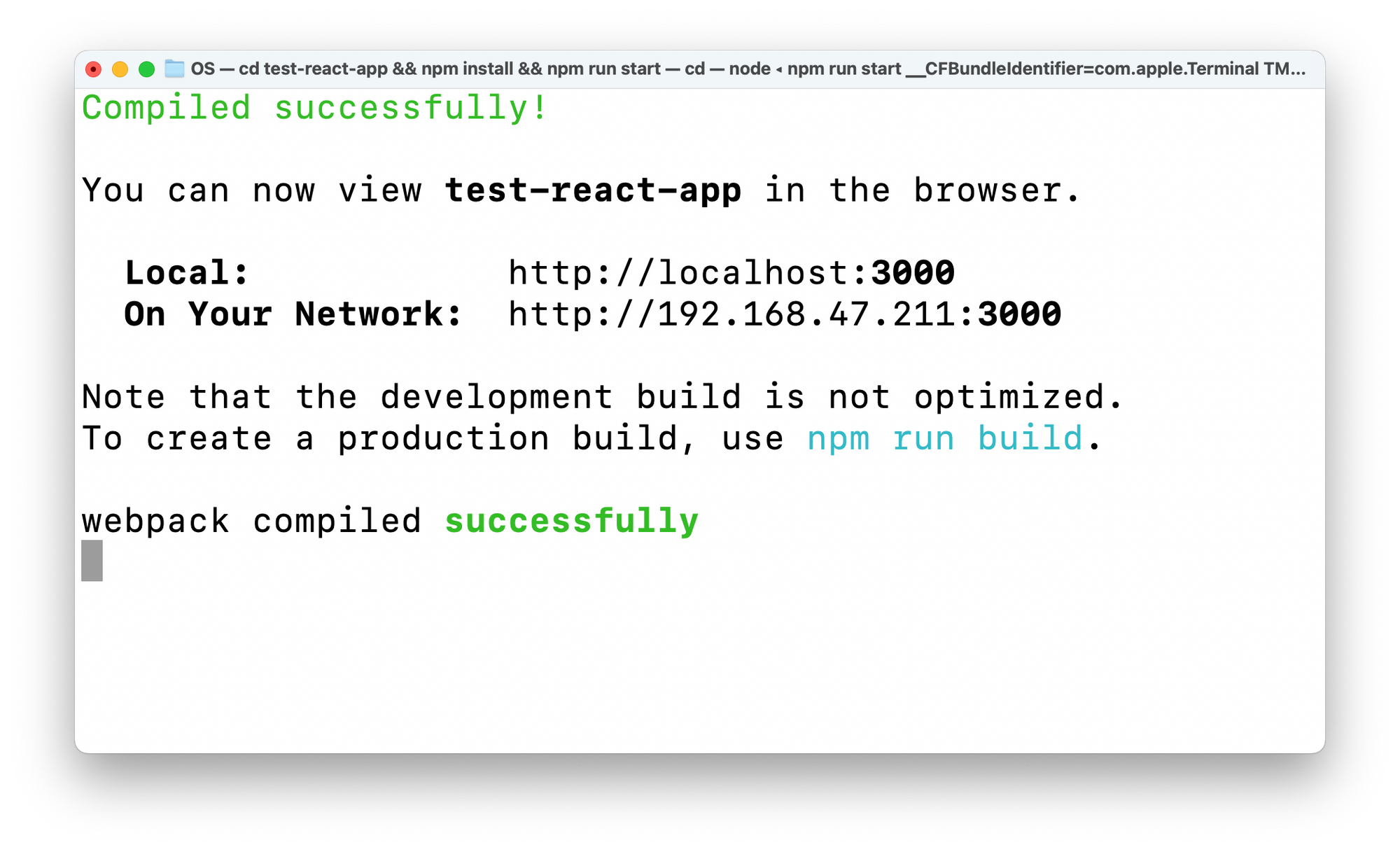 Starting the test React application.
This will start a trivial React application on http://localhost:3000/ or any other available local port.
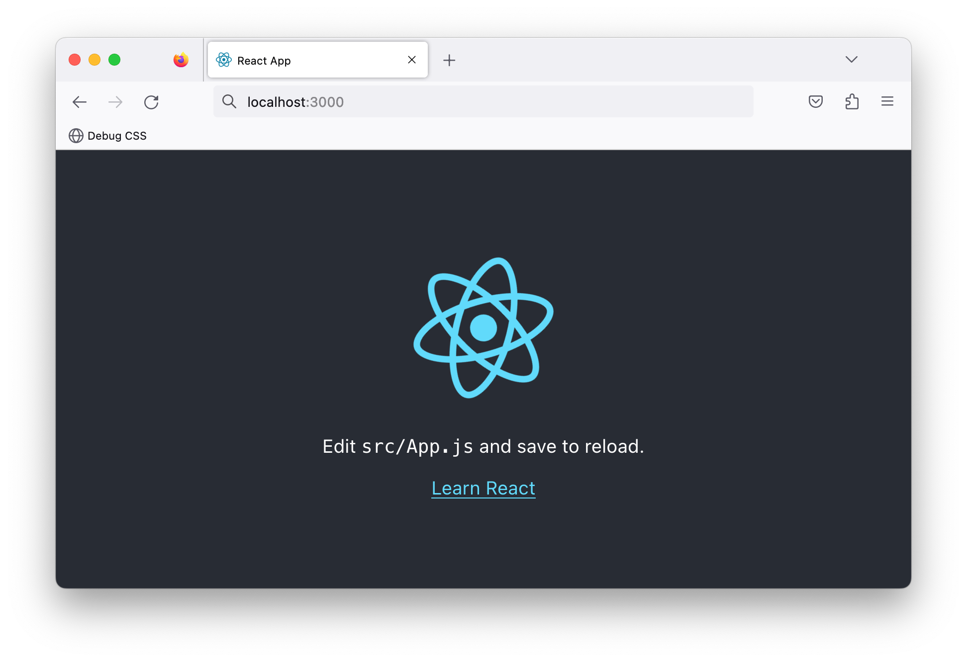 The React test application running in the browser.
This is a contrived React application. It renders text paragraphs, and the React logo, and the application has no significant UI state changes or complex logic.
Now, let’s bundle this application for production.
Stop the local running server and build the application with the following command:
npm run build
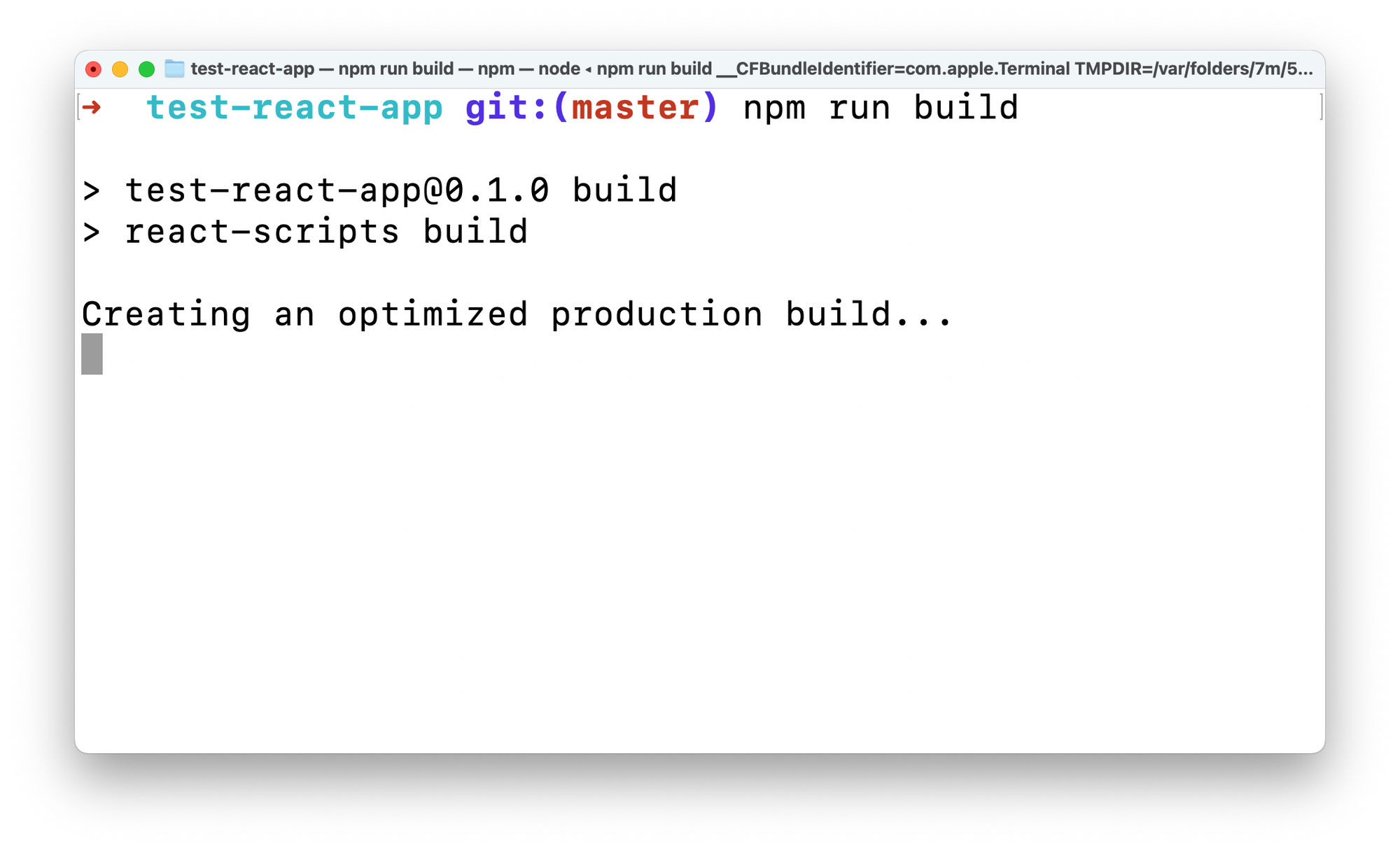 Building the test React application for production.
Let’s take a look at the build output.
Open the test-react-app directory in your code editor of choice and observe the build/index.html file. This root file will be served to the browser when the React application is visited.
Unwrap the minified file:
<!-- 📂 build/index.html -->

<!DOCTYPE html>
<html lang="en">
  <head>
    <meta charset="utf-8" />
    <link rel="icon" href="/favicon.ico" />
    <meta name="viewport" content="width=device-width,initial-scale=1" />
    <meta name="theme-color" content="#000000" />
    <meta
      name="description"
      content="Web site created using create-react-app"
    />
    <link rel="apple-touch-icon" href="/logo192.png" />
    <link rel="manifest" href="/manifest.json" />
    <title>React App</title>
    <script defer="defer" src="/static/js/main.3b5961bb.js"></script>
    <link href="/static/css/main.073c9b0a.css" rel="stylesheet" />
  </head>
  <body>
    <noscript>You need to enable JavaScript to run this app.</noscript>
    <div id="root"></div>
  </body>
</html>
This is a standard HTML file. But what’s of note in its content is the following:
<!-- 📂 build/index.html -->
...
<script defer="defer" src="/static/js/main.3b5961bb.js"></script>
<link href="/static/css/main.073c9b0a.css" rel="stylesheet" />
...

<div id="root"></div>
...
The document renders a <div id="root"></div> node, and the bundled JS and CSS assets are linked in the <head>.
Do you see the defer attribute on the <script>?
With the defer attribute, the script will be downloaded in parallel as the page is parsed and will be executed after the page is parsed.
By implication, this page renders an empty <div> at first until the JavaScript is parsed.
Well, let’s not panic. Instead, let’s explore the JavaScript referenced here. First, look at the bundled JavaScript asset in build/static/js/main...js.
If we unwrap the minified file, we should have a file that’s a little short of 9500 lines of JavaScript!
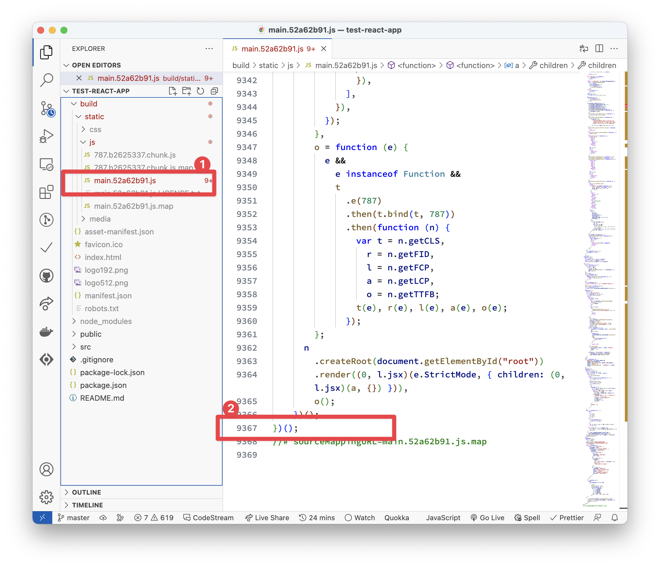 Unwrapping the minified Javascript asset for the trivial React application.
Wait … what?! For such a trivial application?! 😱
Oh yes.
I considered adding a funny meme here, but let’s not stray from the point’s importance.
Explaining what goes on within these 9000+ lines of JavaScript is beyond the scope of this book. But what we have in the file is an immediately invoked function (IIFE) with its entire content executed.
// 📂 build/static/js/main...js
!(function () {
  // ... lines of code go here
})();
We certainly didn’t write the 9000+ lines of code in the main bundle. No! Most of that is the React runtime needed to make our React application work in the way React’s built: state, props, hooks, virtual DOM, and all the lovely abstractions React provides.
Ditching the runtime
Unlike most JavaScript frameworks, Astro advocates for zero JavaScript by default. This means no JavaScript runtime overhead, as in the previous React application.
So, I’ve done what any competent investigator would — reconstructed the crime scene.
To do this, I built the same React starter application using Astro.
Use the following command to create the project:
npm create astro@latest -- --template ohansemmanuel/astrojs-ditch-the-runtime-react --yes
We use the same create astro command to create a new project. The difference here is the --template argument that points to ohansemmanuel/astrojs-ditch-the-runtime-react and the --yes argument to skip all prompts and accept the defaults.
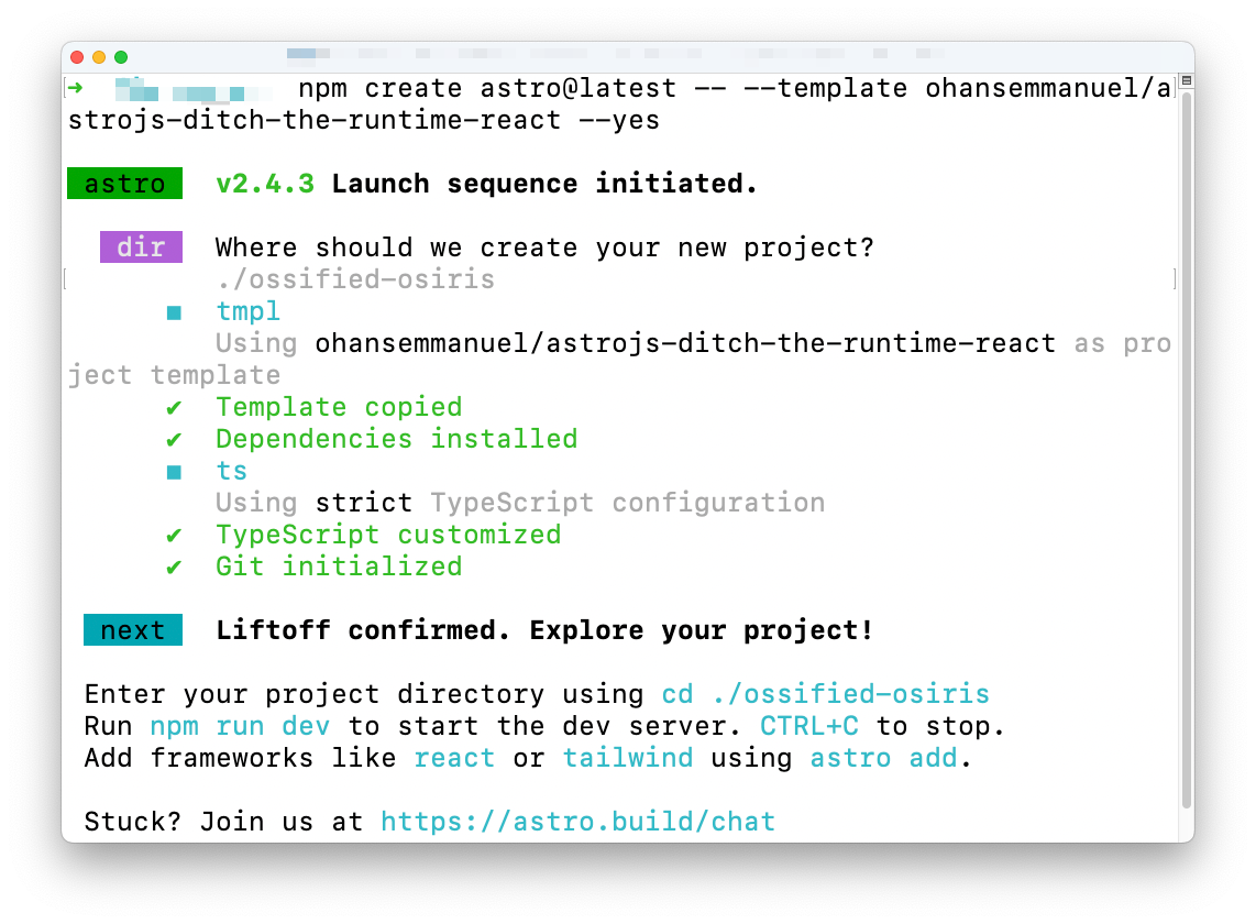 Creating a new Astro project with a template.
Choose the project directory, then start the application via:
npm run start
 The new Astro project running on localhost
Note that the application is similar to the starter React application we explored earlier.
Now let’s go ahead and build this application for production with the following command:
npm run build
This will build the Astro application and generate static in the dist/ directory.
Explore the build output and find the main HTML, CSS and image files in dist/assets.
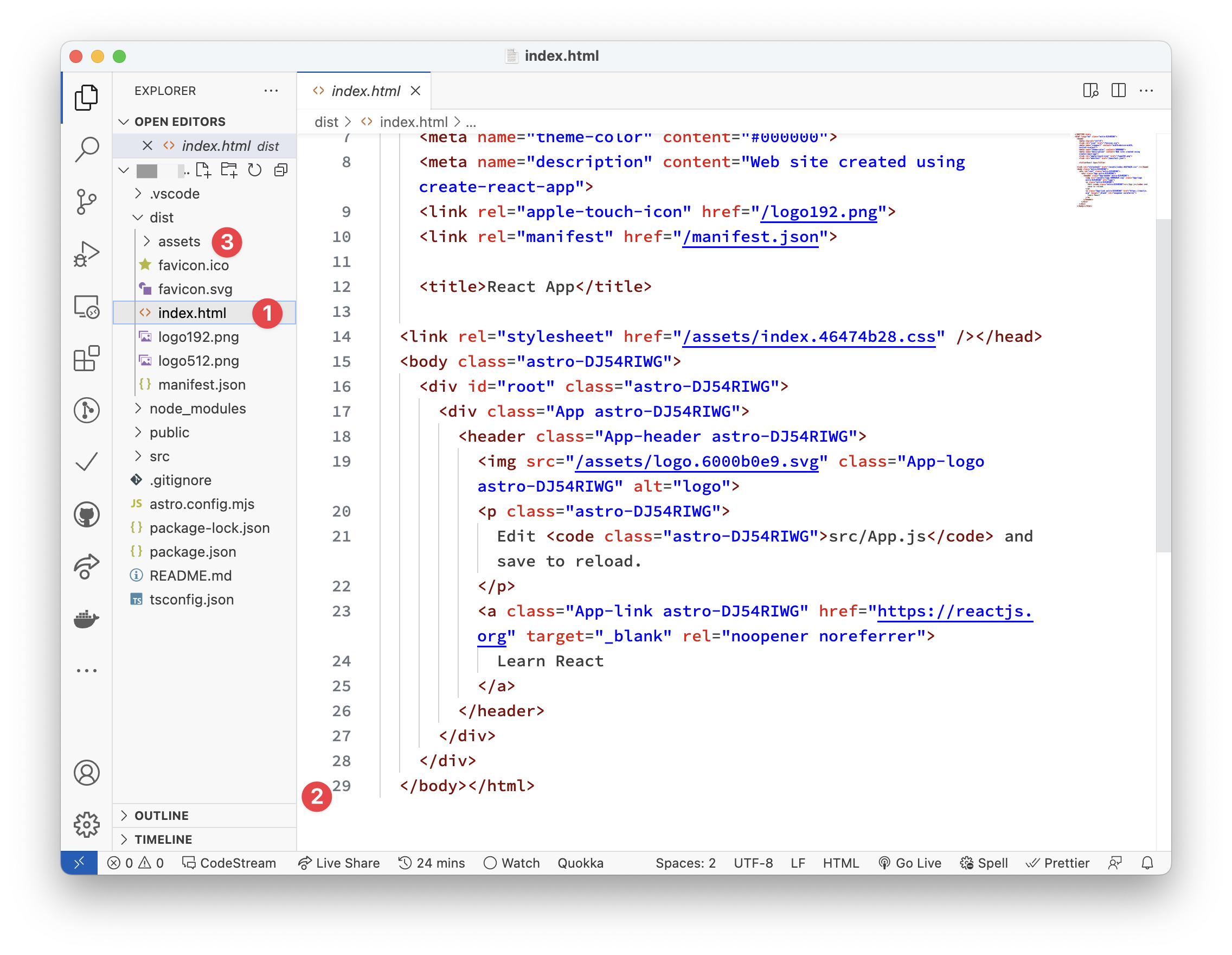 The Astro project build output.
Look closely, and you’ll realise there’s no JavaScript build output! Instead, we have the index.html file, associated CSS, and image assets.
For the same result, we’ve eliminated the 9000+ lines of JavaScript the React example required.
This right here is what’s meant by zero JavaScript by default. This is the Astro premise.
I’m not advocating that you don’t use React or your favourite framework. But this example helps you understand Astro’s premise, that is to eliminate the need to have such client-side runtime if you don’t need it.
The exciting truth is that we don’t need the JavaScript runtime overhead for many applications, such as content-driven websites. So you can ditch it in favour of Astro.
What is an Astro Component?
Before defining Astro components, let’s consider a more generic question. In straightforward terms, what is a website?
My straightforward answer would be: a website is a set of related HTML pages under a single domain.
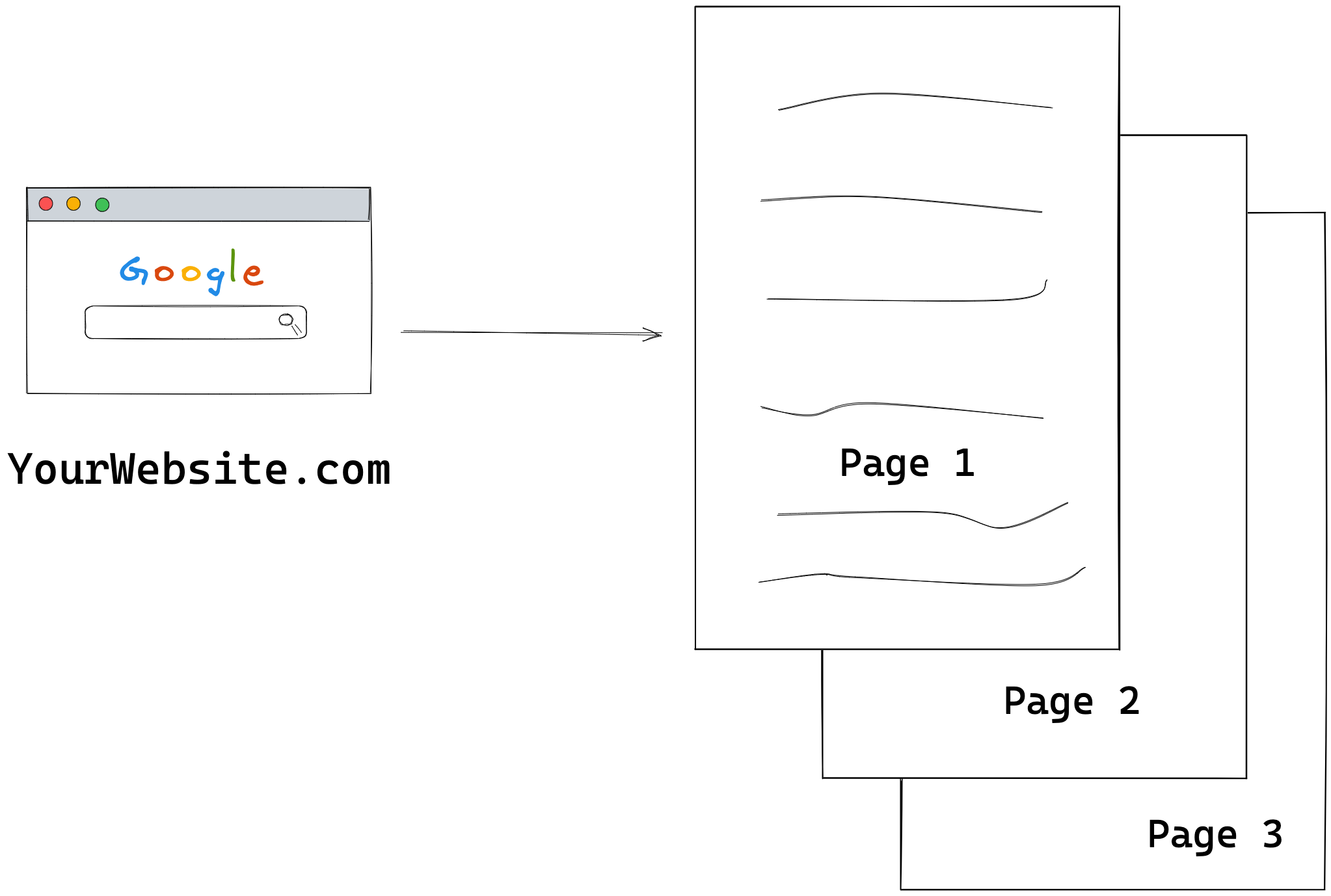 A multi page website
Now, with a single-page application, my definition would need to be updated. This is because a single-page website now consists of a single HTML page with routing handled via client-side JavaScript.
Regardless of the type of website, there’s a common denominator: the browser renders one or more HTML pages.
So, we will start our discussion by exploring the basic HTML page shown below:
<!DOCTYPE html>
<html lang="en-GB">
  <head>
    <meta charset="UTF-8" />
    <meta name="viewport" content="width=device-width" />
    <title>HTML 101</title>

    <style>
      p {
        color: red;
      }
    </style>

    <script>
      console.log('Hello world');
    </script>
  </head>
  <body>
    <p>Hello World</p>
  </body>
</html>
We won’t win any design awards with this page, but it suffices for our learning purposes.
In the HTML above, notice how we’ve produced a paragraph with the text Hello world, styled it with some CSS and logged a message to the console using JavaScript.
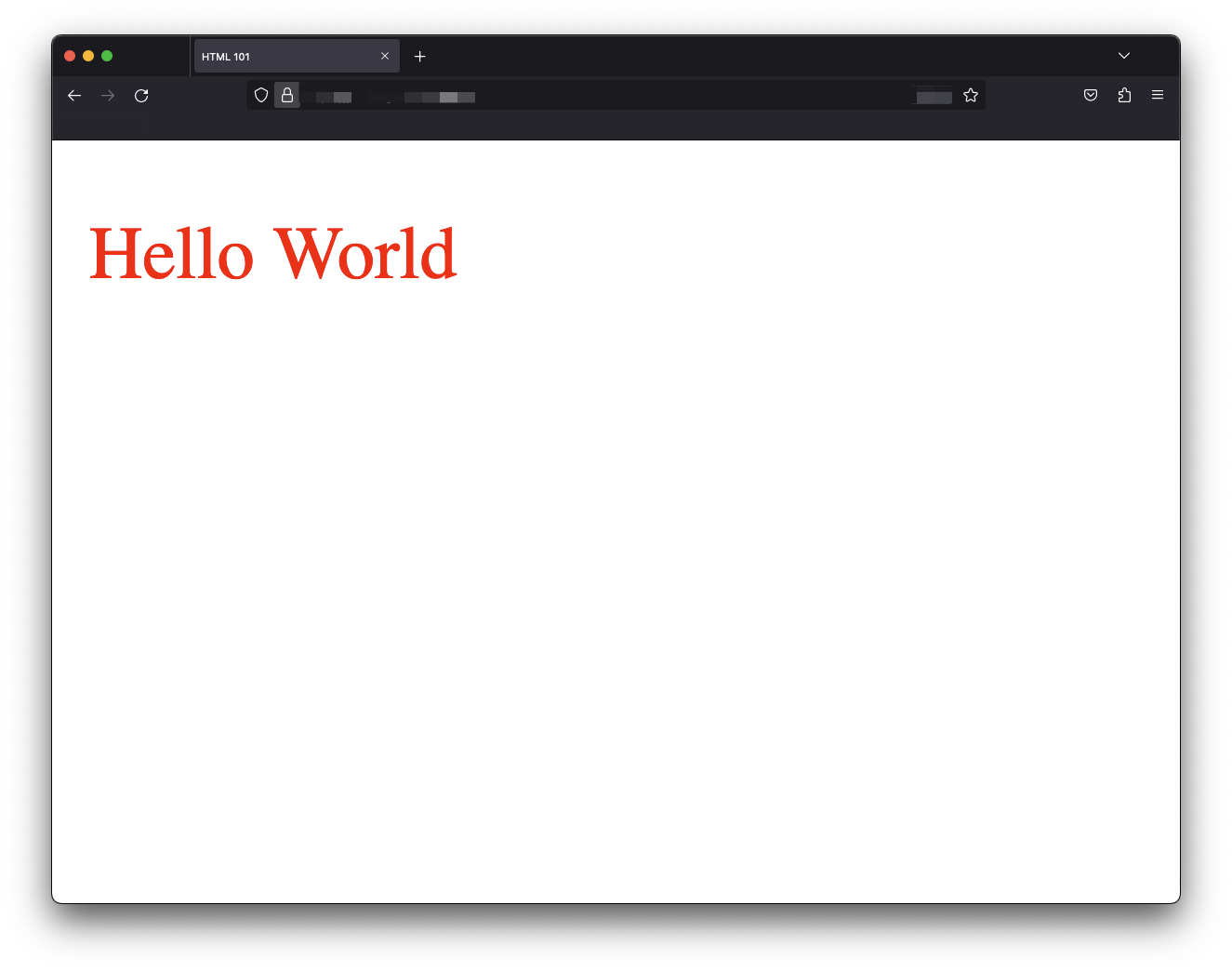 The basic HTML page
In this seemingly simple file, we’ve combined style, script and markup — the three core components of any web application.
Astro components are identical to HTML files, leading us to our first definition of an Astro component.
An Astro component is a .astro file capable of rendering any valid HTML
An Astro component is a document with a .astro file ending, that is file.astro or anotherFile.astro capable of rendering valid HTML content.
Let’s start a barebones hello-astro project to explore this statement. This time, we will not use the create astro utility. Instead, we will manually install Astro.
Create an empty directory and navigate into it:
mkdir hello-astro
cd hello-astro
Run the following command to start the new project:
npm init --yes
The --yes flag will use all the defaults, skipping the prompts.
Now install astro:
npm install astro
Create an empty Astro page in the project in src/pages/index.astro.
This file must be in the src/pages directory as pages are the entry point to an Astro project.
Now we should have a project structure similar to the following:
 The hello-astro project structure.
At this point, go ahead and paste the starting HTML snippet into the index.astro component as follows:
<!-- 📂 src/pages/index.astro -->
<!DOCTYPE html>
<html lang="en-GB">
  <head>
    <meta charset="UTF-8" />
    <meta name="viewport" content="width=device-width" />
    <title>HTML 101</title>

    <style>
      p {
        color: red;
      }
    </style>

    <script>
      console.log('Hello world');
    </script>
  </head>
  <body>
    <p>Hello World</p>
  </body>
</html>
Then start up the application with the command:
npx astro dev
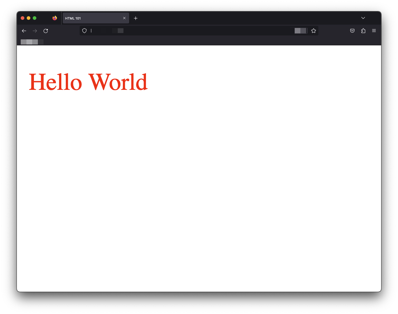 The hello astro application
We’ve got Hello World in red! index.astro successfully renders the HTML content to our web application’s index page.
Valid HTML is thus valid Astro.
If you know HTML, you already know some Astro.
The familiarity with HTML makes Astro approachable. But Astro components would be useless if they were equivalent to HTML pages. Building a new library (Astro) identical to HTML would waste resources. Well, apart from the fancy Astro logo, that’s a win.
Luckily, the Astro component syntax provides features expected from a modern frontend library, making it a superset of HTML.
This leads to our second definition.
Astro components can be composed to make complex pages
Standard HTML files cannot be composed. We cannot import HTML files into another HTML file. That would be invalid.
But composability is vital to structuring complex user interfaces.
Astro components are composable, which makes them highly flexible and reusable.
 The parent child component relationship
The following pseudocode would be a valid representation of parent-child components:
<AstroComponent>
    <!-- render children components in here -->
    <ChildAstroComponent />
    <ChildAstroComponent />
    <ChildAstroComponent />
</AstroComponent>
The simplified mental model for building classic websites involves stringing together a bunch of HTML pages to make up a website.
Astro builds upon the same mental model.
So, essentially, an Astro website comprises pages that eventually get compiled into HTML.
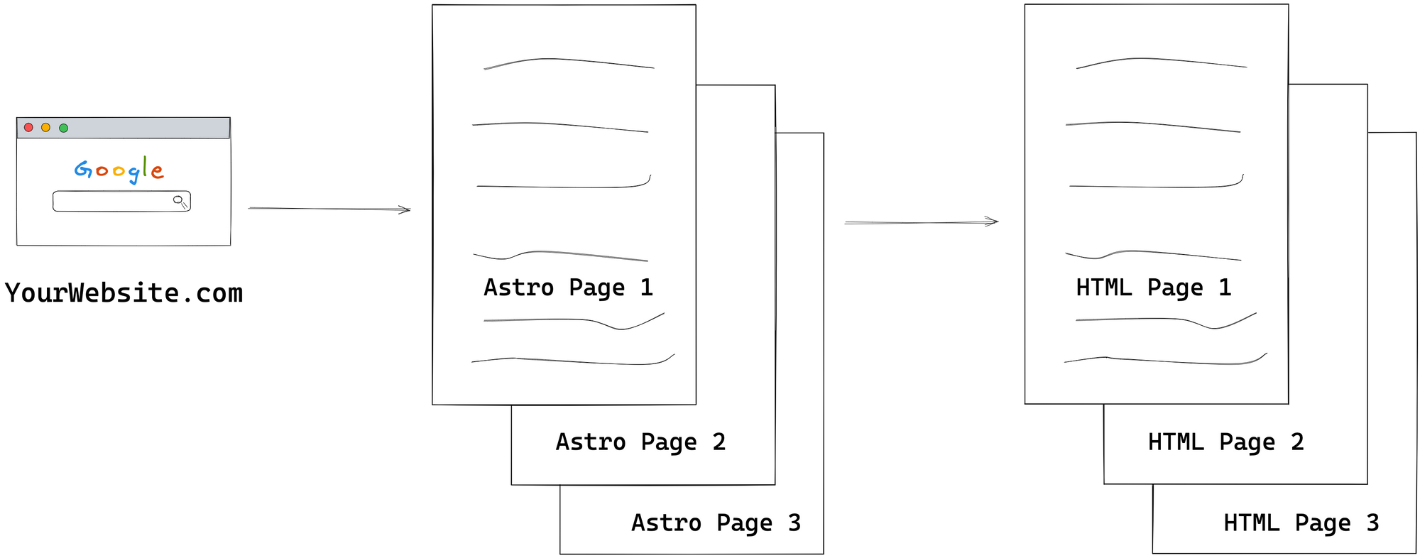 A website made of Astro pages.
Since Astro pages are just Astro components found in the src/pages directory of our Astro project, they can also compose other Astro components.
Let’s give this a shot.
Consider the starting index.astro page below:
<!-- 📂src/pages/index.astro -->

<!DOCTYPE html>
<html lang="en-GB">
  <head>
    <meta charset="UTF-8" />
    <meta name="viewport" content="width=device-width" />
    <title>HTML 101</title>

    <style>
      p {
        color: red;
      }
    </style>

    <script>
      console.log('Hello world');
    </script>
  </head>
  <body>
    <p>Hello World</p>
  </body>
</html>
Conceptually, we could compose the index.astro component from two smaller components: Head and Body.
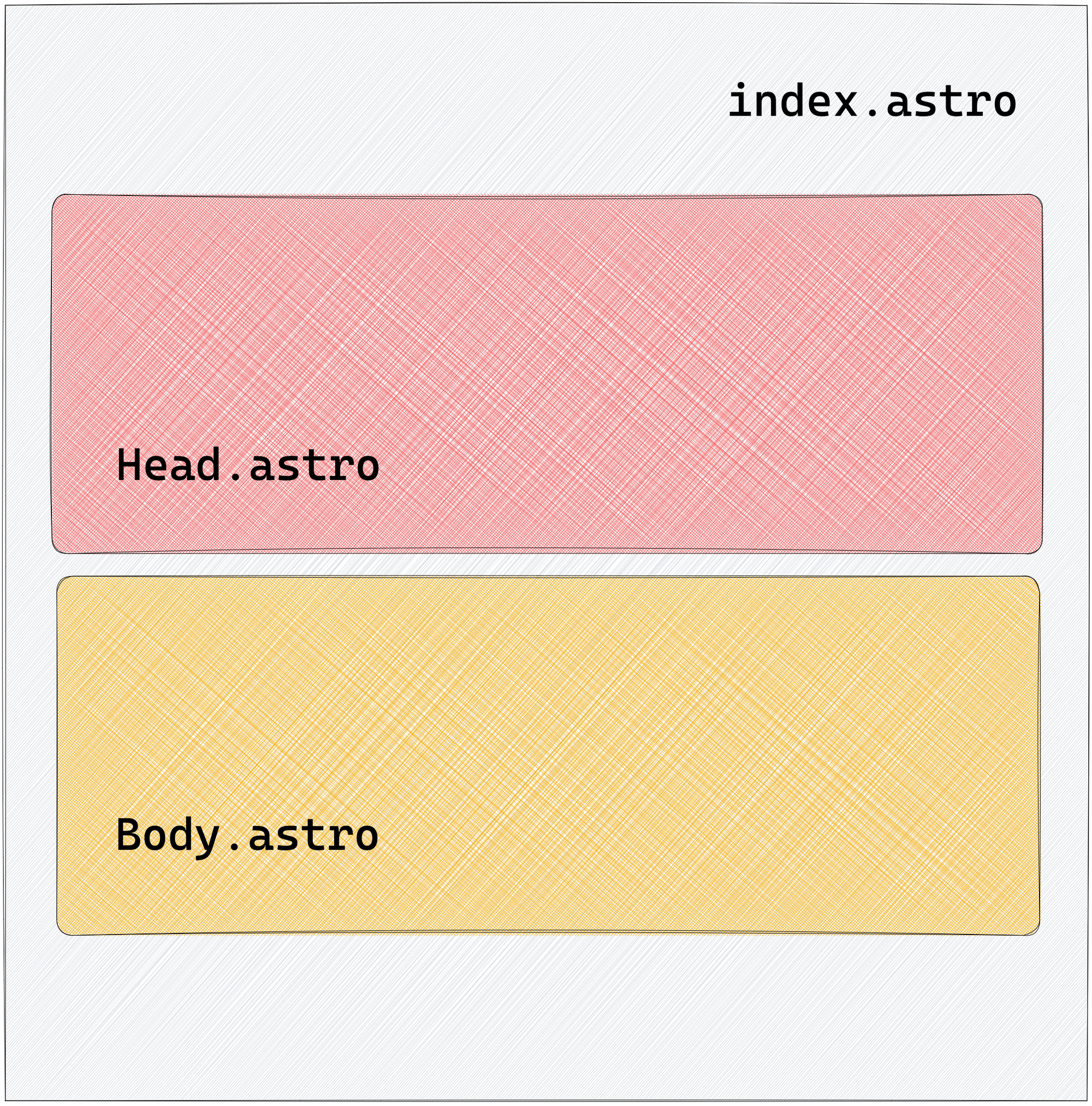 Composing the index page from the Head and Body components
Here’s how:
<!-- 📂 src/pages/index.astro -->
---
import Body from "../components/Body.astro";
import Head from "../components/Head.astro";
---

<!DOCTYPE html>
<html lang="en-GB">
  <Head />
  <Body />
</html>
- The child components are imported within a code fence
--- - The child components are rendered within the component template, that is
<Head />and<Body />— similar to self-closingHTMLtags.
Where Body and Head are as follows:
// 📂 src/components/Body.astro
<body>
  <p>Hello World</p>
</body>
// 📂 src/components/Head.astro
<head>
  <meta charset="UTF-8" />
  <meta name="viewport" content="width=device-width" />
  <title>HTML 101</title>

  <style>
    p {
      color: red;
    }
  </style>

  <script>
    console.log("Hello world");
  </script>
</head>
Note how Head and Body represent “partial” HTML building blocks.
The level of composition we build our pages from is entirely up to us. For example, we could further break down the Head component into smaller bits.
Let’s consider introducing isolated components for the meta, title, style and script elements.
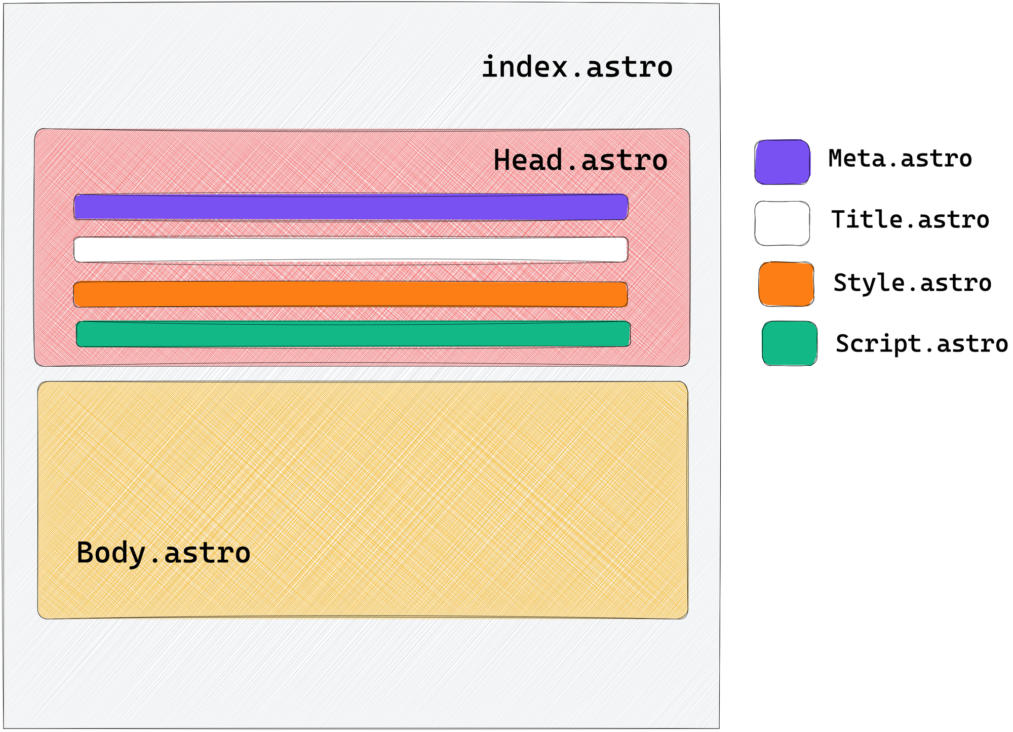 Composing the Head component from other smaller components
// 📂 src/components/Head.astro
---
import Meta from "./Meta.astro";
import Title from "./Title.astro";
import Style from "./Style.astro";
import Script from "./Script.astro";
---

<head>
  <Meta />
  <Title />
  <Style />
  <Script />
</head>
The index page still composes the same top-level components, that is Head and Body. However, Head now contains even more components.
This is the level of composition available to us with many modern frontend libraries. But to prevent unwanted bugs, there are some essential behaviours to be aware of when composing components in Astro.
1. Styles are local by default
It is vital to distinguish how Astro behaves when composing components with styles.
For example, we had a red paragraph when we started with all the HTML content in index.astro.
Now we’ve lost the paragraph style after our composition.
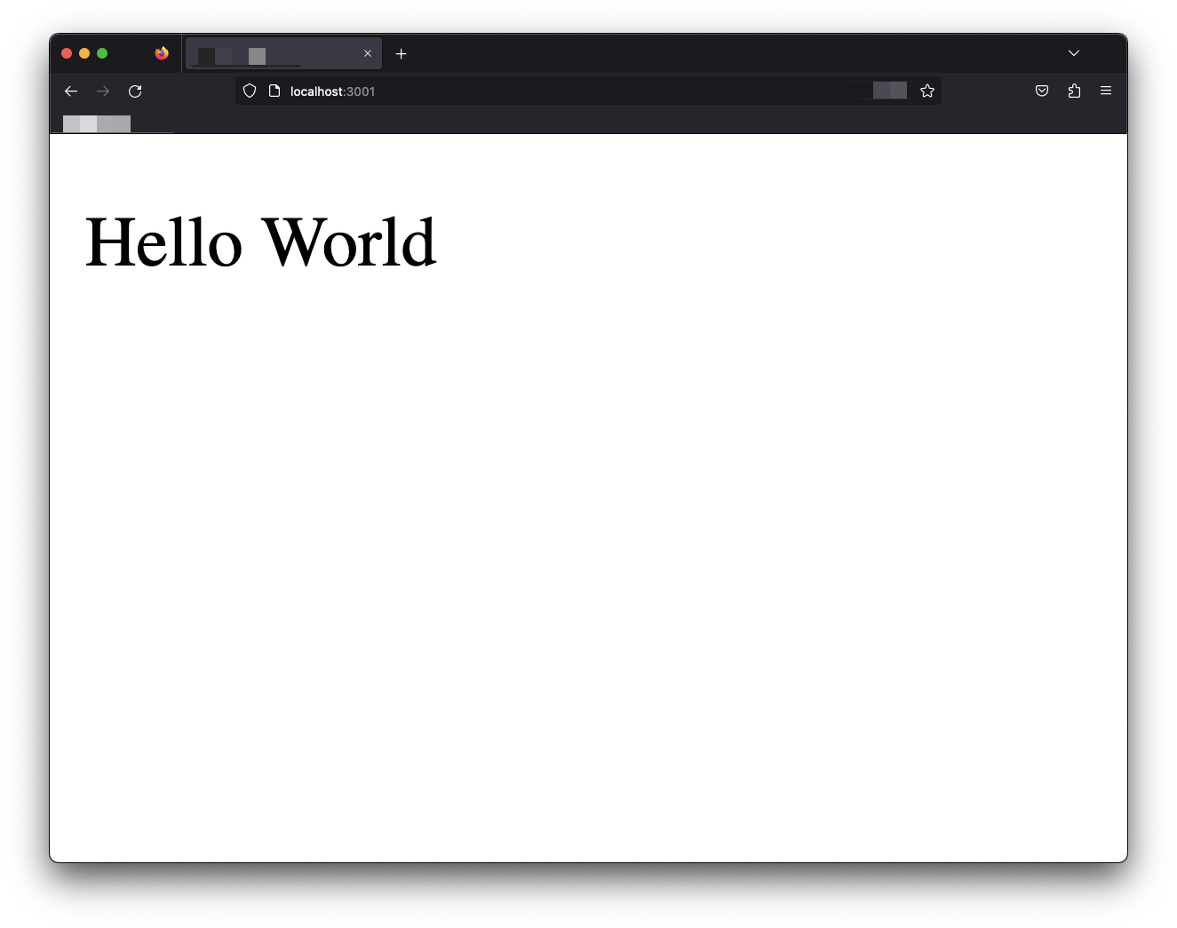 The red paragraph style lost after the composition
What’s gone wrong?
To understand this, we must determine where the style seats in the component composition.
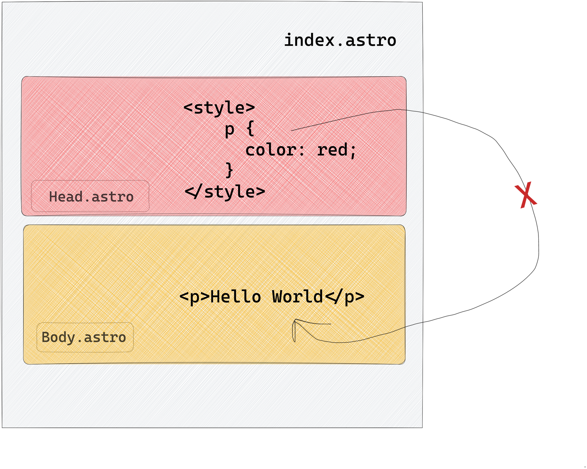 Styles in Astro components are local by default and do not leak over.
We have the style defined in the Head.astro component and expect it to affect the <p> in the Body.astro component.
This does not work.
This is because, with Astro components, styles are local by default. This means the <style> in Head.astro only affects elements defined in the Head.astro component.
Since the <p>Hello world</p> lives in a separate component, the styles never leak over.
2. The HTML element will always be present
The <html> element represents the top-level element of an HTML document. It is often called the root element. Other elements must be descendants.
Our current index.astro page composition looks like this:
// 📂 src/components/index.astro
---
import Body from "../components/Body.astro";
import Head from "../components/Head.astro";
---

<!DOCTYPE html>
<html lang="en-GB">
  <Head />
  <Body />
</html>
Every child component is housed in Head and Body and rendered within the root html element.
But what happens if we remove this element (and the associated DOCTYPE) as seen below:
// src/components/index.astro
---
import Body from "../components/Body.astro";
import Head from "../components/Head.astro";
---

<Head />
<Body />
The HTML page will be rendered with a reasonable default:
<!-- Default HTML wrapper provided -->
<!DOCTYPE html>
<html>
  <!-- Every other component rendered here -->
</html>
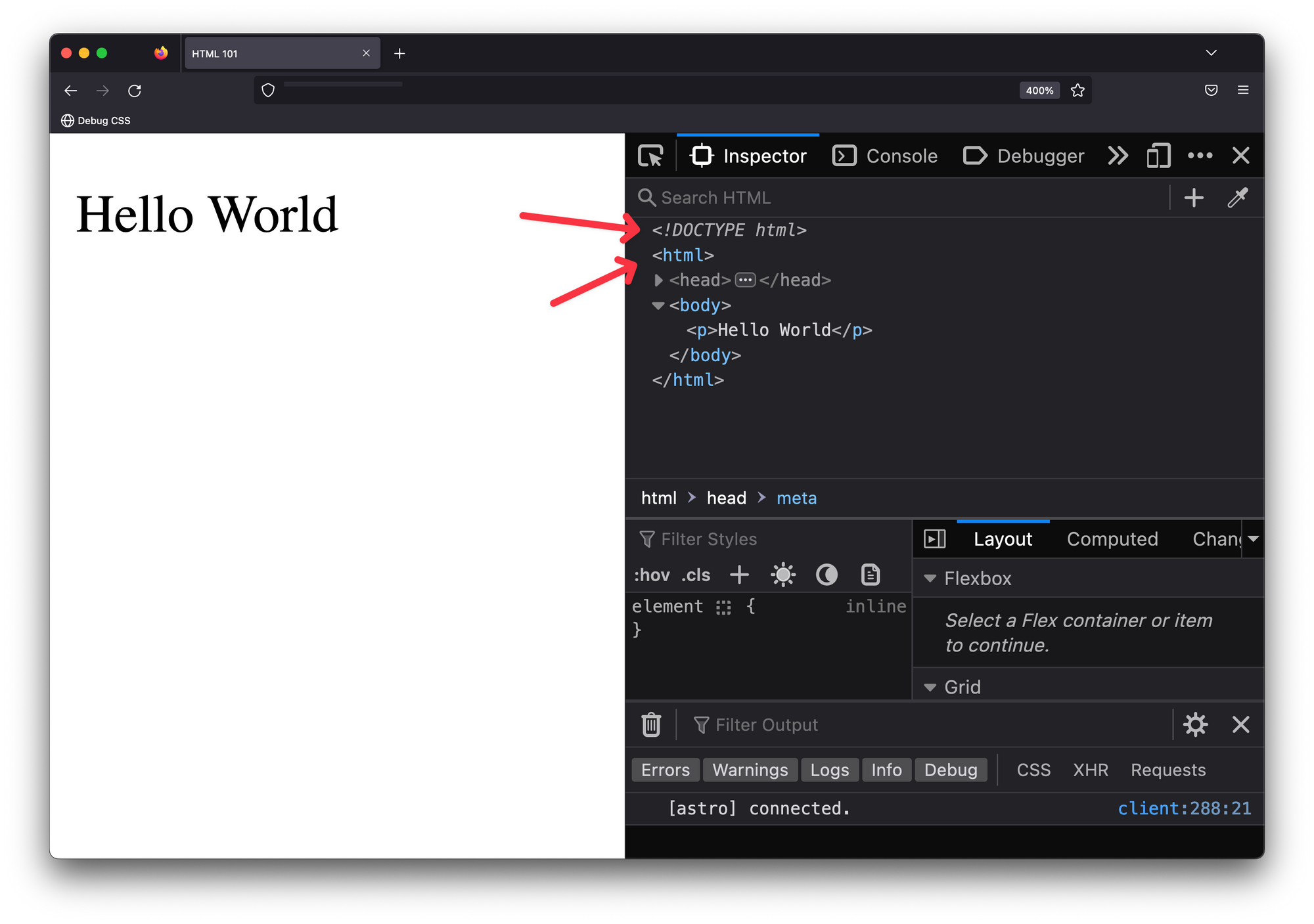 The rendered page with a reasonable default.
Did you know that according to HTML standards, the use of <html> is optional? This means that even without it, the browser can still render the page with a suitable default. Browsers can even render invalid HTML pages!
That being said, Astro’s default setting allows you to template even invalid HTML. So, be careful.
For accessibility reasons, include an <html> element. This is relevant to providing the lang attribute for the webpage. Again, this is helpful for screen-reading technologies.
3. Styles and scripts are hoisted
Our page’s <script> and <style> elements exist in the associated Script and Style components.
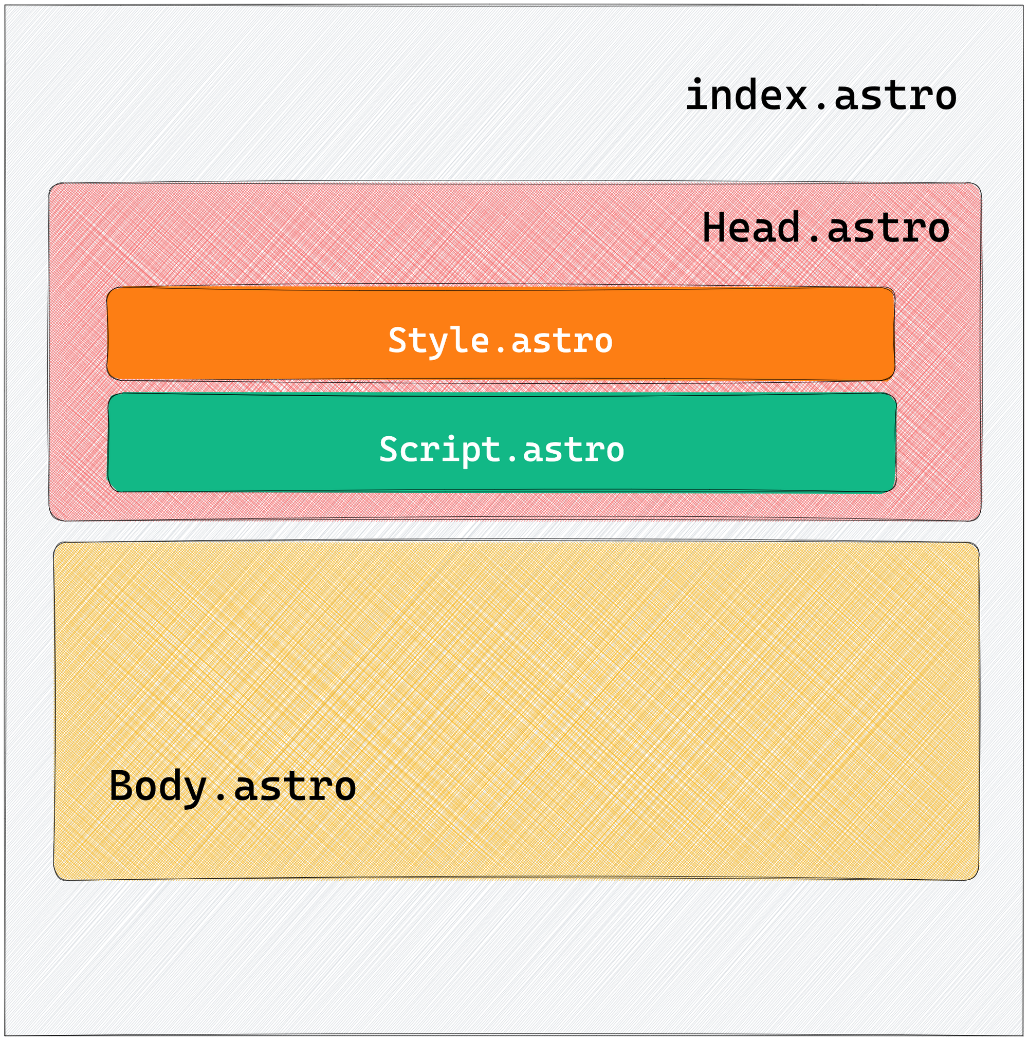 The Style and Script child components
These child components are also precisely rendered within the Head component, and ultimately, we have a markup with <style> and <script> in <head>.
<head>
  <style> ... </style>
  <script> ... </script>
</head/>
As previously mentioned, HTML is quite lenient and will even attempt to render invalid HTML markup. But the <style> element must be included in the <head> of an HTML document.
Let’s attempt to break this rule.
Change index.astro to have Style and Script as adjacent sibling components to Head:
---
import Body from "../components/Body.astro";
import Head from "../components/Head.astro";
import Style from "../components/Style.astro";
import Script from "../components/Script.astro";
---

<Head />
<Body />
<Style />
<Script />
Instead of rendering Style and Script within the <head> of the document, we’ve placed them adjacent to the <head> and <body> elements.
From the composition above, you may expect a render markup similar to the following:
<head> ... <head>
<body> .... </body>
<style> ... </style>
<script> ... </script>
But inspect the rendered Astro page, and you’ll find the style and script elements still placed within the <head> of the document.
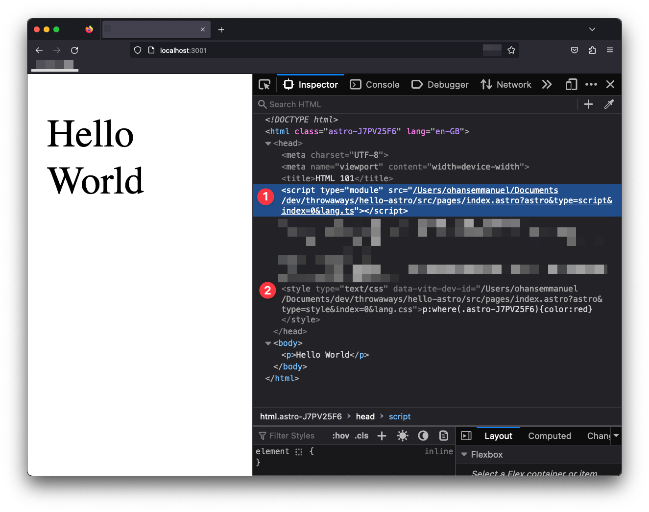 The hoisted script and style elements
This is because in Astro, we can freely use the <style> and <script> elements within our components, and they’ll be hoisted to the <head> of the rendered document. This is regardless of the component composition.
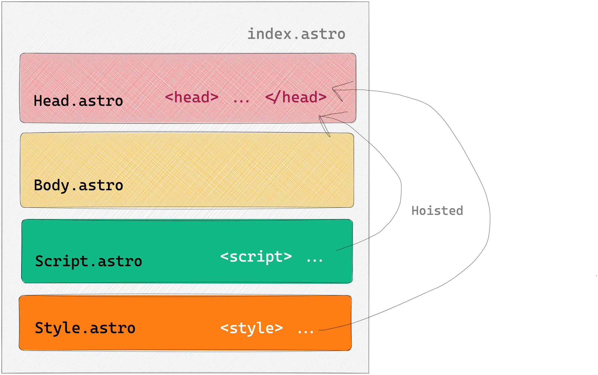 <style> and <script> are hoisted to the <head> of our page
As we’ll learn later, there’s an exception to this behaviour with inline scripts.
4. The element and its children will not be hoisted
Seeing how <style> and <script> elements are hoisted may tempt you to use a <head> element incorrectly in your component composition.
But note that the <head> element and its children will not be hoisted, that is it does not get moved to the top of the page or merged with an existing <head>.
Let’s add a new adjacent <head> element:
// 📂 src/components/index.astro
---
import Body from "../components/Body.astro";
import Head from "../components/Head.astro";
import Style from "../components/Style.astro";
import Script from "../components/Script.astro";
---

<Head />
<Body />
<Style />
<Script />
<head>
  <meta property="og:type" content="article" />
</head>
Adding a new <head> element to the bottom of the page is a silly composition. But browsers are forgiving of bad HTML markup, so in this case, the extra <head> element is ignored, and its content is rendered within the <body> element of the page.
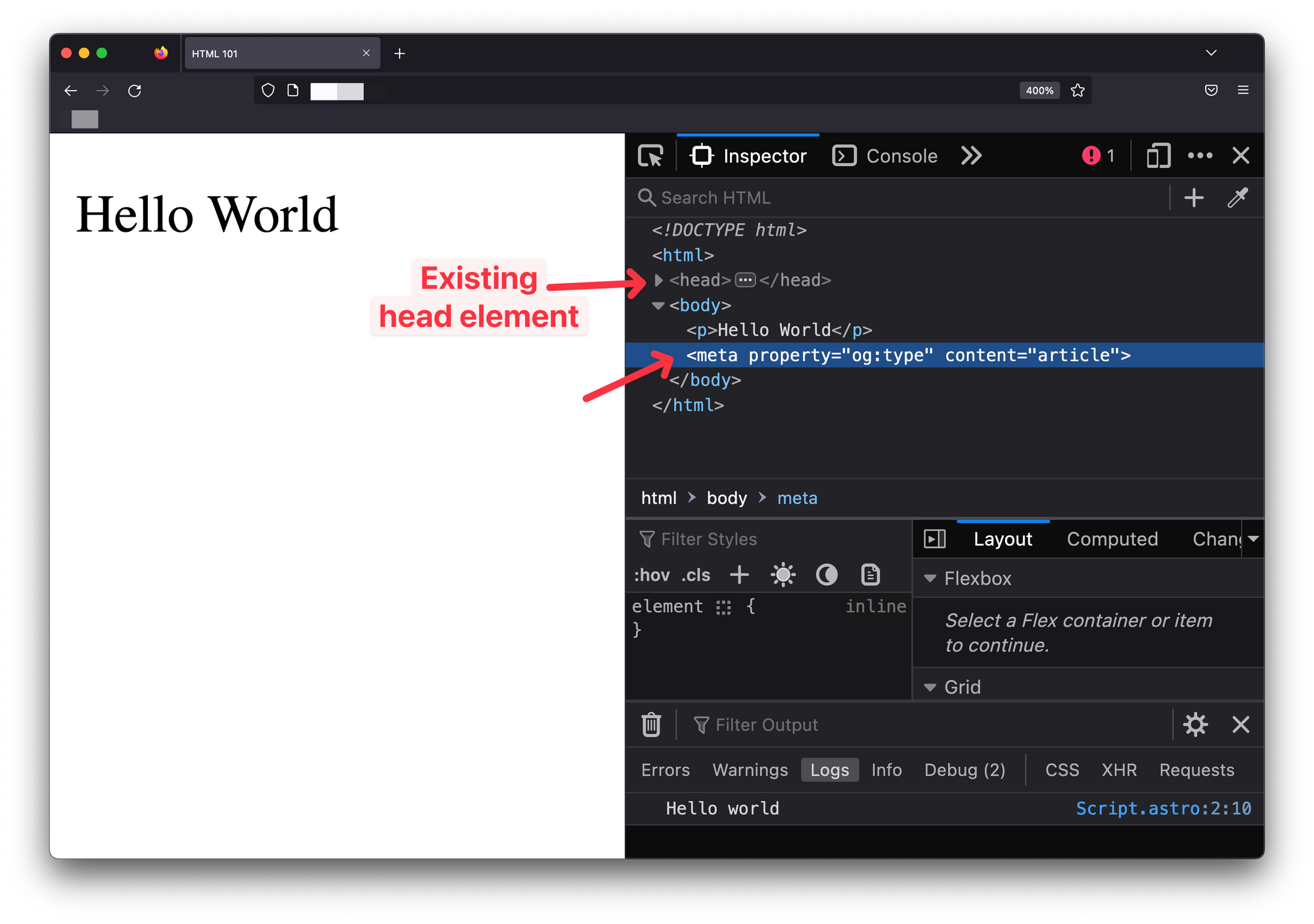 The browser trying to make sense of the wrong composition
Always have the <head> page elements in a layout component to prevent unwanted behaviours. This is a recommended best practice.
Astro components can leverage a powerful templating syntax
Templating is at the heart of most beloved frontend libraries. Think React and JSX or Vue and Vue templates.
Astro isn’t different.
Astro provides powerful templating by splitting a component into two main parts: the component script and the component template sections.
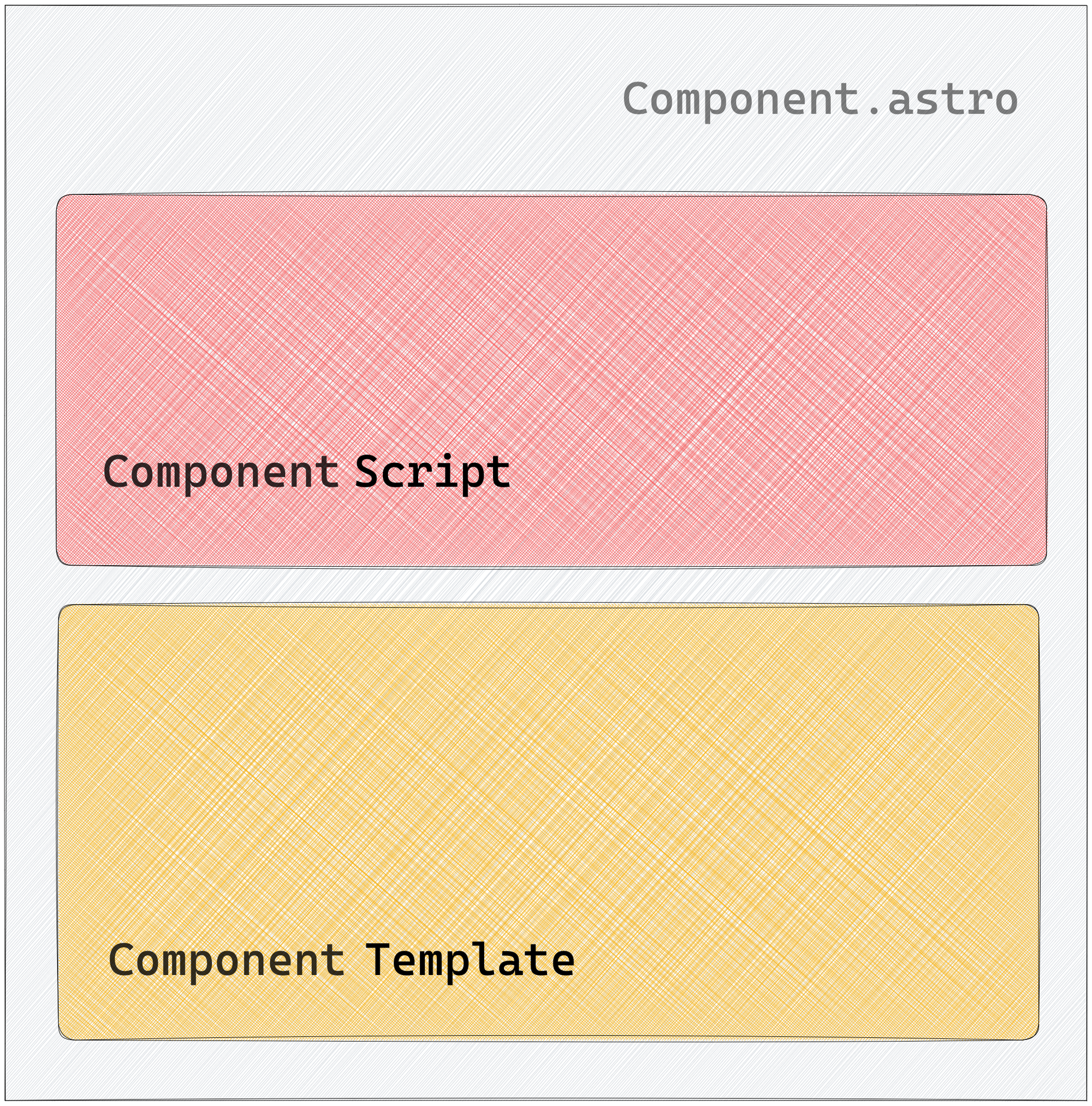 The make-up of an Astro component
It is important to note that technically, an Astro component is still valid with one or none of the sections present, that is an empty (yet valid) Astro component will have none of these sections.
Component script
The component script section is identified with a code fence (---).
---
  // This is the component script section
---
Typically, the component script section is where we write the JavaScript code we need to reference within our template.
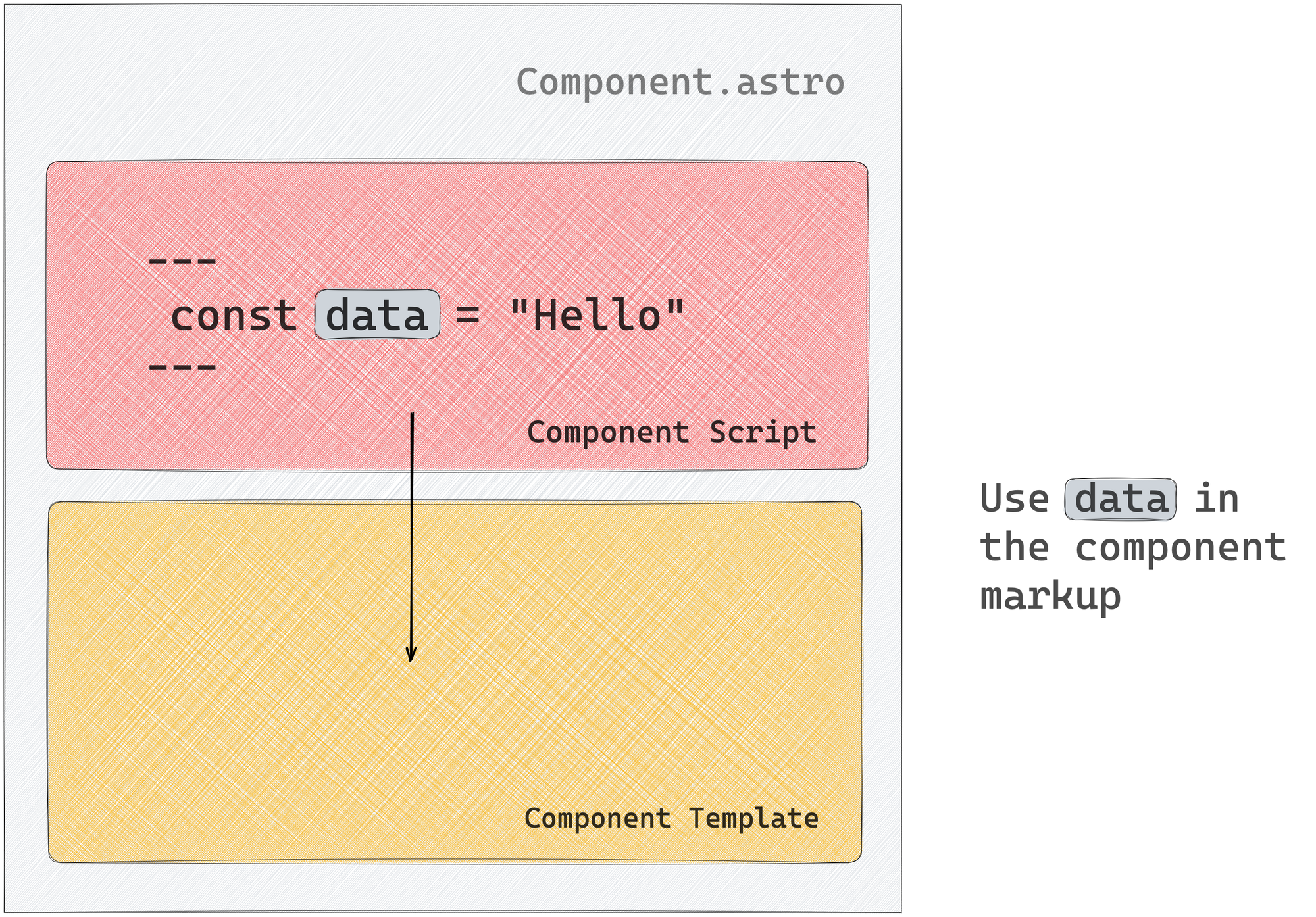 Leverage values from the component script section in the component template
Remember that when our Astro component is eventually compiled, the JavaScript expressions in the script section are evaluated at build time. Therefore, the JavaScript values are used to generate the eventual HTML pages once.
The component script section is not the place for dynamic interactive JavaScript code.
That being said, there are three main actions we’ll be performing in the component script section.
Let’s take a look at these.
1. Creating or referencing variables
We may need to create variables for various reasons, for example to keep our markup DRY (don’t repeat yourself). In addition, the component script section supports standard JavaScript and TypeScript code. So creating or referencing variables works as we would expect.
---
// Javascript
const newVariable = "This is a new variable"
// Typescript
let newVar: string = "This is a new var";
newVar = 9;
---
If the IDE is setup for TypeScript, we’ll get a warning within the editor when we try the reassign the newVar variable to a number:
Type 'number' is not assignable to type 'string'.
TypeScript is supported in the component script section by default.
Components are also capable of receiving props. Props are HTML-like attributes passed when we render a component. For example, here is a name prop passed to a MyAstroComponent component:
<MyAstroComponent name="Emmanuel"/>
Within the component script section, props passed to a component may be referenced on the Astro.props global as shown below:
<!-- 📂 MyAstroComponent.astro -->
---
const { name } = Astro.props
---
Since TypeScript is valid within the component script section, we can also type a component’s prop.
To provide prop types, go ahead and define a Props interface or type alias in the component script section:
---
// ✅ This is valid
type Props = {
  name: string
}
---
---
// ✅ This is equally valid
interface Props {
  name: string
}
---
Astro will automatically pick up the defined Props type and give relevant type warnings/errors related to wrong component props usage.
2. Handling imports
At the start of most JavaScript modules lie imports. Astro components are not any different.
Composing multiple Astro components to build complex pages typically means importing other components or leveraging modules required to get our page working as expected.
Out of the box, Astro supports a wide range of file types, namely:
- Astro Components (
.astro) - Markdown (
.md,.markdown, and so on) - JavaScript (
.js,.mjs) - TypeScript (
.ts,.tsx) - NPM Packages
- JSON (
.json) - JSX (
.jsx,.tsx) - CSS (
.css) - CSS Modules (
.module.css) - Images & Assets (
.svg,.jpg,.png, and so on)
That’s a lot of file types supported natively! Here are some examples of import statements:
// Astro
import Book from './book.astro'

// Javascript
import { getUnderstandingAstro } from './book.js';

// Typescript
import { getUser } from './book';
import type { UserType } from './book';

// NPM package
import { v4 as uuidv4 } from 'uuid';

// load JSON via default export
import json from './data.json';

// load and inject style onto the page
import './style.css';

// css modules
import styles from './style.module.css';

// other assets
import imgReference from './image.png';
import svgReference from './image.svg';
import txtReference from './words.txt';
The important point to note here is apart from TypeScript files and NPM packages, we typically need to add the file ending to the Astro import statement, for example:
// ✅ do this
import Book from './book.astro'

// ❌ not this
import Book from './book'
Astro also supports importing components from other UI frameworks such as React, Vue, Svelte, and so on. An example import for a React component would look like this:
import { Header } from './Header.jsx'
// if file ending is .tsx
import { Header } from './Header'
We will explore these in a later chapter.
It’s equally important to note that we can import any asset from the public directory. But note that assets in the public directory will remain untouched by Astro, that is they will be copied as is into the final build without processing (for example, minification).
// image in public/img-public.png
import imageRef from "/img-public.png";
As a matter of best practice, favour placing images within the src directory so Astro can transform, optimise, and bundle them where possible. The exception is images in markdown (.md) files.
Images within src won’t work in markdown files, so use the public directory or a remote src URL as shown below:
// my-nice-blog.md


3. Fetching data
Astro components can utilise the global fetch function to establish HTTP requests to remote APIs from the component script section. The fetched data can subsequently be accessed within the component template.
---
{/** Random user generator **/}
const URL = "https://random-data-api.com/api/users/random_user?size=1"
const response = await fetch(URL)
const data = await response.json()
---

// Use data in the template
<pre>{JSON.stringify(data, null, 2)}</pre>
The API call will only be made once for statically generated Astro sites to build the HTML page.
But while developing locally, the API requests in the component script section are fetched every time on page refresh. This is only a development behaviour. In our example, we will get a new random user on every page refresh.
Run the production build with npm run build and preview the production application with npm run preview to see the standard behaviour in action. We will have a single user on every page refresh, that is the user fetched at build time.
Component template
The variables created, imports made, and data fetched in the component script section exist primarily for one reason: to be consumed in the component template section of the component.
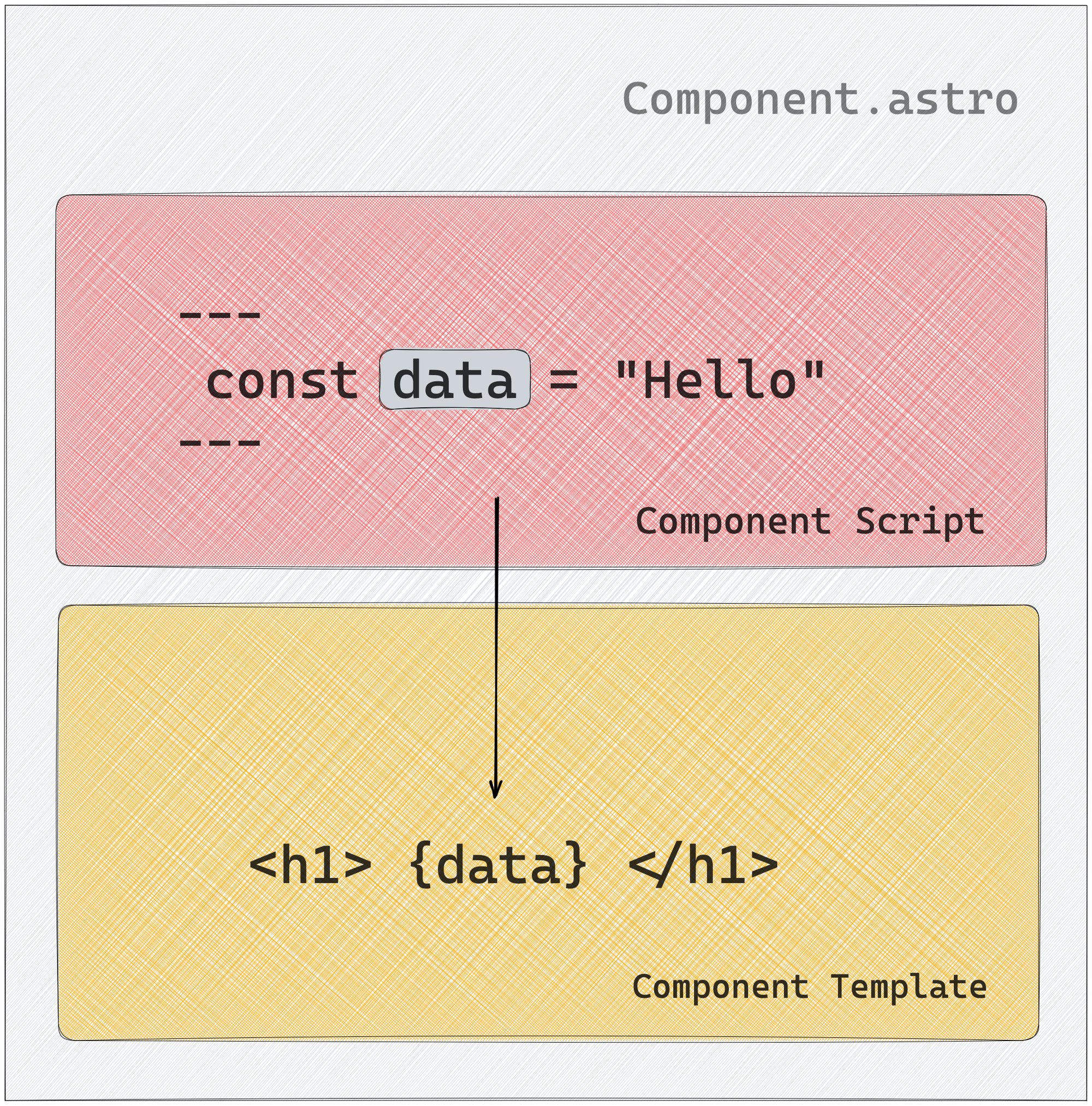 Consuming variables in the component template section
If Astro components are eventually built to HTML, the template section defines the markup of the said HTML page. But the component template section lets us do this dynamically, that is by leveraging the power of JavaScript expressions.
Let’s explore some of the actions we’re likely to perform within the component template of an Astro component.
Consuming variables
To consume a variable, wrap the name of the variable in curly braces as shown below:
---
const book = "Understanding AstroJS";
---

<h1>{book}</h1> // Outputs <h1>Understanding AstroJS</h1>
Create dynamic attributes
Creating a dynamic attribute is similar to consuming a variable. Use the variable in curly braces to pass attributes to both HTML elements and components:
---
const { author } = Astro.props;
const book = "Understanding AstroJS";
---

<h1 data-name={book}>A new book</h1>
// Outputs <h1 data-name="Understanding AstroJS">A new book</h1>
Dynamic HTML
Dynamic HTML is quite the lifesaver as we’ll occasionally not want to repeat ourselves. For example, consider how we may create dynamic lists as shown below:
---
const technologies = ['Javascript', 'Typescript', 'NodeJS']
---
// Dynamically create a list of elements from technologies
<ul>
  {items.map((item) => <li>{item}</li>)}
</ul>
Or we may find ourselves in need of conditional rendering. To do this, leverage logical operators and ternary expressions as shown below:
---
const showCallToAction = true;
---

// This will render <button>Buy now</button>
{showCallToAction && <button>Buy now</button>}

// Alternatively, represent this with a ternary to provide a fallback
{showCallToAction ?  <button>Buy now</button> : <p>Continue
 shopping</p>}
This will render <button>Buy now</button> when showCallToAction is truthy and <p>Continue shopping</p> otherwise.
Dynamic Tags
Less commonly used, dynamic tags can still be useful in certain situations, such as building polymorphic components.
Depending on the consumer’s prop input, these components can render to various element nodes. An example is the Text.astro component that can render any element passed to it:
// usage
<Text as="h1" />
<Text as="div" />
In both cases, we want to render the same component with different underlying HTML element nodes, that is h1 and div text nodes.
We can handle this dynamically, as shown below:
<!-- 📂 Text.astro -->
---
const { as: As = "h1" } = Astro.props;
---

<As>Text content</As>
Within the component script section, we deconstruct the as prop and rename it to a capitalised variable As. This is important as the variable names for a dynamically rendered component must be capitalised, that is:
// ✅ Do this
<As>Text content</As>

// ❌ not this
<as>Text content</as>
If we pass a lower cased variable, Astro will try to render the variable name as a literal HTML tag. In our example, <as>Text content</as> and not the dynamic <h1>Text content</h1> or <div>Text content</div> element.
Revisiting Slots
If you want to easily add external HTML content to your component template, the <slot /> element is your friend! Any child elements you include will be automatically rendered in a component’s <slot />.
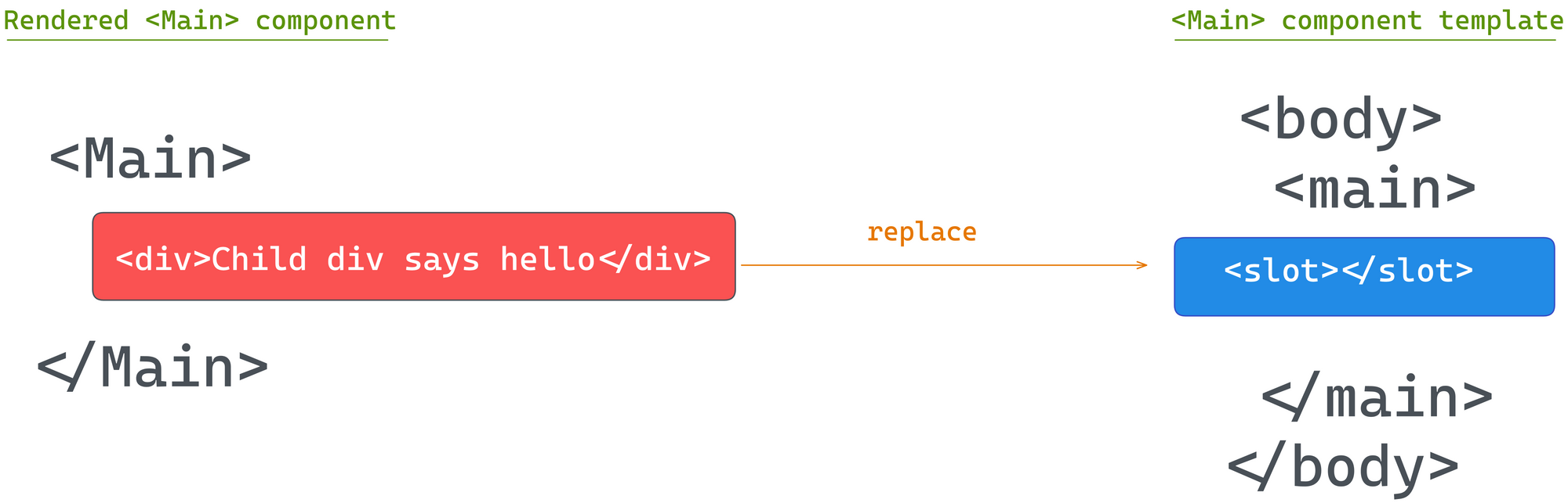 Using the <slot/> element.
If we had a basic Main component with a slot as shown below:
// 📂 src/components/main.astro
---
---

<main>
  <slot />
</main>
The child elements of Main will be rendered in the <slot /> as shown below:
// 📂 src/pages/index.astro
---
---
<Main>
  <p>This will be rendered in the slot </p>
</Main>
We can also provide fallback <slot> content when no child elements are passed to the component. To do this, provide the <slot /> its own children as shown below:
// 📂 src/components/main.astro
---
---

<main>
  <slot>
    <p>This paragraph will be rendered if no child elements are passed to Main</p>
  </slot>
</main>
It is possible to provide more than one slot via named slots. Consider the following example:
// 📂 src/components/main.astro
---
---
<main>
<h1> This is header </h1>
<slot />
<p>This is an INTRO paragraph </p>
<slot name="after-intro" />
<footer> © 2023 </footer>
<slot name="after-footer" />
</main>
In this case, we can render specific child elements to the specific slots after-intro and after-footer as shown below:
// 📂 src/pages/index.astro
---
---
<Main>
  <p slot="after-intro">Hello after Intro</p>
  <p>This will be rendered in the default (nameless) slot </p>
  {/** This will be rendered in the after-footer slot **/}
  <p slot="after-footer">Download my new book </>
</Main>
Not quite JSX
Astro’s syntax will feel very familiar to React developers because it is designed to feel similar to HTML and JSX. But there are significant differences to be aware of so we don’t shoot ourselves in the foot.
All HTML attributes in JSX use camelCase formats. In Astro, stick to the standard kebab-case format:
<!-- JSX -->
<div className="foo" dataValue="bar" />

<!-- Astro -->
<div class="foo" data-value="bar" />
Unlike JSX, use class, not className.
In Astro, we can also use standard JavaScript or HTML comments:
---
//This is a comment
---
<!-- HTML-style comment -->
{/* JS style comment also valid */}
Both are valid in Astro components. But in JSX, only JavaScript-style comments are supported.
With Astro, it is essential to note that HTML-style comments will be included in the browser DOM upon building the page. But JavaScript-style comments will be skipped. As such, for development-only comments, prefer the use of JavaScript-style comments.
My favourite difference is we can use the attribute shorthand for identically named variables in Astro, for example:
---
const name = "Understanding astro"
---

<MyComponent {name} />

// This is identical to writing <MyComponent name={name}>
This shorthand is not supported in JSX.
Astro and JSX also differ in how whitespaces are treated. Astro follows the HTML rules as closely as possible. But unlike JSX, whitespaces are not escaped.
// ❌ will render span (string) with extra whitespace(s)
<span>
  <slot />
</span>

// ✅ will add no extra character spaces
<span><slot /></span>
In most cases, this isn’t very important except when you don’t want that space there! For example, with coloured text backgrounds.
Consider the Code.astro component shown below:
// 📂 src/components/Code.astro
---
---

<code>
  <slot />
</code>

<style>
  code {
    background-color: red;
    color: wheat;
  }
</style>
Including the Code component within a paragraph will result in highlighted white spaces.
 Extra white spaces in coloured text backgrounds.
// 📂 src/pages/index.astro
---
import Code from "../components/Code.astro";
---

<p>Use an <Code>if</Code> statement. Displaying a list? Try array <Code>map()</Code>.</p>
To prevent this, change the Code component render to ignore white spaces:
// ✅ will add no extra character spaces
<span><slot /></span>
And that’s it!
Wrapping Up This Chapter
Put these together, and we now have a solid definition for an Astro component: a document with a .astro file ending representing a composable superset of HTML. It also provides a powerful templating syntax and renders to HTML with no Javascript runtime overhead.
Wow, if I were to ask a candidate about an Astro component definition in an interview and they gave me this answer, I would knight them on the spot! The job is theirs.
 Chapter three.
Chapter 3: Build Your Own Component Island
“What I cannot create, I do not understand” — Richard Feynman
Astro’s fast narrative relies on component islands, which allows you to use other framework components like React, Vue, or Svelte in your Astro applications. This chapter will guide us in creating our own component island from the ground up.
To view the complete application, see the GitHub repo.
What You’ll Learn
- An overview of different web application rendering techniques.
- Build your own component islands implementation from scratch.
- Comprehend the island architecture.
A Brief History of How We Got Here
To ensure the coming technical implementation is built on a solid understanding, let’s peep into the past and explore the several application rendering techniques we may employ on a frontend application.
It is essential to note that this isn’t an exhaustive guide to front-end application rendering. But you'll learn enough to understand and appreciate the component islands architecture.
Where it all begins
In simple terms, there are two main actors in serving an application to a user:
- The user client, for example a web browser
- The application server
To display a website, a user requests a resource from an application server.
 The web browser requesting article.html from an application server
With these two actors at play, a significant architectural decision you’ll make when building any decent frontend application is whether to render an application on the client or server.
Let’s briefly explore both options.
Client-side rendering (CSR)
 Choosing client side rendering.
By definition, a client-side rendered application renders pages directly in the browser using JavaScript. All logic, data-fetching, templating and routing are handled on the client (the user’s browser).
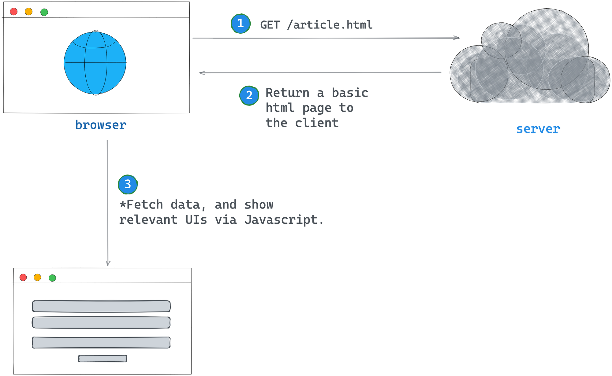 An overview of a client-side rendered application.
The past years saw the rise of client-side rendering, particularly among single-page applications. You’ve likely seen this in action if you’ve worked with libraries like React or Vue.
For a practical overview, consider the webpage for a blog article with a like count and a comment section below the initial viewport.
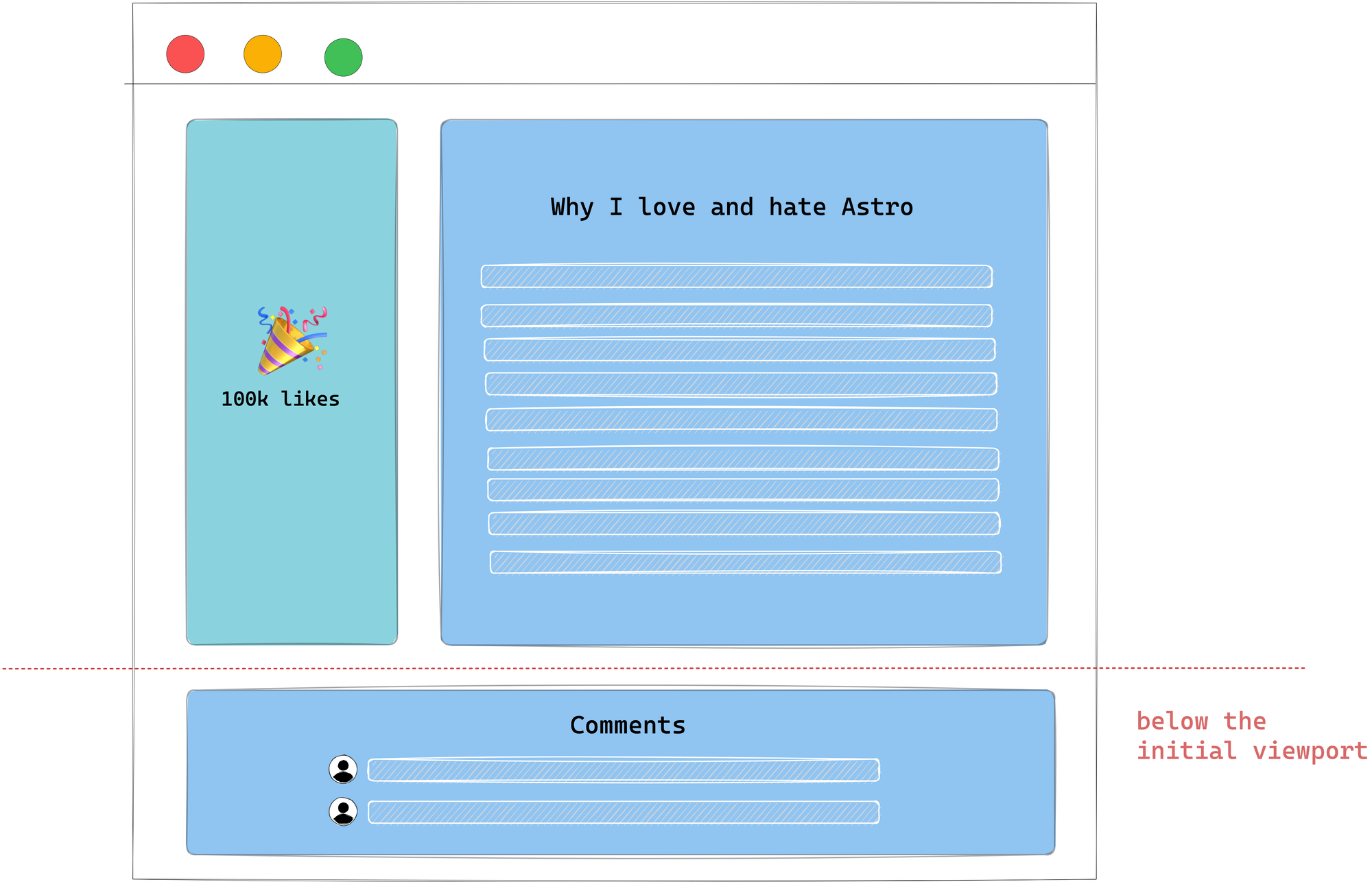 A blog article with a dynamic sidebar and a comment section below the article.
If this application was entirely client-side rendered, the simplified rendering flow would look like this:
- The user visits your website.
- Your static server returns a near-empty
HTMLpage to the browser. - The browser fetches the linked script file in the
HTMLpage. - The JavaScript is loaded and parsed.
- The data for the article, number of comments, and comments are fetched.
- A fully interactive page is shown to the user.
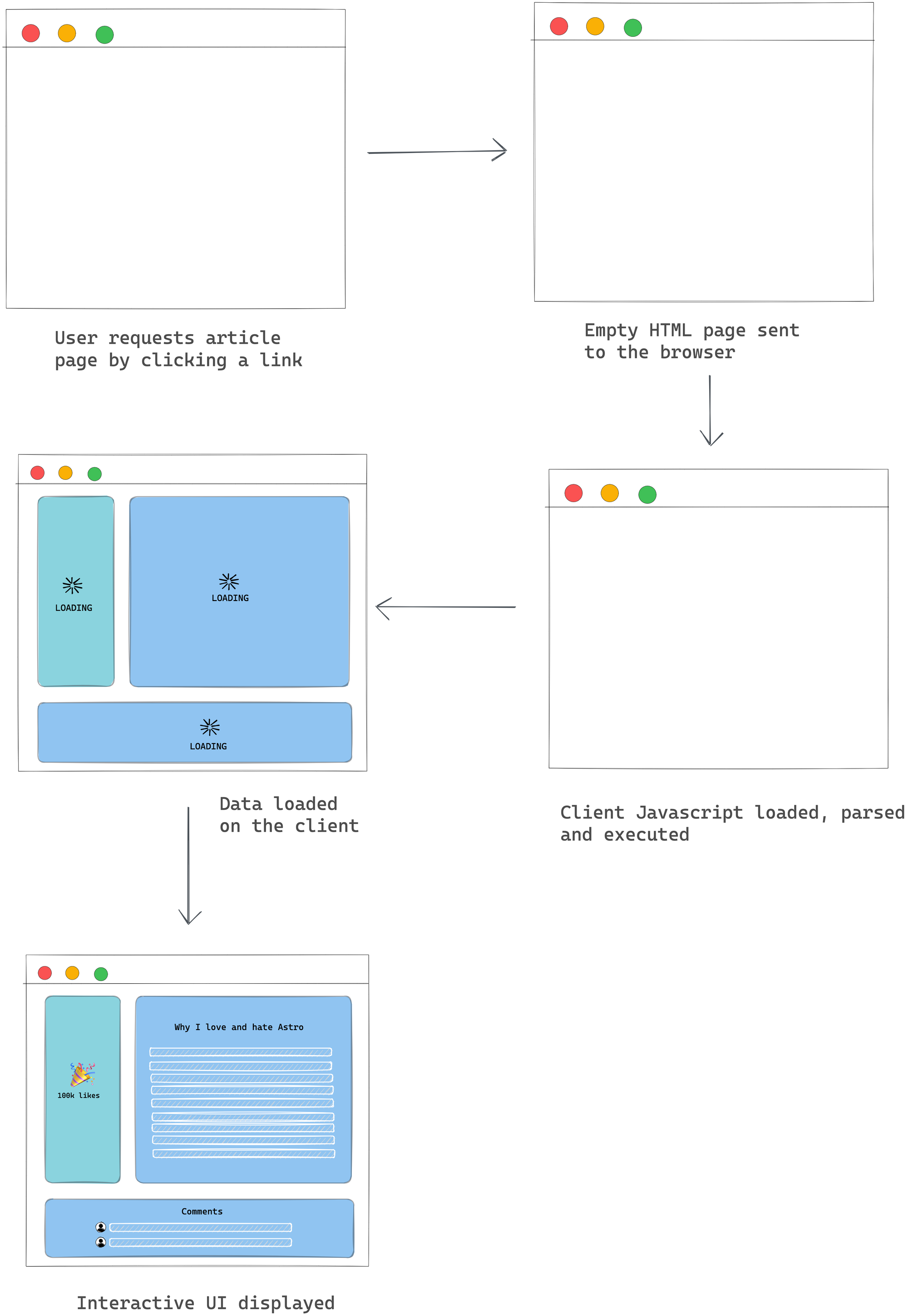 Visualising the rendering process from a user's perspective.
The pros of client-side rendering (CSR)
- The user gets back the resource from the server quickly. In our case, a near-empty
HTMLpage, but on the bright side, the user receives that quickly! In technical terms, client-side rendering yields a high time to first byte (TTFB). - Arguably accessible to reason about. All logic, data-fetching, templating and routing are handled in one place – the client.
The cons of client-side rendering
- It potentially takes the user a long time to see anything tangible on our page, that is they’re initially met with an empty screen. Even if we change the initial
HTMLpage sent to the browser to be an empty application shell, it still potentially takes time for the user to see eventual data, that is after the Javascript is parsed and the data fetched from the server. - As the application grows, the amount of JavaScript parsed and executed before displaying data increases. This can impact mobile performance negatively.
- The page's time to interactivity (TTI) suffers, for example it takes a long time before our users can interact with the comments. All JavaScript must be parsed, and all associated data must be fetched first.
- Detrimental SEO if not implemented correctly.
Server-side rendering
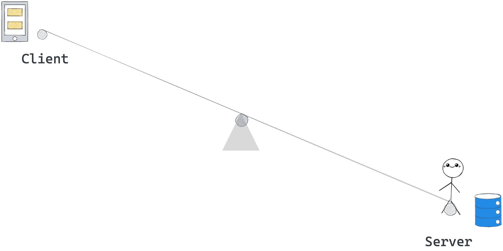 Choosing server-side rendering.
Let’s assume we’re unhappy with client-side rendering and decide to do the opposite.
On the opposing end of the rendering pole lies server-side rendering.
In a server-side rendered application, a user navigates to our site, and the server generates the full HTML for the page and sends it back to the user.
In our example, here’s what a simplified flow would look like:
- The user visits our website.
- The data for the article, user profile, and comments are fetched on the server.
- The server renders the
HTMLpage with the article, the number of comments, and other required assets. - The server sends the client a fully formed
HTMLpage.
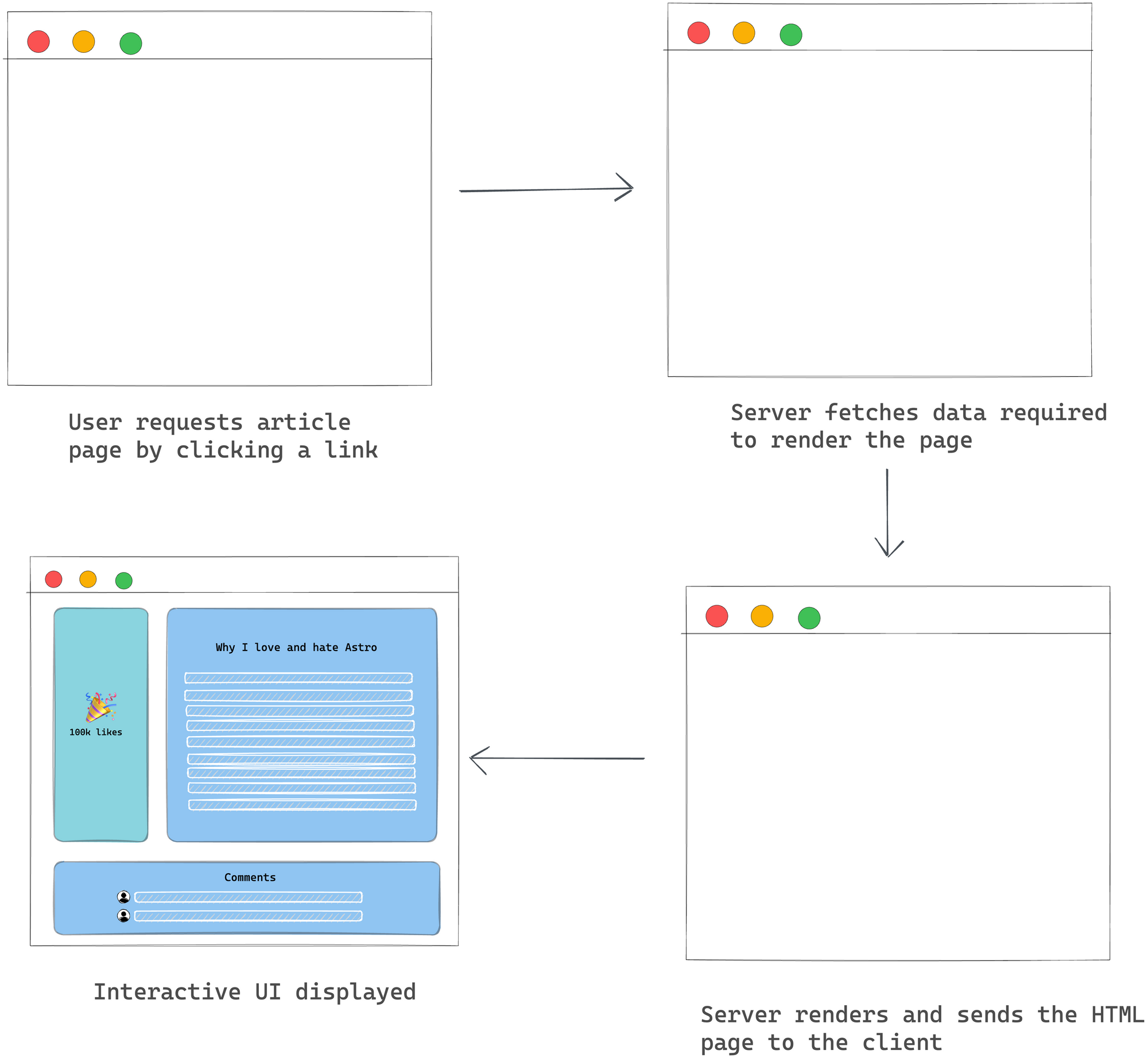 Visualising the rendering process from a user's perspective.
NB: it is assumed that the server sends a mostly static HTML page with minimal JavaScript needed for interactivity.
The pros of server-side rendering
- As soon as the user browser receives our fully formed
HTMLpage, they can almost immediately interact with it, for example the rendered comments. There’s no need to wait for more JavaScript to be loaded and parsed. In performance lingo, the time to interactivity (TTI) equals the first contentful paint (FCP). - Great SEO benefits as search engines can index your pages and crawl them just fine.
The cons of server-side rendering
- Generating pages on the server takes time. In our case, we must wait for all the relevant data to be fetched on the server. As such, the time to first byte (TTFB) is slow.
- Resource intensive: the server takes on the burden of rendering content for users and bots. As a result, associated server costs increase as rendering needs to be done on the server.
- Full page reloads for every requested server resource.
Server-side rendering with client-side hydration
We’ve explored rendering on both sides of the application rendering pole. But what if there was a way to use server and client-side rendering? Some strategy right in the middle of the hypothetic rendering pole?
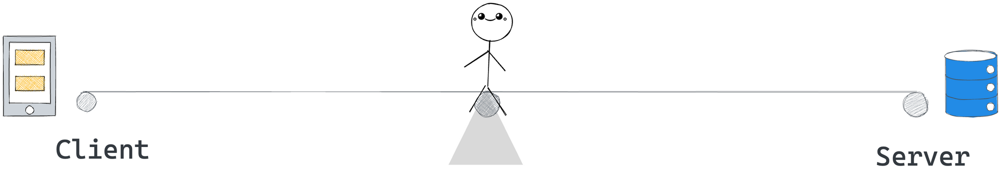 Choosing SSR with client-side hydration.
If we were building an interactive application and working with a framework like React or Vue, a widely common approach is to render on the server and hydrate on the client.
Hydration, in layperson’s terms, means re-rendering the entire application again on the client to attach event handlers to the DOM and support interactivity.
In theory, this is supposed to give us the wins of server-side rendering plus the interactivity we get with rich client-side rendered applications.
In our example, here’s what a simplified flow would look like:
- The user visits our website.
- The data for the article, user profile, and comments are fetched on the server.
- The server renders the
HTMLpage with the article, the number of comments, and other required assets. - The server sends the client a fully formed
HTMLpage alongside the JavaScript client runtime. - The client then “boots up” JavaScript to make the page interactive.
Making an otherwise static page interactive (for example, attaching event listeners) is called hydration.
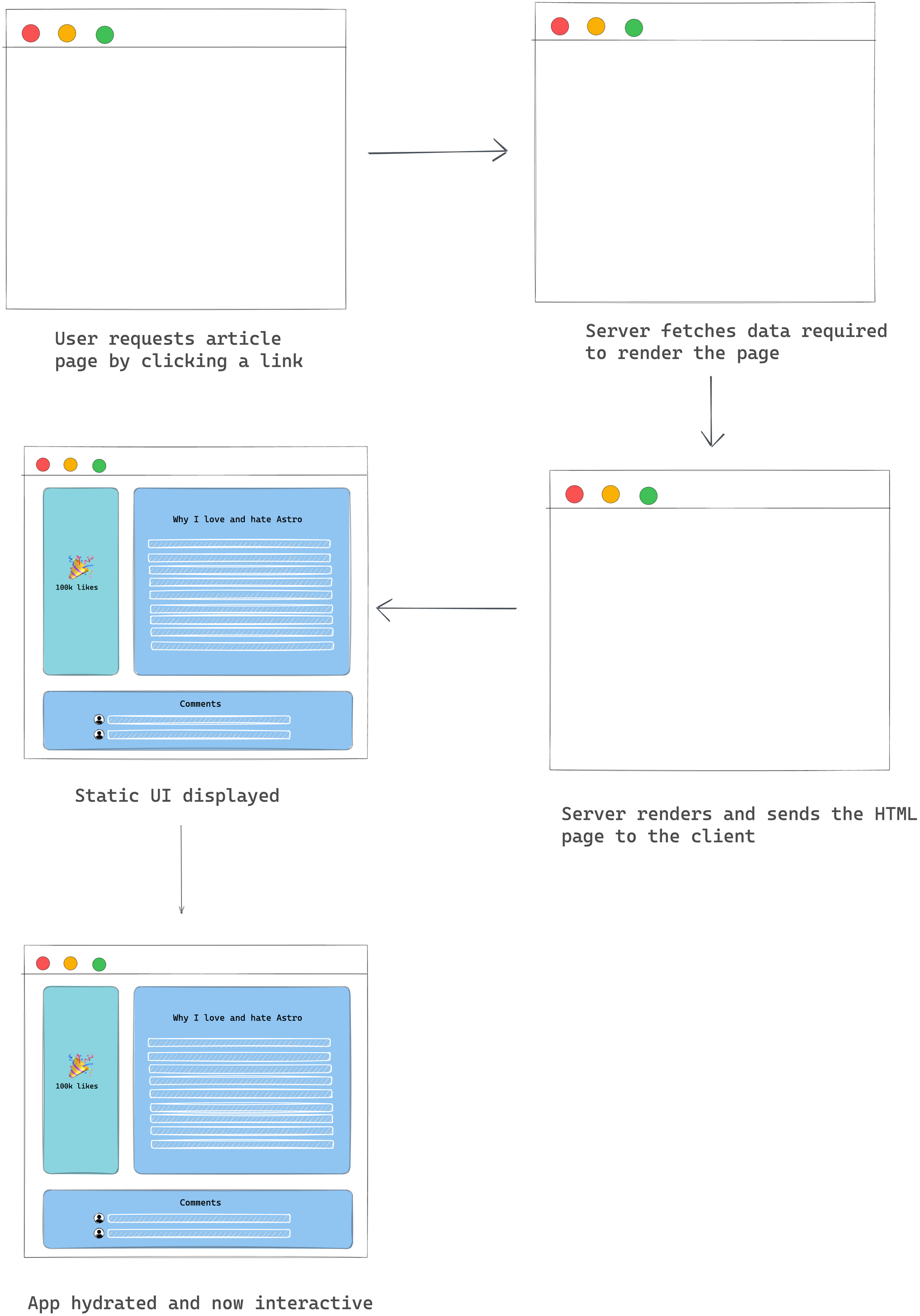 Visualising the rendering process from a user's perspective.
The pros of server-side rendering with client-side hydration
- Benefits of SSR, for example quick FP and FMP
- Can power highly interactive applications.
- Supported rendering style in most frontend frameworks such as React and Vue.
The cons of server-side rendering with client-side hydration
- Slow time to first byte — similar to standard SSR.
- It can delay time to Interactivity (TTI) by making the user interface look ready before completing client-side processing. The period where the UI looks ready but is unresponsive (not hydrated) is what’s been — quite hilariously — dubbed the uncanny valley.
NB: this assumes certain parts of our application, such as the likes and comments, can be interacted with, for example clicked to perform further action.
Partial hydration for the win
Combining server-side rendering with client-side hydration has the potential to offer the best of both worlds. But it is not without its demerits.
One way to tackle the heavy delay in time to interactivity (TTI) seems clear. Instead of hydrating the entire application, why not hydrate only the interactive bits?
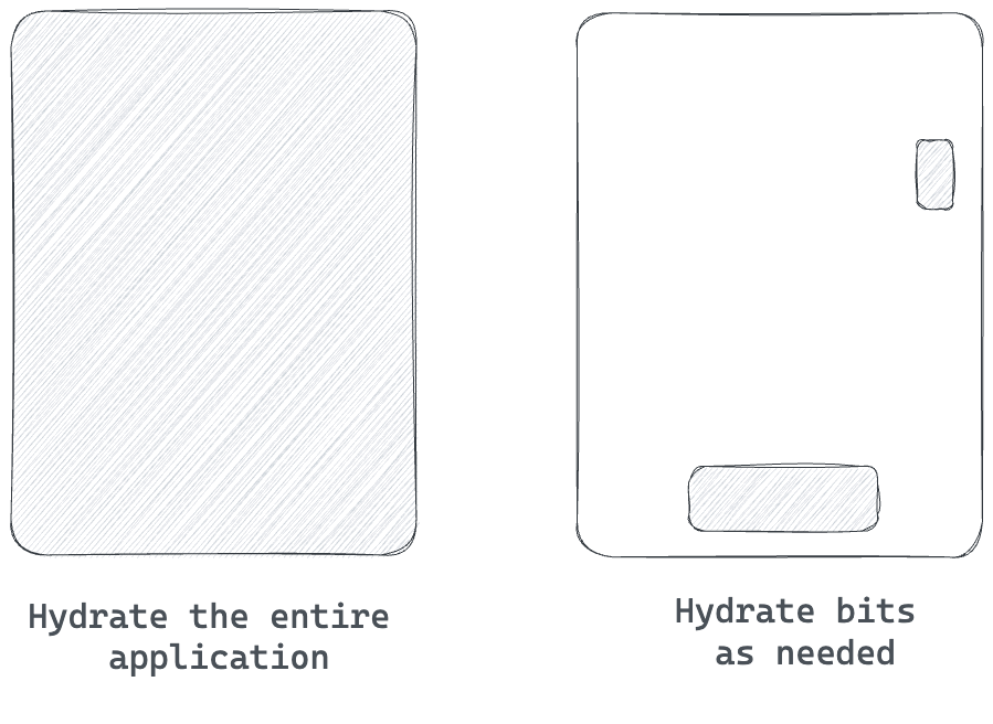 Partial hydration vs full-page hydration.
As opposed to hydrating the entire application client side, partial hydration refers to hydrating specific parts of an application while leaving the rest static.
For example, in our application, we’d leave the rest of the page static while hydrating just the like button and comment section.
We may also take partial hydration further and implement what’s known as lazy hydration. For example, our application has a comment section below the initial viewport.
In this case, we may hydrate the like button when the page is loaded and hydrate the comment section only when the user scrolls below the initial viewport.
 Hydrate the comment section at a later time.
Talk about flexibility!
The pros of partial hydration
- The same benefits of server-side rendering with client-side hydration.
- Faster time to interactivity as the entire application isn’t hydrated.
The cons of partial hydration
- If most of the parts of the application are interactive and have a high priority, the advantage of partial hydration could be arguably minimal, that is the entire application would take just as long to be hydrated.
Where does the island architecture come from?
The island architecture is built upon the foundation of partial hydration. Essentially, the islands architecture refers to having “islands of interactivity” on an otherwise static HTML page.
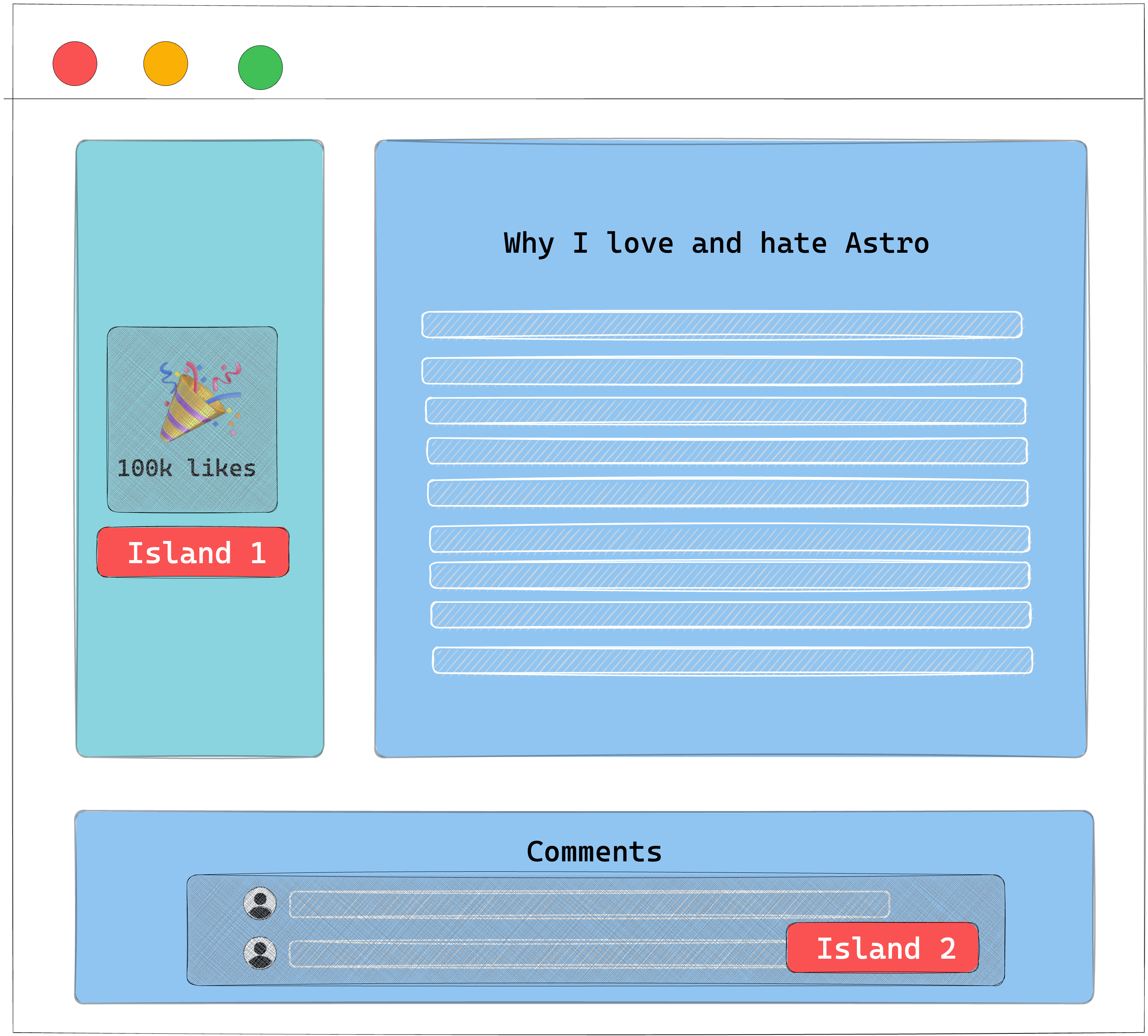 Islands of interactivity on an otherwise static webpage.
To make sense of this, think of these islands as partially hydrated components. So our entire page isn’t hydrated, but rather these islands.
How to Implement a Partial Hydration Islands Architecture
It’s game time, mate.
This section might seem challenging, but I suggest taking your time and coding along if possible. But, of course, you’ll probably be fine if you’re a more experienced engineer.
We will begin building our own island architecture implementation from the ground up. In more technical terms, we will implement a framework-independent partial hydration islands architecture implementation.
Phew! That’s a mouthfull.
Let’s break that down.
Objectives
The goal of this exercise is not to build a full-blown library or to create an exact clone of the Astro Island implementation. No!
Our objective is to peel back the perceived layer of complexity and strip down component islands to a fundamental digestible unit.
Here are the functional requirements for our island implementation:
- Framework-independent: our solution must work across multiple frameworks, for example,
Preact,Vue,Petite-Vue, andReact. - A partial hydration islands architecture implementation: we will strip away JavaScript by default and only hydrate on an as-needed basis.
- No frontend build step: for simplicity, our implementation will disregard a frontend build step, for example using
babel. - Support lazy hydration: this is a form of partial hydration where we can trigger hydration later and not immediately after loading the site. For example, if an island is off-screen (not in the viewport), we will not load the JavaScript for the island. We will only do so when the island is in view.
Installation
Let’s call our island module mini-island.
To install mini-island, a developer will import our soon-to-be-built module as shown below:
<script type="module">
    {/** import a mini-island.js module **/}
    import "/mini-island.js"
</script>
To enjoy the benefits of partial hydration, developers will add mini-island.js to their page with the promise of having a small JS footprint — a small price to pay to get partially hydrated islands of interactivity.
API design
Our first objective is to make sure our solution is framework agnostic. An excellent native solution for framework-agnostic implementations is web components.
By definition, web components are a suite of technologies that allows us to create reusable custom elements.
If you’re new to web components, instead of rendering a standard HTML element, for example a div, we will create our custom HTML element, mini-island.
mini-island.js will expose a custom element with the following basic usage:
<mini-island>
 This is an island
</mini-island>
Within <mini-island>, a developer will be able to leverage an island of interactivity on an otherwise static page.
We will support three different <mini-island> attributes to handle partial and lazy hydration: client:idle, client:visible and client:media={QUERY}.
Here’s an example of how they’d be used on <mini-island>:
<mini-island client:idle />
<mini-island client:visible />
<mini-island client:media="(max-width: 400px)" />
These attributes will affect how the island is hydrated.
client:idle: load and hydrate JavaScript when the whole page is loaded and the browser is idle.client:visible: we will load and hydrate the island JavaScript once the island is visible, for example, when it's entered the user’s viewport.client:media: we will load and hydrate the island once the query is satisfied, for exampleclient:media="(max-width: 400px)".
There’s one final piece to our API design. How will developers define the scripts or markup to be hydrated?
We will use the <template> HTML element, the content template element.
<!-- ❌ incorrect usage: -->
<mini-island client:idle>
    <script>
      console.log("this should be partially hydrated")
    </script>
</mini-island>

<!-- ✅ correct usage: -->
<mini-island client:idle>
  <!-- use the <template> element -->
  <template>
    <script>
      console.log("this should be partially hydrated")
    </script>
  </template>
</mini-island>
<template> is generally used for holding HTML that shouldn’t be rendered immediately on page load. But the HTML may be instantiated via JavaScript.
For example, assuming a user wanted to log a warning to the console but wanted to use our island implementation, they’d do the following:
<mini-island>
  <h2> Warning, something may be wrong </h2>
  <template data-island>
     <script type="module">
        console.error("something has gone wrong")
     </script>
  </template>
<mini-island>
When the above is rendered, the <h2> Warning, something may be wrong </h2> message will be displayed. But child elements of the template will not be rendered by default, that is the script will never be executed.
Our mini-island implementation will grab the content of the template and initialise the <script> when desired.
For example, if the user passes a client:visible attribute, we will ensure the script only runs when the island is visible.
<mini-island client:visible>
  <h2> Warning, something may be wrong </h2>
  <template data-island>
     <script type="module">
        console.error("something has gone wrong")
     </script>
  </template>
<mini-island>
It’s important to note that we expect the developer to pass a data-island attribute to the template. We will only hydrate templates with the data-island attribute to avoid interfering with other potential user-defined templates.
Don’t worry if these seem fuzzy right now. We will implement and test these with examples that’ll solidify your understanding.
Getting started
Ready?
Start by creating a mini-island.js file in whatever directory you want.
In mini-island, create a barebones custom component as annotated below:
// 📂 mini-island.js

/**
 * Define a MiniIsland class to encapsulate the behaviour of
our custom element, <mini-island>
 * This class extends HTMLElement where the HTMLElement
interface represents any HTML element.
 */
class MiniIsland extends HTMLElement {
  /**
   * Define the name for the custom element as a static class
property.
   * Custom element names require a dash to be used in them
(kebab-case).
   * The name can't be a single word. ✅ mini-island ❌
miniIsland
   */
  static tagName = 'mini-island';
  /**
   * Define the island element attributes
   *, e.g., <mini-island data-island>
   */
  static attributes = {
    dataIsland: "data-island",
  };
}

/**
 * Our solution relies heavily on web components. Check that the
 * browser supports web components via the 'customElements' property
 */

if ('customElements' in window) {
  /**
   * Register our custom element on the CustomElementRegistry object using the define method.
   *
   * NB: The CustomElementRegistry interface provides methods for registering custom elements and querying registered elements.
   *
   * NB: The arguments to the define method are the name of the custom element (mini-island)
   * and the class (MiniIsland) that defines the behaviour of the custom element.
   *
   * NB: "MiniIsland.tagName" below represents the static class property, i.e., "static tagName".
   */
  window.customElements.define(MiniIsland.tagName, MiniIsland);
} else {
  /**
   * custom elements not supported, log an error to the console
   */
  console.error(
    'Island cannot be initiated because Window.customElements is unavailable.'
  );
}
Let’s get some basic manual testing to nudge us in the right direction.
Create a new demos/initial.html file with the following content:
<!DOCTYPE html>
<html lang="en">
  <head>
    <meta charset="UTF-8" />
    <meta http-equiv="X-UA-Compatible" content="IE=edge" />
    <meta name="viewport" content="width=device-width, initial-scale=1.0" />
    <title>Initial island demo</title>

    <script type="module">
      import "../mini-island.js";
    </script>
  </head>
  <body>
    <h1>Initial island demo</h1>
  </body>
</html>
To view this via a local web server, run the following command from the project directory:
npx local-web-server
By default, this should start a local static web server on port 8000. We may now view the initial demo page on http://localhost:8000/demos/initial.html
 The initial demo page.
Let’s confirm that our custom element mini-island is registered rendering the custom element with a simple paragraph child element:
<!-- 📂 demos/initial.html -->
...
<body>
    <h1>Initial island demo</h1>
    <mini-island>
       <p>Hello future island</p>
    </mini-island>
</body>
This will render the custom element and the Hello future island paragraph as expected:
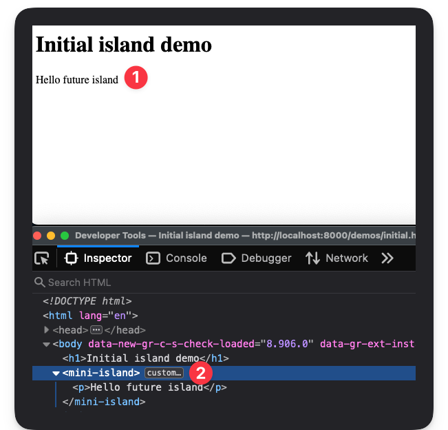 Rendering the custom element with a child element.
Now, let’s go ahead and add some JavaScript within <mini-island> as shown below:
<!-- 📂 demos/initial.html -->
...
<mini-island>
  <p>Hello future island</p>
  <script type="module">
    console.warn("THIS IS A WARNING FROM AN ISLAND");
  </script>
</mini-island>
If you refresh the page and check the browser console, you should see the warning logged.
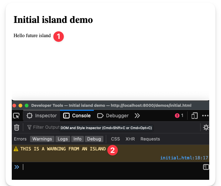 Console warning from the island.
This means the script was fired almost immediately. Not our ideal solution.
While images and video account for over 70% of the bytes downloaded for the average website, byte per byte, JavaScript has a more significant negative impact on performance.
So, our goal is to ensure JavaScript doesn’t run by default. We will render any relevant markup in the island (HTML and CSS) but defer the loading of JavaScript.
How to leverage the content template element
<template> is a native HTML element that’s near perfect for our use case.
The contents within a <template> element are parsed for correctness by the browser but not rendered.
For example, let’s go ahead and wrap the script from the previous example in a <template> element as shown below:
<!-- 📂 demos/initial.html -->
...
<mini-island>
  <p>Hello future island</p>
  <template>
    <script type="module">
      console.warn("THIS IS A WARNING FROM AN ISLAND");
    </script>
  </template>
</mini-island>
If you refresh the page, you’ll notice that the Hello future island paragraph is rendered, but the script within <template> isn’t, that is no log to the console.
This is step one: isolate JavaScript from being loaded right away.
However, the eventual goal here is to ensure the developer can decide when to run the script within our island template.
As discussed in the proposed API implementation, consider the following:
<mini-island client:visible>
  <p>Hello future island</p>
  <template>
    <script type="module">
      console.warn("THIS IS A WARNING FROM AN ISLAND");
    </script>
  </template>
</mini-island>
With the client:visible attribute, we will only initialise the script when the island is visible (within the user viewport).
Without taking the client: attributes into question, let’s go ahead and initialise any template content as soon as the <mini-island> element is attached to the DOM.
Consider the annotated code below:
// 📂 mini-island.js
class MiniIsland extends HTMLElement {
  // ...

  /**
   * The connectedCallback is a part of the custom elements lifecycle callback.
   * It is invoked anytime the custom element is attached to the DOM
   */
  async connectedCallback() {
    /**
     * As soon as the island is connected, we will go ahead and hydrate the island
     */
    await this.hydrate();
  }

  hydrate() {
    /**
     * Retrieve the relevant <template> child elements of the island
     */
    const relevantChildTemplates = this.getTemplates();
  }
}
Now, we will turn our attention to getTemplates().
Since <mini-island> is a custom element extending a standard HTMLElement, we can access traditional DOM querying methods such as querySelectorAll.
So, let’s use querySelectorAll to retrieve a list of all child template elements with a data-island attribute.
// 📂 mini-island.js
// ...

getTemplates() {
  /**
   * querySelectorAll() returns a list of the document's elements that match the specified group of selectors.
   * The selector, in this case, is of the form "template[data-island]."
   *, i.e., this.querySelectorAll("template[data-island]")
  */
  return this.querySelectorAll(
    `template[${MiniIsland.attributes.dataIsland}]`
  );
}
Note that the data-island attribute is retrieved in the code above via MiniIsland.attributes.dataIsland.
Also, do you remember why we’re using the data-island attribute?
This is because we want to give developers the flexibility to use standard <template> elements within our island. So, our island will only concern itself with <template data-island> elements.
Now that we’ve retrieved the template node via getTemplates(), we will grab its content and hydrate it.
Let’s update the hydrate method as shown below:
// 📂 mini-island.js
// ...
hydrate() {
    /**
     * Retrieve the relevant <template> child elements of the island
     */
    const relevantChildTemplates = this.getTemplates();
    /**
     * Grab the DOM subtree within the template and replace the template with live content
     */
    this.replaceTemplates(relevantChildTemplates);
}
The replaceTemplates method is as shown below:
// 📂 mini-island.js
// ...
 replaceTemplates(templates) {
    /**
     * Iterate over all nodes in the template list.
     * templates refer to a NodeList of templates
     * node refers to a single <template>
     */
    for (const node of templates) {
      /**
       * replace the <template> with its HTML content
       * e.g., <template><p>Hello</p></template> becomes <p>Hello</p>
       */
      node.replaceWith(node.content);
    }
  }
Do you see what we’re doing here?
We’re grabbing the template DOM subtree, accessing its content and removing the <template> element.
<!-- 👀 before -->
<mini-island>
  <template>
    <p>Hello</p>
  </template>
<mini-island>

<!-- ✅ after -->
<mini-island>
  <p>Hello</p>
<mini-island>
This will attach the content to the DOM and kick off rendering and script loading.
With the templates now replaced, let’s go ahead and change the initial demo file to hold a more tangible example, as shown below:
<!-- 📂 demos/initial.html -->
<mini-island>
  <p>Hello future island</p>
  <template data-island>
    <script type="module">
      console.warn("THIS IS A WARNING FROM AN ISLAND");
    </script>
  </template>
</mini-island>
Note that the <template> element has the data-island attribute. This is how we signal to the island to hydrate the template content.
Now, refresh your browser and notice how the console.warn is triggered.
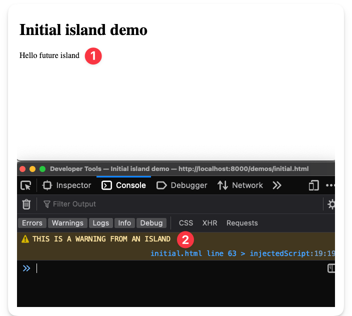 Hydrated island script.
If you also inspect the elements, you’ll notice that the <template> has been replaced with its live child content.
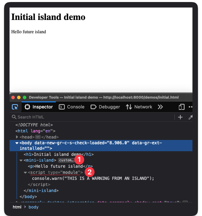 Replaced island <template> element.
We’re officially hydrating our island!
How to handle lazy hydration via “client:” attributes
Our current solution isn’t going to win us any awards. As soon as the island is attached to the DOM, we hydrate the island. Let’s make it better by introducing lazy hydration.
Lazy hydration is a form of partial hydration where we hydration later — not immediately after page load.
Lazy hydration is powerful because we can determine what’s essential or priority for our site, that is we can choose to delay the execution of unimportant JavaScript.
Update the initial.html document to consider our first use case. Here’s the updated code:
<!-- 📂 demos/initial.html -->
<!DOCTYPE html>
<html lang="en">
  <head>
    <meta charset="UTF-8" />
    <meta http-equiv="X-UA-Compatible" content="IE=edge" />
    <meta name="viewport" content="width=device-width, initial-scale=1.0" />
    <title>Initial island demo</title>

    <script type="module">
      import "../mini-island.js";
    </script>
  </head>
  <body>
    <h1>Initial island demo</h1>
    <!-- 👀 look here  -->
    <p style="padding-bottom: 100vh">Scroll down</p>
    <!-- 👀 look here  -->
    <mini-island client:visible>
      <p>Hello island</p>

      <template data-island>
        <script type="module">
          console.warn("THIS IS A WARNING FROM AN ISLAND");
        </script>
      </template>
    </mini-island>
  </body>
</html>
 The client:visible demo
We now have a paragraph that reads scroll down, which has a large enough bottom padding to push the island off the viewport.
With the client:visible attribute on the <mini-island>, we should not hydrate the island except when it’s visible, that is when the user scrolls to view the island.
However, test this in your browser.
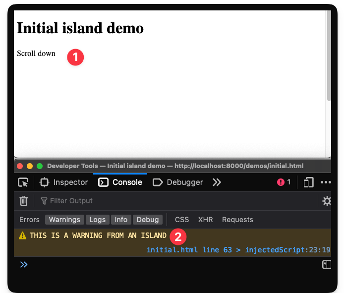 The island is hydrated before being in view.
The script is hydrated before we scroll (as soon as the page loads), and the THIS IS A WARNING FROM AN ISLAND message is logged.
Let’s prevent this from happening.
To achieve this, take a second look at the island hydrate method:
  hydrate() {
    const relevantChildTemplates = this.getTemplates();
    this.replaceTemplates(relevantChildTemplates);
  }
Conceptually, we aim to wait for specific loading conditions to be met before we replace the island templates. In this case, we want to wait until the island is visible.
In pseudo-code:
  hydrate() {
     // Get island conditions, e.g., client:visible, client:idle
    // If these exist, wait for the conditions to be met before the next steps
    const relevantChildTemplates = this.getTemplates();
    this.replaceTemplates(relevantChildTemplates);
  }
To manage our island loading conditions, let’s introduce a new Conditions class as shown below:
// 📂 mini-island.js

// ...
class Conditions {

}

// same existing code ...
if ("customElements" in window) {
  window.customElements.define(MiniIsland.tagName, MiniIsland);
} else {
  console.error(
    "Island cannot be initiated because Window.customElements is unavailable."
  );
}
Within Conditions, we will introduce a static property that’s a key-value representation of the client: attribute and async methods.
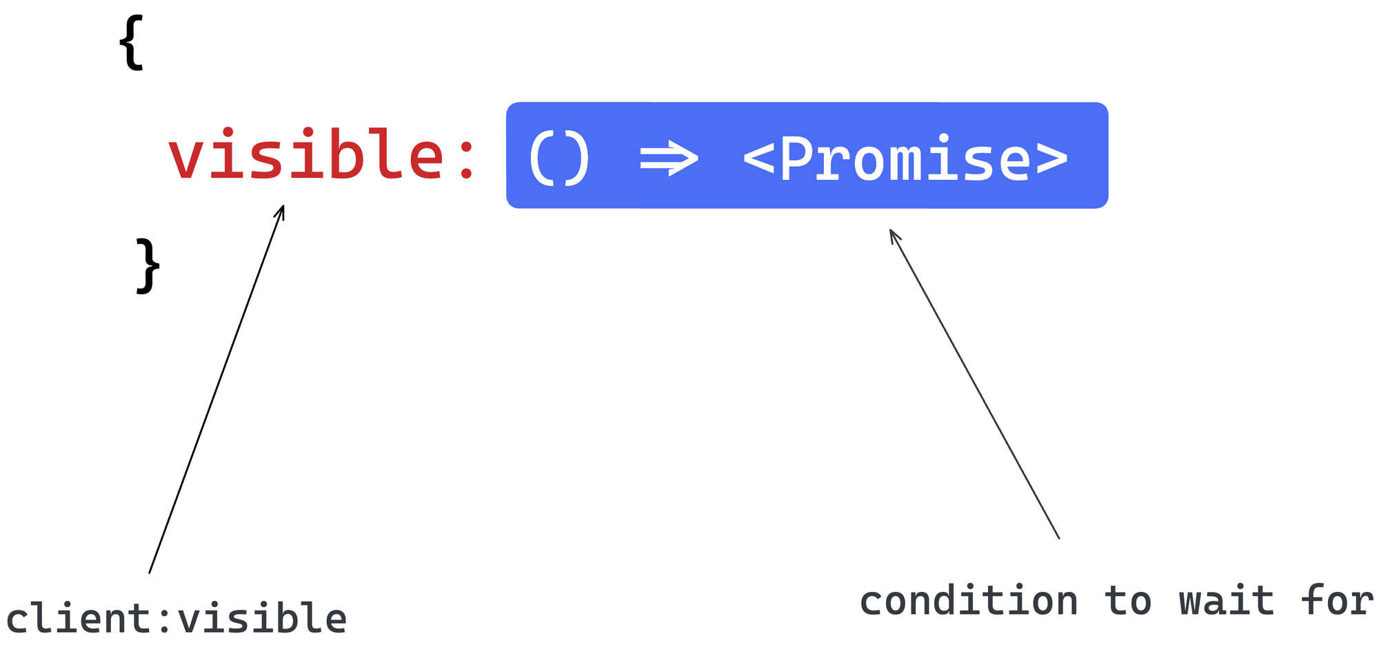 An object with key-value corresponding to attribute and promise condition.
Our conditions will be fulfilled at a later unknown time. So, we will represent these with async functions. These async functions will return promises that are resolved when the associated condition is met.
Here’s the representation of this in code:
// // 📂 mini-island.js
// ...
class Conditions {
  /**
   * A map of loading conditions and their respective async methods
   */
  static map = {
    idle: Conditions.waitForIdle,
    visible: Conditions.waitForVisible,
    media: Conditions.waitForMedia,
  };

  static waitForIdle() {
    return new Promise((resolve) => resolve());
  }

  static waitForVisible() {
    return new Promise((resolve) => resolve());
  }

  static waitForMedia() {
    return new Promise((resolve) => resolve());
  }
}
At the moment, the promises resolve immediately. But let’s go ahead and flesh out our use case for client:visible.
First, we will expose a getConditions method on the Conditions class. The method will check if a certain DOM node (in our case, our mini-island) has an attribute in the form of client:${condition}.
Below’s the annotated implementation:
// 📂 mini-island.js

class Conditions {
 // ...
  static getConditions(node) {
    /**
     * The result variable will hold the
     * key:value representing condition:attribute.
     * e.g., For <mini-island client:visible>
     * result should be { visible: "" }
     * and for <mini-island client:media="(max-width: 400px)" />
     * result should be { media: "(max-width: 400px)" }
     */
    let result = {};

    /**
     * Loop over all keys of the static map,
     *, i.e., ["idle", "visible", "media"]
     */
    for (const condition of Object.keys(Conditions.map)) {
      /**
       * Check if the node has the attribute
       * of the form "client:${key}".
       */
      if (node.hasAttribute(`client:${condition}`)) {
        /**
         * If the node has the attribute...
         * save the condition (key) - attribute (value)
         * to the result object
         */
        result[condition] = node.getAttribute(`client:${condition}`);
      }
    }
    /** return the result */
    return result
  }
}
Next, we will expose a hasConditions method responsible for checking if an island has one or more conditions:
// 📂 mini-island.js
// ...
class Conditions {
 // ...
  static hasConditions(node) {
    /**
     * Using the "getConditions" static class method, retrieve
     * a conditions attributes map
     */
    const conditionAttributesMap = Conditions.getConditions(node);

    /**
     * Check the length of the result keys to determine if there are
     * any loading conditions on the node
     */
    return Object.keys(conditionAttributesMap).length > 0;
  }
}
With hasConditions and getConditions ready, let’s go ahead and use these within the MiniIsland hydrate method.
First, here’s the current state of the hydrate method.
// 📂 mini-island.js

class MiniIsland extends HTMLElement {
 // ...
  hydrate() {
    const relevantChildTemplates = this.getTemplates();
    this.replaceTemplates(relevantChildTemplates);
  }
 // ...
}
Now, update the method with the following. I have provided annotations to make it easier to understand.
// 📂 mini-island.js

class MiniIsland extends HTMLElement {
 // ...
  async hydrate() {
    /**
     * conditions will hold an array of potential
     * promises to be resolved before hydration
     */
    const conditions = [];

    /**
     * Get the condition - attribute value map
     * NB: the argument passed to
     * `Conditions.getConditions` is the island node
     */
    let conditionAttributesMap = Conditions.getConditions(this);

    /**
     * Loop over the conditionAttributesMap variable
     */
    for (const condition in conditionAttributesMap) {
      /**
       * Grab the condition async function from the static map
       * Remember that the function that returns a promise when invoked
       */
      const conditionFn = Conditions.map[condition];

      /**
       * Check if the condition function exists
       */
      if (conditionFn) {
        /**
         * Invoke the condition function with two arguments:
         * (1) The value of the condition attribute set on the node
         * For example:
         * for <mini-island client:visible /> this is an empty string ""
         * for <mini-island client:media="(max-width: 400px)" />
         * This is the string "(max-width: 400px)"
         *
         * (2) The node, i.e., the island DOM node
         */
        const conditionPromise = conditionFn(
          conditionAttributesMap[condition],
          this
        );

        /**
         * append the promise to the conditions array
         */

        conditions.push(conditionPromise);
      }

      /**
       * Await all promise conditions to be
       * resolved before replacing the template nodes
       */
      await Promise.all(conditions);
      /**
       * Retrieve the relevant <template> child elements of the island
       */
      const relevantChildTemplates = this.getTemplates();
      /**
       * Grab the DOM subtree in the template
       * and replace the template with live content
       */
      this.replaceTemplates(relevantChildTemplates);
    }
  }
}
At the moment, remember that our condition promises in Conditions resolve immediately.
Before we test our solution, we must satisfy the condition for the client:visible attribute.
How do we ensure that the island is visible?
The best solution here is to use the IntersectionObserver API. Let’s take advantage of that as shown below:
// 📂 mini-island.js

class Conditions {
 // ...
   /**
   *
   * @param noop - the value of the condition attribute.
   * This is named "noop" as it is not relevant in this condition, i.e.,
   * as per our API, client:visible always has a falsy attribute value, e.g.,
   * ✅ <mini-island client:visible />
   * ❌ <mini-island client:visible={some-value} />
   * @param el - the node element.
   * This represents our island DOM node passed during hydration
   * @returns - a Promise that resolves when "el" is visible
   * NB: relies on the Intersection Observer API
   */
  static waitForVisible(noop, el) {
    /**
     * If the Intersection Observer API is not available,
     * go ahead and exit immediately.
     */
    if (!("IntersectionObserver" in window)) {
      return;
    }

    /**
     * Otherwise, set up a new Promise that is resolved when the
     * node parameter (our island DOM node) is visible
     */
    return new Promise((resolve) => {
      let observer = new IntersectionObserver((entries) => {
        let [entry] = entries;

        /**
         * is it visible?
         */
        if (entry.isIntersecting) {
          /**
           * remove observer
           */
          observer.unobserve(entry.target);
          /**
           * resolve promise
           */
          resolve();
        }
      });

      /**
       * set up the observer on the "el" argument
       */
      observer.observe(el);
    });
  }
}
This is excellent work!
Return to the demo initial.html application running in your browser, refresh, and notice how the island behaves.
The island is no longer hydrated until we scroll down and the island is visible 🎉
Well done, mate! Give yourself a round of applause and a cuppa tea. We’ve smashed it. Take a pause if you need one, and let’s get on the next set of requirements when you’re ready.
How to support the client:idle and client:media conditions
We have a pretty robust solution within the hydrate method. So, to support more loading conditions, we have to flesh out the other condition promises.
waitForIdle
Take a pause and consider how we should do this. For example, what heuristic do we rely on the determine when the browser is “idle”?
It begs the question, what’s “idle” in this case?
Well, for our implementation, the definition of idle is when the browser is not actively loading any resources, and no latency-critical events, such as animation and input responses, are in progress.
To achieve this, we will rely on two properties:
(i) The document.readyState event
If the value of this event is complete, the document and all sub-resources have finished loading. This includes all dependent resources such as stylesheets, scripts, iframes, and images.
Listening to this event ensures we hydrate the island when all other essential assets have been downloaded.
(ii) The window.requestIdleCallback() method
By definition, the window.requestIdleCallback() method will queue a function to be called when a browser is idle. This ensures the function is only executed when the browser handles no latency-critical event.
Let’s put these together and create a promise that resolves when the document.readyState event is complete, and no latency-critical events are being handled.
Here’s the implementation below:
// 📂 mini-island.js
// ...
class Conditions {
 // ...
 static waitForIdle() {
    const onLoad = new Promise((resolve) => {
      /**
       * The document.readyState property
       * describes the loading state of the document.
       */
      if (document.readyState !== "complete") {
        /**
         * Set up an event listener for the "load" event.
         * The load event is fired when the whole page
         * has loaded, including all dependent resources
         * such as stylesheets, scripts, iframes, and
         * images.
         */
        window.addEventListener(
          "load",
          () => {
            /**
             * resolve this promise once the "load" event is fired.
             */
            resolve();
          },
          /**
           * Remove the listener after the first
           * invocation of the "load" event.
           */
          { once: true }
        );
      } else {
        resolve();
      }
    });

    /**
     * The window.requestIdleCallback() method queues a
     * function to be called during a browser's idle periods.
     * This enables developers to perform background
     * and low-priority work on the main event loop
     */

    const onIdle = new Promise((resolve) => {
      /**
       * Check for "requestIdleCallback" support
       */
      if ("requestIdleCallback" in window) {
        requestIdleCallback(() => {
          /**
           * pass the promise resolve function
           * as the operation to be queued
           */
          resolve();
        });
      } else {
        /**
         * resolve the promise immediately
         * if requestIdleCallback isn't supported
         */
        resolve();
      }
    });

    /**
     * waitForIdle will wait for both
     * promises to be resolved, i.e., onIdle and onLoad
     */
    return Promise.all([onIdle, onLoad]);
  }
}
Now, go to the initial.html demo file and update the file as shown below:
<!-- 📂 demos/initial.html -->
<!DOCTYPE html>
<html lang="en">
  <!-- ... -->
  <!-- content unchanged -->
  <body>
    <h1>Initial island demo</h1>
    <img
      src="https://raw.githubusercontent.com/ohansemmanuel/larder/main/large_image.jpeg"
      alt="34MB large satellite image from Effigis."
    />

    <mini-island client:idle>
      <p>Hello island</p>

      <template data-island>
        <script type="module">
          console.warn("THIS IS A WARNING FROM AN ISLAND");
        </script>
      </template>
    </mini-island>
  </body>
</html>
Note that we’ve introduced a large 34MB image from Effigis and passed a client:idle attribute to <mini-island>.
Tip: consider downloading the large image and referencing it locally instead of hitting the GitHub servers repeatedly.
The large image will keep the browser busy for some time. Before testing this in the browser, I suggest disabling the browser cache via developer tools.
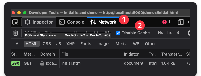 The disable cache property in Firefox.
Open the page in the browser and notice how the script is not invoked until the browser has finished loading the large image and is in an idle state.
This is great!
Instead of potentially allowing non-priority JavaScript code to compete for the browser resources, we’ve shelved that to be initialised later during the browser’s idle period.
waitForMedia
The media condition is fascinating. The island is only hydrated when a CSS media query is met. This is useful for mobile toggles or other elements only visible on specific screen sizes.
We will leverage the window.matchMedia() to determine if the document matches the media query string.
Here’s the annotated implementation:
// 📂 mini-island.js
// ...
class Conditions {
/**
   *
   * @param {*} query - the query string
   * passed to the client:media attribute
   * @returns Promise that resolves when
   * the document matches the passed CSS media query
   */
  static waitForMedia(query) {
    /**
     * window.matchMedia(query) returns A MediaQueryList object.
     * This object stores information on a media query
     * applied to a document and one of the properties
     * on this object is "matches" - a boolean for
     * whether the document matches the media query or not.
     * Create a new simple object of similar form, i.e.,
     * with a "matches" property
     */
    let queryList = {
      matches: true,
    };

    if (query && "matchMedia" in window) {
     /**
       Override our stub with the actual query list
     */
      queryList = window.matchMedia(query);
    }

    /**
     * If matchMedia isn't supported or the
     * query is truthy, return immediately
     * e.g., truthy if matchMedia isn't in the window object
     */
    if (queryList.matches) {
      return;
    }

    return new Promise((resolve) => {
      /**
       * Set a new listener on the queryList object
       * and resolve the promise when there's a match
       */
      queryList.addListener((e) => {
        if (e.matches) {
          resolve();
        }
      });
    });
  }
}
With this in place, we may update the initial.html demo file to the following:
<!DOCTYPE html>
<html lang="en">
  <!-- content remains the same -->
  <body>
    <h1>Initial island demo</h1>

    <mini-island client:media="(max-width: 400px)">
      <p>Hello island</p>

      <template data-island>
        <script type="module">
          console.warn("THIS IS A WARNING FROM AN ISLAND");
        </script>
      </template>
    </mini-island>
  </body>
</html>
Now refresh the page in your browser and notice how the script is never initialised until you resize your browser window to match the CSS query, that is a maximum width of 400px.
How to support frameworks: Vue, Petite-vue, and Preact
Our <mini-island> implementation is simple yet effective. But you may not appreciate it until you’ve seen it used with other frameworks. Coincidentally, this is also a part of our objectives – to develop a framework-agnostic solution.
The following sections show framework examples utilising <mini-island>. To do this, we will build out the same framework user interface in the form of a simple counter.
Vue
Vue is a JavaScript framework for building user interfaces. Vue’s mental model builds on top of standard HTML, CSS, and JavaScript, making it easy to understand for most people.
As expected of a modern UI framework, Vue is declarative and reactive.
Let’s go ahead and build a counter application leveraging Vue and <mini-island> as shown below:
<!-- 📂 demos/vue.html -->

<!DOCTYPE html>
<html lang="en">
  <head>
    <meta charset="UTF-8" />
    <meta http-equiv="X-UA-Compatible" content="IE=edge" />
    <meta name="viewport" content="width=device-width, initial-scale=1.0" />
    <title>Vue mini-island demo</title>

    <script type="module">
      import "../mini-island.js";
    </script>
  </head>
  <body>
    <h1>Vue</h1>
    <mark>This is a vue counter </mark>

    <p>
      By default, this button does not load any Javascript and isn't hydrated.
    </p>

    <p>
      Resize your browser to match the media query:
      <code>(max-width: 400px)</code> to hydrate the island
    </p>

    <mini-island client:media="(max-width: 400px)">
      <div id="vue-app">
        <button @click="count++">
          <span>⬆️</span>

          <div>
            <strong>Vue</strong>
            <div>
              <span v-html="count">0</span>
              <span>-</span>
              <span>clicks</span>
            </div>
          </div>
        </button>
      </div>

      <template data-island>
        <script type="module">
          import { createApp } from "https://unpkg.com/vue@3.2.36/dist/vue.esm-browser.prod.js";

          createApp({
            data: () => ({ count: 0 }),
          }).mount("#vue-app");
        </script>
      </template>
    </mini-island>
  </body>
</html>
It’s okay if you do not understand the Vue code snippets. What’s important is the following:
- The HTML markup is rendered as soon as the HTML page is loaded and parsed.
- This includes the static counter markup within
mini-island, that is:
<div id="vue-app">
<button @click="count++">
<span>⬆️</span>
``<strong>Vue</strong>
<div>
<span v-html="count">0</span>
<span>-</span>
<span>clicks</span>
</div>
</div>
</button>
</div> - But the counter is not hydrated at this point. So, clicking the counter will not increase the count. This is because Vue hasn’t been loaded, and the counter button is not yet hydrated.
- Consider the loading condition set on the island, that is
client:media="(max-width: 400px)". - Now, resize your browser (take advantage of the developer tools) to a width less than
400pxto hydrate the island. - This will import Vue and hydrate the counter. Here’s the code responsible for within the island
template:
<template data-island>
<script type="module">
import { createApp } from "https://unpkg.com/vue@3.2.36/dist/vue.esm-browser.prod.js";
`createApp({`data: () => ({ count: 0 }),
}).mount("#vue-app");
</script>
</template> - The counter should now be hydrated. We may now click to our heart’s content.
Petite-vue
From the official Vue documentation, Vue also provides an alternative distribution called petite-vue that is optimised for progressively enhancing existing HTML.
This is perfect for our use case.
Let’s go ahead and create a similar demo using petite-vue as shown below:
<!-- 📂 demos/petite-vue.html -->

<!DOCTYPE html>
<html lang="en">
  <head>
    <meta charset="UTF-8" />
    <meta http-equiv="X-UA-Compatible" content="IE=edge" />
    <meta name="viewport" content="width=device-width, initial-scale=1.0" />
    <title>Vue mini-island demo</title>

    <script type="module">
      import "../mini-island.js";
    </script>
  </head>
  <body>
    <h1>Petite-vue</h1>
    <mark>This is a petite-vue counter </mark>

    <p>
      By default, this button does not load any Javascript and isn't hydrated.
    </p>

    <p>
      Resize your browser to match the media query:
      <code>(max-width: 400px)</code> to hydrate the island
    </p>

    <mini-island client:media="(max-width: 400px)">
      <div id="vue-app" v-scope="{ count: 0 }">
        <button @click="count++">
          <span>⬆️</span>

          <div>
            <strong>Petite-vue</strong>
            <div>
              <span v-html="count">0</span>
              <span>-</span>
              <span>clicks</span>
            </div>
          </div>
        </button>
      </div>

      <template data-island>
        <script type="module">
          import { createApp } from "https://unpkg.com/petite-vue@0.4.1/dist/petite-vue.es.js";

          createApp().mount("#vue-app");
        </script>
      </template>
    </mini-island>
  </body>
</html>
Apart from a few changes, the code above is identical to the standard Vue API.
Here’s how this works:
- The HTML markup is rendered as soon as the HTML page is loaded and parsed.
- This includes the static counter markup within
mini-island, that is:
<div id="vue-app" v-scope="{ count: 0 }">
<button @click="count++">
<span>⬆️</span>
``<strong>Vue</strong>
<div>
<span v-html="count">0</span>
<span>-</span>
<span>clicks</span>
</div>
</div>
</button>
</div> - NB: the significant difference in the code above is the introduction of the
v-scopeattribute to hold our count data variable. - The counter, however, is not hydrated at this point. So, clicking the counter will not increase the count. This is because petite-vue hasn’t been loaded, and the counter button is not yet hydrated.
- Consider the loading condition set on the island, that is
client:media="(max-width: 400px)" - Now, resize your browser (use the developer tools) to a width less than
400pxto hydrate the island. - This will import Petite-vue and hydrate the counter. Here’s the code responsible for within the island
template:
<template data-island>
<script type="module">
import { createApp } from "https://unpkg.com/petite-vue@0.4.1/dist/petite-vue.es.js";
`createApp().mount("#vue-app");`</script>
</template> - The counter should now be hydrated. We may now click to our heart’s content.
Preact
Preact is a fast 3kB alternative to React with the same modern API, and it can be used in the browser without any transpiration steps.
Let’s go ahead and create a similar demo using Preact, as shown below:
<!-- 📂 demos/preact.html -->

<!DOCTYPE html>
<html lang="en">
  <head>
    <meta charset="UTF-8" />
    <meta http-equiv="X-UA-Compatible" content="IE=edge" />
    <meta name="viewport" content="width=device-width, initial-scale=1.0" />
    <title>Preact mini-island demo</title>

    <script type="module">
      import "../mini-island.js";
    </script>
  </head>

  <body>
    <h1>Preact</h1>
    <p>This is a preact counter</p>

    <p>By default, this button is not rendered or hydrated</p>

    <mini-island client:idle>
      <div id="preact-app">
        <mark
          >The counter island will be rendered and hydrated just above this mark
          when the browser is idle</mark
        >
      </div>

      <template data-island>
        <script type="module">
          import { h, Component, render } from "https://esm.sh/preact";
          import { useState } from "https://esm.sh/preact/hooks";
          import htm from "https://esm.sh/htm";

          // Initialize htm with Preact
          const html = htm.bind(h);

          function App(props) {
            const [count, setCount] = useState(0);

            const increment = () =>
              setCount((currentCount) => currentCount + 1);

            return html`<div>
              <button onClick=${() => increment()}>
                <span>⬆️ </span>

                <div>
                  <strong>Preact</strong>
                  <div>
                    <span>${count}</span>
                    <span>-</span>
                    <span>clicks</span>
                  </div>
                </div>
              </button>
            </div>`;
          }

          render(html`<${App} />`, document.getElementById("preact-app"));
        </script>
      </template>
    </mini-island>

    <ul>
      <li>The document must be completely loaded</li>
      <li>The large image below must complete loading</li>
    </ul>

    <img
      src="https://raw.githubusercontent.com/ohansemmanuel/larder/main/large_image.jpeg"
      alt="34MB large satellite image from Effigis."
    />
  </body>
</html>
The code above behaves differently from the previous framework examples.
Here’s how this works:
- The HTML markup is rendered after loading and parsing the HTML.
- The counter, however, is not rendered or hydrated. This is because
mini-islandhas aclient: idleloading condition. - The counter will be rendered and hydrated when the browser is idle. For this to be the case, the large image in the document must complete loading.
- Once this is loaded (including other associated document resources), Preact renders and hydrates the counter when the browser is idle.
- The counter should now be hydrated; we may now click to our heart’s content.
Wrapping Up This Chapter
When it comes to performance and deciding what rendering solution works for your application, no single solution fits all applications.
Depending on the application, we always have to make tradeoffs. But the island architecture provides very performant client applications without sacrificing rich interactivity.
The main goal of this chapter was to peel back the perceived layer of complexity and strip down component islands to a fundamental digestible unit with <mini-island>.
Now, we will take this knowledge into exploring component islands in Astro, and (almost) nothing will surprise you. That’s the definition of proper understanding.
 Chapter four.
Chapter 4: The Secret Life of Astro Component Islands
Component islands are the secret to Astro’s super-fast narrative. It’s time to learn everything about them.
What You’ll Learn
- Hands-on experience working with framework components in Astro.
- Responsible hydration and why it matters.
- How component islands work in Astro.
- Why islands are essential.
How Islands Work in Astro
Assume we’ve got an Astro application with static content: a navigation bar, some main content, a footer, and a side pane.
 A static astro page structure
If we need to introduce some interactivity content in the side pane of the application, how could we achieve this?
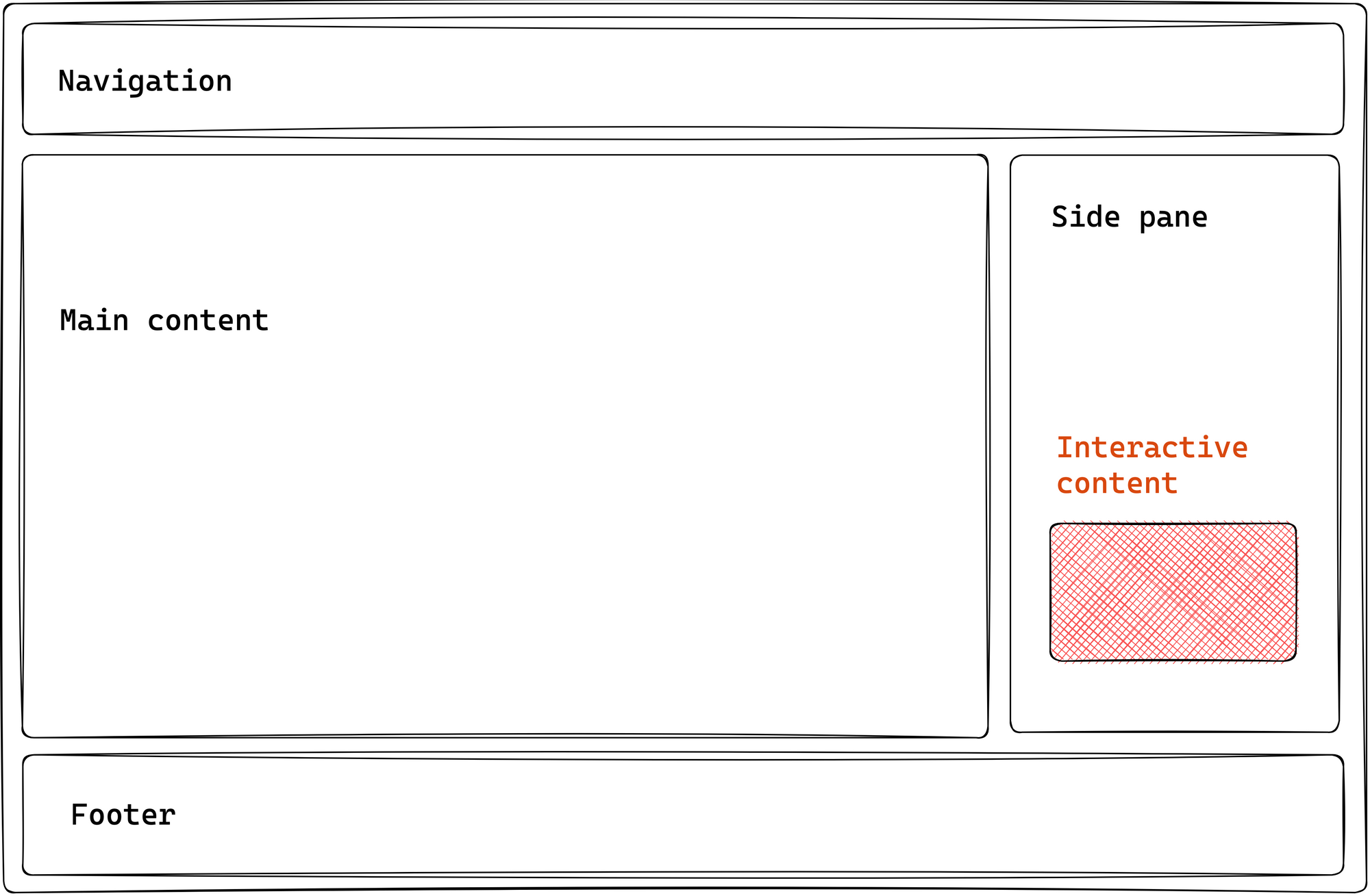 Adding interactive content to the static page
Astro provides the following ways to do this:
- We've seen how this works: introduce a
<script>element to handle interactivity within your Astro component. - Use a supported framework component, and leverage a component island.
The second option is the focus of this chapter.
At the time of writing, Astro lets you use components built with React, Preact, Svelte, Vue, SolidJS, AlpineJS or Lit in your Astro components. Moving on, I’ll refer to these as framework components.
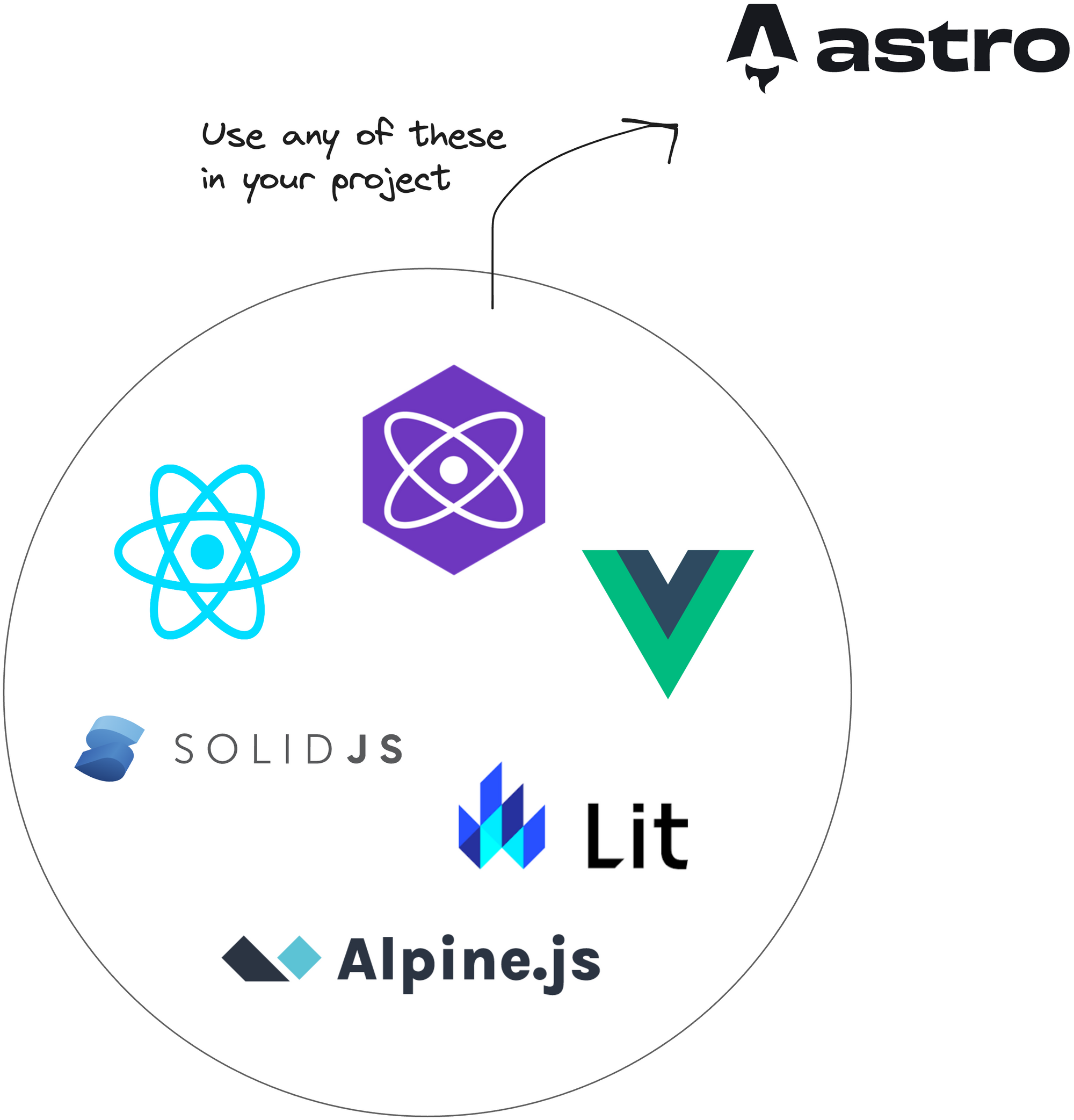 Leveraging framework components in Astro.
So, why would we use framework components and not just provide native support via a <script> element?
It would be best to stick with a <script> element in cases where you can get by with vanilla JavaScript or TypeScript. But there are cases where we may favour a framework component. For example:
- Design systems: using a pre-existing design system in an Astro project can save time, depending on the use case. It also helps keep all your applications looking and feeling the same way.
- Open-source: we might consider utilising a feature-rich open-source framework component already existing instead of building some highly interactive component from scratch. This way, we can easily use an open-source framework component in Astro.
- Ease of development: we may find building richer stateful user interfaces easier, more manageable, and faster to implement via framework components than vanilla JavaScript / TypeScript provided in
<script>.
To use a framework component in Astro, we leverage component islands.
Let’s return to our example application.
Assuming we’ve weighed the pros and cons and decided to introduce a framework component, the following section highlights the steps to take.
Step 1: Build an Astro site
We can’t use framework components without having some Astro site to use them in.
We’ve already seen how to build static sites with Astro, so creating a new static project is unnecessary. Instead, let’s start a new Astro with a project I’ve prepared.
Clone the project:
git clone https://github.com/understanding-astro/astro-islands-visual-example.git
Then, install dependencies and start the application via the following:
npm install
npm run start
This will run the project in one of your local ports.
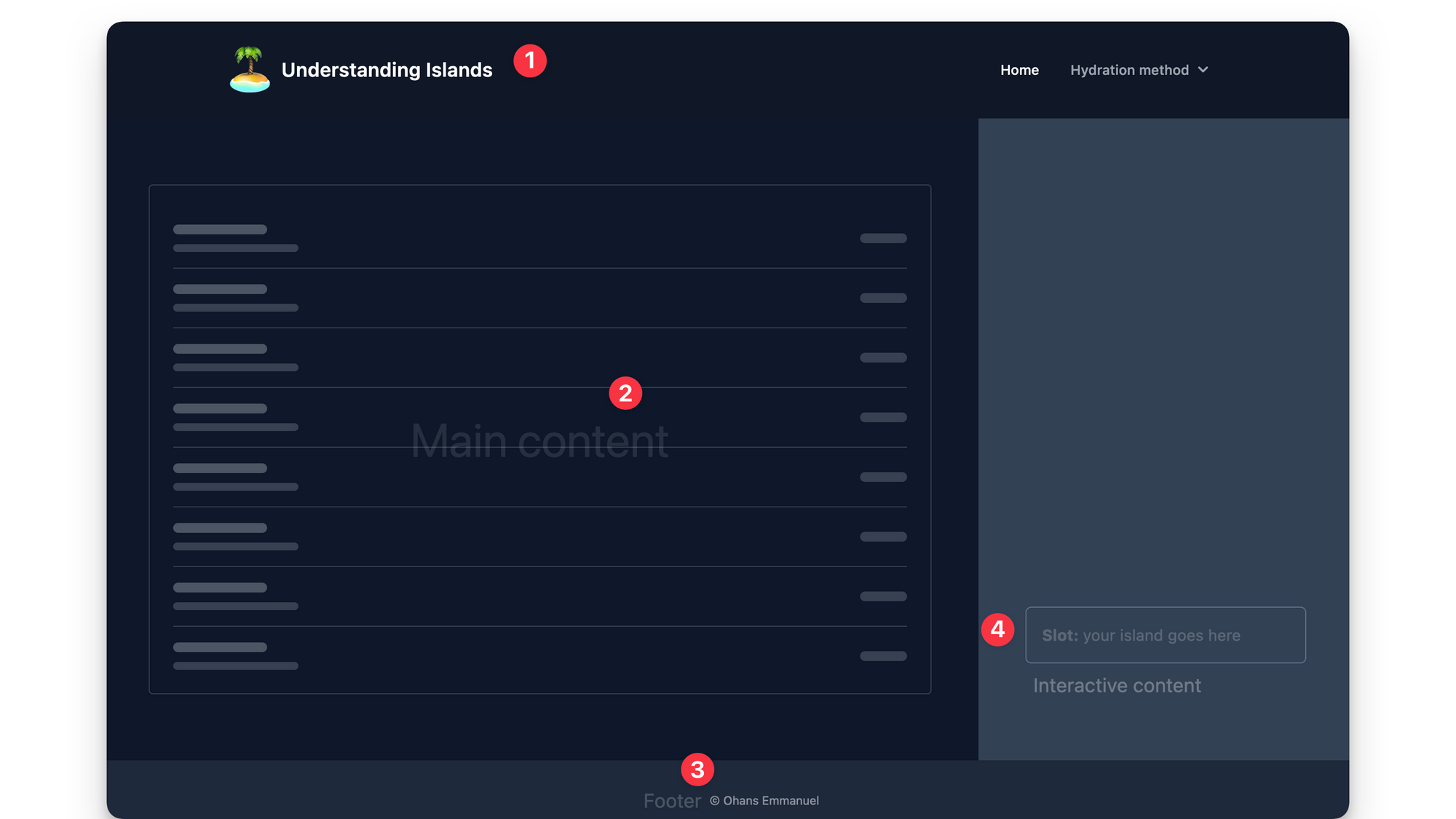 The astro islands visual example project
The project takes the same form as our hypothetical example — it’s got a navigation, main content, footer, and side pane.
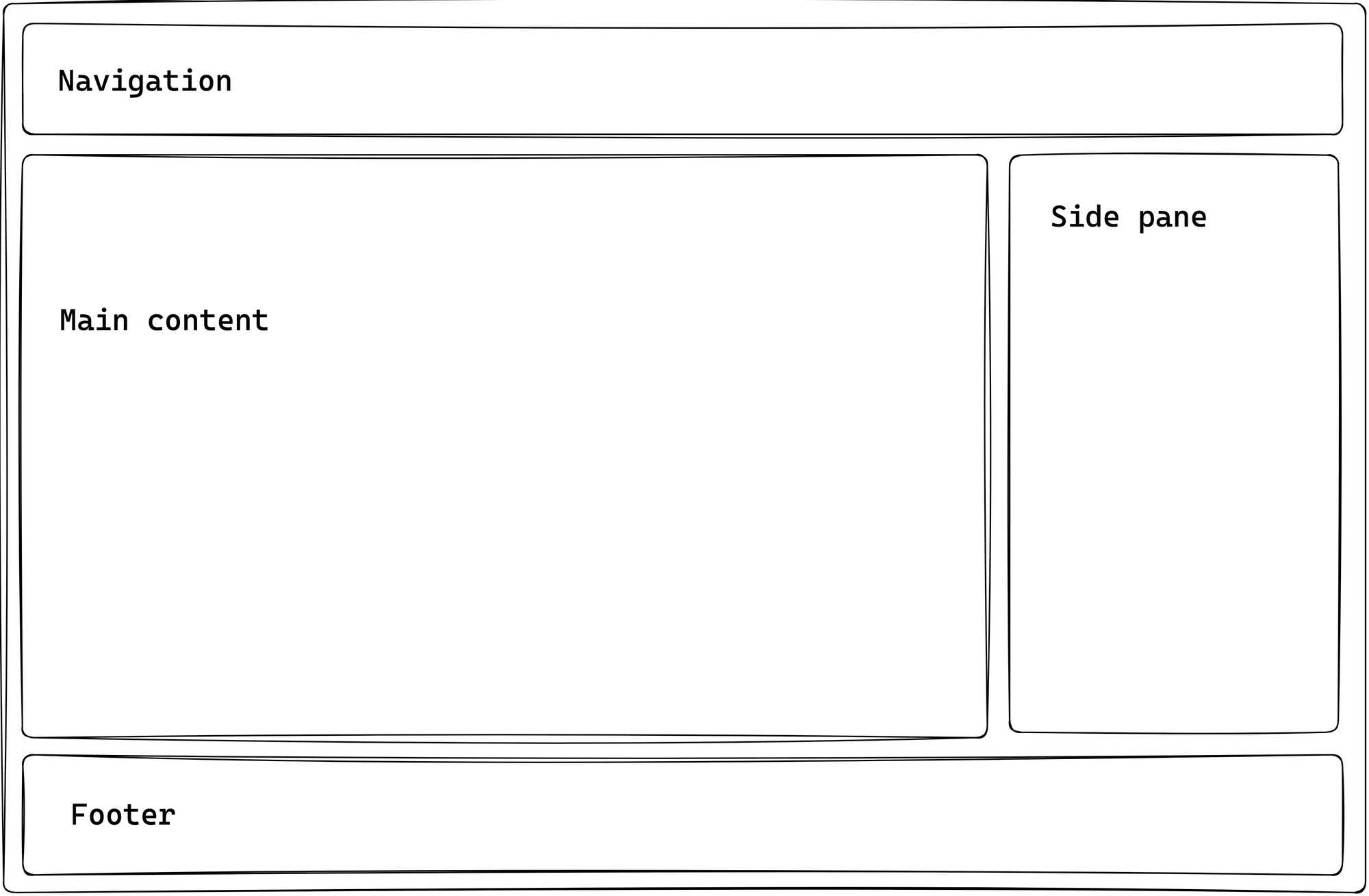 A static astro page structure
Within the side pane, there’s a slot to render our interactive content via a framework component.
In src/pages/index.astro, you’ll find the code responsible for rendering the page as shown below:
// 📂 src/pages/index.astro
---
import DefaultIslandLayout from "../layouts/DefaultIslandLayout.astro";
---

<DefaultIslandLayout />
DefaultIslandLayout provides the layout for the entire page and includes a slot for rendering whatever children elements are passed to it. Initialise the project locally and take a look.
Step 2: Install the framework integration
Astro provides official integrations for the supported framework components. In this example, we’ll use the react framework.
It’s important to note that the steps described here are the same regardless of the framework component of your choosing. Therefore, I’m sticking to react as many more developers arguably use it.
The most convenient way to add your framework integration is to use the astro add command, for example to add react, run the following commands:
# using NPM
npx astro add react
# Using Yarn
yarn astro add react
# Using PNPM
pnpm astro add react
This will automatically add the relevant framework dependencies to our project.
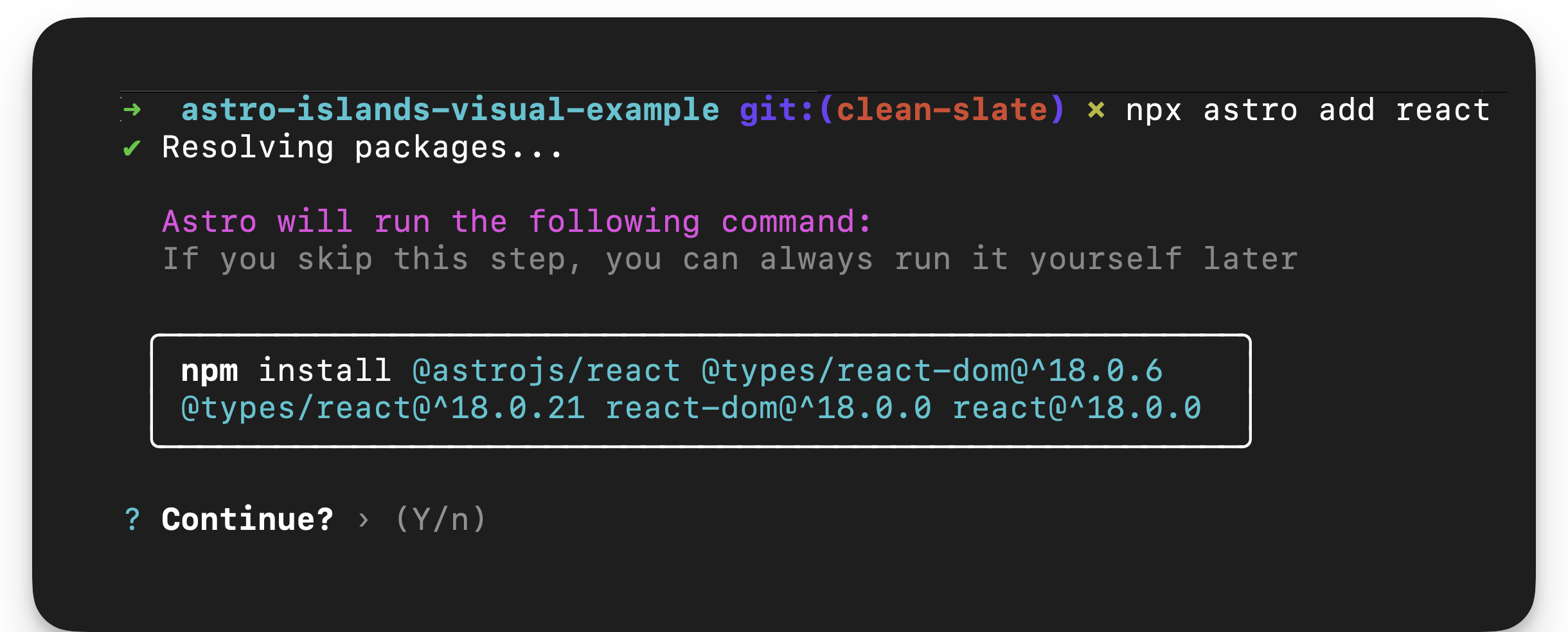 Running astro add react.
The command will also automatically update our project configuration, astro.config.mjs, to include the framework integration.
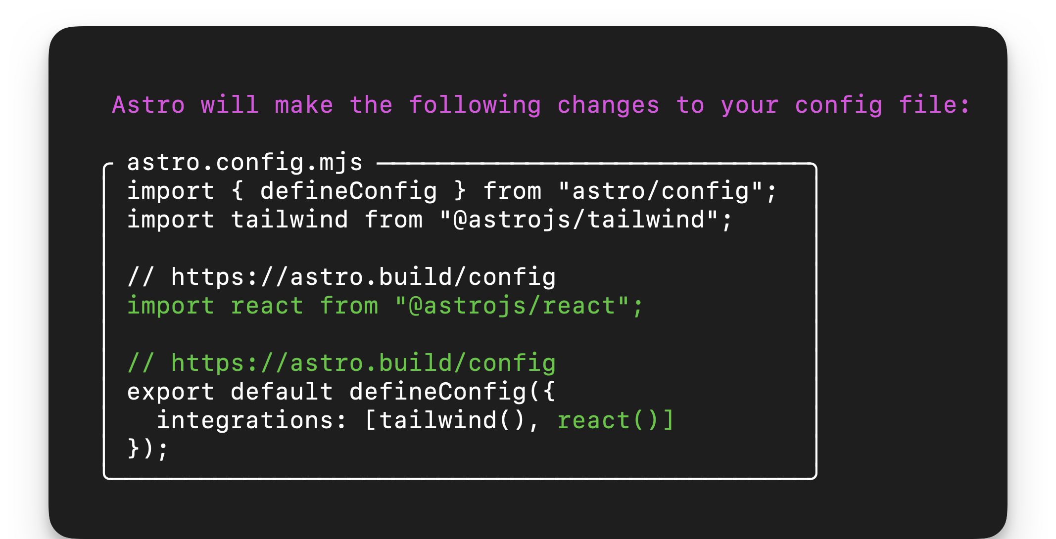 Updating the project config file.
Essentially, this breaks down the installation of a framework into our Astro project into two distinct processes:
- Install the framework dependencies.
- Add the relevant framework integration in the project config file.
If we didn’t use the Astro add command, we could achieve the same results manually by installing the framework dependencies and adding the framework integration in our project configuration file.
Step 3: Write the component framework
Our framework component will be a glorified counter. Assuming the page consists of an article a reader can upvote, we’ll build an upvote button.
 The upvote counter illustrated.
Here’s the annotated UpvoteContent React component:
<!-- 📂 src/components/UpvoteContent.tsx -->

import { useState } from "react";

// The maximum number of upvotes available
const MAX_COUNT = 50;

export const UpvoteContent = () => {
  // the initial state of the upvote counter
  const [upvoteCount, setUpvoteCount] = useState(0);

  return (
    <div>
      <button
       // update state when a user clicks the counter. check if
       //The maximum count value was reached first.
        onClick={() => {
          setUpvoteCount((prevCount) =>
            prevCount < MAX_COUNT ? prevCount + 1 : prevCount
          );
        }}
      >
       { /** Upvote counter SVG icon. shortened for brevity **/}
        <svg />
        Upvote
      </button>

      <div>
        <div>{`${upvoteCount} upvotes`}</div>

        {/** show a growing visual bar based on the upvote count **/}
        <div
          style={{
            width: `${upvoteCount}%`,
          }}
        />

        {/** show a warning if the maximum count has been reached**/}
        {upvoteCount === MAX_COUNT && (
          <div>
            Max upvote reached
          </div>
        )}
      </div>
    </div>
  );
};
Don’t worry if you don’t understand react. The goal here is to know how to work with framework components in Astro. We could build the same component using any other framework we choose, like Vue or Svelte.
Step 4: Render the component framework
Let’s go ahead and render the framework component as shown below:
<!-- 📂 src/pages/none.astro -->
---
import { UpvoteContent } from "../components/UpvoteContent.jsx";
import DefaultIslandLayout from "../layouts/DefaultIslandLayout.astro";
---

<DefaultIslandLayout>
  <UpvoteContent />
</DefaultIslandLayout>
- Create a new page in
src/pages/none.astro - Render the
UpvoteContentcomponent as a child ofDefaultIslandLayout, that is:
<DefaultIslandLayout>
<UpvoteContent />
</DefaultIslandLayout> DefaultIslandLayouttakes theUpvoteContentchild component and renders it within its layout slot.
Now, open the /none page in the browser, and we should have the rendered UpvoteContent component rendered.
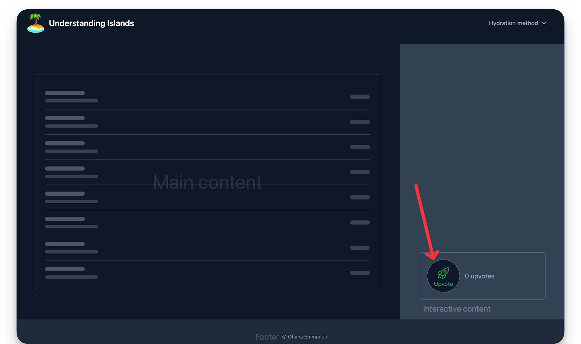 Rendering the framework component.
The upvote counter is successfully rendered, but clicking the button doesn’t increase the count!
What’s going on? 🥹
It’s not a bug. It’s a feature.
By default, when you render a framework component, Astro automatically renders it to HTML ahead of time, that is Astro strips out all of the component JavaScript.
Essentially, you get no interactivity from framework components by default.
 If Astro launched a Twitter campaign, #NoJavscriptByDefault would make an excellent hashtag.
As it stands, what we currently have is technically not an island. We have the component markup rendered with no interactivity.
Responsible Hydration
Astro helps you minimise JavaScript bloat when using framework components by leveraging responsible hydration.
If Astro renders your framework component to 100% HTML, how do you hydrate (make interactive) the framework component?
In the context of Astro development, responsible hydration refers to Astro making no decision on when to hydrate your framework component and leaving that decision entirely up to the developer.
This is powerful but comes with the burden of decision resting on us — developers.
When technical decisions such as this need to be made, they must be made against specific requirements. In this case, the decision lies in evaluating two criteria, namely priority and interactivity.
- Priority: is this a high or low-priority user interface element?
- Interactivity: should this element be interactive as soon as possible?
We may represent this on a 2d plane as follows:
 Representing priority and interactivity on a 2d plane.
There are four attributes you can pass to your rendered framework component, for example:
<ReactComponent attribute />
These attributes are called client directives (or, more generically, template directives). Here are the five client directives that control the hydration of your framework component:
client:loadclient:onlyclient:visibleclient:mediaclient:idle
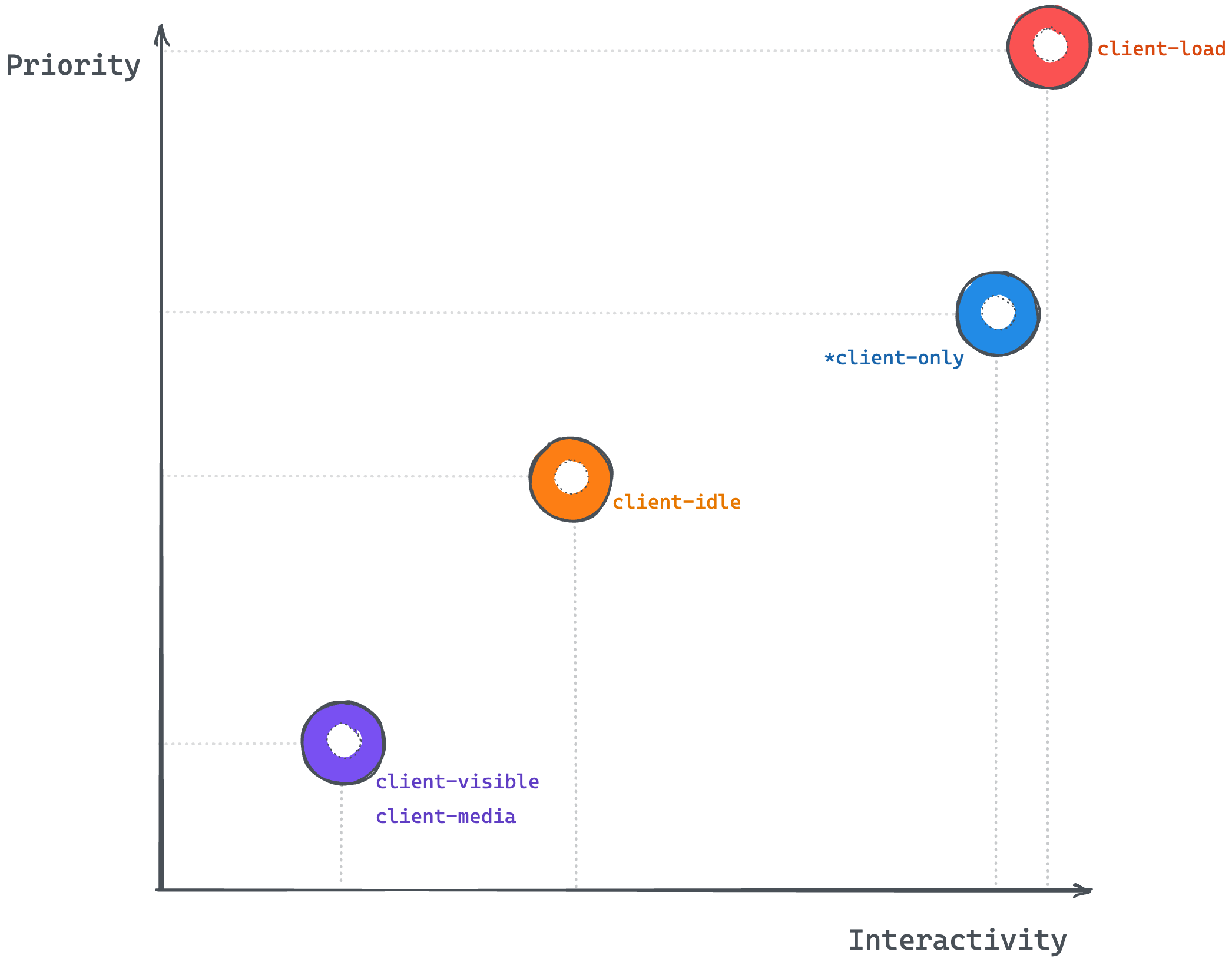 Representing the client template directives on a priority - interactivity plane.
client:load
client:load should be used for high-priority interface elements that must be interactive as soon as possible.
- Priority: high
- Interactivity: high
We may go ahead and render our UpvoteContent component as shown below:
// 📂 src/pages/index.astro
---
import { UpvoteContent } from "../components/UpvoteContent.jsx";
import DefaultIslandLayout from "../layouts/DefaultIslandLayout.astro";
---

<DefaultIslandLayout>
  <UpvoteContent client:load />
</DefaultIslandLayout>
Here are the hydration steps:
- Render the component HTML (not hydrated).
- Wait for the page to load.
- Load component JavaScript.
- Hydrate component.
The load event is fired when the page has loaded, including all dependent resources such as stylesheets, scripts, iframes, and images.
It’s important to note that clicking the upvote button will not trigger any upvotes before hydration.
client:only
client:only behaves similarly to client:load. It should be used for elements where you want to skip server-side rendering (the component will not be initially rendered to HTML) but make it interactive as soon as it’s shown to the user on the client.
- Priority: medium (we’re okay not showing the initial component HTML)
- Interactivity: high (as soon as it’s shown to the user)
We may go ahead and render our UpvoteContent component as shown below:
// 📂 src/pages/index.astro
---
import { UpvoteContent } from "../components/UpvoteContent.jsx";
import DefaultIslandLayout from "../layouts/DefaultIslandLayout.astro";
---

<DefaultIslandLayout>
  <UpvoteContent client:only="react" />
</DefaultIslandLayout>
It’s essential to pass the framework name as shown above. Otherwise, Astro doesn’t know what framework's JavaScript to load. This is because this isn’t determined on the server.
<ReactComponent client:only="react" />
<PreactComponent client:only="preact" />
<SvelteComponent client:only="svelte" />
<VueComponent client:only="vue" />
<SolidComponent client:only="solid-js" />
Here are the hydration steps:
- Do not render component HTML.
- Wait for the page to load.
- Load component JavaScript.
- Hydrate component.
The difference between client:only and client:load is whether to render a static component HTML before the element is interactive. client:only is particularly handy when rendering components requiring client (browser) APIs.
client:visible
client:visible should be used for low-priority interface elements below the fold (far down the page) or resource-intensive. You don’t want to load them if the user never sees the component.
- Priority: low
- Interactivity: low
We may go ahead and render our UpvoteContent component as shown below:
// 📂 src/pages/index.astro
---
import LargeMainContentLayout from "../layouts/LargeMainContentLayout.astro";
import { UpvoteContent } from "../components/UpvoteContent.jsx";
---

<LargeMainContentLayout>
  <UpvoteContent client:visible />
</LargeMainContentLayout>
Note that I’m importing a different LargeMainContentLayout layout in the code block above. The layout is responsible for pushing the island off the initial viewport.
Here are the hydration steps:
- Render component HTML.
- Wait for the element to be visible (uses
IntersectionObserver). - Load component JavaScript.
- Hydrate component.
client:media
client:media should be used for low-priority interface elements only visible on specific screen sizes, for example sidebar toggles.
- Priority: low
- Interactivity: low
We may go ahead and render our UpvoteContent component as shown below:
// 📂 src/pages/index.astro
---
import { UpvoteContent } from "../components/UpvoteContent.jsx";
import DefaultIslandLayout from "../layouts/DefaultIslandLayout.astro";
---

<DefaultIslandLayout>
  <UpvoteContent client:media="(max-width: 30em)" />
</DefaultIslandLayout>
Here are the hydration steps:
- Render component HTML
- Check if the media query matches
- Load component JavaScript
- Hydrate component
client:idle
client:idle should be used for low-priority interface elements that don’t need to be immediately interactive.
- Priority: medium
- Interactivity: medium
We may go ahead and render our UpvoteContent component as shown below:
// 📂 src/pages/index.astro
---
import { UpvoteContent } from "../components/UpvoteContent.jsx";
import DefaultIslandLayout from "../layouts/DefaultIslandLayout.astro";
---

<DefaultIslandLayout>
  <UpvoteContent client:idle />
</DefaultIslandLayout>
Here’s the hydration step visualised:
- Render component HTML.
- Wait for the page to load.
- Wait for the
requestIdleCallbackevent to be fired. IfrequestIdleCallbackisn’t supported, use only the documentloadevent. - Load component JavaScript.
- Hydrate component.
How to Use Multiple Frameworks
Theoretically, we can use multiple framework components in an Astro application. This is a powerful feature, but it shouldn’t be abused.
It does make for powerful demos of what’s possible with Astro. But there are only a few real-world cases where we might want to do this, like composing autonomous micro frontends on an Astro page.
Within an Astro component, the following is valid:
---
 // import different framework components
 import SpecialReactComponent from '../components/
SpecialReactComponent.jsx'

 import SpecialVueComponent from '../components/
SpecialVueComponent.jsx'


import SpecialSvelteComponent from '../components/
SpecialSvelteComponent.jsx'
---

<!-- render the components -->
<SpecialReactComponent client:load/>
<SpecialVueComponent client:idle/>
<SpecialSvelteComponent client:load/>
Let’s see a real example in practice.
An upvote counter in Vue
Recall that we built the initial UpvoteContent component using React. We’ll now create the UpvoteContent component using Vue and render both components in our Astro project.
Here’s the annotated implementation:
<!-- 📂 src/components/UpvoteContent.vue -->
<script>
export default {
  data() {
   // data properties used in the UI template
    return {
      upvoteCount: 0,
      maxUpvoteCount: 50,
    };
  },
  methods: {
    // method called when you click the upvote button
    upvote() {
      if (this.upvoteCount < this.maxUpvoteCount) {
        this.upvoteCount++;
      }
    },
  },
};
</script>

<template>
  <div>
    <button
      // Attach a click event handler and invoke "upvote."
      @click="upvote"
    >
     {/** Collapsed svg for brevity **/}
      <svg ../>
      Upvote
    </button>

    <div>
      <div>
        Vue
      </div>
      <div>{{ `${upvoteCount} upvotes` }}</div>

       {/** Increase the width of the div by "count percentage"**/}
      <div :style="{ width: `${upvoteCount}%` }" />

        {/** Render this section only if
          the count is equal to the max count  **/}
      <div
        v-if="upvoteCount === maxUpvoteCount"
      >
        Max upvote reached
      </div>
    </div>
  </div>
</template>
And that’s it!
How to render different framework components
The rendering process for framework components is essentially the same. Let’s go ahead and render the React and Vue UpvoteContent components on a new page, as shown below:
<!-- 📂 src/pages/multiple-frameworks.astro -->
---
import { UpvoteContent } from "../components/UpvoteContent.jsx";
import UpvoteContentVue from "../components/UpvoteContent.vue";
import DefaultIslandLayout from "../layouts/DefaultIslandLayout.astro";
---

<DefaultIslandLayout>
  <UpvoteContent client:load />
  <UpvoteContentVue client:load />
</DefaultIslandLayout>
- We create a new page in
pages/multiple-frameworks.astro. - We import both React and Vue components.
- We render both components in an identical pattern and with the same client directive,
client:load.
It’s also essential to add Vue support to the project by running the following:
npx astro add vue
This will install the relevant Vue dependencies and add the integration support in the Astro config file.
Once that’s done, we may view the running application on route /multiple-frameworks.
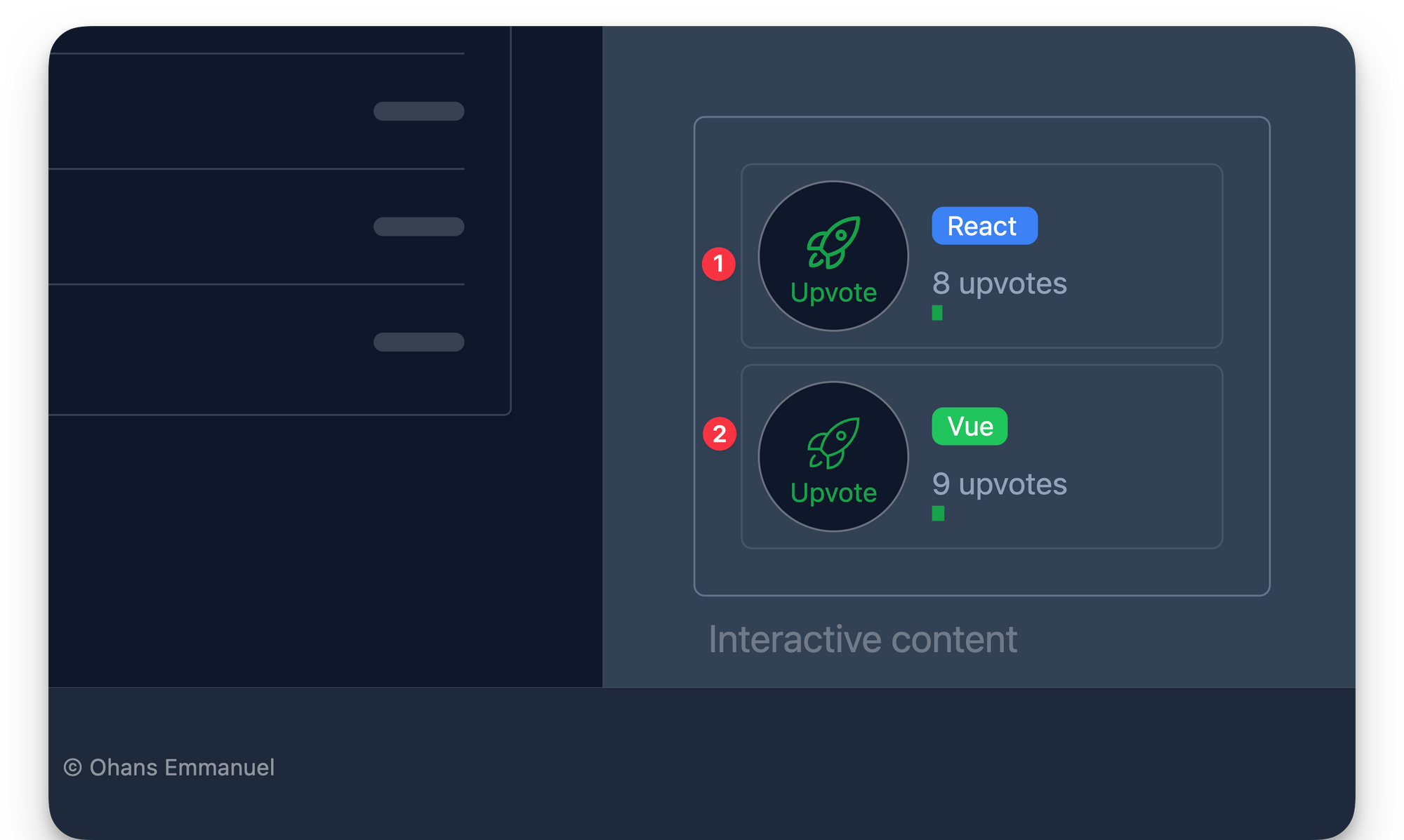 The React and Vue component rendered in a single Astro page Route.
As expected, both components are rendered and work just as expected.
How to Share State Between Component Islands
As we work with component islands in Astro, you will inevitably need to share certain application states between component islands.
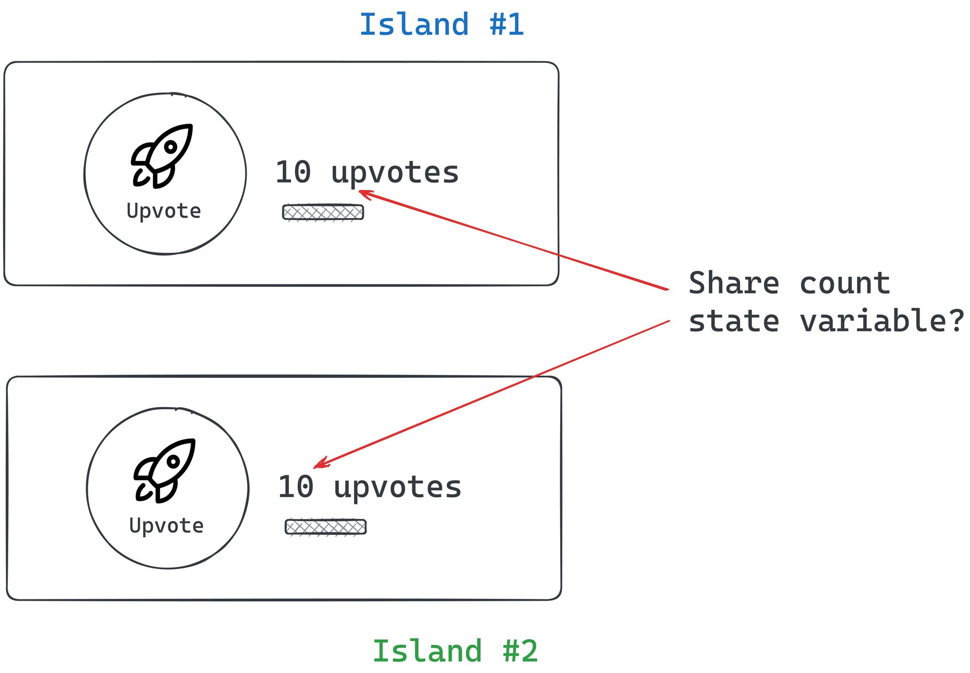 Sharing state between two upvote islands.
For example, let’s assume we want our UpvoteContent components to share the same counter values.
Regardless of the component framework, every framework has its construct for sharing UI state between components, for example between React or Vue components.
But when working within Astro components, we need a solution that works framework agnostic, that is it's not tied to a single framework.
Here are some tremendous framework-agnostic solutions we can choose from:
- Signals: These are great for expressing state based on reactive principles. We may use signals from Preact, signia from tldraw or Solid signals outside a component context.
- Vue’s reactivity API: This can be an excellent ready-to-use solution if you already utilise Vue components in your Astro project.
- Svelte’s stores: This can also be a great out-of-the-box solution if you already use Svelte components in your Astro project.
- Nano stores: This is a tiny framework-agnostic library for state management.
In this example, we’ll use Nano stores mainly because they are lightweight (less than 1kb) and don’t add a lot of JavaScript footprint to our application.
How nano store works
At a high level, what we’re trying to achieve is to remove the state values from within our framework components and manage them via nanastores.
We’ll create a new upvoteCounter state variable within nanostore. We will then propagate changes to this state variable to our framework components.
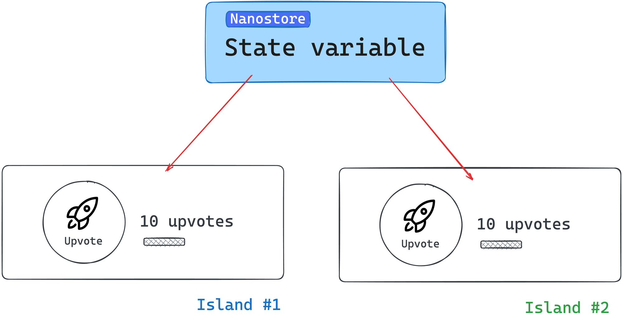 Propagating state variables from nanostore.
Install nano store
To use nano store, we must install the library into our project. Run the following installation command:
npm install nanostores @nanostores/vue @nanostores/react
nanostoresrepresents the base library for creating and managing our state values- To guarantee that the framework component is re-rendered whenever a state value changes, we will use the React and Vue integrations for nano stores through
@nanostores/reactand@nanostores/vue, respectively.
Create the state value
Our example includes sharing the upvote count value across multiple framework components.
To create a state value, nano stores use atoms to store strings, numbers, and arrays.
Let’s create an atom to hold the counter state variable:
<!-- 📂 src/stores/upvote.ts -->
import { atom } from "nanostores";

export const upvoteCountStore = atom(0);
- We create a new file in
src/stores/upvote.ts. - We import
atomfromnanostore. - We create a new state number value called
upvoteCountStore.
We may think of atoms as small pieces of state to be shared across components in our application.
How to use the state value in framework components
In the React component, we will leverage the useStore hook provided in @nanostores/react to retrieve the state value from the upvoteCountStore:
// 📂 src/components/UpvoteContent.tsx

import { useStore } from "@nanostores/react";
import { upvoteCountStore } from "../stores/upvote";

const MAX_COUNT = 50;

export const UpvoteContent = () => {
  // Get the state value from the created store
  const upvoteCount = useStore(upvoteCountStore);

  return (
    <div>
      <button
        onClick={() => {
          if (upvoteCount < MAX_COUNT) {
            //Update the store via the set method
            upvoteCountStore.set(upvoteCount + 1);
          }
        }}
      >
      { /** The rest of the code stays the same **/}
        Upvote
      </button>
      { /** The rest of the code stays the same **/}
     </div>
  );
};
I've annotated the code to make it easier to understand. Take a look.
With the Vue component, we may leverage props for reactivity as shown below:
<script>
import { useStore } from "@nanostores/vue";
import { upvoteCountStore } from "../stores/upvote";

export default {
  // setup props to be used in the UI template
  setup(props) {
    return {
      // Set the value of the upvoteCount from the store
      upvoteCount: useStore(upvoteCountStore),
      maxUpvoteCount: 50,
    };
  },

  methods: {
    upvote() {
      if (this.upvoteCount < this.maxUpvoteCount) {
        // Update the store via the set method
        upvoteCountStore.set(this.upvoteCount + 1);
      }
    },
  },
};
</script>

<template>
  { /** The rest of the code stays the same **/}
</template>
Lovely!
Now, if we try the application, both framework components should have synced upvote values:
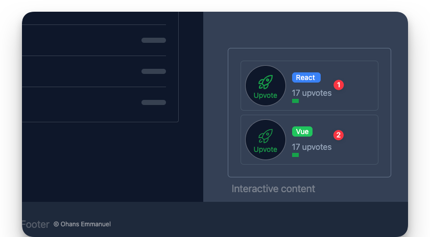 Synced upvote state values via nanostores.
How to Pass Props and Children to Framework Components
Most framework components support receiving data via props and children. These are equally supported when rendering framework components in Astro.
For example, we currently have the upvote button label hardcoded.
 The upvote label.
We could make this dynamic via props as shown below:
// 📂 src/pages/load.astro
---
import { UpvoteContent } from "../components/UpvoteContent.jsx";
import DefaultIslandLayout from "../layouts/DefaultIslandLayout.astro";
---
<DefaultIslandLayout>
<UpvoteContent client:load label="Click" />
</DefaultIslandLayout>
We’d then handle the prop in the UpvoteContent React component as usual:
// 📂 src/components/UpvoteContent.tsx
export const UpvoteContent = (props: { label: string }) => {
// ... render props.label
}
It’s important to note that we can pass any primitive as props, and they will work as expected.
But be careful with function props. Function props will only work during server rendering and fail when used in a hydrated client component, for example as an event handler. This is because functions cannot be serialised (transferred from the server to the client).
Children are often treated as a prop type – depending on the framework component used. For example, React, Preact, and Solid use the special children prop, while Svelte and Vue use the <slot /> element. These are both supported when working with framework components in Astro.
For example, with our React <UpvoteContent /> component, we could go ahead and receive a component description as children:
<UpvoteContent client:load>
<em>An upvote counter created using React</em>
</UpvoteContent>
This will change nothing until we explicitly handle the children prop within the <UpvoteContent> component, as shown below:
// The component accepts props as an argument
export const UpvoteContent = (props: PropsWithChildren<{}>) => {
const upvoteCount = useStore(upvoteCountStore);
return (
<>
{/** Render the content of the children prop**/}
<div>{props.children}</div>
<div>
{/** The rest of the component goes here**/}
</div>
</>
);
};
 Rendering the React component child element.
With our Vue <UpvoteContent /> component, we could equally receive a component description as children:
<UpvoteContentVue client:load>
<em>An upvote counter created using Vue</em>
</UpvoteContentVue>
But we must reference this via a <slot> element. This is a fundamental difference in how libraries like React / Preact and Vue / Svelte deal with references to the children prop.
Here’s how to reference the children element in UpvoteContentVue:
// 📂 src/components/UpvoteContent.vue
<template>
<div>
<div>
<!-- the slot element renders the children element -->
<slot />
</div>
<div>
<!-- The rest of the template goes here -->
</div>
</div>
</template>
Also, we may use multiple slots to group and reference children within our framework components.
Consider the following example with multiple children elements:
---
import { UpvoteContent } from "../components/UpvoteContent.jsx"
---
<UpvoteContent>
<ul slot="social-links">
<li><a href="https://twitter.com/understanding-astro">Twitter</a></li>
<li><a href="https://github.com/understanding-astro">GitHub</a></li>
</ul>
<em slot="description">An upvote counter created using React</em>
</UpvoteContent>
Note that we have two children nodes referenced by the slot names social-links and description, respectively.
Within <UpvoteContent />, we may reference these separately as shown below:
export const UpvoteContent = ({props}) => {
return (
<>
<div>{props.description}</div>
<div>{props.socialLinks}</div>
{/** ... **/}
</>
);
};
It is important to note that the kebab-case slot names in the Astro component are referenced as camelCase values on the props object.
 Reference the kebab-case slot names as camelCase in React or Preact.
In Svelte and Vue, the slots will be referenced using a <slot> element with a name attribute. Here’s the implementation in <UpvoteContentVue /> :
<template>
<slot name="description" />
<slot name="social-links" />
</template>
Note how the slot kebab-case names are preserved.
 Rendering the React and Vue component children elements.
Nested Framework Components
In an Astro file, we may also nest framework components, that. ispass framework components as children. For example, the following is valid:
<DefaultIslandLayout>
<UpvoteContent client:load>
<div slot="description">
<!-- This is a nested <UpvoteContent /> component -->
<UpvoteContent client:load>
<em slot="description">This is the nested component</em>
</UpvoteContent>
</div>
</UpvoteContent>
</DefaultIslandLayout>
As expected, this renders the nested UpvoteContent component:
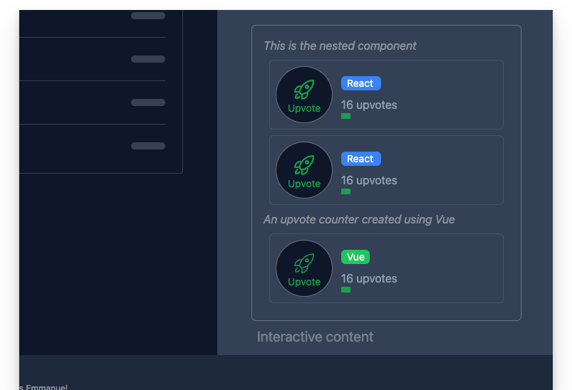 Rendering nested framework components.
Recursively rendering the same component is rarely the goal we want to achieve. But rendering nested framework components is powerful because we can compose an entire framework component application as we see fit.
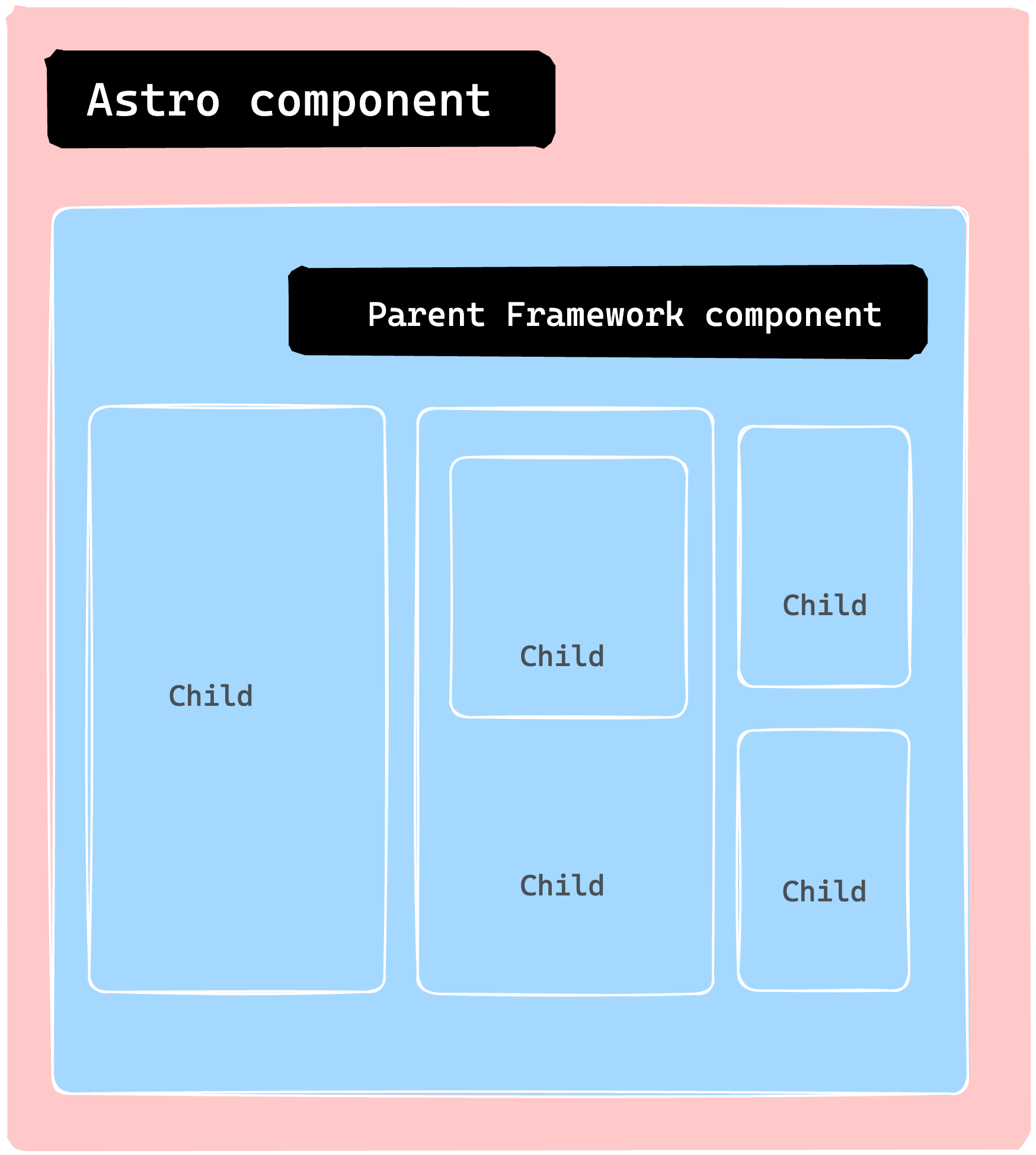 Nesting multiple child components to make a more significant application.
Astro Island Gotchas
As developers, we are often responsible for inadvertently breaking things. Although debugging can be an enjoyable challenge, consider the following boundaries with Astro Islands.
1. Do not use an Astro component in a framework component
Consider the following example of importing a .astro component and rendering it within a React component:
import { OurAstroComponent } from "../components/OurAstroComponent"
const OurReactComponent = () => {
return <div>
<OurAstroComponent />
</div>
}
<OurReactComponent client:load />
This is an invalid use. The reason is that the React component is rendered a React “island”. Consequently, the island should contain only valid React code. This is the same for other framework component islands.
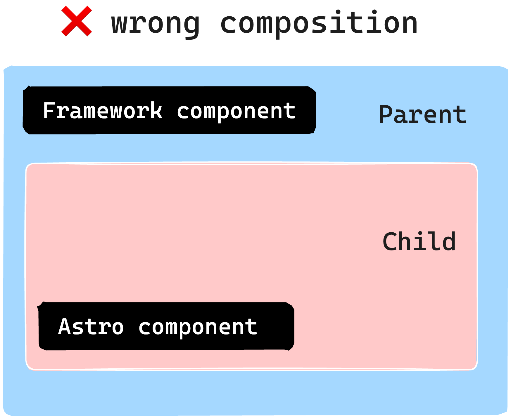 Do not render an Astro component as a framework component child without a <slot>.
To overcome this, consider using the slot pattern earlier discussed to pass static content from an Astro component:
---
import { OurReactComponent } from "../components/OurReactComponent"
import { OurAstroComponent } from "../components/OurAstroComponent"
---
<OurReactComponent client:load>
<!-- pass Astro component as a child via a named slot -->
<OurAstroComponent slot="description" />
</OurReactComponent>
2. Do not hydrate an Astro component
Consider the following naive example to hydrate an Astro component using a client directive:
---
import { OurAstroComponent } from "../components/OurAstroComponent"
---
<OurAstroComponent client:load />
This is invalid. Astro components have no client-side runtime. So use a <script> tag if you need to interactivity.
Why Use Islands?
Typically, most resources would place this section at the start of the chapter. But there are certain instances where it's more beneficial to showcase practical use cases before diving into the reasons behind them. Also, this approach could foster an intuitive understanding, which is what I've adopted here.
So, why focus on islands? What advantages do they offer?
1. Performance
One of the main advantages is improved performance. We can significantly enhance our site’s speed by converting most of our website to static HTML and selectively loading JavaScript through islands only when necessary. This is because JavaScript is one of the slowest assets to load per byte.
2. Responsible hydration
If JavaScript is expensive to parse and execute, the decision to load it should be carefully taken (from a performance perspective). Also, no one solution fits all application types and use cases. As such, controlling when a component island is hydrated puts you in charge of your website's performance.
3. Parallel loading
Lastly, it’s essential to utilise parallel loading. This means that when we load several islands, they won’t have to wait for each other to become hydrated. Instead, each island is considered a distinct unit that loads and becomes hydrated independently, in isolation.
Wrapping Up This Chapter
In this chapter, we learned about component islands in Astro and how they work. We also explored why framework components are sometimes preferred over vanilla JavaScript or TypeScript via a <script> element.
We also went through the steps to use a framework component in an Astro application, including building a static site, installing the framework, and writing the component.
Finally, we experimented using a React and Vue component to demonstrate the use of framework components. See you in the next chapter!
 Chapter five
Chapter 5: Oh my React! (How to Build a React Documentation Site Clone)
In this chapter, we'll cover everything you need to know to develop rich content websites with real-world best practices.
This is a practical section best served with you coding along. To view the complete application, see the GitHub repo.
What You’ll Learn
- How to style Astro projects with Tailwind.
- Several syntax highlighting solutions for Astro.
- How to leverage content collections for scalable and type-safe development.
- Understand dynamic routing in Astro.
Set Up the Starter Project
We’ve spent ample time learning the ins and outs of building static websites with Astro. So, in this chapter, we will not start from scratch.
Instead, we’ll begin with a basic static project we’ll build upon throughout the chapter.
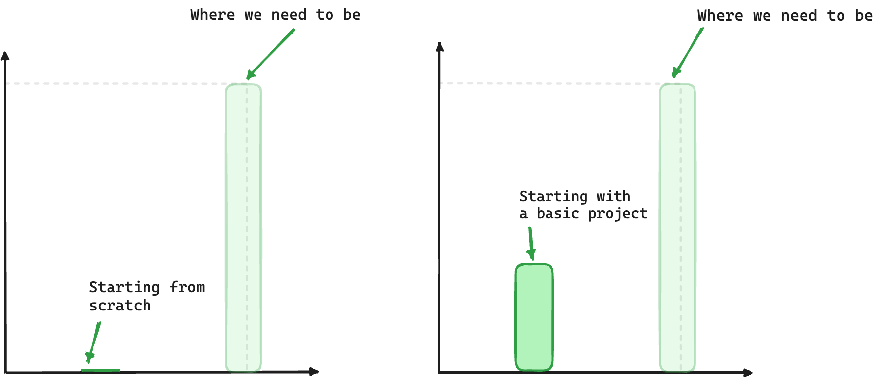 Building from a starter project
In this chapter, we will adopt a solution-oriented approach similar to the kind that detectives use. We aim to solve various TODOs scattered throughout the starter project.
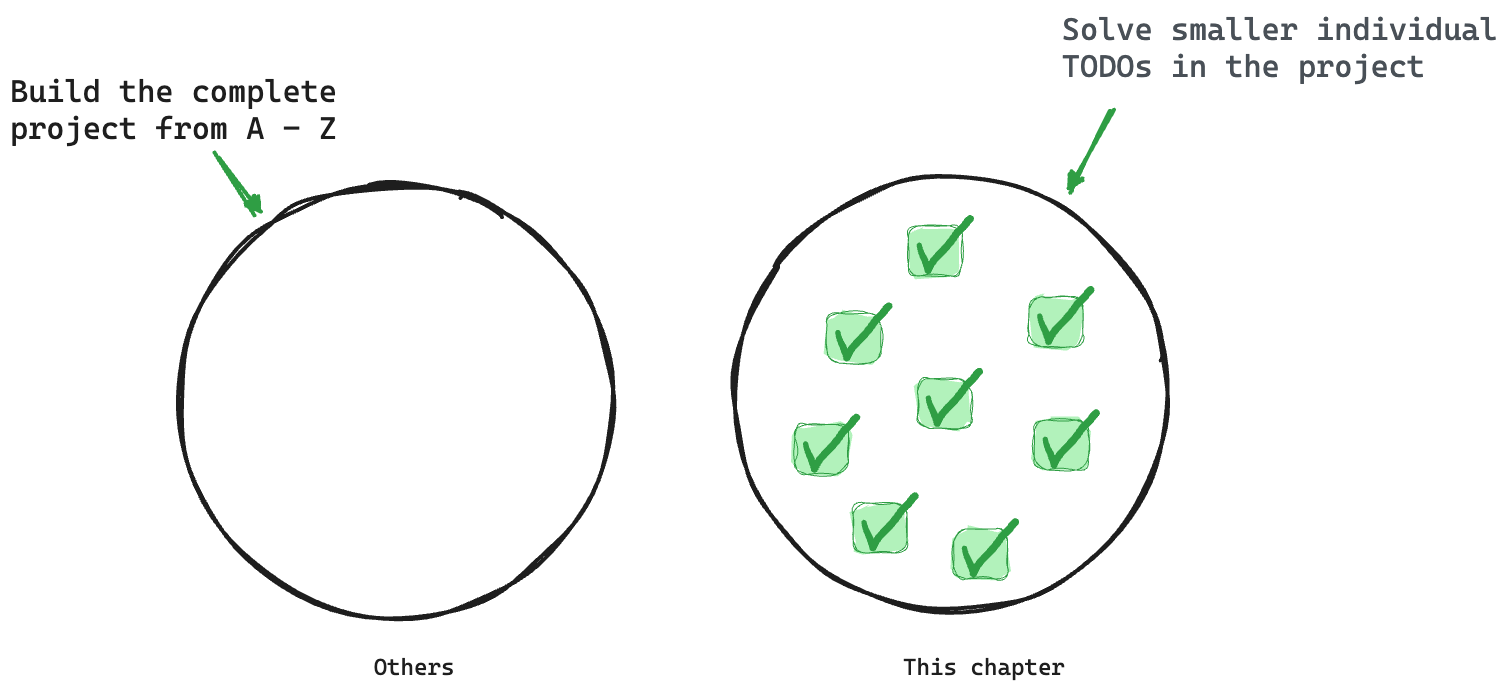 Solving small isolated problems
The reason for this is to ignore the concepts you've already learned and focus on learning new concepts or consolidating older concepts via practice — solving isolated problems.
To get started, go ahead and clone the project:
git clone https://github.com/understanding-astro/react.dev-astro.git
Then change directories:
cd react.dev-astro
Finally, checkout to the clean-slate branch I’ve prepared so we can systematically build upon the base application.
git checkout clean-slate
Install the Dependencies
Go ahead and install the project’s dependencies via the following:
npm install
Then install the Astro react integration:
npx astro add react
When prompted, type “y” to accept each prompt. “y” means “yes”!
The complete installation will add all relevant React dependencies and updates the astro.config.mjs project configuration file.
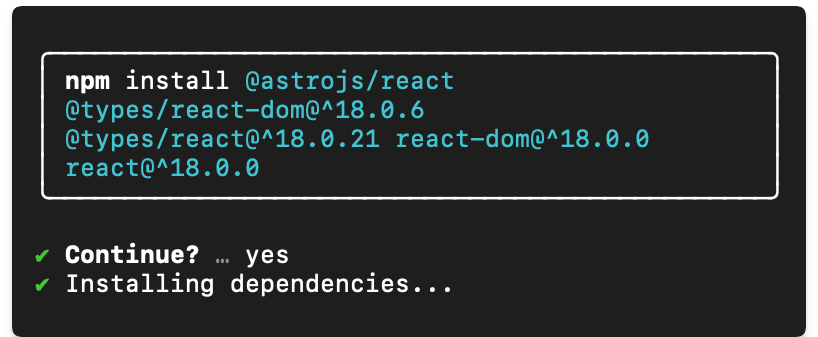 Installing the React integration and dependencies
Finally, go ahead and install the mdx integration. I’ll describe the what and why later in the chapter. For now, go ahead and install the integration by running the following:
npx astro add mdx
This will install the @astrojs/mdx integration and also update the astro.config.mjs project configuration file.
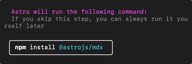 Installing the MDX integration
Now run the application:
npm start
This will run the application in an available local port – the default localhost:3000.
Visit the local server and you’ll find the base unstyled application running in the browser as shown below:
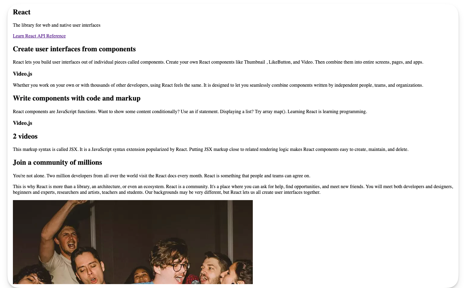 The unstyled homepage
I’ve got to say that’s one ugly-looking page.
We’ll fix that next.
How to Style Astro Projects with Tailwind
Love or hate it, CSS is how we make beautiful web applications.
In Chapter One, we wrote the styles for the personal website by hand, that is by writing out every CSS declaration. But in this chapter, we will use a CSS framework called Tailwind.
So, what’s Tailwind?
An overly simple definition would be, Tailwind is the modern bootstrap. Never used Bootstrap? Then think of Tailwind as a utility-first CSS framework that provides class names like flex, text-lg, items-center and many more that you can apply to your markup for styles.
Tailwind will enable us to build modern-looking websites — fast.
How to install Tailwind
Keep the project running in your terminal and open another terminal tab. Run the following install command:
npx astro add tailwind
This will install the Astro tailwind integration in the project and update the project configuration.
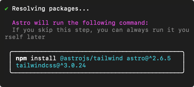 Installing the Astro Tailwind integration
Once the installation is complete, the existing application styles will now take effect. Visit the application on your local port to see the styled application.
 The styled application
What a difference styling makes!
Take your time and browse the different pages of the styled application.
How does Tailwind work?
Using Tailwind in Astro is straightforward. Install the Tailwind integration and provide a class attribute with Tailwind utility classes in your component markup.
For example, consider the styled text “The library for web and native user interfaces” on the project homepage:
 The homepage subtitle
Now, consider the code responsible for the styles:
// pages/index.astro
// ...
<p
class="max-w-lg py-1 text-center font-display text-4xl leading-snug text-secondary dark:text-primary-dark md:max-w-full"
>
The library for web and native user interfaces
</p>
In the example above, the classes applied are as shown below:
"max-w-lg py-1 text-center font-display text-4xl leading-snug text-secondary dark:text-primary-dark md:max-w-full"
While this is not a Tailwind book, it’s only fair to give a general explanation of what’s going on here.
Firstly, most Tailwind utility classes are well-named and you can infer what they do. Others are not so well-named.
If you’re coding along in VSCode, I recommend installing the official Tailwind integration:
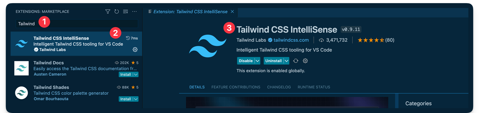 Installing the official VSCode Tailwind plugin
If you’re not using VSCode, consider finding your editor setup in the official Tailwind docs.
Installing the integration brings a lot of benefits. The important benefit I want to highlight here is you can hover over any of the Tailwind utility classes to see the exact CSS property value the class corresponds to.
For example, hovering over the max-w-lg displays the CSS property value for the utility class as shown below:
.max-w-lg {
max-width: 32rem/* 512px */;
}
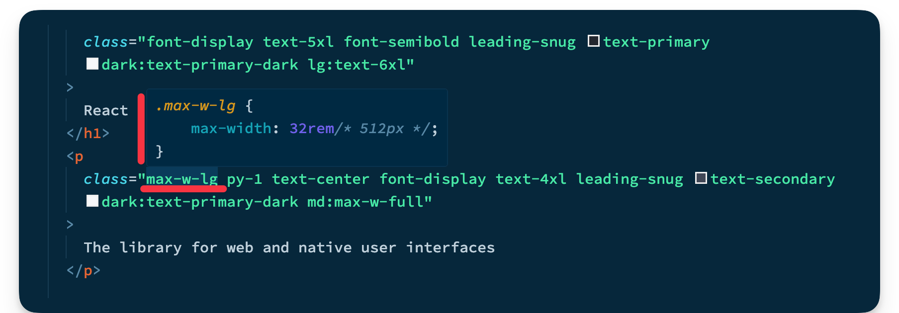 Hovering over Tailwind classes
This is very helpful because you can now inspect whatever classes are added to any markup in the project.
Tailwind configuration
Upon installing Tailwind, it ships with its default theme.
It’s not a bad theme, but when you build projects, you likely want control over the project theme.
In our example, we want a theme that's modeled after the official React documentation theme.
To customise Tailwind, we can provide a tailwind.config.js file where we can define our project’s fonts, colour palette, type scale, border radius values, breakpoints and much more.
Look at the tailwind.config.cjs file in the project’s root. This is where the project’s Tailwind configuration magic happens.
For more details on customising Tailwind, you can consult the official documentation.
Typescript Import Alias
Let’s be honest, no one likes those ugly relative imports, eh?
import MyComponent from '../../components/MyComponent.astro
Ugh!!
C’mon, we can do better.
This is where import aliases come in. The easiest way to get this set up in an Astro project is to define the aliases in the tsconfig.json file.
For example, we may do the following:
// 📂 tsconfig.json
{
"compilerOptions": {
"baseUrl": ".",
"paths": {
"@components/*": ["src/components/*"],
}
}
}
We’re essentially mapping any directories in the src/components import path to @components.
Now, wait for it.
The result of this is we can take our previous ugly import path and turn it into a work of art as shown below:
// Before
import MyComponent from '../../components/MyComponent.astro
// After
import MyComponent from '@components/MyComponent.astro'
Beautiful and clean, isn’t it?
The reason I mention this is the starter project has been set up to use import aliases. So, don’t get confused.
Go ahead and look in the tsconfig.json file where you’ll find the following import aliases:
"paths": {
"@components/*": ["src/components/*"],
"@layouts/*": ["src/layouts/*"],
"@utils/*": ["src/utils/*"]
}
You’re welcome 😉
Islands and Colocating Page Components
We’ve learned that appropriate file types in the src/pages directory get transformed into HTML pages.
But what if we need to have some files collocated in the src/pages directory without being transformed into accompanying HTML pages?
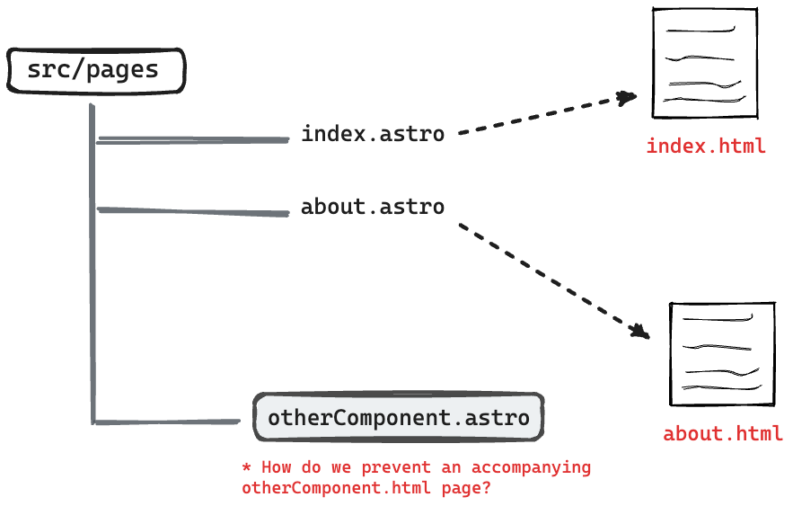 Colocating files in the pages directory
This can be helpful for collocating tests, utilities, and components along the associating pages.
Well, there’s a solution for that.
To exclude a valid page file type in the src/pages directory from being compiled into an associating HTML page, prefix the file name with an underscore _.
 Prefix file name with a underscore to not transform into HTML pages
For example, take a look at the pages/_components/Home directory in the project.
This directory contains a handful of components that aren’t meant to be reusable across the project. They only exist to be used on the project’s homepage.
To exclude these from being separate browser pages, note how the _components directory is named.
As an example, if you visited /_components/Home/Code in the browser, this will return a 404. Even though the Code components exist, it is not a page.
Now, let’s bring our knowledge of collocated components and Astro islands together to solve our first TODO in the project.
Take a look at the index.astro and consider the TODO to render the Video React component as shown below:
// 📂 src/pages/index.astro
❗️ <Code class="text-white">TODO:</Code> (Astro Island): Render the ...
 TODO: Render the Video React component island
Now consider the annotated solution below:
// 📂 src/pages/index.astro
===
// Import the Video component from "_components ..."
import { Video } from "./_components/home/Video";
// ...
---
<ExampleResultPanel slot="right-content">
{/** Render the Video component. NB: this is a React component **/}
<Video
client:visible {/** 👈 Add the client directive **/}
video={{ title: "My video", description: "Video description" }}
/>
</ExampleResultPanel>
- Render the
VideoReact component - Pass a
client:visibleattribute to hydrate the island as soon as the component is visible - Finally pass the required
videoobject props to theVideocomponent:{title: "my video", description: "Video description"}.
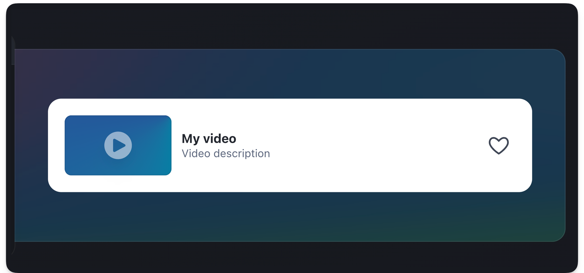 The rendered video island
Similarly, let’s resolve the second TODO. This time around we’ll render multiple Video components.
// 📂 src/pages/index.astro
❗️ <Code class="text-white">TODO:</Code> (Astro Island): Render two ...
 TODO: Render two React component islands
Consider the solution below:
<ExampleResultPanel slot="right-content">
<div class="flex w-full flex-col gap-4">
{/** ... **/}
{/** Render both islands **/}
<Video
client:visible
video={{ title: "My video", description: "Video description" }}
/>
<Video
client:visible
video={{ title: "My video", description: "Video description" }}
/>
</div>
</ExampleResultPanel>
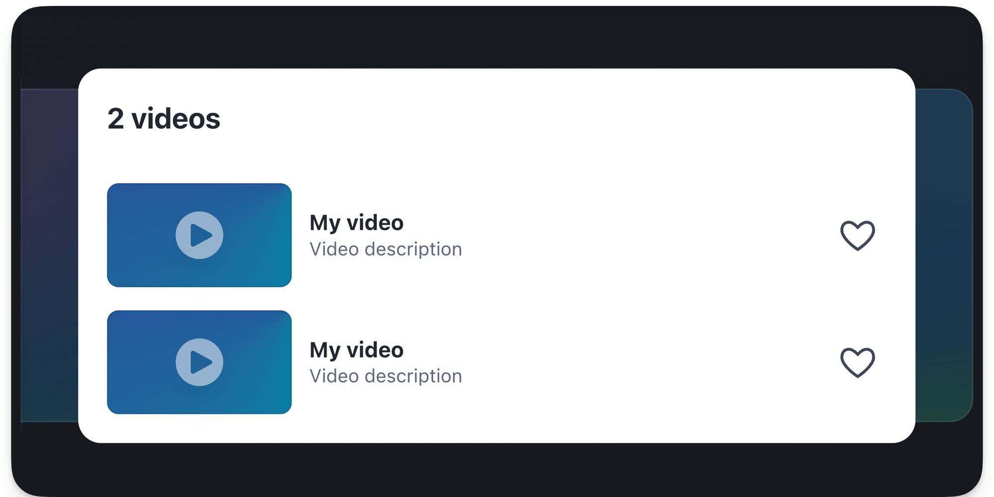 The rendered Astro islands
Syntax Highlighting
I never understood the intricacies of syntax highlighting until I started researching this section of the book. It’s great how much is abstracted in libraries.
Anyway, I’ll skip the nuances and provide what I believe to be the most important bits.
So, how do we tackle syntax highlighting in an Astro application?
By default, Astro uses Shiki – a syntax highlighting library under the hood. Broadly speaking, there are two ways to go about syntax highlighting your code blocks in an Astro component.
Let’s have a look at these.
The default Code component
Astro ships with a <Code /> component that provides syntax highlights at build time.
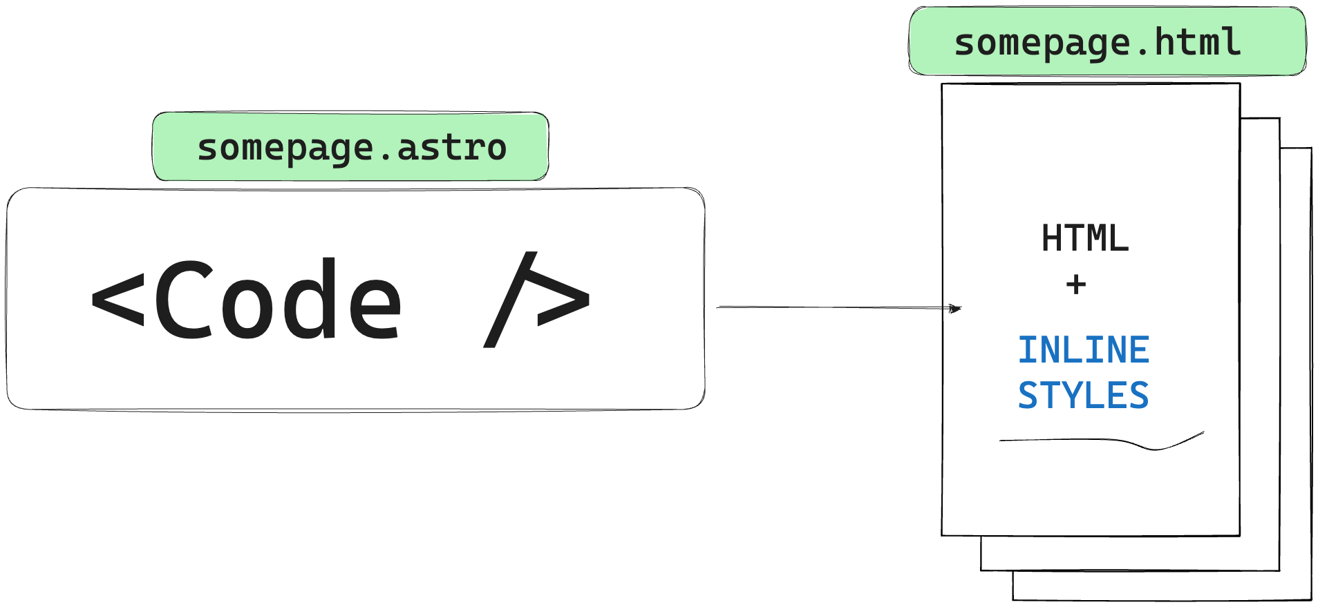 The Code component renders to HTML and inline styles without any Javascript
By implication, there’s no runtime overhead to this method of syntax highlighting as no computations are done at runtime and the eventual result is a bunch of elements with inline styles.
This is powered by Shiki.
 Sample syntax highlighted DOM output
Let’s go back to our starter project and resolve another TODO.
📂 src/pages/index.astro
// ...
❗️ <Code class="text-white">TODO:</Code> Replace with Syntax highlighted code
 TODO: Add syntax highlighted code block
The goal here is to provide syntax-highlighted code within the component markup.
To solve this, we’ll leverage the Code component from Astro as shown in the annotated code block below:
// 📂 src/pages/index.astro
---
// import Code from "astro/components"
import { Code as AstroCode } from "astro/components";
//... other imports
---
// ...Render the component and pass the code and lang string props
<div slot="left-content">
<AstroCode
code={`function Video({ video }) {
return (
<div>
<Thumbnail video={video} />
<a href={video.url}>
<h3>{video.title}</h3>
<p>{video.description}</p>
</a>
<LikeButton video={video} />
</div>
);
}`}
lang="jsx" {/** 👈 code language for syntax highlighting **/}
/>
</div>
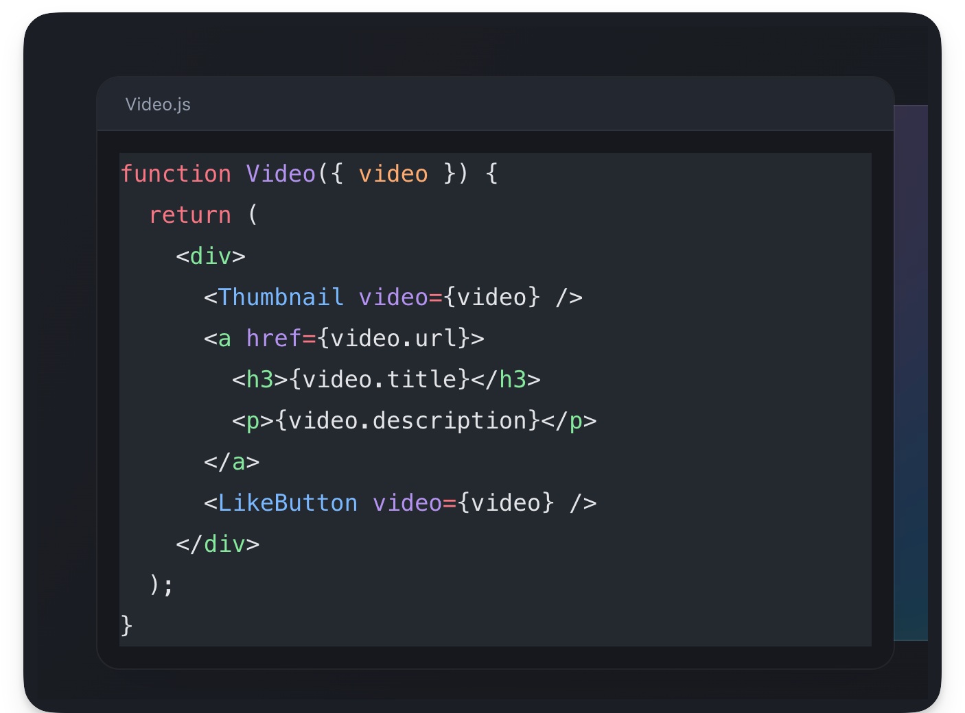 The syntax highlighted code block
Since the code snippets are just good old HTML DOM nodes, we can apply some styles on the parent div to style them further as shown below:
// 📂 src/pages/index.astro
<div
slot="left-content"
class="[&_pre]:!bg-transparent [&_pre]:!text-sm [&_pre]:!leading-6">
<AstroCode ... />
</div>
This will reduce the size of the font, reduce the type leading and make the code background transparent. Note that the square braces are how we write arbitrary custom styles in Tailwind.
See the results below:
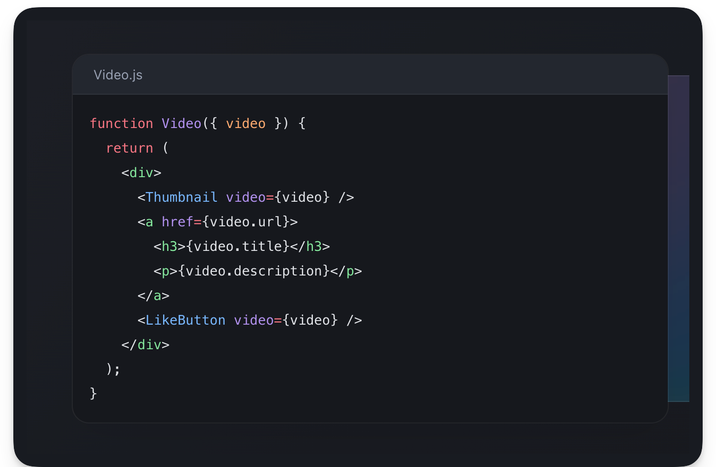 Better styled syntax highlighted code block
Much better eh?
We can go ahead and do the same for the other TODO:
// 📂 src/pages/index.astro
❗️ <Code class="text-white">TODO:</Code> Replace with Syntax highlighted code
Consider the identical solution below:
<div
slot="left-content"
{/** Similar style as before. Leverages Tailwind **/}
class="[&_pre]:!bg-transparent [&_pre]:!text-sm [&_pre]:!leading-6"
>
<AstroCode
code={`function VideoList({ videos, emptyHeading }) {
const count = videos.length;
let heading = emptyHeading;
if (count > 0) {
const noun = count > 1 ? 'Videos' : 'Video';
heading = count + ' ' + noun;
}
return (
<section>
<h2>{heading}</h2>
{videos.map(video =>
<Video key={video.id} video={video} />
)}
</section>
);
}`}
lang="jsx"
/>
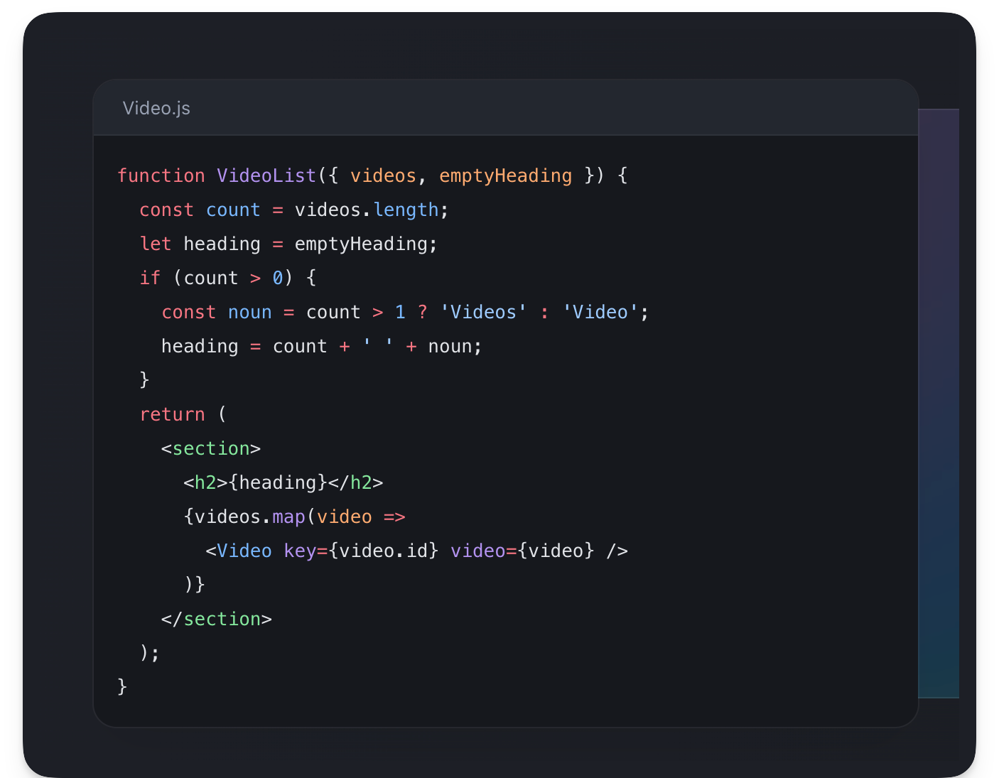 The syntax highlighted code block
The default Code component also supports all the official Shiki themes. For example, we can change the component theme to poimandres as shown below:
<AstroCode
// ...
lang="jsx"
theme="poimandres"
/>
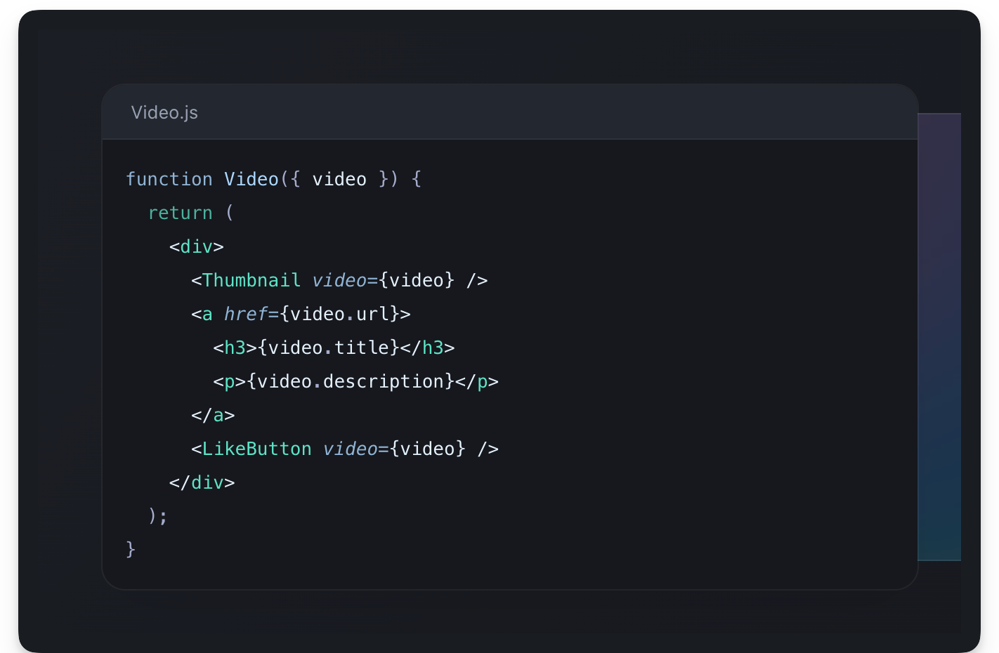 The poimandres theme
Let’s consider the pros and cons of using the default Code component provided by Astro.
Pros
- Easy to use
- Great results for low effort
- Lots of available themes by default
Cons
- More work is required to customise your themes, for example our www.react.dev clone requires its custom theme
- No default support for dark and light theme
Bring your theme
Using your specific syntax themes is probably not the top of your list.
But Shiki supports the same syntax for VSCode themes. For example, we could load some custom open-source VSCode theme (or build on top of it) for our code blocks.
Let’s take a look at Nightowl, a VS Code dark theme for contrast for nighttime coding.
Go ahead and copy the code snippet theme to a src/snippet-theme.json file.
Next, we’ll write a simple component to load our custom theme as shown below:
// 📂 src/components/Shiki.astro
---
import type { Lang } from "shiki";
// Similar to Astro's Code component, this is built on shiki
import shiki, { getHighlighter } from "shiki";
// Similar to Astro's Code component, receive lang and code as props
type Props = {
lang: Lang;
code: string;
};
const { code = "", lang = "jsx" } = Astro.props;
// 👀 Load the custom theme
const theme = await shiki.loadTheme("../../snippet-theme.json");
const highlighter = await getHighlighter({
theme,
langs: [lang],
});
---
{/**
A fragment is an available Astro component. Use Fragment to prevent unnecessary markup.
The set:html directive is used to inject an HTML string into an element e.g., similar to el.innerHTML.
**/}
<Fragment
set:html={highlighter.codeToHtml(code, {
lang,
})}
/>
Import and use the new component:
// 📂 src/pages/index.astro
---
import Shiki from "@components/Shiki.astro";
// ...
---
// Change AstroCode to Shiki (new component)
<Shiki
code={`function Video({ video }) {
return (
<div>
<Thumbnail video={video} />
<a href={video.url}>
<h3>{video.title}</h3>
<p>{video.description}</p>
</a>
<LikeButton video={video} />
</div>
);
}`}
lang="jsx"
/>
And there we go! We’ve successfully loaded a custom theme.
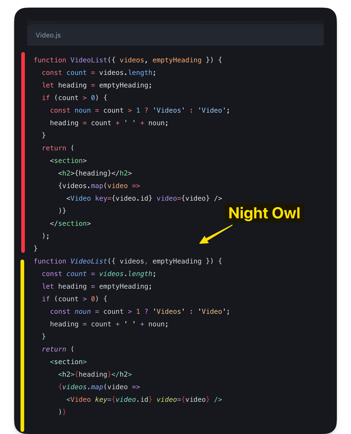 Comparing the previous highlighted code with the new Night Owl theme
For more customisations, we could spend time tweaking the different theme tokens in the snippet-theme.json file.
Pros
- Flexibility: we can customise the theme tokens as granularly as needed
Cons
- Requires more work
- Support for dark and light theme
Handling light and dark themes
Supporting light and dark themes in Shiki (the underlying Astro syntax highlighter) is tricky because Shiki generates themes at build time.
At the time a user toggles the site theme, no changes will be made to the syntax highlighting since it was generated at build time.
When working with Astro components, a simple solution is to leverage CSS variables.
---
import { Code as AstroCode } from "astro/components";
---
// Among, other properties, pass a "css-variables" theme prop to the Code component
<AstroCode theme="css-variables" />
Then provide style tokens for both dark and light themes. Remember that this should be global. For example, we may do this in the Baselayout.astro layout component as shown below:
// 📂 src/layouts/BaseLayout.astro
<style is:global>
@media (prefers-color-scheme: dark) {
:root {
--astro-code-color-text: #ffffff;
--astro-code-color-background: black;
--astro-code-token-constant: #86d9ca;
--astro-code-token-string: #977cdc;
--astro-code-token-comment: #757575;
--astro-code-token-keyword: #77b7d7;
--astro-code-token-parameter: #ffffff;
--astro-code-token-function: #86d9ca;
--astro-code-token-string-expression: #c64640;
--astro-code-token-punctuation: #ffffff;
--astro-code-token-link: #977cdc;
}
}
:root {
--astro-code-color-text: #24292e;
--astro-code-color-background: #ffffff;
--astro-code-token-constant: #032f62;
--astro-code-token-string: #032f62;
--astro-code-token-comment: #6a737d;
--astro-code-token-keyword: #d73a49;
--astro-code-token-parameter: #24292e;
--astro-code-token-function: #6f42c1;
--astro-code-token-string-expression: #c64640;
--astro-code-token-punctuation: #ffffff;
--astro-code-token-link: #977cdc;
}
</style>
If dark and light theme syntax highlighting is critical for your application, take a look at the official documentation for more information.
How to Get Started with Content Collections
Consider building a large application driven by a lot of content – whether that’s Markdown (/md), MDX (.mdx), JSON (.json) or YAML (.yaml) files.
One solution to best organise the project’s content could be to save the content data in a database where we can validate the document schema and make sure the required content fits the data model we desire.
We may visually model these as collections of data saved in a database with a predefined data schema.
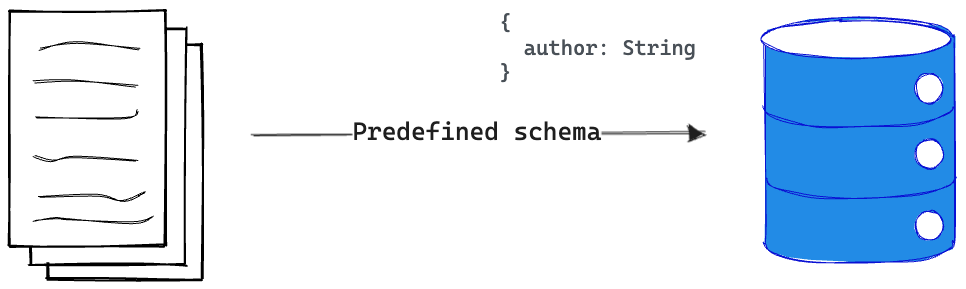 Modelling data with a predefined schema in a database
With Astro projects, we don’t particularly need a database to store and enforce our content data models.
Enter content collections.
Regardless of the size of the Astro project, content collections are the best way to organise our content document, validate the structure of the document and also enjoy out-of-the-box TypeScript support when querying or manipulating the content collection.
So, what’s a content collection?
A content collection is any top-level directory in the src/content folder of an Astro project.
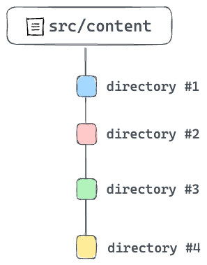 Content collections - top directories in src/content
Note that the src/content directory is strictly reserved for content collections. Don’t use this directory for anything else.
Now that we know what a content collection is, the individual documents or entries within a collection are referred to as collection entries.
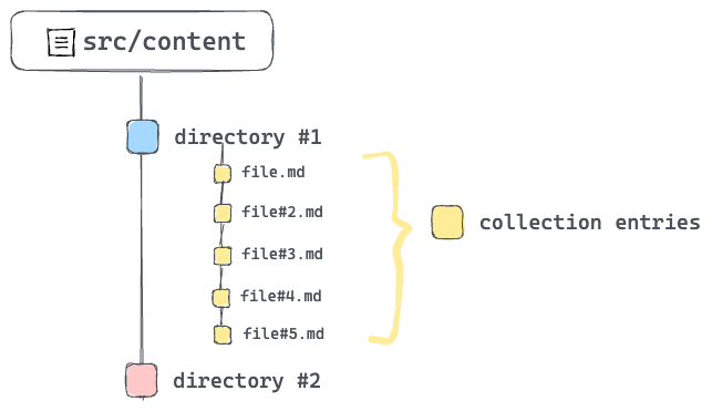 Collection entries within a single collection
Collection entries are documents in formats such as Markdown or MDX. They can also be in data formats such as JSON or YAML. For consistency, you’ll find most collection entries with a consistent naming pattern, for example kebab-case.
What problems do content collections solve?
Littering a project with different content documents and no clear structure is a surefire way to create a mess.
The better solution: use content collections.
Now, content collections aim to address three main problems:
- Organising documents.
- Validating the document structure (for example validating the frontmatter properties of a markdown file).
- Providing strong type safety while querying and working with content collections.
How to organize content collections
When working with content collections, note that only top-level directories in src/content count as collections.
For example, with multiple collections such as blogs, authors and comments, we could accurately represent these distinct content types with three top-level directories within src/content.
 Organising different content collections
If there’s a need to further organise content via subdirectories within a collection, that’s entirely acceptable! For example, the blogs content collection may have subdirectories to organise content via languages for example en, fr, and so on.
 Subdirectories within content collections
How to authorize content with MDX
Take a look at the existing content collection in the project.
What do you see?
You should find a blog collection in src/content/blog with a handful of .mdx files.
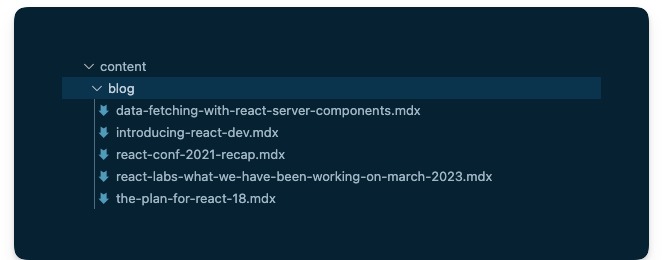 Entries in the blog collection
Each mdx file refers to the collection entry for the blog collection. But what is an mdx file?
MDX touts itself as the markdown for the component era. Think, what if we could use components in markdown? Well, with MDX, we can.
In these files, we can import components and embed them within our standard markdown content.
In the installation section of this chapter, we installed the Astro MDX plugin by running npx astro add mdx.
It’s about time we got started utilising MDX.
How to configure content collections
A big part of content collections is ensuring a consistent collection entry format for every content collection.
For example, assuming a number markdown or MDX collection entries, we can go ahead and ensure that every collection entry has the same frontmatter properties. As you can imagine, this protects the integrity of each collection entry and breeds confidence that no surprising bug will spring at us when working with the entries.
So, how do we ensure such consistency?
The way we do this is by creating collection schemas.
A schema enforces consistent collection entry data within a collection. This is also what powers the TypeScript support we’ll get when working with the collection entries.
To create our collection schema, go ahead and create a src/content/config.ts file with the following content:
// Import utilities from astro:content
import { z, defineCollection } from "astro:content";
// Define the type and schema for one or more collections
const blogCollection = defineCollection({
type: 'content',
// an object of strings - title, year, month, day, and intro
schema: z.object({
title: z.string(),
year: z.string(),
month: z.string(),
day: z.string(),
intro: z.string(),
}),
});
// Export a single collections object to register the collections
// The key should match the collection directory name in "src/content"
export const collections = {
blog: blogCollection, // add the blog collection
};
Take a look at the annotated code above.
You don’t need to memorise how to do this, as you can always refer to the official documentation. But remember that the schema for a project’s content collections is defined in a src/content/config.ts (or .js and .mjs) file.
If we break down what goes on in a collection configuration file, we have three main actions:
- Import utilities from
astro:content. - Define the content collection(s) schema via the
zutility. - Export a single object of collection name key and schema value.
The schema is the brain behind guaranteeing our content contains the right data and also provides TypeScript support — autocompletion and type-checking when querying the collection.
I know the question you’re likely asking.
What’s the z utility exported from astro:content?
The z utility re-exports the widely popular zod library — a TypeScript-first schema validation library with static type inference. The z variable in the config is a convenient export from zod.
Quick intro to Zod
While this is not a Zod book, the truth remains that if we will be defining schemas with Zod, it pays to understand the basics.
So, here’s a quick intro.
First, consider the schema for our blog collection:
z.object({
title: z.string(),
year: z.string(),
month: z.string(),
day: z.string(),
intro: z.string(),
})
Let’s deconstruct this.
Creating a schema starts with importing Zod. With, Astro that’s done via the import from astro:content
import {z} from 'astro:content'
To create a schema for a string property, use the string method as shown below:
const stringSchema = z.string()
To create an object schema, you guessed right. We use the object method as shown below:
const myObjectSchema = z.object({
})
Now, within this object, we may define properties as shown below:
const myObjectSchema = z.object({
someString: z.string()
})
In our blog collection schema, we’re essentially saying that the markdown (and MDX) files within the blog collection must have string front matter properties of title, year, month, day and intro.
The frontmatter is represented by the object schema and its properties, the object keys.
Now, go ahead and view all the collection entries in the blog collection and note how they all have defined properties.
The .astro folder
As you create and work with content collections, Astro creates a .astro directory in the root of our project to keep track of important metadata for our content collections — mostly generated type information.
It’s safe to ignore this directory.
The .astro directory is updated automatically as we run astro dev or astro build commands. But if we find the type information not in sync, we can manually run astro sync at any time to update the .astro directory manually.
How to Query and Render Content Collections
So, we know how to create content collections and define their schemas. What next?
Content collections exist to be consumed in some way — typically by querying and rendering the collections.
So, how do we get started with this?
A collection consists of one or more collection entries. So, to query an entire collection, Astro provides the getCollection() method.
Consider how we may fetch all blog posts in our project:
---
import { getCollection } from 'astro:content'
// Get all entries from the blog collection
const allBlogPosts = await getCollection('blog')
---
To filter the collection entries, we may pass a second function argument to getCollection as shown below:
---
import { getCollection } from 'astro:content'
// Get all entries from the blog collection
const allBlogPosts = await getCollection('blog', ({data}) => {
// return only blogs from a certain year
return data.year === '2023'
})
---
Note that in our case, the data above refers to the frontmatter properties of our MDX blog entries.
How about getting a single collection entry?
Your first inclination may be to filter as shown below:
---
import { getCollection } from 'astro:content'
// Get all entries from the blog collection
const allBlogPosts = await getCollection('blog', ({data}) => {
// return only a specific title
return data.title === 'my-single-blog-title"
})
---
The above is technically valid. But Astro provides a getEntry() method specifically for this case.
Consider the usage below:
import {getEntry} from 'astro:content'
// Get a single blog entry with the entry slug
const blog = await getEntry('blog', 'introduction-to-react')
The example above will fetch the entry in the src/content/blog/introduction-to-react.mdx route.
Note that both getCollection and getEntry return a CollectionEntry type.
Enough with the theory, let’s get back to building our project.
Find the next TODO on the blog/index.astro page:
📂 src/pages/blog/index.astro
<!-- ❗️TODO: List and render (all) blog post cards -->
The goal is to fetch all the blogs in the blog content collection and render visual cards for each entry. Also, note that clicking each card should point to the actual blog.
 Rendering blog post cards.
Consider the solution below:
📂 src/pages/blog/index.astro
---
// Import getCollection from astro:content
import { getCollection } from "astro:content";
// Import the BlogCard visual component
import BlogCard from "@components/BlogCard.astro";
// Import the getMonthName utility
import { getMonthName } from "@utils/getMonthName";
// Fetch all the blog posts
const allBlogPosts = await getCollection("blog");
---
{/** render all blog posts **/}
<div class="mt-12 flex flex-col gap-5 px-5 sm:-mx-5 lg:px-4">
{
allBlogPosts.map(({ data, slug }) => {
const url = `/blog/${data.year}/${data.month}/${data.day}/${slug}`;
return (
<BlogCard
url={url}
date={`${getMonthName(+data.month)} ${data.day}, ${data.year}`}
title={data.title}
>
{data.intro}
</BlogCard>
);
})
}
</div>
Note the URL of each blog constructed in the solution above:
const url = `/blog/${data.year}/${data.month}/${data.day}/${slug}`;
For example, the blog collection entry data-fetching-with-react-server-components.mdx will have the path: /blog/2020/12/21/data-fetching-with-react-server-components.
Go ahead and click any of the blog cards. At the moment, they should lead to an empty page.
Let’s resolve that.
Dynamic Routing
Static routes are arguably easy to reason about. For example, .astro, .md and .mdx files in src/pages will automatically become pages on our website.
But sometimes we require dynamic routes to prevent repetition. This typically happens when we have different routes with minimal UI changes between them.
For example, consider our current project. The blogs will have different routes, but each blog’s look and feel are identical.
// example routes for different blogs
/blog/2020/12/21/data-fetching-with-react-server-components
/blog/2023/04/24/some-other-blog-title
/blog/2023/07/12/getting-started-with-react
// 👀 Manually creating multiple pages for each blog
/pages/2020/12/21/data-fetching-with-react-server-components.astro
/pages/2023/04/24/some-other-blog-title.astro
/pages/2023/07/12/getting-started-with-react.astro
Manually providing multiple pages for each blog is arguably tedious.
Instead of manually creating different pages to represent each blog, we may dynamically handle the routing in one of two ways.
1. Named parameters
The URL structure of the blogs could be represented by /${year}/${month}/${day}/${title} where title represents the blog’s title and year, month and day, describe when the blog was published.
We could represent the variables in the route path with named parameters surrounded by square brackets.
For example, we can create a file in the pages/blog directory with the following file name:
/[year]/[month]/[day]/[title].astro
Since our pages are statically built, for example when we run the build script, all the routes must be determined at build time.
To achieve this, we must export a getStaticPaths function that returns an array of objects that correspond to each route. Here’s how:
// 📂 pages/blog/[year]/[month]/[day]/[title].astro
---
import BlogLayout from "@layouts/BlogLayout.astro";
export function getStaticPaths() {
return [
{
params: {
title: "data-fetching-with-react-server-components",
year: "2020",
month: "12",
day: "21",
},
},
];
}
---
Note that getStaticPaths specifically returns an object with a params field that defines all the variables in the route path that is title, year, month and day
To add another blog route, simply add another object with its params property:
// 📂 pages/blog/[year]/[month]/[day]/[title].astro
---
export function getStaticPaths() {
return [
{
params: {
title: "data-fetching-with-react-server-components",
year: "2020",
month: "12",
day: "21",
},
},
{
params: {
title: "introducing-react-dev",
year: "2023",
month: "03",
day: "16",
},
},
];
}
---
With the route params defined, we then grab the variables and render each blog as shown below:
// 📂 pages/blog/[year]/[month]/[day]/[title].astro
---
import BlogLayout from "@layouts/BlogLayout.astro";
export function getStaticPaths() {
return [
{
params: {
title: "data-fetching-with-react-server-components",
year: "2020",
month: "12",
day: "21",
},
},
{
params: {
title: "introducing-react-dev",
year: "2023",
month: "03",
day: "16",
},
},
];
}
// Get the path variables from Astro.params
const { title, year, month, day } = Astro.params;
---
// Provide markup for each matched page
<BlogLayout title="React Blog - React" header="React Blog">
<h1>{title}</h1>
<p>{year}</p>
<p>{month}</p>
<p>{day}</p>
</BlogLayout>
Clicking on the data fetching with react server components and introducing react dev blog cards should now render their accompanying page.
 Rendered blog markup
2. Rest parameters
Rest parameters provide ultimate flexibility in our URL routing. For example, we may use [...path] to match file paths of any depth. Where path could be represented by any string, for example [...file] or [...somestring].
Following our existing example, how may we reduce the path pages/blog/[year]/[month]/[day]/[title].astro to simply pages/blog/[...path].astro.
Delete the previous directories and file that made up [year]/[month]/[day]/[title].astro and create a single blog/[...path].astro.
This new file will match the blog route.
Similarly, we need to provide a getStaticPaths function, but the variable to be provided here is path as shown below:
---
import BlogLayout from "@layouts/BlogLayout.astro";
export function getStaticPaths() {
return [
{
params: {
path: "2020/12/21/data-fetching-with-react-server-components",
},
},
{
params: {
path: "2023/03/16/introducing-react-dev",
},
},
];
}
const { path } = Astro.params;
---
<BlogLayout title="React Blog - React" header="React Blog">
<h1>{path}</h1>
</BlogLayout>
Clicking on the data fetching with react server components and introducing react dev blog cards should now render their accompanying page.
 Rendered blog markup
Priority order
As we’ve discussed, URL paths can be matched in different ways. So what happens when different file paths match the same URL path in our project?
Well, Astro needs to make a decision, and that’s following the priority list below:
- Static routes, that is those without path parameters, have the highest priority, for example
/pages/products/this-is-a-product. - Dynamic routes with named parameters have the next priority, for example
/pages/products/[id]. - Dynamic routes with rest parameters have the lowest priority, for example
/pages/products/[...path]. - Following the above, any ties will be resolved alphabetically.
 Route priority order from first to last.
A decent example is to note that even though the dynamic path [...path.astro] matches the root path /blog, the static route blog/index.astro always takes priority while the dynamic route [...path.astro] kicks in for each blog page.
How to Generate Routes with Content Collections
Right now, we’re manually adding objects to the exported getStaticPaths function to define our blog paths.
But our desired solution is to generate these from the blog content collection.
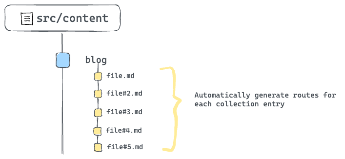 Automatically generate routes for each collection entry
To achieve this, we need to rework the getStaticPaths implementation to fetch all blog posts from the content collection and generate the required paths.
Consider the solution below:
---
import { getCollection } from "astro:content";
import BlogLayout from "@layouts/BlogLayout.astro";
// Make the function async
export async function getStaticPaths() {
// Fetch all blog posts
const allBlogPosts = await getCollection("blog");
// Dynamically construct the blog paths
const paths = allBlogPosts.map((blogEntry) => ({
// construct params
params: {
path: `${blogEntry.data.year}/${blogEntry.data.month}/${blogEntry.data.day}/${blogEntry.slug}`,
},
}));
// Eventually return the constructed paths
return paths;
}
const { path } = Astro.params;
---
<BlogLayout title="React Blog - React" header="React Blog">
<h1>{path}</h1>
</BlogLayout>
Now, every single blog entry now has an associating path defined. Give this a try by clicking any blog link from the home page.
 All blog paths now automatically handled
How to render each blog content
Just rendering the path of the blog was great for simplifying the previous concepts, but that’s not quite our result.
Let’s properly render each blog content. First here’s the solution:
---
import { getCollection } from "astro:content";
import BlogLayout from "@layouts/BlogLayout.astro";
// Make the function async
export async function getStaticPaths() {
const allBlogPosts = await getCollection("blog");
// dynamically construct the blog paths
const paths = allBlogPosts.map((blogEntry) => ({
// construct params
params: {
path: `${blogEntry.data.year}/${blogEntry.data.month}/${blogEntry.data.day}/${blogEntry.slug}`,
},
// 👀 Pass blogEntry as props to be later accessed in the markup via Astro.props
props: {
blogEntry,
},
}));
//Eventually return the constructed paths
return paths;
}
// Get the blog entry from the props
const { blogEntry } = Astro.props;
// get blog content via entry.render()
const { Content } = await blogEntry.render();
---
<BlogLayout title="React Blog - React" header="React Blog">
<!-- Render the Content -->
<Content />
</BlogLayout>
Let’s deconstruct this solution.
The most important piece to the solution puzzle is passing every single blog entry as a prop in the getStaticPath function.
Doing this allows us to reference each entry in the component markup section via Astro.props.
Secondly, every queried collection entry has a render() method that renders the entry to HTML. The solution utilises this to render each blog.
const { Content } = await blogEntry.render();
//...
<Content />
 The rendered blog content
MDX Components
Let’s get back to MDX.
The most impressive feature of MDX is the ability to use components with standard markdown content.
Let’s consider practical examples.
Customised HTML elements
When MDX content is rendered to HTML, the eventual output uses standard HTML elements.
For example, if we had the following MDX content:
# Title
This is a paragraph
This will yield an HTML result similar to the following:
<h1>Title</h1>
<p>This is a paragraph</p>
The good news is, instead of relying on standard HTML elements, we can specific components to be used instead of HTML elements.
For example, we may provide our own styled header and paragraph components in place of the standard h1 and p HTML elements.
To do this, create an object of HTML element to custom component mapping.
// sample MDX component map
// Provide custom header and paragraph
import H1 from "./H1.astro"; // custom Astro component
import P from "./P.astro" // custom paragraph component
// map of HTML element to custom component
export const mdxComponents = {
h1: H1,
p: P,
}
Now, when the MDX content is rendered to HTML, pass the component map as shown below:
---
import {getEntry} from 'astro:content'
// import the component map
import { mdxComponents } from '../mdxComponents'
// Get a collection entry
const blogCollection = await getEntry('blog', 'some-title')
// Get the entry Content
const { Content } = await blogEntry.render();
---
{/** Render to HTML and pass the components map**/}
<Content components={mdxComponents} />
Let’s put this into action.
Take a look at the src/components/mdxComponents.ts file in the project. It contains a list of HTML elements and associated custom Astro components.
We’ll import this object and pass it to the blog entry <Content /> as shown below:
// 📂 pages/blog/[...path].astro
---
import { mdxComponents } from "@components/mdxComponents";
// ... other imports
---
<BlogLayout title="React Blog - React" header="React Blog">
{/** 👀 pass the components down to Content **/}
<Content components={mdxComponents} />
</BlogLayout>
With this, we should now have properly styled components in place of the bland HTML elements.
 Leveraging custom components for the MDX HTML output
Consider the full list of available HTML elements that can be overwritten with custom components in the official MDX documentation.
Internal components
Components can also be imported and directly rendered within MDX. That’s part of the fun!
Go ahead and open the first blog route in /blog/2020/12/21/data-fetching-with-react-server-components and find the first TODO on the page.
 TODO: add the Intro component
To resolve this TODO, we need to import and render the Intro component in src/components/Intro.astro.
Consider the solution below:
// 📂 src/content/blog/data-fetching-with-react-server-components.mdx
---
import Intro from "@components/Intro.astro";
{/** First content after the frontmatter and other imports**/}
<Intro>
2020 has been a long year. As it comes to an end we wanted to share a special
Holiday Update on our research into zero-bundle-size **React Server
Components**.
</Intro>
---
 The rendered Intro component
We imported and rendered an Astro component right in the MDX file. How amazing!
Note that the --- syntax represents dividers (as seen in 1 and 2 above) and not code fences as used to define markdown frontmatter.
There’s no limit to how many components we can import and render in an MDX file. So, we can go further and render another component as shown below:
{/** Import the Note component **/}
import Note from "@components/Note.astro";
{/** Render at the bottom of the file **/}
<Note>React Server Components are still in research and development.</Note>
 The rendered Note component
Note that, unlike JavaScript imports that must be at the top of the file, we can import components in an MDX file anywhere aside from the frontmatter section.
I typically prefer to keep the imports at the top of the document right after the frontmatter, but you may also colocate the imports close to where they are rendered. Both options work!
External imports
We’ve seen different imported components in our MDX documents. Luckily, it gets even more fun.
We can also import and render external components, for example from NPM in MDX.
Go ahead and install astro-embed
npm install astro-embed
astro-embed lets us embed components such as Tweets and Youtube videos in an Astro project.
In the same blog in /blog/2020/12/21/data-fetching-with-react-server-components consider the next TODO:
## Reference
To introduce React Server Components, we have prepared a talk
and a demo. If you want, you can check them out during the.
holidays, or later when work picks back up in the new year.
❗️TODO: Add Youtube video embed here
To resolve this, go ahead and import the Youtube component from astro-embed and render the component with an id prop as shown below:
## Reference
To introduce React Server Components, we have prepared a talk and a demo. If you want, you can check them out during the holidays, or later when work picks back up in the new year.
import { YouTube } from "astro-embed";
<YouTube id="https://youtu.be/TQQPAU21ZUw" />
 The rendered Youtube component
Note that we’re colocating the import statement close to the component render. But we may move the import higher up the file as well.
{/** ✅ This is correct **/}
import { YouTube } from "astro-embed";
<YouTube id="https://youtu.be/TQQPAU21ZUw" />
{/** ✅ This is equally correct **/}
{/** Keep all imports on top, right after the frontmatter **/}
import Intro from "@components/Intro.astro";
import { YouTube } from "astro-embed";
{/** Render other content ... and component much later **/}
<YouTube id="https://youtu.be/TQQPAU21ZUw" />
AutoImport
The Youtube, Intro and Note components are used across all the blogs. Right now, importing the components every single time seems repetitive.
With components we want to be reused across our entire MDX files, how about we automatically import these – that is, without manually duplicating the import in every MDX document?
To achieve this, we will leverage the astro-auto-import package.
With astro-auto-import, we can easily import components or modules automatically and utilize them in MDX files without the need for manual importing.
First, install astro-auto-import:
npm install astro-auto-import
astro-auto-import works as an Astro integration. To use it, we must update the project astro.config.mjs file as shown below:
// other imports ...
// import AutoImport
import AutoImport from "astro-auto-import";
export default defineConfig({
integrations: [
// Pass AutoImport in the integrations array
AutoImport({
imports: [
/**
* Generates:
* import Intro from './src/components/Intro.astro';
*/
"./src/components/Intro.astro",
"./src/components/Note.astro",
/**
* Generates:
* import { YouTube } from 'astro-embed';
*/
{ "astro-embed": ["YouTube"] },
],
}),
react(),
tailwind(),
mdx(),
],
});
To use AutoImport we pass it into the integrations array and invoke AutoImport with an imports list:
AutoImport({
imports: [
"./src/components/Intro.astro",
"./src/components/Note.astro",
{ "astro-embed": ["YouTube"] },
],
})
The imports represents a list of imports to be automatically added to our MDX files.
A string with the path of the import such as "./src/components/Intro.astro" will generate a default import such as import Intro from './src/components/Intro.astro'.
An object such as { "astro-embed": ["YouTube"] } generates a named import such as import { Tweet, YouTube } from 'astro-embed'.
With these in place, we must now remove the manual imports in the MDX files and rely on the AutoImport magic ✨
Neat!
Integration Spotlight: Astro SEO
You’ve seen a lot of Astro integrations already. Think @astrojs/react for having React islands in an Astro project, or the official @astrojs/tailwind integration for using tailwind in Astro.
Generally speaking, integrations add new functionality and behaviour to an Astro project, usually with just a few lines of code.
Sounds like a win!
In this section, let’s discuss astro-seo, an integration that makes it straightforward to add SEO-relevant information to any Astro app.
You know the rodeo.
First, install the integration:
npm install astro-seo
To use astro-seo, we import the SEO component and pass it relevant props as seen below:
// 📂 src/layouts/BaseLayout.astro
---
import { SEO } from "astro-seo";
// ...
---
<html lang="en">
<head>
<meta charset="utf-8" />
<link rel="icon" type="image/svg+xml" href="/favicon.svg" />
<meta name="viewport" content="width=device-width" />
<meta name="generator" content={Astro.generator} />
<SEO
title={title}
description={description}
openGraph={{
basic: {
title,
type: "website",
image: "https://react.dev/images/og-home.png",
},
}}
twitter={{
creator: "@reactjs",
}}
extend={{
meta: [
{
name: "twitter:image",
content: "https://react.dev/images/og-home.png",
},
{ name: "twitter:title", content: "@reactjs" },
{
name: "twitter:description",
content: description,
},
],
}}
/>
{/** ... **/}
</head>
{/** ... **/}
</html>
This will generate relevant meta tags including open-graph meta tags for a more SEO-compliant application.
How to Create Custom 404 Pages in Astro
Custom 404 pages are easy to reason about in Astro. Create a 404.astro or any other relevant page file ending in src/pages. This will build a 404.html page that most deployment services will use if an invalid page is requested and not found.
Let’s do this for our project.
Create a 404.astro page in src/pages with the following content:
// 📂 src/pages/404.astro
---
import BaseLayout from "@layouts/BaseLayout.astro";
---
<BaseLayout title="Redirecting ..." page="index" />
<script is:inline>
// lazy redirect. This is better done server-side: discussed in the next book's chapter
const { pathname } = window.location;
window.location.replace(`https://www.react.dev${pathname}`);
</script>
Our 404 page comes with a twist.
It renders a blank page via <BaseLayout /> and automatically redirects the user to the accompanying path on www.react.dev. Violà!
Give this a try by visiting the API reference link on the homepage.
 The API reference link
Wrapping Up This Chapter
Building rich content applications is right up Astro’s alley. With content collections, we can build large content-driven applications with organisation and confidence.
 Chapter six.
Chapter 6: Server-Side Rendering (SSR) in Astro
This chapter will show you how to enable SSR in an Astro project. We will also discuss a detailed overview of the extensive features a server-side rendered Astro project offers.
What You’ll Learn
- Enable SSR in an Astro project.
- Leverage environment variables to store secrets.
- Provide flexible server routing via dynamic routes.
- Understand the request-response cycle and its relevant properties.
- Take advantage of Astro API routes to power robust applications.
When Do You Need SSR?
In an earlier chapter, we discussed several rendering techniques for a frontend application. The reason was so we could make effective decisions for when to choose one rendering technique over the other.
I’ll briefly summarise why we may need SSR in an Astro project. Remember that your mileage may vary – so always refer to the basics discussed in Chapter 3: Build Your Own Component Island.
Now, the following are pointers to when we may need to enable SSR in an Astro project:
- Content that is subject to frequent changes.: We may need SSR if a page’s content frequently changes, rather than using a statically built page which would require a rebuild for every new change.
- The need for API endpoints: SSR allows us to create API endpoints while keeping sensitive data hidden from clients. We’ll see how to do this later in the chapter.
- Creating pages with restricted access: To limit access to a page, enable server rendering for server-side handling of user privileges.
How to Enable SSR in Astro
Okay, here’s how it all begins. To enable SSR in an Astro project, set the output configuration option to server in the astro.config.mjs file.
// 📂 astro.config.mjs
import { defineConfig } from 'astro/config'
export default defineConfig({
//This will enable SSR
output: 'server'
})
And that’s it!
Let’s see this in action by starting a new project with the following command:
npm create astro@latest -- --template=minimal --yes --skip-houston ssr
This will use the minimal template, --skip-houston will skip the Houston animation, and the --yes option will skip all prompts and accept the defaults.
Now, change directories into ssr and start the project:
cd ssr && npm start
The app should run on a local server with a single index.astro page.
If we build the application for production via npm build, we should have the single index.astro page pre-rendered, that is statically built.
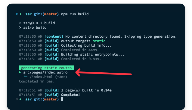 Statically rendering the index.astro page.
To re-iterate, a pre-rendered application is essentially a static site, that is – not server-side rendered.
To initiate server-side rendering, let’s change the configuration to include the output property as shown below:
// 📂 src/astro.config.mjs
import { defineConfig } from 'astro/config';
// https://astro.build/config
export default defineConfig({
output: 'server'
});
If we rerun the production build, we will have an error in the console.
[error] Cannot use `output: 'server'` without an adapter. Please install and configure the appropriate server adapter for your final deployment.
How to Deploy an SSR Project
The root cause of the error above is that to build your application for server-side rendering, the Astro build command must know what server you’ll eventually be deploying to.
SSR requires a server runtime, that is the code running within the server that renders our Astro pages. To achieve this, Astro provides adapters that match our deployment runtime.
An adapter allows Astro to do two things. First, determine the server runtime environment. Second, output a script that runs the SSR code on the specified runtime.
 The Astro adapter needs.
At the time of writing, the available Astro adapters are Cloudfare, Deno, Netlify, NodeJS, and Vercel.
We may deploy our SSR project to any of these runtimes with natively supported adapters.
To install any of these adapters, use the command:
npx astro add [name-of-adapter]
[name-of-adapter] could be cloudfare, deno, netlify, node or vercel.
I recommend looking at the official reference for any adapters you need in your project, as it would be unreasonable to cover all of these in the book. Here, we will stick to netlify.
To add the netlify adapter, go ahead and enter the following command in the terminal:
npx astro add netlify
This will go ahead and install the adapter and update our configuration file to the following:
import { defineConfig } from "astro/config";
// 👀 look here
import netlify from "@astrojs/netlify/functions";
// https://astro.build/config
export default defineConfig({
output: "server",
// 👀 look here
adapter: netlify()
});
Essentially, the adapter is imported in the second line of the config and added to the adapter property.
Now re-run the build command:
npm run build
This will successfully build our SSR project for production by outputting netlify specific code snippets in the dist and .netlify directory.
Now, we’re in business 🚀
Use the Correct Adapter
It goes without saying that, after adding an adapter, the project should be deployed to the specified adapter (here, netlify) and not some other provider (like vercel).
Use the correct adapter for your deployment runtime.
 Deploying a Vercel adapter to Netlify is wrong.
Our actual deployment steps will vary depending on the server runtime being deployed. For example, for Netlify, we may follow the steps described in the deploy a static site in Chapter 1. These steps will be identical for similar runtimes like Vercel.
For other runtimes, the official Astro deployment guides do an excellent job of explaining the deployment steps required.
SSR with Static Pages
With the output configuration property set to server, every page in our Astro project will be server-side rendered. But there’s a great chance we may want one or more pages to be statically generated at build time, that is some pages server-side rendered and others pre-rendered.
 Having a mix of server and statically rendered pages.
In such cases, we can opt-in to pre-rendering by adding export const prerender = true to any page that supports exporting variables, e.g., .astro, .mdx , .ts and .js.
Let’s try this out by creating a new about.astro page with the following content:
// 📂 src/pages/about.astro
---
// 👀 note the prerender export
export const prerender = true;
---
<html lang="en">
<head>
<meta charset="utf-8" />
<link rel="icon" type="image/svg+xml" href="/favicon.svg" />
<meta name="viewport" content="width=device-width" />
<meta name="generator" content={Astro.generator} />
<title>Astro</title>
</head>
<body>
<h1>About us</h1>
</body>
</html>
With the prerender export, the about page will be statically rendered at build time, while the index page remains server-side rendered.
Run npm run build to see this in action.
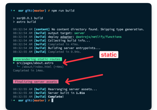 Static and server-side generated pages in the same project.
From Request to Response
The interaction between a client and server may be simplified in two steps:
- the client makes a request.
- the server sends a response.
The two main entities in this simplified interaction are the client request and the server response. Luckily, with server-side rendering, we may access details of the request and response object.
The Request object
The Request object may be accessed on the Astro global as shown below:
---
const request = Astro.request
---
The object holds information about the current request and is represented by the standard Request interface of the fetch API.
interface Request extends Body {
readonly cache: RequestCache
readonly credentials: RequestCredentials;
readonly destination: RequestDestination;
readonly headers: Headers;
readonly integrity: string;
readonly keepalive: boolean;
readonly method: string;
readonly mode: RequestMode;
readonly redirect: RequestRedirect;
readonly referrer: string;
readonly referrerPolicy: ReferrerPolicy;
readonly signal: AbortSignal;
readonly url: string;
clone(): Request;
}
For example, we may access the request headers via Astro.request.headers and the current request URL as a string via Astro.request.url.
The Response object
The Response object is the corresponding interface representing the response to a request. This is also represented by the standard Response interface of the Fetch API.
As opposed to accessing the object on the Astro object, the Response object is created using the Response() constructor.
The Response() constructor has the following signature:
new Response(body, options)
Where body defines the body for the response and options is an object containing custom settings to apply to the response, that is status, statusText and headers.
For example, we could update our index page to return a new response if we were presumably in beta – represented by a simple variable.
---
const isBeta = true;
if (isBeta) {
return new Response("app not available - check back", {
status: 200,
statusText: "OK!",
});
}
---
<html lang="en">
<head>
<meta charset="utf-8" />
<link rel="icon" type="image/svg+xml" href="/favicon.svg" />
<meta name="viewport" content="width=device-width" />
<meta name="generator" content={Astro.generator} />
<title>Astro</title>
</head>
<body>
<h1>We're live!</h1>
</body>
</html>
Instead of returning the HTML page, we should now have a simple text response sent to the client.
 Returning a simple text response to the client.
There’s also a response object on the Astro global. Blimey!
But it’s important to note that this is not the same as the Response object constructor. So, rewriting our example to use Astro.response will fail.
---
const isBeta = true;
if (isBeta) {
// ❌ This is wrong and will fail
return new Astro.response("app not available - check back", {
status: 200,
statusText: "Excellent!",
});
}
---
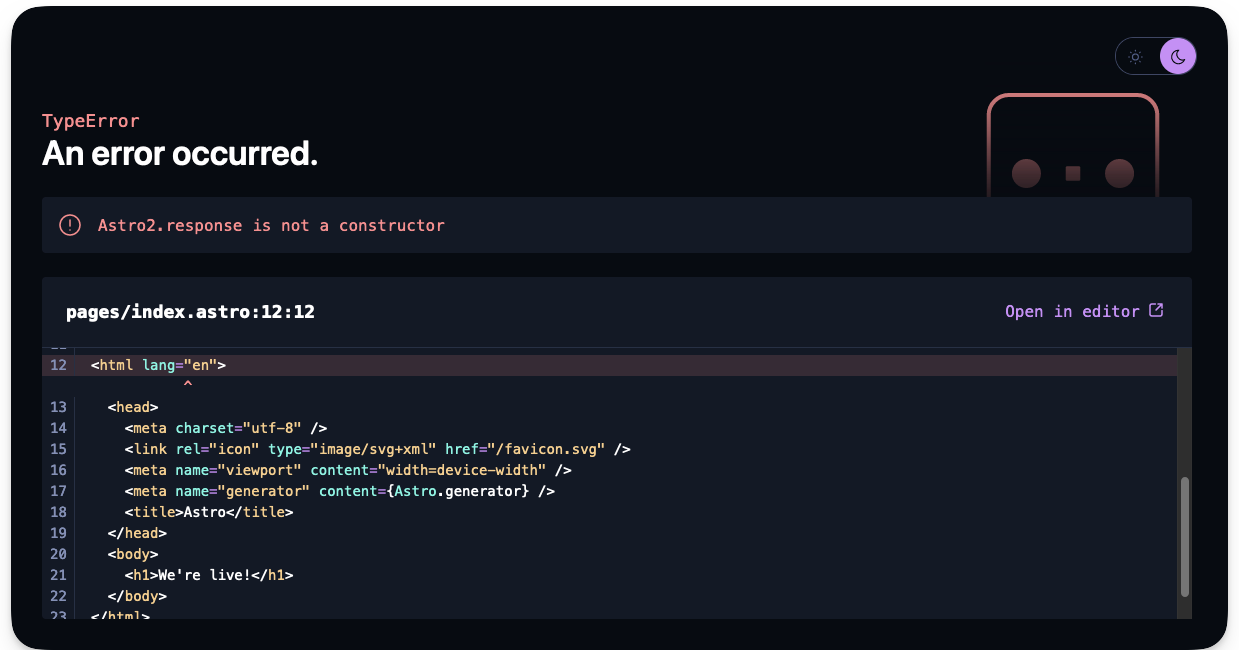 Error: Astro.response is not a constructor.
This is because Astro.response represents the response object initialiser. It’s used to set the options on the server response, i.e., status, statusText and headers.
For example, to set a custom header on the server response, we could do the following:
// 📂 src/pages/index.astro
---
Astro.response.headers.set("beta_id", "some_header_value");
---
<html lang="en">
<head>
<meta charset="utf-8" />
<link rel="icon" type="image/svg+xml" href="/favicon.svg" />
<meta name="viewport" content="width=device-width" />
<meta name="generator" content={Astro.generator} />
<title>Astro</title>
</head>
<body>
<h1>We're live!</h1>
</body>
</html>
The server will return the HTML page and our custom beta_id header.
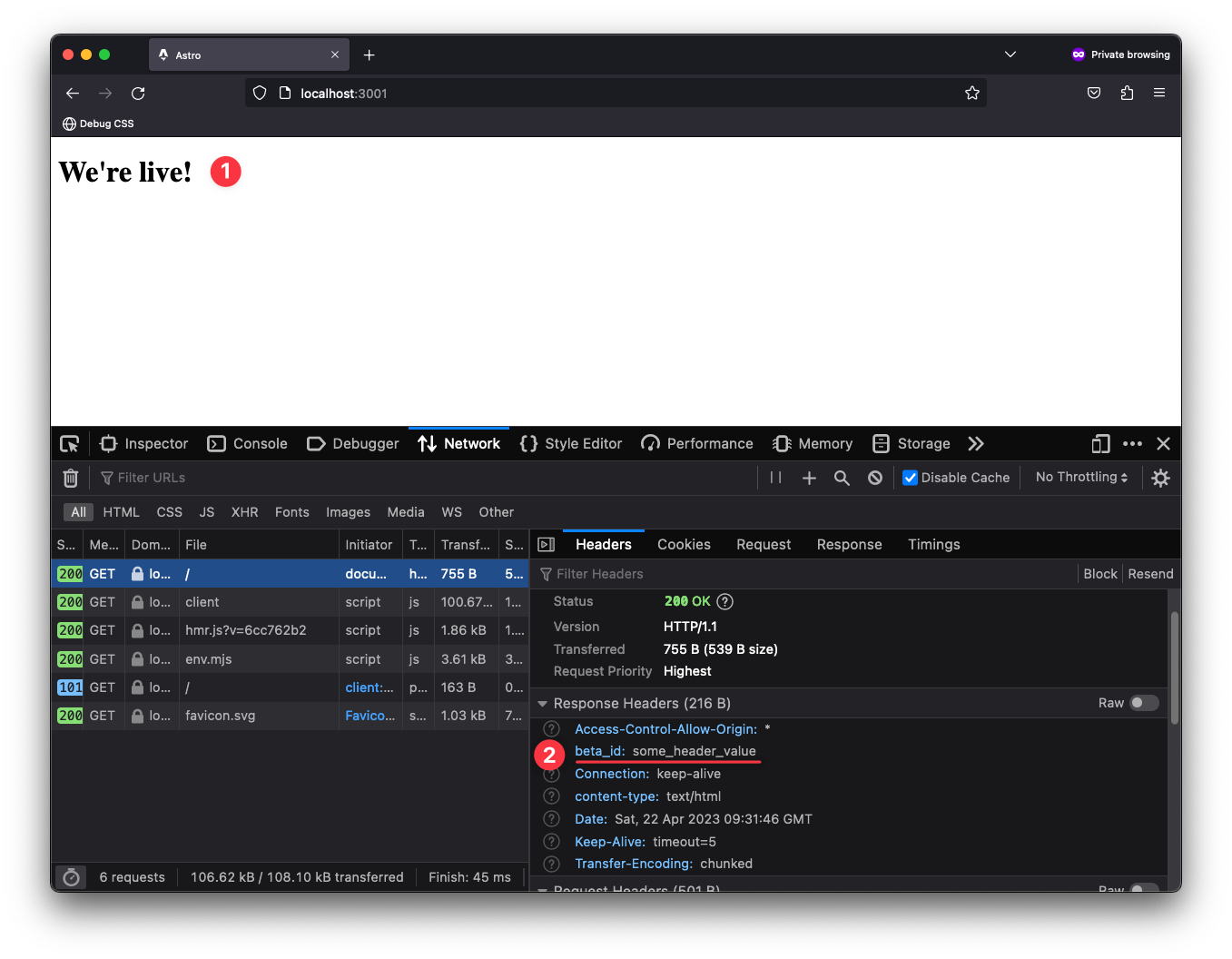 Setting a custom header on the server response.
Redirect response
It is pretty common to receive a client request and perform a redirect on the server.
There are two ways to achieve this in Astro.
The first is to leverage the standard Response object via Response.redirect.
Consider a case where we want to redirect a user to another page if they are not logged in, as shown below:
{/** 📂 src/index.astro **/}
---
const getIsLoggedOut = () => true;
const isLoggedOut = getIsLoggedOut();
if (isLoggedOut) {
return Response.redirect(`${Astro.request.url}about`, 307);
}
---
In this example, we call Response.redirect while passing it a redirect URL and a status code, that is:
Response.redirect(URL, status)
It’s important to note that the URL in this case is an absolute path. So constructing from Astro.request.url that points to the absolute base path, for example http://localhost:3001/.
When logged out, the user will be redirected to the about page and the optional status code 307 indicates a temporary redirect.
As we’ve seen above, constructing the absolute URL could get unnecessarily complex. Luckily, there’s an alternative way to perform a redirect.
We may also leverage the Astro.redirect method to redirect to another page. For example, we could rewrite our solution to use Astro.redirect as shown below:
---
const getIsLoggedOut = () => true;
const isLoggedOut = getIsLoggedOut();
if (isLoggedOut) {
return Astro.redirect("/about", 307);
}
---
We have a much simpler API here. We can redirect by just passing the relative path to redirect to. The status code is also optional here.
It’s important to note that redirects should be done in page components, that is not inside other components like layouts or base components.
Utilities for manipulating cookies
In SSR mode, we may need to read or manipulate cookies. Well, Astro’s got us covered with Astro.cookies. This contains utilities for reading and using cookies in SSR mode.
Consider the examples of retrieving a cookie:
//Get an AstroCookie object
const cookieObject = Astro.cookies.get("coooookiee")
// Get the string value of the cookie
const cookieValue = cookieObject.value
// Parse the cookie value via JSON.parse. Returns an object if the cookie is a valid JSON. It throws an error otherwise.
const cookieJSON = cookieObject.json()
// Parse the cookie value as a Number
const cookieNumber = cookieObject.number()
// Parse the cookie as a boolean
const cookieBoolean = cookieObject.boolean()
That’s a lot of flexibility!
We may also check if a cookie exists with the has method, as shown below:
// check if the "cooooookies" cookie exists. returns a boolean
const hasCookie = Astro.cookies.has('cooooookies')
It is also possible to set a cookie as shown below:
// Set a cookie
Astro.cookies.set("cooookiees", "the-cookie-value")
The signature for Astro.cookies.set is shown below:
// Astro.set(key, value, options)
key: string,
value: string | number | boolean | object,
options?: CookieOptions) => void
Note how different cookie value types may be set and additional cookie options passed if needed, for example domain, encode, expires, maxAge or httpOnly.
The request IP address
Understanding IP addresses is beyond the scope of this book. But, we may gain access to the request’s IP address on the server via the Astro.clientAddress property.
Below’s a simple example:
---
const ip = Astro.clientAddress;
---
<div>Your IP address is: {ip}</div>
Environment Variables
If you’re completely new to environment variables, you might the thinking, "Oi, what are Environment variables, and why should I care?"
Generally speaking, environment variables help us store important information like API keys or sensitive data without ever having to reveal them to clients accessing your application.
Like any secret, environment variables can be arguably slightly tricky to handle. You need to know exactly where to find them, how to use them, and most importantly, how to keep them safe from prying eyes.
How to get environment variables
In Astro, environment variables are accessed on the import.meta.env object.
So, for example, if we had a CAT_API_TOKEN value, we would access it as follows:
---
import.meta.env.CAT_API_TOKEN
---
If you’re conversant with environment variables in node environments, you’ll notice that this differs from the classic process.env object. Astro leverages Vite, which uses the import.meta JavaScript feature.
Default environment variables
We all have secrets.
Well, I’m not quite sure of that. Let me rephrase: most people have secrets.
Similarly, every Astro project has some default secrets, aka environment variables, out of the box. Consider the defaults below:
// Get the mode the Astro site is running in: "development" | "production"
import.meta.env.MODE
// Is the site running in production? returns true or false
import.meta.env.PROD
// Is the site running in development? returns true or false
import.meta.env.DEV
// The base URL of the Astro site
import.meta.env.BASE_URL
// Get the final deployed URL of the Astro site
import.meta.env.SITE
// Get prefix for Astro-generated asset links
import.meta.env.ASSETS_PREFIX
For import.meta.env.BASE_URL, it’s important to note that this will default to / except explicitly stated in the project configuration. For example:
import { defineConfig } from 'astro/config'
export default defineConfig({
base: '/docs'
})
Astro will now use /docs as the root for our pages and assets in the development and production build.
Similarly, import.meta.env.SITE relies on the site property set in the astro config, for example:
import { defineConfig } from 'astro/config'
export default defineConfig({
site: 'https://www.ohansemmanuel.com'
})
Astro will use this full URL to generate the site’s sitemap and canonical URLs where relevant.
import.meta.env.ASSETS_PREFIX also relies on the build.assetsPrefix option set in the project’s config, for example:
import defineConfig from 'astro/config'
export default defineConfig({
build: {
assetsPrefix: 'https://cdn.example.com'
}
})
This can be used if assets are served from a different domain than the current site. For example with the https://cdn.example.com prefix, assets will be fetched from https://cdn.example.com/_astro/.... This implies the files in the default astro build directory ./dist/astro must be uploaded to the CDN directory to serve the assets.
Phew! Out with the secrets.
How to create environment variables
It doesn’t do a lot of good if we can’t create our own secrets. Heck, it helps with the mystic.
The most common way to create environment variables is to use .env files.
For example, let’s go ahead and create a .env file in the root directory of our project directory with the following content:
// 📂 src/.env
CAT_API_TOKEN="this-is-the-cat-production-token"
We may then access the secret server-side via import.meta.env.CAT_API_TOKEN.
I must mention that exposing certain environment variables to the client (browser) is possible. To do this, prefix the environment variable with a PUBLIC_, for example:
PUBLIC_INSENSITIVE_TOKEN="this-is-public"
PUBLIC_INSENSITIVE_TOKEN will now be accessible both on the server and client. That’s an open secret. Anyone, and I mean anyone, can see your dirty laundry here. Only use this for insensitive environment variables.
Remember that environment variables are only available in server-side code by default. Prefix environment variables with PUBLIC_ to expose them to the client.
It is also possible to run your project and provide environment variables from the CLI, as shown below:
CAT_API_TOKEN="this-is-the-cat-production-token npm run dev"
In this case, CAT_API_TOKEN will be available both server-side and client-side. Use with caution. We only tell people we trust secrets and never blindly trust a client, like a user browser.
TypeScript IntelliSense
We don't get TypeScript IntelliSense support if we attempt to access CAT_API_TOKEN in pages/index.astro after creating the .env file.
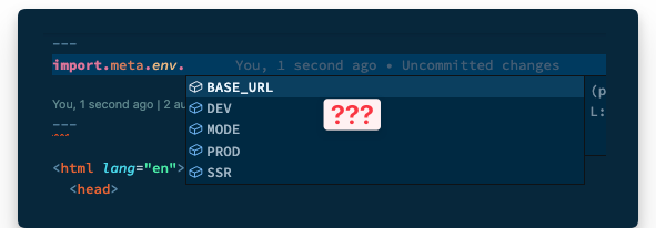 No Typescript IntelliSense for our custom environment variable.
We’re pro developers, so come on – let’s fix this.
We’ll find a src/env.d.ts file with projects started with an Astro template. Otherwise, go ahead and create one.
Here’s the initial content of the file if it already exists:
/// <reference types="astro/client" />
Let’s extend the default ImportMeta interface that provides type definitions for import.meta.env by adding the following:
interface ImportMetaEnv {
readonly CAT_API_TOKEN: string;
// add other custom env variables...
}
And voilà! TypeScript knows our secrets – for the better.
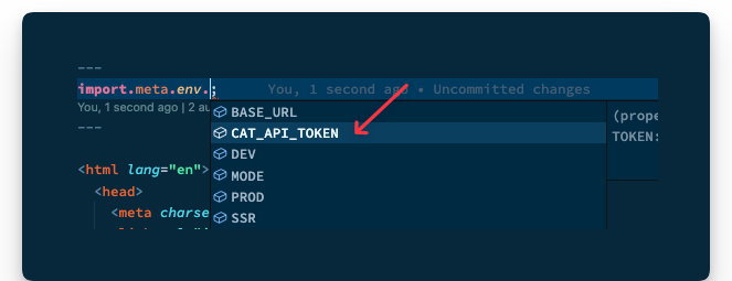 Typescript IntelliSense activated.
Dynamic Routes
Static routes are arguably easy to reason about. For example, .astro, .md and .mdx files in src/pages will automatically become pages on our website.
But sometimes we require dynamic routes to prevent repetition. This typically happens when we have different routes with minimal UI changes between them.
For example, if we were selling products on our website, we would have a different route for each product.
// example routes for different products
www.example.com/product/understanding-astro
www.example.com/product/astro-a-to-z
www.example.com/product/astro-for-beginners
www.example.com/product/fullstack-astro
// ❌ Providing multiple pages for each product
/pages/understanding-astro.astro
/pages/astro-a-to-z
/pages/astro-for-beginners
/pages/fullstack-astro
The URL structure of the product pages could be represented by www.example.com/product/${name} where name means the product’s name.
Instead of creating different pages to represent each product, we may dynamically handle the product routing in one of two ways.
1. Named parameters
We could represent the variables in the route path with a named parameter surrounded by square brackets. For example, creating a file in the pages directory as follows:
/pages/products/[product].astro
We may then grab the product path value on the page as follows:
{/** 📂 src/pages/[product].astro **/}
<h1>{Astro.params.product}</h1>
Alternatively:
---
const {product} = Astro.params
---
<h1>{product}</h1>
Now if we visit the /products/understanding-astro page, we should have the title of the product displayed.
 Grabbing dynamic route path values.
In most cases, our variable path parameter will include a unique identifier, for example /pages/products/[id].astro.
The same routing works.
It is also possible to leverage multiple named parameters in the route path, as shown below:
{/** /products/[product]_[id].astro **/}
<h1>Product name: {Astro.params.product}</h1>
<h1>Product id: {Astro.params.id}</h1>
This will be matched with a URL similar to /products/understanding-astro_09u34359534530903453450.
 Matching multiple route named parameters.
2. Rest parameters
Rest parameters provide ultimate flexibility in our URL routing. For example, we may use [...path] to match file paths of any depth. Where path could be represented by any string, like [...file] or [...somestring].
Consider the following product pages:
/products/product-id
/products/category/product-id/
/products/types/category/product-id
The routes above will all be matched by the page pages/product/[...path].astro, and we can access the full dynamic string path within our code.
For example, create a file in /pages/product/[...path].astro with the following content:
---
const { path } = Astro.params;
console.log({ path });
---
<h1>Hello there</h1>
For the paths above, the path variable corresponds to product-id, category/product-id and types/category/product-id.
With much power comes much responsibility.
With the increased flexibility rest path parameters provide comes the responsibility of handling the paths in our code. For example, consider how we may handle the multiple product paths below:
---
// Get the dynamic route path
const { path } = Astro.params;
// Hold a list of all expected paths and corresponding data, e.g., title.
const page = [
{
path: undefined,
title: "View all products"
},
{
path: "product-id",
title: "Some Product",
},
{
path: "category/product-id",
title: "Some Product Category Item",
},
{
path: "types/category/product-id",
title: "Some Product Type Category Item",
},
];
//Is this a valid path? i.e., exists in our list?
const relevantPageDetails = page.find((v) => v.path === path);
if (!relevantPageDetails) {
// redirect if the dynamic page isn't valid.
return Astro.redirect("/404");
}
---
// render the title of the page
<h1>{relevantPageDetails.title}</h1>
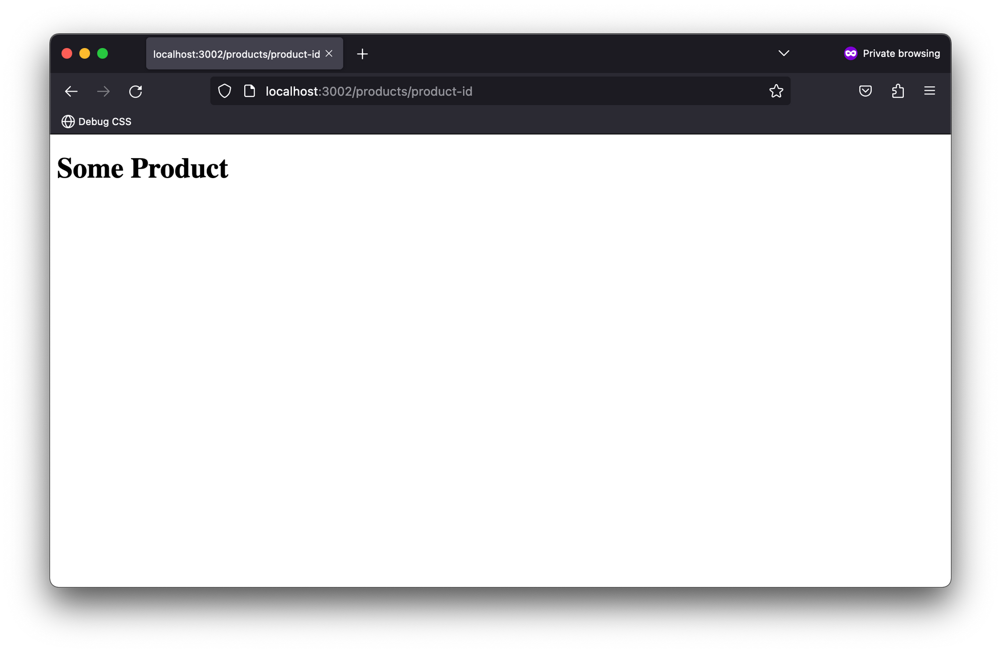 Rendering rest parameter routes.
It’s important to note that if the path is undefined, the root path will be matched, that is it corresponds to pages/product.
While this demonstrates using rest paths in server-side rendered pages, it is a contrived example where we’ve assumed the literal string “product-id”.
In the real world, the literal string will be represented by different product id strings rather than product-id – and we might not know what these are ahead of time.
As we’ve done in the previous solution, keeping a massive list of all product IDs in our application becomes unmaintainable.
For this use case, one way to achieve this would be to update our solution to have sufficiently complex matching logic, for example via regular expressions, because we don’t know the product IDs beforehand.
---
const { path = "index" } = Astro.params;
const page = [
{
match: /some-regex/,
title: "View all products",
},
{
match: /some-regex/,
title: "Some Product",
},
{
match: /some-regex/,
title: "Some Product Category Item",
},
{
match: /some-regex/,
title: "Some Product Type Category Item",
},
];
const relevantPageDetails = page.find((v) => path.match(v.match));
if (!relevantPageDetails) {
return Astro.redirect("/404");
}
---
<h1>{relevantPageDetails.title}</h1>
As a matter of personal preference, I’ve sworn a blood oath to avoid path rest parameters for multiple SSR page paths when I can’t deterministically determine the path variables beforehand.
Simple is sometimes better.
In this case, I suggest separating the pages, that is creating multiple directories and letting the default Astro automatic routing kick in.
For example, match the path category/product-id by creating a page in category/[id] and types/category/[id] to match the route types/category/product-id.
They can also be composed with a common layout or shared components if they have identical user interfaces.
Priority order
As we’ve discussed above, URL paths can be matched in different ways, so what happens when different file paths match the same URL path in our project?
Well, Astro needs to make a decision, so lets review the priority list below:
- Static routes, that is those without path parameters, have the highest priority, for example
/pages/products/this-is-a-product. - Dynamic routes with named parameters have the next priority, for example
/pages/products/[id]. - Dynamic routes with rest parameters have the lowest priority, for example
/pages/products/[...path]. - Following the above, any ties will be resolved alphabetically.
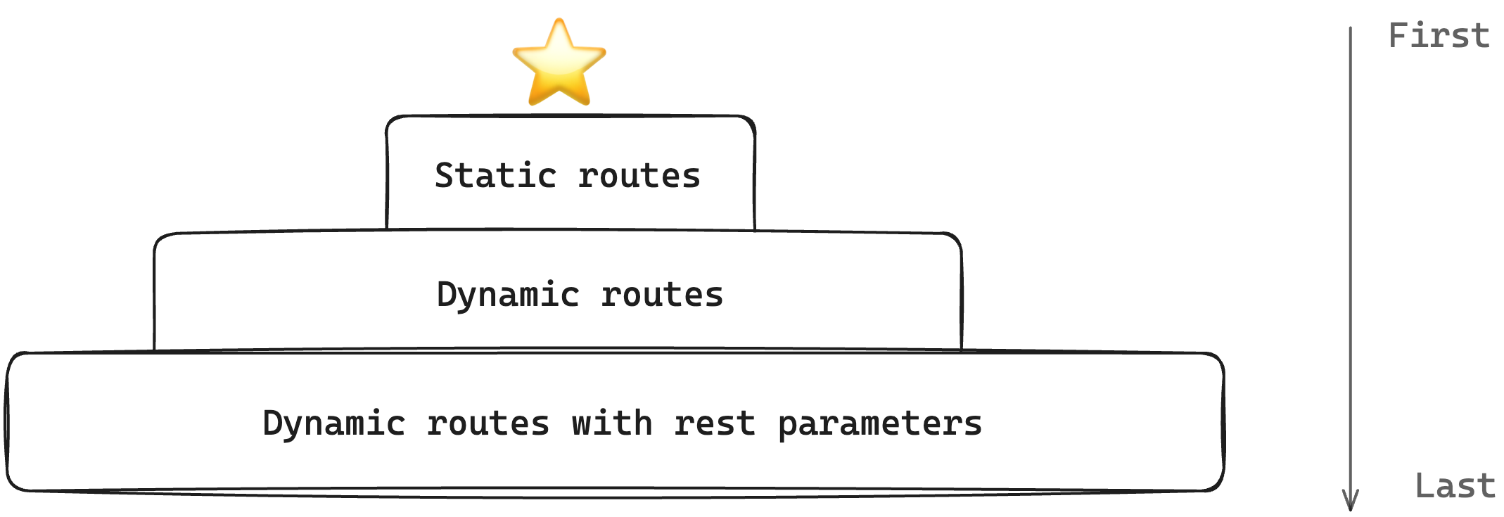 Route priority order from first to last.
Server Endpoints
Server endpoints are like the secret weapons in our arsenal when running server-side functions.
They can be used as REST API endpoints to run functions such as database access, authentications, and verifications without exposing sensitive data to the client, that is we can securely execute code on the server at runtime in these functions.
Consider the current state of our project with a page/products directory. What if we wanted to create an API route to handle some client requests? How would we do this?
How to create server endpoints
To create an API route in the server output mode, create a .ts or .js file within the pages directory. Optionally, you may see endpoints created with the type of data the endpoint returns in the file name, for example .json.ts.
I prefer to keep server endpoints simple and omit additional file names. Let’s go ahead and create an api.ts file and handle incoming GET requests as shown below:
// 📂 pages/products/api
import type { APIRoute } from "astro";
export const get: APIRoute = (ctx) => {
return {
body: JSON.stringify({
message: "Hello world",
}),
};
};
- Note the
APIRoutetype used on thegetfunction. This represents the API route function type definition. - Every API route function receives a context object, for example represented by
ctx. The context object contains relevant properties we’ll take a look at shortly. - As shown above, an API route function can return a response with a
body. The complete response form is shown below:
{
body: string
encoding?: 'ascii' | 'utf8' | 'utf-8' | 'utf16le' |
'ucs2' | 'ucs-2' | 'base64' | 'base64url' |
'latin1' | 'binary' | 'hex'
}
We may also return a standard response via the Response object as shown below:
import type { APIRoute } from "astro";
`export const get: APIRoute = (ctx) => {`return new Response(JSON.stringify({
message: "Hello world"
}), {
status: 200,
});
};
Request details
Accessing details of the request object is a breeze with API routes. For example, we may access the request object on the context object to check its headers, as shown below:
import type { APIRoute } from "astro";
export const get: APIRoute = (ctx) => {
// check for an Authorization header on the request
const auth = ctx.request.headers.get("Authorization");
// The user is unauthorised to get this resource
if (!auth) {
return new Response(JSON.stringify({ message: "Unauthorized" }), {
status: 401,
});
}
return new Response(JSON.stringify({ message: "Hello world" }), {
status: 200,
});
};
We could also destructure properties of the context object, for example the request object, as shown below:
export const get: APIRoute = ({ request }) => {
// ...
}
While getting the request object is great, consider the complete list of properties available on the endpoint context object:
export const get: APIRoute = ({
url,
site,
params,
request,
cookies,
generator,
redirect,
clientAddress,
}) => {
return new Response(JSON.stringify({ message: "Hello world" }), {
status: 200,
});
};
Some of these should be familiar from discussing the request and response objects on the Astro global; however, here’s a quick breakdown:
| Property | What? |
|---|---|
|
url |
A standard URL interface. |
|
site |
The site property from the astro configuration file. |
|
params |
path segments matched by the request. |
|
request |
A standard Request interface of the Fetch API. |
|
cookies |
Similar to Astro.cookies. It contains utilities for reading and manipulating cookies. |
|
generator |
Indicates the version of Astro our project is running. |
|
redirect |
Similar to Astro.redirect. |
|
clientAddress |
Specifies the IP address of the request. Similar to Astro.clientAddress |
The alien properties here are generator, url and params.
generator is easy to reason about, while url represents a URL object constructed from request.url, that is identical to new URL(request.url).
It’s worth mentioning that a similar object may be accessed on the Astro global via Astro.url. This could come in handy in static pages.
What about params? Well, that requires a separate section when we discuss dynamic routes.
Dynamic API routes
The dynamic route fabric on pages works the same magic on API endpoints.
For example, our API endpoint is in the pages/products/api file. What if we wanted client requests to be made in the format: GET /api/products/${id}?
Did you notice the variable id?
In this case, we may leverage dynamic routes as shown below:
// 📂 pages/api/products/[id]
import type { APIRoute } from "astro";
export const get: APIRoute = async (ctx) => {
// Get the product ID
const productId = ctx.params.id;
try {
const response = await fetch("https://fakestoreapi.com/products/1");
const data = await response.json();
return new Response(JSON.stringify({
...data,
// Add the ID in the response body
id: productId
}), {
status: 200,
});
} catch (error) {
return new Response(JSON.stringify({
message: "An error occurred."
}), {
status: 500,
});
}
};
I might have sprung a surprise on you in the code block above. But the main difference here is we’re reaching out to some external API (think fetching data from a database) and sending the response back to the client.
Another critical point is to notice how the specific id is retrieved from ctx.params.id, where ctx represents the context object.
If we make a GET request to api/products/astro-book-001, we should have some data returned to the client.
 Testing the product API on hopscotch.io
Note how whatever “id” is passed in the request path is rightly retrieved, for example astro-book-001.
 The product ID returned in the JSON response.
To re-iterate, we can get the path segments in the dynamic route pattern via context.params and voilà! We have our use case resolved.
Passing query parameters to GET requests is not unheard of in the real world. Heck, it’s quite an everyday use case in fact.
Assuming the following client request GET api/products/astro-book-001?version=2&publishedDate=2023-06-12, how would we handle this?
It’s important to note that version and publishedDate will not be present in context.params. But we can grab these from the URL object as shown below:
// 📂 pages/api/products/[id]
export const get: APIRoute = async (ctx) => {
const productId = ctx.params.id;
// retrieve relevant search parameters, aka URL query parameters
const searchParams = ctx.url.searchParams;
const version = searchParams.get("version");
const publishedDate = searchParams.get("publishedDate");
try {
const response = await fetch("https://fakestoreapi.com/products/1");
const data = await response.json();
// Return a new response with the retrieved
// "version" and "publishedDate"
return new Response(
JSON.stringify({
...data,
version,
publishedDate,
id: productId
}),
{
status: 200,
}
);
} catch (error) {
return new Response(JSON.stringify({
message: "An error occurred" }), {
status: 500,
});
}
};
The crux of the solution is the following:
// retrieve relevant search parameters, aka URL query parameters
const searchParams = ctx.url.searchParams;
const version = searchParams.get("version");
const publishedDate = searchParams.get("publishedDate");
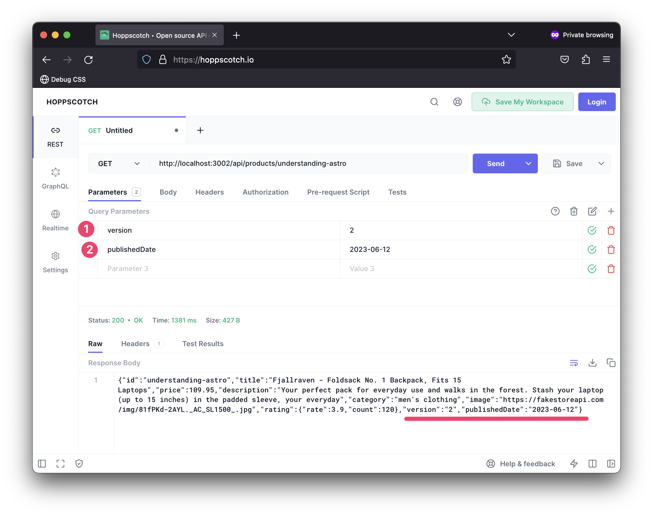 Retrieving query parameters in a server endpoint.
Dedicated API directory
At the time of writing, API routes must live in the pages directory with appropriate file endings, for example .ts or .js.
For example, you can have pages/anyFileName.js act as a server endpoint.
But I find it easier (and better) to have my server API routes in a dedicated pages/api directory instead of mixing these in other page routes.
One advantage to this is potentially making it easier to redirect a subdomain to a single path for all API routes, for example redirect api.my-website.com/... to my-website.com/api/....
On the flip side, an arguable downside is we break the collocation of other routes, for example standard pages such as pages/products/... will have their associated API route in api/products/.... This is a downside and a trade-off I happily make in production applications.
How to support other HTTP methods
All our examples so far have used the get method within our API routes. But Astro does support all the other HTTP methods, such as post or delete.
Consider the following example that extends our api/products/${id} endpoint to include more methods:
import type { APIRoute } from "astro";
// Handle client GET requests
export const get: APIRoute = async (ctx) => {
const productId = ctx.params.id;
try {
// fetch remote resource
const response = await fetch("https://fakestoreapi.com/products/1");
const data = await response.json();
// return data, and the id param
return new Response(JSON.stringify({
...data,
id: productId
}), {
status: 200,
});
} catch (error) {
return new Response(JSON.stringify({
message: "An error occurred" }), {
status: 500,
});
}
};
/**
* Handle "DELETE" requests
* "delete" is a reserved word in Javascript. Hence, the function name "del"
*/
export const del: APIRoute = async (ctx) => {
const productId = ctx.params.id;
try {
const response = await fetch("https://fakestoreapi.com/products/1", {
method: "DELETE",
});
const data = await response.json();
return new Response(
JSON.stringify({
id: productId,
message: "deleted",
title: data.title }),
{
status: 202,
}
);
} catch (error) {
return new Response(JSON.stringify({
message: "An error occurred" }), {
status: 500,
});
}
};
/**
* Handle "POST" requests
*/
export const post: APIRoute = async (ctx) => {
// Get the POST body data
const data = await ctx.request.json();
return new Response(JSON.stringify({
message: "Created", data
}));
};
Go ahead and give these a try!
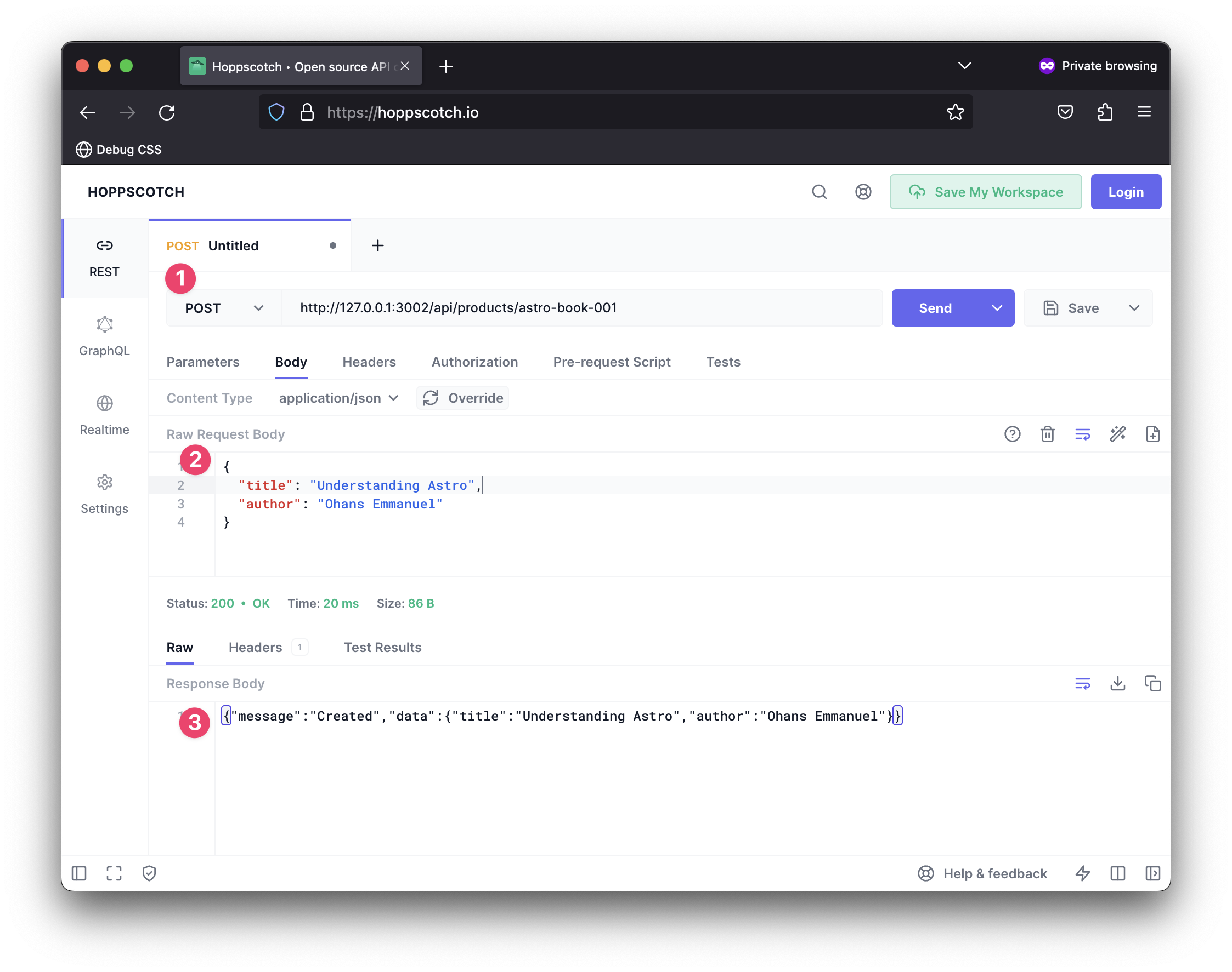 Making a POST request to our server endpoint.
As a fallback to handle other HTTP methods, we can provide an all function to match methods that don’t have a corresponding exported function. Consider the example below:
...
export const all: APIRoute = async (ctx) => {
// Get the request method
const method = ctx.request.method;
// Return a response
return new Response(
JSON.stringify({
method,
message: "Unsupported HTTP method",
}),
{
status: 501, // unsupported
}
);
};
This will match unhandled methods in our implementation, such as PATCH requests.
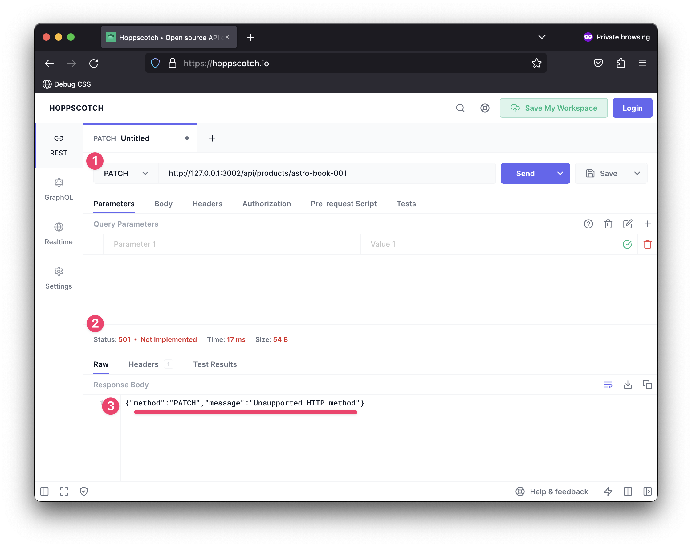 Handling unsupported methods in a server endpoint.
Streams, Oh Streams
I’ve chosen a playful title for this section as it involves a relatively lesser-known feature of Astro: server streaming.
What is server streaming?
Generally speaking, SSR refers to generating HTML on the server and sending that to a browser in response to a request.
In theory, we may break this off into distinct steps:
- Browser requests a page
- The server renders the page (and every associated data)
- The server returns the fully formed page to the browser
- The browser renders the page
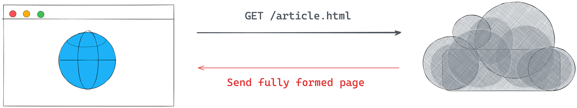 Server sending a fully formed page to the client.
What’s important here is to note that the server generates the page’s full HTML, and only then does it send the HTML to the browser.
Now, consider a different approach.
In most cases, certain parts of the HTML page are static and could be sent from the server immediately, that is without relying on fetching all the relevant data.
What if the server could transmit the HTML to the browser as it creates the page server side?
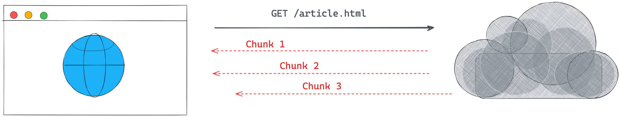 The server sends partial chunks to the browser.
This is the crux of streaming: stream HTML to a browser as the server generates the HTML.
Why should we bother?
In theory, browsers can render partial HTML and support receiving and rendering HTML data in chunks. Users can view and interact with a page as it streams rather than waiting for the full page to be sent as one big chunk.
Different applications will need various workarounds. But streaming improves server overhead. The server doesn’t need as much memory to buffer entire pages. It’ll incrementally send page data to the browser releasing memory to handle more requests and consequently save overhead costs.
This is a great argument to convince your boss that streaming is good for the company’s wallets (except if your company plays the silly game of burning as much cash as possible).
Streaming is easy yet difficult
I’ve sung the praises of streaming. It is conceptually easy to reason about. But in practice you may experience some difficult use cases.
A great example is considering the <title> of a page that goes in our HTML’s <head>. Typically, the <head> is one of the first elements we stream to the browser. But some elements within the <head> could very well be dynamic, for example we may have a <title> in the form <title>{product name} fetched from the server<title>.
What’s likely to happen is we stream a stale <title> before we eventually get the product name from the database (assuming the database is the external source of data here).
This out-of-order streaming represents some of the most common issues we may face in practice. In this example, we may provide a generic <title> placeholder and continue streaming.
Once the data becomes available server-side, we may stream a tiny <script> that updates the page title to the desired value.
Okay, that’s enough backstory. Next, let’s dig into streaming in Astro.
Server streaming in Astro
Now that you’re convinced (not confused) about the importance of server streaming, let’s explore how streaming in Astro works.
Perhaps the most important thing to know is that Astro supports streaming by default. Yes, you heard that right. Browsers also natively support HTML streaming.
Essentially, within the Astro template, Astro will stream out HTML that occurs before hitting an async boundary.
For example, consider the basic page with a <LoadPets/> component responsible for fetching and rendering some pet data from a database.
---
import LoadPets from '../components/LoadPets.astro'
---
<html>
<head>
<title> Petsssss! </title>
</head>
<body>
<h1>This is a pet site</h1>
<p> Consider how pets are awesome ... </p>
<LoadPets />
</body>
</html>
In this contrived example, Astro will steam out the <head>, <h1> and <p> sections to the browser before stopping to fetch the data in <LoadPets /> and then stream its result to the browser when ready.
Let’s explore a visual example.
Update the ssr project to have a new streaming.astro page with the following content:
---
import Block from "../components/Block.astro";
---
<html>
<head>
<title>Streaming</title>
</head>
<body>
<Block text="Block #1" delay={1000} />
<Block text="Block #2" delay={2000} />
<Block text="Block #3" delay={3000} />
<Block text="Block #4" delay={4000} />
<Block text="Block #5" delay={5000} />
</body>
</html>
The <Block/> component receives a text and a delay prop. delay represents how long to wait before rendering its template, that is simulating some network request call.
Here’s the <Block/> component:
{/** 📂 src/components/Block.astro **/}
---
import { sleep } from "../sleep";
interface Props {
text: string;
delay: number;
}
const { text, delay } = Astro.props;
await sleep(delay);
---
<div>
{text}
</div>
<style>
div {
margin: 1rem 0;
padding: 2rem 6rem;
border-radius: 10px;
background-color: blanchedalmond;
}
</style>
Where sleep is a utility as follows:
// 📂 src/sleep.ts
export const sleep = (delay: number) =>
new Promise((r) => setTimeout(r, delay));
Now, go to the Chrome browser and visit the /streaming route to view the wonders of streaming.
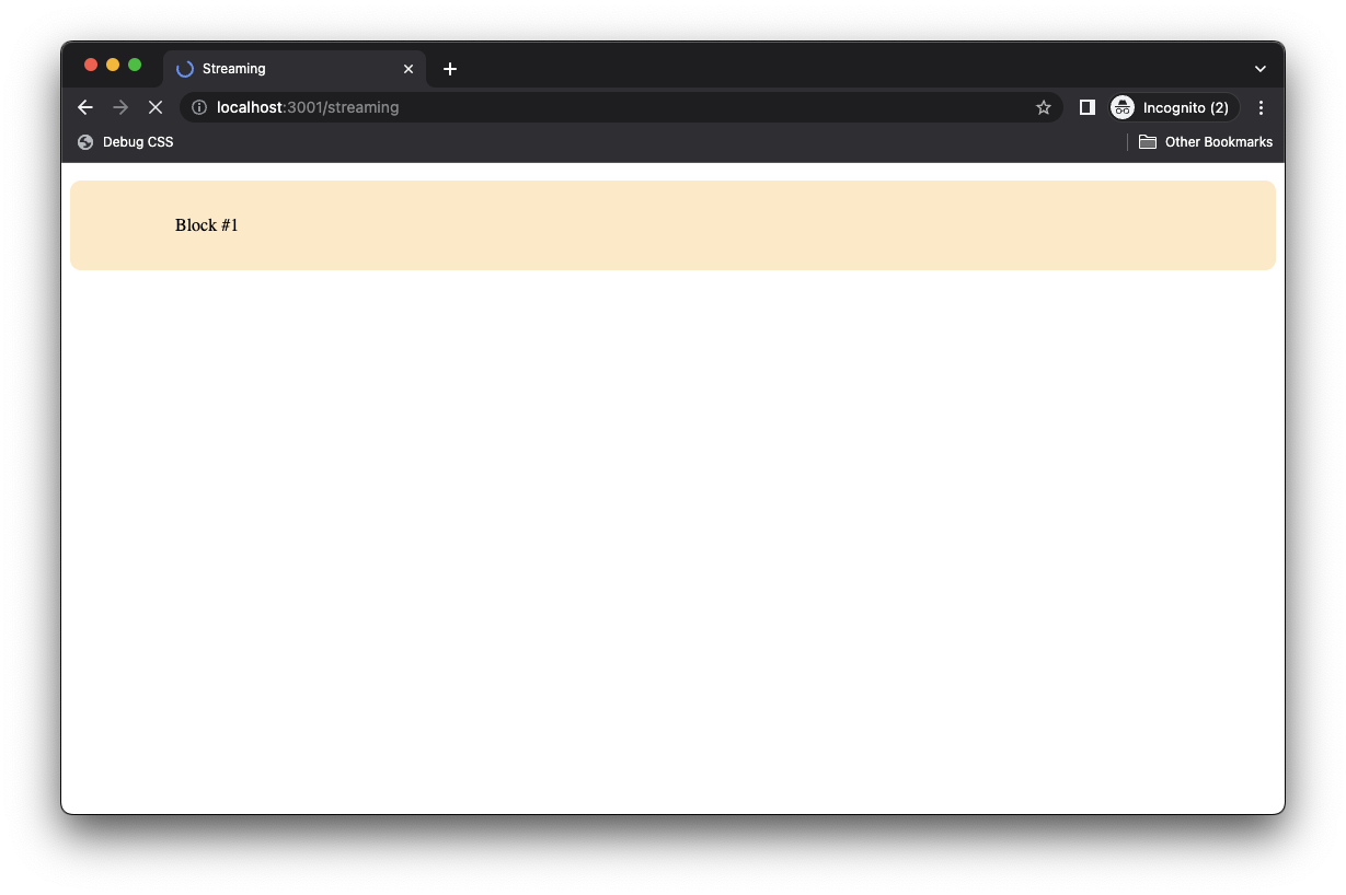 Initial block streamed while awaiting Block #2
Each block of content comes in one at a time.
It’s important to note that we don’t have to abstract the async bits into components. Streaming equally works with standard promises within the Astro template:
// 📂 src/pages/streaming_blocks
---
import Block from "../components/Block.astro";
import { sleep } from "../sleep";
const block5Promise = async () => {
await sleep(1000);
return "Block #5";
};
---
<html>
<head>
<title>Streaming</title>
</head>
<body>
<Block text="Block #1" delay={1000} />
<Block text="Block #2" delay={2000} />
<Block text="Block #3" delay={3000} />
<Block text="Block #4" delay={4000} />
<p>{block5Promise}</p>
</body>
</html>
An important fact to note here is that Astro initiates the async fetches in parallel when sibling async components are in the component tree.
So in our example, Block #1 through Block #5 start fetching data in parallel and don’t block one another.
When Block #4 is rendered, block5Promise is already fetched as it takes one second compared to Block #4’s four seconds. So the result of block5 is streamed alongside Block #4.
This can be difficult to grasp via text descriptions, so here's a visual:
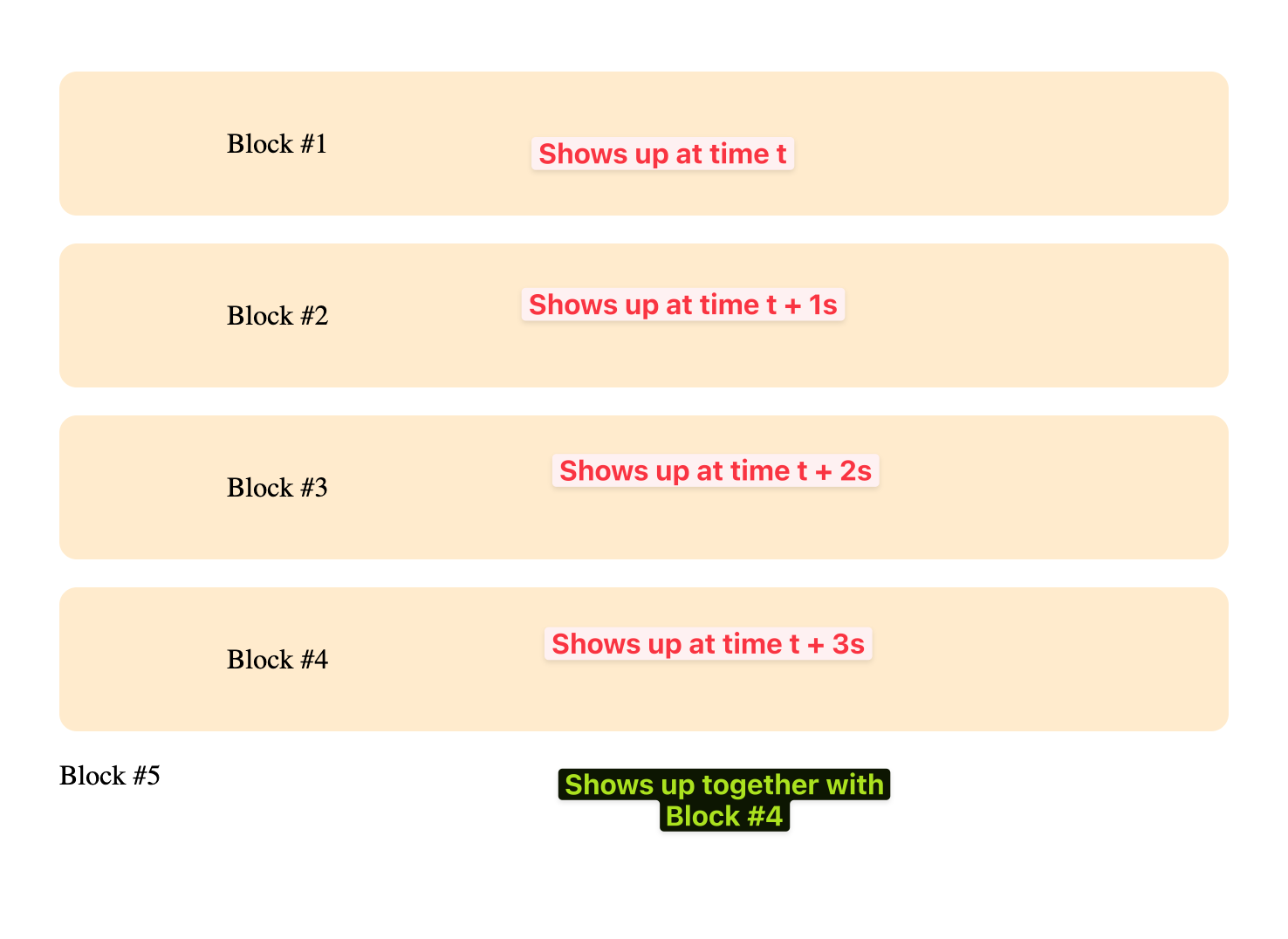 Describing the parallelized rendering of each block.
Give this a look in your Chrome browser.
How to take advantage of streaming
Since Astro supports streaming by default, understanding and applying it is the first step to taking advantage of streaming.
Consider the following example:
---
import { sleep } from "../sleep";
const getSomeData = async () => {
await sleep(1000);
return "some data ";
};
const getSomeOtherData = async () => {
await sleep(200);
return "another data";
};
const data = await getSomeData();
const otherData = await getSomeOtherData();
---
<html>
<head>
<title>Product</title>
</head>
<body>
<h2>A name</h2>
<p>{data}</p>
<h2>A fact</h2>
<p>{otherData}</p>
</body>
</html>
In the example above, we presumably need to fetch two resources, data and otherData. But our solution blocks streaming. We wait for await getSomeData() and await getSomeOtherData() before sending the full page to the browser.
If we wanted to take advantage of server streaming, we could either render the promises directly within the markup:
---
import { sleep } from "../sleep";
const getSomeData = async () => {
await sleep(1000);
return "some data ";
};
const getSomeOtherData = async () => {
await sleep(200);
return "another data";
};
---
<html>
<head>
<title>Product</title>
</head>
<body>
<h2>A name</h2>
<p>{getSomeData}</p>
<h2>A fact</h2>
<p>{getSomeOtherData}</p>
</body>
</html>
Or extract the data fetching to child components:
---
import Data from '../components/Data.astro'
import OtherData from '../components/OtherData.astro'
---
<html>
<head>
<title>Product</title>
</head>
<body>
<h2>A name</h2>
<!-- Handle fetch of data in <Data /> -->
<Data />
<h2>A fact</h2>
<!-- Handle other data fetch in <OtherData /> -->
<OtherData />
</body>
</html>
Excellent!
Wrapping Up This Chapter
Server-side rendering is powerful and opens up many opportunities in our application. But with much power comes responsibility.
So, before considering making every page in your application server-rendered, consider the pros and cons (as discussed in Chapter 3). Then, make the right decision for your application — that’s where true responsibility lies. And do not forget to leverage hybrid rendering where possible.
 Chapter seven.
Chapter 7: Be Audible! (How to Build a Fullstack Astro Project)
… People will believe what they see. Let them see. ― Henry David Thoreau
In this chapter, I’ll ask you to see beyond static apps and build a full stack application with Astro. To view the complete application, see the GitHub repo.
What You’ll Learn
- The ability to add authentication to an Astro application.
- An understanding of setting up a backend for an Astro application.
- A working knowledge of handling form submissions without dedicated API routes.
- Hands-on experience uploading and retrieving data in an Astro application.
- An understanding of the kind of apps you can build with Astro.
Project Setup
We’ve seen how to build static sites with Astro. So, to make this section laser-focused on scripting and Astro features, I’ve set up a static site for us to work on here.
The site has been stripped of any relevant functionality. We will build those step-by-step together.
Start by cloning the project:
git clone https://github.com/understanding-astro/fullstack-astro
Change directories:
cd fullstack-astro
You should be on the clean-slate branch by default. Otherwise, check out to clean-slate.
Next, install dependencies and start the application:
npm install && npm run start
The application should successfully run on one of the local server ports.
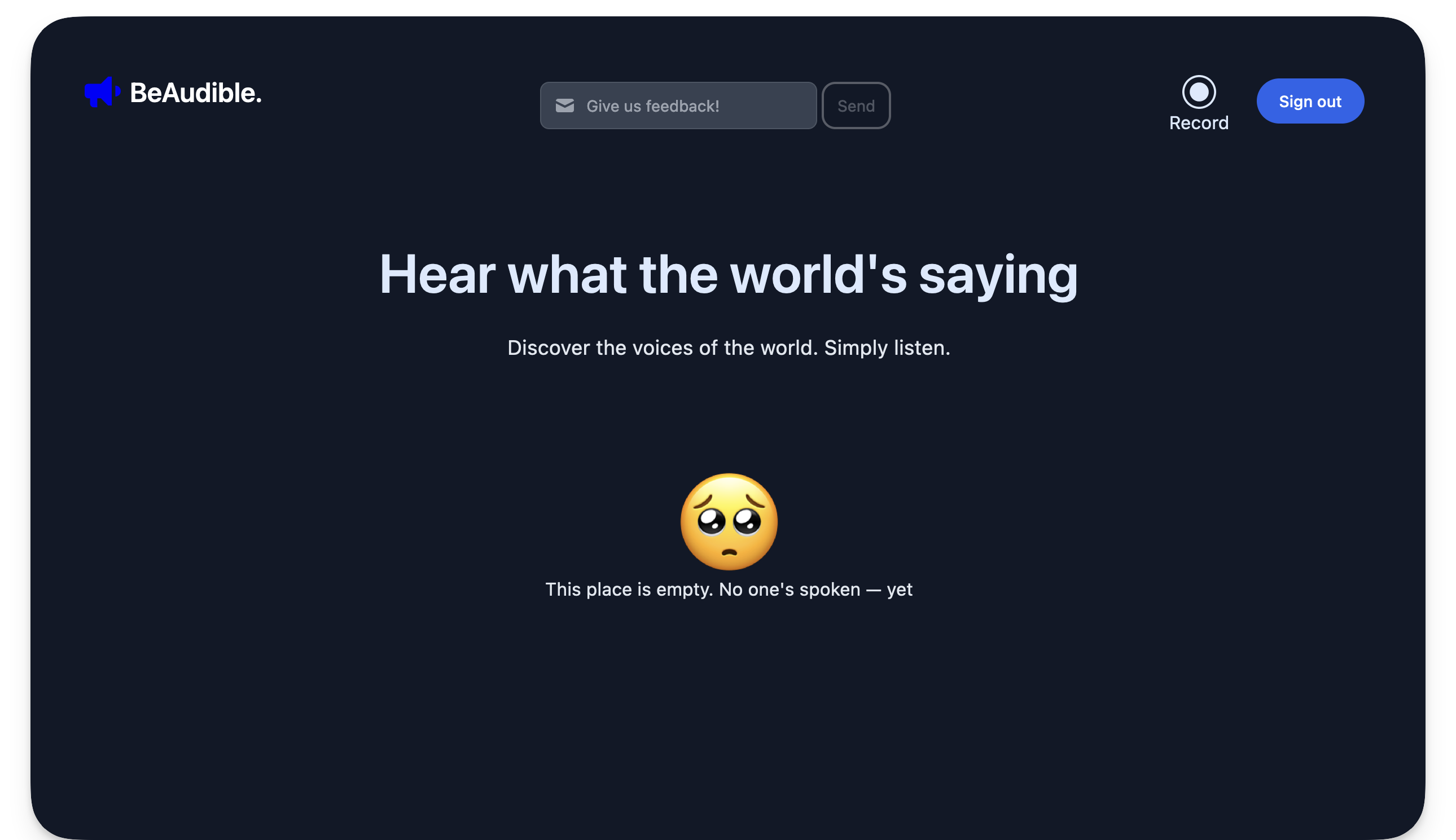 The BeAudible app initialised.
Project Overview
Our application is for a hypothetical startup, BeAudible. Its mission is to discover the voices of the world.
In technical terms, BeAudible lets authorised users create audio recordings, upload them to their servers, and have a timeline where people can listen to everyone’s recordings.
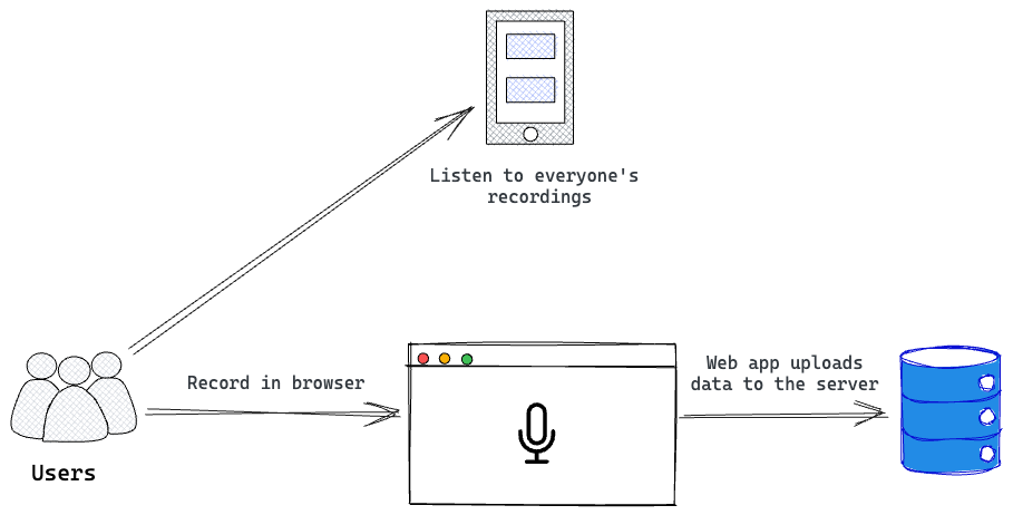 An overview of the BeAudible application.
The project we just cloned will receive and upload a user’s recording and eventually display every recording on a shared timeline.
Let’s explore the pages in the project.
The homepage
Firstly, consider the homepage, that is the base route /.
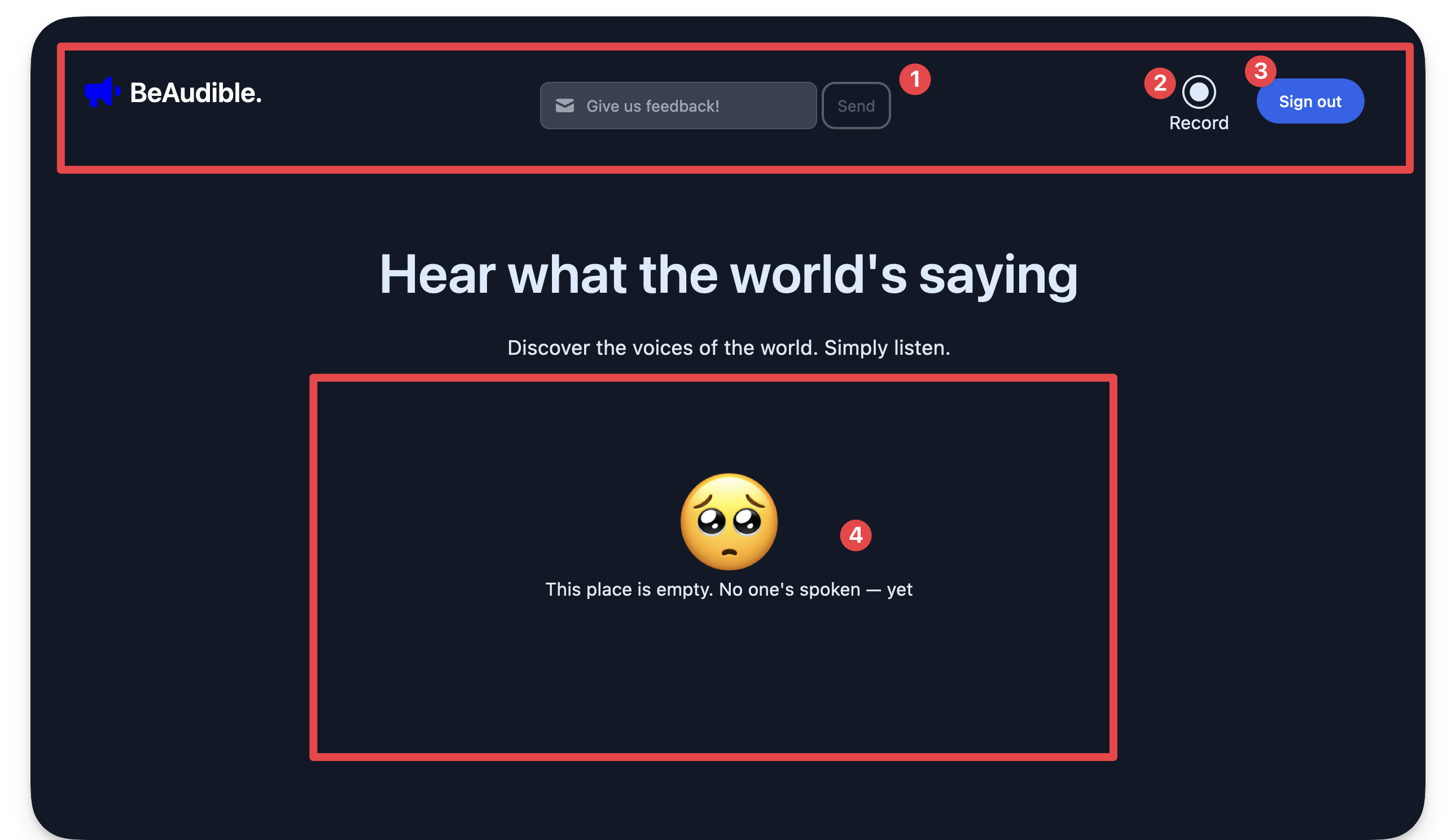 The sections of the BeAudible application.
- The navigation bar holds a feedback form for users to send their thoughts.
- The navigation bar includes a record link to navigate to a dedicated page for recording a user’s audio.
- The navigation bar contains a sign-out button. By implication, the homepage should be protected, that is only authenticated users should land here.
- Finally, in the centre of the page lies the timeline that should list all users’ recordings.
The record page
If you click “Record” from the navigation bar, you will be navigated to the /record route where a user can record their audio.
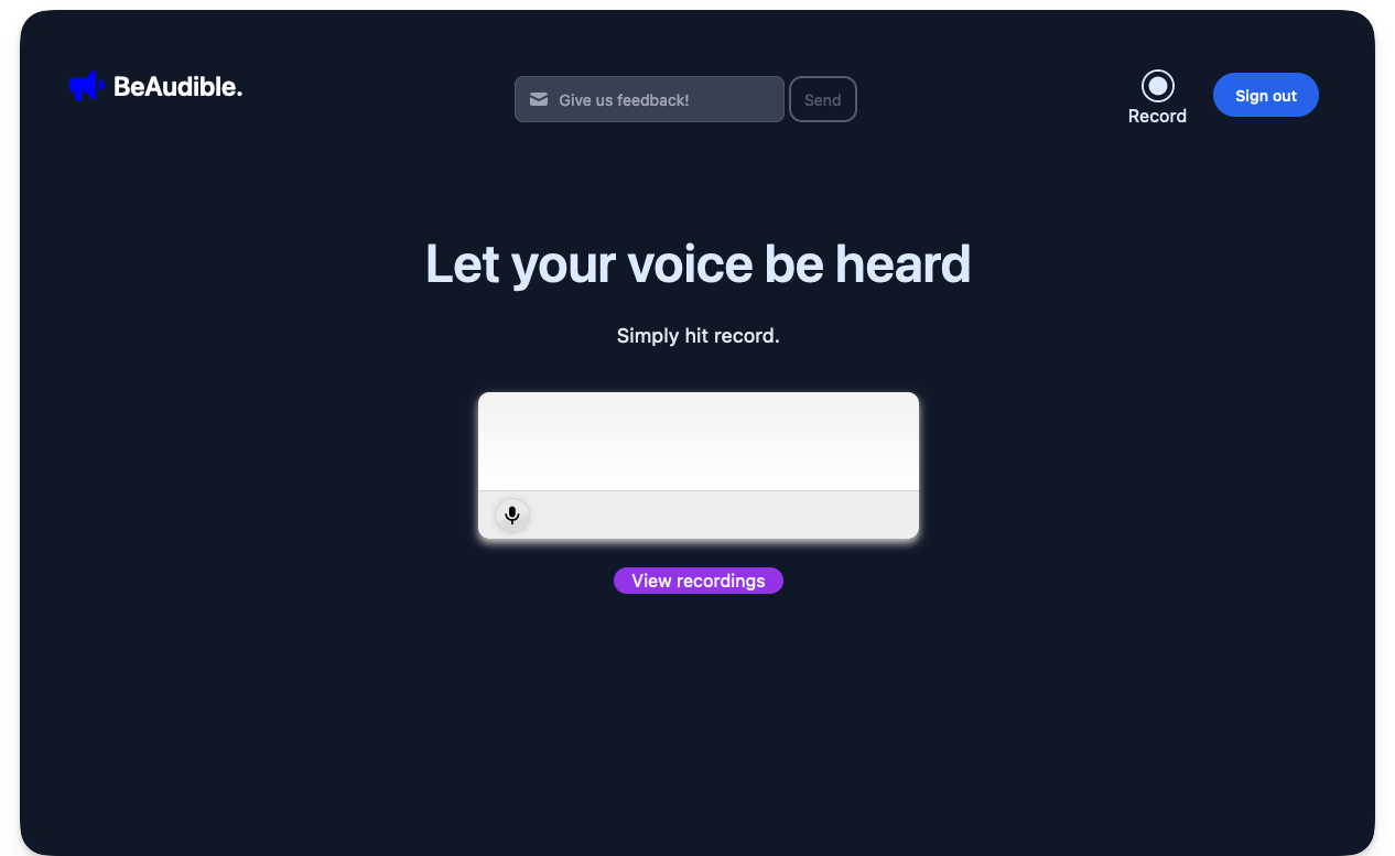 The record page.
A React component hydrated in the Astro application powers the recording user interface element.
The signup page
Now, go to the /signup route.
 The sign-up page.
This is the page to sign up users to BeAudible.
The sign-in page
Finally, visit the /signin route.
 The sign-in page.
This is the page for previously authenticated users to log in to the application.
Go ahead and kill the running application from the terminal. Then, we’ll continue with some setup.
Helper components and utilities
To ensure our focus remains on Astro, I created UI components and stored them in the src/components folder.
We will import and use these components to develop our solution as we proceed.
Similarly, constants have been stored in src/constants and utility scripts in src/scripts. We aim to concentrate on the critical objective of this chapter, which is to build a full stack application with Astro.
Technology Choices
- Firebase as a backend service: we can choose any backend service with Astro, but we’ll use Firebase for simplicity. The principles we’ll discuss work with any other preferred service. We will leverage Firebase’s authentication and cloud storage services.
- Tailwind for styling: Tailwind is famous for styling applications. Instead of writing the styles manually, the project uses Tailwind.
- Astro as the primary web framework: Of course, the web framework of choice for our application is Astro. No questions asked! But we will also leverage React components for islands of interactivity.
Backend Setup
Let’s point our attention to setting up our backend server. Remember, we will use Firebase as our backend service.
Go to the Firebase homepage and visit the Firebase console.
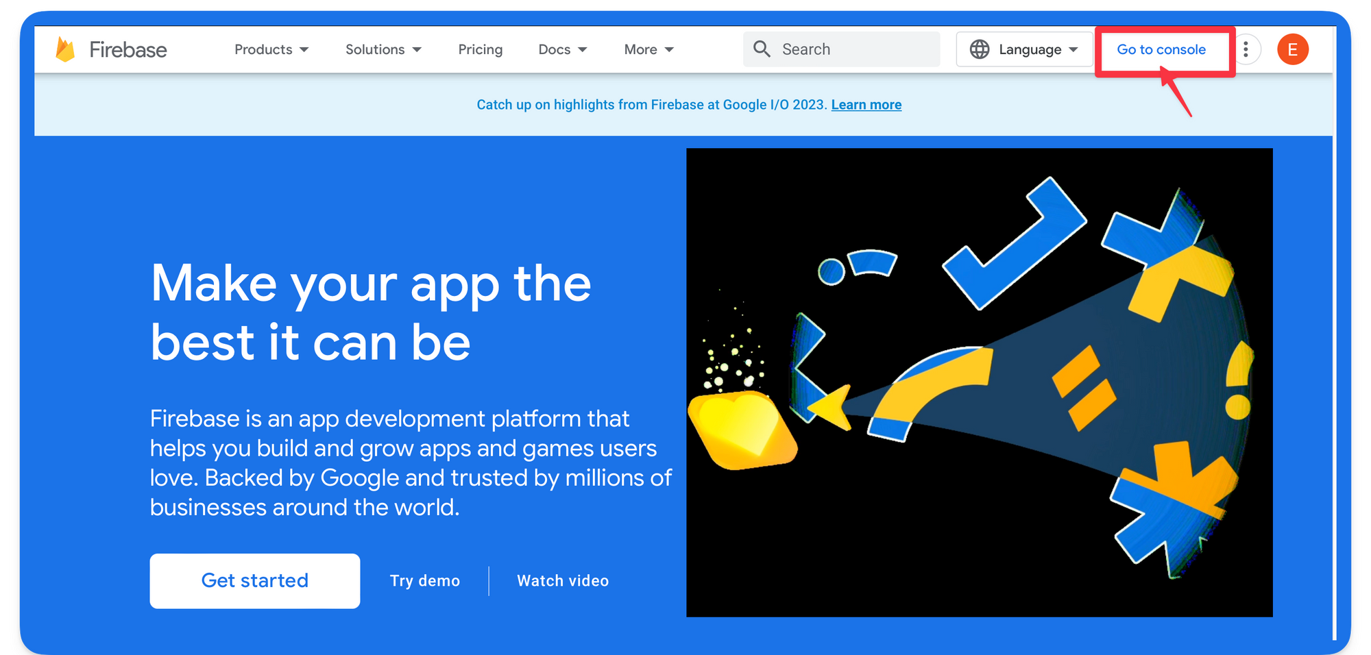 The Firebase homepage.
The process is much smoother if you have (and are signed in to) a Google account (for example, Gmail).
Next, create a new Firebase project.
 Creating a new Firebase project.
Name the project BeAudible and choose whether to use Google Analytics in the project.
 Choosing Google analytics and creating the project.
After successfully creating the project, add a web application to the Firebase project.
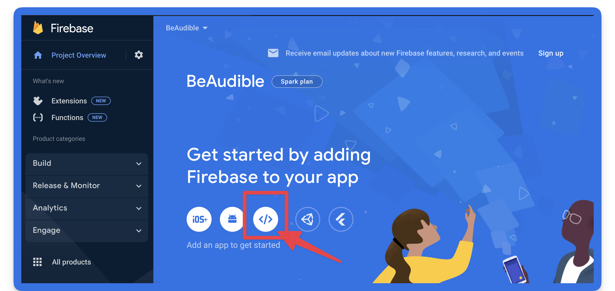 Adding a web application to the Firebase project.
Now, continue the web app set-up process by choosing a name (preferably the same as before), setting up Firebase hosting, and registering the web application.
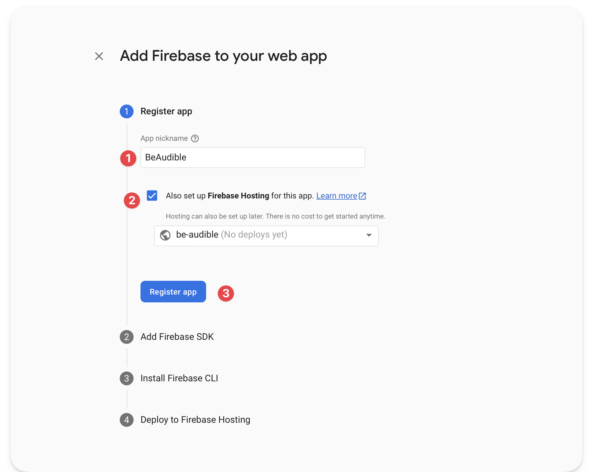 Continuing the application set-up.
The next step is critical.
Copy your web app’s Firebase configuration. We’ll use that to initialise the Firebase application client side.
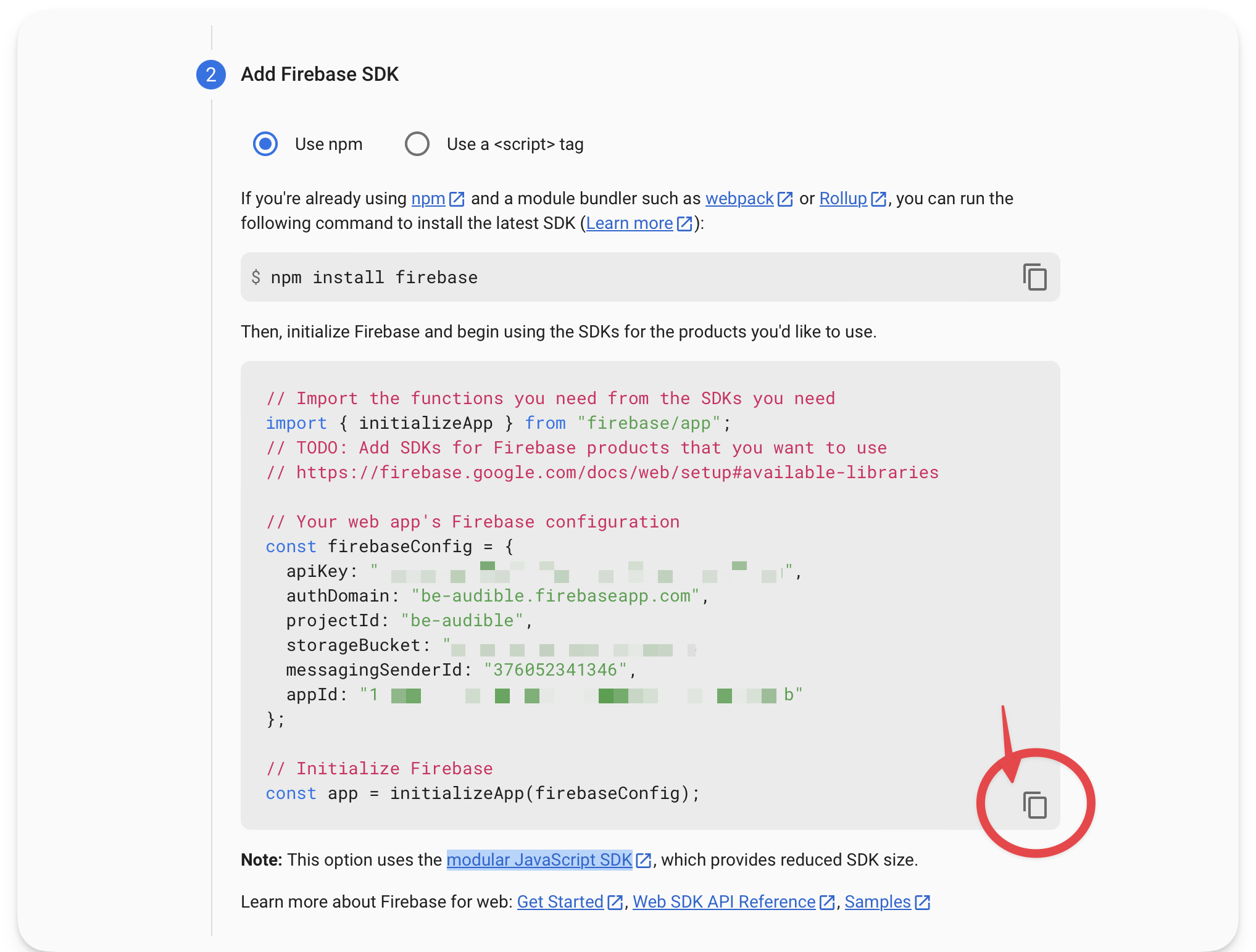 Copying the Firebase configuration for the client SDK.
The next steps are optional. Follow the guided prompt from Firebase and continue to the Firebase console.
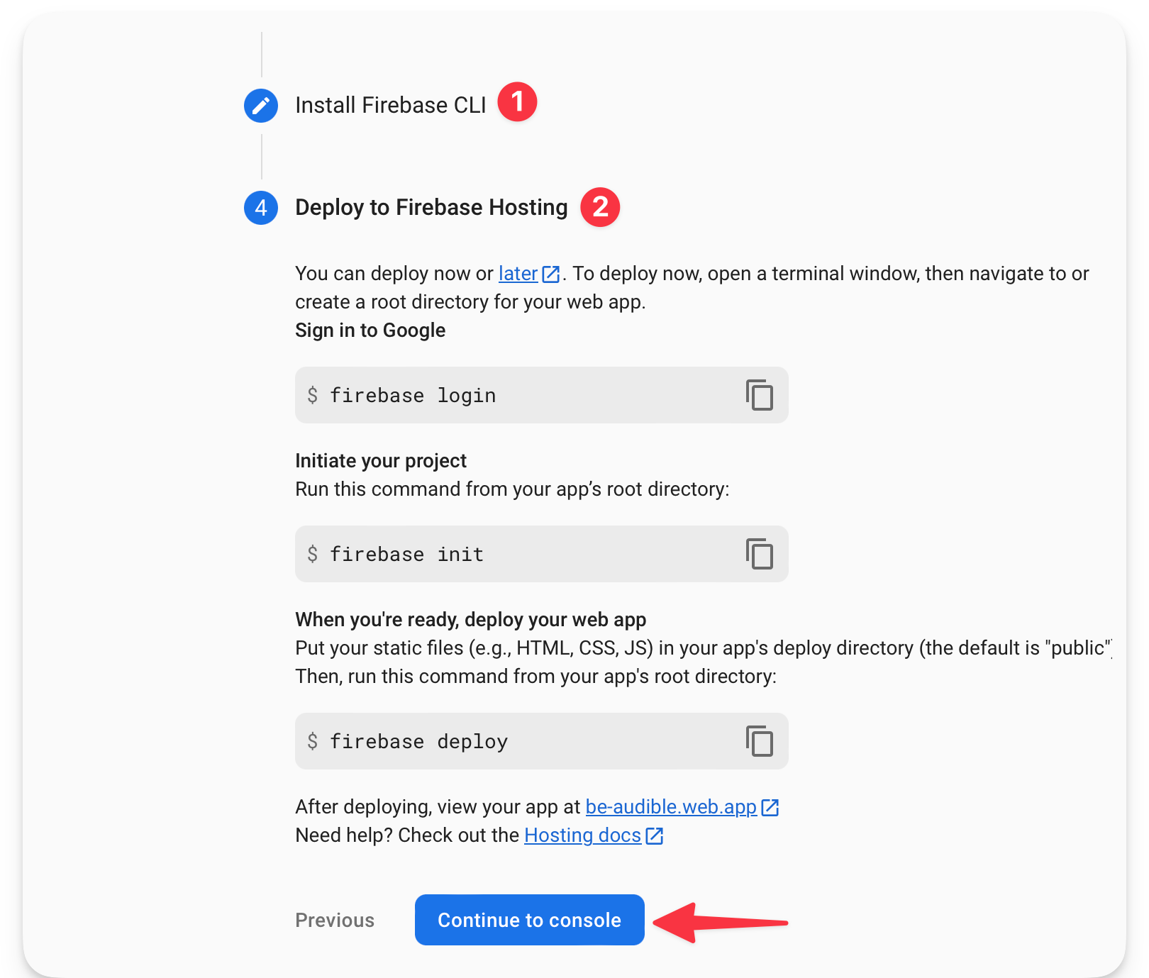 Following the guided prompt from Firebase.
Upon completion, we’ll be redirected to the Firebase application dashboard.
Go to the project settings, find the service account section, and generate a new private key that we’ll leverage in our server application.
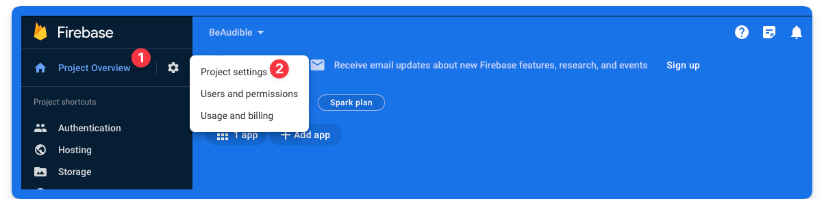 Project overview > Project settings
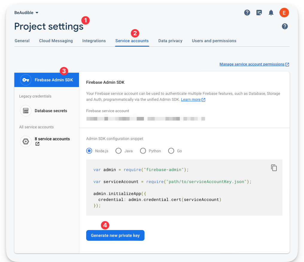 Generating a new private key.
This will download a JSON file to your machine. Keep it secure as it provides access to Firebase’s service. We will leverage this to access Firebase’s server resources from our application server.
How to Handle Authentication
Generally speaking, authentication is serious business and can take different forms.
Firebase provides an authentication service, so we will leverage its client libraries to authenticate the user client-side.
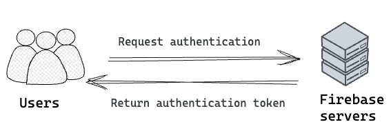 Simplified authentication process.
The client authentication will communicate with Firebase’s servers, but later on, we will look at verifying a user’s authentication token (JWT) on our server.
First, set up the Firebase application to receive client authentication requests.
Return to the Firebase console and set up authentication.
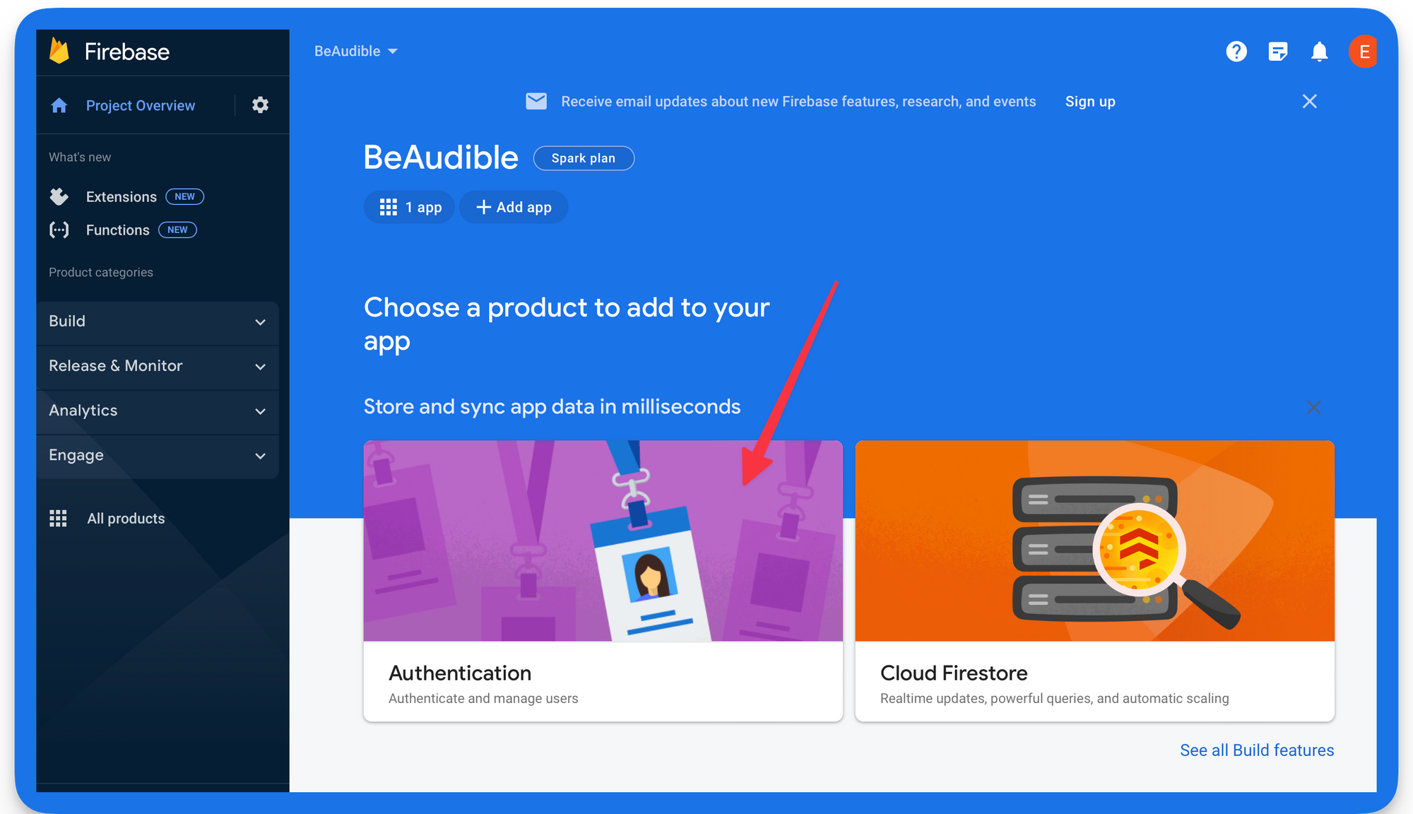 Select authentication from the list of provided services.
Firebase provides different sign-in methods. Let’s keep this simple. Enable the Email and password method from the Firebase console.
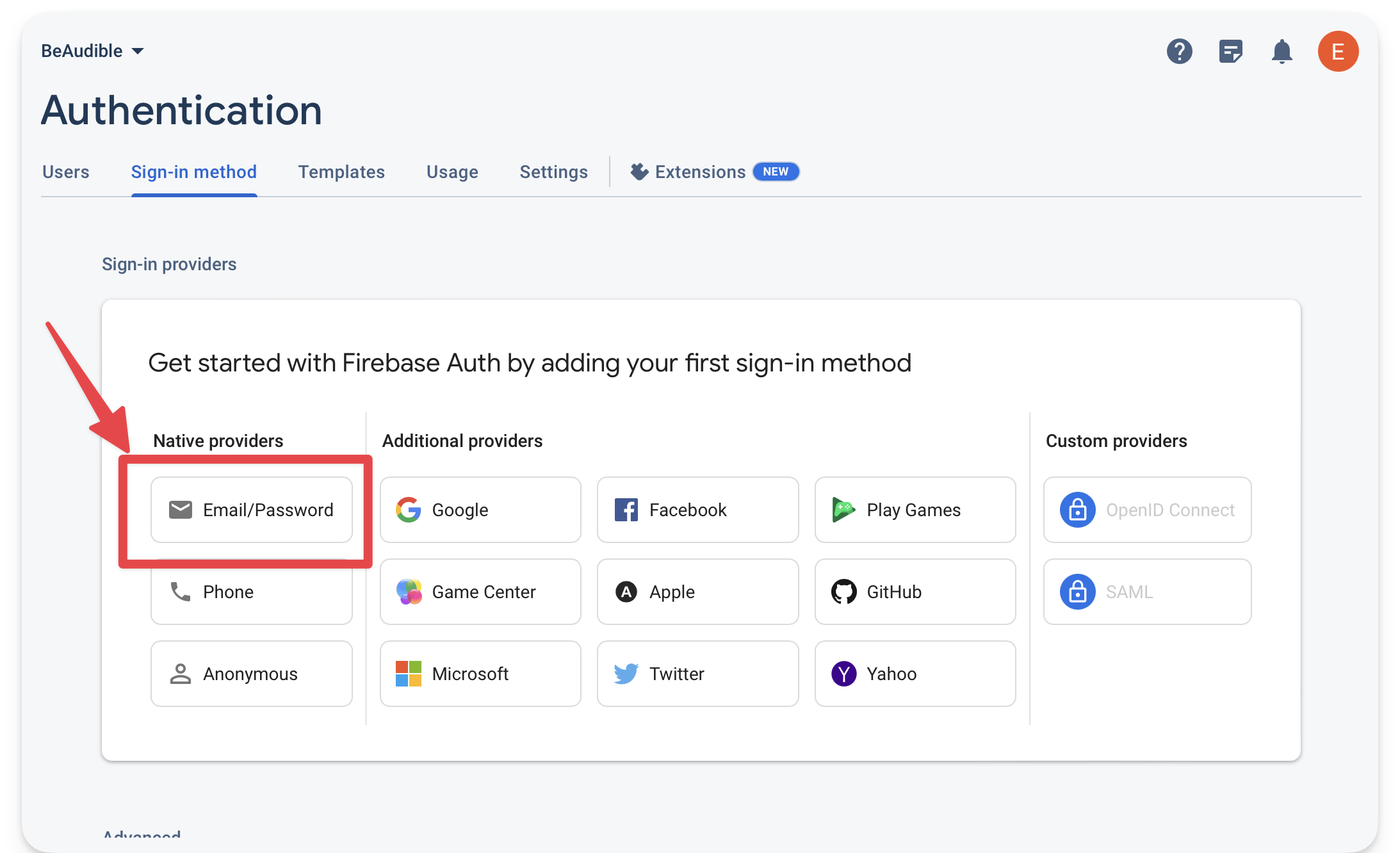 Selecting the email / password sign-in method.
Make sure to enable the option and hit save.
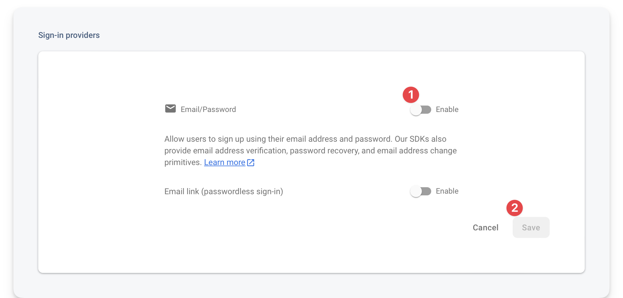 Enabling and saving the Email / Password sign-in method.
How to initialise Firebase on the client
src/scripts/firebase/init.ts contains the initialisation script for our client application.
The code responsible for initialising the application is shown below:
// ...
// 📂 src/scripts/firebase/init.ts
export const app = initializeApp(firebaseConfig);
export const auth = getAuth(app);
The script exports the initialised application via app and the authentication client module via auth where initializeApp and getAuth are methods imported from the Firebase SDK.
We must now replace the firebaseConfig variable with the object copied while initialising the Firebase application.
 The firebase client configuration.
Once this is done, we should have the Firebase client rightly initialised.
How to use the Firebase emulators
Talking to the production firebase services while testing and developing locally is rather silly.
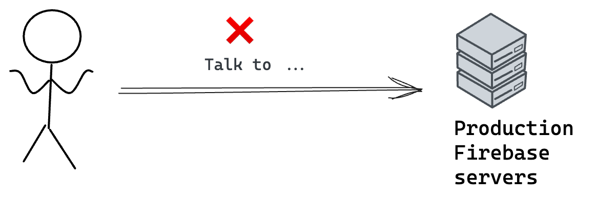 Sending requests to the production Firebase servers while developing locally.
Instead, we can use the Firebase Emulator Suite while developing locally. The emulator suite will intercept our Firebase service requests and provide a testing ground locally without hitting the production services.
I’ve set up the project to use the Firebase emulators. So let’s get it running.
Make sure you have the Firebase CLI tools installed. If you don’t, install the CLI via the following command:
npm install -g firebase-tools
Assuming you have the application running in one tab of your terminal, open another tab and run the firebase emulators script to start the firebase emulators:
npm run emulators
This will start the authentication and storage emulators with a user interface running on localhost:4001. We can view the development data in the emulator user interface, for example application user signups and uploaded recordings.
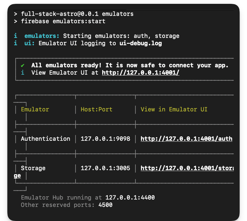 Starting the Firebase emulators.
How to handle user signups
So, how are we going to handle user signups?
Please consider the overall flow diagram below:
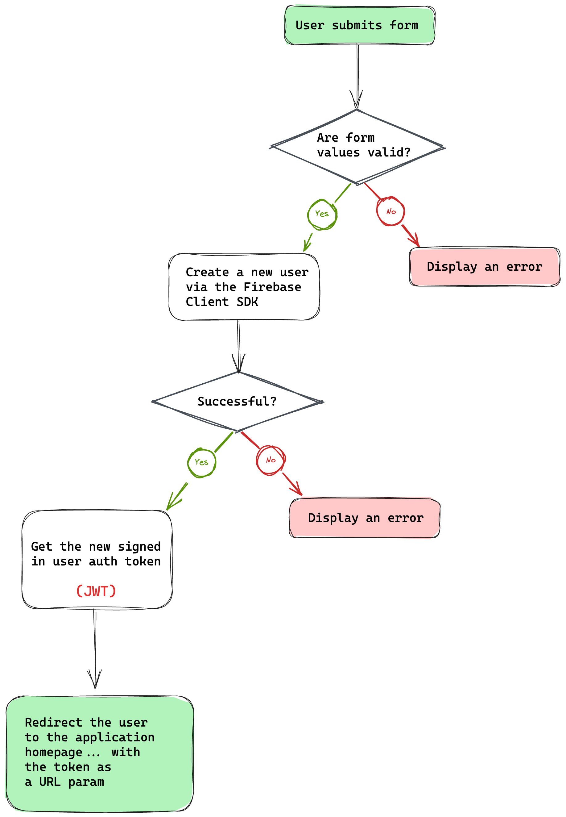 The signup flow.
- The flow kicks off with the user submitting the signup form.
- Then check if the submitted email and password are valid.
- If the form values are invalid, display an error.
- Create a new user via the
createUserWithEmailAndPasswordmethod of the Firebase auth module. - If the new user creation fails, display an error.
- Otherwise, our new user is now in a signed-in state.
- Grab the user auth token (this is called ID token in Firebase lingo and represents a JSON Web Token (JWT)).
- Redirect the user to the homepage with the token as a URL parameter, that is
/?token=${USER_AUTH_TOKEN}.
Before delving into the code for how to do this, I’d like to point out that the project has module aliasing set up to prevent pesky relative imports, for example:
// This ...
import { auth } from "../../firebase/init"
// Becomes this ...
import { auth } from "@scripts/firebase/init";
This is achieved by updating the tsconfig.json file to include the alias:
// 📂 tsconfig.json
{
// ...
"baseUrl": ".",
"paths": {
"@components/*": ["src/components/*"],
"@layouts/*": ["src/layouts/*"],
"@scripts/*": ["src/scripts/*"],
"@stores/*": ["src/stores/*"],
"@constants/*": ["src/constants/*"]
}
}
}
We will reference existing modules in the project via the relevant module alias.
Now, here is the annotated code for handling the user sign-up:
<!-- 📂 src/pages/signup.astro -->
<script>
// import the Validator from the tiny "validator.tool" library
import Validator from "validator.tool";
import { createUserWithEmailAndPassword } from "firebase/auth";
// Import the auth module from `src/scripts`
import { auth } from "@scripts/firebase/init";
// Import basic form validation rules
import { authClientValidationRules } from "@scripts/authClientValidationRules";
// Type alias for the form values
type FormValues = {
email?: string;
password?: string;
};
// Grab the submit button element
const submitButton = document.getElementById(
"submit-signup-form"
) as HTMLButtonElement | null;
// Grab the form element
const form = document.getElementById("signup-form") as HTMLFormElement | null;
// Initialise the validator
const validator = new Validator({
form,
// Pass in basic rules already existing in the project
rules: authClientValidationRules,
});
if (validator.form) {
// Attach a submit event handler on the form
validator.form.onsubmit = async (evt) => {
evt.preventDefault();
const errors = validator.errorMessages;
const values = validator.getValues() as FormValues;
//Check for errors
if (Object.keys(errors).length > 0) {
const errorMessages = Object.values(errors).join("...and...");
return alert(errorMessages);
}
const { email, password } = values as Required<FormValues>;
if (!submitButton) {
return alert("Missing form button");
}
try {
// Show submitting state
submitButton.innerText = "Submitting";
submitButton.disabled = true;
// Create the new user
const { user } = await createUserWithEmailAndPassword(
auth,
email,
password
);
// redirect the user to the homepage with their token
const token = await user.getIdToken();
window.location.href = `/?token=${token}`;
} catch (error) {
submitButton.innerText = "Signup";
submitButton.disabled = false;
alert(error);
}
};
}
</script>
In the solution above, we’re handling form validation via validator.js but could have used any other library. Another minimal framework agnostic library that makes a good choice is Felte.
How to handle user sign-in
With user sign-up handled, the process for user sign-in is the same except for one change. Instead of calling the createUserWithEmailAndPassword method, we’ll use the signInWithEmailAndPassword Firebase auth method.
Notice how the flow is identical in the code below:
<!-- 📂 src/pages/signin.astro -->
<!-- ... -->
<script>
import { signInWithEmailAndPassword } from "firebase/auth";
import Validator from "validator.tool";
import { auth } from "@scripts/firebase/init";
import { authClientValidationRules } from "@scripts/authClientValidationRules";
type FormValues = {
email?: string;
password?: string;
};
const form = document.getElementById("signin-form") as HTMLFormElement | null;
const submitButton = document.querySelector(
"#signin-form button[type='submit']"
) as HTMLButtonElement | null;
const validator = new Validator({
form,
rules: authClientValidationRules,
});
if (validator.form) {
validator.form.onsubmit = async (evt) => {
evt.preventDefault();
const errors = validator.errorMessages;
const values = validator.getValues() as FormValues;
if (Object.keys(errors).length > 0) {
const errorMessages = Object.values(errors).join("...and...");
return alert(errorMessages);
}
const { email, password } = values as Required<FormValues>;
if (!submitButton) {
return alert("Missing form button");
}
try {
submitButton.innerText = "Submitting";
submitButton.disabled = true;
const { user } = await signInWithEmailAndPassword(
auth,
email,
password
);
const token = await user.getIdToken();
window.location.href = `/?token=${token}`;
} catch (error) {
submitButton.innerText = "Signin";
submitButton.disabled = false;
alert(error);
}
};
}
</script>
With these in place, we’ve got authentication handled!
But a question that may remain in your heart is, why exactly are we sending the user token in the homepage redirect URL?
How to Implement Protected Pages
Every page in our application is statically generated except for index.astro, that is the homepage.
The homepage is server-side rendered because we want to ensure it’s protected, and that only authenticated users ever land here.
We will discuss how we’ll achieve this, but first we need to write some code that runs on the server here.
How to initialise Firebase on the server
During the project initialisation, we downloaded a private key for server access. This is a JSON file in the form:
{
type: "...",
project_id: "..."
// more properties
}
We need these values to initialise our server application. So, create a .env file to store these secrets. Then, we’ll break up the JSON keys into individual environment variables as shown below:
FIREBASE_PRIVATE_KEY_ID="..."
FIREBASE_PRIVATE_KEY="..."
FIREBASE_PROJECT_ID="..."
FIREBASE_CLIENT_EMAIL="..."
FIREBASE_CLIENT_ID="..."
FIREBASE_AUTH_URI="..."
FIREBASE_TOKEN_URI="..."
FIREBASE_AUTH_PROVIDER_CERT_URL="..."
FIREBASE_CLIENT_CERT_URL="..."
Save the env file. Without this, we won’t be able to access the application resources from our server.
✨ Fun fact: As discussed in Chapter 5, we’re providing TypeScript support for these environment values in .env.d.ts.
How to protect the home page route
Once a user has successfully signed in, Firebase generates a unique ID token that serves as their unique identifier and provides access to various resources, such as Firebase Cloud Storage.
I have loosely referred to this as auth tokens. We will use this ID token to recognise the user on our server.
✨ Fun fact: Firebase ID tokens are short-lived and last for an hour.
Consider the flow below:
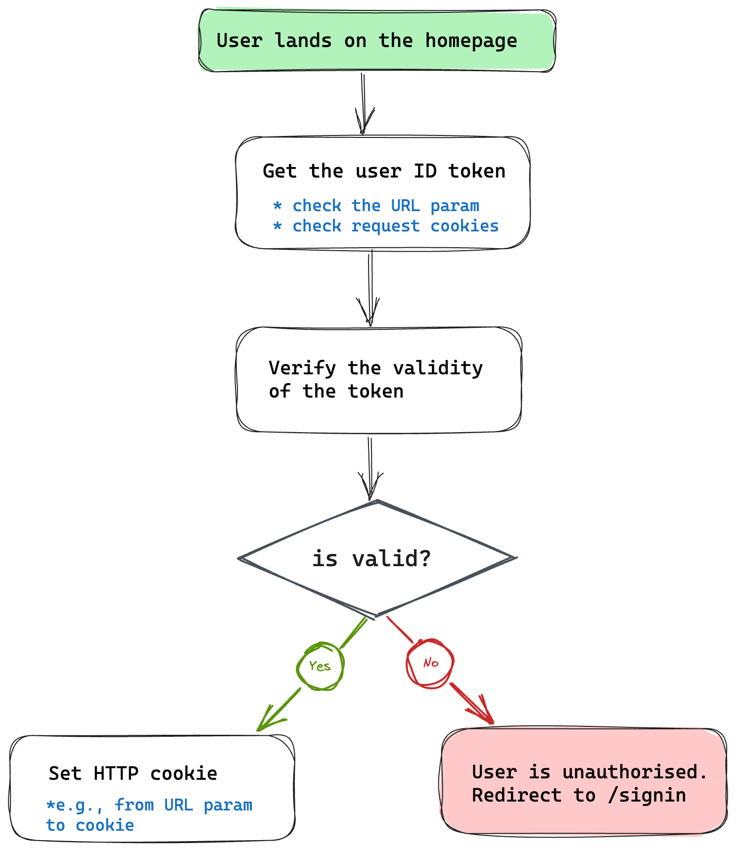 The protected route flow.
- The flow kicks off with the user landing on the homepage.
Note that the following steps are performed on the server, that is within the frontmatter section of our server-side rendered page.
- Then, retrieve the user ID token from the URL (first-time user) or the request cookies (returning user).
- Verify the validity of the token. We will use the Firebase server SDK (Firebase admin) to check this.
- If the token is invalid or doesn’t exist, the user is unauthorised. Redirect them to the
/signinpage. - If the token is valid, set the
tokenas a cookie.
✨Fun fact: by setting the token via cookies, we can remove the token from the URL and refresh without losing the user signed-in state. Every request will send back the cookie to the server, where we can recheck its validity.
Now, here’s the implementation:
// 📂 src/pages/index.astro
---
// ...
import { serverApp } from "@scripts/firebase/initServer";
import { getAuth } from "firebase-admin/auth";
import { TOKEN } from "@constants/cookies";
// Get client token from the URL param
const url = new URL(Astro.request.url);
const urlTokenParam = url.searchParams.get("token");
// Get token from cookies
const cookieToken = Astro.cookies.get(TOKEN);
const token = urlTokenParam || cookieToken.value;
if (!token) {
// Unauthorised user. Redirect to sign in
return Astro.redirect("/signin");
}
const auth = getAuth(serverApp);
try {
// verify the auth token
await auth.verifyIdToken(token);
// set token cookie
// Note that the "TOKEN" constant refers to the string "X-Token."
Astro.cookies.set(TOKEN, token, {
path: "/",
httpOnly: true,
secure: true,
});
} catch (error) {
console.error("Could not decode token", {
fromCookie: !!cookieToken.value,
fromUrl: !!urlTokenParam,
});
// Error occurred, e.g., invalid token. Redirect to sign in
return Astro.redirect("/signin");
}
---
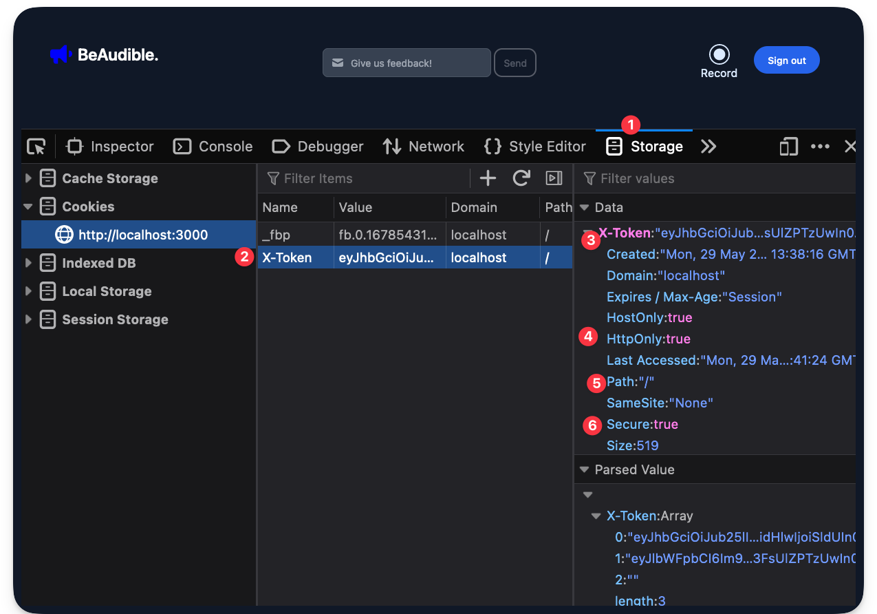 The token cookie set in the browser response.
How to update the redirect URL
When a user successfully signs in, the user looks something like localhost:3000/?token=${some-long-string}.
After performing our token validation on the server and returning the protected HTML page, we may update the URL to remove the token parameter.
// Before
localhost:3000/?token=${some-long-string}
// After
localhost:3000
This is not necessary, but a nice UX touch.
Since we want to do this on the client, our go-to solution is to add a client <script> to the page.
Consider the solution below:
<!-- 📂 src/pages/index.astro -->
<!-- ... -->
<script>
// Enhancement: remove the token from the URL after the page's parsed.
const url = new URL(window.location.href);
const urlTokenParam = url.searchParams.get("token");
if (urlTokenParam) {
// delete the token param from the URL
url.searchParams.delete("token");
// update history without a refresh with the new URL
window.history.pushState({}, "", url.href);
}
</script>
The solution is arguably easy to reason about, with the crux after getting the search parameter being window.history.pushState(...).
How to log out a user from the protected page
The top left section of the application’s navigation bar includes a sign-out button. When a user clicks this, we will sign them out of the application.
To sign out a user, we will use the Firebase client SDK to log a user out of the device.
But remember that the protected index page checks the token request cookie value.
When we sign out a user using the Firebase client SDK, the issued client token remains valid for up to an hour (depending on when it was issued).
So, consider the flow for our solution below:
 The user sign out flow (Click sign-out button, make a request to API endpoint, log out the user, re-ditrect user to sign-in page)
Let’s start our implementation by updating the client application to handle the click event on the sign-out button and initiate our flow as shown below:
<!-- 📂 src/pages/layouts/BaseLayout.astro -->
<!-- ... -->
<script>
import { auth } from "@scripts/firebase/init";
// Grab the sign-out button
const signoutButton = document.getElementById("sign-out-button") as
| HTMLButtonElement
| undefined;
if (signoutButton) {
// Add a click event listener on the button
signoutButton.addEventListener("click", async () => {
try {
// Disable the button while we log the user out
signoutButton.disabled = true;
// Change button text to read "Signing out ..."
signoutButton.innerText = "Signing out ...";
// Invalidate server http cookie
const response = await fetch("/api/auth/signout", {
method: "POST",
});
if (!response.ok) {
throw new Error("server signout failed");
}
/**
* sign the user out via the signOut method
* on the Firebase auth module
*/
await auth.signOut ();
// Redirect to the signin page
window.location.href = "/signin";
} catch (error) {
signoutButton.disabled = false;
alert(error);
}
});
}
</script>
We’re making a request to /api/auth/signout, but the API route does not exist.
Let’s change that with the following code:
// 📂 src/pages/api/auth/signout.ts
// ...
import { TOKEN } from "@constants/cookies";
export const post: APIRoute = (ctx) => {
ctx.cookies.delete(TOKEN, {
path: "/",
});
return {
body: JSON.stringify({ message: "successfully signed out" }),
};
};
After successful sign-out, attempt to visit the protected page localhost:3000, and you’ll be automatically redirected to /sign.
We’re now cooking with gas! 🔥
Cloud Storage Setup
We’ve got a big part of our application functioning — largely the authentication and keeping the index page protected. But we’re protecting an empty page at the moment. So users cannot record or view other users’ recordings.
Let’s fix this by setting up cloud storage to save user recordings on the server.
Go to the Firebase console and click “See all build features” to find the cloud storage service.
 Viewing all build features on the Firebase console.
Next, select the Storage service.
 Selecting the storage service.
Then begin the setup.
 Clicking get started on the Storage service page.
Keep the storage rules as-is:
 The default storage rules.
Then select a server location.
BeAudible is a hypothetical US startup, so I’ll choose a US location here.
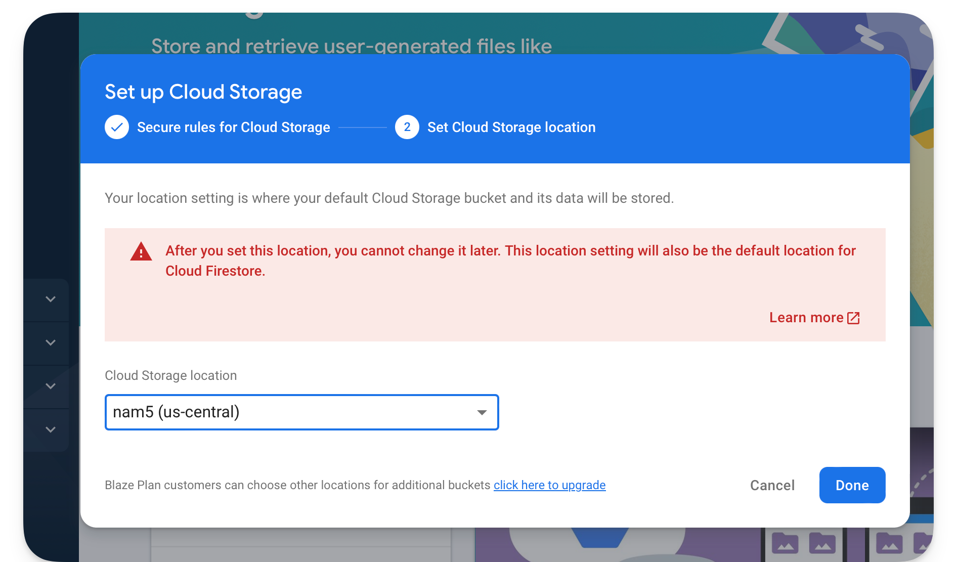 Selecting a Storage location.
Once the setup is complete, visit the Storage page and copy the bucket name in the form gs://{name-of-project}.appspot.com.
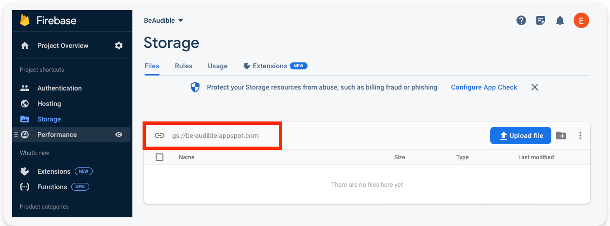 The Storage bucket name.
Excellent!
When we upload and get the user recordings, we’ll need this to connect to the storage servers.
How to Upload Audio Recordings
The recorder user interface is powered by a React Recorder component hydrated via the client:load directive.
<Recorder client:load>
...
</Recorder>
Open the Recorder component and consider the onAudioDownload callback.
// src/components/AudioRecorder.tsx
// ...
<VoiceRecorder
onAudioDownload={(blob: Blob) => {
// 👀 upload recording
}}
/>
After a user completes the recording, this callback will be invoked. Our first task is to go ahead and upload the audio blob to the server.
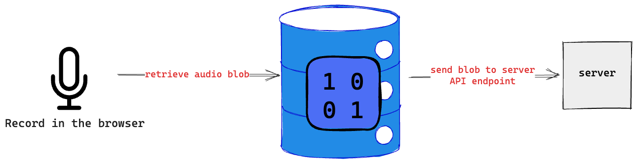 Sending audio blob to a server endpoint.
How to handle uploads via an API route
Let’s go ahead and create the API endpoint that’ll receive the audio blob from the client.
Consider the flow for our solution below:
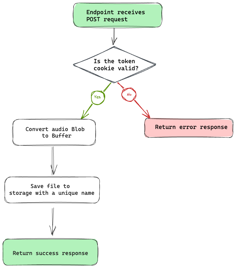 The save recording endpoint flow diagram (Endpoint receives post rquest. Is token valid? If yes, convert audio blob to buffer, save file to storage with unique name, and return success response. If not, return error response.
Now, here’s the annotated code:
// 📂 src/pages/api/recording.ts
// ...
import type { APIRoute } from "astro";
// nanoid will be used to generate unique IDs
import { nanoid } from "nanoid";
import { TOKEN } from "@constants/cookies";
import { getAuth } from "firebase-admin/auth";
import { BUCKET_NAME } from "@constants/firebase";
import { getStorage } from "firebase-admin/storage";
import { serverApp } from "@scripts/firebase/initServer";
// get firebase server auth module
const auth = getAuth(serverApp);
export const post: APIRoute = async (ctx) => {
// Create an error response
const authUserError = new Response("Unauthenticated user", { status: 401 });
try {
// Get token cookie
const authToken = ctx.cookies.get(TOKEN).value;
// not present, return error response
if (!authToken) {
return authUserError;
}
// verify the user token
await auth.verifyIdToken(authToken);
} catch (error) {
/**
* Return error response, e.g.,
* if the token verification fails
*/
return authUserError;
}
try {
// Get the audio blob from the client request
const blob = await ctx.request.blob();
// Get access to the firebase storage
const storage = getStorage(serverApp);
const bucket = storage.bucket(BUCKET_NAME);
// convert Blob to native Node Buffer for server storage
const buffer = Buffer.from(await blob.arrayBuffer());
const file = bucket.file(`recording-${nanoid()}.wav`);
// save to firebase storage
await file.save(buffer);
// return a successful response
return {
body: JSON.stringify({
message: "Recording uploaded",
}),
};
} catch (error) {
console.error(error);
return new Response("Something went horribly wrong", { status: 500 });
}
};
// ...
How to upload recordings from the client
Now that we’ve got the API endpoint ready to receive client requests, let’s go ahead and upload the user recordings from the client.
Instead of clogging our user interface components with the upload logic, I find it more maintainable to move such business logic away from the UI components and, in our case, have this collocated with the application state managed via nanastores.
Remember nanostores?
We’ll use nano stores for state management. The ~1kb library is simple and efficient for our use case.
Create a new audioRecording.ts file to handle our recording state and also be responsible for exposing a uploadRecording method.
Consider the implementation below:
// 📂 src/stores/audioRecording.ts
import { atom } from "nanostores";
/**
* Deterministic state representation
*/
type Store =
| {
blob: null;
status: "idle";
}
| {
blob: Blob;
status: "uploading" | "completed" | "failed";
};
/**
* Optional naming convention: $[name_of_store]
* instead of [name_of_store]Store
*, i.e., $audioRecording instead of audioRecordingStore
*/
export const $audioRecording = atom<Store>({
// Initialise the atom with the default state
blob: null,
status: "idle",
});
/**
* upload audio recording action
*/
export const uploadRecording = async (blob: Blob) => {
// Update $audioRecording state to "uploading."
$audioRecording.set({
status: "uploading",
blob,
});
try {
// POST request to our recording endpoint
const response = await fetch("/api/recording", {
method: "POST",
body: blob, // pass blob as the request body
});
if (response.ok) {
// Successful? Update state to "completed."
$audioRecording.set({
status: "completed",
blob,
});
} else {
// Request failed. Update state to "failed."
$audioRecording.set({
status: "failed",
blob,
});
}
} catch (error) {
$audioRecording.set({
status: "failed",
blob,
});
} finally {
// after 't' revert state to idle again
const timeout = 3000;
setTimeout(() => {
$audioRecording.set({
status: "idle",
blob: null,
});
}, timeout);
}
};
Our UI state is well-represented, and the upload action is defined. But this will only take effect when used in the UI component.
How to react to UI changes in framework components
We will now update the AudioRecorder UI component to react to the state in the $audioRecording store as shown below:
// 📂 src/components/AudioRecorder.tsx
/**
* The useStore hook will help with the React
* component rerenders. In simple terms, it'll hook into the
* store and react upon any change.
*/
import { useStore } from "@nanostores/react";
import { VoiceRecorder } from "react-voice-recorder-player";
// Import the store and the upload recording action
import { $audioRecording, uploadRecording } from "@stores/audioRecording";
type Props = {
cta?: string;
};
export const Recorder = (props: Props) => {
// Get the current application state from the store
const state = useStore($audioRecording);
// React deterministically based on the status of the store
switch (state.status) {
case "idle":
return (
<div>
<VoiceRecorder
// 👀 Invoke uploadRecording after a user completes the recording
onAudioDownload={(blob: Blob) => uploadRecording(blob)}
/>
{props.cta}
</div>
);
/**
Show relevant UI during the uploading state.
**/
case "uploading":
return (
<div className="flex items-center justify-center w-56 h-56 border border-gray-200 rounded-lg bg-gray-50 dark:bg-gray-800 dark:border-gray-700">
<div className="px-3 py-1 text-xs font-medium leading-none text-center text-blue-800 bg-blue-200 rounded-full animate-pulse dark:bg-blue-900 dark:text-blue-200">
Uploading ...
</div>
</div>
);
/**
Show relevant UI during the failed state.
**/
case "failed":
return (
<div className="bg-red-400 rounded-md py-6 px-3 text-slate-100 motion-safe:animate-bounce">
An error occurred uploading your recording
</div>
);
/**
Show relevant UI during the completed state.
**/
case "completed":
return (
<div className="bg-green-400 rounded-md py-6 px-3 text-slate-100 motion-safe:animate-bounce">
Successfully published your recording!
</div>
);
/**
Typescript exhaustive checking
@see https://www.typescriptlang.org/docs/handbook/2/narrowing.html#exhaustiveness-checking
**/
default:
const _exhaustiveCheck: never = state;
return _exhaustiveCheck;
}
};
Now, a user should be able to record in the browser, and we will go ahead and save the recording on our backend.
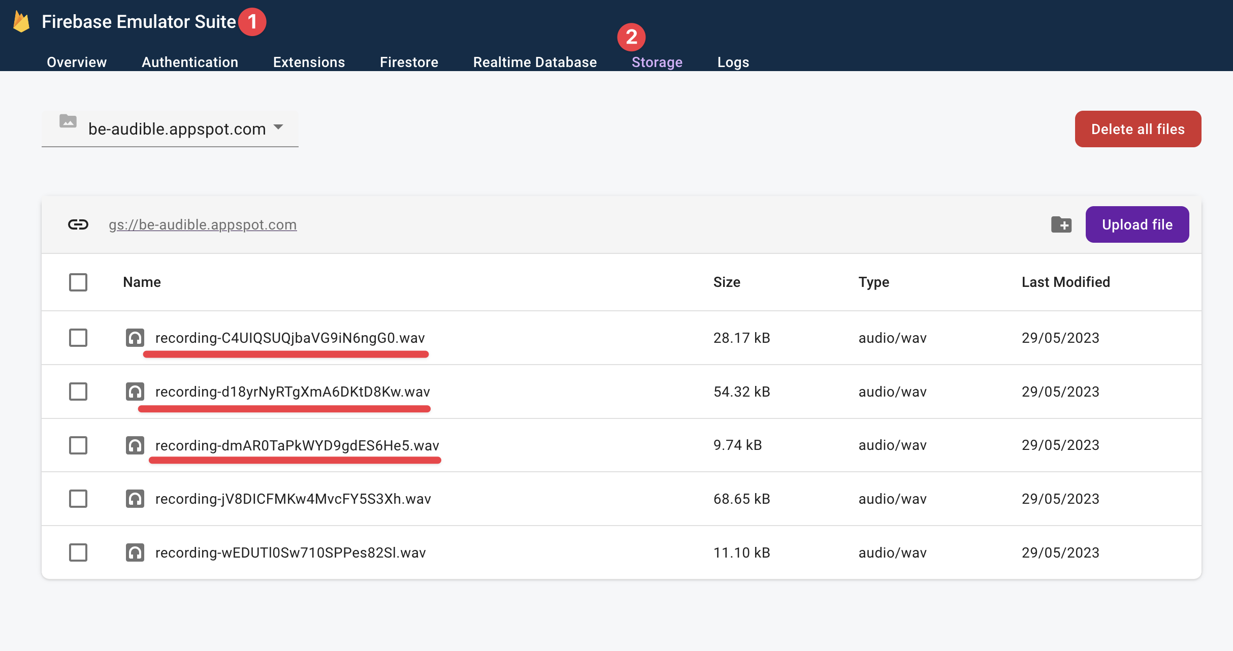 Viewing saved recordings in the Firebase emulator.
How to Fetch Data from the Server
We’re correctly saving user recordings, but at the moment they can’t be viewed on the homepage.
Let’s resolve that.
Our solution is to fetch the recordings on the server and send the rendered HTML page to the client.
Here’s the code solution:
// 📂 src/pages/index.astro
---
import { BUCKET_NAME } from "@constants/firebase";
import LinkCTA from "@components/LinkCTA.astro";
import AudioPlayer from "@components/AudioPlayer.astro";
// ...
// Represent the recordings with the "Audible" type alias
type Audible = { url: string; timeCreated: string };
// audibles will hold the list of "Audibles."
let audibles: Audible[] = [];
const storage = getStorage(serverApp);
try {
/**
* After verifying the user auth token
* and setting the token cookie ...
*/
try {
// get all recordings in the storage bucket
const bucket = storage.bucket(BUCKET_NAME);
const [files] = await bucket.getFiles();
audibles = await Promise.all(
files.map(async (file) => {
const [metadata] = await file.getMetadata();
// return the url and timeCreated metadata
return {
url: file.publicUrl(),
timeCreated: metadata.timeCreated,
};
})
);
} catch (error) {
console.error(error);
console.error("Error fetching audibles");
return Astro.redirect("/signin");
}
}
//...
---
Now update the component template section to render the “audibles”. We’ll leverage the AudioPlayer component, passing it the audible url and the timeCreated metadata.
<div class="flex flex-col items-center">
{
audibles.length === 0 ? (
<>
<Empty />
<LinkCTA href="/record">Record</LinkCTA>
</>
) : (
audibles
.sort((a, b) =>
new Date(a.timeCreated) < new Date(b.timeCreated) ? 1 : -1
)
.map((audible) => (
<AudioPlayer url={audible.url} timeCreated={audible.timeCreated} />
))
)
}
</div>
In the code above, we display an Empty user interface empty if there are no audibles. Otherwise, we render a sorted list of audibles.
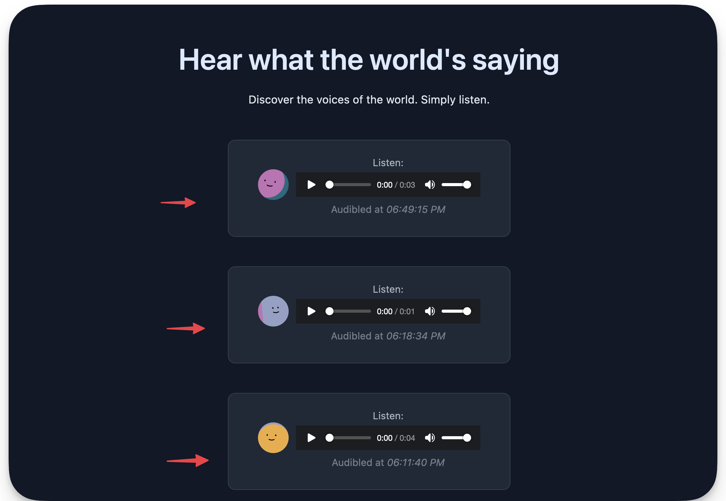 Rendering the sorted list of audio recordings.
How to Submit HTML forms
The final puzzle in our application is handling the submission of the feedback form.
I’ve included this feature to show an example of handling a form within the same server-side rendered page, that is without creating an API endpoint to handle the form request.
Take a look at the form element and notice how its method attribute is set to POST:
// 📂 src/layouts/BaseLayout.astro
// ...
<form class="mx-auto flex" method="POST">
...
</form>
By default, the browser will send a POST request to the server when this form is submitted, which we can capture and react upon.
In the frontmatter section of the index.astro page, we can add a condition to handle the feedback form requests as shown below:
// ...
if (Astro.request.method === "POST") {
try {
// Get the form data
const data = await Astro.request.formData();
/**
* Get the feedback value.
* Corresponds to the form input element value of the name, "feedback".
*/
const feedback = data.get("feedback");
// Do something with the data
console.log({ feedback });
// Do something with the data
} catch (error) {
if (error instanceof Error) {
console.error(error.message);
}
}
}
// ...
I’m keeping this simple by just logging the feedback on the server. But we could save this value to a database in the real world. The crux here is receiving the form values, as shown above.
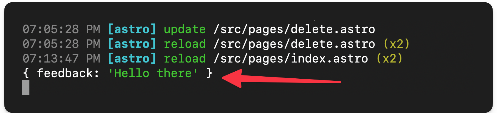 The logged feedback data.
Wrapping Up This Chapter
Astro is great for building content-focused websites such as blogs, landing pages, and so on. But, we can do much more with it.
Suppose you can build the application as a multi-page application (MPA), that is not a single-page application, and can leverage islands of interactivity (component islands). In that case, you can build it with Astro.
 Chapter eight.
Chapter 8: Build Your Own Astro Integrations
At the end of this chapter, you’ll join the order of mages who wield great power to bend Astro to their will with new functionality and behaviour.
What You’ll Learn
- The relationship between Astro and the Vite module bundler
- The different types of integrations available in Astro
- Build your first Astro integration
- Understand the Astro hooks lifecycle
- Deepen your knowledge of building custom Astro feature integrations
Astro and Vite
Before we dive into the beautiful world of Astro integrations, we need to know who’s powering the Astro build ship - and that’s Vite, the build tool all about speed, efficiency and flexibility.
Think of Vite as our trusty co-pilot, helping us bundle our web pages and creating a lightning-fast development environment.
 The Astro Vite relationship.
To build the custom integrations we’re dreaming of, we may need to go beyond Astro and venture deep into Vite territory, for example customising the build step with Vite plugins.
Now, I know this might not be very clear, especially when we start talking about Vite in the upcoming sections of this chapter. But fear not - you now know why Vite is essential to the build process, and I’ll explain with examples in the coming sections of this chapter.
What are Astro Integrations?
By definition, Astro integrations extend Astro with new functionality and behaviour within your project.
We’ll find ourselves building three types of Astro integrations, namely:
- Renderers: these integrations enable a framework component’s rendering (typically server-side rendering and client-side hydration). Examples of this include the official React, Preact, and Vue Astro integrations.
- Libraries: these integrations enable external library support within Astro. Examples of this include the official Tailwind and Partytown integrations.
- Features: these are integrations that extend the behaviour of Astro in a specific way, usually to support a user-defined feature set. Examples include the official sitemap integration that generates a sitemap when you build your Astro project.
For most people, the majority of integrations you build will be to support a particular feature, that is feature integrations. This will be the sole focus of this chapter. Once you have sufficient knowledge of building feature integrations, you can transfer the knowledge to library or renderer integrations.
Let’s get started with a contrived Astro integration.
Hello World. Sorry – Hello, Integration
Let’s get you acquainted with a basic hello world Astro integration. Even though we will be wielding swords and slaying dragons soon, before that you must get introduced to the tools of the trade.
Project objective
The goal for our first Astro integration is arguably straightforward: we will write a custom Astro integration that automatically logs a hello world message to the browser console on every application page.
Have you got it?
I heard a yes!
Your first custom integration
We will approach this solution by injecting a script on every application page.
How?
Where?
When?
Hold your horses, mate!
Start by beginning a new Astro project with the familiar command:
npm create astro@latest hello-astro-integration
Now that you’re a pro at this, name the project whatever you like, for example hello-astro-integration, and use a minimal (empty) template.
Open the application directory and head over to the astro.config.mjs file.
The astro.config.mjs file includes configuration options for our Astro project. This is where we define integrations for our project, that is this is where the magic happens.
At the moment, our astro.config.mjs file should be in the default empty state, as shown below:
// 📂 astro.config.mjs
import { defineConfig } from "astro/config";
export default defineConfig({});
Let’s change that by adding an empty integrations list to the configuration:
// 📂 astro.config.mjs
import { defineConfig } from "astro/config";
export default defineConfig({
integrations: [], // 👀 look here
});
In a nutshell, an Astro integration is represented by an object with name and hooks properties, as shown below:
// 📂 astro.config.mjs
import { defineConfig } from "astro/config";
// https://astro.build/config
export default defineConfig({
// 👀 look here
integrations: [
{
name: "astro-hello",
hooks: {},
},
],
});
In the code block above, we’ve outlined the object in the integrations array.
The name of the integration is astro-hello. We’ll discuss hooks in the coming section, but it represents extendable “hook” points within the Astro build lifecycle process.
For example, let’s leverage the first hook in the lifecycle process called astro:config:setup.
This hook is the starting point for the entire build lifecycle. It is triggered on initialisation before Astro has resolved the project configuration. It’s the perfect place to inject scripts onto a new page or extend the project configuration before it’s resolved.
Let’s take advantage of that by passing it into the hooks object and pointing it to a function invoked when the hook is triggered.
// 📂 astro.config.mjs
import { defineConfig } from "astro/config";
export default defineConfig({
integrations: [
{
name: "astro-hello",
hooks: {
// 👀 hook: callbackFn
"astro:config:setup": (options) => {},
},
},
],
});
Note the options parameter in the hook callback. It is an object with the following type definition:
{
config: AstroConfig;
command: 'dev' | 'build';
isRestart: boolean;
updateConfig: (newConfig: Record<string, any>) => void;
addRenderer: (renderer: AstroRenderer) => void;
addWatchFile: (path: URL | string) => void;
injectScript: (stage: InjectedScriptStage, content: string) => void;
injectRoute: ({ pattern: string, entryPoint: string }) => void;
}
Luckily it contains the injectScript method we’re interested in:
injectScript: (stage: InjectedScriptStage, content: string) => void;
stage denotes how the script content should be injected into the page, and there are four possible values : head-inline, before-hydration, page, and page-ssr.
The page option will bundle and inject the script with other <script> tags defined in any Astro components on the page. The final output will eventually load this with a <script type="module>.
When I started tinkering with the integrations API, I tried silly things to get injectScript to work. I can confidently tell you these won’t work:
// 👀 Error: Failed to parse source for import analysis
// because the content contains invalid JS syntax.
injectScript("page", "console.log('Hello World')")
const log = () => console.log("me");
// 👀 Uncaught ReferenceError: log is not defined
options.injectScript("page", "log()");
This saves you the futility I experienced until I looked in the Astro source code.
The content string parameter in injectScript refers to an import path. This is as shown below:
import { defineConfig } from "astro/config";
// https://astro.build/config
export default defineConfig({
integrations: [
{
name: "astro-hello",
hooks: {
"astro:config:setup": (options) => {
// 👀 "page" option with an import path
options.injectScript("page", `import '/src/scripts/
globalLog.js'`);
},
},
},
],
});
Since we’re passing an import path to the script, let’s ensure the script exists.
Create a new script with the following content in src/scripts/globalLog.js:
// 📂 src/scripts/globalLog.js
const logger = () => {
const msg = "Hello Integrations"
console.log(`%c ${msg}`, "background: black; color: yellow");
};
logger();
The logger method calls the console.log method with a Hello integrations string while adding some colour to the message.
And voilà!
We have our first integration running as expected.
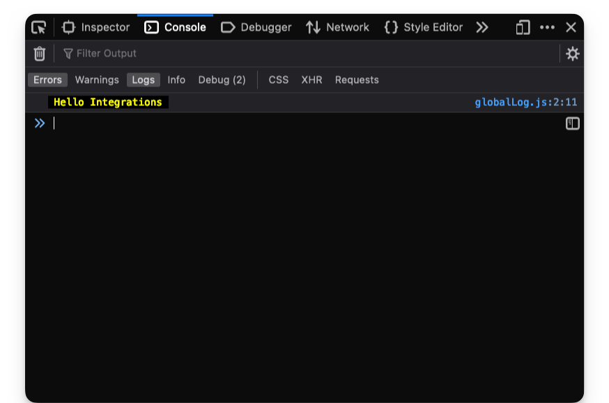 Working integration log printed in the browser console
We may create more pages, and the console message will be logged on every page in the application.
How to print a message to the server console
Since we have hook points into the Astro build process, it is also possible to output logs to the server console.
This may be useful for usability or ascertaining that our custom integration works as expected.
At the moment, here’s the mess that my server logs look like:
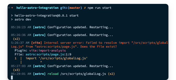 The (messy) Astro server logs
Yours should look familiar. This is from the incremental process of building our first integration.
Let’s go ahead and print something to the logs once we’ve successfully injected our script onto the page.
// ...
hooks: {
"astro:config:setup": (options) => {
options.injectScript("page", `import '/src/scripts/
globalLog.js'`);
// 👀 add a new log
console.log("Injected hello integration script");
},
},
Restart the server for a clean slate, and we should have the log printed as shown below:
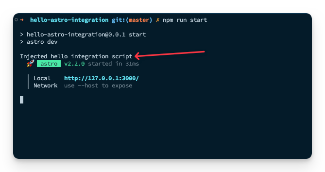 The server log from our hello world integration
Since we’re fancy developers who care about usability, let’s go ahead and make the log feel native to other Astro logs by adding some text formatting and colour via kleur.
Install the kelur package:
npm install kleur
Once the installation is complete, we should now have a new log in the dev server that reads:
05:41:02 AM [astro] update /package-lock.json
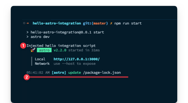 Example native astro server log
05:41:02 represents my current time.
Please do not ask me why I’m writing this chapter so early in the morning.
Let’s go ahead and make our log look similar. Instead of just using console.log, let’s introduce a logServerMessage that does our beautiful bidding as shown below:
// 📂 astro.config.mjs
import kleur from "kleur";
import { defineConfig } from "astro/config";
// 👀 The Intl.DateTimeFormat object enables language-sensitive
// date and time formatting.
const dateTimeFormat = new Intl.DateTimeFormat([], {
hour: "2-digit",
minute: "2-digit",
second: "2-digit",
});
const logServerMessage = (message) => {
// 👀 Get a new date string using the dateTimeFormat object
const date = dateTimeFormat.format(new Date());
// log to console with kleur colours and formatting
console.log(`${kleur.gray(date)} ${kleur
.bold()
.cyan("[astro-hello-integration]")} ${message}
`);
};
export default defineConfig({
// ... same content as before
});
Now we should have a beautiful log message that feels native to Astro, like the other server console logs.
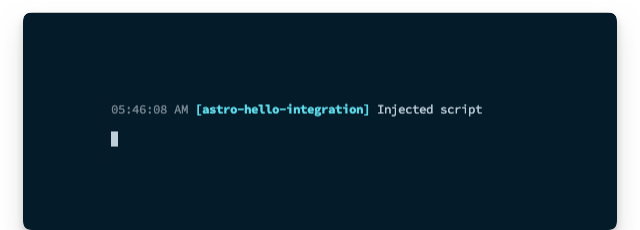 The custom integration "native feeling" server log
Custom integrations as factory functions
Our current implementation is beginning to clog the Astro configuration file.
In practice, instead of inlining our custom Astro integration, it’s likely to live in a separate file as a factory function, that is a function that creates and returns the Astro integration object.
Let’s do that – it'll be something of a refactor.
Move the entire integration content into a new src/integrations/astro-hello.ts file.
// 📂 src/integrations/astro-hello.ts
import kleur from "kleur";
const dateTimeFormat = new Intl.DateTimeFormat([], {
hour: "2-digit",
minute: "2-digit",
second: "2-digit",
});
const logServerMessage = (message) => {
const date = dateTimeFormat.format(new Date());
console.log(`${kleur.gray(date)} ${kleur
.bold()
.cyan("[astro-hello-integration]")} ${message}
`);
};
// 👀 Introduce a default export function that returns the Astro
// integration object.
export default function helloIntegration() {
return {
name: "astro-hello",
hooks: {
"astro:config:setup": (options) => {
options.injectScript("page", `import '/src/scripts/
globalLog.js'`);
logServerMessage("Injected script");
},
},
};
}
Now, add in TypeScript types:
// 📂 src/integrations/astro-hello.ts
import type { AstroIntegration } from "astro";
const logServerMessage = (message: string) => {
// ...
};
export default function helloIntegration(): AstroIntegration {
// ...
}
Oh yeah!
Our implementation is coming around nicely.
Now, let’s clean up astro.config.mjs by importing our integration as shown below:
// 📂 astro.config.mjs
import { defineConfig } from "astro/config";
import astroHello from "./src/integrations/astro-hello";
export default defineConfig({
// 👀 invoke the imported astroHello function in the list
integrations: [astroHello()],
});
And there we have it! A sparkly clean, custom Astro integration.
You may view the complete source code on GitHub.
The Astro Hooks Lifecycle
By definition, lifecycle refers to the series of changes in the life of an organism. For example, a butterfly starts as an egg, larva, pupa, and then becomes a full-blown adult.
Until human cloning becomes available, there’s a decent chance you also started as an infant, then grew into a toddler, eventually puberty, and then found your way into adulthood. At least, I hope so!
In software, the term lifecycle represents a process’s different stages.
With Astro hooks, we explicitly refer to the stages Astro goes through while building your application pages. This is the process from resolving the Astro configuration setup to spinning up a local server to bundling your pages statically or server-side rendered in production.
The entire process is what I call the Astro hooks lifecycle.
To get productive in developing custom integrations, we’ll need to know where in the lifecycle we need to effect a change or react to.
Hooks are functions which are called at various stages of the build. To interact with the build process, we'll leverage the following ten hooks:
astro:config:setupastro:config:doneastro:server:setupastro:server:startastro:server:doneastro:build:startastro:build:setupastro:build:generatedastro:build:ssrastro:build:done
Ten seems like a lot to remember. Good thing it isn’t a dozen hooks (twelve). And you don’t have to memorise these. Instead, understand how they work. You can always refer to the official reference when needed.
The when and why of hooks
One of the first questions I asked myself when I started tinkering with Astro integrations was when exactly are these triggered, and is there some order of execution to them?
Well, the answer to these lies below, but first, consider the following diagram that depicts the order in which the hooks are executed:
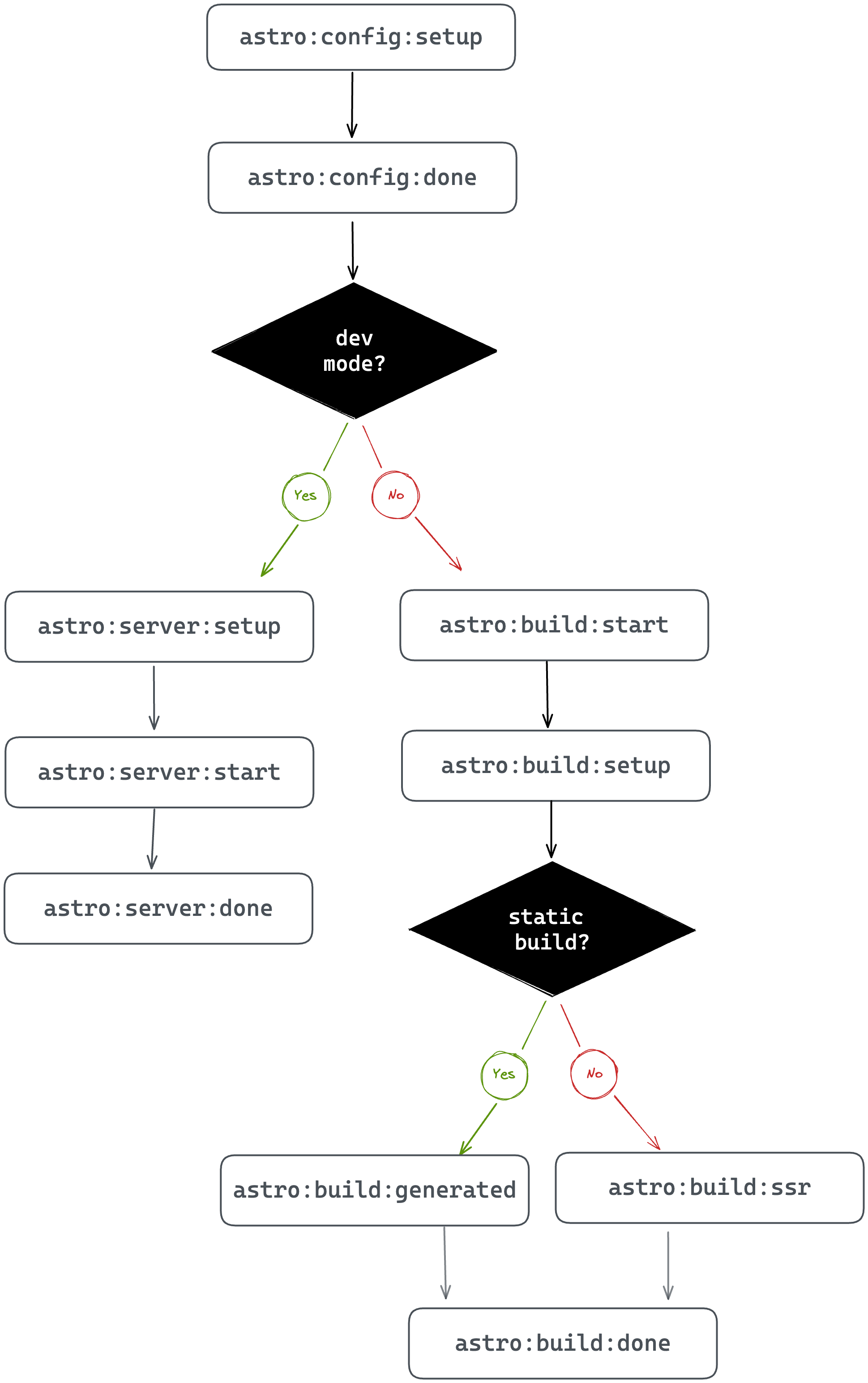 Execution order of Astro hooks
Kicking off the process are two hooks:
astro:config:setupastro:config:done
These hooks are always executed regardless of the Astro build process.
Here’s a breakdown of when these are executed and how we could leverage these in our custom integrations:
| Hook | Executed when … | Why use this … |
|---|---|---|
astro:config: |
Astro is initialised. This happens before the Astro project configuration (or Vite config) are resolved. |
Consider being the first one at the pub before it opens. You can cause a ruckus before anyone else even shows up! Similarly, this is where you swoop in to extend the project configuration e.g., updating the Astro config, applying Vite plugins, adding component renderers and injecting scripts before Astro knows what hit it. |
astro:config:done
|
The Astro config has been resolved. At this point, every astro:config:setup hook has been invoked for every integration in the project. |
Like a perfect pint of beer, we patiently wait to grab the glass only after it’s been poured. Similarly, after the Astro config has finally got its act together and all the other integrations have done their thing, this is where we retrieve the final config for use in our integration. |
Once astro:config:done is fired, there are two branches to consider: development and production mode.
When developing your apps locally, without initiating a production build typically via npm run build or astro build, the left side of the chart depicts the order of hooks execution in developer mode. Then the following hooks are invoked:
astro:server:setupastro:server:startastro:server:done
These hooks are executed when building your app for local development.
Here’s a breakdown of when these are executed and how we could leverage these in our custom integrations:
| Hook | Executed when … | Why use this … |
|---|---|---|
astro:server: |
The Vite server has just been created in development mode. This is before the listen()server event is fired i.e., before starting the server.
|
This is where we may update the Vite server options and middleware. The Vite dev server object is passed as an argument to our hook. |
astro:server:start
|
The Vite listen()method has just been fired i.e., the server is running. |
Like tech-savvy superheroes, we can jump in here to save the day at the last minute - well, if that involves intercepting network requests. This is where we may jump in to intercept network requests at the specified dev server address (passed as an argument to our hook) |
astro:server:done
|
The dev server has just been closed. |
Like cleaners coming in after the party to sweep up the mess, this is where we run cleanups. If you wish to clean up any side effects triggered during astro:server:setup or astro:server:start, here’s where you do so!
|
When we run a production build, two hooks will always be triggered. These are
astro:build:startastro:build:setup
And here’s a breakdown of when these are executed and how we could leverage these in our custom integrations:
| Hook | Executed when … | Why use this … |
|---|---|---|
astro:build: |
The Astro config is completely resolved but before the production build begins. |
The production build is about to start but perhaps you want to set up some global objects or clients needed during the build? Here’s where we do so. |
astro:build:setup
|
The build is just about to get started. At this point, the build config is fully constructed. |
To steal the perfect phrase from the official Astro documentation: this is our final chance to modify the build. It's like getting ready for a night out - we’ve put on our best outfit and look sharp, but we just need to add that one last accessory to complete the look. This is our chance to do just that - to overwrite some defaults and make sure everything is looking top-notch. I must mention that if you're not sure whether to use this hook or astro:build:start, go for astro:build:start instead.
|
Now, depending on whether the page being built is statically generated or to be server-side rendered, either astro:build:generated or astro:build:ssr will be invoked, and finally, astro:build:done.
Yes, you guessed it. Here’s the final breakdown of when these are executed and how we could leverage these in our custom integrations:
| Hook | Executed when … | Why use this … |
|---|---|---|
astro:build: |
The static production build has completely generated routes and assets. |
Access generated routes and assets before build artefacts are cleaned up. As per the official docs, this is an uncommon case and we might be better off using astro:build:done in many cases., except we really need to access these files before cleanup.
|
astro:build:ssr
|
A production SSR build is completed. |
To get access to the SSR manifest. This is helpful when creating custom SSR builds. |
astro:build:done
|
The production build is complete! |
This is where we may access the generated routes and assets e.g., to be copied somewhere. For transforming generated assets, consider using a Vite plugin and configuring astro:config:setup.
|
Examining the hooks evaluation order
Even though we’ve taken time to explore when the Astro hooks are invoked, there’s no better teacher than practice.
Let’s go ahead and write out a simple integration that spits out a log to the server console when invoked. Then, you can tinker with building several pages for production and inspect the logs.
Our eventual goal is to have a custom integration that looks something like this:
{
name: "some-identifier",
hooks: {
"hook-name": () => {
// log hook name so we know it's been invoked
}
}
}
Makes sense?
Let’s go ahead and build this out.
If building along, extend the hello world application or create a new Astro application with the following custom integration:
// 📂 src/integrations/lifecycle-logs.ts
import kleur from "kleur";
import type { AstroIntegration } from "astro";
//Create a new dateTimeFormat object
const dateTimeFormat = new Intl.DateTimeFormat([], {
hour: "2-digit",
minute: "2-digit",
second: "2-digit",
});
export const lifecycleLogs = () => {
const hooks = [
`astro:config:setup`,
`astro:config:done`,
`astro:server:setup`,
`astro:server:start`,
`astro:server:done`,
`astro:build:start`,
`astro:build:setup`,
`astro:build:generated`,
`astro:build:ssr`,
`astro:build:done`,
] as const;
// base integration structure. "hooks" will be updated
let integration: AstroIntegration = {
name: "astro-lifecycle-logs",
hooks: {},
};
// loop over the hooks list and add the name and log
for (const hook of hooks) {
integration.hooks[hook] = () => {
// 👀 Get a new date string
const date = dateTimeFormat.format(new Date());
// log with kleur colours and formatting
console.log(`${kleur.gray(date)} ${kleur
.bold()
.yellow("[lifecycle-log]")} ${kleur.green(hook)}
`);
};
}
return integration;
};
export default lifecycleLogs;
Import lifecycleLogs and add it to your project’s integration list, then (re)start your application to see the logs in the console as shown below:
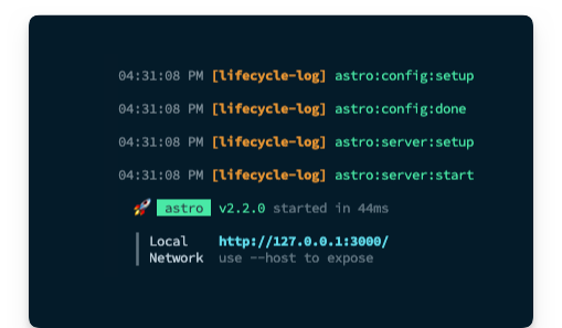 The dev lifecycle hooks
As an exercise, I suggest you add a new SSR page and run a production build to see the order of hooks execution logged.
Here’s an example with two pages:
- a static
index.astropage - a server-side rendered
ssr.astropage
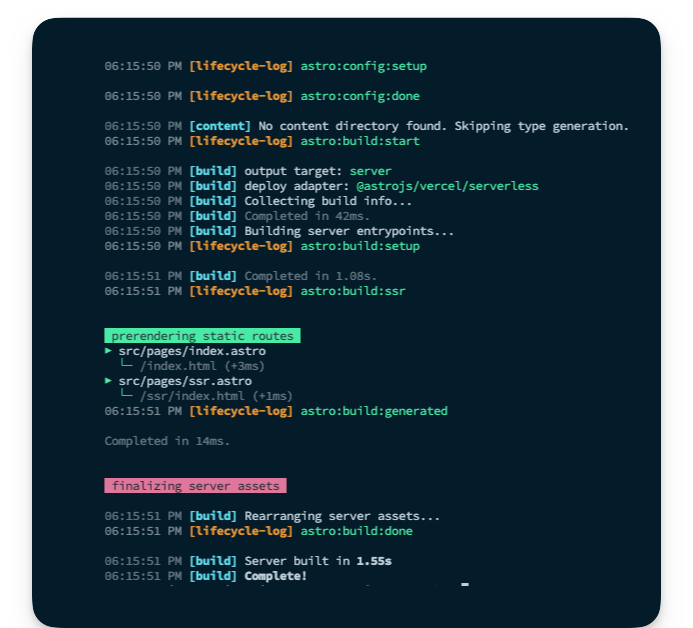 The entire hook lifecycle logged
How to Build a Default Pre-render Integration
When we enable SSR in our project, we can also opt-in to pre-rendering, that is to statically render some files at build time.
The way to do this is to add an export const prerender = true to the desired static page(s).
There was a time Astro didn’t support hybrid rendering, so this is an excellent feature.
But in practice, we may have multiple static pages and just a few server-side rendered ones. Adding export const prerender = true to all the static pages gets painfully annoying.
The other day I started building an Astro application that was predominantly statically rendered. Then I realised I needed one server-side rendered route.
At this point, I change my astro.config.mjs file to include output: server. Consequently, I had to go to all the existing static pages to add export const prerender = true. This wasn’t pleasant.
You may view the complete source code on GitHub.
Project objective
The goal of our custom integration is to flip the default hybrid rendering behaviour of Astro.
By default, with an output: server in our configuration, all pages are assumed to be server-rendered, and we must explicitly add export const prerender = true to our static pages.
We want to achieve a different behaviour for cases when we have more static pages, that is:
- By default, with
output: serverin our configuration, render all pages statically at build time – prerender by default. - Add
export const prerender = falseto render a page server-side explicitly.
See what we’ve done there?
Now, please give it a think. How do we achieve this?
At the time of writing, there’s a public roadmap for Astro to support default pre-rendering internally. Until then, let’s bend Astro to our will.
Integration API
We will design our integration as a factory function named prerenderByDefault.
Our users will go ahead and invoke this function within their integrations list, as shown below:
export default defineConfig({
integrations: [prerenderByDefault()],
});
By default, we will log messages to the server console but expose a silent parameter to prevent server console logs.
Astro integrations usually support configurations by passing arguments to the factory function. Below’s our proposed API:
export default defineConfig({
integrations: [prerenderByDefault({
silent: true // or false (boolean)
})],
});
Finally, we will add some basic validation within our integration. If the user doesn’t have an output: server or adapter option in their configuration, we will skip pre-rendering by default. This is because we only want our integration to take effect during hybrid rendering, which is only activated with output: server in the user’s project configuration.
Technical solution overview
At its core, our integration will take advantage of two lifecycle hooks: astro:config:setup and astro:config:done as shown below:
export default function prerenderByDefault() {
return {
name: "astro-prerender-by-default",
hooks: {
"astro:config:setup"() {
},
"astro:config:done"(options) {
},
},
};
}
In astro:config:done, we will retrieve the project’s resolved configuration and perform our validation.
"astro:config:done"(options) {
// 1. Get resolved config from options.config
// 2. Validate that the config object has the right
// output and adapter values
}
In astro:config:setup, we will swoop in and extend the user’s Astro project configuration by applying a custom Vite plugin.
"astro:config:setup"(options) {
// Apply a custom Vite plugin here
}
When Astro builds our project, it does so using Vite. Integrations are to Astro what plugins are to Vite. To extend Vite, we use plugins.
We can tap into the Vite build lifecycle to access the user’s Astro code (particularly their pages) during the build process.
Now, here comes the fun part.
First, we will parse the Astro code into Abstract Syntax Trees (ASTs).
Essentially, an AST serves as a means of representing the code’s structure in a programming language. Just as a sentence can be broken down into nouns, verbs, and adjectives, an AST dissects code into its essential components – variables, functions, and operations – and reflects their relationships in a tree-like structure.
A valid Astro component may take different forms. But the frontmatter must always be the first child node of the root node.
For example, the following is correct:
---
// frontmatter
---
// markup goes here
<h1> Hello world </h1>
The following is invalid:
<h1> Hello world </h1>
---
// frontmatter
---
With this heuristic, we will grab the first child node in the root of our parsed AST and make some decisions:
- If the file already has a
prerenderexport, do nothing, that is leave the file as is. - Otherwise, update the code to include
export const prerender = true– so we will update the code within our integration. It’s important to note that this only transforms the page’s code to be built. It does not update the local file. - Finally, if a page has no frontmatter, we will create one and include the
export const prerender = truecode snippet.
How to Initialise projects via CLI flags
The create astro command is robust. But sometimes you don’t have the patience to select every option via prompts.
In such cases, use the CLI flags as shown below.
Initialise a new project with the following command:
npm create astro@latest -- --template=minimal
--typescript=strictest --git --install
astro-integration-prerender-by-default
This will set up a new Astro project in the prerenderbyDefaultdirectory with CLI flags passed instead of via prompts, that is --template=minimal will use the minimal template, --template=strictest will use the strictest typescript config, --git will initialise a Git repo and --install will install the dependencies.
Here’s a quick table of the available CLI flags:
| Name | Description |
|---|---|
--template <name>
|
Specify the template. Where name could be any of the directories in https://github.com/withastro/astro/tree/main/examples/. |
--install / --no-install
|
Install dependencies (or not). |
--git / --no-git
|
Initialize git repo (or not). |
--yes (-y)
|
Skip all prompts and accept the defaults. |
--no (-n)
|
Skip all prompts and decline the defaults. |
--dry-run
|
Walk through the project creation steps without any actual execution. Useful for a “dry run” |
--skip-houston
|
Skip the Houston animation. If in a hurry, this saves some time and starts the prompt directly. |
--typescript <option>
|
Where option is strict , strictest orrelaxed
|
Now, change the directory and run the new Astro application:
cd ./astro-integration-prerender-by-default && npm run start
By default, this should start the application on an available port, for example localhost:3000.
How to set up the integration
Create a new index file in integrations/prerenderByDefault and create the integration factory function as shown below:
export default function prerenderByDefault() {
return {
name: "astro-prerender-by-default",
hooks: {
"astro:config:setup"() {},
"astro:config:done"() {},
},
};
}
Let’s add support for configuring the integration by accepting a configuration object.
Go ahead and create a types.ts file in integrations/prerenderByDefault as shown below:
export type Config =
| {
silent?: boolean;
}
| undefined;
Now, let’s add a config parameter to the prerenderByDefault factory function and type its return value as shown below:
import type { AstroIntegration } from "astro";
import type { Config } from "./types";
export default function prerenderByDefault(config: Config): AstroIntegration {
// ...
}
Now go ahead and add the integration in the project’s config file:
import { defineConfig } from "astro/config";
import prerenderByDefault from "./integrations/prerenderByDefault";
export default defineConfig({
integrations: [prerenderByDefault()],
});
How to validate a resolved Astro configuration
Let’s go ahead to handle our integration validation. First, we will create an isValidAstroConfig method to receive an Astro configuration and a validation result.
Here’s the implementation below:
// 📂 prerenderByDefault/isValidAstroConfig.ts
import type { AstroConfig } from "astro";
/**
* @param config: the fully resolved astro project config
* @returns validation result
*/
export const isValidAstroConfig = (config: AstroConfig) => {
if (config.output !== "server") {
return { type: "invalid_output_config", value: false } as const;
}
if (!config.adapter) {
return { type: "invalid_adapter_config", value: false } as const;
}
/**
* configuration is valid
*/
return { type: "success", value: true } as const;
};
I’ve decided to return an object instead of simple boolean values to utilise typescript’s exhaustiveness checking.
Now, let’s leverage isValidAstroConfig in the astro:config:done hook by doing the following:
- Retrieve the final Astro project configuration
- Validate the configuration
- Log messages to the server console based on the validation result
Here’s how:
export default function prerenderByDefault(config: Config): AstroIntegration {
return {
name: "astro-prerender-by-default",
hooks: {
"astro:config:setup"() {},
// 👀 look below
"astro:config:done"(options) {
// get the 'silent' integration config property, default to false.
const silent = config?.silent ?? false;
// validate the resolved project configuration
const validationResult = isValidAstroConfig(options.config);
/**
* Leverage Typescript exhaustive check to handle all
* validation types and log messages where appropriate
*/
switch (validationResult.type) {
case "invalid_adapter_config":
log({
silent,
message: `Adapter not set for hybrid rendering. Skipping`,
});
return;
case "invalid_output_config":
log({
silent,
message: `Config output not set to "server". Skipping`,
});
return;
case "success":
return;
default:
const _exhaustiveCheck: never = validationResult;
return _exhaustiveCheck;
}
},
},
};
}
We’re calling a log function to write messages to the server console depending on the validation result, but this function does not exist.
We’ve written similar log functions, so here’s the code for this one:
// 📂 prerenderByDefault/log.ts
import kleur from "kleur";
type LogOptions = {
silent: boolean;
message: string;
};
const dateTimeFormat = new Intl.DateTimeFormat([], {
hour: "2-digit",
minute: "2-digit",
second: "2-digit",
});
export const log = (options: LogOptions) => {
// do not log if the "silent" argument is passed
if (options.silent) {
return;
}
// get new date
const date = dateTimeFormat.format(new Date());
// log to the console with colours and text formatting
console.log(`${kleur.gray(date)} ${kleur
.bold()
.magenta("[astro-prerender-by-default]")} ${options.message}
`);
};
Now make sure to import the log function in prerenderByDefault/index.ts:
import { log } from "./log";
...
Now if we go ahead and build the project with npm run build, we should have our integration validation log displayed as shown below:
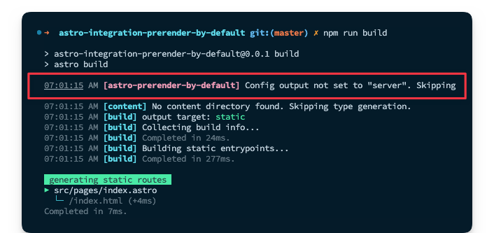 Validation server log
This is expected because the project does not have a server output configured. In this case, hybrid rendering cannot be utilised.
How to apply Vite plugins in custom integrations
Astro uses Vite under the hood. As such, it’s possible to pass additional configurations to Vite in the astro.config.mjs file, for example:
{
vite: {
//This adds a custom plugin directly to the Astro config
plugins: [myPlugin()]
}
}
Consequently, we can take advantage of this in our integration.
Remember from the lifecycle hooks section that astro:config:setup is where we may swoop in to extend the project configuration. Let’s do so now:
import { injectVitePlugin } from "./injectVitePlugin";
// ...
return {
name: "astro-prerender-by-default",
hooks: {
// 👀 look here
"astro:config:setup"(options) {
options.updateConfig({
vite: {
plugins: [injectVitePlugin()],
},
});
},
}
// ...
In the plugins array, we’re invoking injectVitePlugin(), which should return a valid Vite plugin.
Oh, but what’s a valid Vite plugin, you might ask?
Similar to Astro integrations, a Vite plugin is represented by an object with a name property and specific hooks, which are methods on the object, for example:
{
name: "vite-plugin-${name},
configResolved() {
// Called after the Vite config is resolved
}
}
Let’s go ahead and write out a basic version of injectVitePlugin:
import type { Plugin } from "vite";
export const injectVitePlugin = (): Plugin => {
//Our prerender plugin to be fleshed out
const prerenderByDefaultPlugin = { name: "" };
return {
// name follows the pattern vite-plugin-${framework}-${feature}
name: "vite-plugin-astro-inject-default-prerender",
configResolved: (options) => {
//Grab the Vite plugins in the resolved config
// and add our plugin as the first in the list
(options.plugins as Plugin[]).unshift(prerenderByDefaultPlugin);
},
};
};
We will flesh out this basic structure, but first consider that in the astro hooks lifecycle, astro:config:setup runs before astro:config:done.
We're updating the Vite plugins in astro:config:setup. But we're validating the project config in astro:config:done.
We’ll likely run into a race condition here, that is updating the Vite plugin list in astro:config:setup before astro:config:done has wholly validated the project’s config.
How can we resolve this?
Let’s leverage a promise.
We will initialise a promise that’s only resolved after validation is complete, and we will await the promise resolution in injectVitePlugin. Luckily, astro:config:setup can take in async functions. Particularly in the Vite plugin function(s).
Let’s walk through the changes required to achieve this.
First, let’s introduce a ValidationResult type in our types.ts file:
// 📂 prerenderByDefault/types.ts
import type { isValidAstroConfig } from "./isValidAstroConfig";
export type ValidationResult = ReturnType<typeof isValidAstroConfig>;
// ...
Now, create a new promise in the main index file:
// ...
import type { Config, ValidationResult } from "./types";
let resolveValidationResult: (value: ValidationResult) => void;
let validationResultPromise = new Promise<ValidationResult>((resolve) => {
resolveValidationResult = resolve;
});
// ...
Right after validation is done in astro:config:done, let’s go ahead and resolve the promise with the result of the validation:
// ...
"astro:config:done"(options) {
const silent = config?.silent ?? false;
const validationResult = isValidAstroConfig(options.config);
// resolve the validation promise
resolveValidationResult(validationResult);
// ...
}
Then pass both the integration configuration and validation result promise to injectVitePlugin:
// ...
plugins: [injectVitePlugin(config, validationResultPromise)],
We must now update injectVitePlugin to await the validation result promise as shown below:
import type { Plugin } from "vite";
import type { Config, ValidationResult } from "./types";
export const injectVitePlugin = async (
config: Config,
validationResultPromise: Promise<ValidationResult>
): Promise<Plugin | null> => {
// await the validation result promise before continuing
const validationResult = await validationResultPromise;
// exit if the validation result value is false
if (!validationResult.value) {
return null;
}
// TBD ..
const prerenderByDefaultPlugin = { name: "" };
return {
name: "vite-plugin-astro-inject-default-prerender",
configResolved: (options) => {
(options.plugins as Plugin[]).unshift(prerenderByDefaultPlugin);
},
};
};
Phew! We’ve eradicated the pesky race condition. So our solution is shaping up nicely, eh?
How to write Vite plugins for Astro
We know what a Vite plugin looks like now. But the core functionality of our integration hasn’t been written yet. This is currently represented by the prerenderByDefaultPlugin variable, that is:
// TBD...
const prerenderByDefaultPlugin = { name: "" };
Let’s change this to be returned from a separate getVitePlugin function:
// ...
import { getVitePlugin } from "./getVitePlugin";
export const injectVitePlugin = async (
config: Config,
validationResultPromise: Promise<ValidationResult>
): Promise<Plugin | null> => {
// ...
const prerenderByDefaultPlugin = getVitePlugin(config);
// ...
};
Where getVitePlugin is the following:
import type { Config } from "./types";
export const getVitePlugin = (config: Config) => ({
name: "vite-plugin-astro-prerender-by-default",
});
How to parse and transforming ASTs
We want to transform a user’s Astro code and make updates before it is eventually built.
Luckily Vite has a transform hook we can leverage just for this. Let’s play around with this a bit in our getVitePlugin function:
import type { Plugin } from "vite";
import type { Config } from "./types";
import { log } from "./log";
export const getVitePlugin = (config: Config): Plugin => {
const silent = config?.silent ?? false;
return {
name: "vite-plugin-astro-prerender-by-default",
async transform(code, id) {
// 👀 log the value of the id
log({
silent,
message: id,
});
},
};
};
The transform hook is ideal for transforming individual modules in the build process, and we receive the code in the file as a string and an id representing the string path to the file name.
To test how this works, update the Astro project config to include a server output.
export default defineConfig({
output: "server",
integrations: [prerenderByDefault()],
});
Then add an adapter to handle server-side rendering with:
npx astro add netlify
We may now explore the log from getVitePlugin by running npm run build from the terminal.
Notice how many more files are transformed than just the user’s .astro pages.
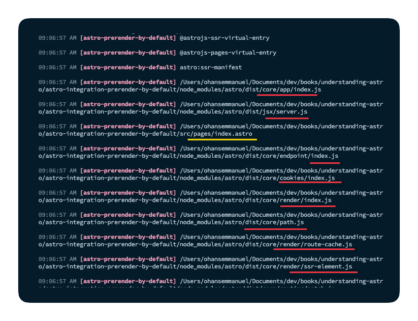 Exploring the list of transformed files.
Most of the files here are related to Astro internals. So we must only concern ourselves with the user’s .astro pages. We want to transform those files while leaving everything else as is.
Let’s add a simple conditional:
// ...
return {
name: "vite-plugin-astro-prerender-by-default",
async transform(code, id) {
// 👀 filter out other file types
if (!id.endsWith(".astro")) {
return;
}
// log the value of the id
log({
silent,
message: id,
});
},
};
Now, rerun the build, and we should have just the user’s .astro page files.
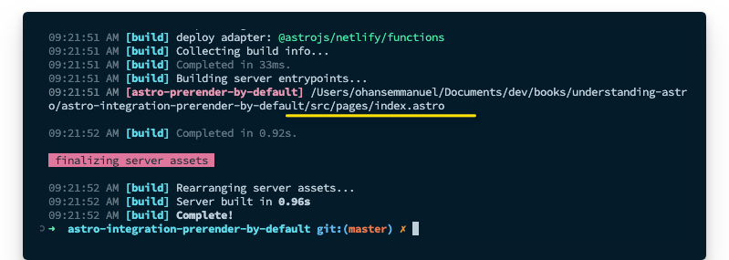 Logging the project page files.
This is excellent.
Just after the conditional, we can get on with parsing the code. To do this, we will leverage the parse utility exported from Astro’s compiler as shown below:
// ...
async transform(code, id) {
if (!id.endsWith(".astro")) {
return;
}
// 👀
const { ast } = await parse(code);
// 👀 logs for debugging
log({
silent,
message: "Parsed AST",
});
console.log(ast);
}
This project only has a single page in src/index.astro. So, essentially, only that page will be transformed.
Here’s the content of the page:
---
---
<html lang="en">
<head>
<meta charset="utf-8" />
<link rel="icon" type="image/svg+xml" href="/favicon.svg" />
<meta name="viewport" content="width=device-width" />
<meta name="generator" content={Astro.generator} />
<title>Astro</title>
</head>
<body>
<h1>Astro</h1>
</body>
</html>
Here’s the corresponding AST logged to the console:
{
type: 'root',
children: [
{ type: 'frontmatter', value: '\n', position: [Object] },
{
type: 'element',
name: 'html',
attributes: [Array],
children: [Array]
},
{ type: 'text', value: '\n', position: [Object] }
]
}
Every parsed AST will have a root element. An empty file will have the shape:
{ type: 'root' }
Knowing this, we can build out our parsing logic. But we need a way to walk the entire AST.
We could write a sophisticated function to loop over every element in the tree. But we can leverage the walk utility from the Astro compiler, which will traverse every node in the tree, and we could perform any actions on a specified node via a callback.
Let’s take that for a spin by adding the following:
const { ast } = await parse(code);
// 👀
walk(ast, (node) => {
console.log("=========== \n", node);
});
Inspect the logs, and we should have the different nodes logged to the console, for example:
===========
{
type: 'root',
children: [
{ type: 'frontmatter', value: '\n', position: [Object] },
{
type: 'element',
name: 'html',
attributes: [Array],
children: [Array]
},
{ type: 'text', value: '\n', position: [Object] }
]
}
===========
{
type: 'frontmatter',
value: '\n',
position: {
start: { line: 1, column: 1, offset: 0 },
end: { line: 2, column: 4, offset: 7 }
}
}
===========
// ... see logs
It’s game time. Let’s go ahead and write out the complete code, which involves:
- Walking the AST
- Checking if the file has a frontmatter
- Checking if the file already has a
prerenderexport in its frontmatter. For this, we will use es-module-lexer , which outputs the list of exports of import specifiers - Adding
export const prerender = trueto the code where required - After transforming the AST, that is adding
export const prerender = truewhere needed, we will return the AST to code via theserializeutility from the Astro compiler.
Here we go:
import type { Plugin } from "vite";
import type { Config } from "./types";
import { parse } from "@astrojs/compiler";
import { walk, is, serialize } from "@astrojs/compiler/utils";
import { parse as parseESModuleLexer } from "es-module-lexer";
import { log } from "./log";
export const getVitePlugin = (config: Config): Plugin => {
const silent = config?.silent ?? false;
return {
name: "vite-plugin-astro-prerender-by-default",
async transform(code, id) {
if (!id.endsWith(".astro")) {
return;
}
const { ast } = await parse(code);
walk(ast, (node) => {
if (is.root(node)) {
const firstChildNode = node.children?.[0];
//Check that a frontmatter exists as the first child node
if (firstChildNode?.type === "frontmatter") {
//Using es-module-lexer, get the list of exports
const [, exports] = parseESModuleLexer(firstChildNode.value);
//Check if any export is named "prerender". "n" stands for "name."
if (exports.some((e) => e.n === "prerender")) {
log({
silent,
message: "'prerender' export found. Skipping",
});
// exit - let whatever prerender value is exported take effect
return;
}
// add prerender export for the static build, i.e., "export const prerender = true."
// note that we concatenate this to whatever the current string value of the node is
firstChildNode.value = `\nexport const prerender = true; \n ${firstChildNode.value}`;
log({
silent,
message: "Added 'prerender' export to frontmatter",
});
} else {
// No frontmatter in this astro component. Add frontmatter node and default export
log({
silent,
message: "No frontmatter, going ahead to add one",
});
// "unshift" to add this to the start of the list, i.e., the first child
node.children.unshift({
type: "frontmatter",
value: "\nexport const prerender = true\n",
});
}
}
});
//serialise the AST and return the result
const result = serialize(ast);
// added for the reader's debugging
console.log(result);
return result;
},
};
};
The code block above is annotated. Please take a close look at it. If something is unclear, add some console.logs. Together with the annotation, I’m sure you’ll understand the explanations even better.
Manual testing
We have our solution complete. Now, let’s test it. First, build the project with npm run build, and even though we have a server output in the Astro config, we now have the index.astro page statically built by default.
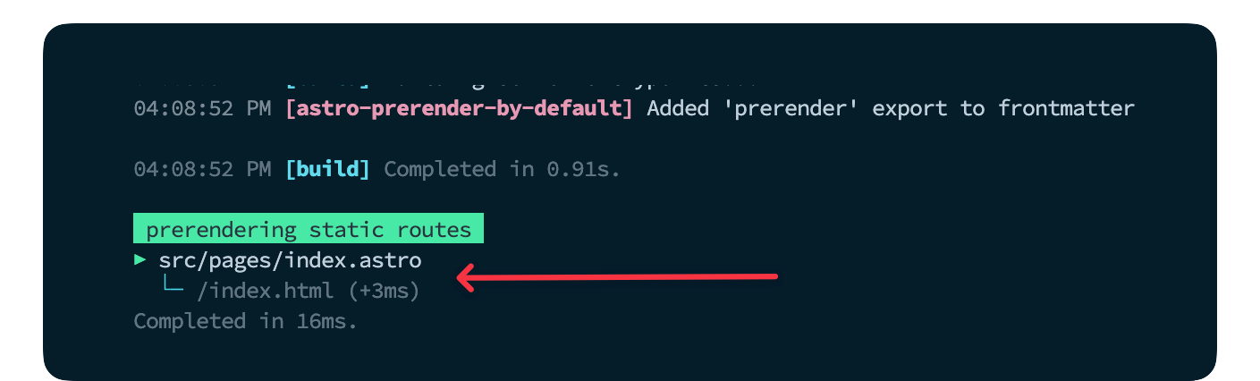 Pre-rendering the index.astro static route.
To render a server-side page, we need to manually add export const prerender = false.
Create a new page with identical content as index.astro and have the prerender export.
---
export const prerender = false;
---
<html lang="en">
<head>
<meta charset="utf-8" />
<link rel="icon" type="image/svg+xml" href="/favicon.svg" />
<meta name="viewport" content="width=device-width" />
<meta name="generator" content={Astro.generator} />
<title>SSR</title>
</head>
<body>
<h1>SSR</h1>
</body>
</html>
Now rerun the build and notice how only the index.astro page is pre-rendered.
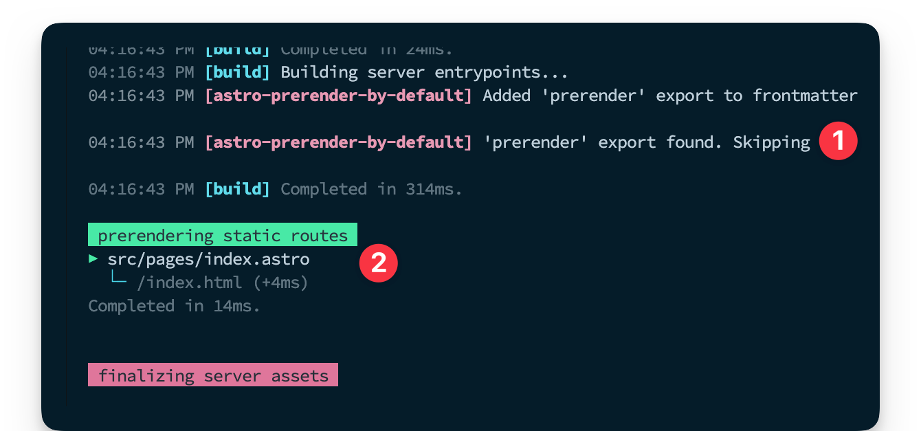 Skipping prerender when export is found.
How to Build Renderers and Library Integrations
As stated earlier in the chapter, the focus here is feature integrations. For building renderers and library integrations, I strongly recommend taking a look at the source code for popular integrations such as:
Most of these integrations are barely 100 lines of code at the core. Dig into them!
Wrapping Up This Chapter
Building custom integrations is definitely something you can do. Heck! Writing compilers isn’t a prerequisite.
Building upon the explanations and examples discussed here, we’ve seen how mere mortals like us can reach down into the internals of Astro and bend it to our will. Now, put this knowledge to practice.
 The end.
Conclusion
Look who made it to the end! 🚀
Yes, you!
I’ve poured my heart into these chapters, and I’m sure you’ve learned a thing or two.
So, where do you go next?
Firstly, I strongly recommend visiting the official Astro documentation. It’s a great resource that’ll benefit you long-term as you develop Astro applications.
Secondly, ponder the features that make Astro stand out:
- Leverage Component Islands: A new web architecture for building faster websites.
- Zero JS, by default: Keep applications fast with no JS runtime overhead.
- Edge-ready: Deploy anywhere, even global edge runtimes like Deno or Cloudflare.
- Incredibly customizable: Use Tailwind, MDX, and 100+ other integrations.
- Bring your own framework: Supports React, Preact, Vue, Svelte, Solid, Lit and more.
Helpful links and resources
- ⚠️ Stay in touch with my work and be first to know about updates to this book (and my other writings). Do so here.
- Astro integrations: explore these to add more functionality to your Astro applications.
- Astro themes: explore themes you can start your new project with.
Until next time,
Want to get the ebook?
- 500+ pages of value
- 4+ practical project chapters
- 100+ carefully crafted illustrations and images
- Learn techniques to build faster applications
- Integrate React, Svelte, Vue, Tailwind and more into an Astro project
- Learn to build your own component islands implementation from scratch
- Learn to build fullstack applications with Astro (without sacrificing performance)
- Go beyond the basics and parse Astro code into ASTs and build custom project features