Today we're going to learn how to use CSS Media Queries to build responsive websites. And we'll practice what we learn by completing three projects. Let's go 🏅
Table of Contents
Topics to discuss at a glance:
You can watch this tutorial on YouTube as well if you like:
What are CSS Media Queries?
CSS Media Queries allow you to create responsive websites across all screen sizes, ranging from desktop to mobile. So you can see why it's important to learn this topic.
Here's a demo of the magic of Media Queries 👇
We'll build this in project 2 below. This layout is called the Card Layout. You can see more Layout Examples here!
How to Set Up the Project
For this project, you need to know little bit of HTML, CSS, and how to work with VS code. Follow along with me ->
- Create a folder named "Project-1"
- Open VS Code
- Create index.html, style.scss, and main.js files
- Install Live Server and SASS Compiler
- Run Live Server and SASS Compiler
HTML
In HTML, write this code inside the body tag 👇
<div class = "container"></div>
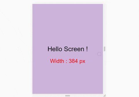
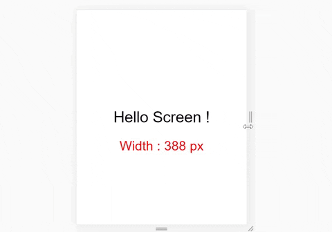
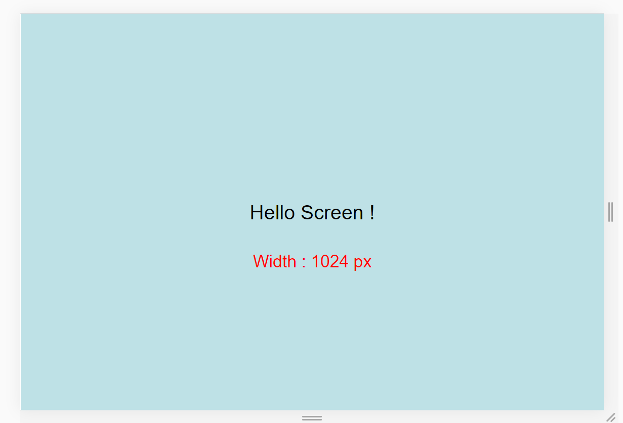
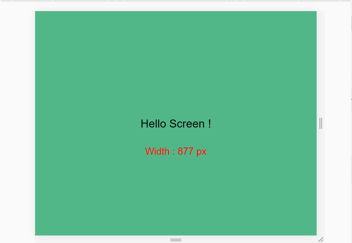
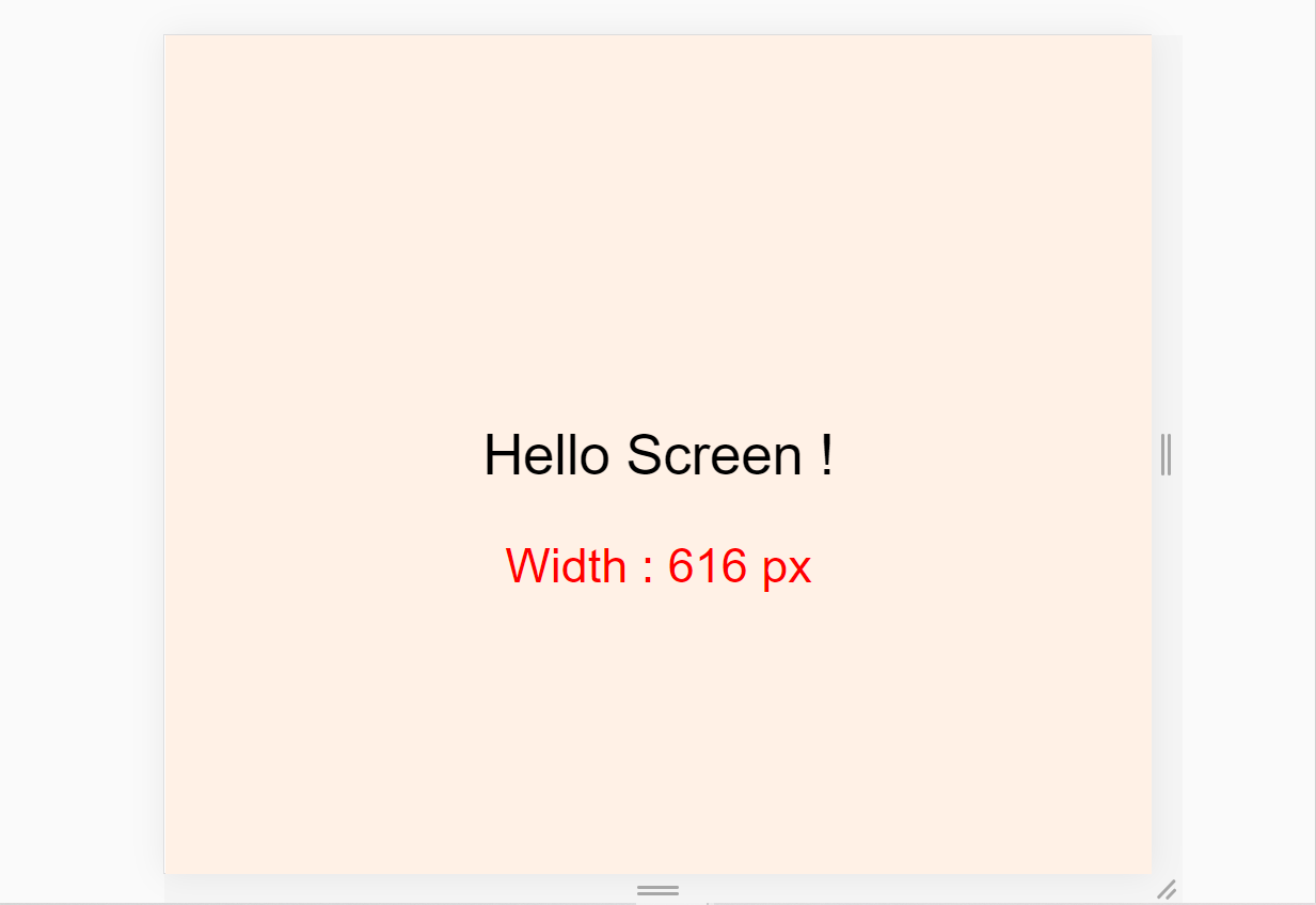
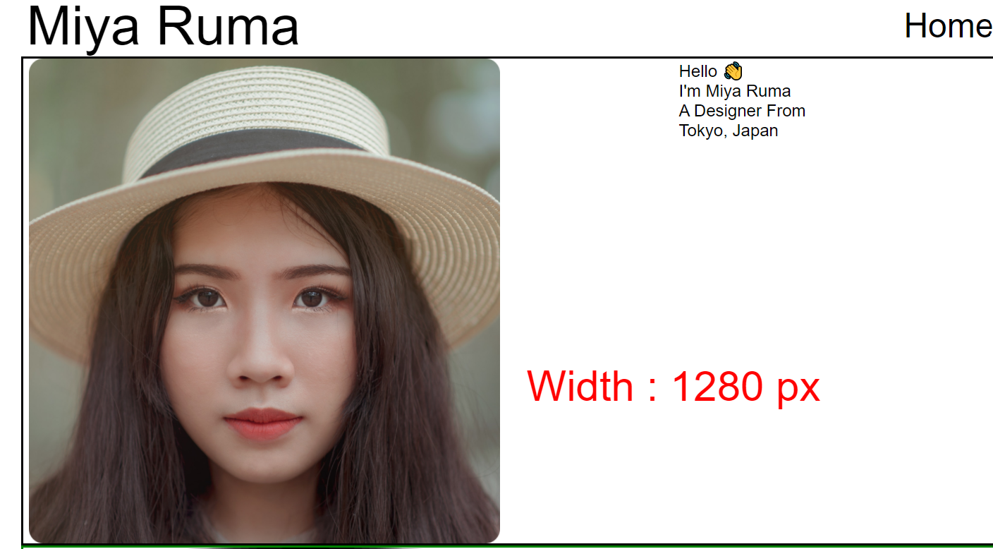
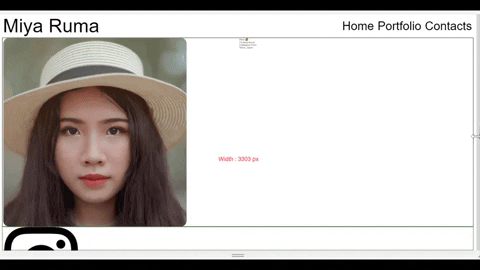
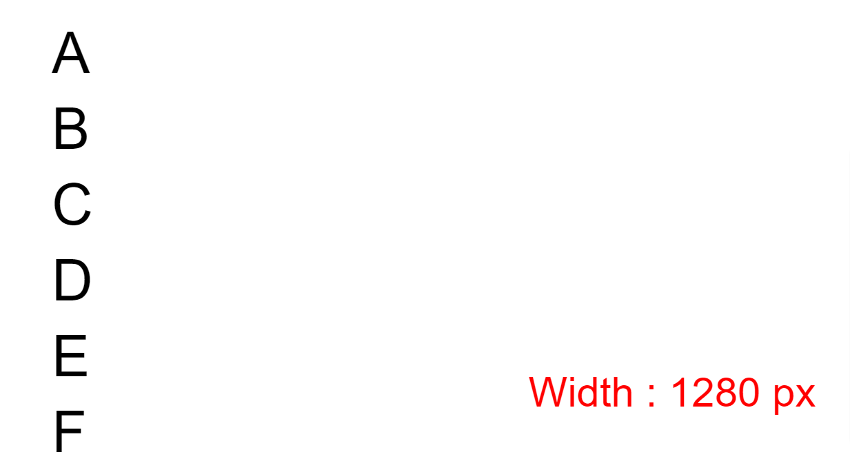
We also need to see the exact size of our window. Here's a demo of what I mean:
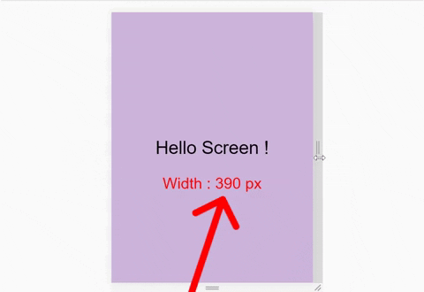
So, write this line inside the html file:
<div id="size"></div>
What is SCSS?
We'll Use SCSS, not CSS. But..... what is SCSS?
SCSS is a pre-processor of CSS which is more powerful than regular CSS. Using SCSS we can ->
- Nest our selectors like a branch of a tree and better manage our code.
- Store various values into variables
- Use Mixins to stop code repetition and save time
And much more!
In our SCSS, we'll remove our default browser settings, and we'll change box-sizing, font-size, and font-family like this: 👇
*{
  margin : 0px;
  padding : 0px;
  box-sizing : border-box;

  body{
    font-size : 35px;
    font-family : sans-serif;
  }
}
Don't forget to set the height of the .container class. Otherwise we'll fail to achieve our desired results:
.container{
  height : 100vh;
}
Remember the additional id we wrote in HTML? We'll style it and position it in our browser here:
#size {
  position: absolute;

// positioning screen size below our main text
  top : 60%;
  left: 50%;

  transform: translateX(-50%);

  color : red;
  font-size : 35px;
}
JavaScript
We need to update our screen size inside our id every time we resize our window. So, write this code in your main.js file:
// 'screen' is name 👇 of a function
window.onresize = screen;
window.onload = screen;

// Function named 'screen' 👇

function screen() {
  Width = window.innerWidth;
  document.getElementById("size").innerHTML
   = "Width : " + Width + " px"
}
Download the images for the project
Responsive website also means Responsive Images. So we're also going to make our images responsive in this project. The images are on my GitHub repository. Here's how to get them:
- Visit and copy the link above ☝️
- Go to downgit and paste the link you copied
- Follow the steps in this video 👇

And.... we're all set! Let's start coding. 😊
CSS Media Query Syntax
Here's the syntax of a Media Query:
@media screen and (max-width: 768px){
  .container{
   //Your code's here
  }
}
And here's an illustrated explanation ->
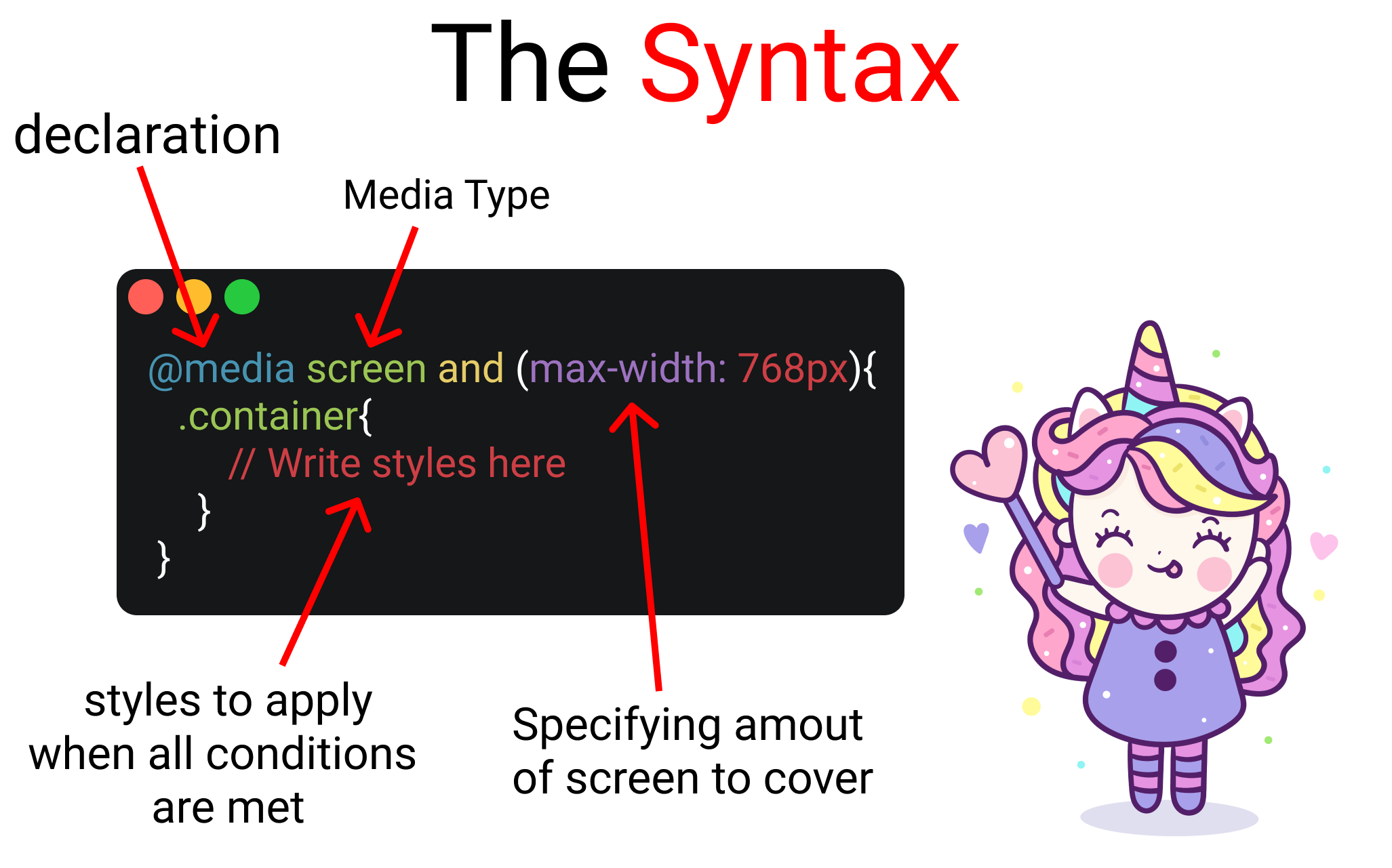
Let's divide the syntax into four sections:
- Media Query Declaration
- The Media Type
- min-width & max-width Functions
- The Code itself
To understand all 4 section of the syntax, let's start our First Project:
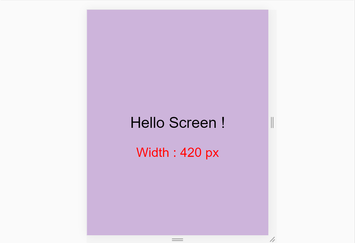
We'll build this. ☝️ It's a small project where the background-color changes on resizing the window by taking one small step at a time. Let's start!
The HTML
Place the following code inside your HTML, like this:
<div class = "container">

   <div class = "text">
      Hello Screen !
   </div>

</div>
The SCSS
Now, we'll store four color codes inside variables like this:👇
$color-1 : #cdb4db ; // Mobile
$color-2 : #fff1e6 ; // Tablet
$color-3 : #52b788 ; // Laptop
$color-4 : #bee1e6 ; // Desktop
You can find more colors at coolors.co if you want to choose your own.
Now, at the bottom, target the .container and .text classes. We'll also center our text like this👇
.container{
//To place text at center

  display : grid;
  place-items : center;

  background-color : $color-1;
  height : 100vh;
}

.text{
 // keep it blank for now
}
So far so good!

1. How to declare media queries
Media Queries start with the @media declaration. The main purpose of writing this is to tell the browser that we have specified a media query. In your CSS, write it like this:👇
@media
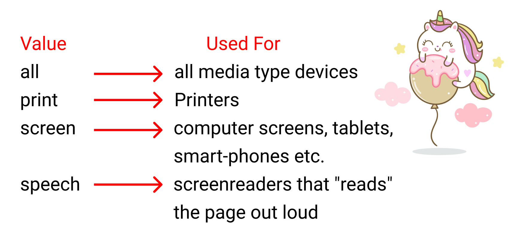
2. How to Set the Media Type
This is used to specify the nature of the device we're working with. The four values are:
- all
- screen
- speech
Here's the purpose of each of the values at a glance 👇
We declare the media type after the @media declaration, like this:
@media screen
Why do we write the "and" operator?
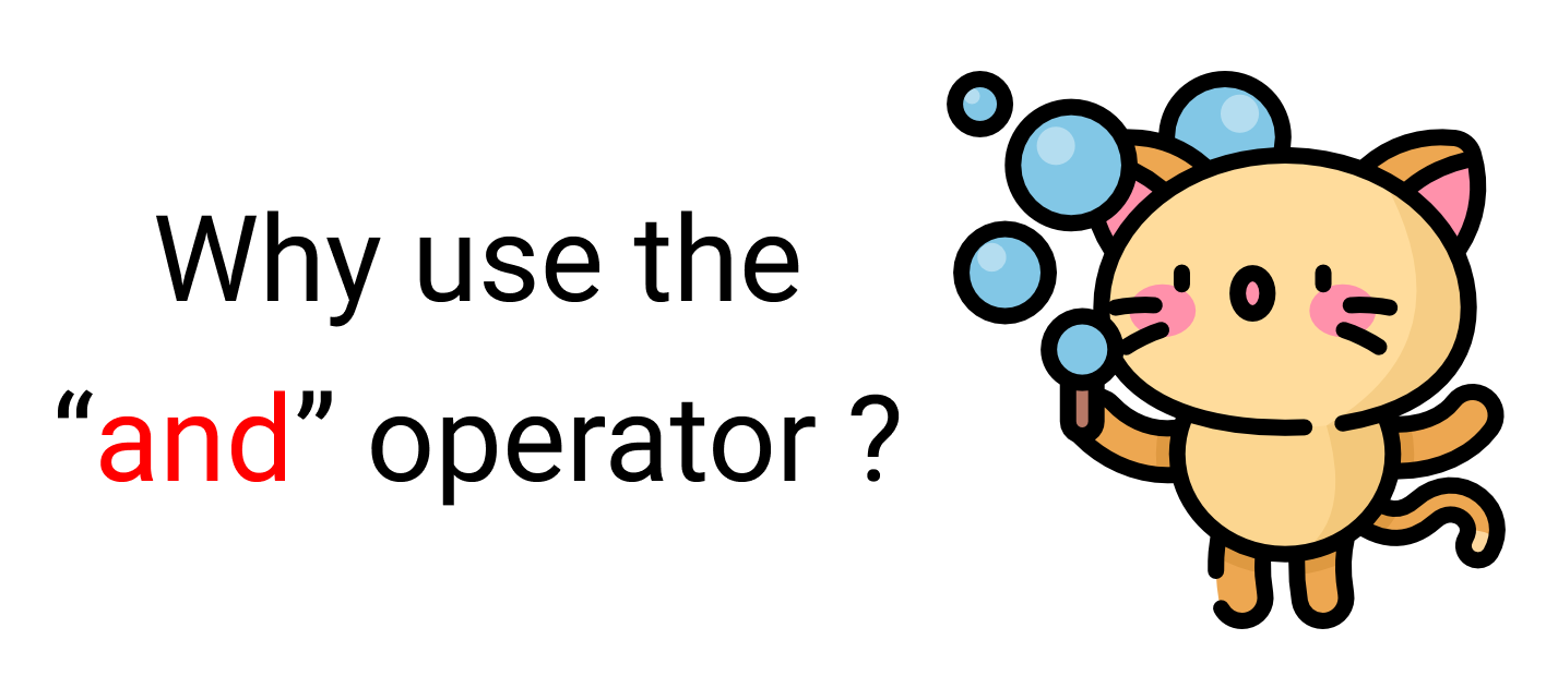
Let's say we're placing an order at a restaurant, "A burger and a pizza". Notice that the two orders are separated by [and].
Likewise, the media type, min-width, and max-width functions are basically conditions we are giving to the browser. We don't write the "and" operator if we have one condition. Like this ->
@media screen {
  .container{
     // Your code here
  }
}
We write the and operator if we have two conditions, like this:
@media screen and (max-width : 768px) {
  .container{
     // Your code here
  }
}
You can also skip the media type and work with just min-width & max-width, like this:
//Targeting screen sizes between 480px & 768px

@media (min-width : 480px) and (max-width : 768px) {
  .container{
     // Your code here
  }
}
If you have three conditions or more, you can use a comma, like this:
//Targeting screen sizes between 480px & 768px

@media screen, (min-width : 480px) and (max-width : 768px) {
  .container{
     // Your code here
  }
}
3. How to Use the min-width & max-width Functions
Let's discuss the Most important component of a media query, screen breakpoints.
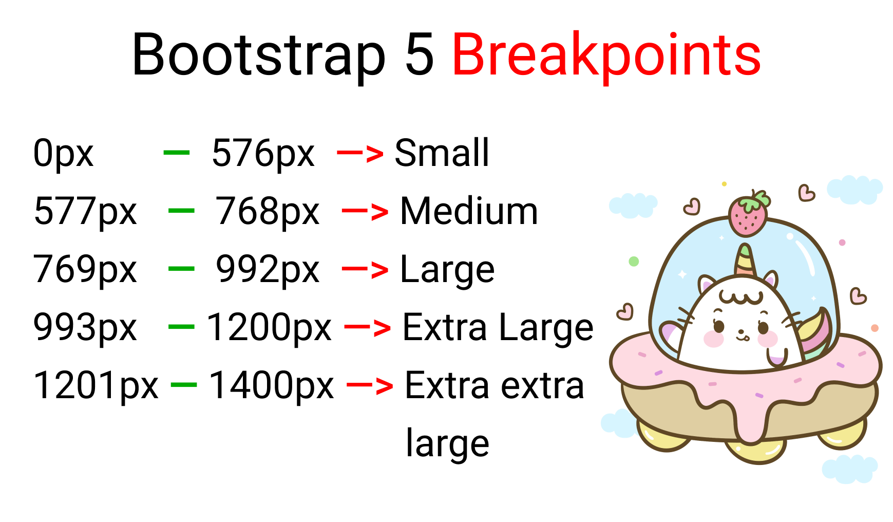
To be honest, there's no such thing as a standard screen break-point guide because there are so many screen sizes on the market. But, for our project, we'll follow The Official Bootstrap 5 screen break-point values. Here they are:
Here's a list of every device screen resolution on CSS-Tricks.
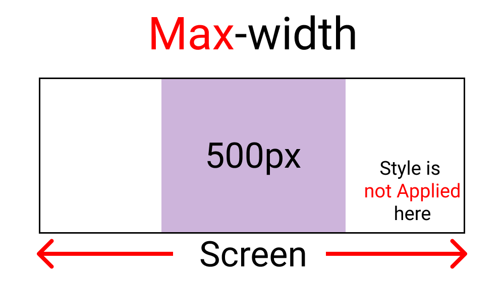
The max-width function:
Using this function, we are creating a boundary. This will work as long as we are inside the boundary. Here's a sample 👇
Our Boundary is 500px:
Notice how the light purple color gets Disabled when we hit above 500px.
To recreate this, write this code in SCSS:
.container{
  background-color: white ;
  height: 100vh;
  display: grid;
  place-items: center;
}
At the bottom, insert the media query like this 👇
@media screen and (max-width : 500px){
  .container{
    background-color: $color-1;
  }
}
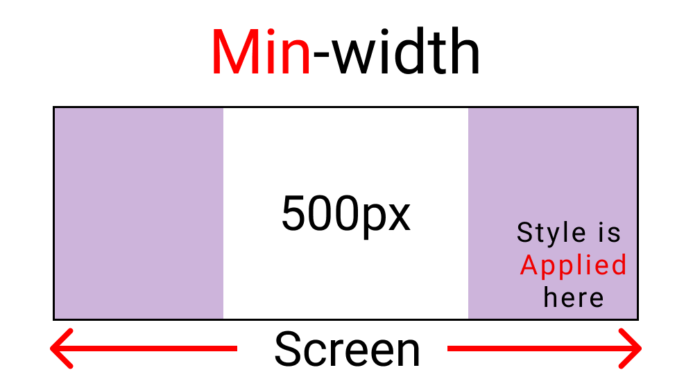
The min-width function:
We are also creating a boundary here. But this will work if we go outside the boundary. Here's a sample: 👇
Our boundary is 500px:
Notice how the light purple color gets enabled after we hit above 500px width.
To recreate this, write this code in SCSS:
.container{
  background-color: white ;
  height: 100vh;
  display: grid;
  place-items: center;
}
At the bottom, insert the media query like this: 👇
@media screen and (min-width : 500px){
  .container{
    background-color: $color-1;
  }
}
To sum it up, remember that:
- max-width sets styles inside the set boundary
- min-width sets styles outside the set boundary
The code itself
Let's put our first project together!
We will have four screen breakpoints:
- Mobile -> 576px
- Tablet -> 768px
- Laptop -> 992px
- Desktop -> 1200px
Yes, we are following the official bootstrap 5 screen breakpoints. And each breakpoint will get these colors:
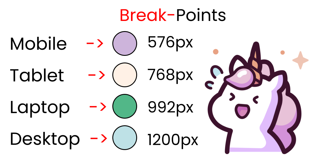
For four device types, we will have four Media Queries. Before touching the media queries, first let's store the breakpoint values in variables, like this:
Note: Don't forget to add the $ sign:
$mobile  : 576px;
$tablet  : 768px;
$laptop  : 992px;
$desktop : 1200px;
And our .container class should look like this:
.container{
  background-color: white ;
  height: 100vh;
  display: grid;
  place-items: center;
}
We're all 50% done! Now let's setup the four media queries.
But Wait...
You need to follow the proper order while writing the media queries. Start writing from the largest display to the smallest display.
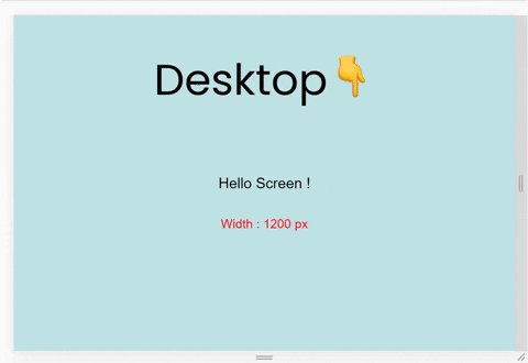
First breakpoint for desktop – 1200px
For the desktop screen, write this code in SCSS:👇
// using variable here which is  👇 1200px
@media screen and (max-width: $desktop){
  .container{
    background-color: $color-4;
  }
}
And here's the result:
Second breakpoint for laptop – 992px
For laptop screens, write this code in SCSS: 👇
// using variable here which is  👇 992px
@media screen and (max-width: $laptop){
  .container{
    background-color: $color-3;
  }
}
And here's the result:
Third breakpoint for tablet – 768px
For tablets screens, write this code in SCSS: 👇
// using variable here which is  👇 768px
@media screen and (max-width: $tablet){
  .container{
    background-color: $color-2;
  }
}
And here's the result:
Fourth breakpoint for mobile – 576px
For mobile screens, write this code in SCSS: 👇
// using variable here which is  👇 576px
@media screen and (max-width : $mobile){
  .container{
    background-color: $color-1;
  }
}
And here's the result:
Take a Break
Congratulations on completing project 1! Now take a break. You deserve it.

Let's build some projects using CSS Media Queries
How to Build a Responsive Portfolio
We'll build a small responsive Website for our second project.
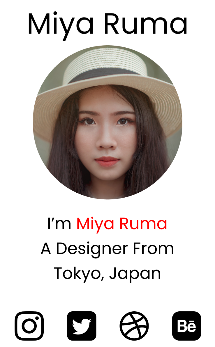
Here's what the desktop view will look like:

And here's the mobile view:
Okay then, let's start coding! First, let's work with the desktop view by taking small baby steps.
Before we start
Create a folder named 'images' inside our Project-1 Folder. Place all the images you downloaded from my GitHub Repository inside the images folder.
The HTML
Step 1 – Create the sections
We'll create three sections for our website. Write this code in your HTML:
<div class="container">

    <div class="header"></div>

    <div class="main"></div>

    <div class="footer"></div>

</div>
Step 2 – Logo and menu items
We'll place the logo and menu items inside the .header div, like this:
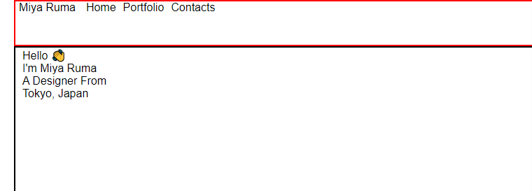
<div class="header">

      <div class="header__logo">Miya Ruma</div>

      <div class="header__menu">
          <div class="header__menu-1"> Home </div>
          <div class="header__menu-2"> Portfolio </div>
          <div class="header__menu-3"> Contacts </div>
      </div>

  </div>
Step 3 – Image and text
We'll place the image and text inside the .main div, like this:
<div class="main">
<div class="main__image"></div>
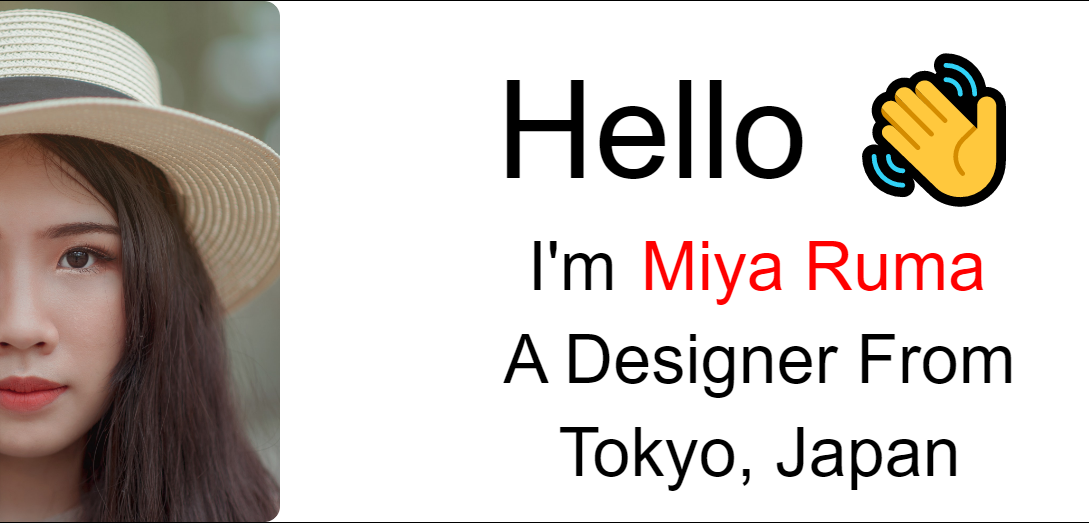
<div class="main__text">
<div class="main__text-1">Hello 👋</div>
<div class="main__text-2">I'm <span>Miya Ruma</span></div>
<div class="main__text-3">A Designer From</div>
<div class="main__text-4">Tokyo, Japan</div>
</div>
</div>
Step 4 – Social media icons
We'll place the social media icons inside the .footer div, like this:
<div class="footer">

   <div class="footer__instagram">
      <img src="./images/instagram.png" alt="">
   </div>

   <div class="footer__twitter">
      <img src="./images/twitter-sign.png" alt="">
   </div>

    <div class="footer__dribbble">
       <img src="./images/dribbble-logo.png" alt="">
    </div>

    <div class="footer__behance">
       <img src="./images/behance.png" alt="">
    </div>

</div>
The SCSS
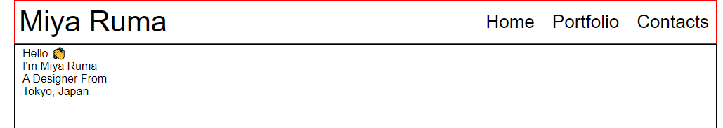
Step 1 – Update the SCSS
Delete everything inside our SCSS and write this code instead:
* {
  // placing Margin to left & right
  margin: 0px 5px;

  padding: 0px;
  box-sizing: border-box;

  body {
    font-family: sans-serif;
  }
}
This is what we have so far:
Step 2 – Select all classes in HTML
Select all the classes we created in HTML on our stylesheet.
.container{}

.header{}

.main{}

.footer{}
Step 3 – Select all children
Now select all the children of the parent classes.
.header{

  &__logo{}

  &__menu{}
}

.main{

  &__image{}

  &__text{}
}

.footer{

  [class ^="footer__"]{}

}
Note that &__logo nested inside .header is a shortcut of .header__logo.
Step 4 – Define the .container
Define the .container for the desktop layout, like this:
.container{

// Defining height
  height: 100vh;

  display: flex;

  flex-direction: column;
}
Apply display: flex; to .header and to the menu items so that it behaves like a row, not a column:
.header{
  display: flex;
  flex-direction: row;

  &__logo{}

  &__menu{
    display: flex;
    flex-direction: row;
  }
}
Divide each section and create borders to see what we are doing:
.header{
  display: flex;

// The border & height
  border: 2px solid red;
  height: 10%;

// Other selectors are here

}

.main{

//The border & height
  border: 2px solid black;
  height: 80%;

// Other selectors are here

}

.footer{

// Border & height
  border: 2px solid green;
  height: 10%;

// Other selectors are here
}
And here's the result:
Step 5 – Complete .header styling
Let's complete the styling of our .header section using flex-box properties and the appropriate font-size:
.header {
// height
  height: 10%;

  display: flex;
// Aligning logo & menu at center
  align-items: center;

// space between logo & menu
  justify-content: space-between;

  &__logo {
    font-size: 4vw;
  }

  &__menu {
    display: flex;
    font-size: 2.5vw;

// to put gap between menu items
    gap: 15px;
  }
}
And here's the result:
Step 6 – Add the image
Let's add the image inside .main section and create a partition for image and text.
.main {
// image & text will act like a row
display: flex;
flex-direction: row;
//The border & height
border: 2px solid black;
height: 80%;
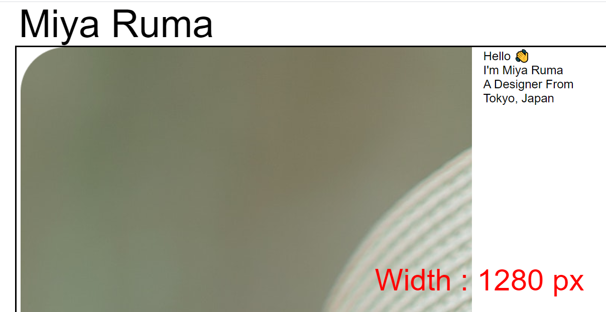
&__image {
//Adding the image
background-image: url("./images/Portrait.png");
// will cover half of screen width
width: 50%;
}
&__text {
// will cover half of screen width
width: 50%;
}
}
The result is a bit ugly at the moment, but don't lose hope~
Step7 – Make the image responsive
Style the image to be responsive like this:
.main{
  &__image{
  //make image fluid
    background-size: contain;

  // stop image repetition
    background-repeat: no-repeat;

  // position the image
    background-position: left center;
  }
}
And here's what we have so far:
The image is responsive all the way from 4k to your smart watch screen. Don't believe me? Open chrome developer tools and test it yourself and see.
You can learn more about Background Properties here if you want to make responsive images for responsive websites.
Step 8 – Style the text
Let's style our text now. First, we'll bring it to the exact center with this code:
.main{

  &__text {
    // will cover half of screen width
    width: 50%;
    display: flex;
    flex-direction: column;

// To bring it at the center
    justify-content: center;
    align-items: center;
  }

// To color The name
  span{
    color: red;
  }

}
Now, let's set font sizes for the text:
.main{


  &__text{

// To add gaps between texts vertically
    gap: 15px;

// font size for "hello"
    &-1{
      font-size: 10vw;
    }

// font size for other texts
    &-2,&-3,&-4{
      font-size: 5vw;

    }

  }
}
The result looks like this:
At this point, you can remove all the borders we placed inside our header, main, and footer classes.
Step 9 – The footer section
First, resize the images like this:
.footer{
  [class^="footer__"] {
    img {
      width: 5.3vw;
    }
  }
}
Then, position the images to our desired place, with a small gap between the icons, like this:
.footer{
  display: flex;
  flex-direction: row;

// To align icons along x-axis
  align-items: center;
// placing image to the right side
  justify-content: flex-end;
// Gap between icons
  gap: 20px;

// margin to right side of icons
  margin-right: 10%;
}
And here's the result, without the guides:
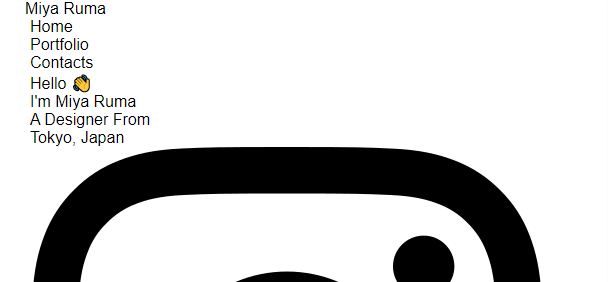
Step 10 – The mobile layout
We're almost there...
Create a media query at the 650px mark and style the .header class like this:
@media (max-width: 650px) {

  .header {

// To place logo at center
    justify-content: center;

    &__logo {
      font-size: 40px;
    }
//hiding the menu on mobile device
    &__menu {
      display: none;
    }
  }
}
Step 11 – Center .main
Now, place the .main section at the exact center with this code:
@media (max-width: 650px){
// styles of header section of step-10...

// main section here
  .main {
    flex-direction: column;
    justify-content: center;
    align-items: center;
}
Step 12 – Style the image and text for mobile
Style the image and text for mobile layout like this:
@media (max-width: 650px){

 .main {
   &__image {
// Image size
      height: 200px;
      width: 200px;
      background-size: 100%;

// To have rounded image
      border-radius: 100%;
      background-position: center;
    }

// Styles for the text ->
    &__text {
      width: 100%;

      &-1 {
        display: none;
      }
      &-2, &-3, &-4 {
        font-size: 30px;
      }
    }
}
Step 13 – Style the footer for mobile
The last step is to style the footer section for the mobile layout:
@media (max-width: 650px){
  .footer {
// placing icons along the X-axis
    justify-content: center;
    margin: 0px;

    [class^="footer__"] {

// Resizing images for mobile layout
      img {
        width: 45px;
        height: 45px;
      }
    }
  }
}
And here's our result:

Take a break
Good job so far! Take a break before moving on to the next project. 😊

Project 3 – How to Build a Card Layout
In project 3, we'll build this:

So let's start.
The SCSS
On your stylesheet, delete everything except the styles of #size. And then add this code there:
* {
  margin: 0px;
  padding: 0px 10px;
  box-sizing: border-box;

  body {
    font-family: sans-serif;
    font-size: 55px;
  }
}

#size{
  position: absolute;
// Positioning the text
  top: 60%;
  left: 50%;
  transform: translateX(-50%);
// color & size of text
  color: red;
  font-size: 40px;
}
The HTML
Your HTML should look like this inside the body tags: 👇
<div class="container">
   // We'll place code here
</div>

// This will show our window width Live
<div id="size"></div>
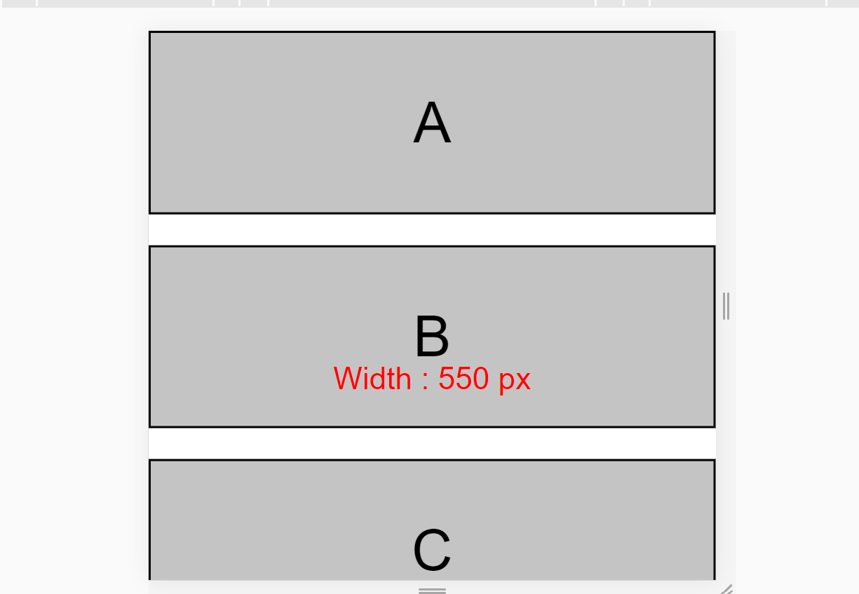
Now, create three classes with class names .row-* like this 👇 inside .container:
<div class="container">

   <div class="row-1">
   </div>

   <div class="row-2">
   </div>

   <div class="row-3">
   </div>
</div>
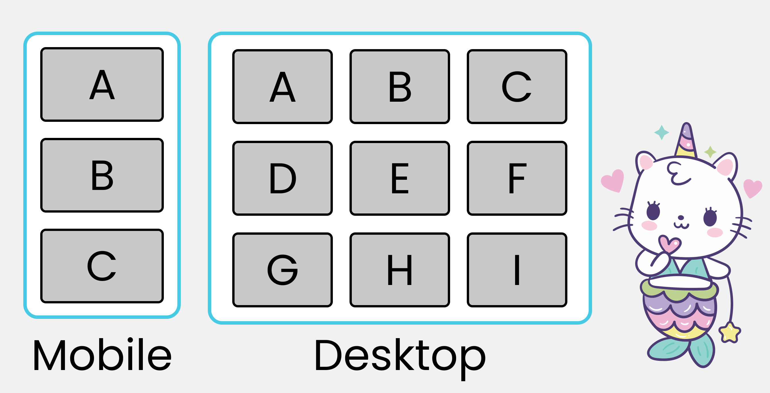
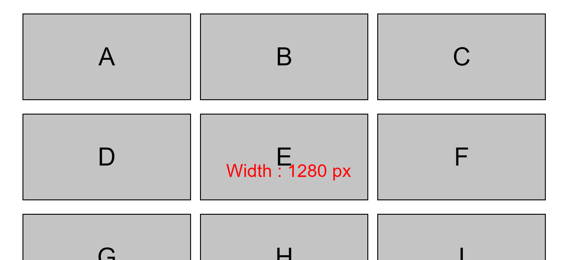
Each row will have three boxes with class names .box-* like this. 👇 And yes, you'll insert letters inside the boxes:
<div class="container">

   <div class="row-1">
       <div class="box-1">A</div>
       <div class="box-2">B</div>
       <div class="box-3">C</div>
   </div>

   <div class="row-2">
       <div class="box-4">D</div>
       <div class="box-5">E</div>
       <div class="box-6">F</div>
   </div>

   <div class="row-3">
       <div class="box-7">G</div>
       <div class="box-8">H</div>
       <div class="box-9">I</div>
   </div>
</div>
We're done with the HTML part, and the result should look like this: 👇
The SCSS
Follow these small baby steps one by one to style the project.
Step 1 – Add some SCSS code
To select and style all the boxes and rows together, this is what we write in our CSS: 👇
.container{
  // styles here
}

[class ^="row-"]{
  // Styles applied on all rows
}

[class ^="box-"]{
  // Styles applied on all boxes
}
Step 2 – Make boxes behave like rows
Boxes should behave like a row. This code will make that happen:
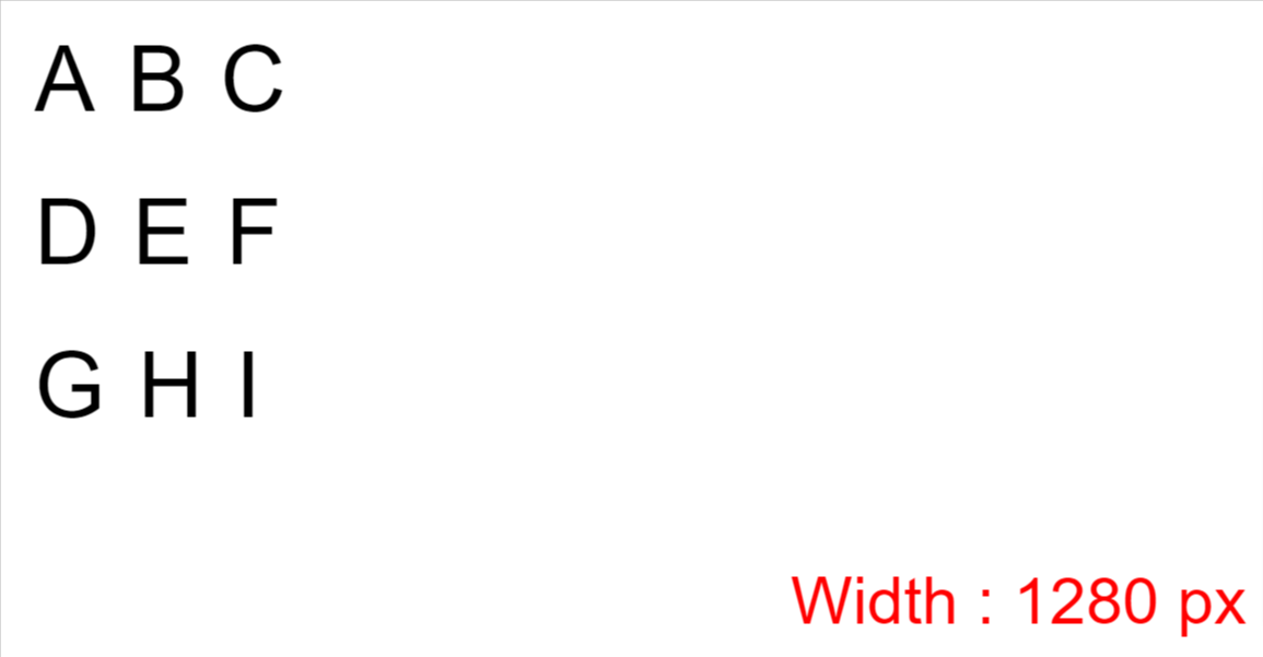
[class ^="row-"]{
  display: flex;
  flex-direction: row;
}
And here's the result: 👇
Step 3 – Define the boxes
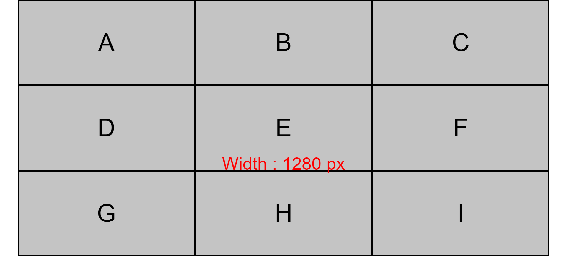
Expand the boxes across the width and height and place the letters at the center.
[class ^="box-"]{

  background-color: #c4c4c4;
  border: 2px solid black;

// Defining the size of the boxes
  width : (100%)/3;
  height: (100vh)/3;

// Place letter at the center
  display: grid;
  place-items: center;
}
Here's the result:
Step 4 – Create gaps between rows
Next we'll create a gap between the rows, like this:
.container{
  display: flex;
  flex-direction: column;
  height: 100vh;

// Creating gap between rows
  gap: 30px;
}
Now let's create a gap between the boxes:
[class ^="row-"]{
  display: flex;
  flex-direction: row;

// Creating gap between boxes
  gap : 30px;
}
And here's what it looks like:
Step 5 – Set up the mobile layout
Create the media query which will be applied at the 650px mark:
@media (max-width: 650px){
  // We'll write code here
}
Change the orientation of the boxes on the mobile screen from row to column, and stretch the boxes to 100% of the width with this code:
@media (max-width: 650px){

//Change orientation
  [class ^="row-"]{
    flex-direction: column;
  }

// Change width of boxes
  [class ^="box-"]{
    width: 100%;
  }
}
And here's the final mobile result:
By the way, project 2 is a part of this article of mine. If you're interested to learn more and practice both your Flexbox and media query skills, then go for it!
Conclusion
Here's your medal for reading all the way until the end ❤️
Suggestions and criticisms are highly appreciated ❤️
YouTube / Joy Shaheb
Twitter / JoyShaheb
Instagram / JoyShaheb
Credits
- CSS Tricks
- Portrait used for the example project
- Images from Vecteesy
- Panda, Ice-cream & Cute Cat
- Unicorn Pack & Kitty Avatar
- instagram,Twitter,Behance and Dribbble icons
- Bubble tea