
Today we're gonna learn how to use the CSS units EM, REM, VW and VH by working through some practical examples. We'll also see how to make responsive websites with these units.
Let's start. 💖
Table of Contents
- Why learn relative units?
- What are REM Units?
- How to make responsive websites with REM units
- What are EM Units?
- What are VW units?
- What are VH units?
- Additional Resources
 Topics covered
You can watch this tutorial on YouTube as well if you like:
Why Learn CSS Relative Units?

If you want to make responsive websites very easily, quickly, and efficiently, then you should definitely learn the relative units of CSS.
REM, EM, VW, VH are relative units. If you Combine these with media queries, then you can make perfectly scalable layouts. Look at this GIF 👇 The text is responsive on desktop, tablet, and mobile screens!
 Font using the REM unit
Keep in mind that pixels are absolute units. They won't change when you resize the window. Look at this GIF 👇 Notice that the font size of 50px doesn't change when we resize the window.
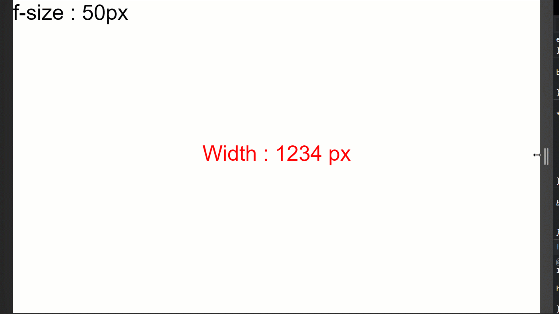 Font using the Pixel unit
Tip: Before starting the tutorial, I suggest that you don't think of EM and REM as units. Think them as multipliers of a base number.
Project Setup

First, copy the code from this Code Pen link and paste it into VS Code or your code editor of choice. Then follow these steps:👇
- create a folder named project-1
- create HTML, CSS, JS files and link them together
- install the plugins we'll need – px to rem and Live server
- Run live server
 Testing starter files
As you can see in the gif above, 👆 the JavaScript is doing all the calculations, so we just need to focus on the tutorial. We will just change the CSS and experiment with different values.
Let's start coding!

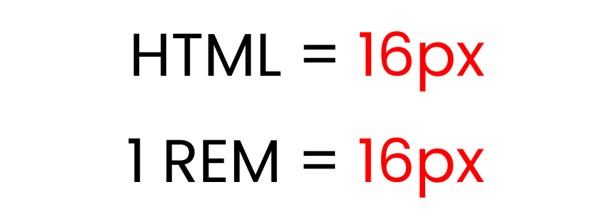
What are REM Units?

The REM unit depends on the root element [the HTML element]. Here's an image to show you how it works:👇
 Default font size of root element
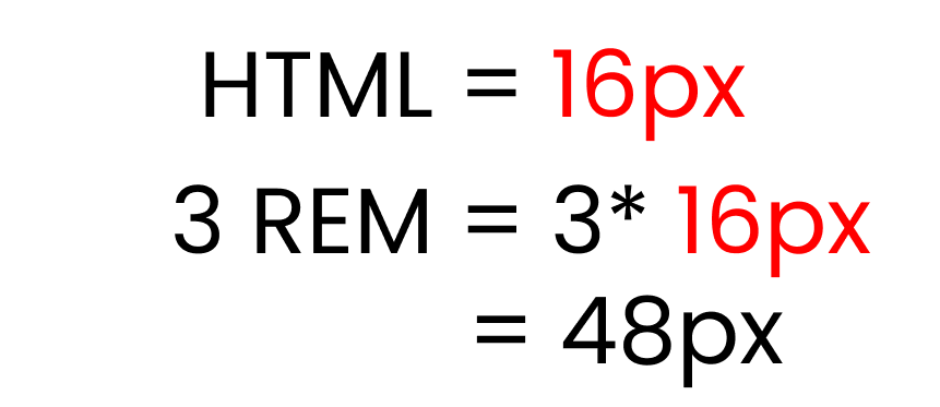
The default font-size of the root element [in HTML] is 16px. So, 1 REM = 16px.
If we write 3 rem, it will show us [ 3*16px = 48px ]. So as you can see, it works like a multiplier.
 experimenting with 3 rem
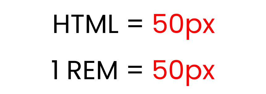
But, if we change the root element font size, the REM unit changes – like this: 👇
 changed font size of root element
We're setting the HTML font-size to 50px.
Now, if we write 3 rem, it will show us [ 3*50px = 150px ] like this: 👇
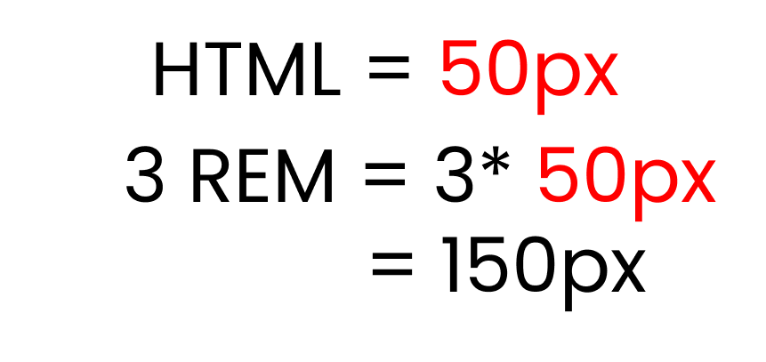 experimenting with 3 rem
Let's recreate the results with code and see their use cases in practice. 👇
First, let's experiment with the default font-size of every website, which is 16 pixels. And we'll set the .text class font-size to 1 rem.
html {
  font-size: 16px;
}

.text {
  font-size: 1rem;
}

/** Calculations
 1 rem * 16px = 16px
**/
Here's what the result looks like:👇
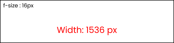 Font-size is 1rem, root is 16px
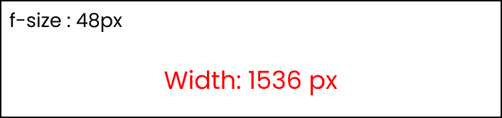
Now, let's increase the .text font-size to 2 rem:
html {
  font-size: 16px;
}

.text {
  font-size: 2rem;
}

/** Calculations
 2 rem * 16px = 32px
**/
And here's the result: 👇
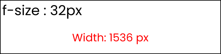 Font-size is 2 rem, root is 16px
As you can see, the font size gets bigger but the width stays the same (1536px).
How to change the root font-size
Now, let's experiment by changing the root font-size, which is inside the html. First write this code to get the default result: 👇
html {
  font-size: 16px;
}

.text {
  font-size: 1rem;
}

/** Calculations
 1 rem * 16px = 16px
**/
Here's what that looks like:👇
 Default setting
Now, change the root font-size to 40px like this:
html {
  font-size: 40px;
}

.text {
  font-size: 1rem;
}

/** Calculations
 1 rem * 40px = 40px
**/
Here's the result:👇
 root element is 40px
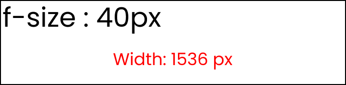
Now, change the .text font size to 2 rem: 👇
html {
  font-size: 40px;
}

.text {
  font-size: 2rem;
}

/** Calculations
 2 rem * 40px = 80px
**/
And you can see the result: 👇
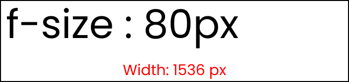 The result
Since we changed the root font size to 40px, when we change the .text font size to 2 rem, we get 2*40 = 80px.
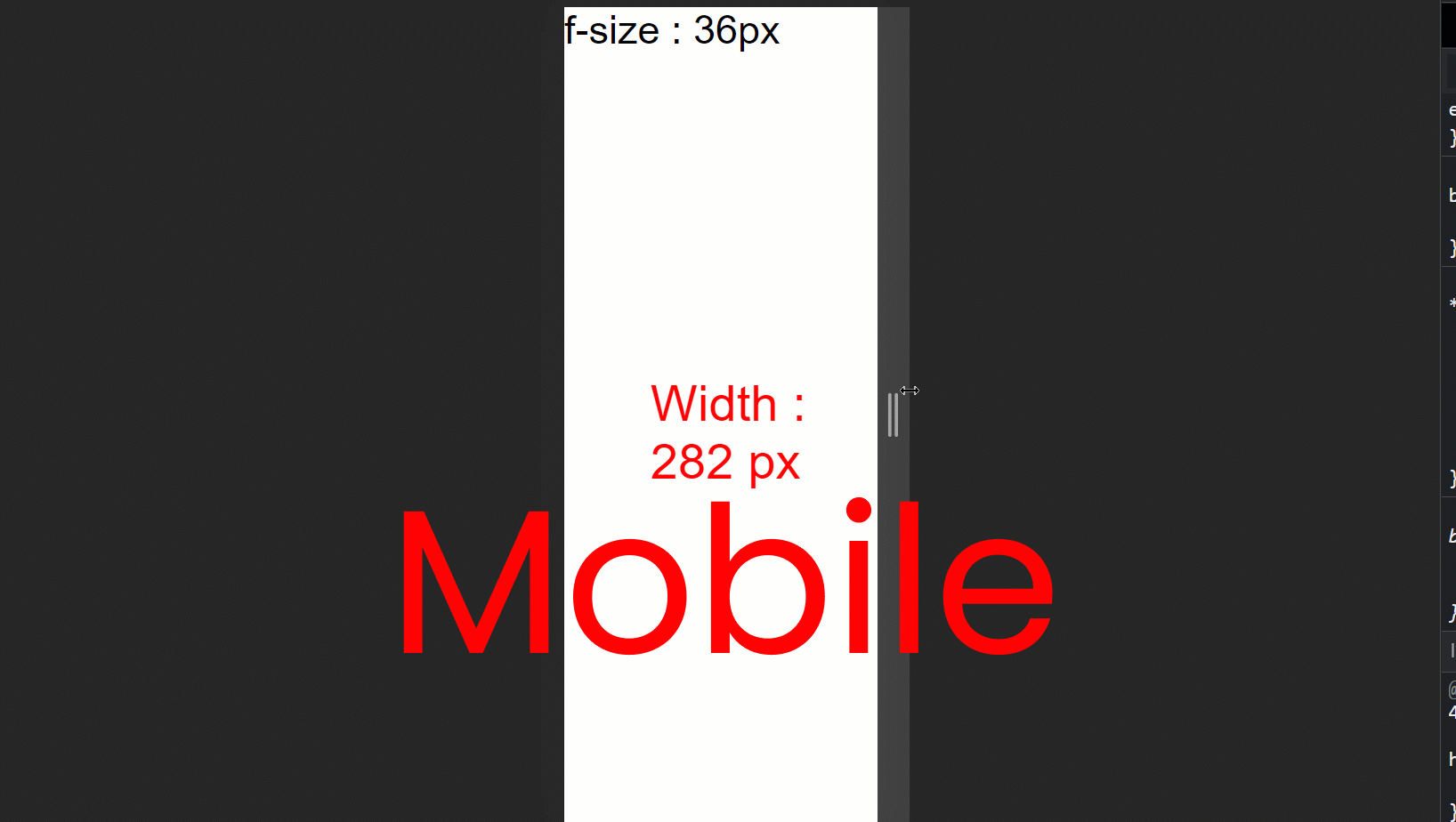
How to Make Responsive Websites with REM Units
Making responsive websites with the REM unit is very easy. Just write your styles in rem units instead of the pixels and change the root elements at different breakpoints using media queries.
Here's a demo that shows you how it's done👇 and how to add the media queries:
// large screen

@media (max-width: 1400px) {
  html {
    font-size: 25px;
  }
}

// Tablet screen

@media (max-width: 768px) {
  html {
    font-size: 18px;
  }
}

// Mobile screen

@media (max-width: 450px) {
  html {
    font-size: 12px;
  }
}
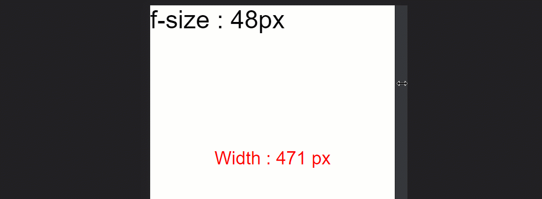
Now, set the .text class to 3 rem units, like this:
.text{
    font-size : 3rem;
}
And here's the result: 👇

Here are the calculations:
- For the large screen -> 3 rem * 25px = 75px
- For tablet screen -> 3 rem * 18px = 54px
- For mobile screen -> 3 rem * 12px = 36px
- Default setting -> 3rem * 16px = 48px
What are EM Units?

The EM unit is the same as the REM unit but it depends on the parent font size. Here's a demo. 👇
Note: make sure you remove all the media queries.
html {
  font-size: 16px;
}

.text {
  font-size: 3em;
}

/** Calculations
  font-size should be
  3 em * 16px = 48px
**/
Here's the result: 👇
Now, let's try adding 3em padding to the .text class.
html {
  font-size: 16px;
}

.text {
  font-size: 3em;
  padding: 3em;
}

/** Calculations
text    => 3em * 16px = 48px
padding => 3em * 3em * 16px = 144px
**/
Instead of being 48px of padding, we are getting 144px padding. As you can see, it is getting multiplied by the previous number.
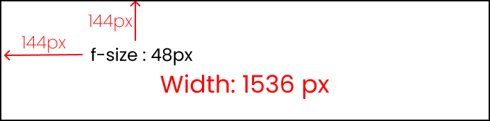 result of 3em padding
Here's the computed part from the developer console: 👇
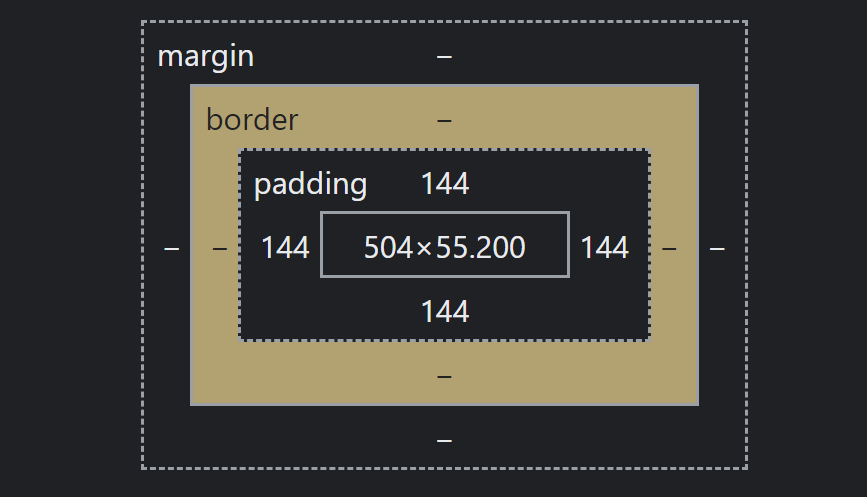 3em padding to our text
Don't use the EM unit 😵❌
Using the EM unit is not worth the effort because:
- you have a high chance of making a calculation error
- you have to write a lot of code in media queries while trying to make the website responsive on all screen sizes
- it's too time-consuming.
What are VW Units?

The full form of VW is viewport width. It works like the percentage unit. Specifying 10vw is equivalent to occupying 10% of entire visible screen width.
To experiment with the results, make these changes in your CSS👇
Note: comment the last line on the .box class.
.text {
  display: none;
}

.box {
  width: 50vw;

  height: 300px;
  /* display: none; */
}
If you look carefully, you can see that 50vw means 50%, which will cover half of the entire screen width.
In the JavaScript part, uncomment this line at the very end: 👇
  // Box Width & height

  box.innerHTML = "Width : " + Box_width;

  // box.innerHTML = "Height : " + Box_height;
The result looks like this:👇
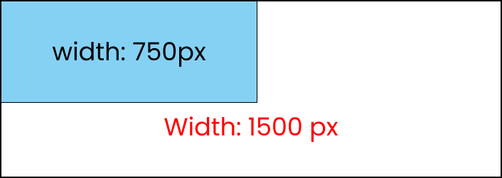 50vw occupies 50% of screen width
As you can see, that element will always cover that much space even if we resize the window
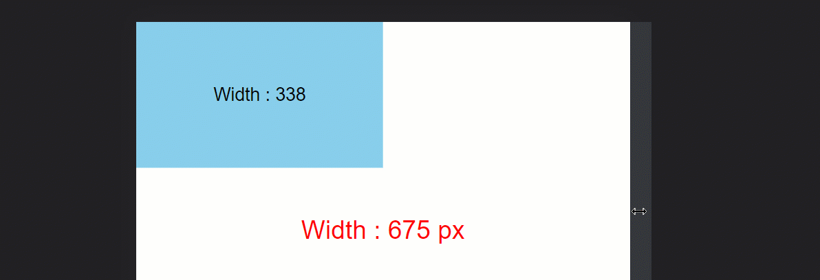 resizing box which is 50vw in size
What are VH Units?

The full form of VH is viewport height. It works like the percentage unit as well. Specifying 10vh is equivalent to occupying 10% of entire visible screen height.
Look at this demo to see how it works:👇
.text {
  display: none;
}

.box {
  width: 300px;

  height: 50vh;
   /* display: none; */
}
If you look carefully, you can see that 50vh means 50%, which will cover half of the entire screen height.
In the JavaScript part, uncomment this line at the very end: 👇
  // Box Width & height

  // box.innerHTML = "Width : " + Box_width;

  box.innerHTML = "Height : " + Box_height;
Also, make these changes:👇
  // Screen Size (Width & height)

  // size.innerHTML = "Width : " + Width + " px";
  size.innerHTML = "Height : " + Height + " px";
And here's the result: 👇
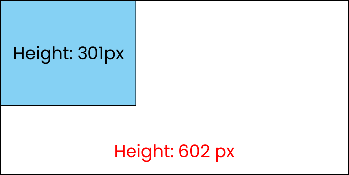 50vh occupies 50% of screen Height
As you can see, it will always cover that much space even if we resize the window.
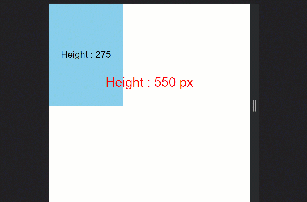 resizing box which is 50vh in size
That's it!
Conclusion
Congratulations! Now, can confidently use the REM, EM, VW, and VH units to make perfectly responsive websites.
Here's your medal 🎖️ for successfully reading till the end. ❤️

Additional Resources
Credits
- Images from Freepik