By Thu Nghiem
When it comes to building responsive websites, Flexbox makes it super easy to create flexible and responsive layouts. So learning Flexbox is a must for front-end developers.
But many tutorials try to teach you everything at once and forget to tell you when and why you'll use each concept.
In this tutorial, I am going to show you the most common use cases of Flexbox by solving eight tasks together. By the end you will be ready to use Flexbox in your next projects.
You can download the starter here: Flexbox-Tutorial-Starter
Here's a video you can watch if you want to supplement this article:
Setup
If you download and open the index.html file, you will see 8 tasks in total. For each task, you will find containers and items inside it. Items are div elements with width and height of 40px.
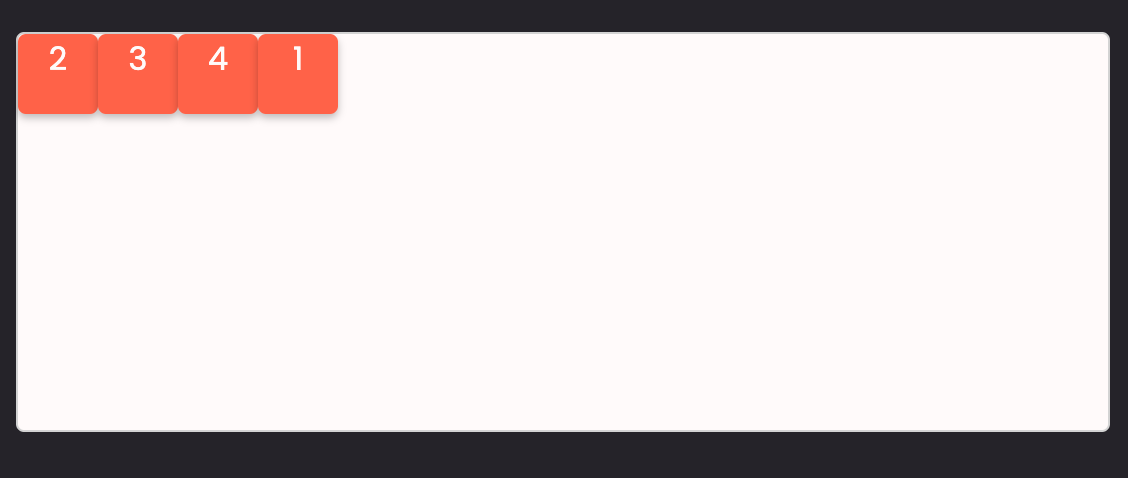
Task 1: Align block elements horizontally in Flexbox
For task number one, we want to align block elements horizontally. By default, block elements are stacked on each other. But if we put them inside a flex container:
.container {
  display: flex;
}
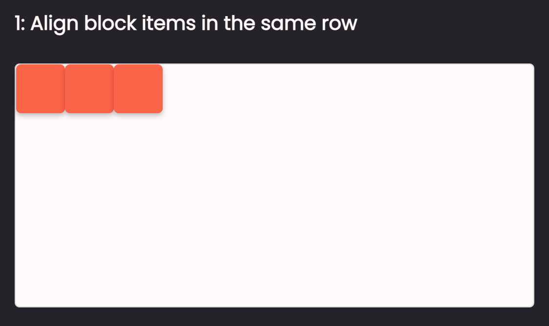
All the block elements will be aligned on the horizontal axis. Quite easy, right? 😉And that's it for task number one.
Task 2: Center item(s) in the middle of the container in Flexbox
For the next task, we need to center some items in the middle of the container. We can do so by setting the flex container to have justify-content: center; and align-items: center;:
.container {
  display: flex;
  justify-content: center;
  align-items: center;
}
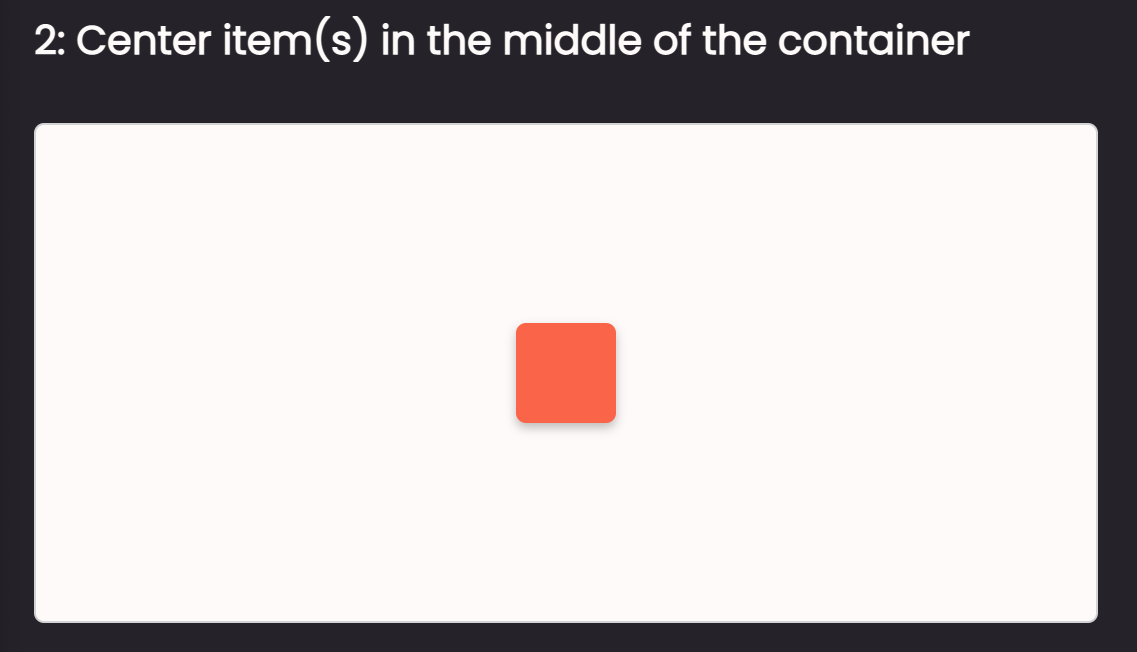
And that's it for the task 2. But before we move on, let's take a closer look at the justify-content and align-items properties.
1. justify-content property
With justify-content, we can align the item(s) on the horizontal axis.
For example, if we want to align item(s) on the horizontal axis at the beginning of the container, we'll do this:
.container {
  display: flex;
  justify-content: flex-start;
}
At the end of the container, we'll do this:
.container {
  display: flex;
  justify-content: flex-end;
}
And in the middle of the container, we'll do this:
.container {
  display: flex;
  justify-content: center;
}
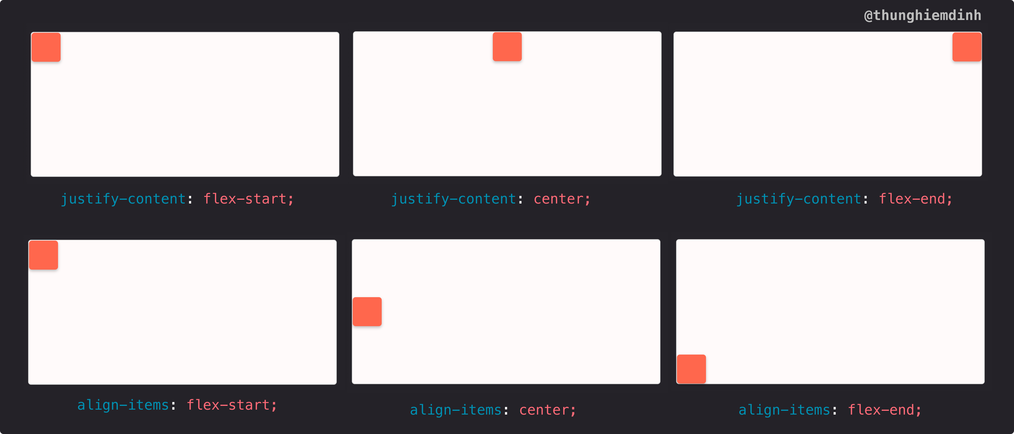
2. align-items property
This property is similar to justify-content, but it's on the vertical axis. With align-items, we can align item(s) on the vertical axis at the beginning of the container like this:
.container {
  display: flex;
  align-items: flex-start;
}
At the end of the container like this:
.container {
  display: flex;
  align-items: flex-end;
}
- And in the middle of the container like this:
.container {
  display: flex;
  align-items: center;
}
Now if we combine justify-content and align-items, we can align item(s) at the middle of the container, right-bottom corner, right-top corner, and so on.
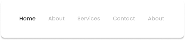
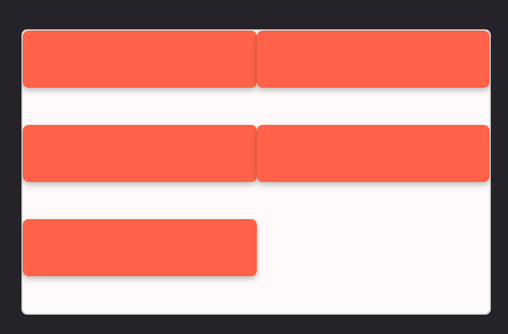
Task 3: Distribute space between items in Flexbox
For the third task, we need to add equal spaces between the items. To achieve this, it is quite simple. All we have to do is to give the flex container justify-content: space-between;.
.container {
  display: flex;
  justify-content: space-between;
}
justify-content: space-between; gives us equal spaces between items.
This is super useful in the navigation, for example, where we need to put equal spaces between the items:
And because we are looking at space-between, with justify-content we can also give it space-evenly and space-around values.

justify-content: space-evenly;
If we give justify-content a value of space-evenly, spaces will not only be added between the items but also before the first item and after the last item.
justify-content: space-evenly;
If we give justify-content a value of space-around, equal spaces will be added around the items.
Task 4: Push items to the end of the container in Flexbox
For task 4, we need to push the last item to the end of the container on the horizontal axis. I am going to show 3 options using Flexbox.
Option 1: using justify-content: space-between;
With 2 items inside the container, we can use justify-content: space-between;. It will push the first item to the start and the last item to the end of the container.
.container {
  display: flex;
  justify-content: space-between;
}
You can see in the example when we only have the logo and the button:

or logo and navigation items:

Option 2: using an empty div with flex-grow
With more than 3 items, I like to add an empty div with flex-grow: 1 between items.
For example, if I put a div with flex-grow: 1 between the second item and the last item (third item), the empty div will expand as much as it can and it pushes the last item to the end of the container:
  <div class="option-2">
     <div class="container">
        <div class="item sm"></div>

        <div class="item"></div>

        <div class="space"></div>

        <div class="item"></div>
        </div>
  </div>
  .option-2 .space {
    flex-grow: 1;
  }

You might see it in more complex navigation like:

Option 3: using flex-grow for one item
If we have 2 items, for example, we can give the first item flex-grow: 1;. By doing this, the first item will expand as much as it can, so it pushes the last item to the end of the container.
  .option-3 .item:first-child {
    flex-grow: 1;
  }

Few examples in input components:

Bonus
We can also use margin-left: auto to push the last item to the end of the container. For example, in option 1, we can give the last item margin-left: auto; and it will work the same.
.task-4 .option-1 .container {
  display: flex;
}

.task-4 .option-1 .item:last-child {
  margin-left: auto;
}
margin: auto is super useful, but let's dive into it in another article and video.
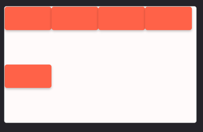
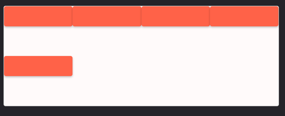
Task 5: Build relative size column layout in Flexbox
By giving the item a flex value of flex: {number}, we can control the size of the item relative to other items. For example with this code:
.task-5 .item-1 {
  flex: 3;
}

.task-5 .item-2 {
  flex: 1;
}

.task-5 .item-3 {
  flex: 1;
}

.task-5 .item-4 {
  flex: 1;
}
We just created a layout that has in total 6 columns. Item 1 takes up 3 columns, whereas the other 3 items will take up 1 column:
This is useful, for example, in a table layout:

This layout is taken from another tutorial, where I show how to build a React + Next.js application from start to finish. Here's the YouTube link if you want to watch and code along.
Task 6: Build a responsive layout in Flexbox with and without media queries
1. Responsive layout without media query
If we give a flex container flex-wrap: wrap:
.task-6 .container {
  display: flex;
  flex-wrap: wrap;
}
We will have a responsive layout where items will not try to shrink inside the container:
2. Responsive layout with media query
With media queries, we will have more control over the size of the items. Say that inside a flex-wrap container we want to have 2 columns. We can do this by:
.task-6 .container {
  display: flex;
  flex-wrap: wrap;
}

.task-6 .item {
  flex-basis: 50%;
}
Now items will be arranged into a 2-column layout, where each column takes up half of the container.
With the same logic, say that we want to have a 4-column layout when the screen is wider than 375px, we can give every item flex-basis: 25%:
@media (min-width: 375px) {
  .task-6 .item {
    display: flex;
    flex-basis: 25%;
  }
}
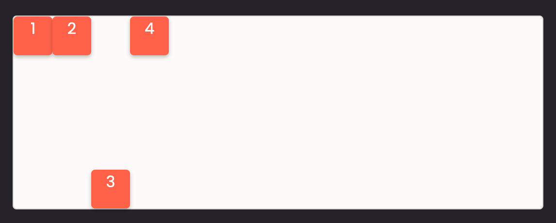
Task 7: Change item order in Flexbox (not common)
With Flexbox, we can change the order of the items. For example, inside a flex container, if we have 4 items and we want to put the first item at the end of the row. All we have to do is to give the item order: 1.
.task-7 .item-1 {
  order: 1;
}
By default, the order property has a value equal to 0 and it can take a negative number.
Task 8: Change the position of an item inside a flex container (not common)
An item inside the flex can change position by itself by using align-self.
align-self: auto | flex-start | flex-end | center | baseline | stretch;
For example, say we want to have item 3 at the end of the container on the vertical axis. We can do this:
.task-8 .container {
  display: flex;
}

.task-8 .item-3 {
  align-self: flex-end;
}
flex-direction property
Flexbox has a flex-direction property by default. flex-direction has the value of row, which means that items are aligned on the horizontal axis.
If we want items to be aligned on the vertical axis, we can use flex-direction: column;.
For example, in task 3, if we give the flex container flex-direction: column;:
.task-3 .container {
  display: flex;

  justify-content: space-between;
  flex-direction: column;
}
We will have:
What we just learnt for flex-direction: row; will still work the same for flex-direction: column;, but instead of a horizontal axis, it will be a vertical axis.
Conclusion
Now that you have learned about Flexbox and CSS Grid, you can continue by building responsive websites. You can find a list of projects to do on devchallenges.io, or you can join me in the following video tutorial, where we will build a professional website from start to finish:
Thanks for reading this article. This topic belongs to the series of videos that I will update on Learn.DevChallenges.io. So to say updated, follow me on social media or subscribe to my Youtube Channel. Otherwise, happy coding and see you in the next videos and articles 👋.
__ 🐣 About me __
I am a full-stack developer, a UX/UI designer and a content creator. You can get to know me more in this short video:
- I am the founder of DevChallenges
- Subscribe my Youtube Channel
- Follow my Twitter
- Join Discord