

I know what you're thinking – but despite the article title and cover image, this article isn't about bread or even pastries. Instead, it looks at a commonly used component in web applications for navigation called the breadcrumb component.
Here, we'll unravel the mysteries of breadcrumb trails in React applications. We'll dissect their types, and you'll learn how to seamlessly integrate them into your web projects for better user navigation.
Prerequisites
- Fundamentals of CSS and TailwindCSS
- Fundamentals of ES6 JavaScript and React
- Fundamentals of Routing and the React Router library ( check out this routing article if you’re unfamiliar).
What We'll Cover:
- Understanding Breadcrumbs
- Types of Breadcrumb Navigation
- How to Build the Breadcrumb Component in React
- How to Create the Breadcrumb Component Structure
– Location-Based Breadcrumbs
– Path-Based Breadcrumbs
– Attribute-Based Breadcrumbs - Best Practices for Breadcrumbs in React
- Conclusion
Understanding Breadcrumbs
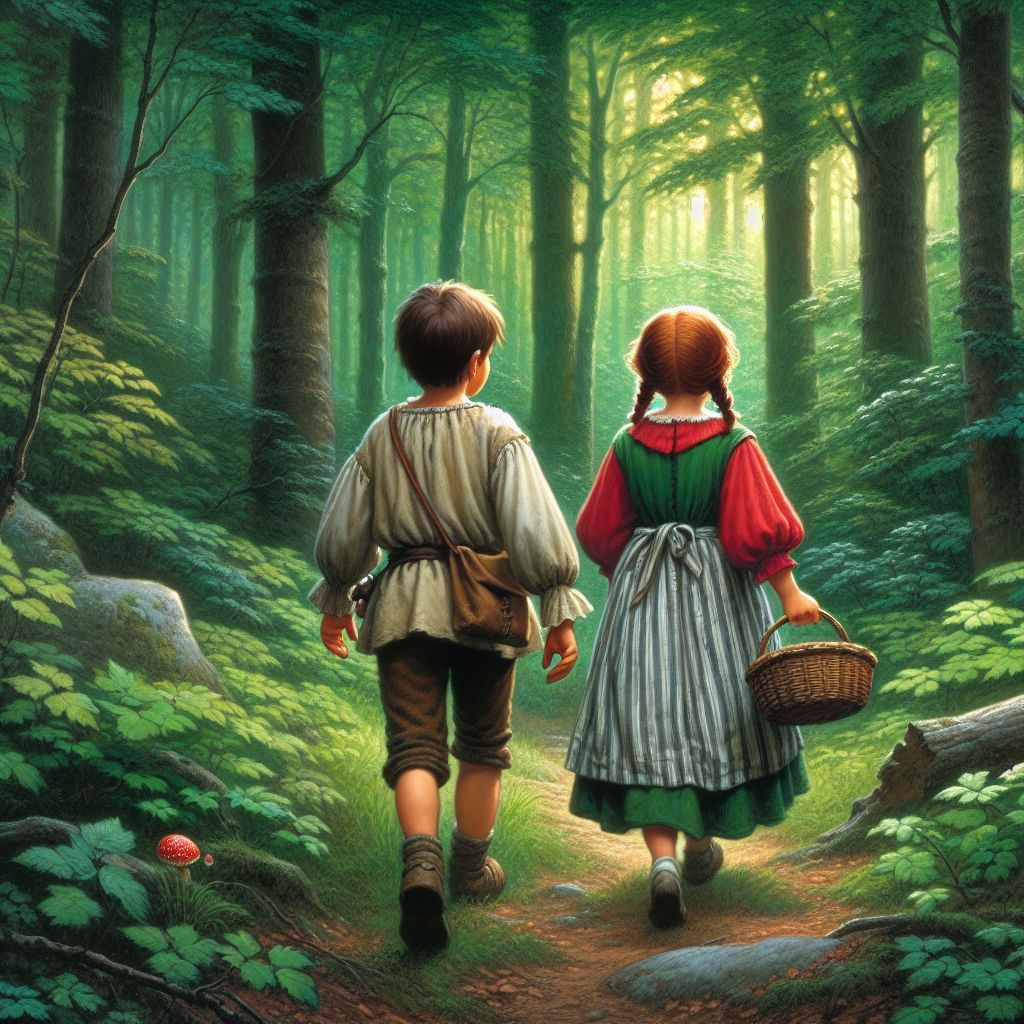
Before we venture deeper into the intricacies of breadcrumbs, let's set the scene. Imagine the classic tale of Hansel and Gretel, where they leave a trail of breadcrumbs to find their way back home through the dense forest.
In the digital realm, breadcrumbs serve a similar purpose, albeit with a twist.
 Hansel And Gretel
Breadcrumbs, in the context of web navigation, are a series of hierarchical links typically displayed at the top of a webpage. These links reflect the user's path from the homepage to the current page, allowing them to retrace their steps or navigate to higher-level pages.
These navigation aids have a fascinating history and a crucial role in guiding users through a digital space.
A typical example of what this component looks like is shown below:
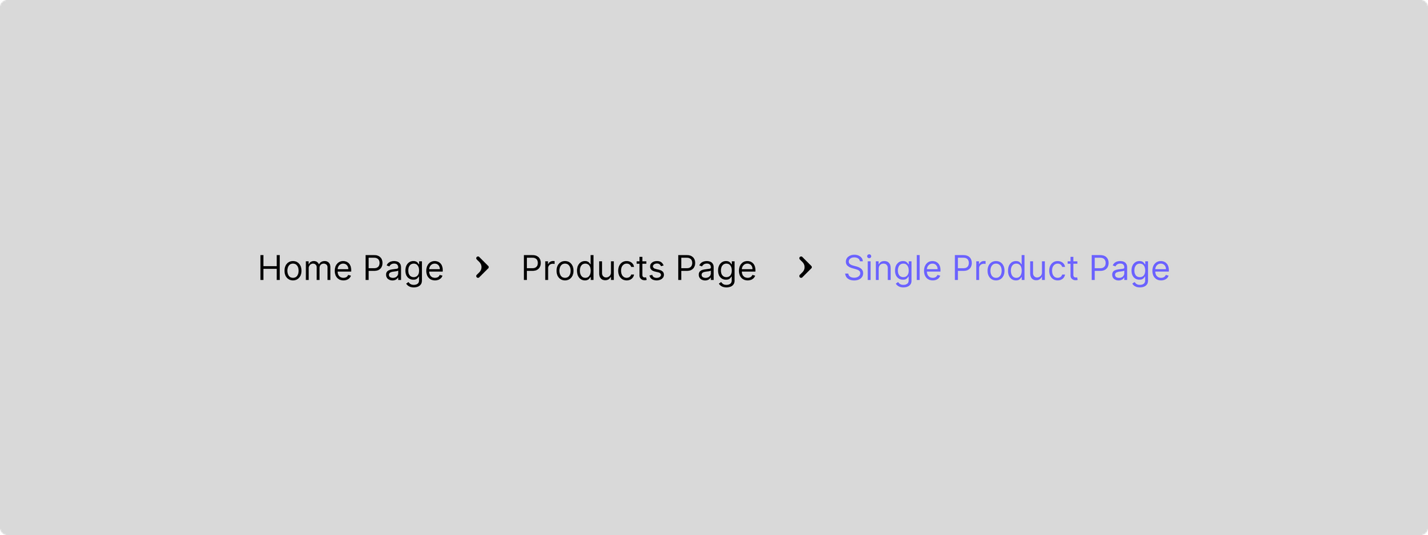 Breadcrumb example: Home Page > Products Page > Single Product Page (current page)
Types of Breadcrumb Navigation
- Location-based Breadcrumbs: Like landmarks in a forest, location-based breadcrumbs show users where they are within the website's hierarchy. They show the current page's position relative to other pages on the site.
- Path-based Breadcrumbs: Like retracing your steps in the forest, path-based breadcrumbs display the user's journey through the website. They show the sequence of pages visited, helping users understand how they arrived at the current page.
- Attribute-based Breadcrumbs: These breadcrumbs highlight specific attributes or characteristics of the current page. They offer more context to the user's navigation, akin to discovering unique features along a trail.
How to Build the Breadcrumb Component in React
The first step in this section involves creating a React environment. Before you begin, make sure to install Node.js on your computer if you don't have it already.
How to Set Up a React Environment
After installing Node.js, use Vite (a modern build tool for React projects) to create a new React project. In your local terminal, run the command:
npm create vite@latest
Select React as your framework and your preferred variant.
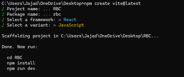 Setting up a react environment with Vite
To install the necessary packages, run npm install and open it in your IDE.
Finally, clear the boilerplate code and start up your server using the command npm run dev.
This project will use Tailwind for styling. To get that set up, run the following command:
npm install -D tailwindcss postcss autoprefixer
npx tailwindcss init -p
After this command, a tailwind.config.js file will be created. Head into the config file, delete its content, and paste this in there instead:
/** @type {import('tailwindcss').Config} */
export default {
  content: [
    "./index.html",
    "./src/**/*.{js,ts,jsx,tsx}",
  ],
  theme: {
    extend: {},
  },
  plugins: [],
}
Then, open your index.css file and paste the style configs (preferably at the top):
@tailwind base;
@tailwind components;
@tailwind utilities;
Finally, restart your dev server to get access to Tailwind.
How to Create the Breadcrumb Component Structure
Rather than building one breadcrumb component, we’re going to build all three types mentioned above so you can see how they work.
Location-Based Breadcrumbs
This type is the most basic type of breadcrumb that involves showing all the routes readily available for the user to navigate.
To begin, start by creating a Breadcrumb file and pasting in these styles:
import SlashImg from "./assets/slash.png";

export default function Breadcrumb() {
  return (
    <div className="bg-white ">
      <ul className=" flex border p-2 gap-6 text-xl text-[#2E4053] items-center">
        <li className=" cursor-pointer hover:bg-[#E8DAEF] p-4 rounded-md">
          Home
        </li>
        <img src={SlashImg} className="w-5 h-5 " alt="" />
        <li className=" cursor-pointer hover:bg-[#E8DAEF] p-4 rounded-md transition-all duration-300">
          Products
        </li>
        <img src={SlashImg} className="w-5 h-5 " alt="" />
        <li className=" cursor-pointer hover:bg-[#E8DAEF] p-4 rounded-md transition-all duration-300">
          About
        </li>
        <img src={SlashImg} className="w-5 h-5 " alt="" />
        <li className=" cursor-pointer hover:bg-[#E8DAEF] p-4 rounded-md transition-all duration-300">
          FAQ
        </li>
      </ul>
    </div>
  );
}
Then import this file into a Home component which you also need to create:
import Breadcrumb from "./Breadcrumb";

export default function Home() {
  return (
    <div className=" h-[100dvh] bg-gray-200">
      <div className="flex flex-col items-center gap-8 ">
        <h1 className=" text-4xl text-[#2E4053 ] mt-20">
          My Breadcrumb Component 🍞
        </h1>
        <Breadcrumb />
      </div>
    </div>
  );
}
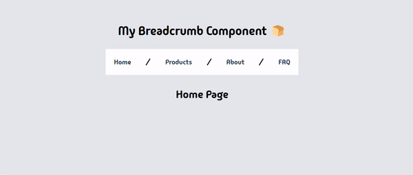
At the moment, your component looks like this:
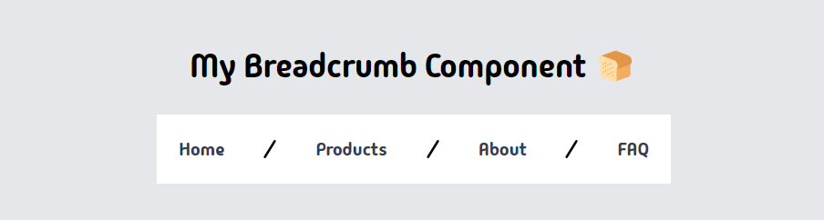 Breadcrumb after rendering on UI
To perform navigation functionalities with this component, start by installing React Router (a widely used library for managing navigation and routing in React applications).
npm i react-router-dom
Then create the routes in your App component.
import { BrowserRouter, Navigate, Route, Routes } from "react-router-dom";

import About from "./About";
import FAQ from "./FAQ";
import Home from "./Home";
import Homepage from "./Homepage";
import Products from "./Products";

export default function App() {
  return (
    <BrowserRouter>
      <Routes>
        <Route index element={<Navigate replace to="home" />} />
        <Route path="/" element={<Home />}>
          <Route path="home" element={<Homepage />} />
          <Route path="products" element={<Products />} />
          <Route path="about" element={<About />} />
          <Route path="faq" element={<FAQ />} />
        </Route>
      </Routes>
    </BrowserRouter>
  );
}
The code block above is a configuration for client-side routing in a React application using React Router v6. It sets up a BrowserRouter to handle dynamic routing and defines a series of Route components within Routes to map URL paths to React components.
BrowserRouteris a router implementation that uses the HTML5 history API to keep the UI in sync with the URL.Navigateredirects users to a specific route. In this case, it redirects from the index route to/home.Routecomponents define a mapping between a path and a component. Theelementprop specifies what to render when the path matches the current URL.- The
path="/" element={<Home />}route is a nested route that serves as a layout for its child routes. It renders the Home component when the URL is/. Nested inside theHomeroute are routes forhome,products,about, andfaq, each rendering their respective components when their path matches the URL.
Next, head over to your Breadcrumb component and change the list elements to Link elements (imported from React Router) to aid routing between routes.
import { Link } from "react-router-dom";
import SlashImg from "./assets/slash.png";

export default function Breadcrumb() {
  return (
    <div className="bg-white ">
      <ul className=" flex border p-2 gap-6 text-xl text-[#2E4053] items-center">
        <Link
          to={"home"}
          className=" cursor-pointer hover:bg-[#E8DAEF] p-4 rounded-md">
          Home
        </Link>
        <img src={SlashImg} className="w-5 h-5 " alt="" />
        <Link
          to={"products"}
          className=" cursor-pointer hover:bg-[#E8DAEF] p-4 rounded-md transition-all duration-300">
          Products
        </Link>
        <img src={SlashImg} className="w-5 h-5 " alt="" />
        <Link
          to={"about"}
          className=" cursor-pointer hover:bg-[#E8DAEF] p-4 rounded-md transition-all duration-300">
          About
        </Link>
        <img src={SlashImg} className="w-5 h-5 " alt="" />
        <Link
          to={"faq"}
          className=" cursor-pointer hover:bg-[#E8DAEF] p-4 rounded-md transition-all duration-300">
          FAQ
        </Link>
      </ul>
    </div>
  );
}
Then use the Outlet component provided by React Router to display the content of each route in the Home component.
import Breadcrumb from "./Breadcrumb";
import { Outlet } from "react-router-dom";

export default function Home() {
  return (
    <div className=" h-[100dvh] bg-gray-200">
      <div className="flex flex-col items-center gap-8 ">
        <h1 className=" text-4xl text-[#2E4053 ] mt-20">
          My Breadcrumb Component 🍞
        </h1>
        <Breadcrumb />
        <Outlet />
      </div>
    </div>
  );
}
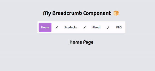
Testing out your component in the browser now gives the following result:
 Routing with the Breadcrumb component
With this, your location-based breadcrumbs are functional, but we can take it a step further. To improve the UX, we can add an active class to the currently active route, creating a visual indicator of where the user is at every point in time.
Start by extracting the current location of the user in the Breadcrumb component:
const location = useLocation();
Then use the pathname property to add an active class to each link:
import { Link, useLocation } from "react-router-dom";

import SlashImg from "./assets/slash.png";

export default function Breadcrumb() {
  const location = useLocation();
  console.log(location.pathname);

  return (
    <div className="bg-white ">
      <ul className=" flex border p-2 gap-6 text-xl text-[#2E4053] items-center">
        <Link
          to={"home"}
          className={`cursor-pointer hover:bg-[#E8DAEF] p-4 rounded-md ${
            location.pathname === "/home" && "bg-[#b572d6] text-white"
          }`}>
          Home
        </Link>
        <img src={SlashImg} className="w-5 h-5 " alt="" />
        <Link
          to={"products"}
          className={`cursor-pointer hover:bg-[#E8DAEF] p-4 rounded-md ${
            location.pathname === "/products" && "bg-[#b572d6] text-white"
          }`}>
          Products
        </Link>
        <img src={SlashImg} className="w-5 h-5 " alt="" />
        <Link
          to={"about"}
          className={`cursor-pointer hover:bg-[#E8DAEF] p-4 rounded-md ${
            location.pathname === "/about" && "bg-[#b572d6] text-white"
          }`}>
          About
        </Link>
        <img src={SlashImg} className="w-5 h-5 " alt="" />
        <Link
          to={"faq"}
          className={`cursor-pointer hover:bg-[#E8DAEF] p-4 rounded-md ${
            location.pathname === "/faq" && "bg-[#b572d6] text-white"
          }`}>
          FAQ
        </Link>
      </ul>
    </div>
  );
}
This now gives the following result:
 Routing with the Breadcrumb component after adding an active class
Tasty! 🍩
Path-Based Breadcrumbs
This breadcrumb type uses the pattern of progressive reveal to better guide the users on where they are based on their actions.
Here we’re going to create two routes and move from the first to the third (Home to Single product page).
Start by modifying your Home component a bit.
export default function Home() {
  return (
    <div className=" h-[100dvh] bg-gray-200">
      <div className="flex flex-col items-center gap-8 ">
        <h1 className=" text-4xl text-[#2E4053 ] mt-20">
          My Breadcrumb Component 🍞
        </h1>
        <Breadcrumb />
        <Outlet />

        <div className="flex gap-4 p-2 ">
          <Link to="products" className=" rounded-md p-2 bg-[#777] text-white">
            Products
          </Link>
          <Link
            to="products/1"
            className=" rounded-md p-2 bg-[#777] text-white">
            Single Product
          </Link>
        </div>
      </div>
    </div>
  );
}
The changes include creating a single product page which we'll route to later.
Then make a nested route path for the page in the App component:
import { BrowserRouter, Navigate, Route, Routes } from "react-router-dom";

import Home from "./Home";
import Homepage from "./Homepage";
import Products from "./Products";
import SingleProduct from "./SingleProduct";

export default function App() {
  return (
    <BrowserRouter>
      <Routes>
        <Route index element={<Navigate replace to="home" />} />
        <Route path="/" element={<Home />}>
          <Route path="home" element={<Homepage />} />
          <Route path="products" element={<Products />}>
            <Route path=":productId" element={<SingleProduct />} />
          </Route>
        </Route>
      </Routes>
    </BrowserRouter>
  );
}
For the already existing Products page, add these styles and changes:
import { Outlet } from "react-router-dom";

export default function Products() {
  return (
    <div className="bg-[#EDBB99] p-2 w-96 h-96 flex flex-col items-center">
      <h1>Products Page</h1>
      <Outlet />
    </div>
  );
}
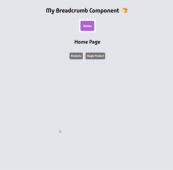
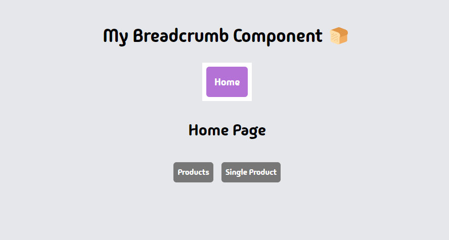 Page after creating the Single Product page without any routing
Finally, modify your breadcrumb component to display the routes when you route to them from the home page.
import { Link, useLocation } from "react-router-dom";

import RightArrowImg from "./assets/right-icon.png";

export default function Breadcrumb() {
  const location = useLocation();

  return (
    <div className="bg-white ">
      <ul className=" flex border p-2 gap-6 text-xl text-[#2E4053] items-center">
        <Link
          to={"home"}
          className={`cursor-pointer hover:bg-[#E8DAEF] hover:text-black p-4 rounded-md ${
            location.pathname === "/home" && "bg-[#b572d6] text-white"
          }`}>
          Home
        </Link>
        {location.pathname.includes("/products") && (
          <>
            <img src={RightArrowImg} className="w-5 h-5 " alt="" />
            <Link
              to={"products"}
              className={` hover:text-black cursor-pointer hover:bg-[#E8DAEF] p-4 rounded-md ${
                location.pathname.includes("/products") &&
                " bg-[#b572d6] text-white"
              } ${
                location.pathname.includes("/products/") &&
                " bg-[#E8DAEF] text-black"
              }`}>
              Products
            </Link>
          </>
        )}
        {location.pathname.includes(`/products/`) && (
          <>
            <img src={RightArrowImg} className="w-5 h-5 " alt="" />
            <Link
              to={"products"}
              className={`hover:text-black  cursor-pointer hover:bg-[#E8DAEF] p-4 rounded-md ${
                location.pathname.includes("/products") &&
                "bg-[#b572d6] text-white"
              }`}>
              Single Product
            </Link>
          </>
        )}
      </ul>
    </div>
  );
}
In the code above, we’re displaying more breadcrumbs based on the route we’re in and applying styles to reflect the route changes.
Testing our component now gives the following result:
 Routing with the Breadcrumb component after adding a nested route
Sweet! 🍬
Attribute-Based Breadcrumbs
Attribute-based breadcrumbs focus on highlighting specific attributes or characteristics of the current page, such as tags, categories, or any other relevant metadata.
Instead of simply showing the user's path through the website hierarchy, they provide additional context that can aid in navigation and understanding.
A common use case for them is on E-commerce sites where you go through multiple items and filter through multiple product properties to find your desired product.
To begin, our app component is going to look drastically different with no routing done.
import Products from "./Products";

export default function App() {
  return (
    <div className=" h-[100dvh] bg-[#EDBB99]">
      <Products />
    </div>
  );
}
Then add this JSX to your Products component:
import Breadcrumb from "./Breadcrumb";

export default function Products() {
  const dogsArray = [
    {
      size: "S",
      color: "white",
      image: "/small-white-dog.jpg",
      name: "Gigi",
      age: 1,
    },
    {
      size: "M",
      color: "white",
      image: "/medium-white-dog.jpg",
      name: "Tom",
      age: 2,
    },
    {
      size: "L",
      color: "white",
      image: "/big-white-dog.jpg",
      name: "Jake",
      age: 3,
    },
    {
      size: "S",
      color: "black",
      image: "/small-black-dog.jpg",
      name: "Hill",
      age: 1,
    },
    {
      size: "M",
      color: "black",
      image: "/medium-black-dog.jpg",
      name: "Jack",
      age: 2,
    },
    {
      size: "L",
      color: "black",
      image: "/big-black-dog.jpg",
      name: "Jones",
      age: 3,
    },
    {
      size: "S",
      color: "brown",
      image: "/small-brown-dog.jpg",
      name: "Herbert",
      age: 1,
    },
    {
      size: "M",
      color: "brown",
      image: "/medium-brown-dog.jpg",
      name: "Coco",
      age: 2,
    },
    {
      size: "L",
      color: "brown",
      image: "/big-brown-dog.jpg",
      name: "Benny",
      age: 3,
    },
  ];


  return (
    <div className="flex flex-col items-center p-2">
      <h1 className="p-4">Adopt Page</h1>
      <Breadcrumb />
      <main>
        <div className="relative grid grid-cols-5 gap-6">
          {dogsArray.map((dog) => (
            <div key={dog.name}>
              <div className=" w-[225px] rounded-md overflow-hidden">
                <img className="w-full " src={dog.image} alt="" />
              </div>
              <div className="grid items-center grid-cols-2 gap-2 mt-2">
                <div className="flex items-center gap-2">
                  <span>Name:</span>
                  <p className="text-center text-white bg-orange-900 border rounded-[4px] p-1.5 min-w-14">
                    {dog.name}
                  </p>
                </div>
                <div className="flex gap-2 ">
                  <span>Size:</span>
                  <p className="text-center text-white min-w-14">{dog.size}</p>
                </div>
                <div className="flex gap-2 ">
                  <span>Color:</span>
                  <p className="text-center text-white capitalize min-w-14">
                    {dog.color}
                  </p>
                </div>
                <div className="flex gap-2 ">
                  <span>Age:</span>
                  <p className="text-center text-white min-w-14">
                    {`${dog.age + " " + "year"}${dog.age > 1 ? "s" : ""}`}
                  </p>
                </div>
              </div>
            </div>
          ))}

          <div className="absolute bottom-0 left-0 p-1 translate-y-[110%]">
            <h2 className="mb-2">Filter by</h2>
            <div className="flex items-center mb-4">
              <h3 className="w-12">Size:</h3>
              <div className="flex gap-2">
                <button
                  className={`p-2 text-center bg-white rounded-md min-w-14 `}>
                  All
                </button>
                <button
                  className={`p-2 text-center bg-white rounded-md min-w-14 `}>
                  S
                </button>
                <button
                  className={`p-2 text-center bg-white rounded-md min-w-14 `}>
                  M
                </button>
                <button
                  className={`p-2 text-center bg-white rounded-md min-w-14 `}>
                  L
                </button>
              </div>
            </div>
            <div className="flex items-center">
              <h3 className="w-12">Color:</h3>
              <div className="flex gap-2">
                <button
                  className={`p-2 text-center bg-white  rounded-md min-w-14 `}>
                  All
                </button>
                <button
                  className={`p-2 text-center bg-white  rounded-md min-w-14`}>
                  White
                </button>
                <button
                  className={`p-2 text-center rounded-md bg-white min-w-14 `}>
                  Brown
                </button>
                <button
                  className={`p-2 text-center rounded-md bg-white  min-w-14 `}>
                  Black
                </button>
              </div>
            </div>
          </div>
        </div>
      </main>
    </div>
  );
}
This JSX uses dummy dog data to create a template and style it with tailwind.
At the moment, your app should look like this;
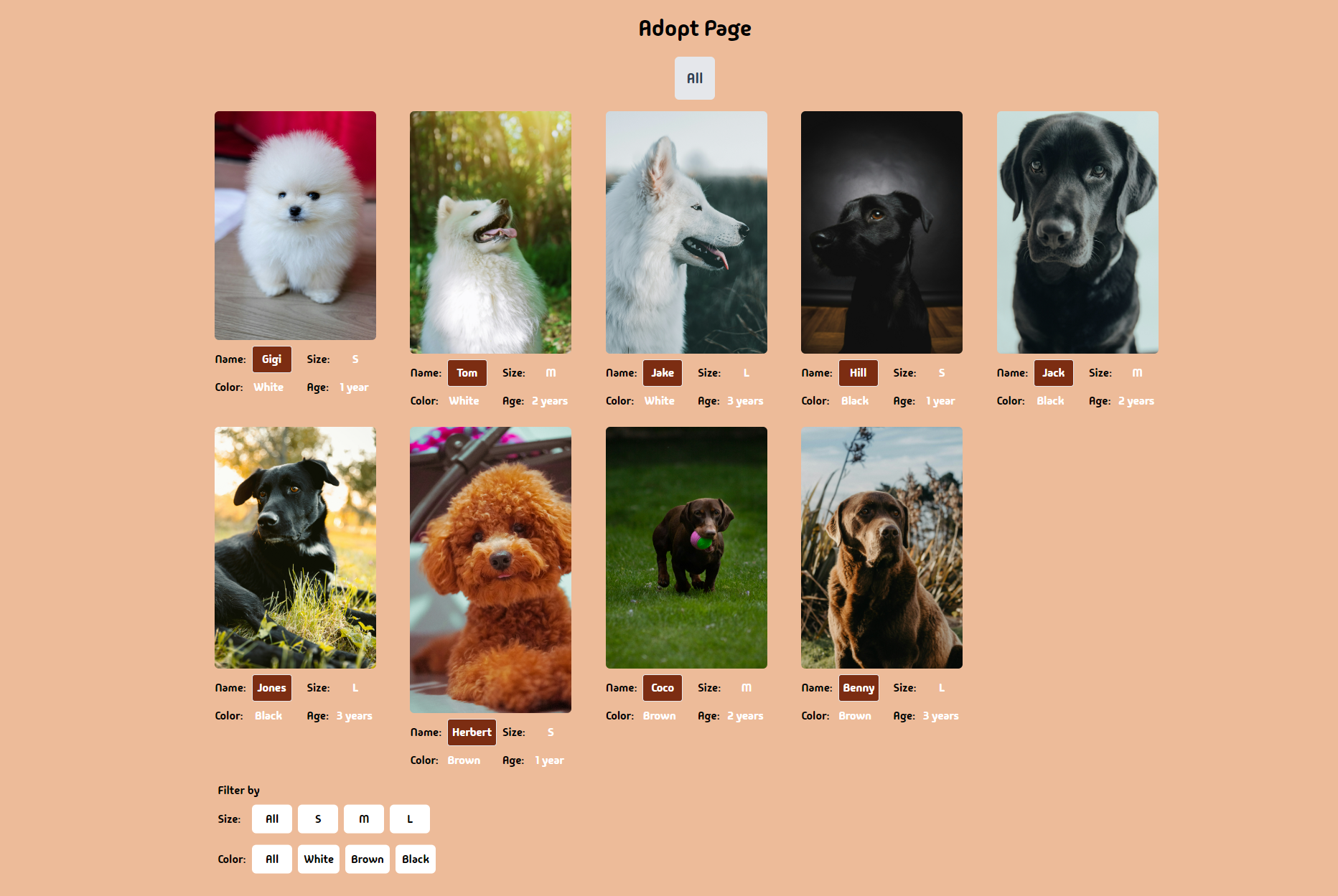 Page after looping over the dummy dog data
To implement the attribute-based breadcrumbs, start by creating two states for the attributes you want to filter by:
const [sizeFilter, setSizeFilter] = useState(null);
const [colorFilter, setColorFilter] = useState(null);
Then create a function to filter based on the value passed in:
  const filteredDogs = dogsArray.filter((dog) => {
    if (sizeFilter && dog.size !== sizeFilter) return false;

    if (colorFilter && dog.color !== colorFilter) return false;

    return true;
  });
After that, change the array you used used to create the JSX to the array returned from the function:
 {filteredDogs.map((dog) => (
            <div key={dog.name}>
Finally, use the setter function to pass in the values you want to filter by:
<main>
        <div className="relative grid grid-cols-5 gap-6">
          {filteredDogs.map((dog) => (
            <div key={dog.name}>
              <div className=" w-[225px] rounded-md overflow-hidden">
                <img className="w-full " src={dog.image} alt="" />
              </div>
              <div className="grid items-center grid-cols-2 gap-2 mt-2">
                <div className="flex items-center gap-2">
                  <span>Name:</span>
                  <p className="text-center text-white bg-orange-900 border rounded-[4px] p-1.5 min-w-14">
                    {dog.name}
                  </p>
                </div>
                <div className="flex gap-2 ">
                  <span>Size:</span>
                  <p className="text-center text-white min-w-14">{dog.size}</p>
                </div>
                <div className="flex gap-2 ">
                  <span>Color:</span>
                  <p className="text-center text-white capitalize min-w-14">
                    {dog.color}
                  </p>
                </div>
                <div className="flex gap-2 ">
                  <span>Age:</span>
                  <p className="text-center text-white min-w-14">
                    {`${dog.age + " " + "year"}${dog.age > 1 ? "s" : ""}`}
                  </p>
                </div>
              </div>
            </div>
          ))}

          <div className="absolute bottom-0 left-0 p-1 translate-y-[110%]">
            <h2 className="mb-2">Filter by</h2>
            <div className="flex items-center mb-4">
              <h3 className="w-12">Size:</h3>
              <div className="flex gap-2">
                <button
                  // Reset size state
                  onClick={() => setSizeFilter(null)}
                  className={`p-2 text-center bg-white rounded-md min-w-14 `}>
                  All
                </button>
                <button
                  // Set filter to small
                  onClick={() => setSizeFilter("S")}
                  className={`p-2 text-center bg-white rounded-md min-w-14 `}>
                  S
                </button>
                <button
                  // Set filter to medium
                  onClick={() => setSizeFilter("M")}
                  className={`p-2 text-center bg-white rounded-md min-w-14 `}>
                  M
                </button>
                <button
                  // Set filter to large
                  onClick={() => setSizeFilter("L")}
                  className={`p-2 text-center bg-white rounded-md min-w-14 `}>
                  L
                </button>
              </div>
            </div>
            <div className="flex items-center">
              <h3 className="w-12">Color:</h3>
              <div className="flex gap-2">
                <button
                  // Reset color state
                  onClick={() => setColorFilter(null)}
                  className={`p-2 text-center bg-white  rounded-md min-w-14 `}>
                  All
                </button>
                <button
                  // Set color to white
                  onClick={() => setColorFilter("white")}
                  className={`p-2 text-center bg-white  rounded-md min-w-14 `}>
                  White
                </button>
                <button
                  // Set color to brown
                  onClick={() => setColorFilter("brown")}
                  className={`p-2 text-center rounded-md bg-white min-w-14 `}>
                  Brown
                </button>

                <button
                  // Set color to black
                  onClick={() => setColorFilter("black")}
                  className={`p-2 text-center rounded-md bg-white  min-w-14 `}>
                  Black
                </button>
              </div>
            </div>
          </div>
        </div>
      </main>
Testing your component now gives the following result:
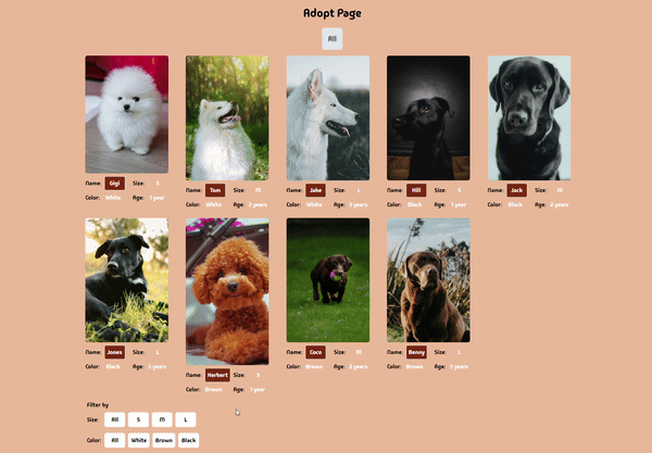 Filtering by properties working
Exquisite!🍦
To add our breadcrumb functionality, pass in the filter props to the component like this:
<Breadcrumb sizeFilter={sizeFilter} colorFilter={colorFilter} />
Then use those props to render the headers:
import RightArrowImg from "./assets/right-icon.png";

export default function Breadcrumb({ sizeFilter, colorFilter }) {
  return (
    <div className="mb-4 bg-gray-200 rounded-md ">
      <ul className="   flex items-center  text-xl text-[#2E4053] text-left">
        <li className={`cursor-pointer p-4 rounded-md `}>All</li>

        {sizeFilter && (
          <>
            <img src={RightArrowImg} className="w-5 h-5 " alt="" />
            <li className={`cursor-pointer p-4 rounded-md capitalize`}>
              {sizeFilter}
            </li>
          </>
        )}
        {colorFilter && (
          <>
            <img src={RightArrowImg} className="w-5 h-5 " alt="" />
            <li className={`cursor-pointer p-4 rounded-md capitalize`}>
              {colorFilter}
            </li>
          </>
        )}
      </ul>
    </div>
  );
}
Before we see the final result, let’s add indicators of what filter props are currently active:
<main>
        <div className="relative grid grid-cols-5 gap-6">
          {filteredDogs.map((dog) => (
            <div key={dog.name}>
              <div className=" w-[225px] rounded-md overflow-hidden">
                <img className="w-full " src={dog.image} alt="" />
              </div>
              <div className="grid items-center grid-cols-2 gap-2 mt-2">
                <div className="flex items-center gap-2">
                  <span>Name:</span>
                  <p className="text-center text-white bg-orange-900 border rounded-[4px] p-1.5 min-w-14">
                    {dog.name}
                  </p>
                </div>
                <div className="flex gap-2 ">
                  <span>Size:</span>
                  <p className="text-center text-white min-w-14">{dog.size}</p>
                </div>
                <div className="flex gap-2 ">
                  <span>Color:</span>
                  <p className="text-center text-white capitalize min-w-14">
                    {dog.color}
                  </p>
                </div>
                <div className="flex gap-2 ">
                  <span>Age:</span>
                  <p className="text-center text-white min-w-14">
                    {`${dog.age + " " + "year"}${dog.age > 1 ? "s" : ""}`}
                  </p>
                </div>
              </div>
            </div>
          ))}

          <div className="absolute bottom-0 left-0 p-1 translate-y-[110%]">
            <h2 className="mb-2">Filter by</h2>
            <div className="flex items-center mb-4">
              <h3 className="w-12">Size:</h3>
              <div className="flex gap-2">
                <button
                  onClick={() => setSizeFilter(null)}
                  className={`p-2 text-center  rounded-md min-w-14 ${
                    // Dynamic background color add
                    sizeFilter === null
                      ? "bg-orange-900 text-white"
                      : "bg-white text-black "
                  }`}>
                  All
                </button>
                <button
                  onClick={() => setSizeFilter("S")}
                  className={`p-2 text-center  rounded-md min-w-14 ${
                    // Dynamic background color add
                    sizeFilter === "S"
                      ? "bg-orange-900 text-white"
                      : "bg-white text-black "
                  }`}>
                  S
                </button>
                <button
                  onClick={() => setSizeFilter("M")}
                  className={`p-2 text-center  rounded-md min-w-14 ${
                    // Dynamic background color add
                    sizeFilter === "M"
                      ? "bg-orange-900 text-white"
                      : "bg-white text-black "
                  }`}>
                  M
                </button>
                <button
                  onClick={() => setSizeFilter("L")}
                  className={`p-2 text-center  rounded-md min-w-14 ${
                    // Dynamic background color add
                    sizeFilter === "L"
                      ? "bg-orange-900 text-white"
                      : "bg-white text-black "
                  }`}>
                  L
                </button>
              </div>
            </div>
            <div className="flex items-center">
              <h3 className="w-12">Color:</h3>
              <div className="flex gap-2">
                <button
                  onClick={() => setColorFilter(null)}
                  className={`p-2 text-center   rounded-md min-w-14 ${
                    // Dynamic background color add
                    colorFilter === null
                      ? "bg-orange-900 text-white"
                      : "bg-white text-black "
                  }`}>
                  All
                </button>
                <button
                  onClick={() => setColorFilter("white")}
                  className={`p-2 text-center   rounded-md min-w-14 ${
                    // Dynamic background color add
                    colorFilter === "white"
                      ? "bg-orange-900 text-white"
                      : "bg-white text-black "
                  }`}>
                  White
                </button>
                <button
                  onClick={() => setColorFilter("brown")}
                  className={`p-2 text-center rounded-md   min-w-14 ${
                    // Dynamic background color add
                    colorFilter === "brown"
                      ? "bg-orange-900 text-white"
                      : " bg-white text-black "
                  }`}>
                  Brown
                </button>

                <button
                  onClick={() => setColorFilter("black")}
                  className={`p-2 text-center rounded-md    min-w-14 ${
                    // Dynamic background color add
                    colorFilter === "black"
                      ? "bg-orange-900 text-white"
                      : " bg-white text-black"
                  }`}>
                  Black
                </button>
              </div>
            </div>
          </div>
        </div>
      </main>
A final test on your component now gives this result:
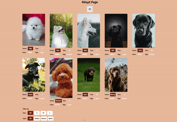 Filtering via properties and showing it in the breadcrumb
And voilà! Your component filters perfectly, and also shows a useful breadcrumb to help users know what properties they’ve filtered by.
 Bruce Almighty Jim Carrey beautiful gif
Best Practices for Breadcrumbs in React
When implementing breadcrumbs in React, it's crucial to follow certain best practices to ensure a seamless user experience. Here are some key points to consider:
- Consistency with React Routing: Breadcrumbs should align with the application's routing structure. You can do this by implementing dynamic breadcrumbs using a good routing library (React Router). By defining routes and generating an array of breadcrumbs based on the user's current route, you can ensure that the breadcrumb trail reflects the user's navigation path.
- Breadth and Depth of Breadcrumb Trails: Breadcrumb trails should represent the user's location within the application. This includes using a separator, such as a slash ("/"), to distinguish between different parts of the breadcrumb trail.
- Naming and Navigation: Breadcrumbs should be easy to understand and navigate. This involves using clear and descriptive names for each breadcrumb and ensuring that each breadcrumb link is clickable, leading the user to the appropriate page.
- Ensuring Accessibility: Breadcrumbs should be accessible to all users. This can be achieved by using the
aria-labelattribute to identify the breadcrumb trail as a navigation landmark. This makes it easier for users with assistive technologies to locate and navigate the breadcrumb trail. - Customization and Ease-of-Use: When using a component for creating breadcrumbs, consider its customization options and ease of use. Look for components that provide useful defaults and allow for easy customization of texts, links, and separators.
By adhering to these best practices, you can create effective and user-friendly breadcrumbs in your React applications.
Here are links to the repositories on GitHub:
Conclusion
Implementing breadcrumbs in React applications not only provides a navigational aid but also contributes to a seamless and intuitive user experience. Adhering to best practices enhances the usability and accessibility of applications.
Just as the aroma of freshly baked bread entices hungry people to come visit the bakery, a well-structured breadcrumb trail can entice users to explore and navigate an application with ease, ultimately improving user navigation and experience. And that's how the cookie crumbles, leaving a trail of delightful navigation in its wake.
Contact Information
Want to connect or contact me? Feel free to hit me up on the following:
- Twitter / X: @jajadavid8
- LinkedIn: David Jaja
- Email: Jajadavidjid@gmail.com