

Having a responsive layout is an important component of user interface (UI) design. It enables a website or application to automatically adjust its size and layout based on the size of the user's device and screen. This provides an optimal viewing experience.
Responsive layouts also give the user a more consistent and unified look across all devices and platforms, while still making sure the user's experience is tailored to their device.
This helps create a more user-friendly experience and improves the overall usability of the website or application.
In this tutorial, I'll show you how to create a simple responsive layout in React Native. You can preview the demo here.
Requirements
To follow this tutorial, you'll need:
A basic understanding of React Native
Expo Snack – a browser-based development environment for React Native
How to Create a Responsive Layout
Go to Expo Snack and clear the content of App.js. Start by importing the React library and Text, View, and Stylesheet UI components:
import * as React from 'react';
import { Text, View, StyleSheet } from 'react-native';
React Native is based on React, so we need to import the React library explicitly. The Text component is used to create text, View is a container element used for grouping other elements, and StyleSheet is used to define the components stylesheet.
Next, define an App function and return two custom components, <Header /> and <Footer />:
export default function App() {
  return (
    <View style={styles.container}>
      <Header />
      <Boxes />
    </View>
  );
}
Here we wrap <Header /> and <Footer /> inside a <View /> container. Both of them are custom components, and because they haven't been created yet, you'll get a ReferenceError. Ignore that for now.
Next, create the stylesheet for this component and define the styling for the container element:
const styles = StyleSheet.create({
  container: {
    flex: 1,
  },
});
This flex:1 value tells the component to fill all available space and to share the space evenly amongst its children.
Let's now create both the <Header> and <Boxes/> components.
How to Create the <Header /> Component
In the components folder, create a new file named Header.js. Then import both the following:
import * as React from 'react';
import { Text, View, StyleSheet} from 'react-native';
Create a <Header /> function and return a single <View /> with text saying "Header Component":
export default function Header() {
  return (
    <View style={styles.header}>
      <Text>Header Component</Text>
    </View>
  );
}
The <View /> is linked to a style property of header. Keep in mind that we want to make this header responsive on all screen sizes. Let's do that using CSS.
const styles = StyleSheet.create({
  header: {
    width: "100%",
    height: "15%",
    alignItems: 'center',
    justifyContent: 'center',
    backgroundColor: 'grey'
  },
});
With this stylesheet, we're specifying that, no matter how big or small the screen, the header should span the whole width of the screen (100%) and take only 15% of the screen's height.
Now to the boxes.
How to Create the <Boxes /> Component
Below the header we want to place two boxes, one to the left and one to the right. We also want the boxes to take up a certain width and height based on the screen dimension of the target device.
Inside the components folder, create a new file named boxes.js. Start by importing the following:
import * as React from 'react';
import { Text, View, StyleSheet} from 'react-native';
Next, create a Boxes function and return the markup for the boxes:
export default function Boxes() {
  return (
    <View style={styles.container}>
      <View style={styles.box}>
        <View style={styles.inner}>
          <Text>Box 1</Text>
        </View>
      </View>
      <View style={styles.box}>
        <View style={styles.inner}>
          <Text>Box 2</Text>
        </View>
      </View>
    </View>
  );
}
Here we have two boxes placed inside the container. Inside both is a View element containing the text label for each box.
Next, define the styling for the component. We'll create three sets of styles, one for the box container, one for the inner wrapper and the last for the boxes themselves.
const styles = StyleSheet.create({
  container: {
    width: "100%",
    height: "85%",
    alignItems: "center",
    flexDirection: 'row',
    flexWrap: 'wrap'
  },
  box: {
    width: "50%",
    height: "50%",
    padding: 5
  },
  inner: {
    flex: 1,
    backgroundColor: "#D3D3D3",
    alignItems: 'center',
    justifyContent: 'center'
  }
});
Recall that the header takes up 15% of the screen's height. Therefore, with the above CSS, we specify that the box container should take up the remaining 85%.
We align the boxes to the center and place them in a row arrangement. Each box takes up 50% of the total height and width, and we apply padding of 5 to space them a bit.
Now that we have both the responsive Header and Boxes ready, let's import them to App.js and see the results.
How to Import <Header /> and <Boxes />
Inside App.js, at the top of the file, import both <Header /> and <Boxes /> like so:
import Header from "./components/Header"
import Boxes from "./components/Boxes"
Once the app compiles, you should see your responsive layout on the right side of your window looking like this:
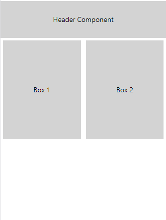
Final look of responsive layout
This arrangement will be consistent across all screen sizes because we used percentages to set the height and width instead of fixed width values.
Conclusion
I hope this tutorial helped you understand React Native positioning better. You should now be able to create responsive layouts in your React Native app using the techniques we covered in this post.
Grab my FREE freelance writing checklist here. Have a great week!