

React is a JavaScript library for building user interfaces. And it's gained a lot of popularity in the front-end development community.
One of the benefits of using React is its integration with CSS, which allows developers to apply styles to their components in a modular and reusable way.
In this tutorial, you will learn how to integrate React with CSS like a pro by understanding the different ways you can apply styles to your components. You'll also learn some best practices for organizing and maintaining your CSS code.
By the end of this tutorial, you should be able to confidently style your React components and build visually appealing user interfaces.
What you will learn
Here are some things that you will learn:
- How to apply basic CSS styles to React components
- How to use CSS modules to apply scoped styles to components
- How to use CSS-in-JS libraries like styled-components to style your components
- How to apply responsive styles to your components using media queries and other responsive design techniques
- How to use CSS animations and transitions to add dynamic visual effects to your components
- Best practices for organizing and maintaining your CSS when working with a large React application.
How to Integrate React with CSS
There are several ways to integrate React with CSS. Here are a few approaches that you may find useful:
Using inline styles
You can use the style attribute in your React components to specify styles inline. This can be convenient if you only need to apply a few styles to a single element.
import React from 'react';

function MyComponent() {
  return (
    <div style={{color: 'red', fontSize: '32px'}}>
      This text is red and 32px
    </div>
  );
}
This is a functional component in React that returns a single div element with inline styling. The inline styling sets the text color to red and the font size to 32px. When this component is rendered in a React application, it will display a red text with font size 32px as you can see in this CodePen.
Using a CSS file
You can create a CSS file and import it into your React components. This is useful if you have a set of styles that you want to reuse across multiple components.
/* my-styles.css */
.red-text {
  color: red;
}

.large-text {
  font-size: 32px;
}
This is a CSS file that contains two class selectors, .red-text and .large-text, which can be used to apply the corresponding styles to elements. The .red-text class sets the text color to red and the .large-text class sets the font-size to 32px.
To use these classes in JSX, you need to import the stylesheet file in the component file and then add the className to the JSX elements:
import React from 'react';
import './my-styles.css';

function MyComponent() {
  return (
    <div className="red-text large-text">
      This text is red and 32px
    </div>
  );
}
Check out the code on Codepen.
Using a CSS preprocessor
You can use a CSS preprocessor (such as SASS or LESS) to write and organize your styles. This can be convenient if you want to use features like variables, mixins, and nested selectors in your styles.
/* my-styles.scss */
$red: red;

.red-text {
  color: $red;
}

.large-text {
  font-size: 32px;
}
This is a SCSS (Sass) file that uses variables to store color values, which can be reused throughout the stylesheet. The $red variable is set to the value of red, and is then used to set the text color of the .red-text class. Additionally, the .large-text class sets the font-size to 32px.
import React from 'react';
import './my-styles.scss';

function MyComponent() {
  return (
    <div className="red-text large-text">
      This text is red and 32px
    </div>
  );
}
This is a functional React component that imports the my-styles.scss file and uses the class selectors defined in that file to style the elements in the JSX. The import statement at the top of the file is used to import the my-styles.scss file into the component, allowing the component to use the CSS classes defined in that file.
The JSX within the MyComponent function returns a single div element with the className red-text large-text. This means that the div element will have both of the class styles .red-text and .large-text that were defined in the my-styles.scss file, resulting in the text inside the div being red and 32px.
When this component is rendered by a React application, it will display a red text with font size 32px. You can view the working code here.
Using a CSS-in-JS library
There are also several libraries that allow you to write your styles in JavaScript and apply them to your components.
This can be convenient if you want to dynamically generate styles or take advantage of features like theming. Some popular CSS-in-JS libraries include styled-components and emotion.
import React from 'react';
import styled from 'styled-components';

const RedText = styled.div`
  color: red;
  font-size: 32px;
`;

function MyComponent() {
  return (
    <RedText>
      This text is red and 32px
    </RedText>
  );
}
This is a functional React component that uses the "styled-components" library to style its JSX elements. The styled-components library allows you to write actual CSS code to style your components, in a way that is scoped to the component. It also allows you to use JavaScript expressions in your CSS.
Here, the component imports the styled object from the styled-components library and creates a new component called RedText that renders a div element with the styles defined inside the backticks. The styles defined inside the backticks include setting the text color to red and font-size to 32px.
Then the component returns JSX that uses the RedText component, which renders a div with the defined styles.
When this component is rendered by a React application, it will display a red text with font size 32px.
This method of styling allows you to create reusable, self-contained components, with their own styles, that are easy to manage and test.
How to Use CSS Animations and Transitions to Add Dynamic Visual Effects to Your Components
To use CSS animations and transitions in a React component, you will need to use a style object or an external stylesheet to define the styles for your component.
Here is an example of using a style object to define a simple CSS animation that fades in an element when it is mounted:
import React, { useEffect } from 'react';

function FadeInElement() {
  const [fadeIn, setFadeIn] = useState(false);

  useEffect(() => {
    setFadeIn(true);
  }, []);

  const fadeInStyle = {
    opacity: fadeIn ? 1 : 0,
    transition: 'opacity 500ms linear'
  };

  return <div style={fadeInStyle}>Fade In Element</div>;
}
This is a functional React component that uses React Hooks to create a simple animation that "fades in" an element on the screen.
The component utilizes the useState hook to manage the state of the component, in this case it is a boolean value that determines whether the element should be visible or not.
The component also utilizes the useEffect hook to listen for changes in the component and set the fadeIn state to true when the component is rendered. The useEffect takes an empty array as a second argument, meaning it will only run once when the component first renders (on mount).
The component then defines an object fadeInStyle that uses the fadeIn state to set the opacity of the element. If fadeIn is true, the element will be fully opaque (opacity: 1), otherwise it will be fully transparent (opacity: 0). The transition property is also set to smoothly transition the opacity over 500ms.
The component returns a div element with the fadeInStyle object as its inline style. When this component is rendered by a React application, it will display the text "Fade In Element" that fades in smoothly over a period of 500ms. You can view the working code here.
You can also use the className prop and an external stylesheet to define your styles. Here is an example of using an external stylesheet to define a simple CSS transition that changes the color of an element when it is hovered:
import React from 'react';
import './FadeInElement.css';

function FadeInElement() {
  return <div className="fade-in-element">Hover Me</div>;
}
.fade-in-element {
  transition: color 500ms linear;
}

.fade-in-element:hover {
  color: blue;
}
You can also use the @keyframes rule to define more complex animations. For example:
@keyframes pulse {
  0% {
    transform: scale(1);
  }
  50% {
    transform: scale(1.1);
  }
  100% {
    transform: scale(1);
  }
}

.pulse {
  animation: pulse 500ms linear;
}
You can then apply the pulse animation to an element using the className prop:
import React from 'react';
import './PulseElement.css';

function PulseElement() {
  return <div className="pulse">Pulse</div>;
}
Best Practices for Organizing and Maintaining your CSS in a Large React Application
Use a CSS-in-JS library
CSS-in-JS libraries like styled-components and emotion allow you to write your styles in JavaScript and automatically scope them to your components as shown above. This can help prevent naming conflicts and make it easier to manage your styles.
Use a naming convention
It's a good idea to use a consistent naming convention for your CSS classes to keep your styles organized and easy to understand. Some popular conventions include BEM (Block-Element-Modifier) and SMACSS (Scalable and Modular Architecture for CSS).
Here's an example of how these conventions might be used together in a React component:
import React from 'react';
import './ProfileInfo.css';

function ProfileInfo(props) {
  return (
    <div className="profile-info">
      <h2>{props.name}</h2>
      <p>{props.bio}</p>
    </div>
  );
}

export default ProfileInfo;
And the corresponding CSS:
.profile-info {
  background-color: #f5f5f5;
  padding: 20px;
}
In this code, the following naming conventions are used:
- The React functional component is named "ProfileInfo", which follows the UpperCamelCase or PascalCase convention for naming React components.
- The CSS file imported is named "ProfileInfo.css", which also follows the UpperCamelCase convention and matches the name of the component.
- The class in the JSX template is "profile-info", which follows the lowercase and hyphen-separated convention, also known as kebab-case, for naming CSS classes.
You can read more about naming conventions here if you like.
Use a linter
A linter is a tool that checks your code for style and syntax errors. There are linters available for CSS that can help you keep your styles consistent and error-free.
There are several linters available for linting CSS code, such as CSSLint, Stylelint, and ESLint.
To use a linter in CSS, you will first need to install it. For example, to install CSSLint, you can use npm by running the following command:
npm list -g csslint
Once the linter is installed, you can use it to lint your CSS code by running the linter and passing in the file or files you want to lint as arguments.
For example, to lint a file called "styles.css" using CSSLint, you will need to change your directory to the folder with the CSS file then run the following command:
csslint styles.css
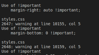
After running the command above you will see the following output according to errors in your code:
You can also configure the linter to use specific rules and settings by creating a configuration file. The format of the configuration file depends on the linter you are using. For example, CSSLint uses a .csslintrc file.
Once you run the linter, it will output any issues or warnings it finds in your CSS code. You can then go through the output and fix any issues that were found.
Note: Depending on the linter you are using, the process may vary. But the basic concept is the same.
Split your styles into separate files
As your project grows, it can be helpful to split your styles into separate files, such as one file for base styles, one for layout styles, and one for theme styles. This can make it easier to find and maintain your styles.
Use source control
Using a version control system like Git to track changes to your CSS files can make it easier to collaborate with other team members and also to roll back changes if something goes wrong.
Use a CSS preprocessor
CSS preprocessors like SASS and LESS can help you write and maintain your styles more efficiently as shown above. They allow you to use variables, functions, and other features that are not available in standard CSS.
Conclusion
Integrating React with CSS can be a powerful tool for building efficient and stylish web applications.
By understanding the principles of the React framework and how it interacts with CSS, you can leverage the strengths of both technologies to create dynamic and expressive user interfaces.
Whether you are a seasoned developer or just starting out with React, learning how to effectively integrate CSS can take your skills to the next level and help you build truly impressive applications.