
By Zoltán Szőgyényi
Flowbite is an open-source library of web components built with the utility-first classes from Tailwind CSS. It also includes interactive elements such as dropdowns, modals, datepickers.
Tailwind CSS is a framework that I've been using a lot lately in my web-related projects because of how fast it is to build the pages using the utility-first classes.
One problem that I have encountered, however, is that the framework does not include a basic set of components to get started with. So I had to build them over and over for every project.
But then I found a component library based on Tailwind CSS called Flowbite. It comes with the most commonly used web components, such as buttons, navigation bars, cards, form elements, and more which are conveniently built with the utility classes from Tailwind CSS.
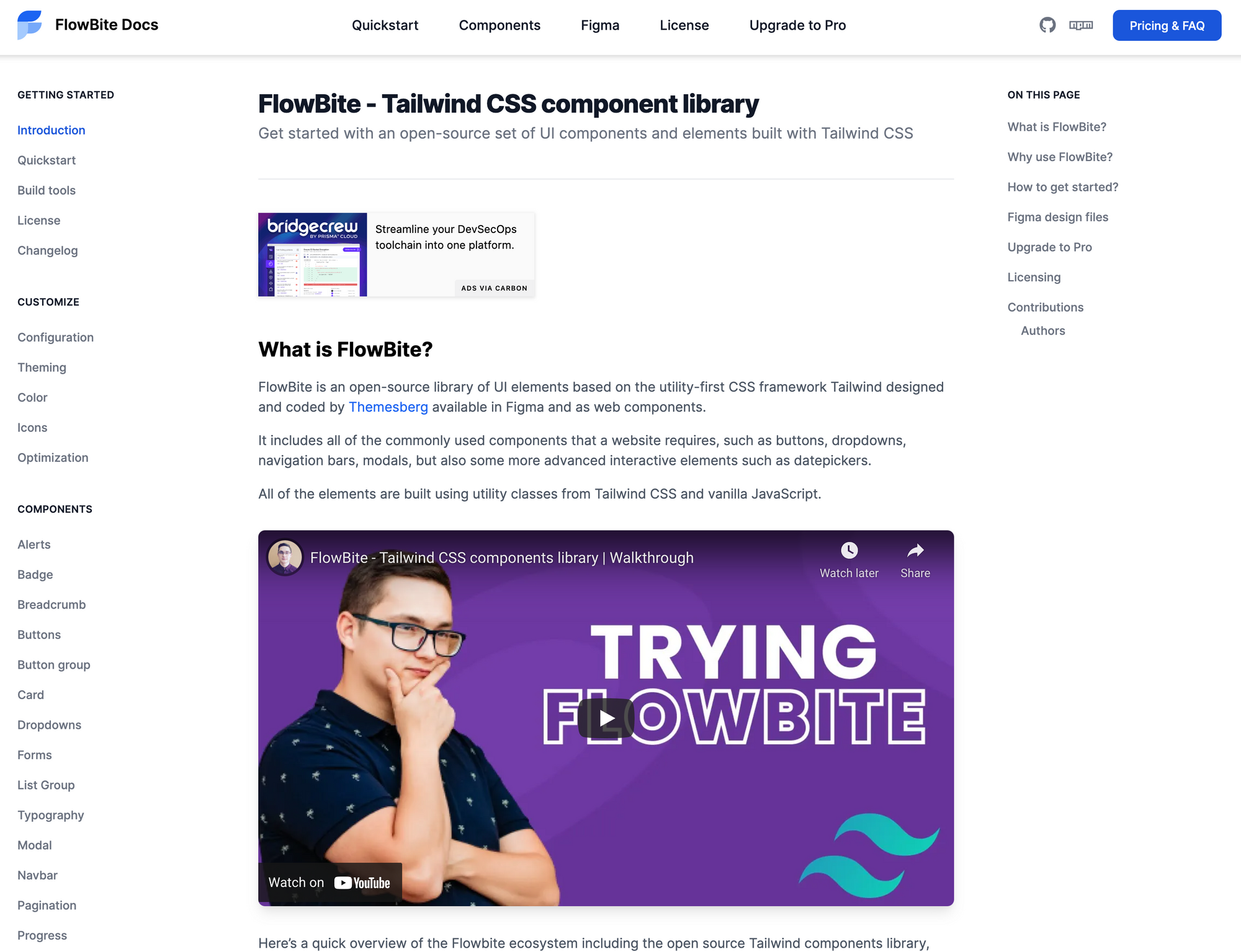 Flowbite - Tailwind CSS component library
Today I want to show you how you can get started with this library and start building websites even faster with Tailwind CSS and the components from Flowbite.
The project is available on Github and it is open source under the MIT License.
Getting started with Flowbite
First of all you need to understand how Flowbite works. This library is not another framework. Rather, it is a set of components based on Tailwind CSS that you can just copy-paste from the documentation.
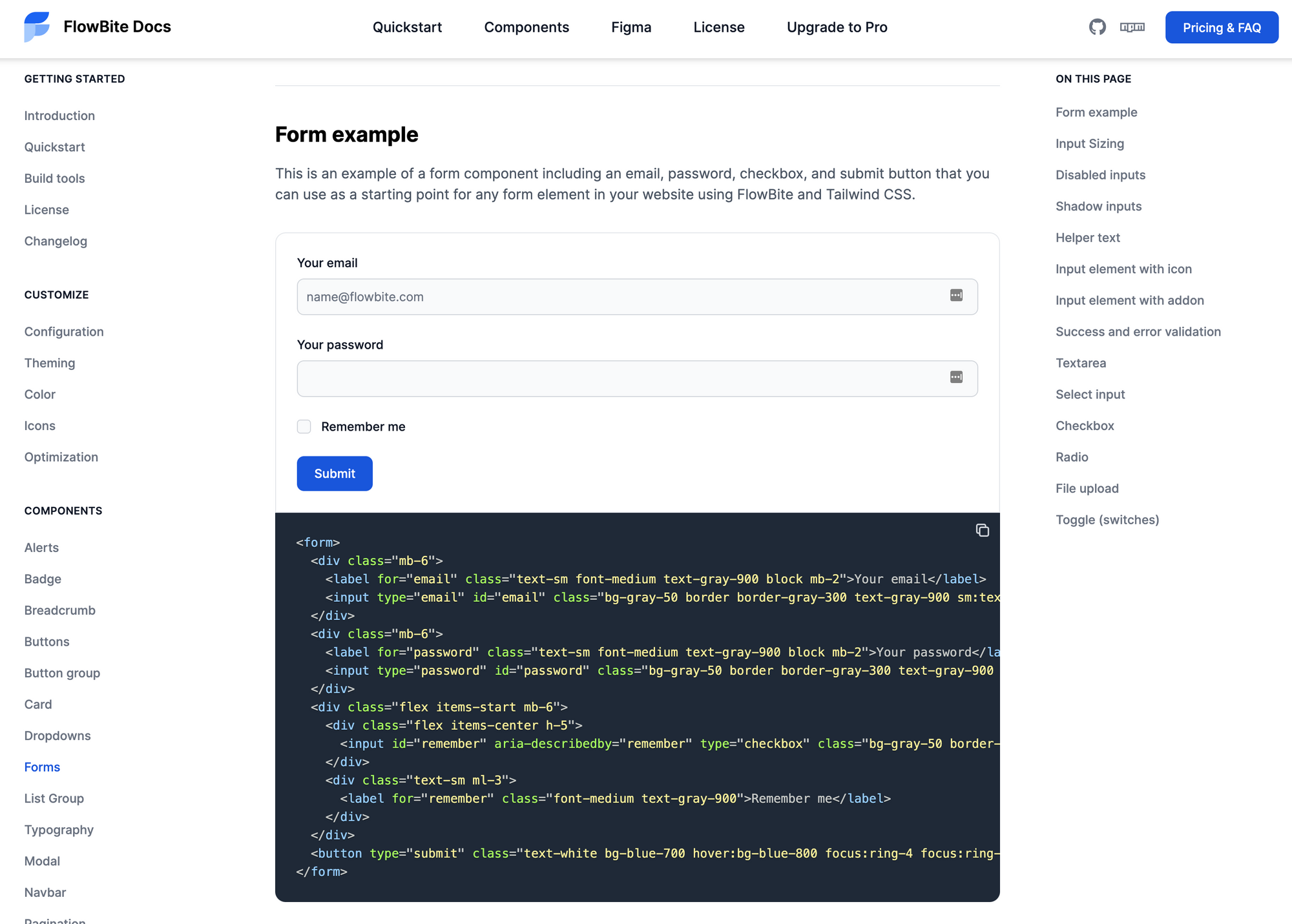 Flowbite - Tailwind CSS form components
It also includes a JavaScript file that enables interactive components, such as modals, dropdowns, and datepickers which you can optionally include into your project via CDN or NPM.
You can check out the quickstart guide to explore the elements by including the CDN files into your project. But if you want to build a project with Flowbite I recommend you to follow the build tools steps so that you can purge and minify the generated CSS.
For a faster configuration we will include everything using a CDN.
How to include Flowbite and Tailwind CSS via CDN
Let's start by including the CSS file inside the head tag of your HTML:
<link rel="stylesheet" href="https://unpkg.com/flowbite@latest/dist/flowbite.min.css" />
Then also include the JavaScript file that enables the interactive elements before the closure of the body tag:
<script src="https://unpkg.com/flowbite@latest/dist/flowbite.bundle.js"></script>
If you've followed these two steps correctly you should now have both Tailwind CSS and Flowbite included in your project and the components from Flowbite should all work now.
Exploring the components from Flowbite
The next step is to check out the components from the documentation which are all built using the utility classes from Tailwind CSS.
You can find anything from alerts, buttons, and badges all the way to navigation bars, modals, dropdown menus, and even datepickers.
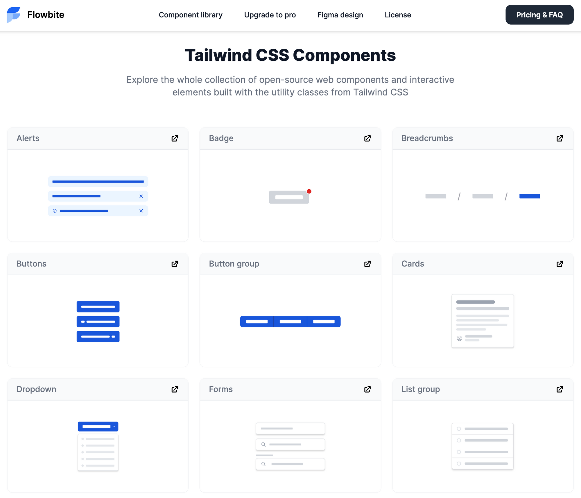 Flowbite - Tailwind CSS components
Here's the full list of components:
- Alerts
- Badges
- Breadcrumb
- Buttons
- Button group
- Cards
- Dropdowns
- Forms
- List group
- Typography
- Modal
- Navbar
- Pagination
- Progress bar
- Tables
- Tooltips
- Datepicker
You can check out the all of the components on the homepage and then it will be accessible from every page of the documentation.
All you need to do now is to copy-paste the element of your choice inside your project and then use them any way you see fit.
Let's create a user authentication page using the components from Flowbite and the utility classes from Tailwind CSS to show you the workflow of this library.
Here's how it will look in the end:
 Authentication page built with Flowbite
How to build a user authentication page with Flowbite
The first requirement is to include Flowbite into the HTML page that you're going to work with either via CDN or NPM. I already showed you how to do that in this article, so I'll assume you've already done that.
Let's first build the wrapper element to which we will later add the logo and the main card element.
<div class="mx-auto md:h-screen flex flex-col justify-center items-center px-6 pt-8 pt:mt-0">
    <!-- content will go here -->
</div>
This element ensures that everything will be centered horizontally and vertically on larger screens.
Let's now add the logo which is good for branding and which users can also click on to go back to the homepage.
<div class="mx-auto md:h-screen flex flex-col justify-center items-center px-6 pt-8 pt:mt-0">
    <a href="#" class="text-2xl font-semibold flex justify-center items-center mb-8 lg:mb-10">
      <img src="https://flowbite.com/application-ui/demo/images/logo.svg" class="h-11 mr-4" alt="FlowBite Logo">
      <span>Flowbite</span>
    </a>
</div>
Next we should create the main card element that comes just after the logo that we've added and also add the image inside the card.
<div class="bg-white shadow rounded-lg lg:flex items-center justify-center md:mt-0 w-full lg:max-w-screen-lg 2xl:max:max-w-screen-lg xl:p-0">
    <div class="hidden lg:flex w-2/3">
        <img class="rounded-l-lg" src="https://flowbite.com/application-ui/demo/images/authentication/login.jpg" alt="login image">
    </div>
    <div class="w-full p-6 sm:p-8 lg:p-16 lg:py-0 space-y-8">
        <!-- Authentication form goes here -->
    </div>
</div>
If you've followed the steps correctly you should have an empty authentication card with an image inside it and the logo above.
 Empty authentication card
How to use the Flowbite Tailwind CSS form element
This is where Flowbite comes into play, as we need to build a form element which includes two text input fields, a checkbox, and a button. We don't have to build it ourselves because we can use the Tailwind CSS form elements from Flowbite.
Let's add the following title and the form element inside the second div element from the card.
<h2 class="text-2xl lg:text-3xl font-bold text-gray-900">
   Sign in to platform
</h2>
<form class="mt-8 space-y-6" action="#">
   <div>
      <label for="email" class="text-sm font-medium text-gray-900 block mb-2">Your email</label>
      <input type="email" name="email" id="email"
         class="bg-gray-50 border border-gray-300 text-gray-900 sm:text-sm rounded-lg focus:ring-blue-500 focus:border-blue-500 block w-full p-2.5"
         placeholder="name@company.com" required>
   </div>
   <div>
      <label for="password" class="text-sm font-medium text-gray-900 block mb-2">Your password</label>
      <input type="password" name="password" id="password" placeholder=""
         class="bg-gray-50 border border-gray-300 text-gray-900 sm:text-sm rounded-lg focus:ring-blue-500 focus:border-blue-500 block w-full p-2.5"
         required>
   </div>
   <div class="flex items-start">
      <div class="flex items-center h-5">
         <input id="remember" aria-describedby="remember" name="remember" type="checkbox"
            class="bg-gray-50 border-gray-300 focus:ring-3 focus:ring-blue-300 h-4 w-4 rounded" required>
      </div>
      <div class="text-sm ml-3">
         <label for="remember" class="font-medium text-gray-900">Remember me</label>
      </div>
      <a href="#" class="text-sm text-blue-700 hover:underline ml-auto">Lost Password?</a>
   </div>
   <button type="submit"
      class="text-white bg-blue-700 hover:bg-blue-800 focus:ring-4 focus:ring-blue-300 font-medium rounded-lg text-base px-5 py-3 w-full sm:w-auto text-center">Login
   to your account</button>
   <div class="text-sm font-medium text-gray-500">
      Not registered? <a class="text-blue-700 hover:underline">Create account</a>
   </div>
</form>
The final result should look like this:
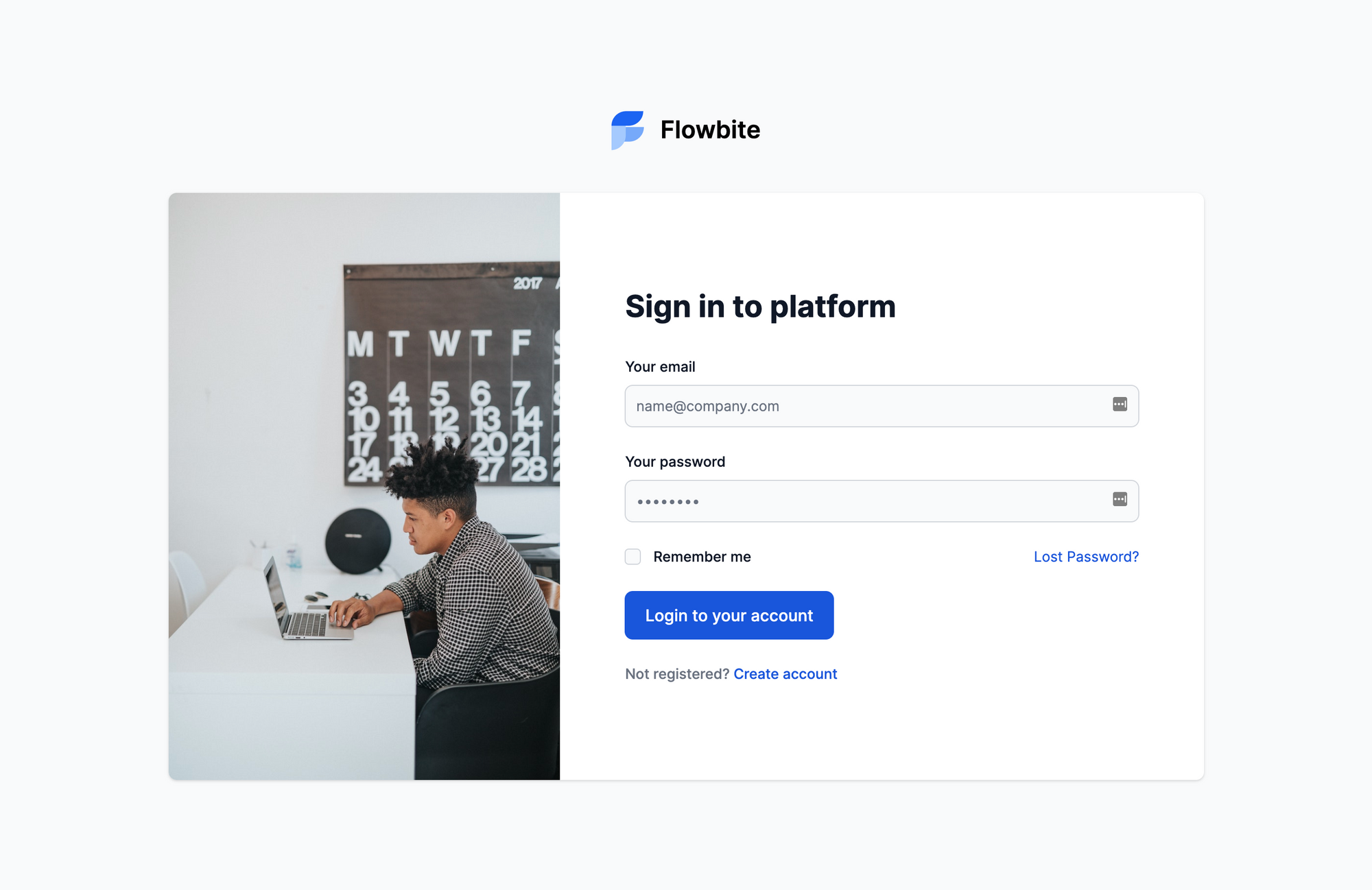 Authentication page built with Flowbite and Tailwind CSS
Congratulations! You've built your first page using both Tailwind CSS and Flowbite. Imagine how much it'll help you with your projects not having to build all of the commonly used web components over and over again.
Conclusion
I hope that this tutorial has helped you understand what Flowbite is about and how you can use it to power and speed up your Tailwind CSS development flow even more.
There's a video about trying out Flowbite on YouTube that you can check out if you want to see an experienced developer working with the library.
There's also a pro version of Flowbite out there for those who want upgrade their Tailwind CSS toolkit even more, as it includes a Tailwind CSS Figma design kit that you can use to prototype your website design before actually coding it.
 Preview of Flowbite Pro
You'll also receive a lot of useful application UI, marketing UI, and e-commerce pages that can help you get started with your projects even faster. You can check out this comparison table to better understand the differences between the open-source and pro version of Flowbite.