
Flexbox is a useful tool for creating beautiful and responsive layouts for web pages. In this guide, you will learn everything you need to know to start using CSS Flexbox like a pro. We'll also go through loads of practice examples.
This is a perfect resource for you if you are a beginner web developer. It'll also be useful if you're an experienced developer who wants to brush up on your responsive web design skills.
Table of Contents
What is Flexbox?
Flexbox is short for "Flexible Box Layout". It's a CSS layout model that simplifies creating complex layouts. It provides a flexible way to align elements and distribute space within a container element.
The Flexbox layout model is bidirectional. This means you can either arrange your elements in rows, columns, or both. More on that later.
What are the benefits of using Flexbox?
Before Flexbox, it was hard to create complex layouts and responsive web pages. You needed a combination of CSS floats and position properties. This required many workarounds and hacks.
But with Flexbox, you can now do the following with less difficulty and fewer lines of code:
Align and center elements using properties like
justify-contentandalign-items.Develop responsive layouts without writing lots of media queries.
Reorder elements without changing the HTML structure
Create same-height columns without any extra HTML elements or background images.
Now you know what Flexbox is, along with some of the things you can do with it. Let's see how you can use it.
The main axis and the cross-axis
The first thing you need to understand about Flexbox is the concept of axes. Every flex container (an element with a display property set to flex or inline-flex) has a main axis and a cross axis.
The main axis is either horizontal or vertical depending on the value of the flex-direction. No worries if you are not familiar with flex-direction. You are about to learn it.
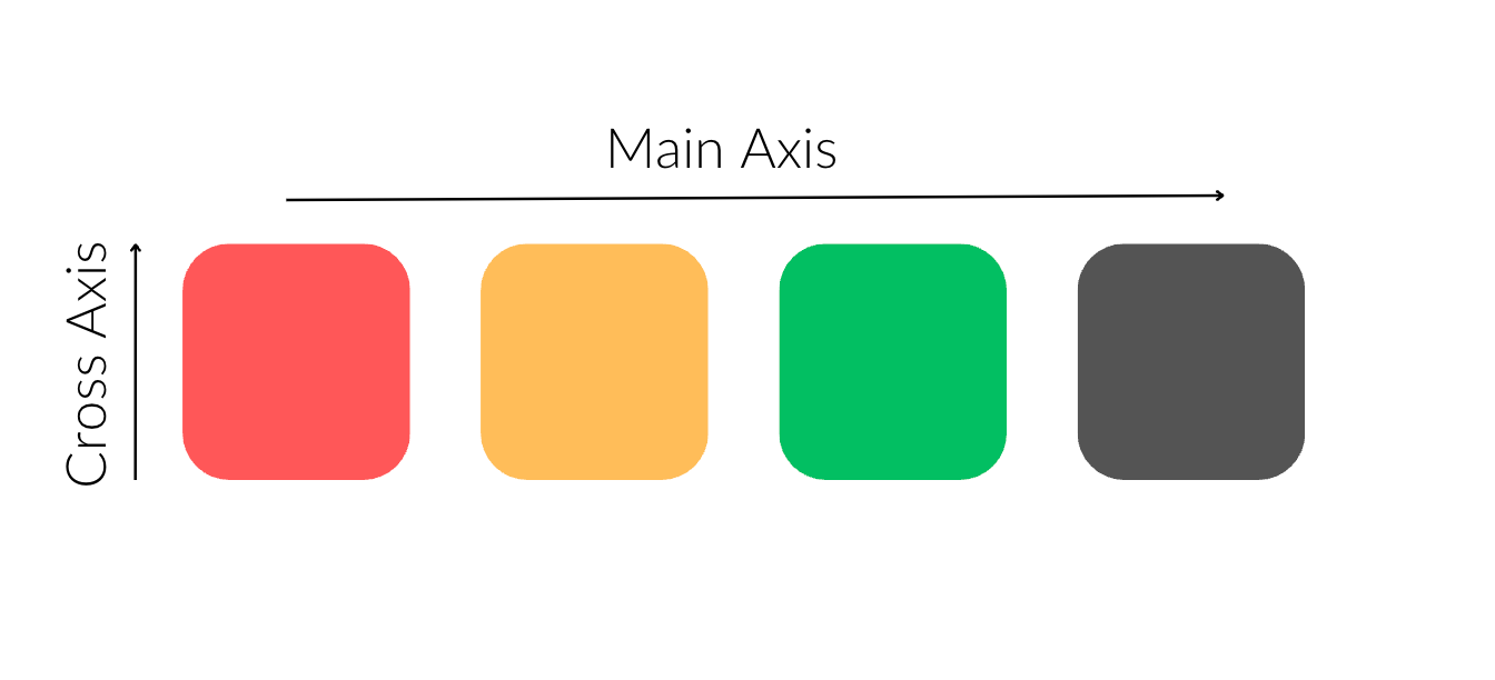
The cross axis and main axis when the flex-direction is row
In this example, the main axis is horizontal and the cross axis is vertical.
The following is an example where the the main axis is vertical and the cross axis, is horizontal.
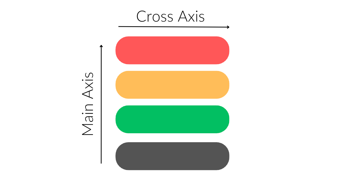
The main axis and cross axis when the flex-direction is column
Flex Containers and Flex Items
To use all of Flexbox's properties, you need to set the display property for an element to flex or inline-flex.
This turns the element into a flex container, and the children of that element become flex items.
Here's an example:
<section class="container">
    <div>Flex Item 1</div>
    <div>Flex Item 2</div>
    <div>
        <p>This paragraph is not a flex item</p>
    </div>
</section>
.container {
  display: flex;
}
The .container element is now a flex container. The three div elements are direct children of the .container element, which makes them flex items.
But the paragraph element inside the third div is not a flex item. This is because it's not a direct child of the .container element.
Understanding flex and inline-flex
You can use both flex and inline-flex to make an element a flex container. The difference is in how they interact with surrounding elements.
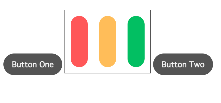
display: flex
This makes the flex container behave like a block-level element. The flex-container takes up the entire available width of its parent element. It starts on a new line, and the element that comes after it also starts on a new line.
Example:
<button>Button One</button>

/* Flex Container */
<section class="container">
    <div id="red"></div>
    <div id="gold"></div>
    <div id="green"></div>
</section>

<button>Button Two</button>
.container {
    display: flex;
}
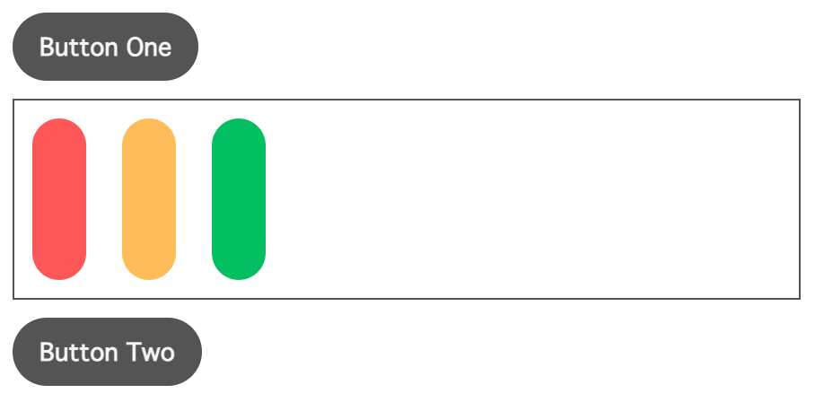
Flex containers behave like block elements when you use display: flex
The .container element takes up the entire available width of the body (its parent element).
display: inline-flex
This makes the flex-container behave like an inline-level element. This allows other inline elements (like buttons) to flow alongside it. Using the previous example, this is how the elements will be arranged when you change display from flex to inline-flex.
Flex containers behave like inline-elements when you use display: inline-flex
The flex container does not take up the entire width of its parent. It uses only as much horizontal space as necessary for its content.
Practice using flex and inline-flex on StackBlitz
The Flex Container Properties
The flex container properties allow you to control the layout and alignment of the flex items within a flex container.
NOTE: You apply these properties on the flex container, and not on its items.
The following are the flex container properties:
flex-directionflex-wrapflex-flowjustify-contentalign-itemsalign-contentplace-content
The flex-direction Property
The flex-direction property defines the direction for displaying the flex items. It is what sets the flex container's main axis. This property can take any of these four values:
row(default value)columnrow-reversecolumn-reverse
Now, let's look at some examples to see how it all works.
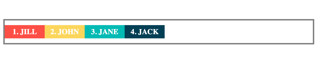
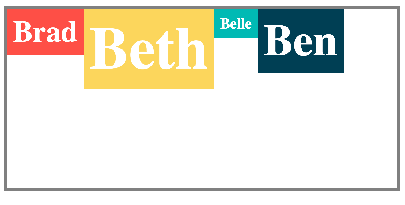
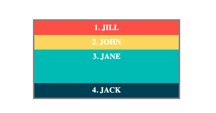
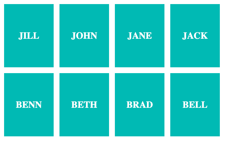
In the following code snippet, we have a names-container with four names:
<div class="names-container">
    <p id="jill">1. JILL</p>
    <p id="john">2. JOHN</p>
    <p id="jane">3. JANE</p>
    <p id="jack">4. JACK</p>
</div>
Let's see the different ways you can arrange the names using the flex-direction property.
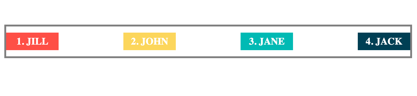
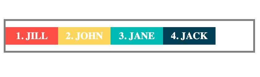
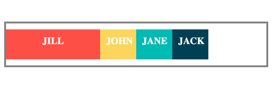
flex-direction: row
This displays the flex-items horizontally from left to right.
.names-container {
    display: flex;
    flex-direction: row;
    /* Other styles here... */
}
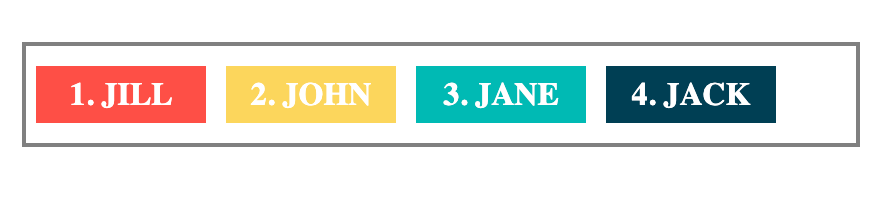
Example of flex-direction: row
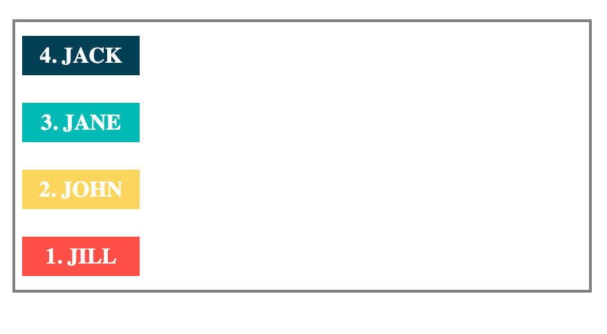
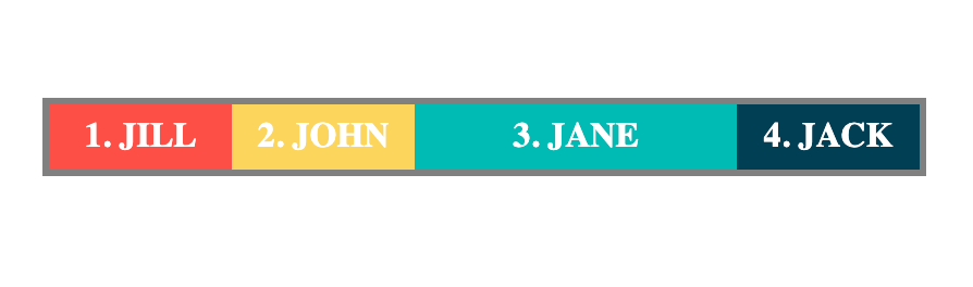
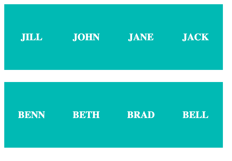
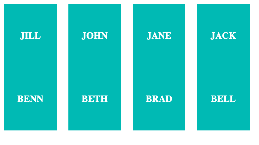
flex-direction: column
This displays the flex-items vertically from top to bottom.
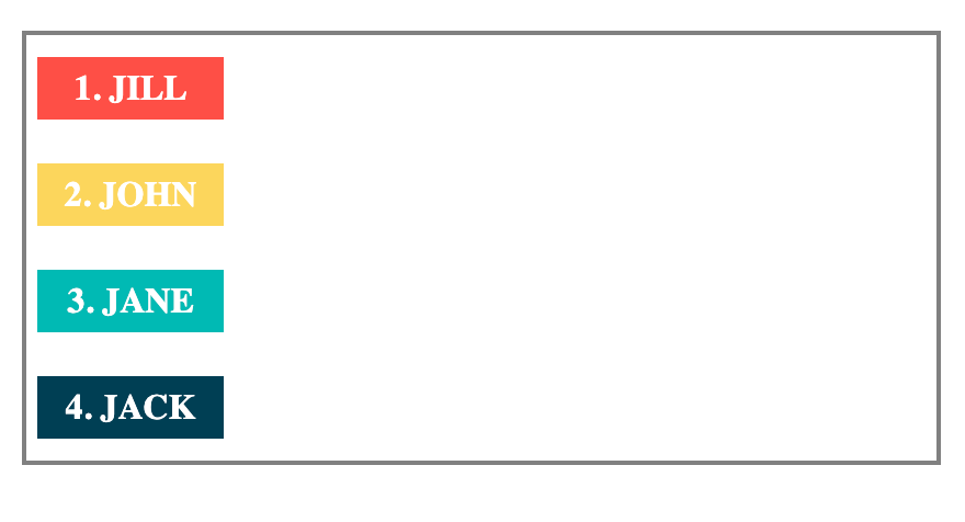
Example of flex-direction: column
flex-direction: row-reverse
This is the opposite of the row value. It displays the flex items from right to left.
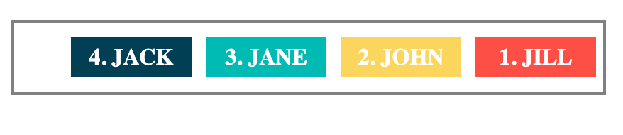
Example of flex-direction: row-reverse
flex-direction: column-reverse
This is the opposite of the column value. It displays the flex items from the bottom to the top.
Example of flex-direction: column-reverse
Practice using flex-direction on StackBlitz
A note on the reverse values and accessibility:
There's something you need to keep in mind when you use row-reverse and column-reverse. As you've already seen, both affect the visual order of elements on the screen.
But the order in your HTML remains unchanged. And that is the order that screen readers and keyboard navigation controls use.
In the example, when you use row-reverse, you see Jack's name first on the screen, followed by Jane, John, and Jill.
But for someone using a screen reader, they will hear the names as they appear in the HTML and not as they appear on screen. In this case, they will first hear Jill's name, followed by John, Jane, and Jack.
The flex-wrap Property
Sometimes, the space within the flex container will not be enough for the flex items.
In such cases, you use the flex-wrap property to choose whether to let the flex-items overflow or begin on a new line.
The flex-wrap property accepts any of the following values:
nowrap(default value)wrapwrap-reverse
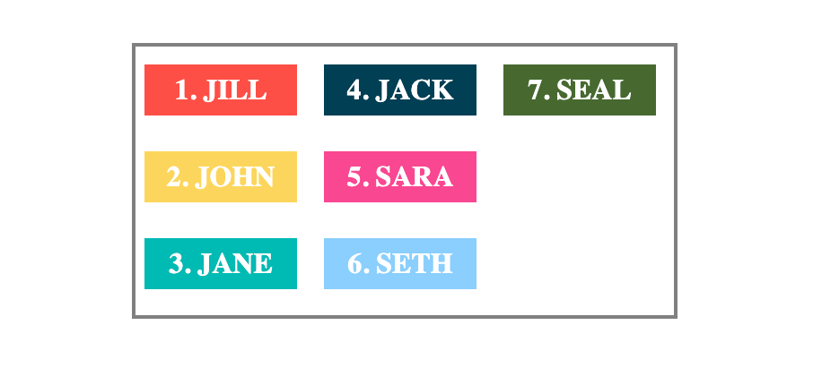
To see flex-wrap in action, let's add four more names to our names-container:
<div class="names-container">
    <p id="jill">1. JILL</p>
    <p id="john">2. JOHN</p>
    <p id="jane">3. JANE</p>
    <p id="jack">4. JACK</p>
    <p id="sara">5. SARA</p>
    <p id="seth">6. SETH</p>
    <p id="seal">7. SEAL</p>
</div>
flex-wrap: nowrap
This keeps all the flex items on a single line either in a row or column. It allows the flex items to overflow if there's not enough room in the flex container. See the example below:
.names-container {
    display: flex;
    flex-direction: row;
    flex-wrap: nowrap;
    /* Other styles here... */
}
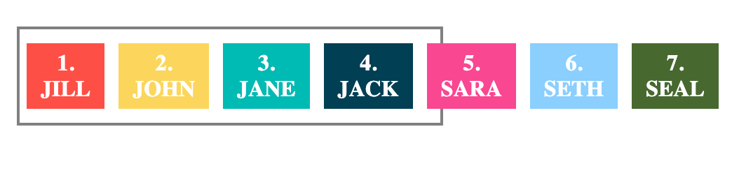
Flex items overflows because flex-wrap is set to nowrap
In this example, three names overflow out of the container because there is not enough space for them.
flex-wrap: wrap
This will wrap or push the flex items to the next line if there's not enough room for them.
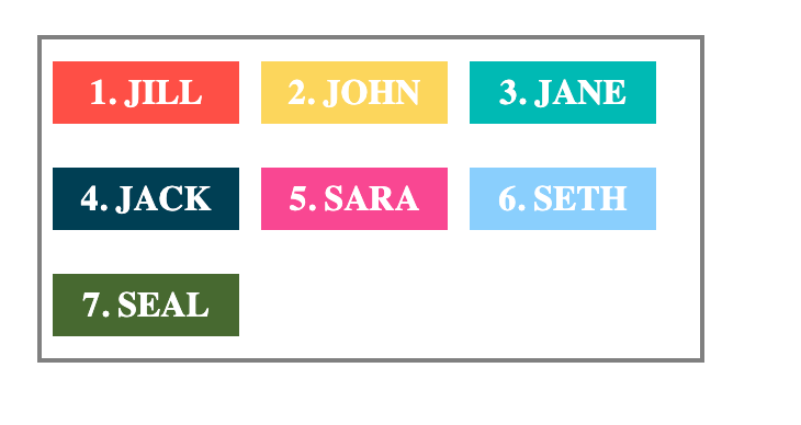
Flex items wrap or moves to the next line when flex-wrap is set to wrap
flex-wrap: wrap-reverse
This is the opposite of wrap. It moves the overflow items to the next line but in a reverse direction.
For example, using wrap-reverse on the names container moves overflow items to the next top line instead of the next line below.
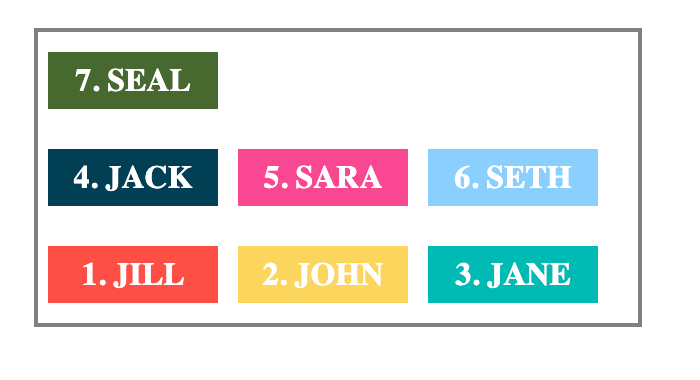
Example of flex-wrap: wrap-reverse
Practice using flex-wrap on StackBlitz.
The flex-flow Shorthand Property
The flex-flow property is a shorthand for the flex-direction and flex-wrap properties. This means that when you use flex-flow, you can apply both properties with only a single line of code.
See the example below using the names container. You can give the container flex-direction and flex-wrap properties.
.names-container {
    display: flex;
    flex-direction: column;
    flex-wrap: wrap;
}
Or you can use the flex-flow shorthand to get the same result.
.names-container {
    display: flex;
    flex-flow: column wrap;
}
Example of flex-flow: column wrap
Practice using flex-flow on StackBlitz.
The justify-content Property
This justify-content property handles the alignment of flex items on the main axis of the flex container.
You can use it to take care of how space is distributed on the main axis. This property takes any of the following values:
flex-start(default value)flex-endcenterspace-betweenspace-aroundspace-evenly
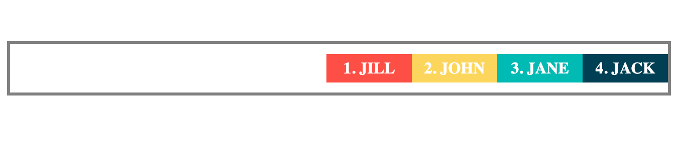
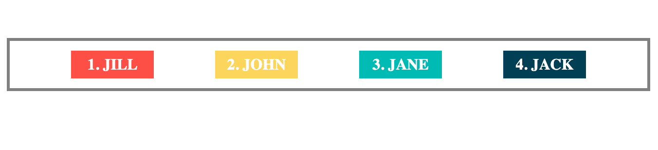
justify-content: flex-start
This places the items at the start of the flex-direction. If the main axis is horizontal with a flex-direction of row (like the example below), it aligns the items to the left. And if it's vertical (with a flex-direction of column), it aligns the items to the top.
Using the names container example, this is how justify-content: flex-start would look like:
.names-container {
    display: flex;
    justify-content: flex-start;
    /* Other styles here... */
}
Example of justify-content: flex-start
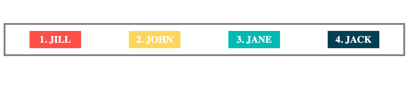
justify-content: flex-end
This will place the flex items at the end of the flex-direction of the main axis.
Example of justify-content: flex-end
justify-content: center
This places the flex items at the center of the flex container's main axis.
Example of justify-content: center
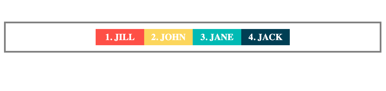
justify-content: space-between
This will place the first flex item at the start of the main axis. And also place the last item at the end of the main axis. Then space on the main axis is distributed equally among the the elements.
Example of justify-content: space-between
justify-content: space-evenly
This distributes space equally among the flex items. This means the space before and after each item is the same.
Example of justify-content: space-evenly
justify-content: space-around
This also distributes space equally between the flex items. The key difference here is that the space before the first item and after the last item is half the space between the flex items.
Example of justify-content: space-around
Practice using justify-content on StackBlitz.
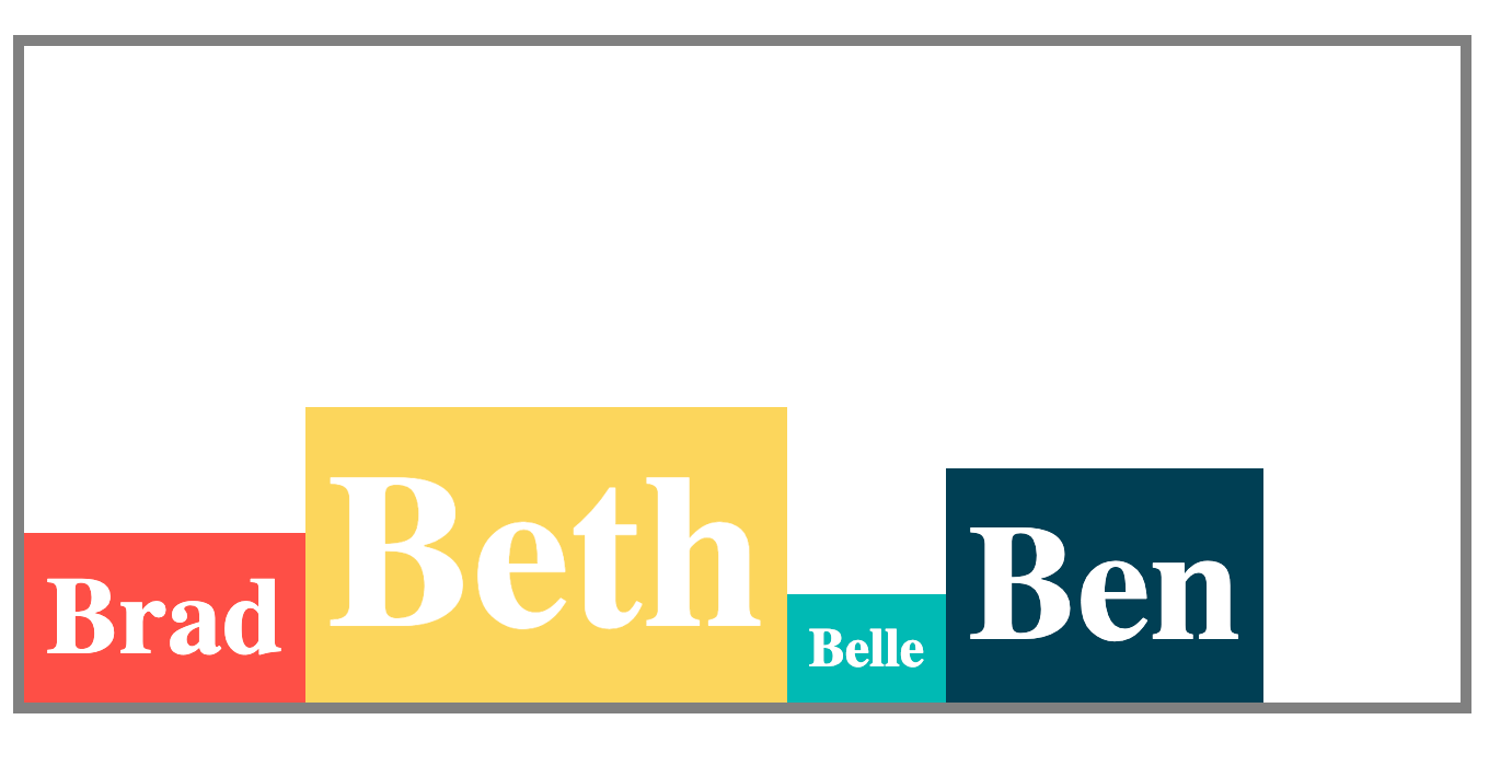
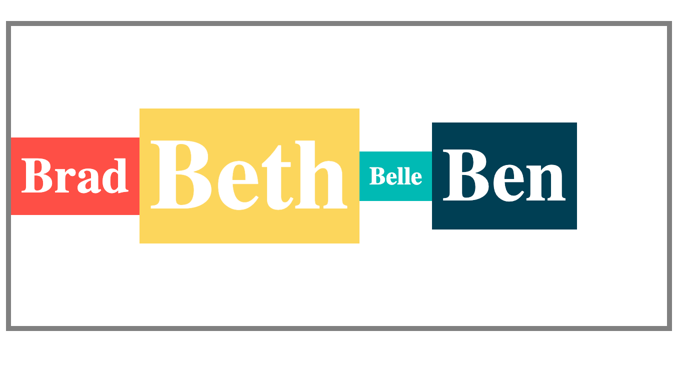
The align-items Property
The align-items property handles the alignment of flex items on the cross-axis of the flex container. It can take any of the following values:
stretch(default value)flex-startflex-endcenterbaseline
align-items: stretch
This stretches the flex items to fill up the space within the flex-container.
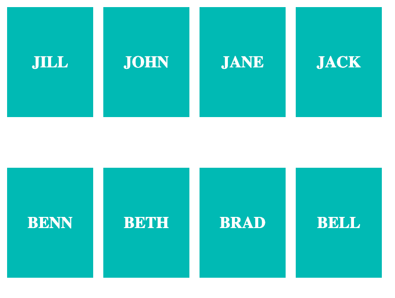
See the example below using a new names container with name cards of different sizes:
.names-container {
    display: flex;
    align-items: stretch;
    /* Other styles here... */
}
Example of align-items: stretch
align-items: flex-start
This will place the flex items at the start of the cross-axis of the flex container. If the cross-axis is vertical like in the example below, align-items: flex-start will place the items at the top.
.names-container {
    display: flex;
    align-items: flex-start;
    /* Other styles here... */
}
Example of align-items: flex-start
align-items: flex-end
This will place the flex items at the end of the cross-axis of the flex container. If the cross-axis is vertical like in the example below, align-items: flex-end will place the items at the bottom.
.names-container {
    display: flex;
    align-items: flex-end;
    /* Other styles here... */
}
Example of align-items: flex-end
align-items: center
This aligns flex items at the center of the cross-axis of the flex container.
.names-container {
    display: flex;
    align-items: center;
    /* Other styles here... */
}
Example of align-items: center
align-items: baseline
When you use the baseline value, flex items are arranged such that their baselines are aligned. See the example below:
.names-container {
    display: flex;
    align-items: baseline;
    /* Other styles here... */
}
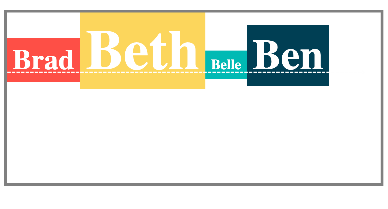
The baseline is indicated with the dotted white line
Practice using align-items on StackBlitz.
The align-content Property
When you have a flex container with wrap (or more than one flex line), you may need to align the lines to distribute the space as you want. That is when you use align-content. This property can take any of the following values:
stretch(default value)flex-startflex-endcenterspace-betweenspace-evenlyspace-around
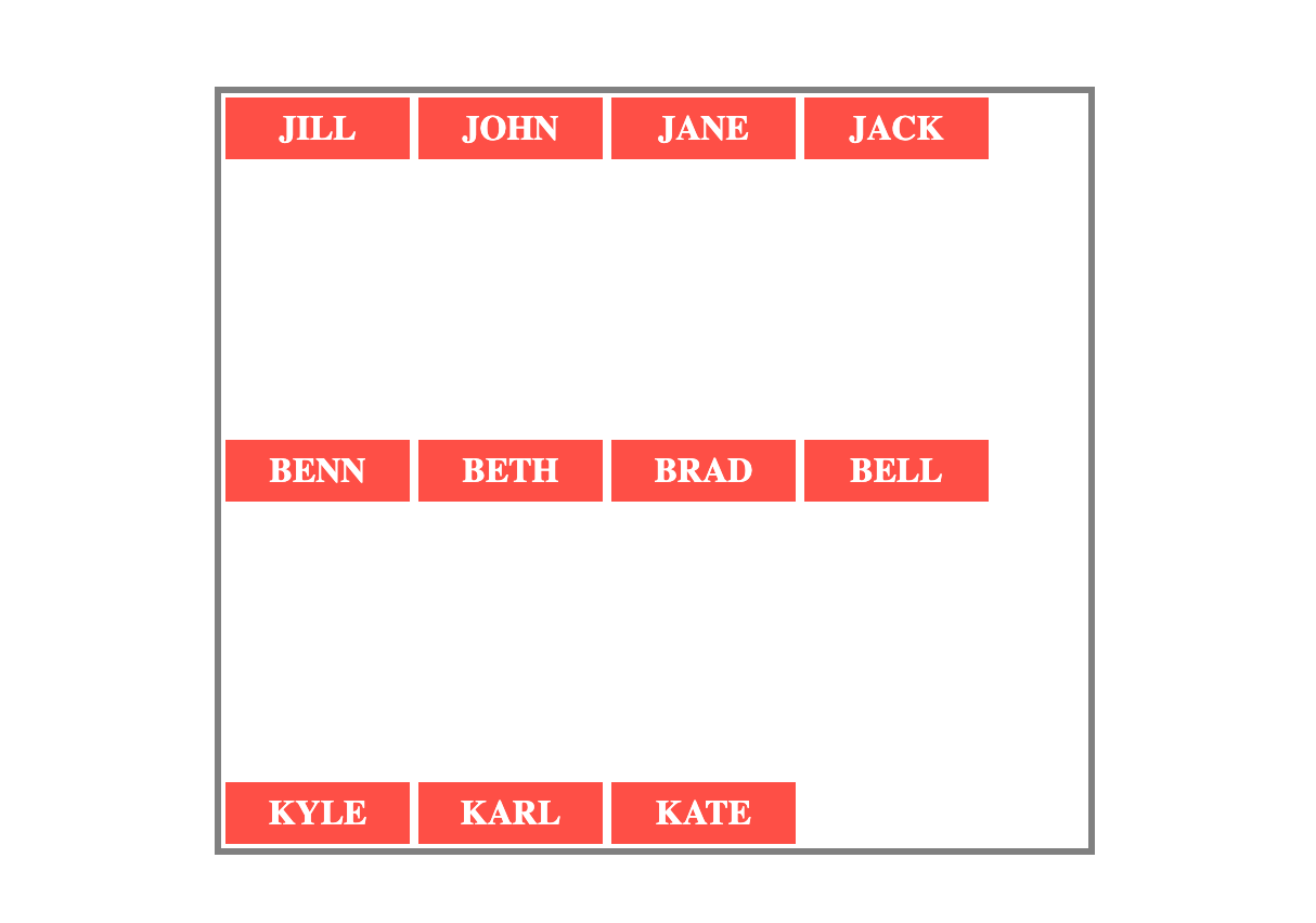
In the example below, there are 11 names in the names container. And the names container element has a flex-wrap value of wrap. This means you can apply the align-content property to change the alignment of the flex lines.
align-content: stretch
This stretches the flex lines to fill up the space within the flex container's cross-axis.
.names-container {
    display: flex;
    flex-wrap: wrap;
    align-items: stretch;
    /* Other styles here... */
}
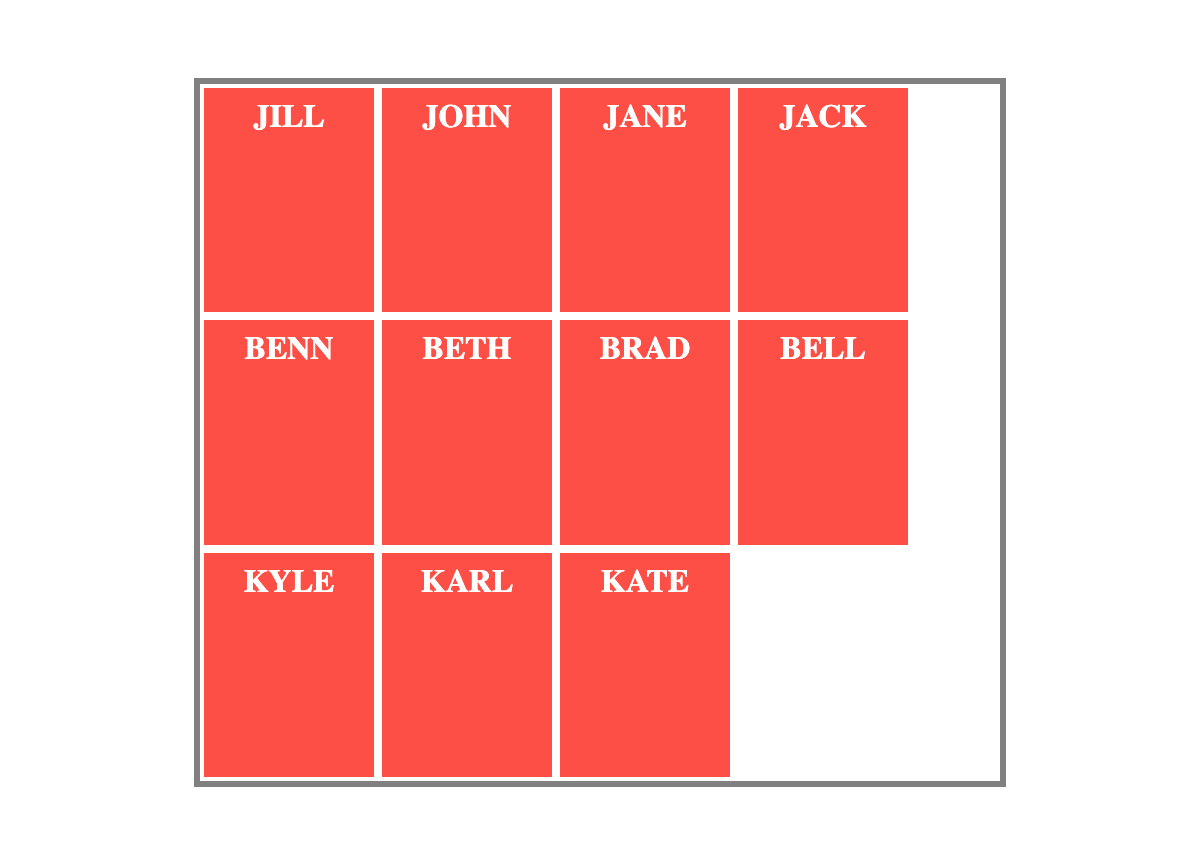
Example of align-content: stretch
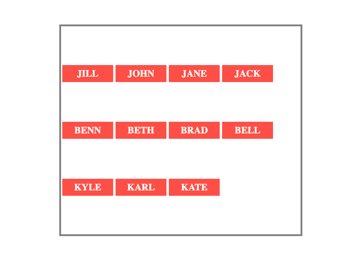
align-content: flex-start
This places the flex lines at the start of the container's cross-axis. For example, if the cross axis is vertical like that of the names container, it will place the flex lines at the top.
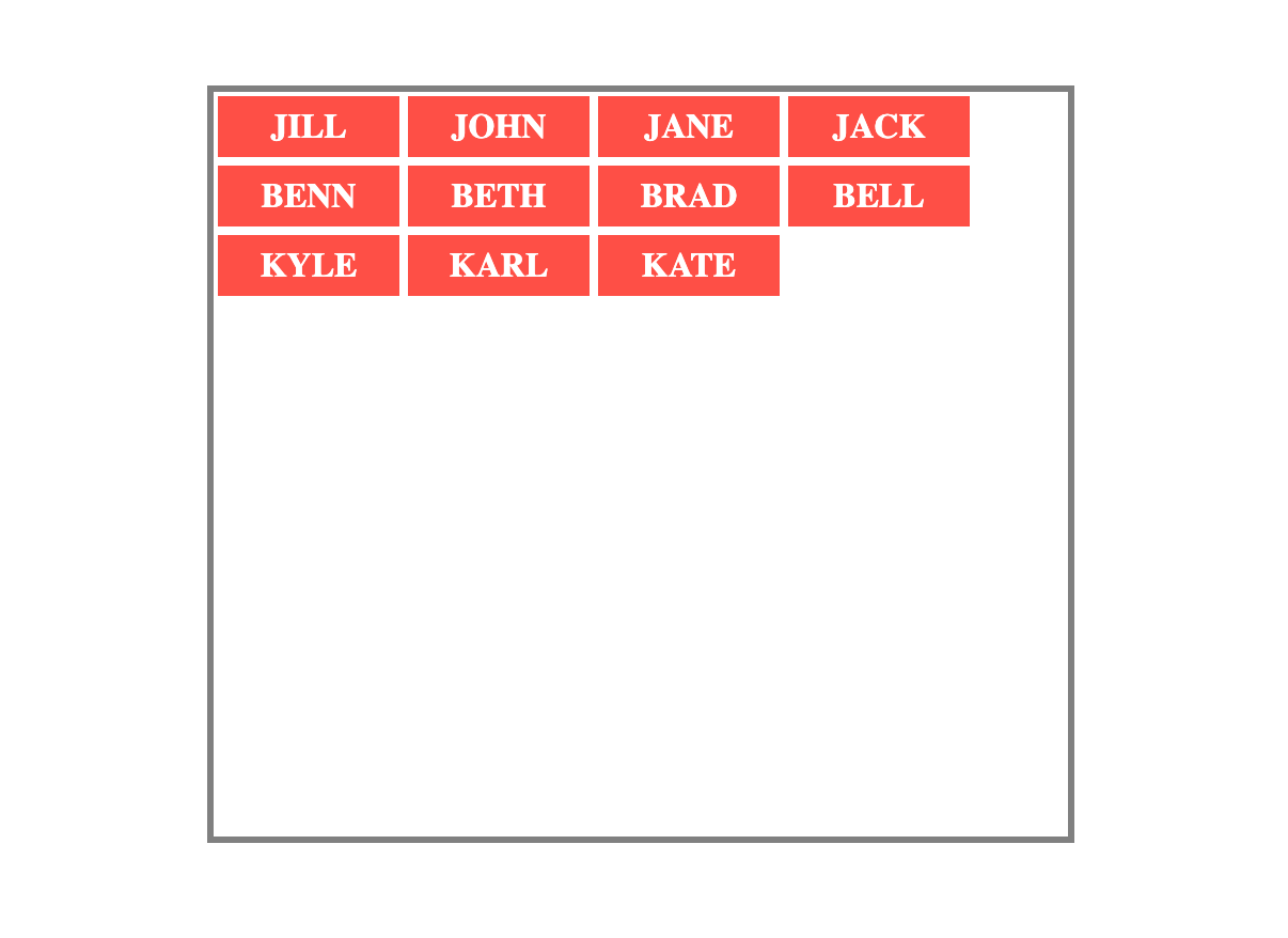
Example of align-content: flex-start
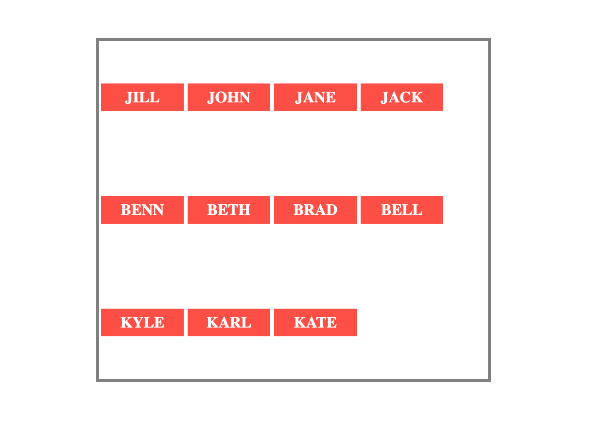
align-content: flex-end
This places the flex lines at the end of the container's cross-axis.
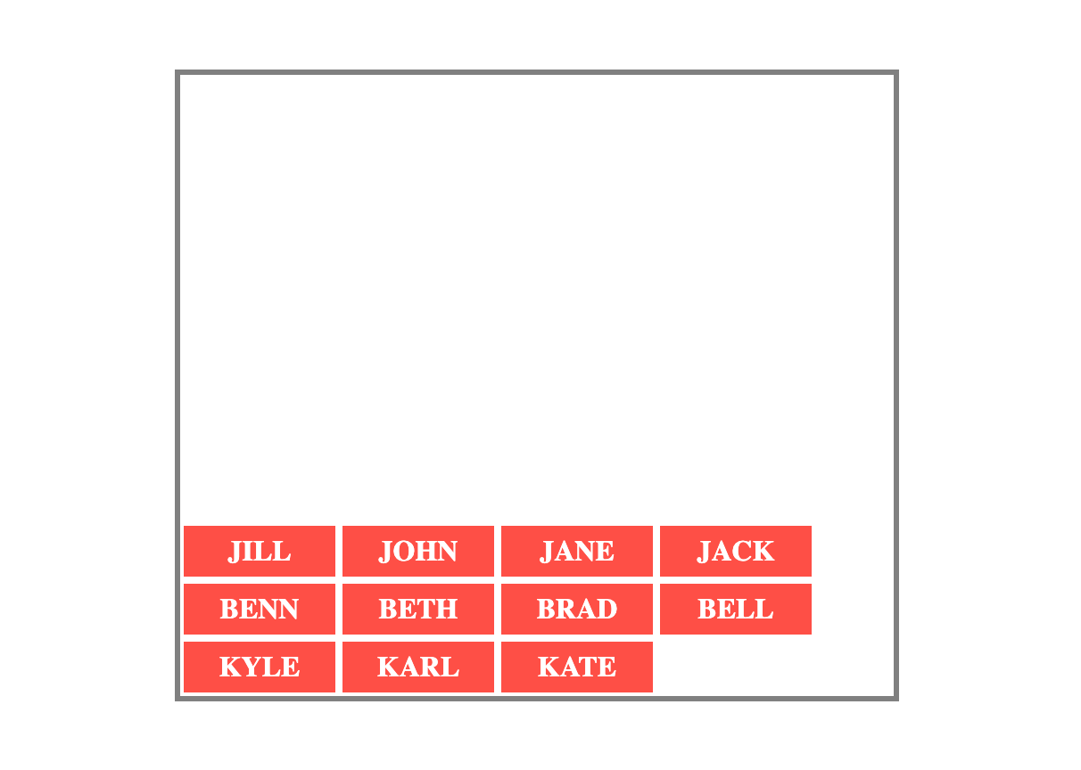
Example of align-content: flex-end
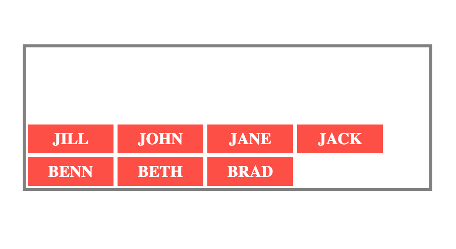
align-content: center
This places the flex lines at the center of the container's cross-axis.
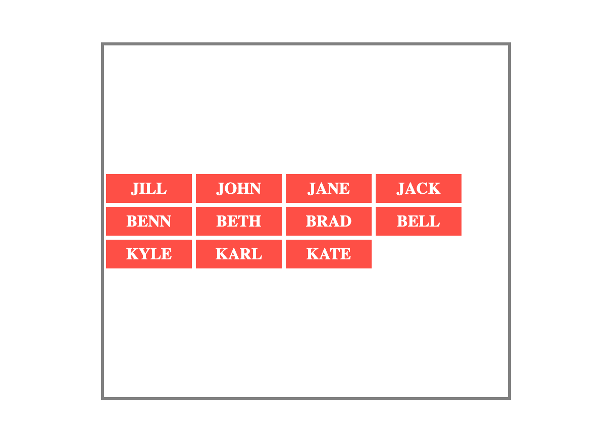
Example of align-content: center
align-content: space-between
This will place the first flex line at the start of the cross-axis. It also places the last flex line at the end of the cross axis. Then space on the cross-axis is distributed equally between the the lines.
Example of align-content: space-between
align-content: space-evenly
This distributes space equally between the flex lines. This means the space before and after each line is the same.
Example of align-content: space-evenly
align-content: space-around
This also distributes space equally between the flex lines. The key difference here is the space before the first line and after the last line is half the space between the flex lines.
Example of align-content: space-around
Practice using align-content on StackBlitz.
The place-content Property
If you need to use both the justify-content and align-content properties, you use the place-content shorthand property.
It can take one or two values. When you give it a single value, the browser will apply the same value for both justify-content and align-content.
And when you give 2 values for place-content, the first value will be for align-content and the second for justify-content.
Let's look at an example:
Instead of writing this:
.names-container {
    display: flex;
    flex-wrap: wrap;
    align-content: flex-end;
    justify-content: flex-start;
    /* Other content */
}
You can instead write the following and it will have the same effect:
.names-container {
    display: flex;
    flex-wrap: wrap;
    place-content: flex-end flex-start;
    /* Other content */
}
Example of using the place-content shorthand
Practice using place-content on StackBlitz.
The Flex Item Properties
Every direct child of a flex container is a flex item. So far, you've learned the properties of the flex containers.
Flexbox also has properties that you can apply to individual flex items. They include the following:
orderalign-selfflex-growflex-shrinkflex-basisflex
The order property
The order property determines the order of appearance for the flex items.
The value you give to this property must be a number. A flex item with a lower number will appear before one with a higher number.
In the HTML code, the order for the four names is as follows:
Jill
John
Jane
Jack
<div class="names-container">
    <p id="jill">1. JILL</p>
    <p id="john">2. JOHN</p>
    <p id="jane">3. JANE</p>
    <p id="jack">4. JACK</p>
</div>
You can change the order of appearance on the screen using the order property. See the example below.
Here's how they appear with no order properties:
Name cards before add the order property
Now, see how they appear when you add the following order properties:
.names-container {
    display: flex;
}

#jill {
    order: 2;
    background-color: #fe4f46;
}

#john {
    order: 4;
    background-color: #fcd65c;
}

#jane {
    order: 1;
    background-color:
    #00bab4;
}

#jack {
    order: 3;
    background-color: #003f54;
}
The order property changes the order of appearance
Practice using the order property on StackBlitz.
Word of caution: Even though the order of appearance changes on screen, the order in the HTML remains unchanged. And it's the order in the HTML that screen readers use. Where possible, it's best practice to change the order in the HTML rather than doing it with Flexbox.
The align-self property
You can use the align-self property to give a flex item a different alignment from the other items.
It works the same way as the align-items property. The difference is that whereas align-items applies to all flex items, the align-self property is applied to only specific items.
Example:
.names-container {
    display: flex;
    align-items: center;
    /* Other styles */
}

#jill {
    align-self: flex-start;
}
Example of align-self with a flex-start value
In the example, the align-items property for the names container has a value of center. This aligns all the names at the center.
But using the align-self property, you are able to align Jill's name card to the top with a value of flex-start.
Practice using the align-self property on StackBlitz.
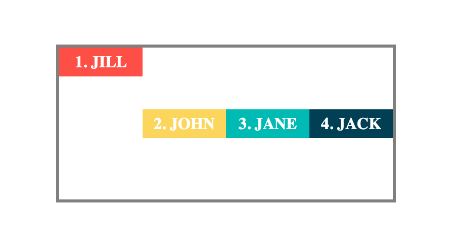
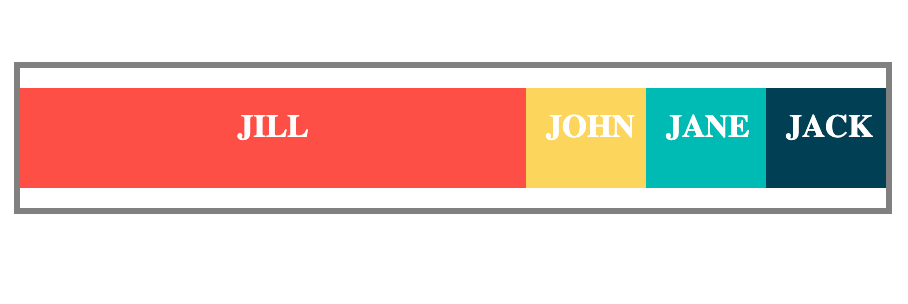
The flex-grow property
When you set a container's display to flex, often there will be some extra space after the items are arranged. See the example below:
.names-container {
    display: flex;
    justify-content:
    flex-start;
     /* Other styles */
 }
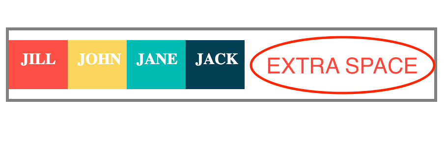
The flex container has more than enough space for the flex items
The browser treats the extra as a value of 1. This means when you give a flex-grow value of 0.5 to only one of the flex items, the browser will add half of the remaining space to the item's size.
#jill {
    flex-grow: 0.5;
}
The flex-grow property makes the Jill's larger than its initial size
And if you add a flex-grow value of 1 to only one of the flex items, the browser will add all the extra space to that item.
NOTE: If only one item in the container has a flex-grow value, then any value of 1 or more will make it take up all the extra space.
For example, the two code snippets below will have the same effect on Jill's card:
#jill {
    flex-grow: 1;
}
#jill {
    flex-grow: 99;
}
When only one card has a flex-grow of 1 or more
What happens when you add flex-grow values to more than one element?
The browser will share the extra space proportionately for them.
For example, when you give Jane a flex-grow of 3 and Jack a flex-grow of 1, the browser will share the extra space with a 3:1 ratio.
This means the total value of the extra space becomes 4 (3+1). Jane will then get 3/4 of the extra space. And Jack will get 1/4 of it.

The extra space is shared proportionately betwee Jane and Jack
Practice using the flex-grow property on StackBlitz.
The flex-shrink property
The flex-shrink property is the opposite of flex-grow.
You use flex-grow when you want to increase the flex item's size if there's extra space. But, you use flex-shrink when you want to decrease the flex-item's size if there's not enough space in the flex container.
See the example below:
<div class="numbers-container">
    <p id="one">1</p>
    <p id="two">2</p>
    <p id="three">3</p>
    <p id="four">4</p>
</div>
.numbers-container {
    display: flex;
    justify-content: flex-start;
    /* Other styles */
}

#one {
    flex-shrink: 2;
    background-color: #fe4f46;
}
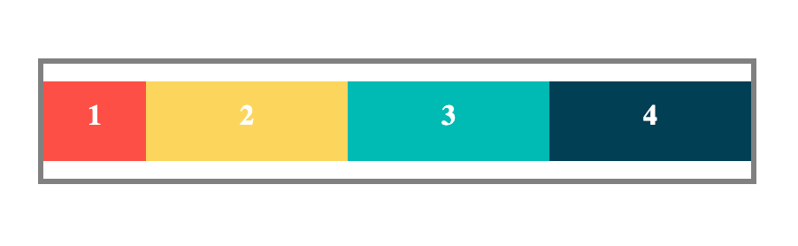
The first card shrinks to make room for the others
In the example, each of the four numbers has a width of 150px (that's a total of 600px). But the numbers-container has a width of 400px which is not enough.
The cards have to shrink to fit in the available space. But Number 1 which with a flex-shrink value of 2 shrinks to become twice as small as the other numbers.
What if you don't want a flex item to shrink?
To prevent a flex item from shrinking, give it a flex-shrink value of 0.
For example, when you give Number 1 a flex-shrink of 0, it will maintain the width of 150px. And the other flex items will shrink to fit in the remaining space.
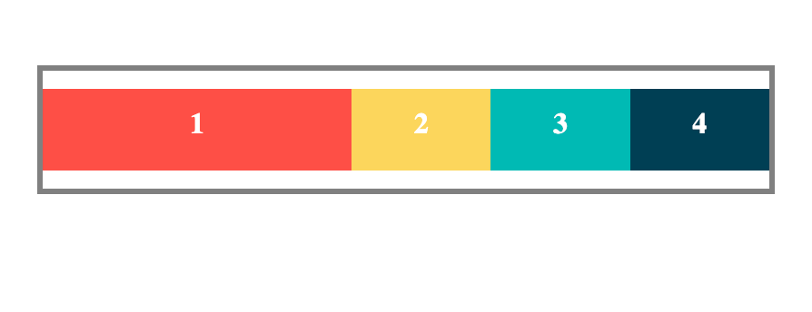
The first card does not shrink because it has a flex-shrink value of 0
Practice using the flex-shrink property on StackBlitz.
The flex-basis property
You can use the flex-basis property to set the default length of a specific flex item. This is either the width or height of the item depending on the flex-direction.
If the flex-direction is row or row-reverse, the value for flex-basis becomes the initial width of the item.
And if flex-direction is column or column-reverse, then the value for flex-basis becomes the initial height of the item.
Example:
.names-container {
    display: flex;
    flex-direction: column;
    /* Other styles */
}

div {
    height: 20px;
}

#jane {
    flex-basis: 60px;
}
Example of flex-basis setting the height of an item
In the example, the height for the divs is set at 20px. But Jane gets a flex-basis value of 60px. And that overrides the 20px given to all the divs.
Note: The flex-basis of 60px becomes the height for Jane because the flex direction is column. This means the main axis is vertical.
Here is another example. This time, the flex-direction is row. This means the flex-basis will set the width of the item.
.names-container {
    display: flex;
    flex-direction: row;
    /* Other styles */
}

div {
    width: 70px;
}

#jane {
    flex-basis: 140px;
}
Example of flex-basis setting the width of an item
While all the other divs have a width of 70px, Jane has a width of 140px set by the flex-basis.
Practice using the flex-basis property on StackBlitz.
The flex Shorthand Property
You can use flex as a shorthand for the flex-grow, flex-shrink, and flex-basis properties.
For example, instead of writing the following:
.flex-item {
    flex-grow: 2;
    flex-shrink: 0;
    flex-basis: 50px;
}
You can use the shorthand like so and it will have the same effect:
.flex-item {
    flex: 2 0 50px;
}
The flex property can take up to three values. The order of the values is important. The browser assigns the first value for flex-grow, the second for flex-shrink, and the third for flex-basis.
The default values for flex are 1 0 auto.
This means if you give flex a single value of 2, the browser uses 2 for flex-grow. And then it sets flex-shrink to 0 and flex-basis to auto.
Practice using the flex property on StackBlitz.
How to Center an Element With Flexbox
One of the headaches for many front-end developers is centering elements. Flexbox has a perfect solution for that.
There are two steps involved.
Make the parent element a flex container by setting
displaytoflex.Give a value of
centerto bothjustify-contentandalign-items.
That's it! Your element will be perfectly centered.
Example:
<div class="name-container">
    <p>JOHN</p>
</div>
.name-container {
    display: flex;
    justify-content: center;
    align-items: center;
    /* Other Styles */
}
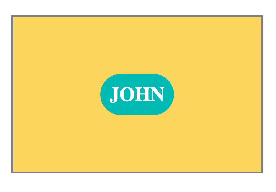
Example of centering an element with Flexbox
Whether you're trying to center text, images, or even an entire navigation bar, this will work just fine.
Flexbox Gaps
You can use the gap property to adjust the space between flex items.
NOTE: You apply the gap property on the flex container and not the flex items.
gap can take two values: the first value for gaps between the rows and the second value for gaps between the columns.
Example:
.names-container {
    display: flex;
    flex-wrap: wrap;
    gap: 50px 10px;
    /* row-gap column-gap */
}
Example of giving two values for the gap property
If the gap you want between the rows and the columns is the same, you can use a single value. The browser will apply the same value to both rows and columns.
Example:
.names-container {
    display: flex;
    flex-wrap: wrap;
    gap: 10px;
    /* Other Styles */
}
Example of using only one value for both rows and columns gap
You can also use the properties row-gap if you need to apply a specific gap value between only the rows. and column-gap if you need to add gaps between only the columns.
Example: Adding gaps between only the rows:
.names-container {
    display: flex;
    flex-wrap: wrap;
    row-gap: 20px;
    /* Other Styles */
}
Example of using row-gap
Example: Adding gaps between only the columns:
.names-container {
    display: flex;
    flex-wrap: wrap;
    column-gap: 20px;
    /* Other Styles */
}
Example of using column-gap
Practice using the gap property on StackBlitz.
Practice with Flexbox Games
Want to practice Flexbox in an interactive way? Check out the following games. They provide a hands-on experience for practicing Flexbox in a fun and engaging way.
Are There Bugs in CSS Flexbox?
While CSS Flexbox is a powerful layout tool, it's got a few bugs that may surprise you.
A common example is that some HTML elements cannot act as flex containers. These include the <button>, <fieldset>, and <summary> elements.
The workaround is to use an element like a div to wrap around the element's children. Then use Flexbox on the wrapper div.
If you are curious about other Flexbox bugs and workarounds, you can have a look at the Flexbugs repository on GitHub.
Conclusion
In this guide, you learned all the Flexbox properties, their values, and how to use them to create responsive layouts. You also learned about some games like Flexbox Froggy you can use for practice.
Thank you for reading, and happy coding! For more in-depth tutorials, feel free to subscribe to my YouTube channel.