Typography is a field that deals with the written word and how letters and characters are presented.
The same letters can be styled in different ways to convey different emotions. And there are all kinds of tradeoffs around style versus readability.
In this article, we’ll look at some of the smaller - but still important - details related to typography like point size, upper vs lower case letters, em vs en dashes, kerning, and more.
Point Size
The point size is a way to introduce standardization to typography. The point size is the smallest unit of measurement.
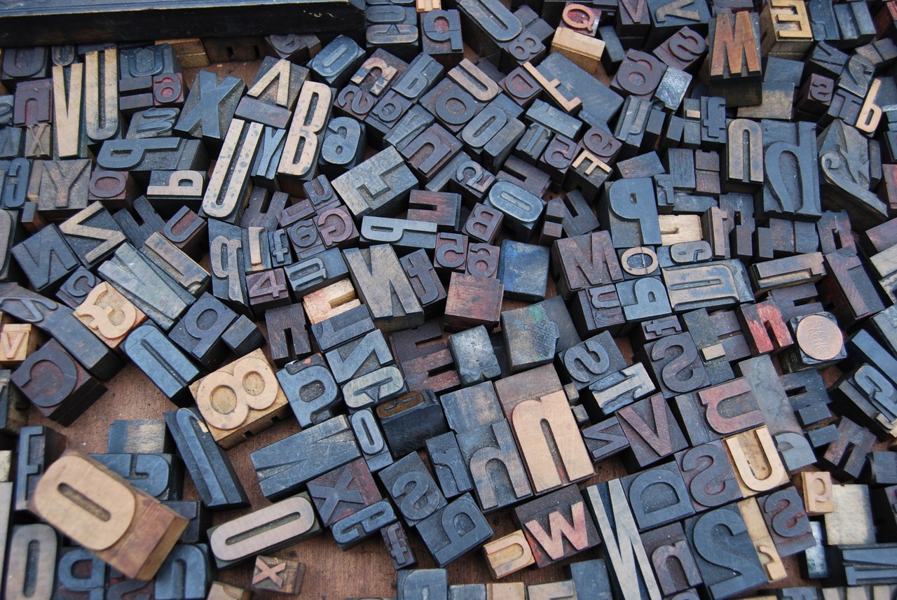
In metal type, point size refers to the height of the metal body on which a typeface’s character is cast. In digital typefaces, the metal body is replaced by an invisible box known as the em square. Each character fits inside that em square or em box. The em size of a font is equal to its point size.
html{
  font-size:16px;
}

body{
  font-size:1em;  // 1em is equal to 16px
}
The point size is also used to measure leading (line-height), line length and other elements, apart from font size.
In digital typefaces, one point is equal to 1/72 of an inch. Twelve points make one pica. Six picas make one inch. A common way of representing picas and points is as follows:
- 1 pica = 1p
- 1 point = 1 pts or p1
- 6 picas and 3 points = 6p3
- 7-point Open Sans with 9 points of leading = 7/9 Open Sans
The optimal point size for print is usually between 10-12 points while that for web, the optimal point size is between 15-25 points.
In CSS, you should set font-size in ems or rems than pixels as the former are scalable in nature. Recently, there has been much talk about fluid typography using the newly introduced units vw and vh.
Learn more about it here : Fluid Typography
Remember, different fonts set at the same point size will not appear to be of the same size due to their individual characteristics, namely—x-height, stroke modulation or contrast and character-width.
Upper and Lower Case
Uppercase (UC) is alternatively referred to as caps and capital. It is a typeface of larger characters. Lowercase (LC) is a typeface of small characters. As long as the shift key is not being pressed and the Caps lock is not active, everything typed is in lowercase. The Uppercase and Lowercase is often synonymous with Majuscule and Minuscule.
Many languages have two different written representations of their letters, upper case and lower case, also known as majuscule and minuscule forms.
Upper case and lower case letters are often mixed in the same piece of text. The use of cases is decided by grammar, but a variety of case styles also exists. Certain case styles are common in computer programming, referred to as naming conventions, like CamelCase and snake_case.
Uppercase:
A B C D E F G H I J K L M N O P Q R S T U V W X Y Z
Lowercase:
a b c d e f g h i j k l m n o p q r s t u v w x y z
Capitalization is important for the following reasons:
- Passwords: passwords are case sensitive, so capitalization add an extra level of security.
- Measurements: When dealing with computer measurement, and other measurements, capitalization is important for identifying the exact type of measurement. For example, “Mb” (short for Megabit) and “MB” (short for Megabyte) are two different types of measurements with different values.
- Commands
- File names, directories and paths.
Ems and Ens
Ems and Ens are a form of the punctuation mark called ‘dash’. Although similar in appearance to a hyphen, they serve different purposes.
Em Dash
Use an Em dash to denote a break in the sentence. Substitute it for a comma or to denote a pause in a sentence. They are also used to attribute a quote to a speaker. An Em dash is one em wide—the width of a point size of a typeface. Don’t put any spaces before and after an em dash.
For example: The noise from the neighbor’s house—it’s killing me.
- Command for an Em dash on a mac : Shift-Option-Hyphen
- Command for an Em dash on Microsoft Word : Alt + Ctrl + (minus)
- Em dash in HTML :
—or—
En Dash
Use an En dash as a replacement for the word ‘to’ or to denote a range of numbers. An En dash is half the width of an Em dash. Don’t put any spaces before and after an en dash.
For example: The first world war lasted from 1914–1918.
- Command for an En dash on a mac : Option-Hyphen
- Command for an En dash on Microsoft Word : Ctrl + (minus)
- En dash in HTML :
–or–
Kerning and Tracking
Kerning refers to the spacing between two individual characters within a word.
Tracking refers to the spacing between words.
Some typefaces are not designed to be kerned or tracked too loosely and vice versa. If one kerns or tracks too tightly or too loosely, they risk sacrificing readability and legibility.
When deciding how tight or loose to kern or track your text, it is advisable to first consider the scale at which the text will be interacted with. If it is to be printed, how far away from the printed text will the viewer be? Will they be driving by? Will it be on read on a backlit screen?
One should also consider the positive and negative ground when tracking and kerning. Tracking too tightly or too loosely can result in awkward figure/ground relations that will distract the user.
Legibility and Readability
Legibility
Legibility means being able to differentiate different characters in a text. Legible text implies it can be easily interpreted. Look at the unique characteristics of a typeface when considering legibility. Some of the considerations are as follows:
- You should use each typeface according to it’s context and intended usage. Look into it’s history and it’s best use case scenarios. For example : Garamond is best used for large bodies of text on print whereas Georgia for screen.
- Keep in mind whether the typeface is for display text or body text.
- The x-height of a typeface is the size of the lowercase ‘x’ in a typeface. A typeface with medium to high x-height results in a text legible at even small sizes.
- Conventionally, serif typefaces are more legible for body text than their sans-serif counterparts.
Readability
Readability means arranging group of words or a blocks of text in such a way to make the text more accessible. The idea is to reduce the amount of effort required to read a body of text.
Stephen Coles remarks that readability, not only begs the question of “Can you read it?” but whether ” do you want to read it?”.
Jason Santa Maria points out in his book On Web Typography that reading is not a linear activity. We read in a back and forth motion called saccades, which is our eyes hopping from one point to another. Also, text with familiar words makes it easier for us to read. Some basic points to remember when considering readability are as follows:
- Contrast refers to the change in thickness of the stroke in different parts of the letter. Higher the contrast, higher the change in stroke. Use medium to low contrast typefaces for long bodies of text.
- Line Height refers to the distance between two lines of text. You do not want to make the block of text neither too tight nor too loose. You can control line height in CSS by the property ‘line-height’. For most texts, you can set it between 1.2 to 1.5 (without any units).
- Line length (measure) refers to the average number of characters in a line of text. A large line length hampers readability by making it difficult for our eyes to scan the text. Usually about 45-75 characters per line is optimal for a body of text. If you plan on increase the line length beyond that, then also take care to increase the line height so that there is enough space between two lines of text. In CSS, you can set the width of the container, and by using the em unit, you can get close to a set number of characters, depending on the width-to-height ratio of the font. Example: width: 35em;
- Tracking refers to adjusting the space between characters in a text. Adding tracking means adding white space between characters and vice versa. At small font sizes i.e. less than 10pts, adding tracking helps in improving readability. Similarly, for large headings, use negative tracking to bring the letters closer. You can control tracking in CSS via ‘letter-spacing’ property. For example : letter-spacing: 0.05em;
- Font size refers to the size of the font used in a text. For mobile display, use sizes of at least 12px. You can control font-size in CSS via ‘font-size’ property. Example: font-size: 48px;
As you can see, you need to take into account a lot of factors to ensure optimal legibility and readability. Remember, there are no hard and fast rules for any of the above described factors. They are mere guidelines which might help you to train your typographic eye better.
Color and Tonal Value
In color theory, a tonal value is produced by adding white, grey, or black to a selected color. This does not change the hue but does alter the colorfullness, also known as saturation. When discussing tonal value, there are three main terms that must be discussed: Tint, Tone, and Shade.
Tint is the addition of white to a color. Tint can be used to highlight an area as well as begin to create the illusion of depth on an object.
Tone is the addition of grey to a color. The tonal color creates a more muted and less saturated color.
Shade is the addition of black to a color. Shade can be used to darken and area to create the illusion of depth on an object.
By altering a colors tonal value, you can create the illusion of depth in images as well as alter the saturation level to better apply color for a desired emotion or mood.