

This article will cover how to build a full website design from scratch following the process of user experience and user interface. This will be done in three stages:
- Wireframe
Sketching the layout - Prototype
Preparing the user interface from the wireframe - Design in Figma
Completing the design from the prototype with color, image, etc
Watch the full video course with the step-by-step process in the YouTube embed below for free:
Step #1: How To Make a Wireframe
The first step to designing a website: wireframe it.
A good wireframe can give you the vision for the entire layout and functionality of your website. It can also serve as the first stage of a design.
Wireframes give you an idea of the overall structure pages will take, and how navigation will flow.
If you are considering building a website, you can do a wireframe quickly and easily. You don't even have to be a graphic designer to do so.
To get started, all you need is a pencil and some paper. (Or if you want to get an iPad and iPencil.)
We are going to create a wireframe and show how it allows for a quick, iterative design process. This will create a living piece of documentation that you can use for yourself and for a client. And you can use this to reason through your planning – all before you invest any time in actually coding it.
Here are some steps we'll cover in this article (and in the accompanying video tutorial):
- Sitemap planning
- Creating a homepage wireframe
- Using markup in wireframes
- Wireframe components (header, menu, footer)
- Wireframing your Features Page and Contact Page
- Mobile Responsive Wireframes
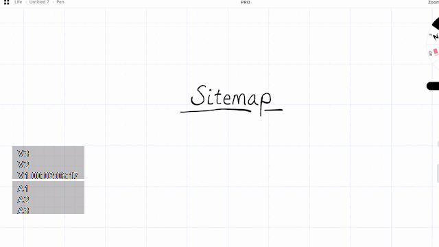 Sketching out a sitemap
Wireframe #1: Sitemap Planning
Getting started with wireframing begins with a good sitemap. Before you create a page wireframe, a sitemap will give you some structure. This way, you'll understand which pages you're going to build, and how they will all connect to one another.
Most small sites may not need a sitemap. They usually just have either a single landing page, or a few common pages like Features, About, and Contact Us.
This said, as soon as your website or application becomes larger and more complex, you'll want a sitemap.
Sitemaps provide you with a brief overview of where items exist and how they interconnect.
In our example, we will create a simple sitemap which will contain just the Home Page, Features Page, and Contact Us page.
You don't have to spend too much time on this. Just add a few boxes to show each page, lines underneath to show sub-pages, and that's it.
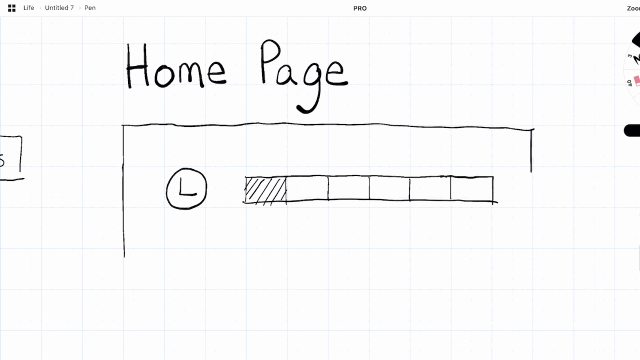 Creating a homepage wireframe
Wireframe #2: Creating Homepage Wireframe
We are going to create our first wireframe page. If you haven't wireframed before, the process is quite simple. Each aspect of a website is represented with a shape or simple graphic, such as:
- boxes with diagonal lines through them to represent images
- horizontal lines to represent paragraphs of text
- and a circle with an L in it to represent your logo.
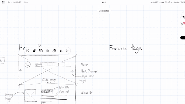
For the homepage, we'll build out a slider image, menu, and logo. We'll also give it a few labels to show what each item is.
This is also useful to organize each section into rectangles that we can later copy-paste onto other pages (especially for the header and footer).
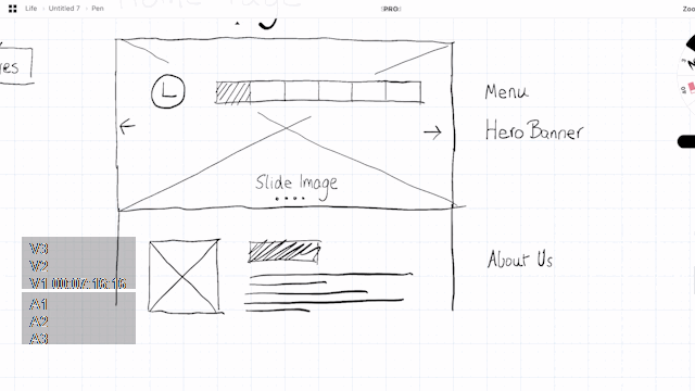 Creating a wireframe for the body of our home page
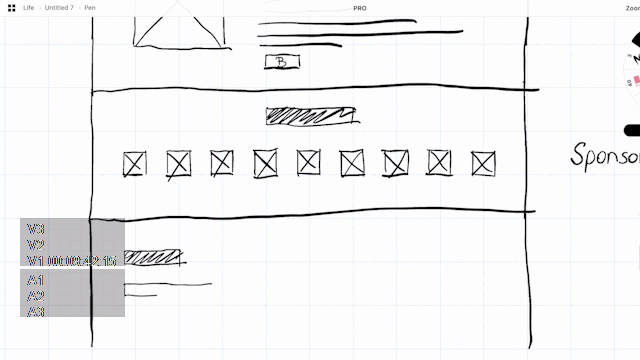
Let's also create another section for an introduction to the company (About Us) and a sponsor section (with logos and images of our sponsors).
As we progress through the design, we can also implement other items into the homepage, like call-to-action buttons in areas that would be appropriate.
We finalize the design with a Footer section where we add common elements such as a Contact Form, Contact Info, and reuse the Logo once more.
 Creating additional page elements in our wireframe
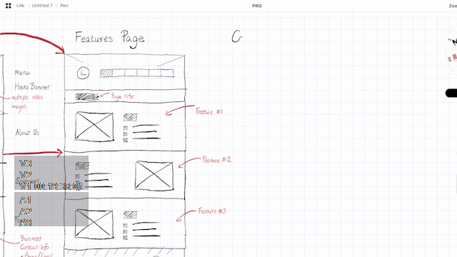
Wireframe #3: Using Markup in Wireframes
The wireframe is often viewed not just by designers, but by developers, clients, and management. So it's useful to add some markup to each part of the content. This can help guide people viewing your wireframe for the first time. I usually do this at the end of completing a page.
In our example, let's markup the homepage and label each part of the content with red text.
Aspects you want to markup include items such as sections, titles, contact forms, and what images might be.
Note that Markup doesn't have to literally explain what the content will eventually be – just what it represents. So instead of putting in the actual "Example of intro title", you can label the title as "Intro Title."
 How to Markup a wireframe
Wireframe #4: Add Other Wireframe Components like Header, Menu, and Footer
Now that we have already created a header and footer, we can reuse them for additional pages. If you're working digitally, you can copy-paste headers, footers, and other recurring elements into new page wireframes. (And if you are just using paper and pen, you can always use a razor and a photocopier to achieve the same effect.)
This allows your wireframe design to remain consistent. Tools like Figma will allow you to create asset components which you can also copy-paste throughout your design. You can even configure them to dynamically update other parts of your wireframe when you change your root component.
In our example, we are going to reuse components to build a features page. By creating our first features section component, we can then copy and paste it below several times to build out our entire features page in just a few minutes.
 Adding wireframe components and reusing them on different pages
Wireframe #5: Features Page and Contact Page
It gets easier and easier to building out additional pages once you get started with wireframing and build out some components. With the features page finished, we can create a Contact Us page. All we really have to do is add a few common elements, such as a Google Map, Contact Us form, and some basic contact details like a phone number and email address.
In this example, I have small logos for a phone and email, and large blocks to represent where they will be located on the page.
The contact form will be located below (without a box outline), as well as a Google map on the right hand side.
 Wireframing the Contact Us Page
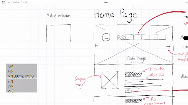
Wireframe #6: Make a Mobile Responsive Wireframe
No good wireframe can exist these days without a mobile version. This is because much of the web today is viewed on mobile devices.
It's good to know how a design might collapse down to smaller viewports. If you are have more time on your hands, you can also build out a tablet version of the responsive wireframe as well.
In our example, we build out the home page design wireframe section-by-section. Most of the rows and columns are collapsed. And since we're on a mobile viewport, many of the images, texts and blocks reduce in size.
Because of this, it's possible for some of the sections to still have the same amount of height as their respective desktop versions. On the other hand, some sections with lots of images (like the sponsors section) might end up having much more scroll height.
Due to this, I often also add additional markup to show which desktop version sections correspond to which responsive equivalents for the mobile version.
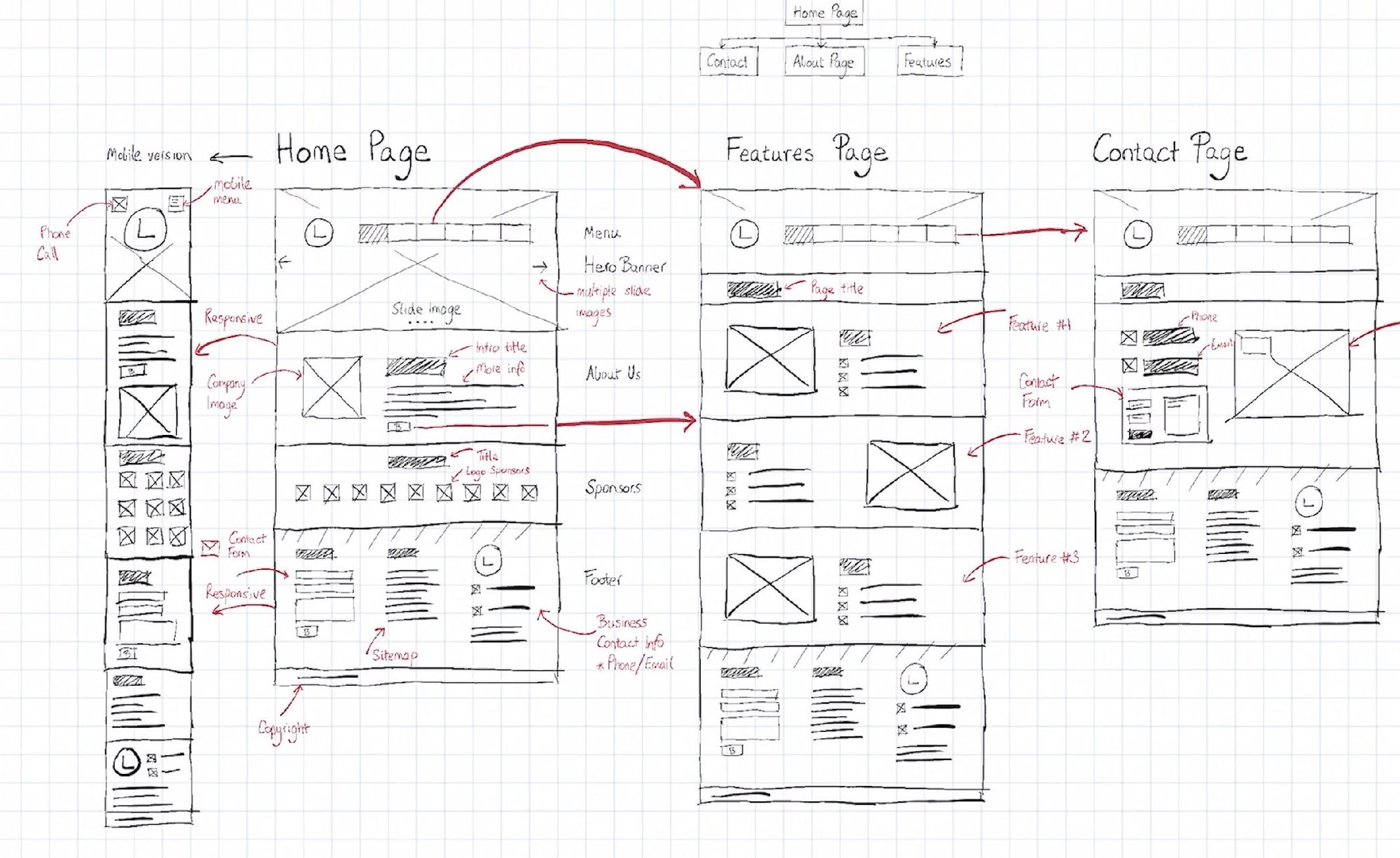 The final wireframe with several pages designed, the sitemap, and mark-up
Wireframe Conclusion
Wireframing is a quick way to get a better idea of your website or application visually. I recommend you try it for your next project to help you plan how it might function and look.
Wireframing is the ideal approach for this, since it takes so much less time than having a designer do a full-blown User Interface prototype.
Step #2. How to Make a Website Prototype
You may have heard the old saying: "Measure twice, cut once." Well that is exactly why you should plan out a website before you build it. And that's where prototyping comes in.
When we design our websites, we progress from wireframing to prototyping to – finally – a full design.
I wanted to explore and expand on what Prototyping actually means by taking you through the full process.
In this part, we'll cover:
- What an Early Prototype is
- Creating a Structure: Frame, Rows, Columns
- Adding Content: Header, Slider, About
- Designing Sections
- Conclusion: What we've learned from the prototyping process
Prototype #1: What is an Early Prototype?
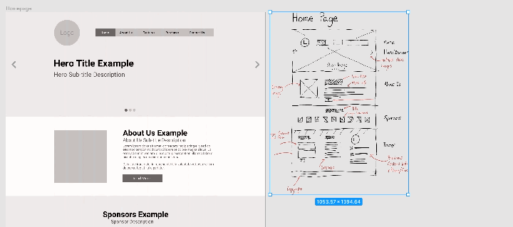
A prototype is normally the secondary iteration of a design, as it is built on top of a wireframe.
A wireframe usually involves a simple drawn sketch via paper, pen, or online tool. Next we build the prototype, which is our more refined mockup for the website or app.
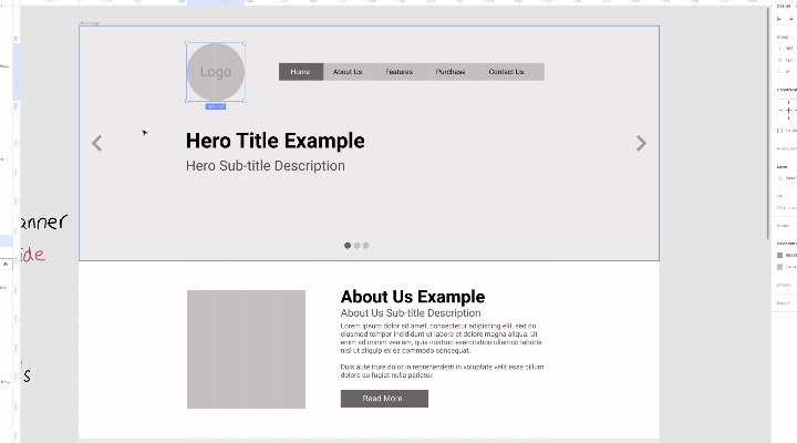
Let's take a look at the early wireframe we built so far.
 The wireframe we created in [my previous wireframing course](https://www.freecodecamp.org/news/what-is-a-wireframe-ux-design-tutorial-website/" style="box-sizing: inherit; margin: 0px; padding: 0px; border: 0px; font-style: inherit; font-variant: inherit; font-weight: inherit; font-stretch: inherit; line-height: inherit; font-family: inherit; font-size: 17.6px; vertical-align: baseline; background-color: transparent; color: var(--gray90); text-decoration: underline; cursor: pointer; word-break: break-word;).
It has a number of pages, sections, and areas where text and images will be added later.
The goal, then, in the Prototype is to build this visually, but without adding color or images.
In this example, I will be using Figma to do the Prototype. You can view the whole Figma protype here.
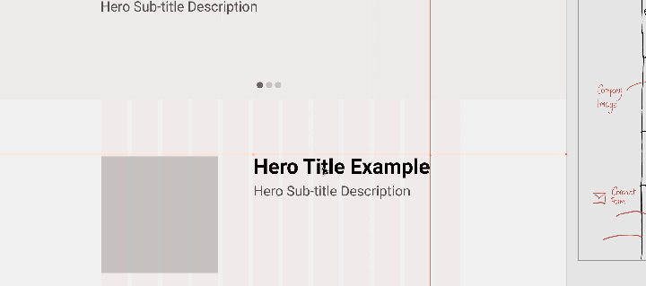
Prototype #2: How to Create a Website Prototype Structure: Frame, Rows, Columns
When we created the wireframe, we considered the grids – but they were hand drawn.
When doing an early prototype, we have to define them properly so that the whole design follows the grid structure.
In this example, I will be using a 12-column design with a regular width of 1140px, which is traditionally used and seen in Bootstrap designs. This gives us a 15-30px margin between grid units.
This will be useful later when we collapse the columns to rows for mobile responsiveness.
You can create your own grid structure in Figma. But be aware that you (or someone else) will later need to actually code these designs.
Whenever you're designing something, be sure to take the developer into consideration.
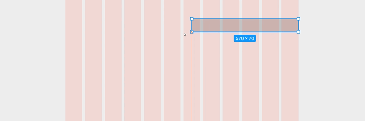
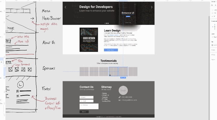
Prototype #3: How to Add Content to a Website Prototype: Header, Slider, Sections
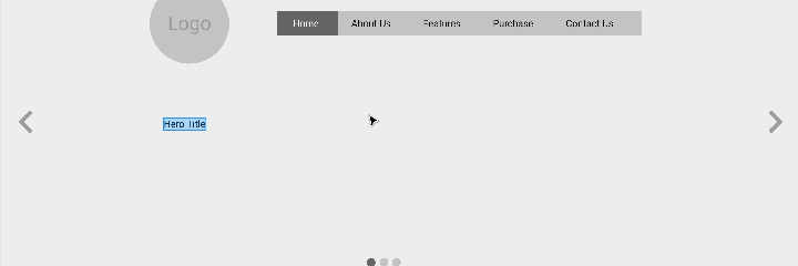
Unlike the Wireframe, we are no longer representing text with lines, and headers with blocks. Instead we need to fill out content for a mockup.
This doesn't mean adding colors or images. But it does mean we have to show real text.
At this stage, it's a great idea to make sure that the header and sections are shown with the actual content they will be intended to hold. This will allow better selection for colors and images in later stages of the design.
In this part of the example, I built out the slider with hero text, and a description underneath. There are a few things to look out for at this phase of the prototype process:
- Font sizing and positioning
- Content location and spacing
- Margins and padding between sections and content
Prototype #4: How to Design Sections of the Website Prototype
For prototyping and the final mockup, it's important to start layering your groups and sections. Sections can include things like the header, the "about us" section, and the sponsors section.
You can create groups in your UI tool (Figma does this with Ctrl+G). Label your sections and set them with different background colors. This will make it easy to identify them, and will allow you to easily move them about.
Too many times I've been asked to move certain parts of a website up and down the grouping. By grouping all your components into sections, you will make it much easier on yourself during the prototype phase of the design work.
Prototype Conclusion: What We Have Learned from the Prototyping Process
As we build out the rest of the design, it's important to ensure that this early prototype does not become a full mockup for a website design.
It's easy to get carried away. But the goal of doing a prototype after a wireframe is to ensure that we can continue to plan the website's development.
It's much easier to identify problems and issues in the early planning stages and update them before diving into creating the full design. Such prototyping may only take you a few hours, but it can save days worth of effort later in the process.
Step #3. How to Build a Website Design in Figma
Our final step will pull all the elements together so far, and fill in the space between. This includes replacing blank boxes with real images, placeholders with content and greys with color.
It's important to do a bit of research into what sort of product or website you will be building. Most things can often be extrapolated from the logo, such as what kind of design and color will be used.
Design #1: Introducing the Logo
The introduction of this logo will show the colors for this design, which will include blacks and blues, as well as the design aesthetic, which has a more simple box like model.
The logo should not be too large and overwhelming, as the main focus should be on the hero content, and the menu, but it should be enough to stand out on its own when placed at the top of a website.
Design #1: Hero Section
Using the shades from the logo, we can apply the same colors to the background of the hero image. In this case, it's black with white text. This immediately allows for better contrast of the logo, menu and text in this section.
The hero section can be improved further by adding in a background image that is subtle in nature, and doesn't take focus away from our text, as well as an image that can bring into perspective the product, service or content we are trying to deliver.
Design #2: Content
The content of a design can be further improved by applying good photography or imagery.
While stock photography is useful to bring more life, if you have good images of the product or service, those always deliver more context when paired with the description, such as an about us section.
Design #3: Testimonials
It's always a good idea to bring reputation and authority to your website, so whenever designing a page, a good testimonial section provides just this.
We customise the design of this section by letting it stand out with an alternative color – in this case blue. This blue also makes this section be segregated from the section above it.
Then white is used for each of the testimonials themselves. If you only have one or two, that's fine, you can divide the boxes. However if you have many, it's also useful to turn this section into a swiping slider.
Design #4: Footer
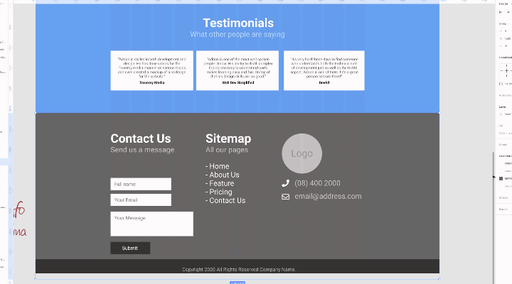
Finally the footer. This part of the design is usually one of the easiest and doesn't require too many changes.
First we match the dark colors we have been using so far. Adjusting the contact form to fit more inline with the text of the website as well as including the logo in once more at the bottom. We make sure the same spacing is applied from the bottom and top and we are complete!
Conclusion: What the Finished Website Looks Like
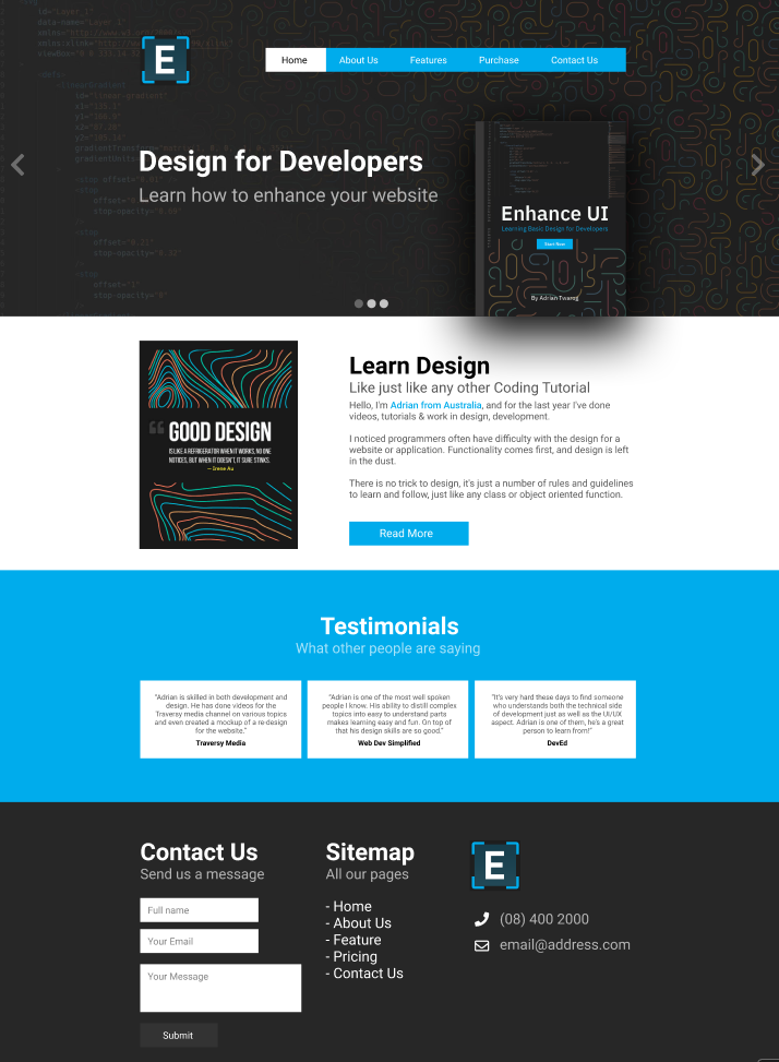 What the finished website will look like
I hoped you enjoyed this journey on developing the wireframe, prototype and full design.
You can view the whole process in real time on YouTube at this link, which will cover a lot more elements, such as the mobile and responsive design, and additional thinking process for each stage.
You can also access the Figma design files to view or use if you want to give this example a go yourself, or create your own personal version using this as reference.
This whole process is part of what I am trying to teach on my own channel and also part of a course/book I am writing on design called Enhance UI. The goal is to help developers understand the fundamentals of design. Check out my Enhance Ui Book below:
I hope you enjoyed this article. If you don't know who I am, I'm Adrian from Australia. I have a tiny channel on Twitter & YouTube, so if you want to know more about me or enjoy my content, check me out sometime. 😉

- YouTube: https://youtube.com/adriantwarog
- Twitter: https://twitter.com/adrian_twarog