
When building for the web, it's easy to develop tunnel vision and only build for yourself. You may overlook the diverse needs of your audience and focus solely on your preferences and how things look on your preferred browser. This can cause you to miss out on crucial functionality aspects and lead to future compatibility issues on other browsers.
In this article, we'll dive into practical strategies for achieving cross-browser compatibility, focusing on specific UI components like form elements, scrollbars, and fonts. Then we'll discuss some general best practices that every web developer should adopt.
“Remember that you are not your users — just because your site works on your MacBook Pro or high-end Galaxy Nexus, doesn't mean it will work for all your users!” – MDN Web Docs
Table of Contents
- What is Cross-Browser Compatibility?
- Common Cross-Browser Issues and Solutions
- Best Practices for Cross-Browser Compatibility
- Conclusion
What is Cross-Browser Compatibility?
In simple terms, cross-browser compatibility is about ensuring that your website delivers a consistent, top-notch experience for all users, regardless of their browser choice.
Browsers use different engines, so by default they render websites differently. In order to get your websites to look and work the same regardless of the user's browser requires an understanding of unique browser capabilities.
Cross-browser compatibility says that ideally, a website should look and function the same whether someone is viewing it on Chrome, Microsoft Edge and Opera (powered by Blink engine), Firefox (powered by Gecko engine) or even Safari (powered by WebKit engine).
Benefits of Cross-Browser Compatibility:
- Wider reach – your websites are accessible to more users, regardless of the browser they use.
- Consistent User Experience – your websites have a uniform look and functionality across platforms.
- Better Search Engine Optimization (SEO) – your websites get higher rankings from being more user-friendly.
Common Cross-Browser Issues and Solutions
 Infographic showing test results of a web page on different browsers. Image credit Browserstack
Form Elements
The appearance and behavior of form elements like <input>, <select>, <textarea>, and <button> can vary significantly across browsers. This affects both the visual aspect and usability of forms, including how users interact with them (for example, clicking, focusing, and typing).
For instance, placeholder text in <input> fields may appear fainter in one browser and more pronounced in another, leading to readability issues.
To resolve this:
- Use CSS to standardize the appearance of form elements as much as possible.
- For placeholders, ensure contrast and legibility across browsers:
::placeholder { /* Chrome, Firefox, Opera, Safari 10.1+ */
  color: #909090;
  opacity: 1; /* Firefox */
}

input.studentid:-ms-input-placeholder { /* Microsoft Edge */
  color: #909090;
}
The CSS code above targets placeholder text in input fields across browsers, sets their color to #909090, and ensures full opacity for consistent visibility (with specific rules for Microsoft Edge).
Fonts
Fonts and typography face several cross-browser compatibility issues, from varying default font sizes to differences in font rendering engines. This can affect the weight, spacing, and overall appearance of text.
A font might appear thinner and more spaced out in Chrome compared to Edge, affecting readability and design consistency.
To resolve this:
- Define a base font size in your CSS and use relative units (like
emorrem) for text sizing as shown in the code below. This helps maintain scalability and consistency.
html {
  font-size: 16px; /* Define a base font size */
}

body {
  font-family: 'Open Sans', sans-serif;
  line-height: 1.6;
  color: #333;
}

h1, h2, h3, p {
  margin: 2rem;;
  padding: 1.5rem;
}
- When using web fonts, ensure they are loaded properly across all browsers by using services like Google Fonts, which provide cross-browser compatible font loading:
<link href="<https://fonts.googleapis.com/css?family=Open+Sans&display=swap>" rel="stylesheet">
- The code below makes sure that the 'Open Sans' font looks the same on our website, no matter the browser. It does this first by using a version of the font that might already be on our computer to load things faster. Otherwise, it grabs it from the internet but swaps in a default font while waiting for the latter to load.
@font-face {
  font-family: 'Open Sans';
  font-style: normal;
  font-weight: 400;
  font-display: swap;
  src: local('Open Sans Regular'), local('OpenSans-Regular'), url(<https://fonts.gstatic.com/s/opensans/v15/mem8YaGs126MiZpBA-UFVZ0b.woff2>) format('woff2');
}
Scrollbars
Scrollbar styling has long been a challenge for web developers due to inconsistent support across different browsers. While browsers like Chrome, Safari, and Edge have provided ways to customize scrollbars using CSS, the level of support and ways of implementing them vary.
Recent updates have seen improvements in standardizing scrollbar customization, with most modern browsers adopting similar capabilities. But there are still some differences in the approach:
For Chrome, Edge, and Firefox, you can use the CSS scrollbar-width and scrollbar-color properties to customize the scrollbar's appearance. These are part of a newer standard aimed at providing a more consistent way of styling scrollbars across browsers that support it.
/* For Chrome, Firefox, and Edge */
scrollbar-width: thin;
scrollbar-color: #c0c0c0 #f0f0f0;
For Safari, which uses the WebKit rendering engine, you'll need to use the ::-webkit-scrollbar pseudo-element to achieve similar styling. This method is specific to WebKit-based browsers.
/* For Safari */
.mostly-customized-scrollbar::-webkit-scrollbar {
  width: 5px;
  height: 8px;
  background-color: #aaa; /* or add it to the track */
}
The CSS code above customizes the appearance of scrollbars across those browsers by adjusting their size and colours.
But for consistency across all browsers, you'll need to design your web pages in a way that the default scrollbar appearance does not negatively impact your design.
Best Practices for Cross-Browser Compatibility
 Infographic showing measuring tools. Image credit Creative Bloq
Define a Doctype
Start your HTML document with a <!DOCTYPE> declaration to ensure standards mode is activated.
This is important because it tells the web browser which version of HTML the page is written in. Without it, browsers might render the page in "quirks mode," – where the browser assumes you've written old, non-standard code. This ultimately leads to unpredictable styling and layout issues because modern web standards are not fully applied.
A <!DOCTYPE> declaration in HTML5 looks like this at the very beginning of your HTML file:
<!DOCTYPE html>
Use a CSS Reset
A CSS reset is basically adding a set of rules that target common elements to remove their default styling, reducing browser-default discrepancies.
Various browsers have different inherent styles for HTML elements – margins, paddings, font sizes, and so on. So implementing a CSS reset makes sure that only the styles you write in your code will take effect. This leads to a consistent baseline for styling your webpage across various browsers.
There are developers that like to write theirs from scratch. And there are others like me, who use Eric Meyer's popular and free CSS reset as you can see in the code below:
/* http://meyerweb.com/eric/tools/css/reset/
   v2.0 | 20110126
   License: none (public domain)
*/

html, body, div, span, applet, object, iframe,
h1, h2, h3, h4, h5, h6, p, blockquote, pre,
a, abbr, acronym, address, big, cite, code,
del, dfn, em, img, ins, kbd, q, s, samp,
small, strike, strong, sub, sup, tt, var,
b, u, i, center,
dl, dt, dd, ol, ul, li,
fieldset, form, label, legend,
table, caption, tbody, tfoot, thead, tr, th, td,
article, aside, canvas, details, embed,
figure, figcaption, footer, header, hgroup,
menu, nav, output, ruby, section, summary,
time, mark, audio, video {
    margin: 0;
    padding: 0;
    border: 0;
    font-size: 100%;
    font: inherit;
    vertical-align: baseline;
}
/* HTML5 display-role reset for older browsers */
article, aside, details, figcaption, figure,
footer, header, hgroup, menu, nav, section {
    display: block;
}
body {
    line-height: 1;
}
ol, ul {
    list-style: none;
}
blockquote, q {
    quotes: none;
}
blockquote:before, blockquote:after,
q:before, q:after {
    content: '';
    content: none;
}
table {
    border-collapse: collapse;
    border-spacing: 0;
}
There's another group of developers that use Normalize.css, which you can install using a package manager like npm and then importing it in your CSS.
npm install normalize.css
Review CSS Property Support
Before using advanced CSS features, check their compatibility on websites like Can I Use. There, you can find detailed compatibility tables for HTML, CSS, and JavaScript features across different browsers and versions. This should help you make informed decisions about which technologies to use and when to implement fallbacks.
In the screenshot below, I searched for CSS Grid and immediately got to see the various browsers and their versions that support it. So before implementing CSS Grid on my web page, I have an idea of the browsers that it works with.
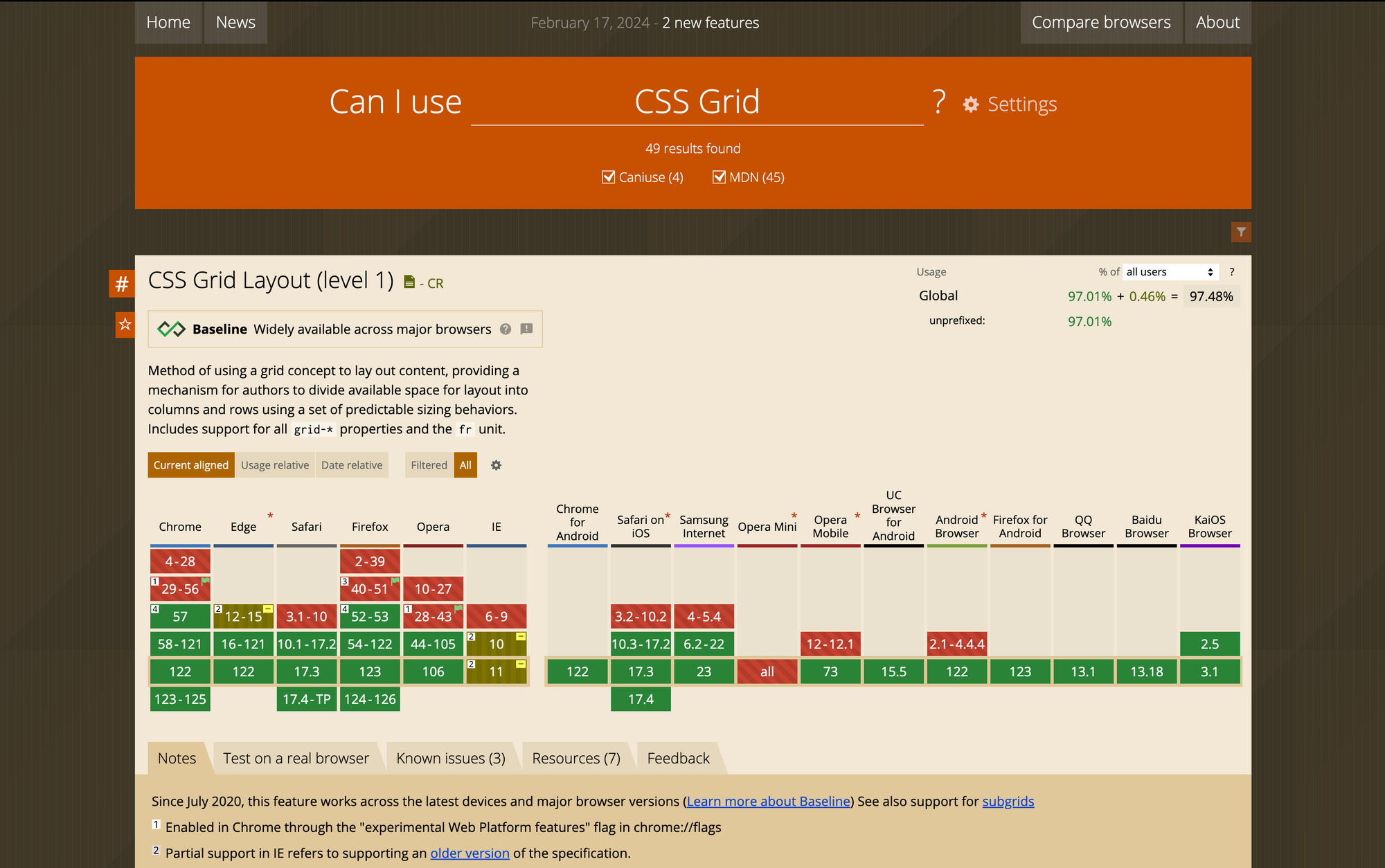 Browser compatibility for CSS Grid.
Create Responsive Websites
The multi-device world we currently live in demands that, as web developers, we make responsiveness a priority.
We can use fluid layouts, flexible images, and media queries to ensure our websites adapt to any screen size. The ripple effects of getting responsiveness right is cross-browser compatibility, accessibility and enhanced user experience.
Here's an article discussing some best practices for responsive design and how to implement them.
Do Cross-Browser Testing
Testing has become such a buzzword in programming lately, but this is because it's very important to make sure the code you write works as expected.
It's not just about checking if your TypeScript code runs smoothly, though. Even simpler web projects need thorough testing.
Cross-browser testing means trying your web pages on various browsers and devices to make sure they look and work consistently across board.
Conclusion
Cross-browser compatibility may be a mouthful to pronounce. But as we’ve seen, it's essential to consider when building websites. And you can gradually make your websites compatible by testing and tweaking your code and implementing some of the five best practices we’ve discussed above.
So, before you draw the curtains on your next website or web app, remember to check if your users on Chrome, Firefox, Safari, and other browsers are seeing and experiencing the same things.
Here are some helpful resources: