By Fakorede Damilola
The way we interact with the web has changed dramatically, and it will keep changing.
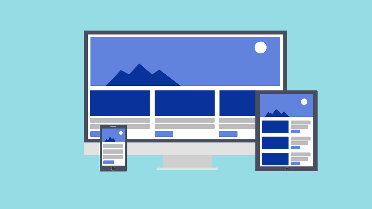
In the past, most people used desktop computers to access the internet. But today, people are using a wide variety of devices, including laptops, tablets, and smartphones. This has resulted in a growing demand for responsive web design.
Responsive web design is a design approach that ensures that a website looks good and functions properly on all devices. This is done by using fluid layouts and media queries to adapt the website to different screen sizes.
There are many benefits to using responsive web design. First, it provides a better user experience for everyone. When a website is responsive, users can access it from any device without having to zoom in or scroll horizontally. This makes it easier to read content and navigate the website.
Gone are the days when you build a website that looks good on your laptop and don't consider other users' devices.
So you can say responsive web design is the approach that suggests that design and development should respond to the user's behavior and environment based on screen size, platform, and orientation.
In this tutorial, I will be explaining some of the most vital details that you should remember when building your responsive website
5 Principles to Apply When Building Responsive Websites
There are a number of principles you should consider when building your next website in order to make it responsive. And here are five of them that I think are particularly important.
I won't be going into a lot of detail on each of these. This is more of an overview to keep in the back of your mind when you're building.
Use Media Queries
One of the most fundemental ways to create a responsive website is by using media queries. Media queries help you to define different breakpoints for your website.
A breakpoint in a responsive design is the “point” at which a website's content and design will adapt in a certain way to provide the best possible user experience. These breakpoints help you specify different CSS properties to use based on the size of the user's screen.
Common examples of breakpoints include 480px, 768px, 1024px, and 1280px. But you cannot define breakpoints for all the different screens. So developers work by defining two (mobile-desktop) to three (mobile-tablet-desktop) different breakpoints. Then along with other properties we will talk about below, you can define your various styles for each breakpoint.
Below is a typically example of how you can use a media query when building a website. I'm assuming you want to build a main layout and an aside layout.
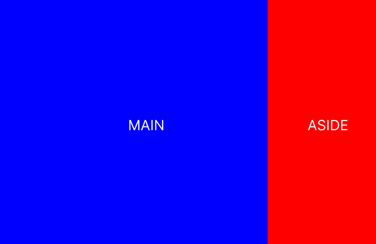
The code should look something like this:
     .wrapper{
            width:100%;
            display:flex;
        }
        .main {
            width:80%;
            height:100px;
            background:blue;
            display:flex;
            justify-content: center;
            align-items: center;

        }
        .aside{
            height:100px;
            background:red;
            width:20%;
            display:flex;
            justify-content: center;
            align-items: center;
        }
    </style>
<body>
    <div class="wrapper">
       <main class="main">
        <h1>MAIN</h1>
    </main>
    <aside class="aside">
       <h1>ASIDE</h1>
    </aside>
    </div>


</body>
But you have to consider the fact that some users might try to view the website on a smartphone, which has a much smaller screen than your desktop system.
To make this look good even on devices with smaller screens, you can use media queries to either completely remove the aside bar or you can bring it below the main content area.
It depends on you and what you think your users might want to see or the type of information on the aside. This is just to help you think about the options – remember you are a problem solver and there is rarely one way to solve a problem. So pick what works best for you.
For the smaller screen, in this example we will be putting the aside bar below the main area with media query.
When building a website, there is a question you should ask before you start coding. Are you building for mobile first or desktop? This question is quite important as it will determine how you structure your CSS.
I personally like to go mobile first, simply because I know most people will view my website on smartphones, so I want to perfect that first. I realize that this debate has been going on for a while, but it depends on you and your site's needs.
Using media queries, we'd do this to change the layout of the code so that it looks good on both smart phones and desktop:
 <style>

    .wrapper > div {
        display:flex;
            justify-content: center;
            align-items: center;
    }


        .main {
            width:100%;
            height:100px;
            background:blue;

        }
        .aside{
            height:100px;
            background:red;
            width:100%;
        }
        @media (min-width:600px) {
                   .wrapper{
            width:100%;
            display:flex;
                   }
                   .main {
            width:80%;

        }
        .aside{
            width:20%;
        }
        }
    </style>
<body>
    <div class="wrapper">
       <div class="main">
        <h1>MAIN</h1>
    </div>
    <div class="aside">
       <h1>ASIDE</h1>
    </div>
    </div>


</body>
There are a few things to take note of here (but again, this isn't meant to be an in-depth tutorial on media queries so we won't go into too much detail).
When working with media queries, you can define the min-width or max-width.
The code written inside the container of min-width are those we want to apply for that width and above – in this case, for the wrapper, you applied the display flex only when the width of the user screen is 600px or above . Other styles like the main width and the aside width also have their indivdual size adjusted when the screen get to a size of 600px and above. That is, the styles you have defined outside this media query will keep working until it sees a screen of 600px and above.
At 600px, it overrides these styles, which it does in the media query block, and then makes the necessary changes.
You can learn more about media queries and practice your skills by building projects in this tutorial.
Use Flexible Layouts
The layout is one of the most fundemental part of a website. This is the structure of your website, and you can lay things out in different ways, depending on what you need.
Since this is one of the most crucial part of your website, you want to create your layout in a way that it is not clogged up and doesn't look disorderly for the main screen sizes like mobile, tablet, and desktop.
By using CSS properties like Flexbox, Grid, and so on, you can easily achieve this.
CSS Grid: CSS Grid is a two-dimensional layout system for creating responsive web designs.
It allows you to define rows and columns in a grid, and then place and align content within those grid cells.
Grid is typically used for more complex layouts, such as those with multiple rows and columns. It gives you fine-grained control over how content is placed and spaced within the grid cells, and can even be used for overlapping content.
With the grid layout, you can easily have your website rearranged when used with media queries.
Flexbox: CSS Flexbox is a one-dimensional layout system for creating flexible and responsive web designs.
It allows you to define a flexible container and then align and distribute items within that container along a single axis (either horizontally or vertically).
Flexbox is best used for simpler layouts where items need to be arranged along a single axis. It allows you to easily control the spacing and alignment of those items, and can be used for both horizontal and vertical layouts.
You can learn more about CSS Flexbox in this crash course. And here's a handbook to get you started with Grid.
Then, if you want to put your Flexbox and Grid skills into practice, check out this project-based guide.
Use Flexible Units
Another fundamental concept in web development is units. Depending on the kind of unit you use, it can make your website look orderly or disorderly.
There are different units you can use to define, for example, the size of a box or circle. And while there is a wide range of units to choose from (like rem, cm, px, inches, and more), they can be broadly classified into two types:
Relative units: These are the units that change value based on the screen size. This kind of unit doesn't have a fixed dimension, but can easily expand or contrast based on the size of the device. Examples include percentage, rem (root element's font-size) or em.
Absolute units: These are units whose values remain the same no matter the sreen size. Regardless of the size of the screen, the space occupied will always remain the same
Choosing units that automatically expand or resize based on screen size or the content it carries should be your go-to (except where absolutely necessary, and then you can go for absolute units).
A typical example is using a percentage value when you want a div (box) to always span the entire screen. Or you can use a px value when you want it to remain the same size regardless of the screen size.
Newer and easier units to use include rem and em. Let's look at an example of what not to do first:
  <style>
        .main {
            width:500px;
            height: 500px;
            background-color: red;
        }
    </style>
 <div class="main">
        <h1>MAIN</h1>
    </div>
The code above is a box with some text in it. Having a set up like this will look good on your large screen, but when you compare it with what you see on the smartphone, there will be a horizontal overflow. And as a web developer, you don't want this (except where absolutely necessary).
Creating something better might go like this:
<style>
        .main {
            width:50%;
           height:100px;
            background-color: red;
        }
    </style>
       <div class="main">
        <h1>MAIN</h1>
    </div>
As you can see from the code above, we defined the div with class main, with a relative width. That is, depending on your screen size, the box here will take 50% of your total screen size. This is really nice because now you don't have to worry about the user's screen size because no matter the size, the box will always be half of the screen.
The CSS Position Property
You can also use the various positioning properties in CSS to help you build responsive websites. Some examples include relative, absolute, static, sticky, and fixed.
The position property in CSS helps you easily move different elements from their normal flow, depending on the property you set.
These elements are then positioned using the top, bottom, left, and right properties. But these properties will not work unless the position property is set first. They also work differently depending on the position value.
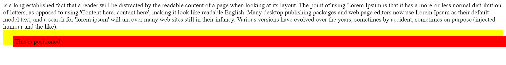
- Static: The static position is the default position of any element on the browser, so the top, left, right and bottom properties won't work for it. This property can be used when you want to return an element back to its initial position after you have moved it with another positioning property.
<html>
 <style>
   .position{
     background:red;
     padding:5px;
     position:static;
     top:10px;
     left:20px;
   }
   .wrapper{
background:yellow;
     padding:5px;
   }
  </style>
  <body>
   <div class="main">
     It is a long established fact that a reader will be distracted by the readable content of a page when looking at its layout. The point of using Lorem Ipsum is that it has a more-or-less normal distribution of letters, as opposed to using 'Content here, content here', making it look like readable English. Many desktop publishing packages and web page editors now use Lorem Ipsum as their default model text, and a search for 'lorem ipsum' will uncover many web sites still in their infancy. Various versions have evolved over the years, sometimes by accident, sometimes on purpose (injected humour and the like).</div>
    <div class="wrapper">
    <div class="position">
      This is positioned static
    </div>
    </div>
  </body>
</html>
As you can see from above, we added the position static along with other properties and nothing happened. This is not because the code is not working – this is just the behaviour of position static. Adding or removing the position static does nothing to the code, that is where it should be.

- Relative: The relative position property positions an element relative to where the intial position of that element was. The following code will explain this better:
<html>
 <style>
   .position{
     background:red;
     padding:5px;
     position:relative;
     top:10px;
     left:20px;
   }
   .wrapper{
background:yellow;
     padding:5px;
   }
  </style>
  <body>
   <div class="main">
      It is a long established fact that a reader will be distracted by the readable content of a page when looking at its layout. The point of using Lorem Ipsum is that it has a more-or-less normal distribution of letters, as opposed to using 'Content here, content here', making it look like readable English. Many desktop publishing packages and web page editors now use Lorem Ipsum as their default model text, and a search for 'lorem ipsum' will uncover many web sites still in their infancy. Various versions have evolved over the years, sometimes by accident, sometimes on purpose (injected humour and the like).</div>
    <div class="wrapper">
    <div class="position">
      This is positioned relative
    </div>
    </div>
  </body>
</html>
As you can see from the code above, a position of relative will simply move the element around its actual position based on the value you set. So it is relative to its actual position:
- Fixed: We use the fixed position to keep an element at a particular point on the screen, regardless of the content of the page. The fixed position will be relative to the size of the screen, that is when you set a top value, it will be calculated from the top of your screen. Here is an example. I will reduce the dummy content I am using.
<html>
 <style>
   .position{
     background:red;
     padding:5px;
     position:fixed;
     top:10px;
     left:20px;
   }
   .wrapper{
background:yellow;
     padding:5px;
   }
  </style>
  <body>
   <div class="main">
     This is a really long text
    </div>
    <div class="wrapper">

    <div class="position">
      This is positioned fixed
    </div>
    </div>
  </body>
</html>
This element with the position fixed completely left its original position. Then, based on the the value of the top and left, it was aligned some distance from the top of the screen. It the content is scrollable, the element will still remain there.
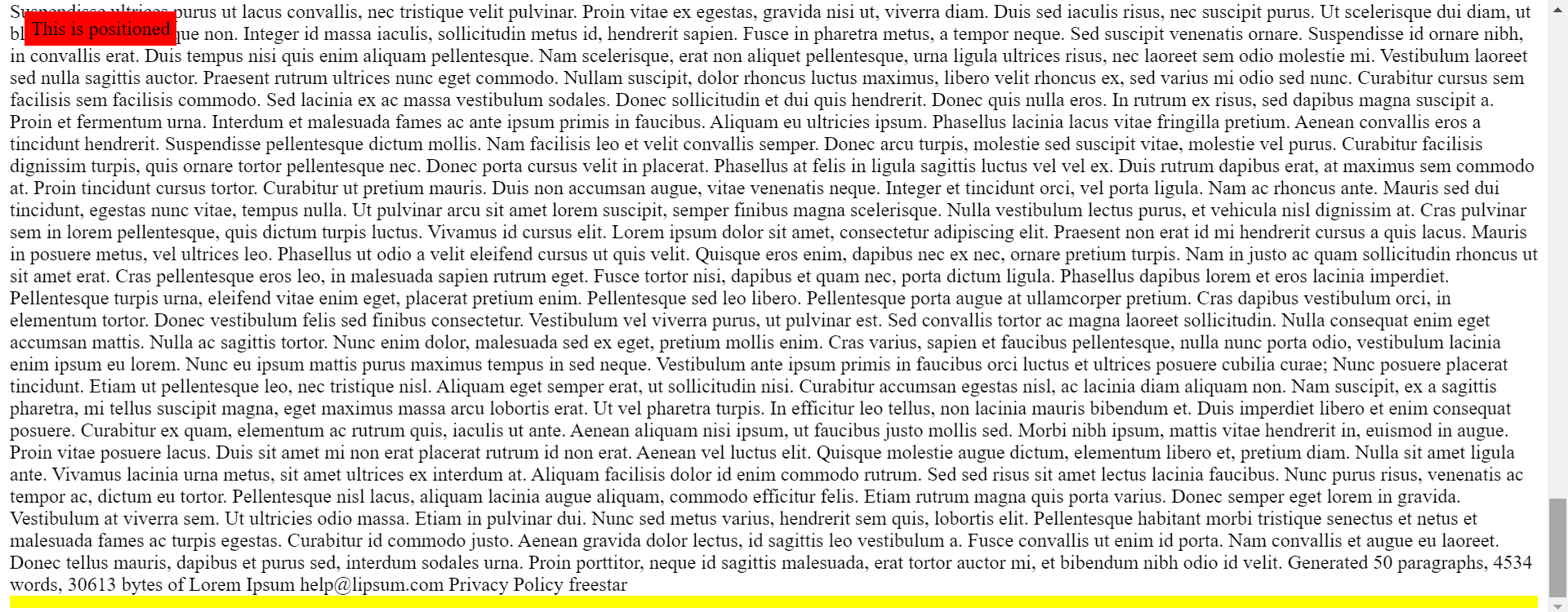
- Absolute: The absolute property positions an element relative to a parent element. So if it is inside another element that has a position property other than static, it will be positioned relative to that element. If there is no such element, it will be positioned relative to the top of the screen.
<html>
 <style>
   .position{
     background:red;
     padding:5px;
     position:absolute;
     top:7px;
     left:20px;
   }
   .wrapper{
background:yellow;
     position:fixed;
     top:30px;
     padding:30px;
   }
  </style>
  <body>
   <div class="main">
this is dummy content
</div>
    <div class="wrapper">
    <div class="position">
      This is positioned
    </div>
    </div>
  </body>
</html>
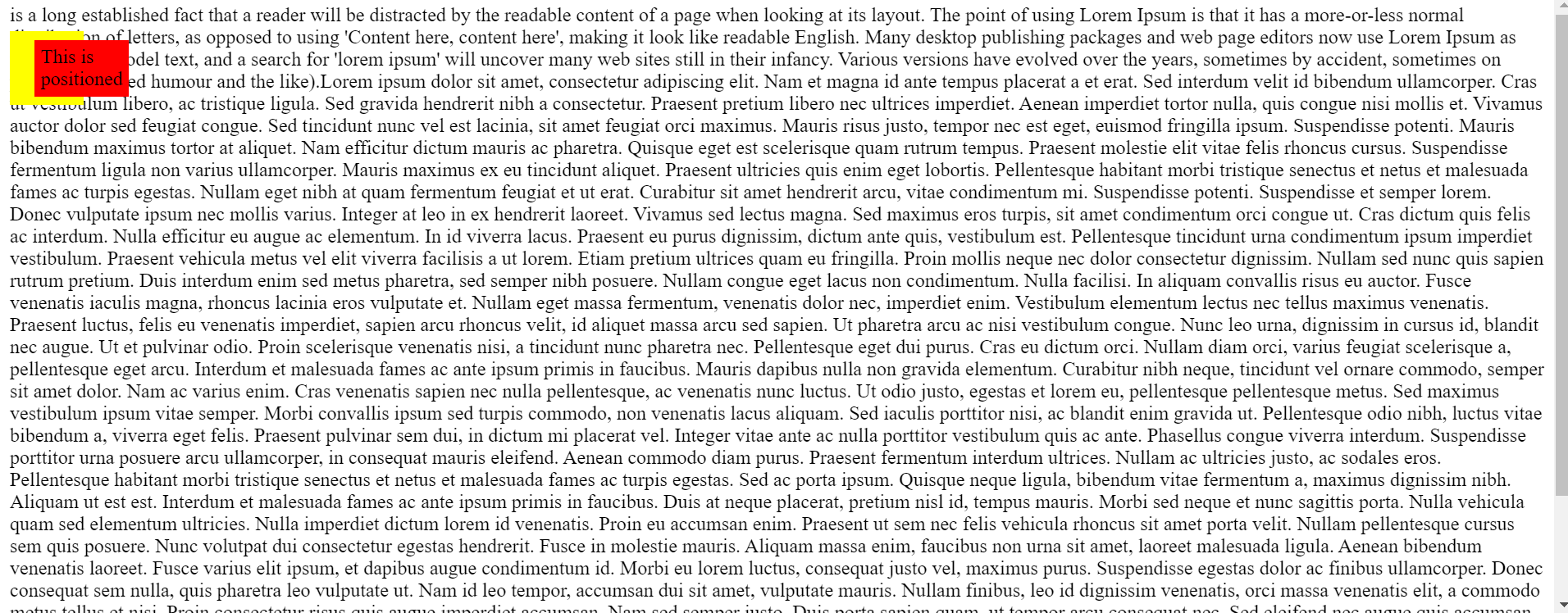
As you can see from the code and image above, the position is relative to that of the parent element – in this case, it's the fixed wrapper.
You can learn more about the CSS position property in this tutorial.
Make Images Responsive
Images are quite special, and that is why I am adding a section on them here too.
You can make images responsive by using the various methods listed above – but due to the nature of images, they are easily cropped or distorted if you're not careful.
Here are a couple things you can do when working with images if you want them to be responsive
Use SVG images: SVG stands for Scalable Vector Graphics. It's a type of image format that uses vector graphics to create scalable images that can be resized without losing quality.
Unlike raster images (for example, jpg, png, and so on) which are made up of individual pixels, SVG images are defined by mathematical equations and can be scaled up or down infinitely without losing clarity.
Some developers prefer to use SVGs rather than other types of images because:
- scalability – SVGs are infinitely scalable, which means that they can be used in a variety of different sizes and resolutions without losing quality.
- smaller file size – SVG images typically have a smaller file size than other types of images, such as JPEGs or PNGs.
Object-fit: The object-fit property is used to specify how the img should be resized to fit its container. This property tells the content to fill the container in a variety of ways, such as "preserve that aspect ratio" or "stretch up and take up as much space as possible".
Wrapping up
In this article, I hope I have helped you learn about the basic components you'll need when building responsive websites.
Responsive websites are necessary, and it's essential for every web developer to be able to comfortably build responsive web applications.
In this article, I have talked about 5 main building blocks of responsive sites, which are:
- Media queries
- Flexible layout
- Flexible units
- Positioning elements
- Images
Hopefully you can start using them in your own projects.