
These days, we find ourselves consuming vast amounts of information, at an unprecedented rate. From online transactions, to social media interactions, to scientific research, the complexity of data grows exponentially. This reveals a challenge — how to transform this raw data to actionable insight.
This is where data visualization comes in. Data visualization is a very important concept we should all consider when designing for our users.
In this article, you'll learn what data visualization is, how it relates to UX Design, and challenges faced when designing for data visualization.
What is Data Visualization?
Data Visualization can be defined as being able to view data in designs. This could be done using charts, maps, tables, and so on. Data visualization simply enables users to see and understand data, without stressing their head or eyes.
By leveraging the power of visual perception, data visualization empowers individuals and organizations to gain deeper insights, and make informed decisions.
How Does Data Visualization Relate to UX Design?
You might be wondering if and how data visualization relates to UX design. After all, isn't data all about numbers?
They do relate! You see, data visualization isn't just about numbers. It's about representing these numbers in a way that makes sense to the user, and also helps them make decisions.
As UX designers, our primary goal is to solve a problem for our users. When we design for data visualization, we're reducing the strain of going through bulky amounts of data for our users, and generally making their lives easier.
Why is Data Visualization important?
Data Visualization is important for so many reasons, some of which are:
- Enhancement of understanding: Just putting out data might confuse a particular user or customer. Using visuals to interpret the data makes it easier and more fun for the users.
- Communication of insight: Data visualization helps communicate insights on a digital platform. Users will be able to understand the data, data sources and how it's being analyzed.
- Better user experience: Overall, data visualization helps in making sure your user has a better experience while interacting with your platform. You're generally trying to make their lives easier and reduce information overload.
- Informed decision-making: Helping the user understand the data better, will keep them informed, and help them make better decisions which can boost their businesses.
Challenges of Designing for Data Visualization
Data visualization is so easy to get wrong. Because of the delicate nature of data and how broad it can appear, designers might face some challenges when trying to help users visualize data. Some of these challenges include:
- Bulky/complex data: The bulky nature of the data might make it difficult to represent the data using visuals. Also, simplifying the data without losing information can be very tricky.
- Cluttered interface: Somewhat related to the previous point, the overwhelming nature of the data can make the design look cluttered. Because you're designing with a lot of data, you might end up having a messy interface, while trying to put it all on a screen. You have to find a way to make sure your user interfaces don't look cluttered with an overload of information.
- Usage of color: Despite the fact that we want the interface to look visually appealing, we have to consider the fact that colors can distract users from the overall intention, which is to communicate data to the users. Therefore, we should figure out a way to strike the balance, especially when differentiating color categories and highlighting important information.
- Background of the target audience: You should also consider the background and understanding of your target audience. Some users might not have technical knowledge so, it would be best not to use jargon while designing for them.
How to Design Efficiently for Data Visualization
To effectively design for data visualization and correctly interpret data for your users, you should consider these tips:
Define the purpose
First of all, you'll want to define your purpose for the design. This is a common step in most designs. You need to understand the purpose of the visualization – is it to convey trends, monitor business growth, and so on.
Also, consider the domain, requirements, and possible constraints. This will help you determine the best visualization type to use.
For example, say you're designing a data visualization for a social media tracking platform. The purpose here is to track the growth of the social media account, note what posts are most engaged with, and basically providing actionable insights to help the user make decisions that would further boost the account.
Know your audience
Another tip for designing effectively is to know your audience. You have to understand what your audience needs before figuring out how to help them.
You can conduct some research on the kind of people that would use the data visualization tool for the domain you're working on.
Using the same example as the first tip, your audience would generally be social media managers, brand ambassadors, or others who work primarily in the social media space. Do note that the audience may vary in terms of age, expertise, and personal preferences.
Choose the visualization type
Here, you choose the best visualization type for conveying your information. You can decide to use bar charts, tables, graphs, and so on, to represent your data.
Continuing with our example, you'd want to select visualizations that effectively represent progress over time, such as bar charts, progress charts, and so on. You might also want to analyze key data such as active followers. Would you use a bar chart or a line chart to do so? This is what choosing the visualization type entails.
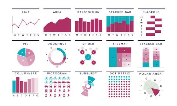 Examples of some data visualization charts. Image from [OpenClassrooms](https://www.google.com/url?sa=i&url=https%3A%2F%2Fopenclassrooms.com%2Fen%2Fcourses%2F4555961-apply-metrics-to-design-decisions%2F5403056-decide-on-an-approach-to-present-information&psig=AOvVaw11EJaN3uJ8zzLGJ7VRciQd&ust=1685717146266000&source=images&cd=vfe&ved=0CBEQjRxqFwoTCKjA--nov8CFQAAAAAdAAAAABAR)_
Have an intuitive and simple layout
Here, you'd have to think of the kind of layout you want to use for your design. You would want to go for a simple layout that would help your users easily understand the visuals.
For the social media data visualization, you might want to:
- Incorporate a clear hierarchy of elements using size, colors, and placement.
- Use familiar patterns like icons or symbols, to represent different social media metrics.
- Embrace a minimalist approach by displaying essential information only.
- Design a clear navigation system so users would always understand their current location on the application.
Having an intuitive layout can help reduce information overload on your users. When elements are arranged logically, and the visualization is simple and free of clutter, your users are sure to have a great experience.
Use accessible colors
Next, choose colors that are easy on the eyes. Aside from the background and primary colors, you might use color coding to differentiate between different metrics/elements.
For example, you may decide to get the gender demography of the audience for the social media account. To represent this data, you could use a circle graph (doughnut), and choose different colors to represent the genders.
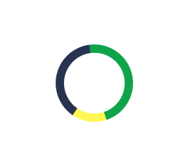 An example of a circle graph with each element differentiated by colors.
Please note that accessibility isn't only for people with disabilities. Make sure to use colors that don't distract the user from important elements and information. You can use the 60-30-10 rule to choose a color palette that improves understanding and aids interpretation.
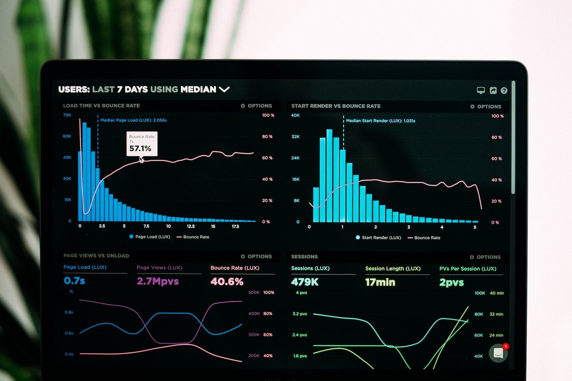
A Data Visualization Dashboard
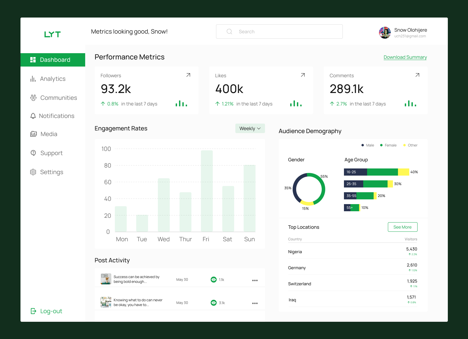 Example of a dashboard for a Data Visualization Tool
The image above shows a dashboard for a social media data visualization tool. The dashboard contains performance metrics, analytics of likes, followers and comments on the account. The dashboard also contains the demographics of the audience, engagement rates and posts activity.
All these are important data analytics information which are useful to the owner of the account.
You can see how charts and bar graphs are used to interpret the data. Imagine having one big list which has the demographics of each user, each like and comment posted, everyone who engaged with each posts, and so on. It would be a bit overwhelming and hard to sift through to find insights.
Conclusion
The average person consumes about 40-75 gigabytes of data per day. Now, that's quite a lot. Imagine having to take in this huge amount of data through cluttered and disorganized interfaces. This would make it difficult to understand and interpret the data.
As designers, it's our job to ease the experiences of users while interacting with our products. We have to focus and align our design choices with the purpose and audience, as well as continuously evaluate our visualizations to ensure they effectively convey insights and appropriately inform the viewers. Remember, this gets better with practice.
Thank you for reading!