
As the world of technology continues to advance, so does the way people interact with businesses and organizations.
With the growing popularity of mobile devices, responsive website design has become a must-have. It helps you provide the best user experience to customers regardless of which device they are using at any given time.
In this article, we'll discuss some of the benefits that responsive website design can bring to your business or organization.
What you will learn
In this article, you will learn about responsive web design and how it can benefit your business.
You will also learn about some of the key features that make a responsive website.
By the end of this post, you should have a good understanding of why you need to make the switch to a responsive website.
What is Responsive Web Design (RWD)?
Responsive web design is an approach to web design that makes websites look good on all devices, from small phones to large desktop monitors, as shown below.
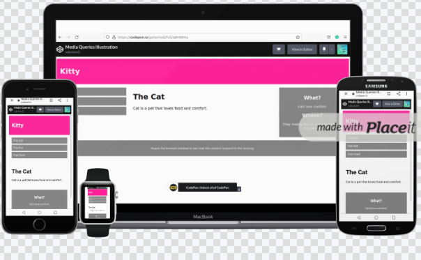 responsive web design
RWD is important because it allows your website to be accessible to everyone, no matter what device they're using.
Why Does RWD Matter For My Business?
These days, more and more people are using their mobile devices to browse the web.
In fact, according to Statista, mobile devices accounted for more than 50% of global internet usage this year. That’s more than half! And it's only going to increase as technology becomes even more advanced.
As you can see, your business needs to be accessible anywhere, on any device – and responsive design is the best way to make that happen.
If you have a website that is not responsive, you're losing out on valuable traffic from mobile users because they will bounce off your site immediately if they can't view it properly on their phone or tablet.
How Does Responsive Web Design Benefit Me And My Customers?
A responsive website provides a better user experience, which can lead to more customers and conversions.
Responsive websites aren't just beneficial for businesses. They also provide benefits to consumers. With a single touch or click of their mouse, users can access whatever they need from whichever device they prefer – be it their laptop, tablet or phone.
If you're like most business owners, you want to make sure your website is accessible to as many people as possible. That's why responsive design is so important.
Responsive sites are also easier to maintain because you can make content updates on one version and it'll automatically be reflected on all screens. This can save you time and money in the long run.
How to Get Started with Responsive Web Design
Having a responsive design is paramount for attracting new clients. While it may seem difficult, I assure you that you can do it!
Here are a few simple steps you can take in order to start becoming responsive today:
- Start by redesigning your site with images and content scaled for smaller screens such as tablets and smartphones. This way, you will be ahead of the curve when mobile use starts dominating the market.
- Write your content responsively.
- Use
CSSmedia queries so that you can display different styling based on the device being used to view the site. TheCSScode below will serve as an example:
@media only screen and (max-width: 768px){...}
When the screen shrinks to less than 768px, each column should have a width of 95%:
@media only screen and (max-width: 768px) {
  /* For mobile phones: */
  [class*="col-"] {
    width: 95%;
  }
}
Checkout the following code. You can play around with it to learn more about media queries.
Convert all your fonts into web fonts, which are faster loading and much more compatible across browsers than other fonts. You might also consider investing in a retina ready logo and site design.
Add social media icons to your site so people visiting from mobile devices can share your content with friends.
Enable any videos or slideshows on your website to auto play once they load instead of making users click first. This helps ensure that people don't exit out before viewing important information.
Make sure your navigation menu uses clear language and large buttons for easy access no matter what size screen is being used.
When adding links, think about how you would navigate the site on a smartphone or tablet to help increase usability for those browsing from these small screens.
Test your website regularly to make sure everything looks good and functions properly across various types of devices.
Timing Is Everything!
You may be wondering if responsive website design is worth the investment. After all, your current website might be getting the job done just fine.
But in today’s mobile-first world, a responsive website is essential to stay competitive. Here are four reasons why you should make the switch to a responsive website
- It will improve your customer experience
- It will improve SEO
- It will improve user engagement
- It will help retain customers
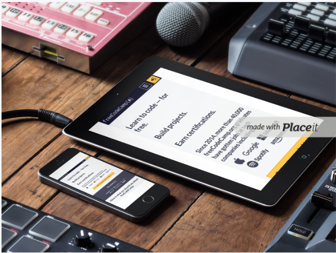
How to Learn Responsive Web Design
If you want to get started learning responsive web design so you can update your site, check out freeCodeCamp's newly updated RWD curriculum here. You'll learn major responsive web design concepts and syntax through building 20 projects.
Here's what the certification covers:
- Learn HTML by Building a Cat Photo App
- Learn Basic CSS by Building a Cafe Menu
- Learn About CSS Colors by Creating a Marker Set
- Learn HTML Forms by Building a Registration Form
- Certification Project: Build a Survey Form
- Learn the CSS Box Model by Building a Rothko Painting
- Learn CSS Flexbox by Building a Photo Gallery
- Learn Typography by Building a Nutrition Label
- Learn Accessibility by Building a Quiz
- Certification Project: Build a Tribute Page
- Learn More About CSS Pseudo Selectors by Building a Balance Sheet
- Learn Intermediate CSS by Building a Picasso Painting
- Learn Responsive Web Design by Building a Piano
- Certification Project: Build a Technical Documentation Page
- Learn CSS Variables by Building a City Skyline
- Learn CSS Grid by Building a Magazine
- Certification Project: Build a Product Landing Page
- Learn CSS Transforms by Building a Penguin
- Learn CSS Animations by Building a Ferris Wheel
- Certification Project: Build a Personal Portfolio Webpage
It's free and self-paced, and you can check it out here.
Conclusion
If you're not already using a responsive website design, it's time to make the switch.
A responsive website is essential for delivering a positive user experience, and that's important for keeping your customers happy.
In addition, responsive design can help improve your search engine ranking, which can lead to more traffic and more customers.
With so many benefits, there's no reason not to make the switch to a responsive website design.