
By Zoltán Szőgyényi
Dark mode is starting to become a requirement rather that a nice-to-have feature like it was back in the day. It gives users the option to choose a theme that's comfortable for them, whether they're working during the day or at night.
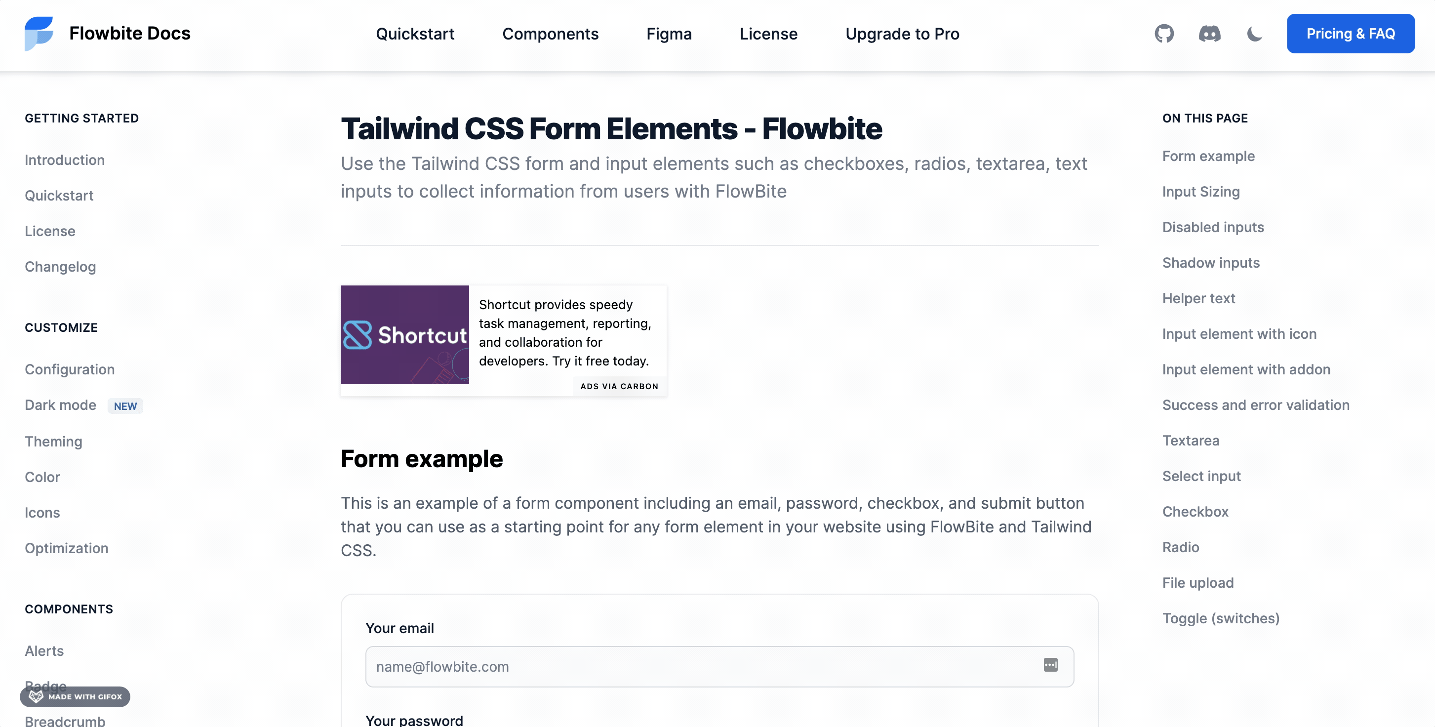
If you haven't already heard, Tailwind CSS is one of the fastest growing CSS frameworks today due to its utility-first approach.
But even though Tailwind has a pretty good dark mode integration guide, there's no clear explanation on how to build a switch element to toggle it. On top of that, Tailwind doesn't include any actual components that support dark mode.
That's where Flowbite comes in. Flowbite is a library that provides components and interactive elements on top of Tailwind CSS. And as of version 1.2, it supports dark mode.
So that's what I want to show you today – how to build a Tailwind CSS dark mode switch element, and how to work with Flowbite components.
 Flowbite - Tailwind CSS dark mode switcher
Before diving into the tutorial, make sure you have a Tailwind CSS project already set up. You should also install Flowbite as a plugin so you can use its components in dark mode.
Getting Started
If you already have a Tailwind CSS project set up then you can skip to the part where you should install Flowbite as a plugin. If not, then follow the instructions here on how to install Tailwind CSS first.
How to Install Tailwind CSS
The most popular way of using Tailwind CSS is by installing it as a PostCSS plugin. For that, we need to install three different packages using NPM:
npm install -D tailwindcss@latest postcss@latest autoprefixer@latest
After that you should create a file called postcss.config.js and add the following code inside of it:
// postcss.config.js
module.exports = {
  plugins: {
    tailwindcss: {},
    autoprefixer: {},
  }
}
Now open your terminal and execute the following command:
npx tailwindcss init
This will create an empty tailwind.config.js file which we will use later on to include Flowbite as a plugin.
Next up you should create a new CSS file which you can call styles.css and add the following code inside of it:
/* ./your-css-folder/styles.css */
@tailwind base;
@tailwind components;
@tailwind utilities;
After compiling the code using PostCSS, the injected directives (base, components, utilities) will be available as styles in the final CSS file.
Lastly, all you need to do is compile the CSS using Tailwind CLI by running the following command:
npx tailwindcss -o tailwind.css
A newly created tailwind.css file will be available in your project and you should include that inside your HTML templates to have access to the styles.
Now you have a working Tailwind CSS configuration locally on your computer. If you want to find more about this process, take a look at the installation guide from Tailwind CSS.
How to Install Flowbite
We need to install Flowbite to have access to the full features of the components and dark version support. Luckily the setup process is very straightforward since it's a Tailwind CSS plugin.
Let's start by first installing it via NPM:
npm i flowbite
Then require it as a plugin inside the tailwind.config.js file:
module.exports = {

    plugins: [
        require('flowbite/plugin')
    ]

}
Lastly, make sure that you also include the JavaScript file somewhere before the closure of the <body> tag:
<script src="../path/to/flowbite/dist/flowbite.bundle.js"></script>
How to Enable Dark Mode in Tailwind CSS
The first thing to understand is how dark mode works in Tailwind CSS. There are two ways you can set it up:
- using the
mediaoption - using the
classoption
The main difference is that the media option will only take your browser's color scheme preference into account, which is actually set by the OS.
The class option will only look for a .dark class applied to the main <html> tag. This is what most websites use because, with this method, users can manually set their preference.
We'll stick with the class option, as it gives users greater control over their theming preferences.
Let's start off by adding the following to the tailwind.config.js file:
module.exports = {
  darkMode: 'class',
  // ...
}
This configures Tailwind to use the class option for dark mode.
Next, add a script to the <head> element of the page. This checks for a previous user preference in localStorage, and uses the browser's color scheme as a backup:
<script>
  // It's best to inline this in `head` to avoid FOUC (flash of unstyled content) when changing pages or themes
  if (
    localStorage.getItem('color-theme') === 'dark' ||
    (!('color-theme' in localStorage) &&
      window.matchMedia('(prefers-color-scheme: dark)').matches)
  ) {
    document.documentElement.classList.add('dark');
  } else {
    document.documentElement.classList.remove('dark');
  }
</script>
The reason we add this script to the <head> tag and not before the closing <body> tag is because we want to avoid a flicking effect when setting the page to dark or light mode.
How to Build the Dark Mode Switch
Now that Tailwind is configured, we need to build the element users will interact with to change the theme from dark to light mode.
To do this, we'll stick with a basic <button> element from Flowbite's component library, and use two interchangeable icons.
Add the following HTML code to your page. I recommend adding the element somewhere on the top right side of the navigation bar, as it's the natural place users look when they want to change the color scheme:
<button
  id="theme-toggle"
  type="button"
  class="text-gray-500 dark:text-gray-400 hover:bg-gray-100 dark:hover:bg-gray-700 focus:outline-none focus:ring-4 focus:ring-gray-200 dark:focus:ring-gray-700 rounded-lg text-sm p-2.5"
>
  <svg
    id="theme-toggle-dark-icon"
    class="w-5 h-5 hidden"
    fill="currentColor"
    viewBox="0 0 20 20"
    xmlns="http://www.w3.org/2000/svg"
  >
    <path
      d="M17.293 13.293A8 8 0 016.707 2.707a8.001 8.001 0 1010.586 10.586z"
    ></path>
  </svg>
  <svg
    id="theme-toggle-light-icon"
    class="w-5 h-5 hidden"
    fill="currentColor"
    viewBox="0 0 20 20"
    xmlns="http://www.w3.org/2000/svg"
  >
    <path
      d="M10 2a1 1 0 011 1v1a1 1 0 11-2 0V3a1 1 0 011-1zm4 8a4 4 0 11-8 0 4 4 0 018 0zm-.464 4.95l.707.707a1 1 0 001.414-1.414l-.707-.707a1 1 0 00-1.414 1.414zm2.12-10.607a1 1 0 010 1.414l-.706.707a1 1 0 11-1.414-1.414l.707-.707a1 1 0 011.414 0zM17 11a1 1 0 100-2h-1a1 1 0 100 2h1zm-7 4a1 1 0 011 1v1a1 1 0 11-2 0v-1a1 1 0 011-1zM5.05 6.464A1 1 0 106.465 5.05l-.708-.707a1 1 0 00-1.414 1.414l.707.707zm1.414 8.486l-.707.707a1 1 0 01-1.414-1.414l.707-.707a1 1 0 011.414 1.414zM4 11a1 1 0 100-2H3a1 1 0 000 2h1z"
      fill-rule="evenodd"
      clip-rule="evenodd"
    ></path>
  </svg>
</button>
The two SVG objects are icons, and only one of them is shown based on the active theme. And there are three ids for the three objects:
#theme-togglefor the main dark mode switch element#theme-toggle-dark-iconfor the moon icon that will be shown when the active theme is light#theme-toggle-light-iconfor the sun icon that will be shown when the active theme is dark
How to Handle the Dark Mode Switch with JavaScript
The last thing we need to do is to handle the click events of the dark mode switch element and update the localStorage and the icons inside the element.
Add the following code in your main JavaScript file:
var themeToggleDarkIcon = document.getElementById('theme-toggle-dark-icon');
var themeToggleLightIcon = document.getElementById('theme-toggle-light-icon');

// Change the icons inside the button based on previous settings
if (localStorage.getItem('color-theme') === 'dark' || (!('color-theme' in localStorage) && window.matchMedia('(prefers-color-scheme: dark)').matches)) {
    themeToggleLightIcon.classList.remove('hidden');
} else {
    themeToggleDarkIcon.classList.remove('hidden');
}

var themeToggleBtn = document.getElementById('theme-toggle');

themeToggleBtn.addEventListener('click', function() {

    // toggle icons inside button
    themeToggleDarkIcon.classList.toggle('hidden');
    themeToggleLightIcon.classList.toggle('hidden');

    // if set via local storage previously
    if (localStorage.getItem('color-theme')) {
        if (localStorage.getItem('color-theme') === 'light') {
            document.documentElement.classList.add('dark');
            localStorage.setItem('color-theme', 'dark');
        } else {
            document.documentElement.classList.remove('dark');
            localStorage.setItem('color-theme', 'light');
        }

    // if NOT set via local storage previously
    } else {
        if (document.documentElement.classList.contains('dark')) {
            document.documentElement.classList.remove('dark');
            localStorage.setItem('color-theme', 'light');
        } else {
            document.documentElement.classList.add('dark');
            localStorage.setItem('color-theme', 'dark');
        }
    }

});
The first part of the code will change the icon that is being shown based on previous preference, either via the localStorage or the color scheme from the browser.
The second part of the code handles the click events on the switch element itself and sets the localStorage based on which theme has been selected.
How to Use the Dark Mode Switch in the Navigation Bar
We're still not done yet as we need to find a place to position the dark mode switcher – and what a better place to do that other than the navigation bar.
Luckily, Flowbite comes with a lot of great navbar components that we can select from and position the dark mode switch button inside of it.
Let's take the navbar example with the button and change it with our own dark mode switcher:
<nav class="bg-white border-gray-200 px- bg-white border-gray-200 px-2 sm:px-4 py-2.5 rounded dark:bg-gray-800">
  <div class="container mx-auto flex flex-wrap items-center justify-between">
  <a href="#" class="flex">
    <svg class="h-10 mr-3" viewBox="0 0 52 72" fill="none" xmlns="http://www.w3.org/2000/svg"><path d="M1.87695 53H28.7791C41.5357 53 51.877 42.7025 51.877 30H24.9748C12.2182 30 1.87695 40.2975 1.87695 53Z" fill="#76A9FA"></path><path d="M0.000409561 32.1646L0.000409561 66.4111C12.8618 66.4111 23.2881 55.9849 23.2881 43.1235L23.2881 8.87689C10.9966 8.98066 1.39567 19.5573 0.000409561 32.1646Z" fill="#A4CAFE"></path><path d="M50.877 5H23.9748C11.2182 5 0.876953 15.2975 0.876953 28H27.7791C40.5357 28 50.877 17.7025 50.877 5Z" fill="#1C64F2"></path></svg>
      <span class="self-center text-lg font-semibold whitespace-nowrap dark:text-white">FlowBite</span>
  </a>
  <div class="flex md:order-2">

      <!-- Dark mode switcher -->
          <button
      id="theme-toggle"
      type="button"
      class="text-gray-500 dark:text-gray-400 hover:bg-gray-100 dark:hover:bg-gray-700 focus:outline-none focus:ring-4 focus:ring-gray-200 dark:focus:ring-gray-700 rounded-lg text-sm p-2.5"
    >
      <svg
        id="theme-toggle-dark-icon"
        class="w-5 h-5 hidden"
        fill="currentColor"
        viewBox="0 0 20 20"
        xmlns="http://www.w3.org/2000/svg"
      >
        <path
          d="M17.293 13.293A8 8 0 016.707 2.707a8.001 8.001 0 1010.586 10.586z"
        ></path>
      </svg>
      <svg
        id="theme-toggle-light-icon"
        class="w-5 h-5 hidden"
        fill="currentColor"
        viewBox="0 0 20 20"
        xmlns="http://www.w3.org/2000/svg"
      >
        <path
          d="M10 2a1 1 0 011 1v1a1 1 0 11-2 0V3a1 1 0 011-1zm4 8a4 4 0 11-8 0 4 4 0 018 0zm-.464 4.95l.707.707a1 1 0 001.414-1.414l-.707-.707a1 1 0 00-1.414 1.414zm2.12-10.607a1 1 0 010 1.414l-.706.707a1 1 0 11-1.414-1.414l.707-.707a1 1 0 011.414 0zM17 11a1 1 0 100-2h-1a1 1 0 100 2h1zm-7 4a1 1 0 011 1v1a1 1 0 11-2 0v-1a1 1 0 011-1zM5.05 6.464A1 1 0 106.465 5.05l-.708-.707a1 1 0 00-1.414 1.414l.707.707zm1.414 8.486l-.707.707a1 1 0 01-1.414-1.414l.707-.707a1 1 0 011.414 1.414zM4 11a1 1 0 100-2H3a1 1 0 000 2h1z"
          fill-rule="evenodd"
          clip-rule="evenodd"
        ></path>
      </svg>
    </button>
    <!-- Dark mode switcher end -->

      <button data-collapse-toggle="mobile-menu-4" type="button" class="md:hidden text-gray-500 hover:bg-gray-100focus:outline-none focus:ring-2 focus:ring-gray-200 rounded-lg text-sm p-2 inline-flex items-center dark:text-gray-400 dark:hover:bg-gray-700 dark:focus:ring-gray-600" aria-controls="mobile-menu-4" aria-expanded="false">
      <span class="sr-only">Open main menu</span>
      <svg class="w-6 h-6" fill="currentColor" viewBox="0 0 20 20" xmlns="http://www.w3.org/2000/svg"><path fill-rule="evenodd" d="M3 5a1 1 0 011-1h12a1 1 0 110 2H4a1 1 0 01-1-1zM3 10a1 1 0 011-1h12a1 1 0 110 2H4a1 1 0 01-1-1zM3 15a1 1 0 011-1h12a1 1 0 110 2H4a1 1 0 01-1-1z" clip-rule="evenodd"></path></svg>
      <svg class="hidden w-6 h-6" fill="currentColor" viewBox="0 0 20 20" xmlns="http://www.w3.org/2000/svg"><path fill-rule="evenodd" d="M4.293 4.293a1 1 0 011.414 0L10 8.586l4.293-4.293a1 1 0 111.414 1.414L11.414 10l4.293 4.293a1 1 0 01-1.414 1.414L10 11.414l-4.293 4.293a1 1 0 01-1.414-1.414L8.586 10 4.293 5.707a1 1 0 010-1.414z" clip-rule="evenodd"></path></svg>
    </button>
  </div>
  <div class="hidden md:flex justify-between items-center w-full md:w-auto md:order-1" id="mobile-menu-4">
    <ul class="flex-col md:flex-row flex md:space-x-8 mt-4 md:mt-0 md:text-sm md:font-medium">
      <li>
        <a href="#" class="bg-blue-700 md:bg-transparent text-white block pl-3 pr-4 py-2 md:text-blue-700 md:p-0 rounded dark:text-white" aria-current="page">Home</a>
      </li>
      <li>
        <a href="#" class="text-gray-700 hover:bg-gray-50 border-b border-gray-100 md:hover:bg-transparent md:border-0 block pl-3 pr-4 py-2 md:hover:text-blue-700 md:p-0 md:dark:hover:text-white dark:text-gray-400 dark:hover:bg-gray-700 dark:hover:text-white md:dark:hover:bg-transparent dark:border-gray-700">About</a>
      </li>
      <li>
        <a href="#" class="text-gray-700 hover:bg-gray-50 border-b border-gray-100 md:hover:bg-transparent md:border-0 block pl-3 pr-4 py-2 md:hover:text-blue-700 md:p-0 md:dark:hover:text-white dark:text-gray-400 dark:hover:bg-gray-700 dark:hover:text-white md:dark:hover:bg-transparent dark:border-gray-700">Services</a>
      </li>
      <li>
        <a href="#" class="text-gray-700 hover:bg-gray-50 border-b border-gray-100 md:hover:bg-transparent md:border-0 block pl-3 pr-4 py-2 md:hover:text-blue-700 md:p-0 md:dark:hover:text-white dark:text-gray-400 dark:hover:bg-gray-700 dark:hover:text-white md:dark:hover:bg-transparent dark:border-gray-700">Contact</a>
      </li>
    </ul>
  </div>
  </div>
</nav>
The end result should look something like this:
 Dark mode switch (light mode)
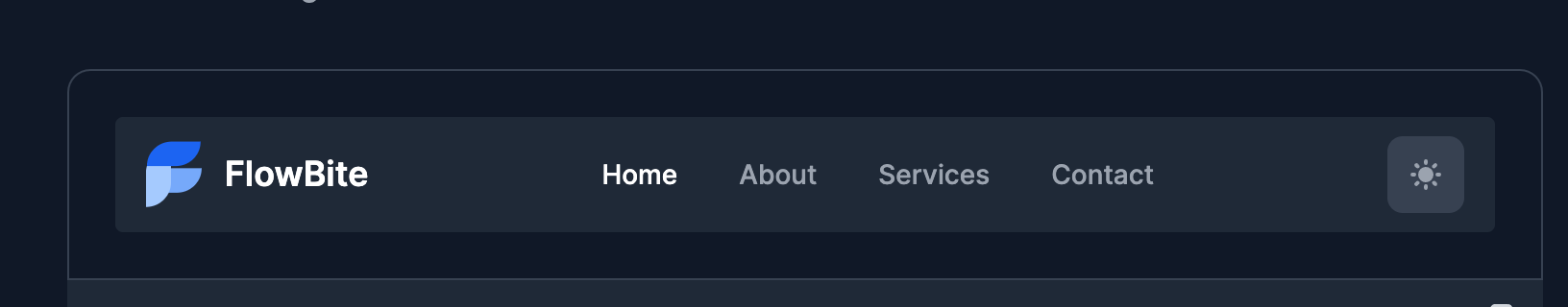 Dark mode switch (dark mode)
Now whenever a user clicks on the button the whole layout will change from dark to light and vice-versa. This is all of the code that you need to create a dark mode switcher using Tailwind CSS and Flowbite.
Flowbite Components in Dark Mode
In this tutorial I would also like to show you some of the components from Flowbite that already support dark mode and how you can use them in your Tailwind CSS project.
After the release of Flowbite v1.2 an important feature was added to this open source component library: a full integration of dark mode for all of the components and plugin.
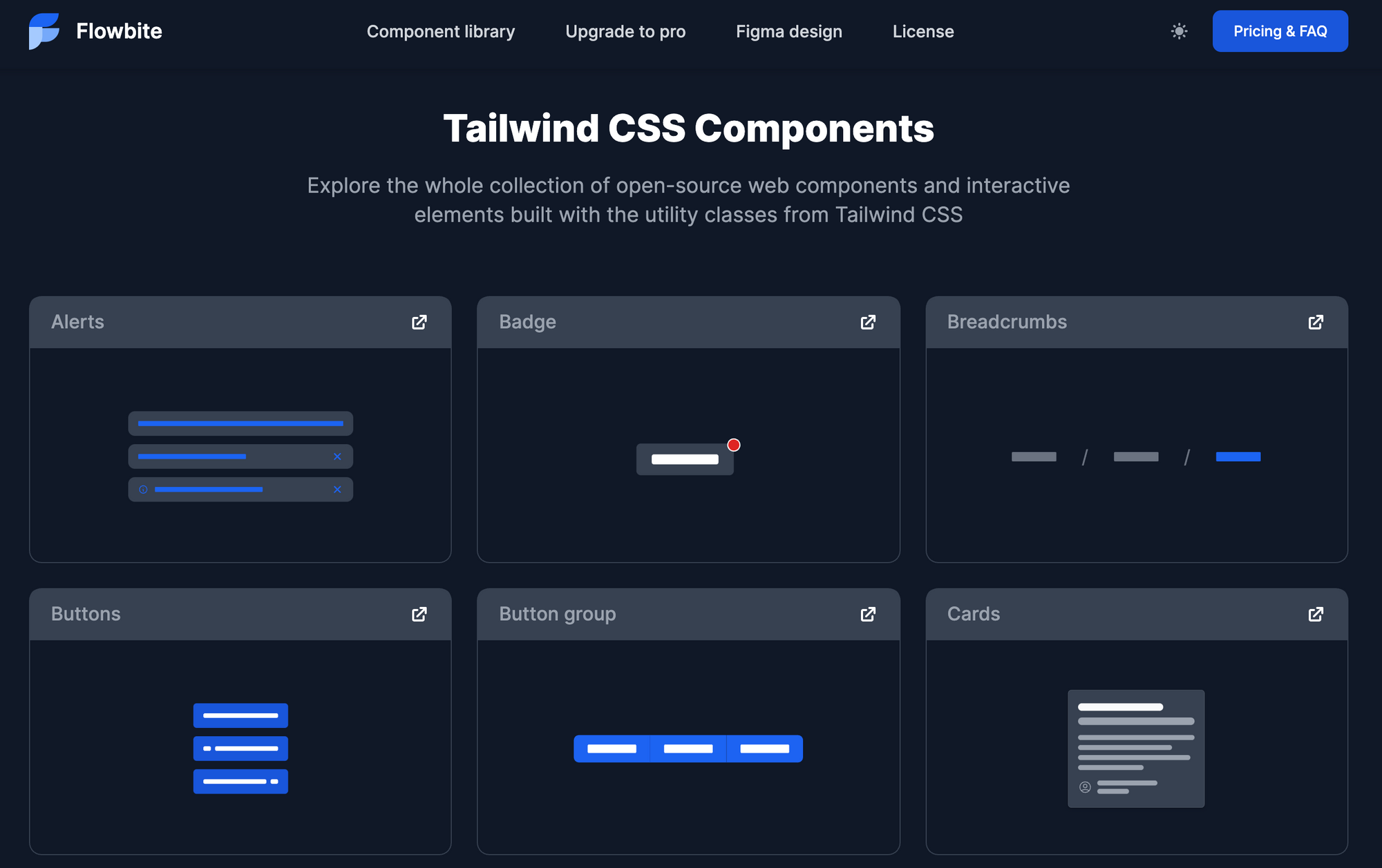 Flowbite - Tailwind CSS component in dark mode
This can help you tremendously when it comes to building a user interface with Tailwind CSS where you need to support dark mode as well. The components from Flowbite will work with dark mode out-of-the-box because of the .dark:{*} classes.
A good example would be the modal component which completely changes the appearance when switching from light to dark:
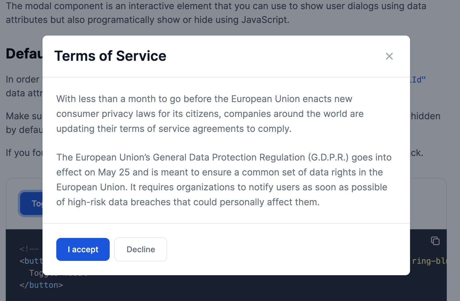 Flowbite - Tailwind CSS modal (light mode)
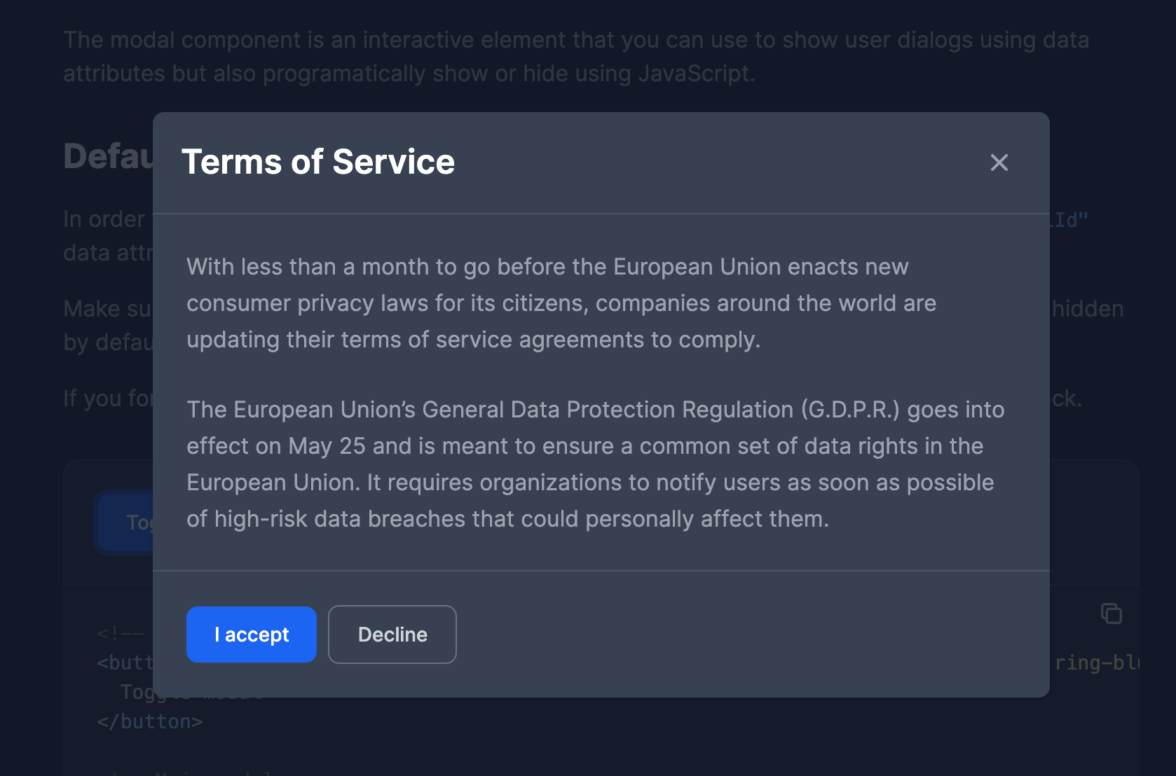 Flowbite - Tailwind CSS modal (dark mode)
I've already written an article on how to use Flowbite here on freeCodeCamp and you can check it out to learn more about how you can use the components from this library.
Conclusion
I hope that this tutorial has helped you with your Tailwind CSS and Flowbite journey when it comes to building a dark version for your website. It is great to see open source projects evolve and make the web a better place.
Let me know on Twitter which color scheme you prefer when browsing websites: dark or light mode?