

Cascading Style Sheets (CSS) represents the design for a web page. But when you are learning this information for the first time, it can be hard to keep track of all of the different CSS properties.
In this article, I have created a study guide for the freeCodeCamp curriculum's entire Learn Basic CSS by Building a Cafe Menu practice project. This study guide is filled with additional information, articles, and videos to help you understand the concepts better.
Feel free to reference this guide as you go through the certification. The first part of the project reviews HTML elements and then moves onto CSS.
Here is the complete list of topics covered. Click on any of the links below to learn more about the topic.
Table of Contents
- DOCTYPE and HTML elements - Step 1
- Head and Title elements - Step 2
- Meta charset attribute - Steps 3,17
- Body element - Step 4
- Heading elements - Steps 6,9,10, 47
- Paragraph element - Steps 7, 30, 31, 49, 65
- Header element - Step 7
- Main element - Step 5
- Section Elements - Steps 8, 9, 46
- Style element - Step 10
- text-align property in CSS - Steps 11, 12, 33, 35
- Grouping CSS selectors - Steps 13, 51
- Linking External Stylesheets - Step 16
- Viewport meta tag - Step 18
- background-color property - Steps 18, 19, 23, 68
- Div element - Step 20
- CSS
widthproperty - Steps 21, 24, 38, 39, 41, 45 - CSS comments - Steps 22, 77
- Margin property - Steps 25, 73, 75, 84, 85, 86, 91
- Class selectors - Steps 26, 27, 32, 34, 36, 42, 44, 50, 61, 76, 87
background-imageproperty - Step 28- Article element - Steps 29, 31, 48, 52
- Block, inline and inline-block values - Steps 37, 89
- Padding - Steps 53 - 55, 72
max-widthproperty - Step 56- font-family - Step 57 - 59
font-styleproperty - Step 60font-sizeproperty - Steps 62, 74, 78- Footer elements - Step 63
- Anchor elements - Step 64
- hr element - Steps 66, 71
- Height property - Steps 67, 70
border-colorproperty - Step 69- Color property - Steps 79, 83
- Pseudo-classes - Steps 80, 81, 82
- Image elements - Steps 88, 90
- Additional resources for HTML and CSS
DOCTYPE and HTML elements
The first line in your HTML code should be the DOCTYPE declaration. A DOCTYPE tells the browser what version of HTML the page is written in.
This is the DOCTYPE declaration for HTML 5:
<!DOCTYPE html>
If you forget to include this line of code in your file, then some of the HTML 5 tags like <article>, <footer>, and <header> may not be supported by the browser.
The html element is the root element where all other elements go inside of it.
<!DOCTYPE html>
<html lang="en">
  <!--All other elements go inside here-->
</html>
The lang attribute inside the opening <html> tag sets the language for the page. It is also good to include it for accessibility reasons, because screen readers will know how to properly pronounce the text.
<html lang="en">
Head and Title elements
The <head> tags contain information that is processed by machines. Inside the <head> tags, you will nest metadata which is data that describes the document to the machine.
<head>
  <!--important meta data goes inside here-->
  <!--title element also goes inside here-->
</head>
The <title> tag is the title for the web page. This text is shown in the browser's title bar.
<title>HTML 5 Boilerplate</title>
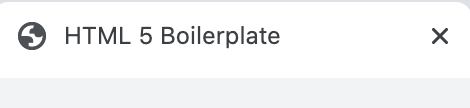
This is an example of what a head would look like on a real web page. None of this information is displayed on the web page itself.
 <head>
    <meta charset="UTF-8">
    <meta name="viewport" content="width=device-width, initial-scale=1.0">
    <meta http-equiv="X-UA-Compatible" content="ie=edge">
    <title>HTML 5 Boilerplate</title>
    <link rel="stylesheet" href="style.css">
  </head>
For a detailed description of each meta tag listed, you can read through this article on an HTML5 Boilerplate.
Meta charset attribute
UTF-8 is the standard character encoding you should use in your web pages. This will usually be the first <meta> tag shown in the <head> element.
<meta charset="UTF-8">
According to the World Wide Web Consortium,
A Unicode-based encoding such as UTF-8 can support many languages and can accommodate pages and forms in any mixture of those languages. Its use also eliminates the need for server-side logic to individually determine the character encoding for each page served or each incoming form submission.
Body element
The body element contains all of the content for the web page. This includes headings, paragraphs, images, links, and more.
<html>
  <head>
    <title>Let's learn about the body element</title>
  </head>
  <body>
    <!--web page content goes inside here-->
  </body>
</html>
Heading elements
HTML heading elements represent the main heading and subheadings of a web page.
The h1 element represents the most important heading and should only be used once per web page.
<h1>I represent the main heading of a web page</h1>
The h2 element represents the second most important heading on the page.
<h2>I am the second most important heading element</h2>
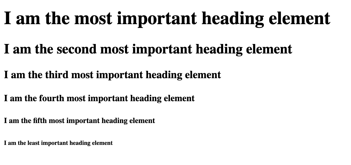
There are a total of six section heading elements:
<h1>I am the most important heading element</h1>
<h2>I am the second most important heading element</h2>
<h3>I am the third most important heading element</h3>
<h4>I am the fourth most important heading element</h4>
<h5>I am the fifth most important heading element</h5>
<h6>I am the least important heading element</h6>
This is what it looks like rendered to the page.
To learn more about heading elements, you can read through this DevDocs detailed heading elements explanation.
Paragraph element
Paragraph elements represent the paragraphs on a web page.
<p>I love learning with freeCodeCamp. They have thousands of free articles and videos to help me learn how to code.</p>
This is what it looks like rendered to the page:

To learn more about paragraph elements, you can read through this DevDocs p element detailed explanation.
Header element
The header element contains introductory content of the web page. This can include elements like a nav, h1 or website logo.
<header>
  <img src="link-for-logo" alt="description for fake logo goes here">
  <nav>
    <ul>
      <li><a href="/">Home</a></li>
      <li><a href="#bio">Bio</a></li>
      <li><a href="#projects">Projects</a></li>
    </ul>
  </nav>
</header>
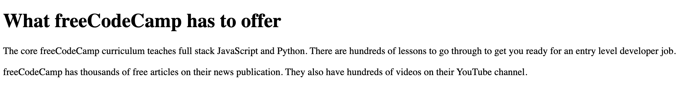
Main element
The main element is used to group all of the main content of the web page.
<h1>What freeCodeCamp has to offer</h1>
<main>
  <p>The core freeCodeCamp curriculum teaches full stack JavaScript and Python. There are hundreds of lessons to go through to get you ready for an entry level developer job.</p>

  <p>freeCodeCamp has thousands of free articles on their news publication. They also have hundreds of videos on their YouTube channel.</p>
</main>
This is what the code looks like rendered to the page.
To learn more about the main element, you can read through this DevDocs detailed main element explanation.
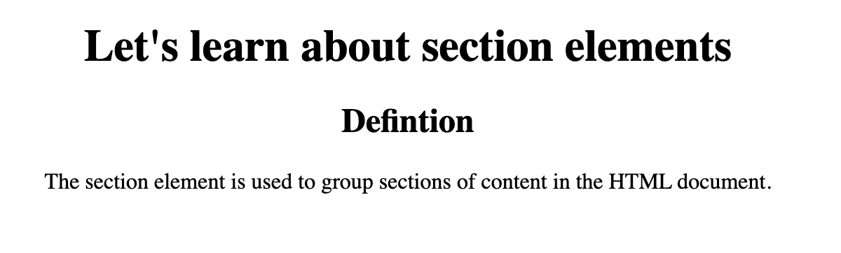
Section elements
The section element is used to group sections of content in the HTML document.
Here is an example of the section element:
<h1>Let's learn about section elements</h1>
<section>
  <h2>Defintion</h2>
  <p>The section element is used to group sections of content in the HTML document.</p>
</section>
This is what the result looks like rendered to the page.
To learn more about section elements, you can read through this DevDocs section element detailed explanation.
Style element
The style element contains the styling for the web page. This is known as internal CSS.
The style element goes inside the head tags.
<!DOCTYPE html>
<html lang="en">

<head>
  <style>
    /*Styles will go inside here*/
  </style>
</head>

<body>
  <!--website content goes inside here-->
</body>

</html>
To learn more, you can read through this helpful DevDocs explanation on the style element.
text-align Property in CSS
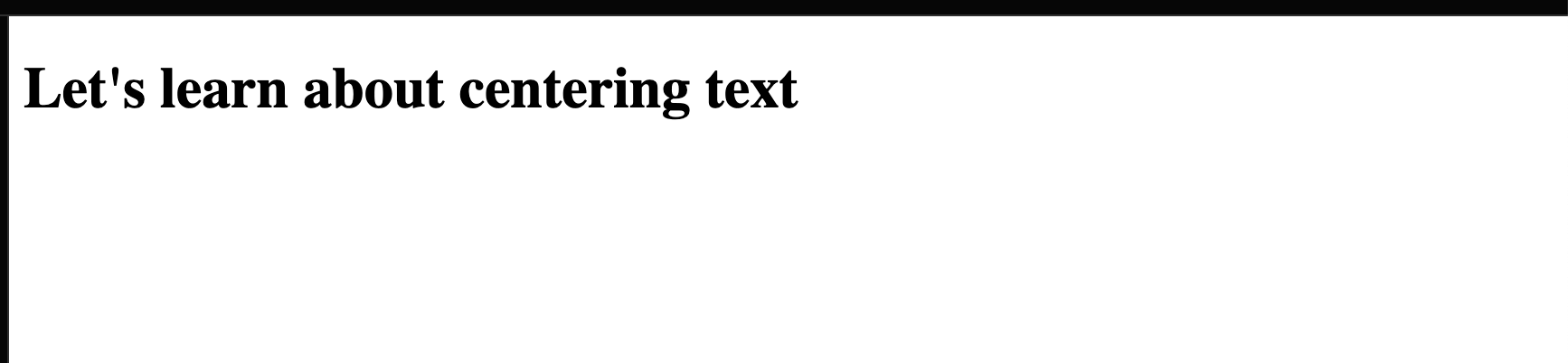
When you are working with heading or paragraph tags, the default styling in HTML will position the text on the left hand side of the page.
In this example, we have an <h1> which is placed on the upper left hand side of the page.
<h1>Let's learn about centering text</h1>
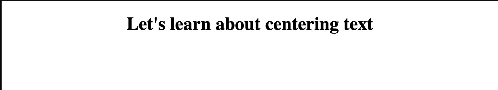
If we wanted to horizontally center that text on the page, then we can use the text-align property.
h1 {
  text-align: center;
}
To learn more, you can read through this helpful article on centering text: Text Align in CSS – How to Align Text in Center with HTML.
Grouping CSS selectors
If you have multiple CSS selectors with the same styles, then you can group them together like this:
h1, h2, h3 {
    text-align: center;
}
Notice how the h1, h2 and h3 are separated by commas. Grouping multiple CSS selectors together cleans up your CSS and removes repetition.
You can read more about CSS combinators here.
Linking External Stylesheets
The link element is used in most cases to link an external stylesheet to the HTML document. Using external CSS is preferred in most cases to help keep your HTML and CSS in separate documents for readability.
<!DOCTYPE html>
<html lang="en">
  <head>
    <link rel="stylesheet" href="style.css">
  </head>
  <body>
  </body>
</html>
rel="stylesheet" defines the relationship between the HTML file and the external stylesheet.
To learn more, you can read this DevDocs example on link elements.
Viewport meta tag
This tag renders the width of the page to the width of the device's screen size. If you have a mobile device that is 600px wide, then the browser window will also be 600px wide.
The initial-scale controls the zoom level. The value of 1 for the initial-scale prevents the default zoom by browsers.
<meta name="viewport" content="width=device-width, initial-scale=1.0">
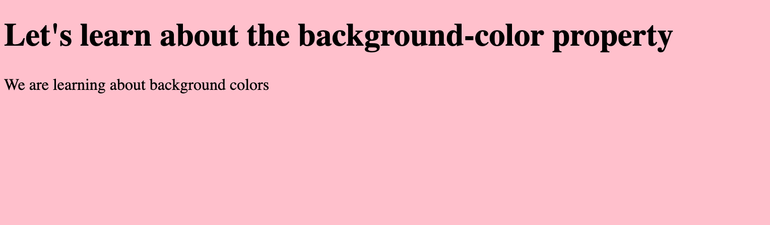
background-color property
You can change the background color of an HTML element by using the CSS background-color property.
Let's say we have this HTML markup.
<h1>Let's learn about the background-color property</h1>
<p>We are learning about background colors</p>
I wanted to change the background color from the default of white to pink. We can target the body selector and use background-color: pink;
body {
  background-color: pink;
}
To learn more, you can read through this helpful article: CSS Background Color – How to Change the Background Color in HTML.
Div element
The div HTML element is used to group multiple HTML elements and represents a generic container. This element holds no semantic meaning and is mainly used for styling purposes.
<div>
  <h1>Let's learn about divs</h1>
  <p>div elements are generic containers to group elements</p>
</div>
To learn more, you can read through this helpful article: HTML Div – What is a Div Tag and How to Style it with CSS.
CSS width property
The width property will set the width for the HTML element.
In this example, I want to set the width of this div to 200px.
div {
  width: 200px;
}
To learn more, you can read through this helpful DevDocs explanation on the width property.
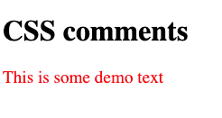
CSS comments
If you need to comment out code or leave messages for yourself or other developers, you can use comments.
Here is the basic syntax for a comment in CSS:
/* this is a comment in CSS */
Anything inside that comment tag will not be rendered to the web page.
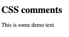
In this example, we have some HTML markup.
<h1>CSS comments</h1>
<p class="red-text">This is some demo text</p>
For the CSS, I have changed the text color to red and increased the font size.
.red-text {
  font-size: 1.2rem;
  color: red;
}
Here is the current result:
If I comment out the red text color, then the text will go back to black.
.red-text {
  font-size: 1.2rem;
  /* color: red; */
}
Margin property
The margin property represents the space around the HTML element. There are four different margin properties:
margin-leftmargin-rightmargin-topmargin-bottom
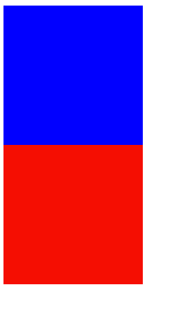
In this first example, we have two div elements which represent blue and red boxes.
<div class="blue-box"></div>
<div class="red-box"></div>
.blue-box,
.red-box {
  width: 200px;
  height: 200px;
}

.blue-box {
  background-color: blue;
}

.red-box {
  background-color: red;
}
Here is what the result looks like rendered to the page:
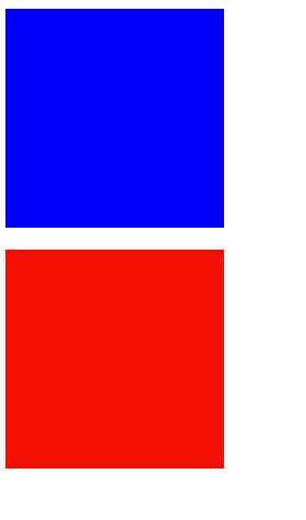
If we want to created some space between the red and blue boxes we can use the margin property. I am going to add a margin-bottom: 20px; to the blue box to create space.
.blue-box {
  background-color: blue;
  margin-bottom: 20px;
}
This is what the result looks like:
We can also center both boxes, by setting the margin-left and margin-right properties to auto.
.blue-box,
.red-box {
  width: 200px;
  height: 200px;
  margin-left: auto;
  margin-right: auto;
}
Here is the result:
In this next example, we have a green box, a blue box, and some text on the page. We can use the margin-left, margin-right, margin-top, and margin-bottom properties to create spaces between the text and boxes.
<h1 class="text">Margin shorthand property</h1>
<div class="green-box"></div>
<p class="text">Margins create space around HTML elements</p>
<div class="blue-box"></div>
<p class="text">CSS is fun</p>
.text {
  text-align: center;
}
.blue-box,
.green-box {
  width: 200px;
  height: 200px;
  margin-left: auto;
  margin-right: auto;
  margin-top: 20px;
  margin-bottom: 20px;
}

.blue-box {
  background-color: blue;
}

.green-box {
  background-color: green;
}
Here is the result:
For the blue and green boxes, we can clean up our code here and place all of these margin styles all in one line.
  margin-left: auto;
  margin-right: auto;
  margin-top: 20px;
  margin-bottom: 20px;
The margin shorthand property is used to set the margin for all sides of the element. If two values are present, then the first value represents the top & bottom margins while the second value represents the left & right margins.
margin: 20px auto;
To learn more about the margin shorthand property, you can read through this helpful DevDocs explanation.
Class selectors
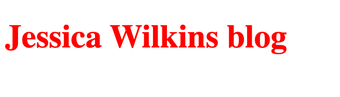
If you wanted a group of HTML elements to share the same styles, then you would use the class attribute.
Here is an example of how to apply a class to an HTML element.
<h1 class="title">Jessica Wilkins blog</h1>
Then in your CSS, you can target that class and add some styles to it.
Here is an example of turning that text red, using CSS. Note, that you need to precede that class name with a . which tells the computer that you want to use a class selector.
.title {
  color: red;
}
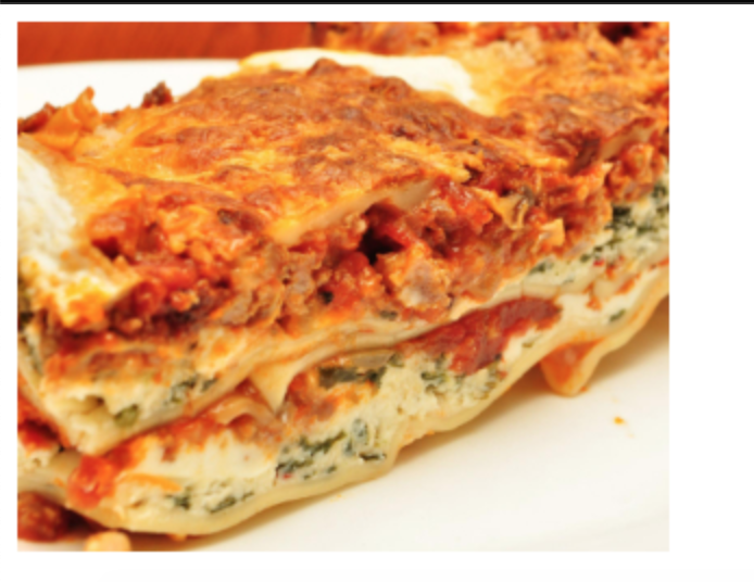
background-image property
The background-image property is used to set the background image for an HTML element.
In this example, we are going to apply a background image of lasagna to the body element.
body {
  background-image: url("https://cdn.freecodecamp.org/curriculum/cat-photo-app/lasagna.jpg");
}
The reason why this image is repeating on the screen is because that is the default behavior for the background-image property. You could use background-repeat: no-repeat; to change that default behavior.
Article element
The article element is a semantic HTML element that is used for independent self contained content.
<article>
  <h2>Blog entry #3</h2>
  content goes here...
</article>
Block, inline and inline-block values
The display property is used to apply block or inline characteristics to an element. Block level elements take up the full horizontal space on the page while inline elements only take up the horizontal space for that element.
Inline elements will not work with width and height properties. The margin left and right values will work for inline elements but not the top and bottom values.
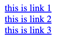
You can have multiple inline elements displayed in a row while you can have only one block level element per row. Here is an example for multiple inline elements in a row:
<a href="">this is link 1</a>
<a href="">this is link 2</a>
<a href="">this is link 3</a>
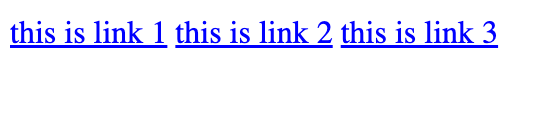
You can use the display:block; value on these anchor element to change their default behavior and set it to block characteristics.
a {
  display: block;
}
This next example is for multiple block level elements. Notice how each of these divs takes up the entire horizontal space on the page and they are not displayed next to each other.
<div class="box red"></div>
<div class="box green"></div>
<div class="box blue"></div>

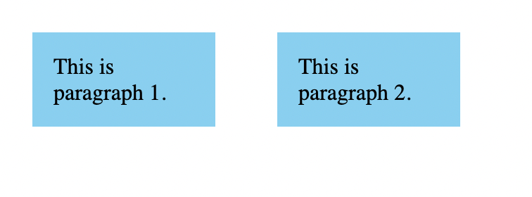
This last value is called inline-block which will treat elements as inline but will also have characteristics of block level elements.
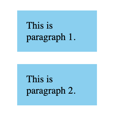
Here is an example of two paragraph elements that are block level elements by default.
<p>This is paragraph 1.</p>
<p>This is paragraph 2.</p>
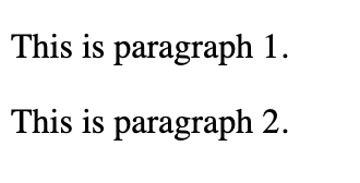
I can set the width, margin, padding and background-color for these p elements.
p {
  background-color: #89cff0;
  width: 100px;
  margin: 20px;
  padding: 15px;
}
We can add display: inline-block; to place the paragraph elements next to each other.
p {
  background-color: #89cff0;
  width: 100px;
  margin: 20px;
  padding: 15px;
  display: inline-block;
}
Padding
In CSS, you can add padding to create space around the element's content.
In this example we have a paragraph element with a pink background that uses no padding.
<p>This is an example without padding</p>
p {
  background-color: pink;
  width: 100px;
}
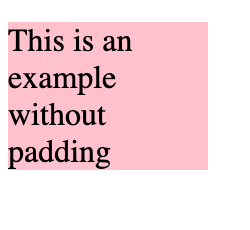
Notice how the text is right up against the border of the p element. That is because we haven't added any padding.
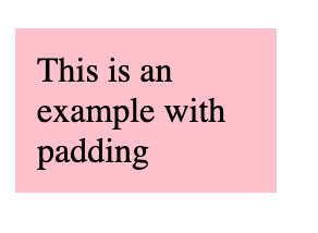
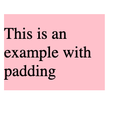
If we want to create space around that text, then we can use padding. Let's add 10px of padding on all sides of the text.
p {
  background-color: pink;
  width: 100px;
  padding: 10px;
}
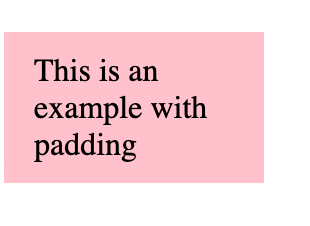
If we only wanted to add padding to the left and right sides, then we can use the padding-left and padding-right properties.
p {
  background-color: pink;
  width: 100px;
  padding-left: 10px;
  padding-right: 10px;
}
We can also modify it so there is only space around the top and bottom of the text.
p {
  background-color: pink;
  width: 100px;
  padding-top: 10px;
  padding-bottom: 10px;
}
Similar to the margin property, you can use a shorthand notation to apply different types of padding to the top, left, right, and bottom sides.
In this example we are going to add 10px of padding to the top and bottom of the text and add 15px of padding to the left and right sides of the text.
Without the shorthand property the code would look like this:
p {
  background-color: pink;
  width: 100px;
  padding-left: 15px;
  padding-right: 15px;
  padding-top: 10px;
  padding-bottom: 10px;
}
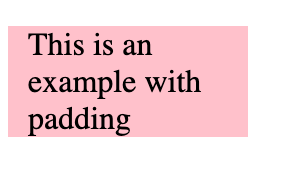
But we can use the shorthand notation to achieve the same result. The first number in the padding property represents the top and bottom while the second number represents the left and right.
p {
  background-color: pink;
  width: 100px;
  padding: 10px 15px;
}
To learn more about the padding shorthand notation, you can read through this helpful DevDocs explanation.
max-width property
The max-width property is useful when you want to set a maximum width for an element.
In this example, we have a red container with a width set to 70% of the viewport width.
<div class="red-container"></div>
.red-container {
  width: 70%;
  height: 40px;
  background-color: red;
}

We can use the max-width property to set a maximum width of 1000px to this red container.
.red-container {
  width: 70%;
  max-width: 1000px;
  height: 40px;
  background-color: red;
}
Now, when the viewport is larger than 1000px, the width will no longer be set to 70% of the viewport. Instead, it will stay at the maximum width of 1000px.
font-family property
In design, a font-family represents a collection of fonts that share similar design characteristics. Here are some examples of some font families:
Times, Times New Roman, serif
Comic Sans MS, Comic Sans, cursive
In CSS, you can use the font-family property to apply a set of fonts to given elements.
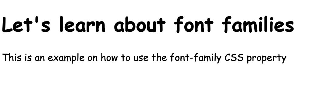
<h1>Let's learn about font families</h1>
<p>This is an example on how to use the font-family CSS property</p>
body {
  font-family: Comic Sans MS, Comic Sans, cursive;
}
The browser will select the first font in the list and display if it is available. If that font is not available, then it will move onto the next font in the list.
It is good practice to provide a fallback font in the event that the other fonts in the list are not available to the browser. In our example, cursive would considered the fallback if Comic Sans MS and Comic Sans were not available.
font-style property
The font-style property is used to set the text in a normal, italic, or oblique font style.
Here is an example of setting the text to an italic font-style.
<h1>This example is about the font-style property</h1>
h1 {
  font-style: italic;
}
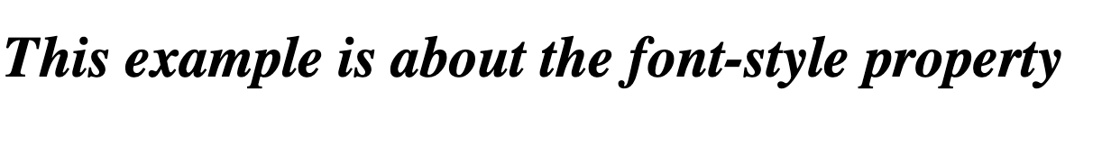
It's important not to use the HTML i (Idiomatic Text) element for styling text in italics. When it comes to styling text, you should always use the font-style property.
font-size property
The font-size property is used to change the font sizes for HTML elements like headings and paragraphs. Here are some common values that you can use with the font-size property:
- xx-small, x-small, small, medium, large, x-large, xx-large, xxx-large
- smaller, larger
- px, em, rem
- percentages (for example, font-size: 60%;)
In this example, we are going to set the font-size for this paragraph element to be 20px.
<p>This example is about the font-size property</p>
p {
  font-size: 20px;
}
Footer elements
The footer element is located at the bottom of the HTML document and contains information like copyrights, or links to other related information for the page.
Here is a basic example:
<footer>
  <p>© 2022 Jessica Wilkins</p>
</footer>
To learn more about the footer element, you can read through this DevDocs explanation of the footer element.
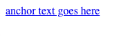
Anchor elements
An anchor element represents a link on the web page.
Here is the basic syntax:
<a href="link-where-you-want-to-go">anchor text goes here</a>
This is what it looks like rendered to the page:
You use the href attribute to tell the hyperlink where to go.
href="link-where-you-want-to-go"
The anchor text is what gets displayed on the screen to users.
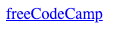
Here is an example of an anchor tag that links to freeCodeCamp:
<a href="https://www.freecodecamp.org/">freeCodeCamp</a>
This is what it looks like rendered to the page.
To learn more about HTML anchor elements, I suggest reading through these helpful articles:
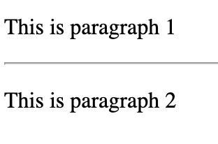
hr element
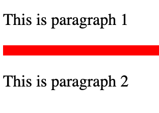
The hr (Horizontal Rule) element is used to created breaks between the paragraph elements.
Here is an example of how to use the hr element between two paragraph elements. hr elements are self closing.
<p>This is paragraph 1</p>
<hr>
<p>This is paragraph 2</p>
You can style the hr element by changing its border and color.
hr {
  border: 5px solid red;
}
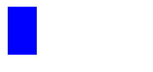
Height property
The height property in CSS is used to set the height for an HTML element. Here is an example where we have a blue container with a height of 50px.
<div class="blue-container"></div>
.blue-container {
  background-color: blue;
  width: 30px;
  height: 50px;
}
To learn more about the height property, you can read through this helpful DevDocs explanation.
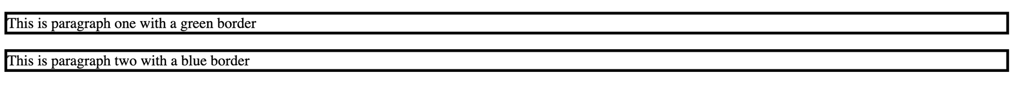
border-color property
The border-color property is used to set the color for an element's border.
In this example, we are going to create two paragraph elements with different border colors. The first step is to set the border widths and style.
<p class="para1">This is paragraph one with a green border</p>
<p class="para2">This is paragraph two with a blue border</p>
p {
  border-style: solid;
  border-width: 3px;
}
Then we can set the first paragraph to have a border color of green and the second paragraph to have a border color of blue.
.para1 {
  border-color: green;
}

.para2 {
  border-color: blue;
}
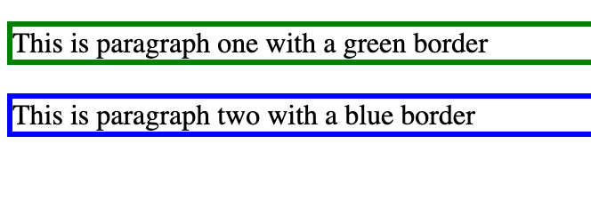
We can rewrite our example to use the border shorthand notation to apply the border width, color, and style all at the same time.
.para1 {
  border: 3px solid green;
}

.para2 {
  border: 3px solid blue;
}
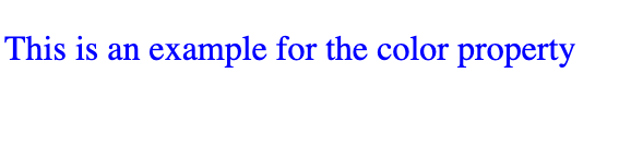
Color property
You can change the color of the text by using the color property. Here is an example to change the paragraph text to blue:
<p>This is an example for the color property</p>
p {
  color:blue;
}
Pseudo-classes
Pseudo-classes are special keywords that you can add to CSS selectors to show the specific state of an HTML element.
In this first example, we are going to create a blue button that changes to a darker shade of blue when the user hovers over it. We can use the :hover pseudo-class to achieve that result.
<button>Login</button>
button {
  border: none;
  padding: 10px;
  font-size: 20px;
  color: white;
  background-color: #0e3386;
  cursor: pointer;
}

button:hover {
  background-color: #041e42;
}
In this next example, we are going to use CSS pseudo-classes to style the different states for a link.
The :link pseudo-class is used to show the initial state of the link.
a:link {
  color: #0066b2;
}
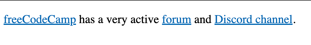
The :hover pseudo-class is used to show when a user hovers over a link.
a:hover {
  color: #13274f;
}
The :visited pseudo-class is used to show when a user clicks on that link and visits the site.
a:visited {
  color: #5a4fcf;
}
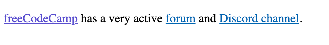
You can play around with this CodePen example to see the different link states.
If you want to learn more about pseudo-classes, then you can read through this helpful article.
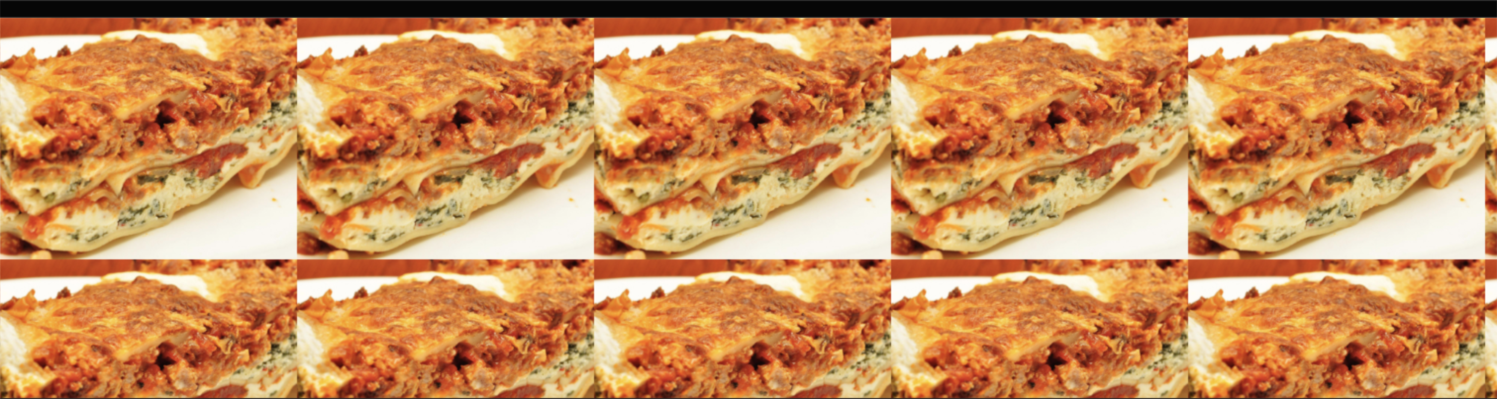
Image elements
img elements are used to add images to the web page.
The src attribute represents the location of the image and the alt attribute is descriptive text for the image.
<img src="https://cdn.freecodecamp.org/curriculum/cat-photo-app/lasagna.jpg" alt="plate of lasagna">
This is the what code looks like rendered to the page:
To learn more about the img element, you can read through this helpful img element tutorial.
Additional resources for HTML and CSS
Thanks for reading! Here are some more helpful resources to get you comfortable with CSS: