
In this article I'm going to discuss some use cases of REM (Root EM) in CSS.
I will begin with some background knowledge about CSS properties and values, which I think is necessary. Then I'll discuss the differences between absolute length values and relative ones. REM is a relative length value.
In the last two parts I discuss why REM is useful with regard to font size, and how it can help make webpages responsive. Let's get to it.
What you need to know
In this section I will first say a few things about CSS, as a way of introduction.
What is CSS?
CSS (which stands for Cascading Style Sheets) uses properties and values to create all the aesthetic magic that goes on in webpages.
Say, you want to enhance your image with a beautifully crafted border, and you want the edges to be a solid black line. In this case border would be the property to choose, and solid the value. This is a keyword in CSS that instructs it to create the desired solid border.
As you may have guessed, there must be different kinds of these values, seeing that merely a solid line as a border is not much of an adornment.
The property border indeed accepts keywords, colors, and lengths. Actually, this is because border is shorthand for border-width, border-style and border-color. So instead of specifying each of these properties, border accepts these values for all of them at once, like so:
border: 2px solid #ffff00;In the code snippet above, you see the value 2px which is a length value, solid which is a keyword for the styling of the border, and the RGB hex value #ffff00 of the color yellow. Now that's a nice border (not really, I know, but I made my point).
One last thing about these values before we get down to business. Different properties have different kinds of values that are applicable to them. These collections of values are aptly called value types (a.k.a. data types).
Let me clarify with a last example: color is a value type, and the RGB hex value #ffff00 (which represents the color yellow) is a specific value of this value type. If you need to, think of the value types as types and the values as tokens of these types.
So if you ever need to know which values a specific property accepts, just search for its value types, and you're covered.
What is REM in CSS?
This article is about one of these values, namely REM, which stands for Root EM. REM is a value of the value/ data type length. Another value of length is our good old friend pixel (px). Every property that accepts lengths as a value will accept REM. Some of these are margin, padding, and so on.
You might wonder why you should consider using REM? Let's see why in the next section.
Relative Values vs Absolute Length Values in CSS
There are two types of length values in CSS: absolute length values and relative length values.
Absolute length values
Examples of absolute length values are: px (which is 1/96th of an inch), in (an inch) or cm (which is 37.8px or 25.2/64in). You can find more information about these values in the MDN.
When you use these length values you can be sure that they will always be more or less the same size. This is especially useful when you know the exact dimensions of the output, which is mostly with print layouts. But it's not so useful when this is not the case, like with all the different screen sizes out there.
And don't forget the possible different browser settings people use, either because of preferences or accessibility needs.
Relative length values
Relative length values are defined in terms of some other value. These are, for example, REM, EM, and vw. We are going to discuss REM in detail below, so lets discuss the others briefly.
EM is defined relative to:
- the font size of the parent element when the property
font-sizeis concerned, and - the font size of the element itself when we're dealing with other properties like
height.
vw stands for 1% viewport width. That is to say that if you define the width property as 10vw, the element will take up 10% of the available viewport's width. There are many more, and you can find them here.
These relative length values have a clear advantage above the absolute ones, because they can help make your website responsive. That is to say, your website automatically adapts to the size of the available screen size, doing so in a predictable way.
Root EM and Root Font Size
REM is defined relative to the font size of the root element. The root element is matched by the :root pseudo-class or the html selector.
1rem therefore takes on the value which is given to the font-size of the root element. This means that 1 REM keeps the same value throughout your whole CSS code. If the root element's font size is not changed by the user this value is normally 16px.
Here's an example:
html {
	font-size: 18px; // default value would be 16
}

h1 {
 	font-size: 2rem; // 2 * 18px = 36px;
}
Reasoning backwards from 2rem to px is not a hard task. But do you need to keep a calculator nearby to know the exact font size of your sub-heading which you set to 1.125rem (that's: 16 * 1.125: 18px)?
Thankfully there is a clever way of dealing with this problem. Keeping in mind that you can also specify the font size of the root element with a percentage (%), developers have found that 62.5% of the default value of the root element equals 10px. This simplifies things really nicely:
html {
	font-size: 62,5%; // 16px * 0.625 = 10px;
}

h1 {
	font-size: 1.8rem; // 10px * 1.8 = 18px;
}
Using REM (or another relative length value) for font-size is a must for accessibility, because px in some browsers doesn't resize when the browser settings are changed.
Some people, for example, need to zoom maybe up to 400% to be able to read your text, due to a visual impairment. Using REM you make sure that your text respects these needs, because the font-size is defined relative to the default font-size a user has chosen.
Responsive Web Design with REM
Let me first say that responsive web-design is an extensive subject, with many different aspects. There are two certificates about responsive web design in freeCodeCamp's curriculum (check these out at https://www.freecodecamp.org/learn, if you're interested).
Below I'm going to concentrate on how REM can help with making webpages responsive.
Google encourages you, in this article about responsive web design, to restrict line length to not much more than 10 words. This is in accordance with classical readability theory.
They advise that you should use media queries with break points chosen in such a manner that the width of your content/text lines are not too long. This helps provide the best possible reading experience.
Here is an example inspired by this article by Adrian Sandu:
html {
  margin: 0;
  padding: 0;
  font-size: 62.5%;
}

#divOne {
  width: 100%;
  box-sizing: border-box;
  font-size: 1.6rem;
  padding: 0.5rem;
  background-color: lightblue;
}

@media (min-width: 27.1875rem) { // first breakpoint: 27.1875*16px= 435px
  p {
    font-size: 1.6rem;
  }
#divOne {
  width: 41.8rem;
  background-color: yellow;
  margin: auto;
  }
}

@media (min-width: 40.78125rem) { 1.5 * first breakpoint: 653px
  p {
    font-size: 2.4rem; // 1.5 * font-size first breakpoint
  }
#divOne {
  width: 62.7rem; // 1.5 * width of first breakpoint
  background-color: green;
  padding: 0.75rem; // 1.5 * padding of first break point
  margin: auto;
  }
}You can check this code out here on CodePen. Change the size of your view port to see how the layout changes.
One thing that might stand out to you in the code above is that the value of 1rem in the defined media queries is always 16px. 1rem inside the media query blocks follows the root definition of font-size of 62.5% of 16px, which is 10px as we found earlier.
This behavior is caused by the fact that REM inside media queries always takes the default value of the browser font size, which is often 16px. However if the user changes this default browser setting, REM will take that value. This means that the accessibility preferences a user might have specified are accommodated.
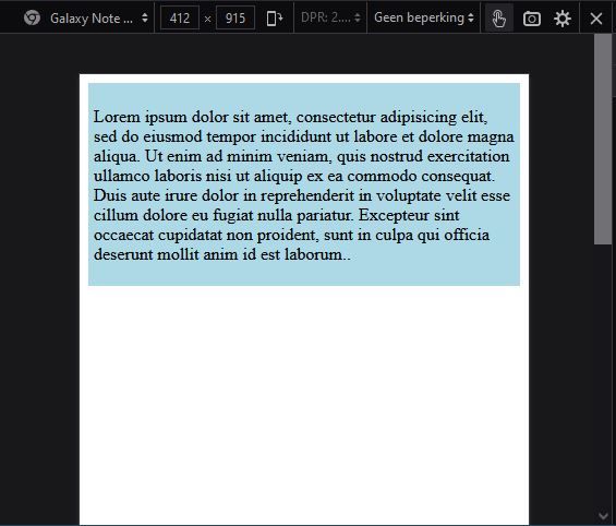
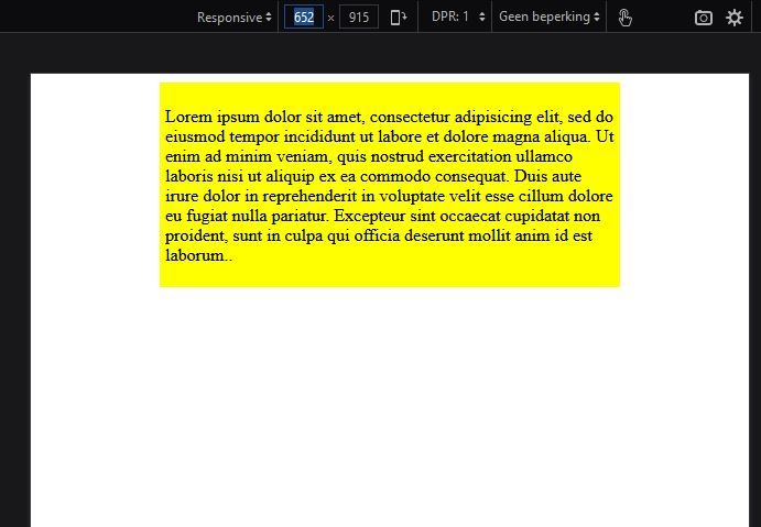
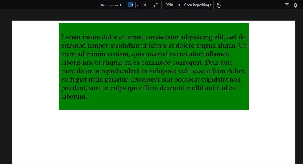
The code takes a mobile first design approach. The first breakpoint I have defined at 435px. Notice that the width of the text after this breakpoint never changes, but the ratio of the values around it changes in proportion, 1.5 to be exact. Below are illustrations of each step:
The layout when viewport is smaller than 435px:
The layout when viewport is between 435px and 652px:
The layout when viewport is greater than 652px:
Conclusion
In this article we have explored the use of REM in CSS. We saw that REM is a relative length value which can be utilized to make a logical schema of the font sizes inside your webpages.
Using it your webpages also makes them accessible to people who need to change the default font-size value of the browser to suit their needs.
Lastly we explored how REM can help you make a webpage responsive, while also making allowances for the possible default setting changes made by users who need/ prefer other settings.
While writing this, I have greatly benefited from these articles:
- Learn CSS Units – Em, Rem, VH, and VW with Code Examples, by Joy Shaheb
- CSS Unit Guide: CSS em, rem, vh, vw, and more, Explained, from freeCodeCamp
- CSS Unit Battle: EMs Vs. REMs…FIGHT!, by ZAYDEK
- Rem in CSS: Understanding and Using rem Units, by Adrian Sandu
- CSS values and units, <length>, font-size, by MDN
- Accessible responsive design, by Dave Gash, Meggin Kearney, Rachel Andrew, Rob Dodson
- Responsive web design basics, by Pete LePage and Rachel Andrew
Cover photo by Sora Shimazaki via Pexels.